The best fonts for thumbnails
21 classic typefaces certain to make your thumbnails stand out.
Thumbnails demand a lot from design; accurately depicting a sometimes complicated message through a tiny rectangle and only a few large words can be challenging. A thumbnail may feel like a limiting design brief, but the fonts we’ve put together at Creative Bloq widen the possibilities of a thumbnail and make that tiny rectangle suddenly feel like a limitless opportunity. The text is often the most prominent aspect of a thumbnail that stands out the most, and the font choice can define the entire tone, which means it’s crucial to find just the right choice of typeface to effectively depict your message.
Whether you’re designing a thumbnail for a YouTube video, an Instagram Reel, a blog post or even an article, these 21 fonts offer a way to make only a few small words make a big impact. Our guide to free web fonts also has you covered for the rest of your online design font choices, and if you need even more free fonts, make sure to check out our ultimate list of free fonts, which compiles all the free typefaces you might need.
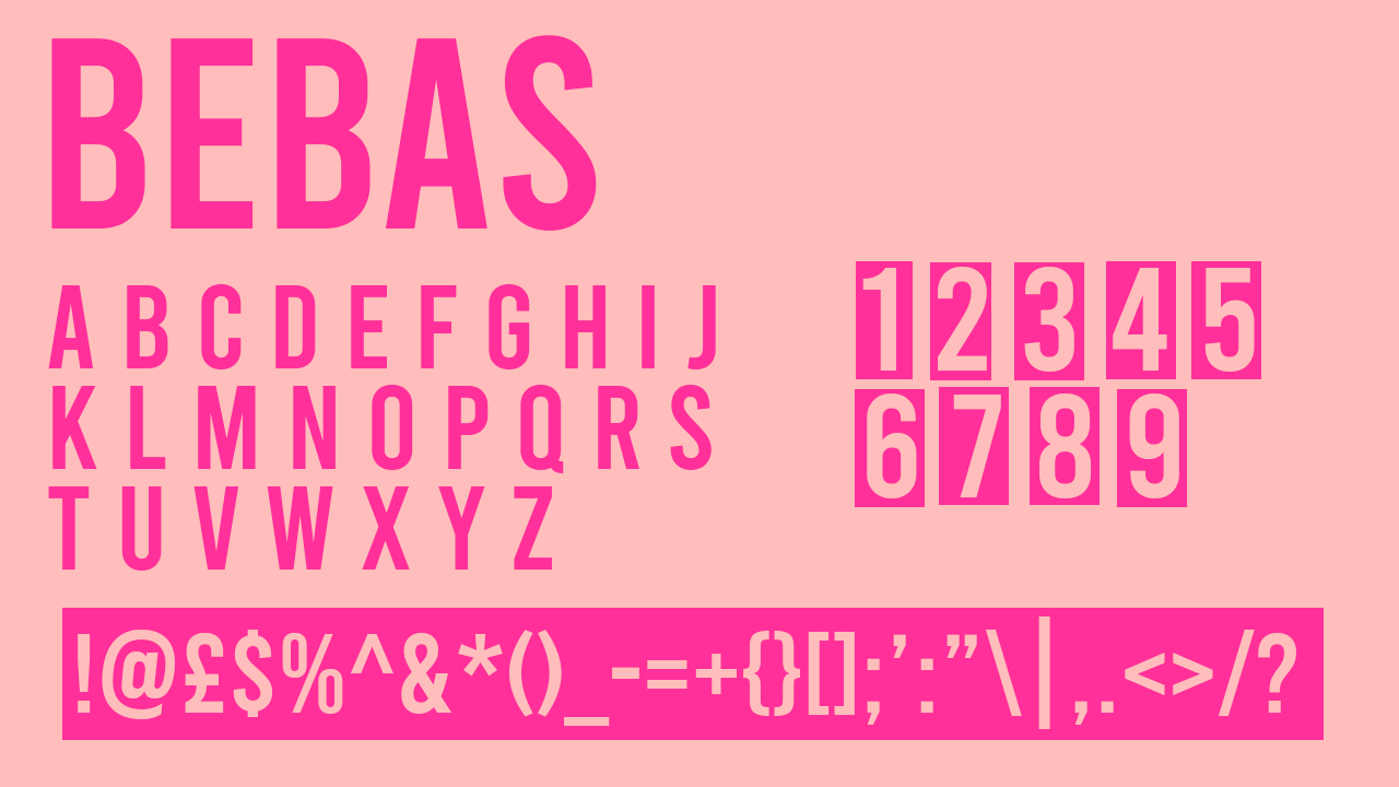
1. Bebas Neue
Why you can trust Creative Bloq
• Cost: Free
A clean and sleek typeface, Bebas is a font certain to help any project look put-together and professionally designed. It’s even used often for graphics in television, as its thick strokes are decisive and impactful, making it perfect for a concisely designed thumbnail intended to make a clear statement.
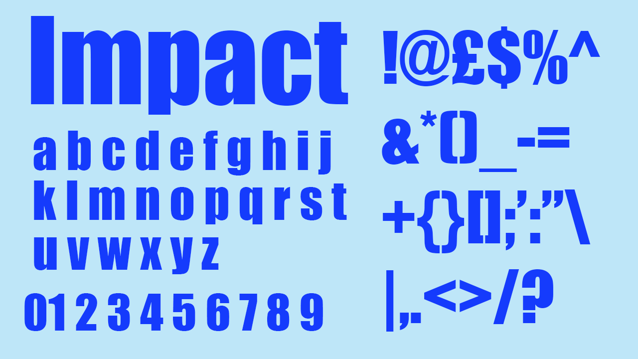
2. Impact
• Cost: Free
If you’re looking for a font that effectively delivers your message with briefer words and large text, Impact delivers exactly what its name promises. Originally created in 1965, it’s now owned by Monotype – an infamous fonts company whose ownership proves the ubiquity and effectiveness of Impact.
3. Avenir (black oblique)
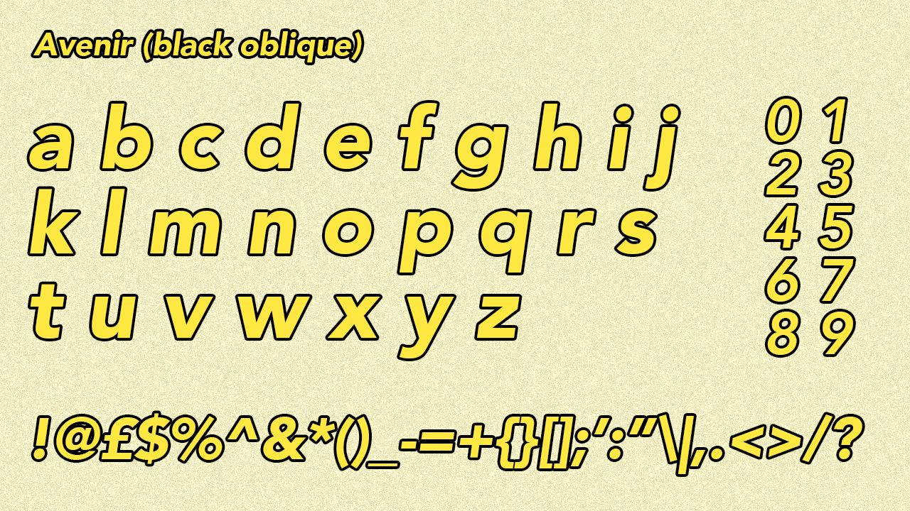
• Cost: £42.99
Avenir is possibly one of the largest font families out there, with six different weights all available in their regular styles as well as in 'oblique'. This means it’s used in popular graphics far more often than you might notice at a glance. Avenir in 'black oblique' is often used for text designed to reflect old-fashioned film subtitles, and it also features heavily in the thumbnails of lifestyle vloggers and short film creators as it’s a font that reads clearly at all sizes as well as delivers effortless style and a beauty that mixes the old fashioned with the clear and modern.
4. Obelix Pro
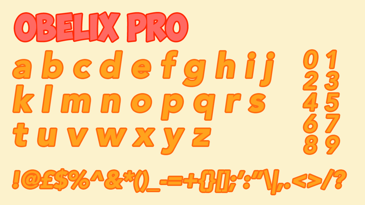
• Cost: Free
You’ll recognise this font from its use on the thumbnails of mainstream YouTubers targeted at teen audiences. Channels that use this font in their thumbnails usually make content that performs extremely highly in the algorithm, so if you’re making a video you want to pick up a few views, the familiarity of this font and its associations with easy-to-watch content has a good chance of helping you go viral.
5. Futura PT
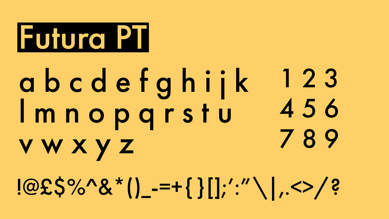
• Cost: Free (with Adobe subscription)
Futura is a font that’s featured in the logos of many household brands, and has even got itself a place on a sign on the moon. Future PT is a slight reworking of Futura that ensures a touch more consistency across every letter. Futura’s strokes aren’t too thick but cut a definite line with a slight curve that creates incredibly readable and friendly text, with endless options for using it to make your own piece of distinctive typography, given its use across so many companies. Its international success and usage make it a safe and excellent font choice for a small thumbnail that relies on the text.
6. Agency
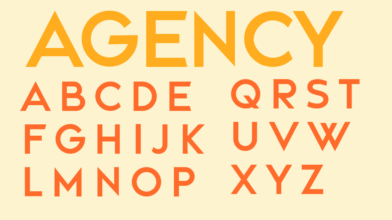
• Cost: Free
If sans serif fonts had been around in the 1920s, Agency would have taken over the decade. Its slimmer but striking strokes boast large x-heights and low y-heights to go with the large curves this typeface consists of. It’s perfect to use for a noticeable piece of text in a thumbnail that you want to inject a bit more style into. This one would work especially well at a smaller size in the context of landscape-based backdrops.
7. Coolvetica
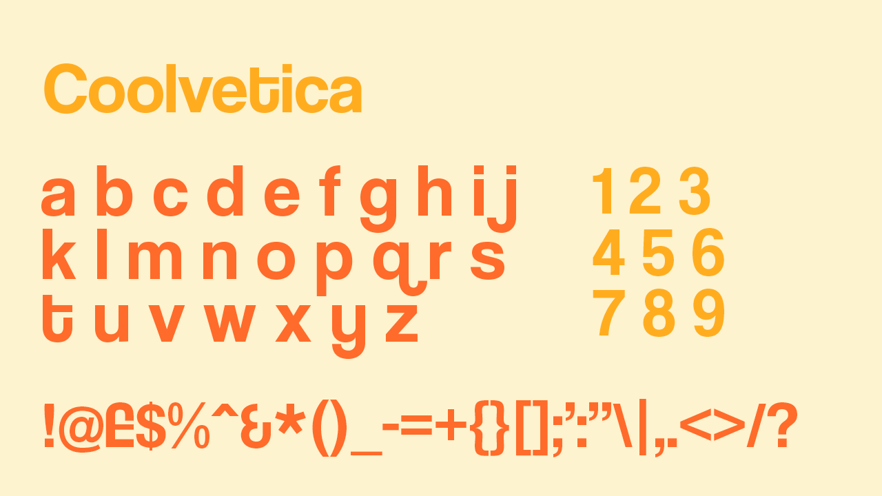
• Cost: Free (with Adobe subscription)
Another striking sans serif font, Coolvetica is a bold set of lettering that would function well at all sizes, especially medium and small. Its letters are made up of thick strokes that again, are incredibly curved, but are significantly more compressed than those of Agency. Some of its lines are especially distinctive, noticeably the ‘t’, the ‘q’ – the ‘q’ especially with the contrast of its straight strokes with its over-expressed curves.
8. Lovecraft
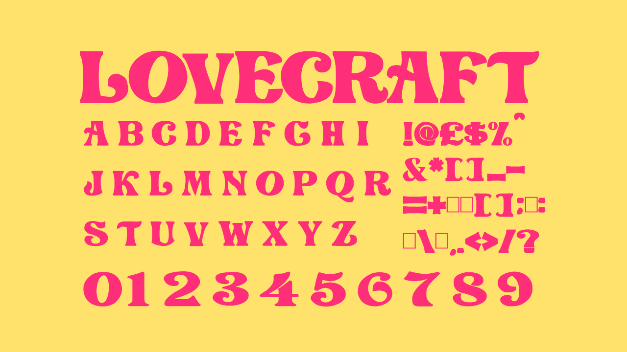
• Cost: Free
Lovecraft’s masterful style is already a finished piece of typography before you’ve even got to work on it! This decorative, all-caps font is made up nothing but large, chunky serifs, and would work perfectly for a feminine and more casual, personal touch to a thumbnail.
9. Phosphate
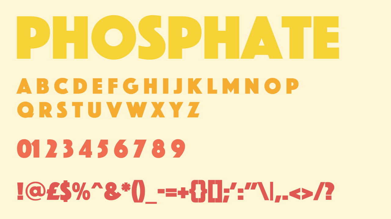
• Cost: £46.98
Phosphate presents as a sans serif version of Lovecraft. Its all caps letters are just as thick and intense, but creates something more to-the-point and sans frills as it looks as though its letters have been designed geometrically.
10. Paparazzi
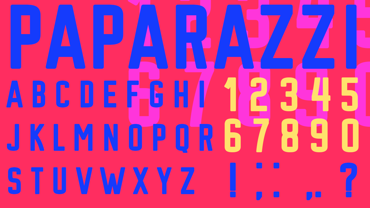
• Cost: Free
Paparazzi is equipped for the essentials with an all-caps typeface including only a few key punctuation marks, making it ideal for an eye-catching short, snappy title on a thumbnail. With the use of some bold RGB colours, it would work well at a large size, as its squared-off strokes are designed to make a colourful statement.
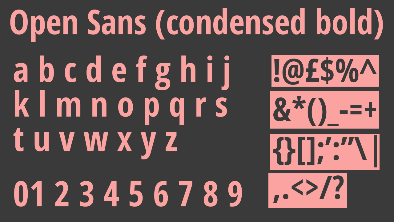
11. Open Sans (condensed bold)
• Cost: Free (with Adobe subscription)
Open Sans is a large font family consisting of numerous different weights and variations, but its ‘condensed bold’ variation is ideal for thumbnails. It’s another sans serif typeface that’s built on rounded letters rather than geometric, and its condensed nature means it features excellent legibility and makes it perfect for fitting more text into a smaller space.
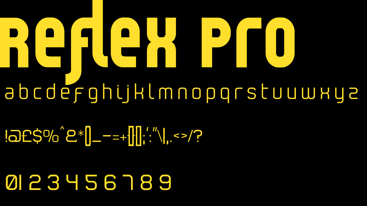
12. Reflex Pro
• Cost: Free (with Adobe subscription)
The example image of Reflex Pro on Adobe fonts shows the truly endless potential and flexibility of the typeface and its wide scope to be turned into a truly unique and recognisable piece of typography. It can be used as an ideal large text mask for a photograph or colour-based design, to make it stand out in a text-focussed thumbnail.
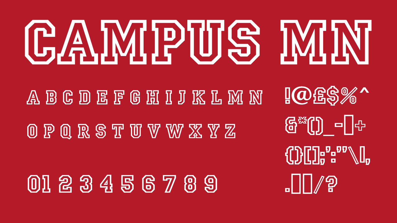
13. Campus MN
• Cost: Free (with Adobe subscription)
A geometric take on an American university-style design, Campus MN is a decorative font made entirely out of strokes outlining its letters – allowing a different colour or design to shine underneath your text. This adds the potential of extra layering to your design that will help to make it stand out.
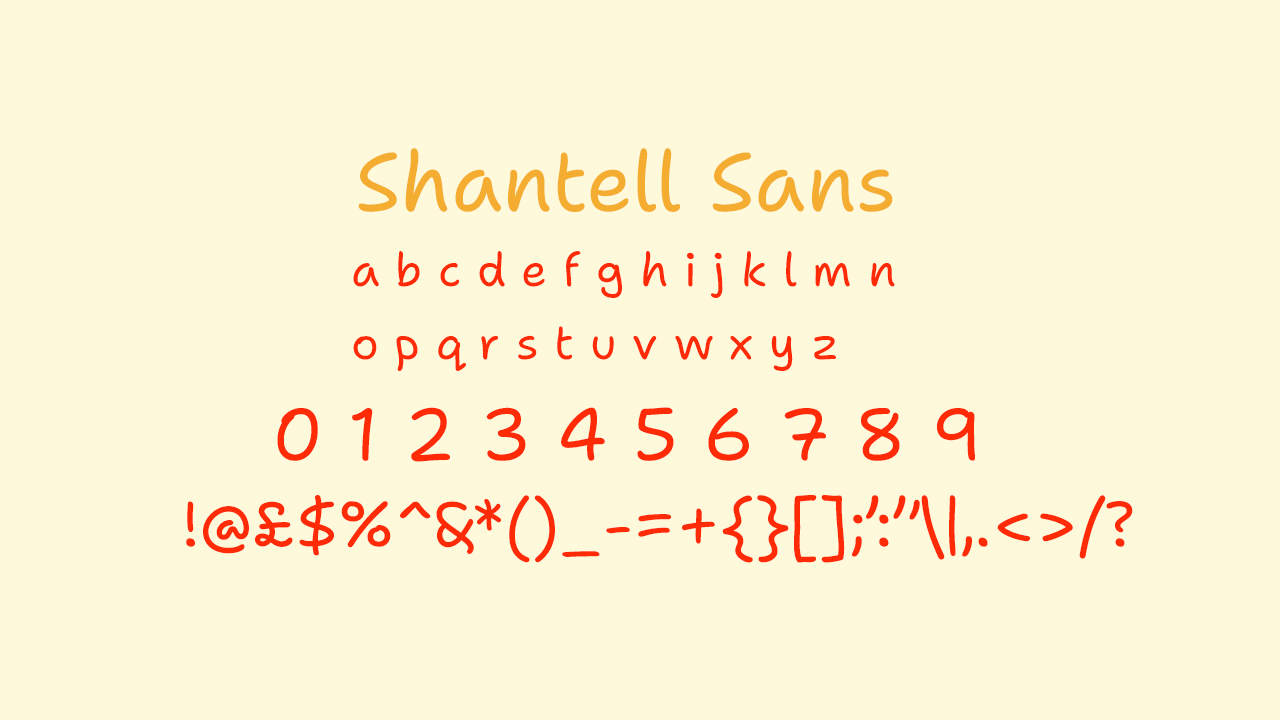
14. Shantell Sans
• Cost: Free (with Adobe subscription)
Shantell Sans is a decorative font perfect for thumbnails titling education or learning-based content. It’s the sort of typeface we all need once in a while. It also fits the bill for more casual, personal projects, or projects aimed at younger audiences. Shantell Sans is ideal for a casual tone that still emulates professionally created, deliberate content.
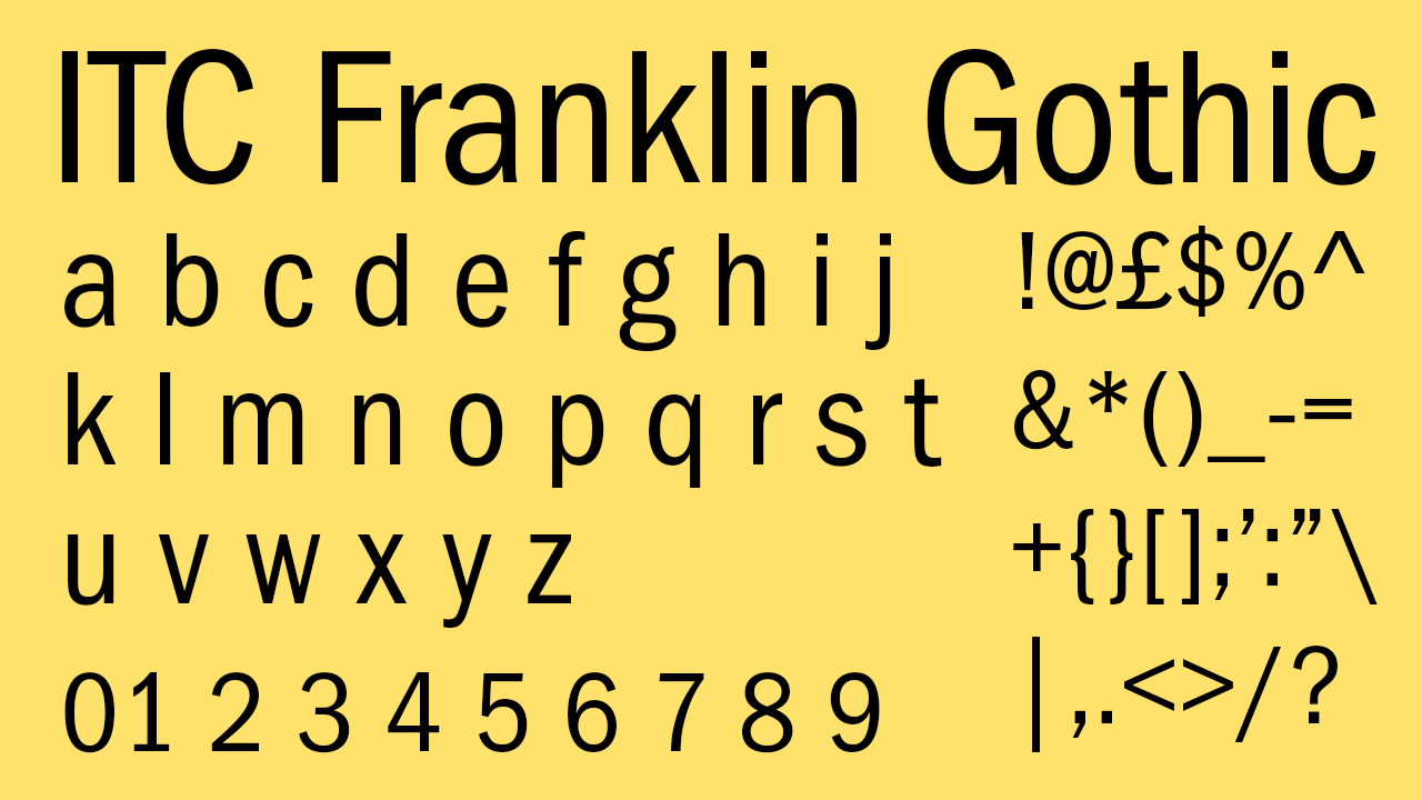
15. ITC Franklin Gothic
• Cost: Free (with Adobe subscription)
Another excellent sans serif choice, ITC Franklin Gothic is a condensed font with lighter, far less intense lines than that of a choice like Paparazzi, but its condensed nature combined with unusually high x-heights make it a font that stands out and is safely clear from a distance and at smaller sizes.
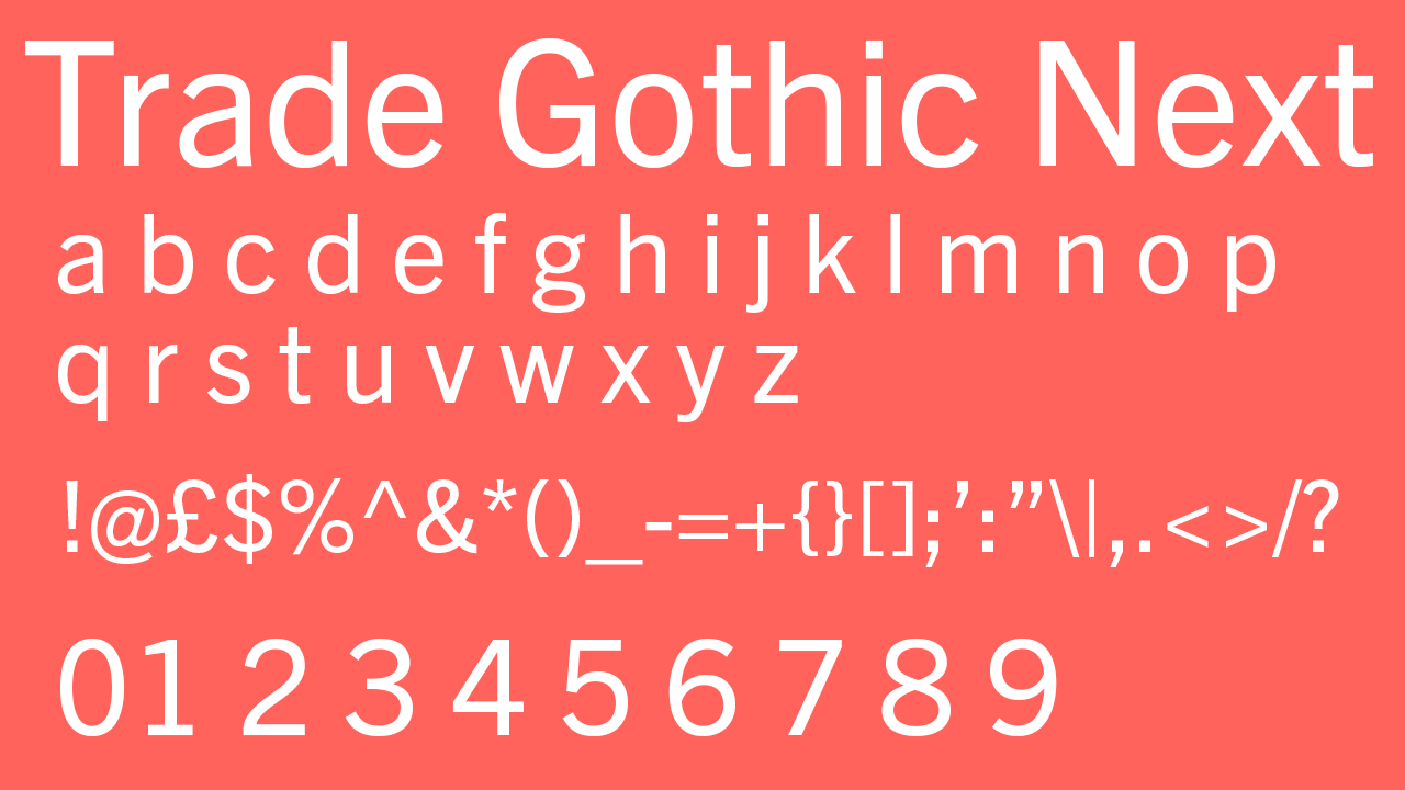
16. Trade Gothic Next
• Cost: Free (with Adobe subscription)
Trade Gothic Next is not quite so condensed as ITC Franklin Gothic and features similarly lighter lines and large x-heights, but its rounded lines are wider than most and its x-heights are even higher than that of ITC Franklin Gothic, creating extremely rounded letters. The ‘o’, ‘d’ and ‘b’ make a particular impact with this feature, ensuring a thumbnail designed with clean lines that the brain responds well to.
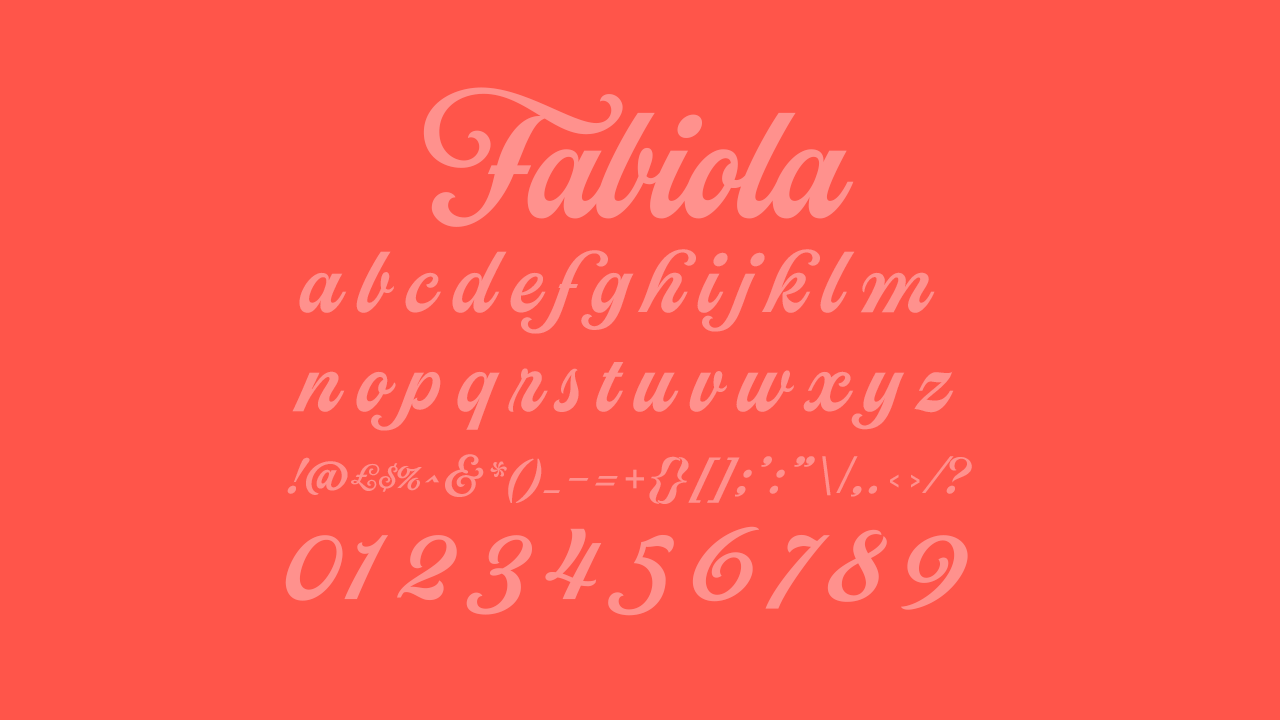
17. Fabiola
• Cost: Free (with Adobe subscription)
This inventive font family on Adobe fonts includes the most decorative option, as well as an additional more demure version with far less pronounced serifs and fewer flourishes. The two fonts are designed to use their contrasts to work together to aid your design as a whole. Fabiola equips you with a more decorative option to fulfil your need for a legible but highly stylised font for your thumbnail, as well as with a clearer, far subtler accompaniment to use either for design purposes as a contrast to the first option, or even to serve as a second, more readable font, allowing you to not have to compromise on design for the sake of legibility.
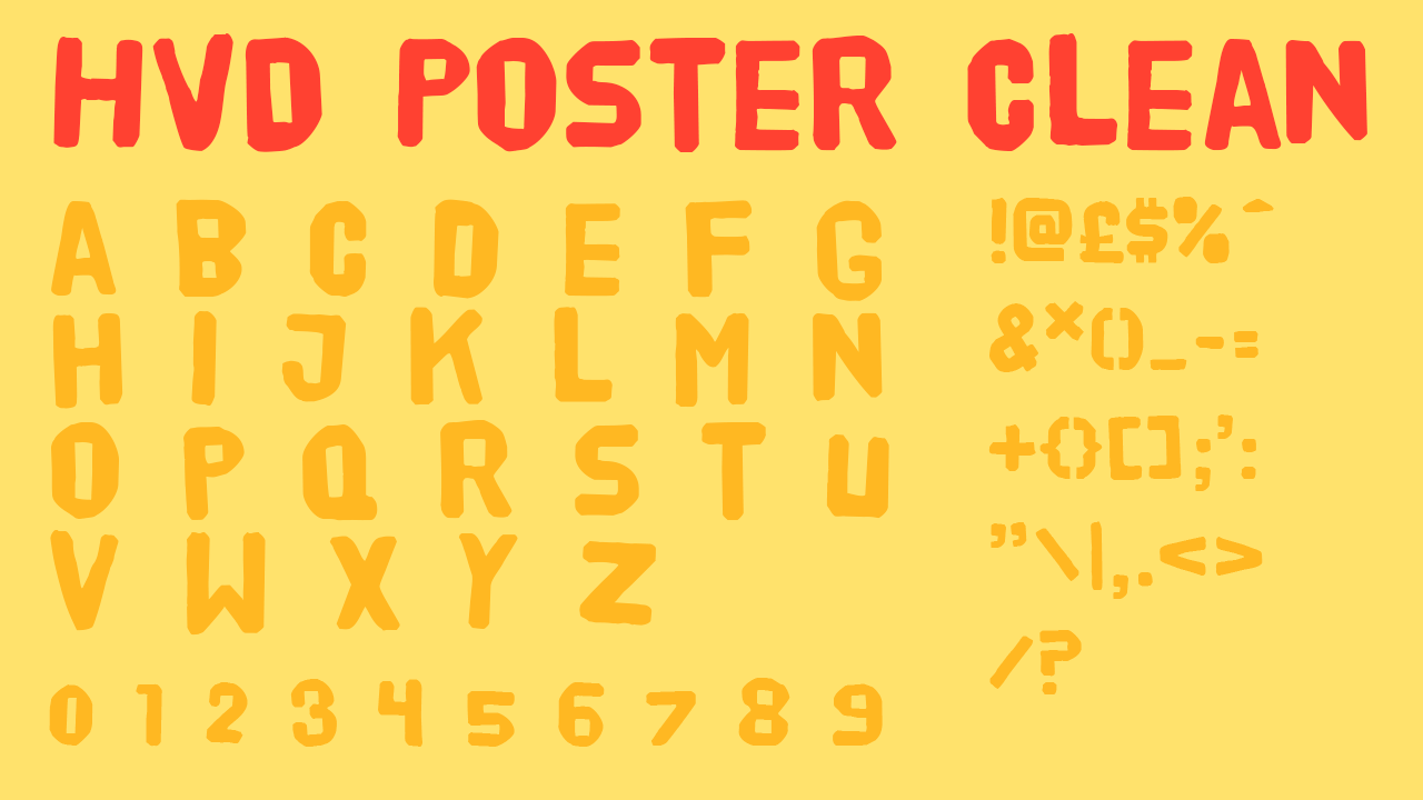
18. HVD Poster Clean
• Cost: Free (with Adobe subscription)
A bit more out-there, this font holds connotations of marker pens and posters created using screen printing. This makes HVD Poster Clean an ideal match for a project on urban topics. This font would look especially great when styled with a few extra colour tweaks in Photoshop, over the top of a photograph relating to your project. This would be sure to make anyone notice a video, blog post or article in the urban genre.
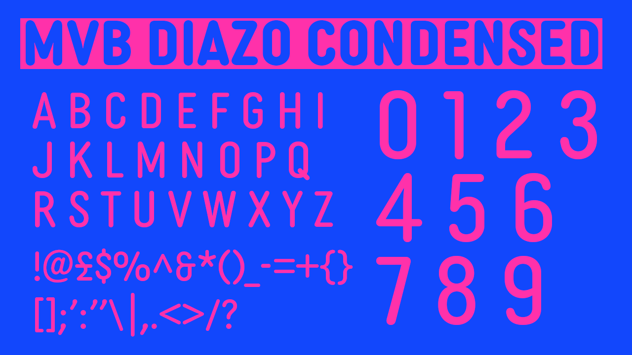
MVB Diazo Condensed
• Cost: Free (with Adobe subscription)
MVB Diazo Condensed almost presents as a version of Paparazzi made up of lighter strokes. The rounded ends of its strokes connote tiny balloons or the titling of a felt tip pen, meaning that executed well, on the right thumbnail, this font could go far.
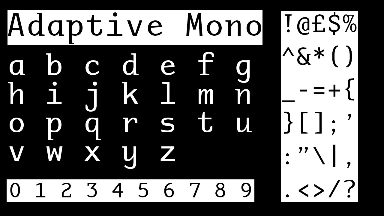
20. Adaptive Mono
• Cost: Free (with Adobe subscription)
A serif font designed to imitate the fonts that computer systems use, this is often used as the go-to font when designers need to create typography that imitates computer coding numbers. The ‘0’ and the ‘1’ especially imitate that infamous style. So if your thumbnail is titling anything about the digital, tech, computing or coding communities or industries, the exact imitation of Adaptive Mono's typeface will ensure your thumbnail catches eyes and is certified as excellent design work.
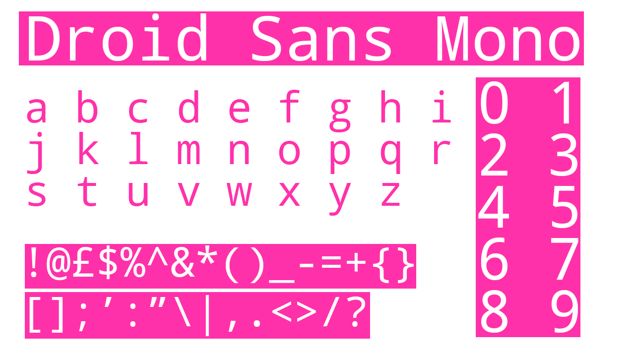
21. Droid Sans Mono
• Cost: Free (with Adobe subscription)
The text of Droid Mono is most effective for creating the effect the numbers have in the Adaptive Mono typeface. While the text of Adaptive Mono is made up of serif letters, its numbers create an infamous ‘coding’ look that no other font can imitate quite as effectively. However its letters are not quite as in-line with the look, which is where Droid Sans Mono comes in, and equips you with a full set of sans serif letters certain to match the numbers of Adaptive Mono.
Sign up to Creative Bloq's daily newsletter, which brings you the latest news and inspiration from the worlds of art, design and technology.
Mabel is a writer and multi-disciplinary artist. She is a regular freelance contributor to Creative Bloq and has also written for T3, TechRadar, Tom's Guide, and other Future publications. She's currently working on obtaining her degree in illustration and visual media from UAL, as well as running her independent publishing house Mabel Media, which has just launched its debut fine print publication, ‘One day I could be living again’, stocked in Magalleria, MagCulture and the London Review of Books bookshop. When she's not writing or making art in the physical form, she's making films for Mabel Media, rollerskating or travelling.

