How to create glossy graphics in Adobe InDesign
A quick tutorial demonstrating how to create glossy looking graphics using InDesign or Illustrator.
Sign up to Creative Bloq's daily newsletter, which brings you the latest news and inspiration from the worlds of art, design and technology.
You are now subscribed
Your newsletter sign-up was successful
Want to add more newsletters?
Shiny and glossy appearing graphics may not be to everyone's taste but they certainly have their place and are often employed in sports branding and design. Through the next several steps I'll run through how to achieve this look using a recent Euro 2016 Wallchart I designed as an example.
Although I created this particular piece in InDesign the same techniques can be employed within Illustrator if you wish to use that, as they both run on a vector engine and share many of the same functions.
01. Outlining live text
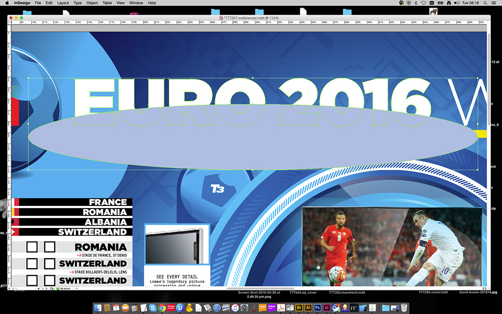
Begin by selecting your type that you want to make shiny with the direct selection tool. Now navigate to the type menu and select 'create outlines' to convert the live type to an object. Now draw a large elongated elipse shape that sits roughly at the halfway point vertically and central horizontally.
Article continues below02. Creating the sheen
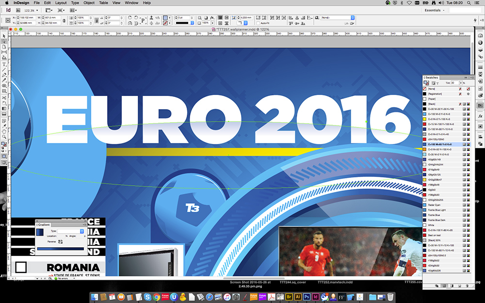
Now colour up the ellipse in a darker colour than the white type that fits with your colour scheme. Copy the shape, delete it, select the type again and navigate to edit, paste into. Now to create a fade effect simply use the gradient feather tool dragging vertically down until you're satisfied with the results.
03. Using the pathfinder
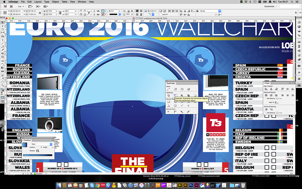
Now we're going to create a simple glossy roundel for the giant football roundel in the middle using pretty much the same technique but with more layers. Simply duplicate the circle, use the Alt+Cmd+, shortcut to make it incrementally smaller within the centre. Now simply draw another eclipse over the top and use the pathfinder subtract function to punch out the shape.
04. Overlaying multiple sheens
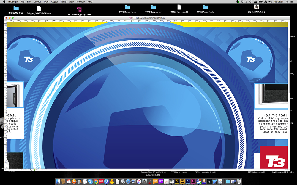
Once again use the gradient feather tool to create a fade effect so that our shine isn't one solid colour and appears more realistic. At this stage you may wish to experiment with the objects opacity level so that it's not quite so prominent.
In the above example you can see that I've also created a diagonal sheen by employing the same technique but using a rectangle rotated to 45 degrees and then punched out of the circle rather than an eclipse.
Sign up to Creative Bloq's daily newsletter, which brings you the latest news and inspiration from the worlds of art, design and technology.
05. Think about realistic highlights
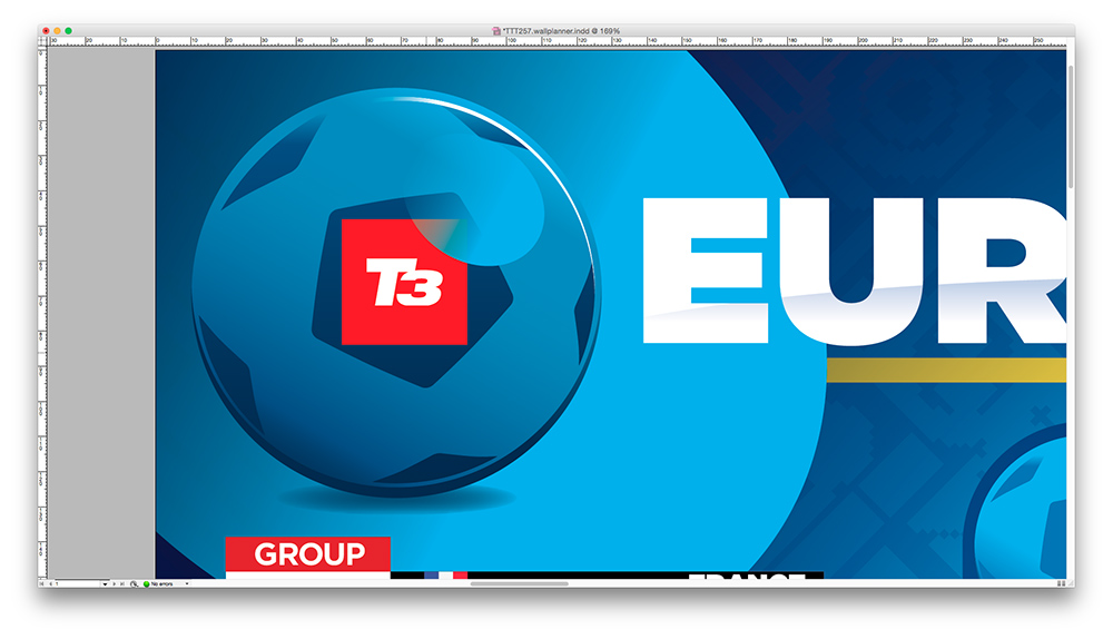
Now we've got the basic technique down you can begin experimenting and playing around with different techniques. Although we're going for a very graphic look, we still want the effect to based in reality. In the above example of the smaller football you can see that I've employed several techniques, including two very thing crescent shapes for the white highlight at the top and the darker shadow at the bottom.
A simple eclipse shape faded out gives the ball a spherical appearance whilst the gradient from light to dark helps to emphasise the graphic highlight effects,.
06. Bigger picture
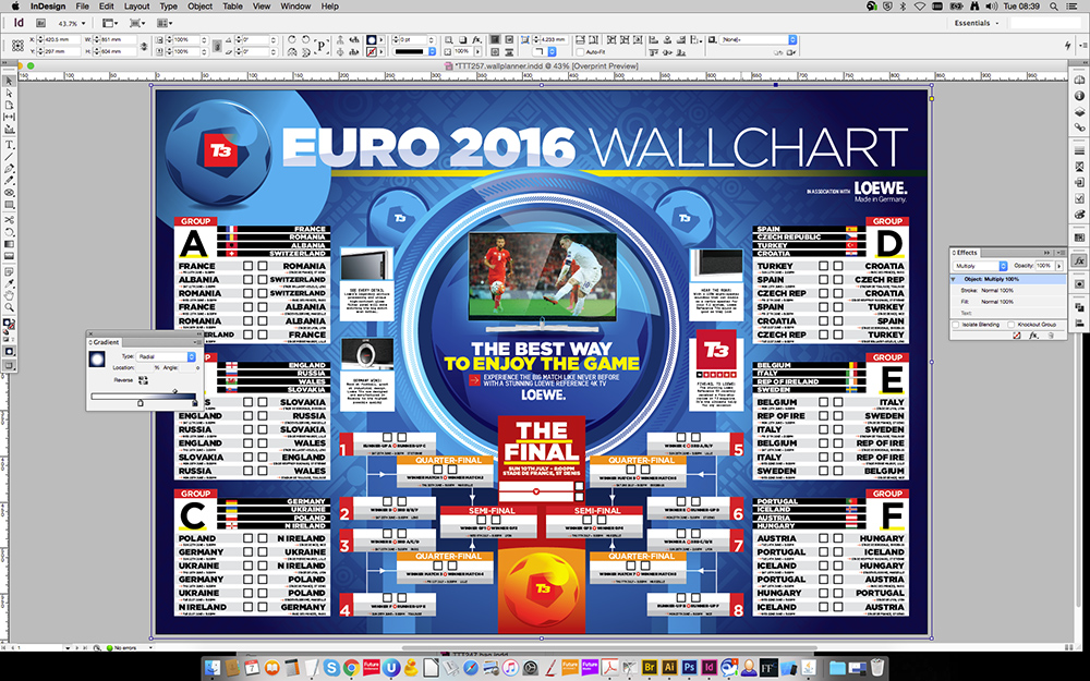
Finally, once all the elements for your piece have been created it's a good idea to take a step back and see what you can add to bring the whole piece together.
In this case I added a graphic pattern to the background and to really set it off and draw focus to the centre of the piece, I simply applied a white to dark blue radial gradient to the background and set its blending mode to multiply. This helps to bring the whole thing together and also achieves a subtle glow effect around the central elements.
Luke is a creative director, visual designer and digital artist, who works at THG Studios in Manchester as creative director of beauty. He previously worked for Future Publishing, where he was art editor of leading magazines such as Guitarist, T3 and Computer Arts.
