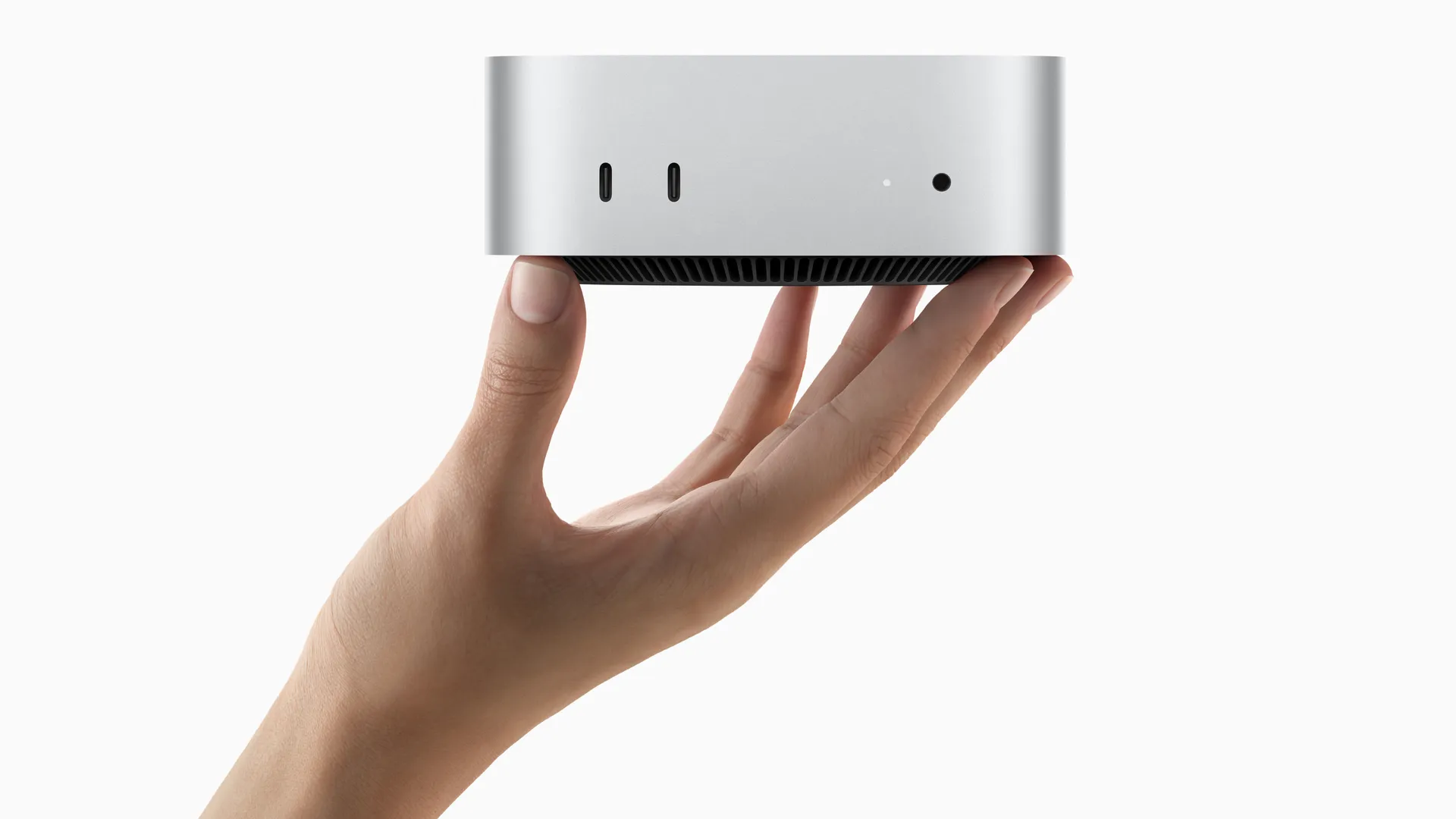
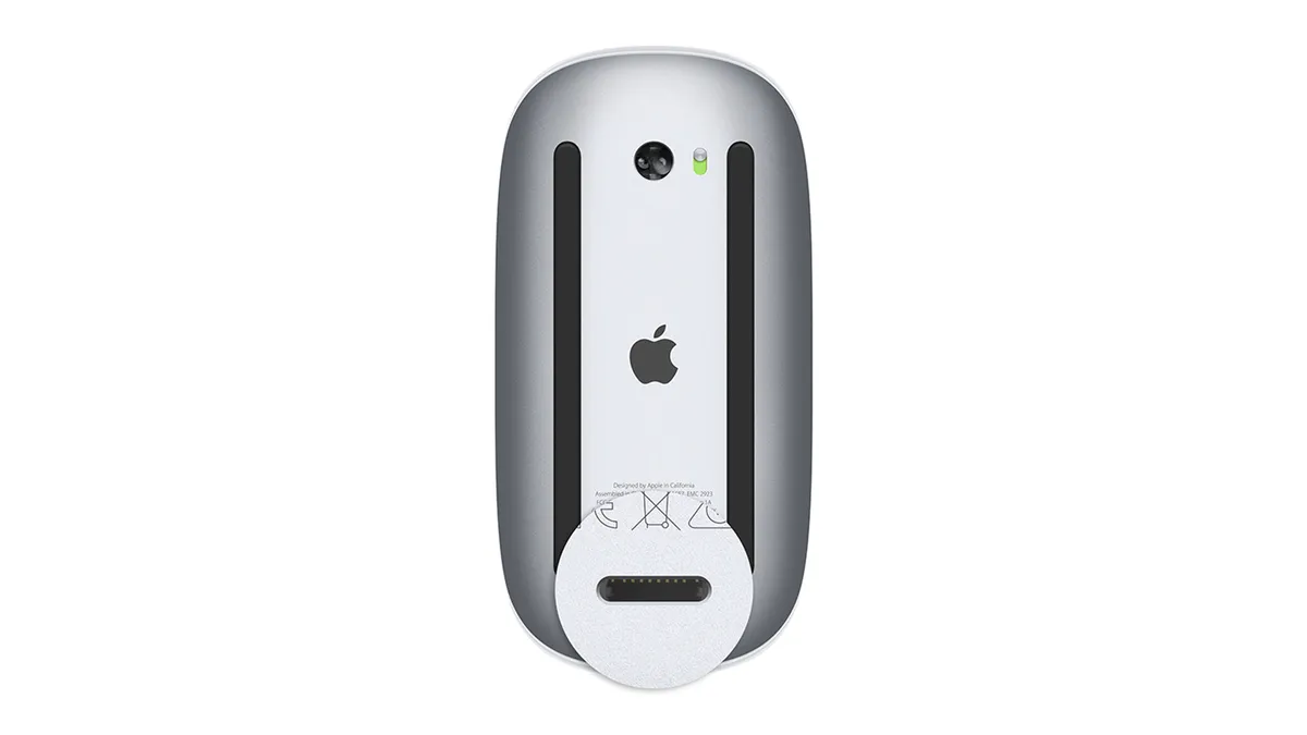
Whilst Apple is known for its design nous, the company does occasionally drop a clanger. The most infamous example is the Magic Mouse 2 with its charging port on the bottom – a design crime that the company still refuses to atone for. In a somewhat similar fashion, Apple had added the M4 Mac mini's power button to the bottom of the device. And now, it's defended the decision.
In and amongst the various details about the new M4 Mac mini, announced by Apple this month, is the fact that the Power button is located on the bottom of the device. The device, yes, that sits on a desk. It's a good job that this is the smallest and lightest Mac mini ever, because if you want to turn it on or off, you're going to have to pick it up.

In a video shared via Chinese social media platform Bilibili, Apple’s senior vice president of worldwide marketing Greg Joswiak defended the design decision. He calls it a “kind of optimal spot for a power button,” claiming that you just need to “kinda tuck your finger in there and hit the button.” Ultimately, he added, "You pretty much never use the power button on your Mac," which, let's be honest, is true.
For anyone confused as to why Apple put the power switch on the bottom of the new Mac Mini it is so people will shut up about how awkward it is to charge their Magic Mouse. pic.twitter.com/Vzcdh61h8EOctober 31, 2024
You’ve got to be kidding me. The power button is ON THE BOTTOM of the new M4 Mac Mini. So in order to power the computer on, you have to lift it or tip it forward. That is the dumbest design EVER. Who approved that? pic.twitter.com/wRWhUNc65sOctober 29, 2024
Joswiak has a point. While the Magic Mouse port placement is genuinely infuriating whenever the thing runs out of power (which is invariably right in the middle of a project, on deadline day), the Power button is arguably much less important. These days, it isn't often that users really need to turn off their computers – if it's a laptop, you likely just close the lid and send it to sleep.
And while it may come as little solace to the fat-fingered, it does look as though the 'foot' of the Mac mini might just be raised enough to slip a digit under there. If you're only pressing the button once in a blue moon, and can just about reach it, does it really matter that it's out of sight?
Sure, placing it on the back of the device might have made it slightly easier to press. But with the reduction in size and the huge power upgrade from the M4 chip, the new Mac mini looks like such a significant upgrade that I'm willing to accept a modicum of inconvenience when trying to reach a button I probably press one a month.

