5 unusually effective ways design studios show work
Be inspired by how top design agencies showcase projects.
Sign up to Creative Bloq's daily newsletter, which brings you the latest news and inspiration from the worlds of art, design and technology.
You are now subscribed
Your newsletter sign-up was successful
Want to add more newsletters?
A decent website is essential for any successful design studio. It's a great way to set out your stall to potential clients and pick up new business.
However, design agency portfolios are rarely one-size-fits-all solutions – especially if you want to show off your studio's personality and way of thinking, as well as the end product.
Read on to discover how five top design agencies thought a little differently and showcased their work in unusually effective ways...
01. NB Studio
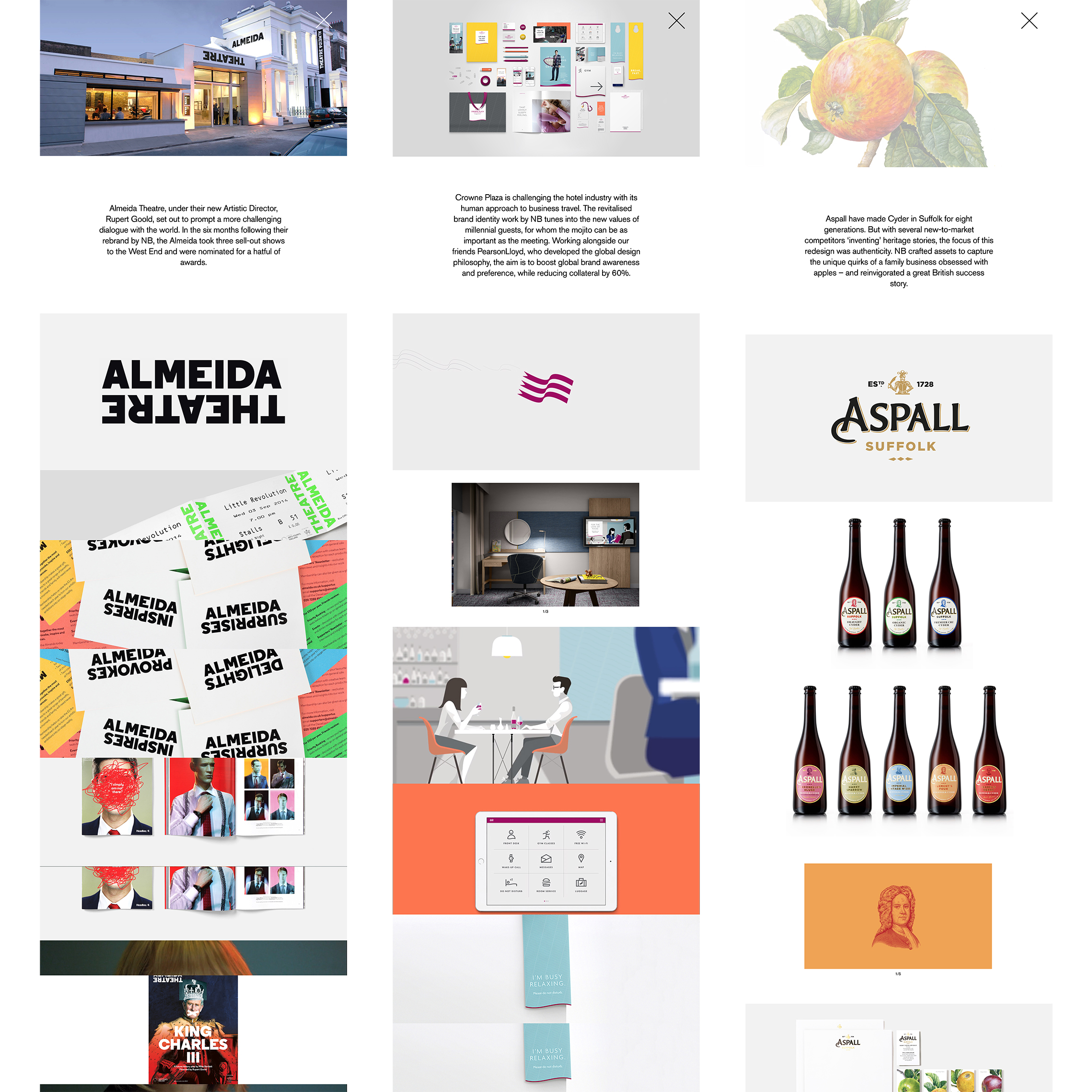
According to its website, NB Studio puts design at the heart of its business, and its soul "into everything we create". The mission statement continues by emphasising that the London-based outfit sets out to ask: 'What could the brand of tomorrow look like?'
This curious, questioning spirit – which helps define the 'soul' of the studio – translates beautifully into NB's approach to its website. Alongside highly visual, image-led case studies that use a single sparing paragraph to explain their approach, is a section called simply 'What if...' that digs deeper into the thought process.
Article continues belowEach of the pieces contained within that section complete the rest of that sentence to create a thought-provoking question.
The team then set out to answer these in an essay-like format, illustrated with work from both their portfolio and those of others.
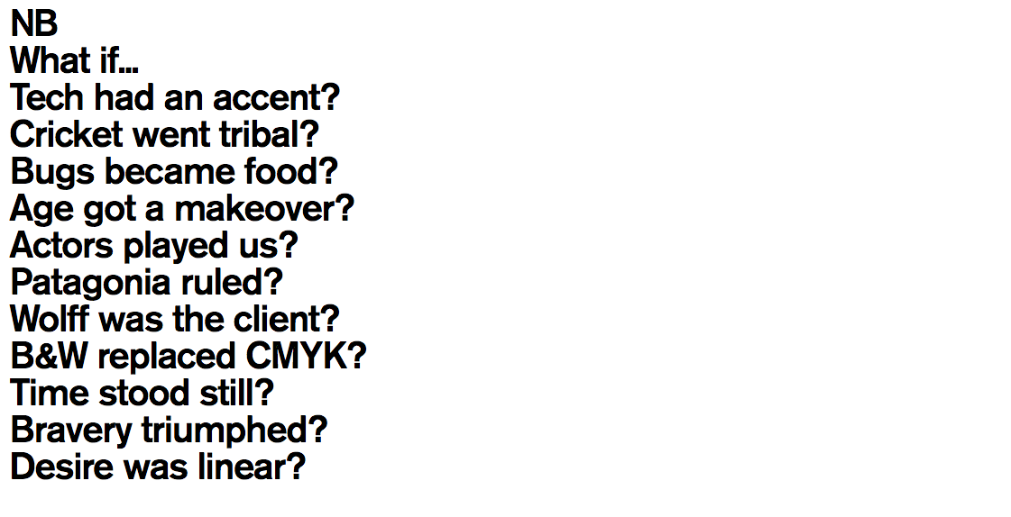
Such thoughts as 'What if tech had an accent?' and 'What if cricket went tribal?' frame NB's approach to its work in a smart, quirky way that shows off the studios personality as much as its final creative output. While it certainly requires more work to do so, the essays also have more standalone value to readers.
02. Koto
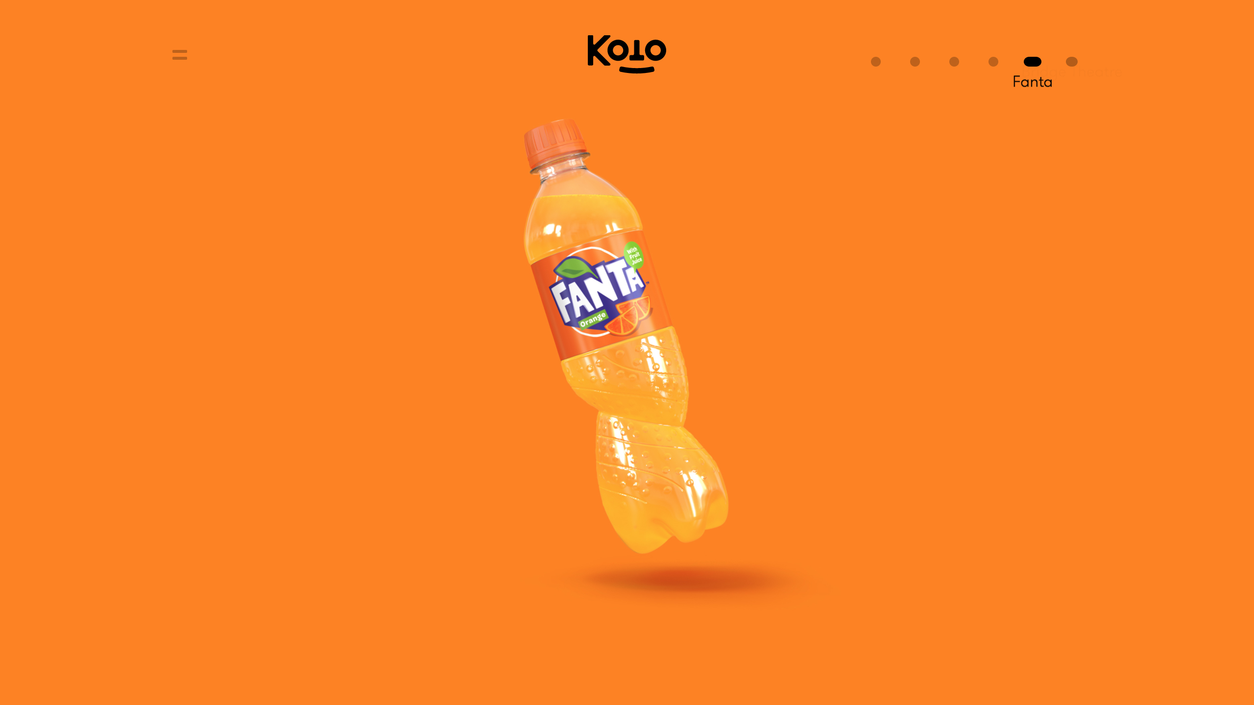
Koto follows a loosely similar approach to NB for its project case studies, letting the visuals do most of the talking - but the studio chooses to alternate full-screen images on bold, flat-colour backgrounds with punchy explanatory paragraphs to walk site visitors through each project.
Sign up to Creative Bloq's daily newsletter, which brings you the latest news and inspiration from the worlds of art, design and technology.
As a result, even though each case study requires a reasonable amount of vertical scrolling to read, the information feels bite-sized and easily digestible - particularly as the flat-colour backgrounds for each screen also alternate as you scroll.
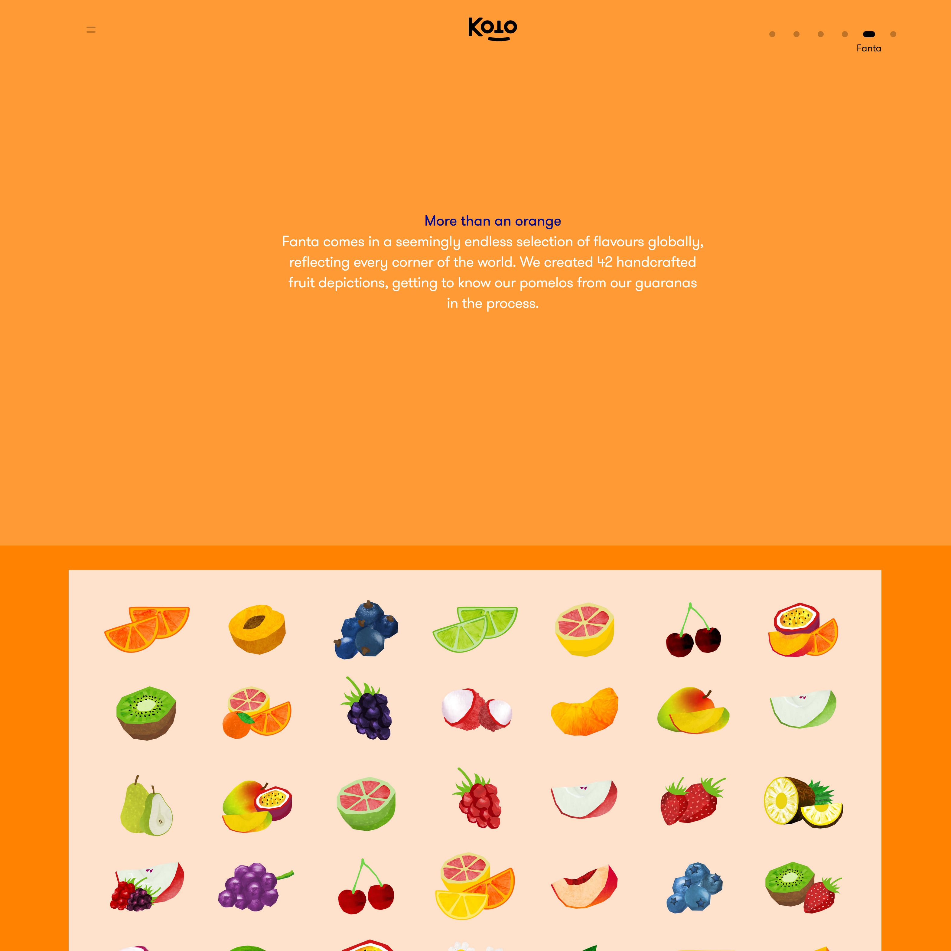
Koto's global rebrand of Fanta is a particularly strong example, as the case study incorporates everything from the process behind the logo design, to multi-language compatibility of the branding, to iconography, to custom typography - a potentially complex story, presented in a fresh vibrant, highly visual way.
03. GBH London
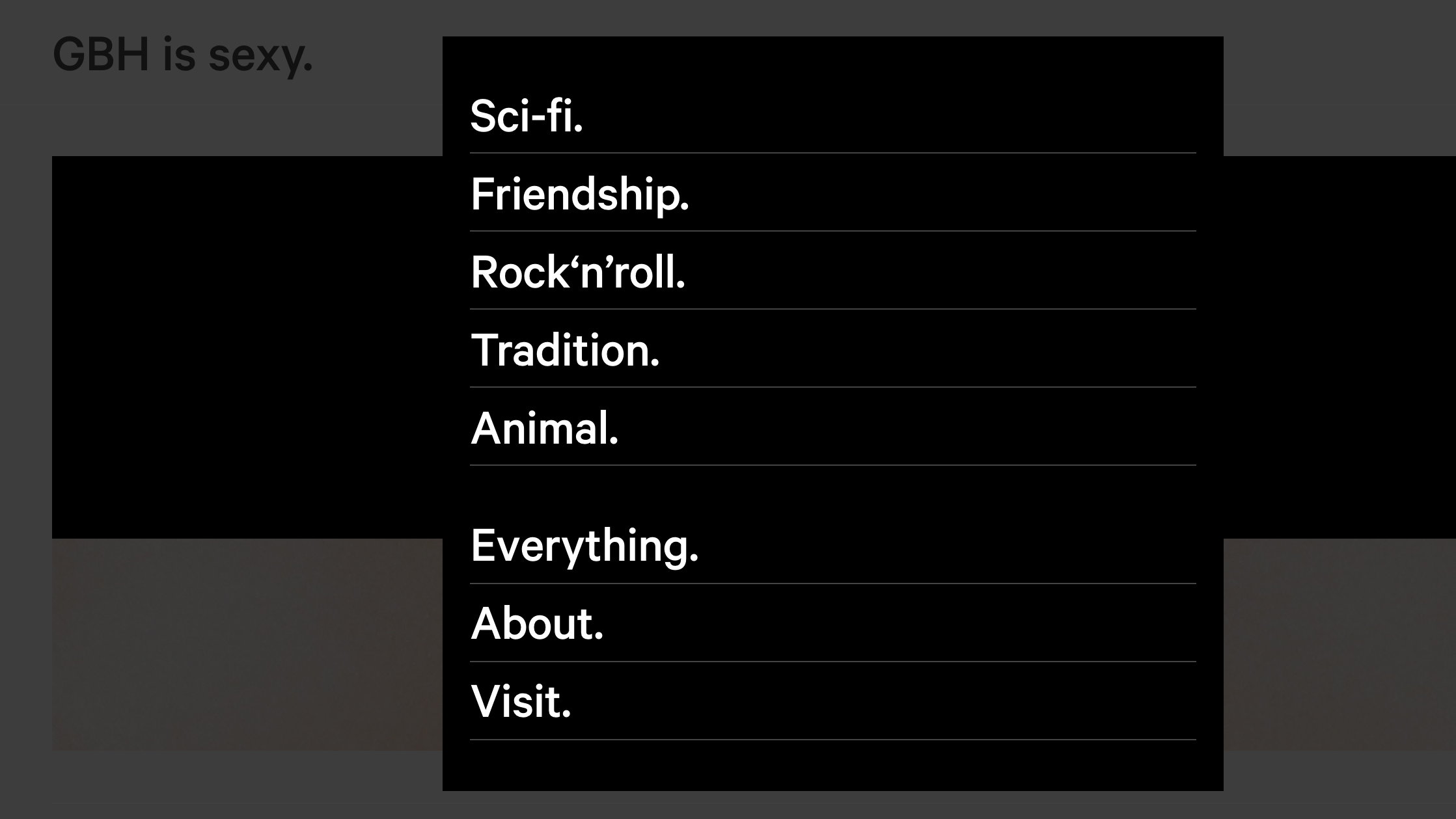
Working with a broad range of clients that include PUMA, Philippe Starck and Virgin Galactic, GBH believes in doing things a little differently, with a quirky, left-field way of presenting its studio ethos - well documented in its recent monograph, Charm, Belligerence and Perversity.
With this in mind, it's no surprise that the GBH website isn't conventionally structured either: rather than splitting its projects by client, sector or discipline, the agency instead groups them together more by vibe and approach - making the site a lot more fun to navigate.
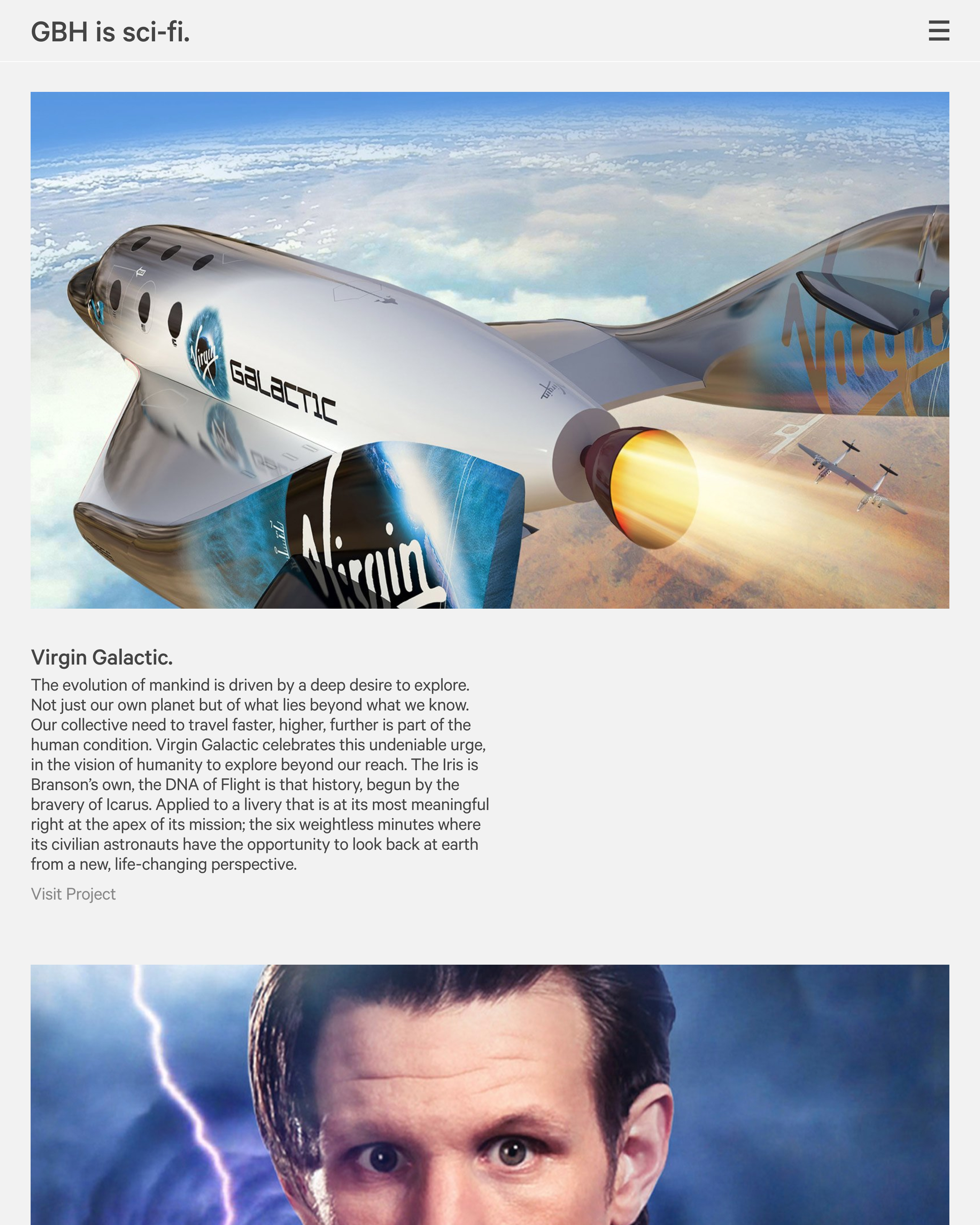
Using the construct 'GBH is...', projects are given much more personality. Examples include 'GBH is robot' to explore its work for Yotel, PUMA Local and HEXA; 'GBH is sci-fi' for Virgin Galactic and Dr Who; and the alluring 'GBH is sexy' for its work for Miss Kō, Mama Shelter and Starck Naked.
Besides giving a strong sense of the studio's personality, this approach also help express GBH's versatility, giving clients the confidence that the creative solution can be moulded to their own personality in turn.
04. Spin
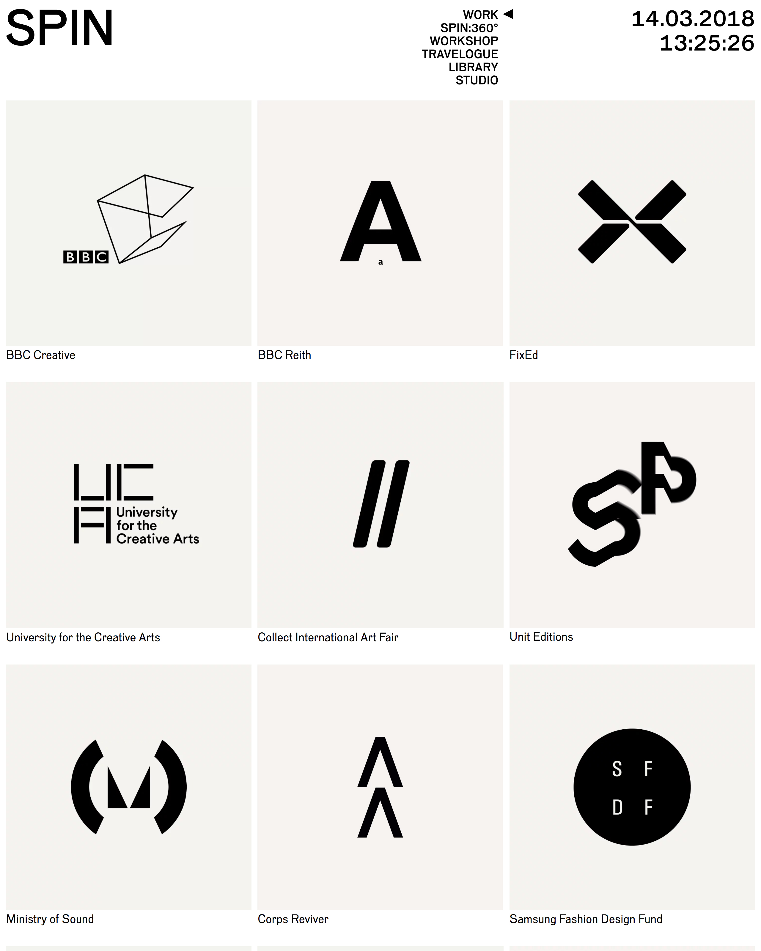
Graphic design consultancy Spin presents its work in a much more reference-friendly format, defined by its pragmatic use of words like 'Index' and 'Library' - a stark contrast from GBH and NB.
Under the 'Work' category, Spin's identity work is all presented in a uniform, monochrome way as a grid - an approach that, initially at least, puts all the emphasis on the form of the logo marques rather than their application.
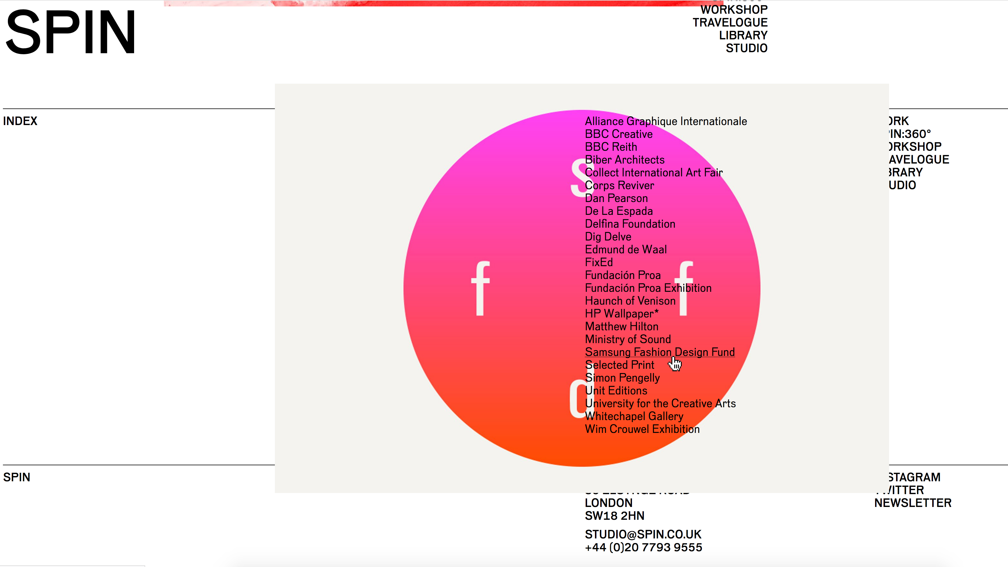
While the 'Index' section is presented as a simple typographic list on the front page, a single hero image pops up as you draw the mouse over each project name, leading through to a grid of large images and animations showing every possible permutation of the brand.
Descriptive text and project credits are moved to the bottom of the page, almost like a production note - the work is given the breathing space to speak for itself.
05. Graphic Thought Facility
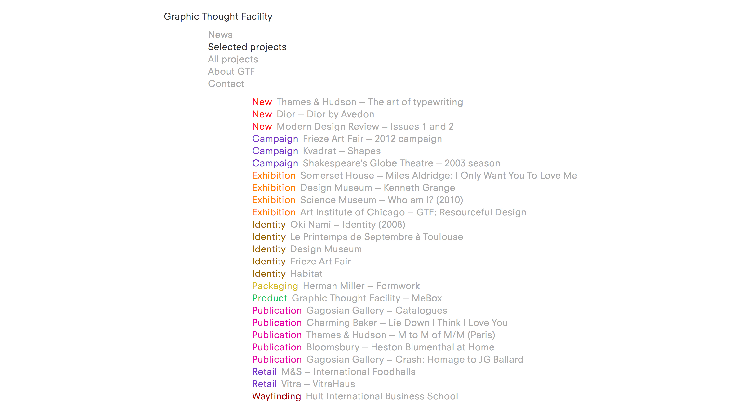
Our final example of a design studio that presents its work a little differently is Graphic Thought Facility. Similarly to Spin, GTF presents a typographic list of projects that bring up a thumbnail when the mouse hovers over each item.
In the 'Selected projects' menu, these are neatly colour-coded by discipline - with categories including campaign, exhibition, publication and identity. Under 'All projects', this switches to a chronological list, split by year completed.
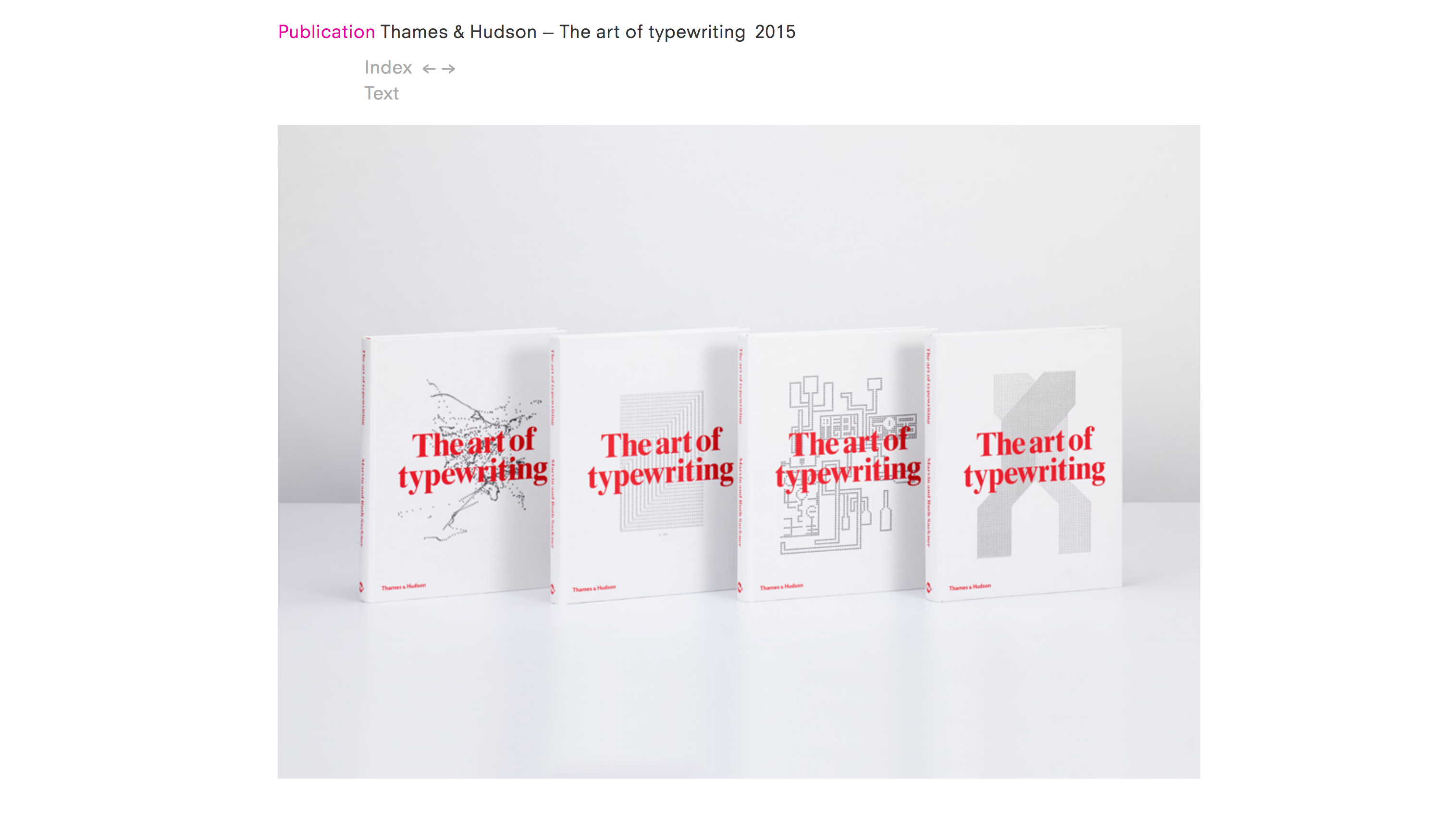
When you click through to each project, in a simple but satisfying twist, site visitors can toggle between images and text. There are a few succinct paragraphs for each, as well as links to related projects elsewhere in GTF's portfolio.
Although there's plenty to learn from GTF's method of presentation, as well as the world-class calibre of its work, the agency sets rather less of a good example when it comes to the frequency with which its site is updated - the most recent project on the list is from 2015.
Related articles:

Nick has worked with world-class agencies including Wolff Olins, Taxi Studio and Vault49 on brand storytelling, tone of voice and verbal strategy for global brands such as Virgin, TikTok, and Bite Back 2030. Nick launched the Brand Impact Awards in 2013 while editor of Computer Arts, and remains chair of judges. He's written for Creative Bloq on design and branding matters since the site's launch.
