8 hot logo design trends in 2023
Whether you love a single line logo or you enjoy rubber hose animation, there's something for you in 2023's logo trends.
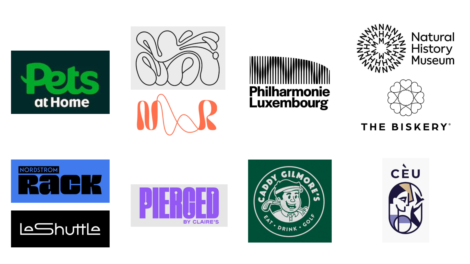
You may remember last year’s report on logo design trends, and this year there are just as many to admire. We may not have reached the end of the year yet, but it’s clear that certain aesthetics are in fashion for 2023.
There’s something in this list for every kind of designer, whether you enjoy subtle and simplistic logo design, like the trends for minimalist animals and hidden icons in negative space and counters, or if you’re drawn to dynamic logos that can be brought to life with animation. We spoke to design studios and creatives to understand the symbolism behind the trends.
01. Minimalist animals
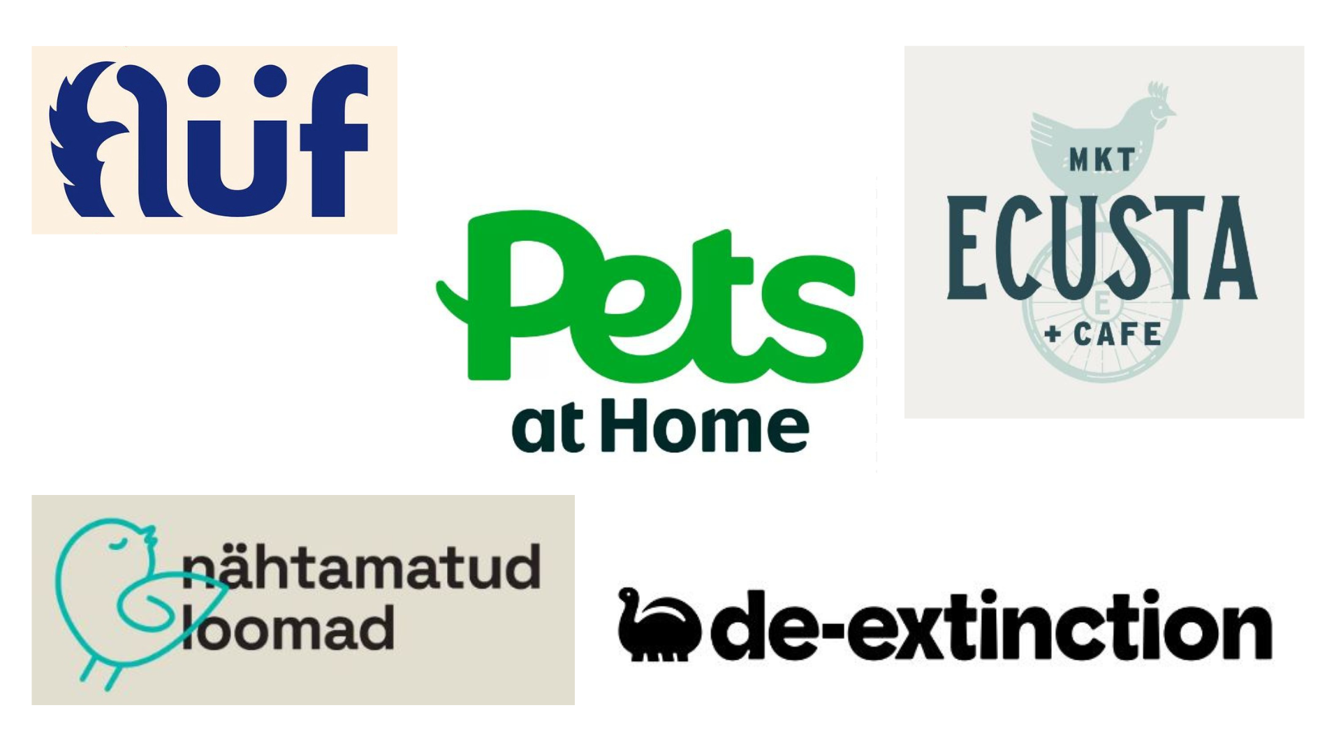
This trend is making waves in the animal logo space. A new logo for Pets at Home, by Nomad, subtly incorporates an animal’s tail. It’s generic enough that it could belong to either a cat or dog, so not too prescriptive for pet owners. This is a return to logotypes for Pets at Home, which most recently used a simple wordmark with no imagery, and had lots of sub-brands with no single identity. Similarly, designer Kamila Štěpničková incorporated two tails in her design for Flüf Boutique.
Hmmm Creative Studio rebranded charity Nähtamatud Loomad (Invisible Animals, in Estonian) and replaced its silhouette logo with a more appealing and rounded single line drawing. Thanks to Koto, eco-friendly packaging company De-Extinction chose a dinosaur to represent its work, challenging viewers to think about the planet, while Atlas Branding Agency incorporated a chicken into the logo for Ecusta Market & Café, picking it as a symbol of homesteading.
02. Flowing psychedelic abstraction
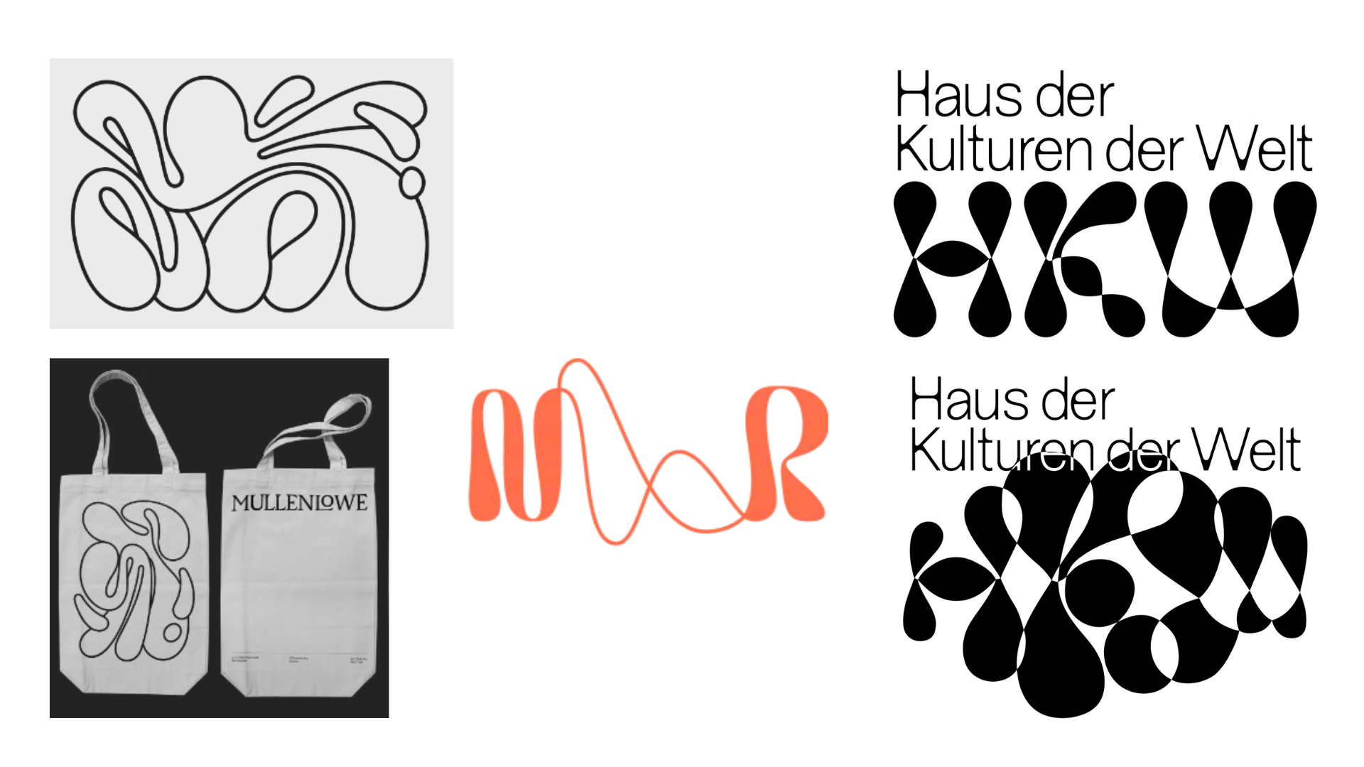
In the rise of the psychedelic aesthetic in 2022, we started to see more free-flowing typefaces and wavy symbols. Now we’ve moved much further towards abstraction, with a lava lamp feel. Agency MullenLowe rebranded in-house, led by head of design João Paz, adapting what was a very static and symmetrical octopus logo and making it totally fluid.
Heidi Elkholy, of Salt and Sister Studio, says: "We like to see more weirdness in commercial and high-end design, moving away from serious homogenised minimalism. We love fluid logos that have a lot of different states."
Over in Berlin, Studio Yukiko revamped the Haus der Kulturen der Welt (House of World Cultures) logo with a new animation: gelatinous blobs form the HKW monogram, which drips into a fluctuating pattern. Visitors and audiences can play with the logo using a cutting-edge face filter that tracks their sounds and movements.
Sign up to Creative Bloq's daily newsletter, which brings you the latest news and inspiration from the worlds of art, design and technology.
For Pentagram, working with music therapy charity Nordoff & Robins gave it the chance to reference soundwaves, moods and emotions in its undulating design, which includes a hand-drawn ampersand.
03. Optical illusions in classical music
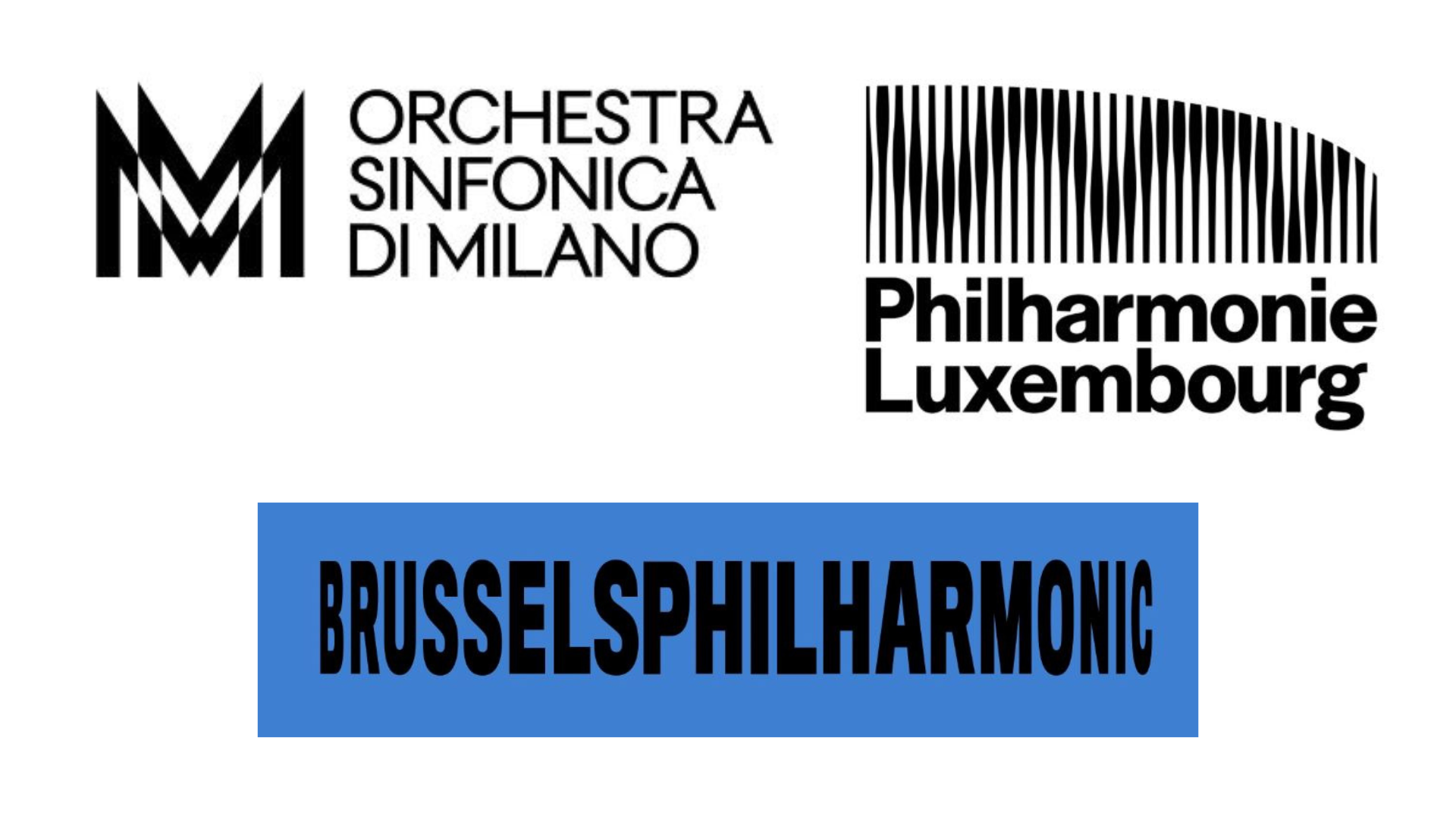
Optical illusions really are everywhere, especially in music logos this year. Orchestra Sinfonica di Milano has gone for a domineering logotype that turns a double letter 'M' into a Metropolis-like structure, similar to a staccato sound pattern; a vast improvement on their previous branding as La Verdi, which screamed 'accountancy firm' rather than arts sector.
Brussels Philharmonic has a type-only logo by WeWantMore that appears to be scrolling or travelling across a screen, with varying letter widths creating this distortion. Unfortunately, the warping is a little painful. For Philharmonie Luxembourg, it’s all about undulating soundwaves, designed by NB Studio to mirror the architecture of the concert hall; the logo can regenerate to match any piece of music.
One concern with this trend is its lack of accessibility – doesn’t it alienate a percentage of users who have additional needs, such as photosensitive epilepsy, autism, migraine or vestibular conditions? As someone with vestibular migraine, the longer I look at Philharmonie Luxembourg, the stranger I feel. I spoke to Imali Chislett, founder and design lead at Inkfire Studio, a disabled-led agency about the trend:
"There are so many possibilities with the optical illusions trend, and clever ways to nod at brand values through the logos symbols and submarks. However, there’s a fine line between clever uses of shapes and an accessibility nightmare. If you’re going to animate a logo, don’t make it 'flash': this causes huge problems for those with conditions like epilepsy and detracts from your design."
04. Kaleidoscopic patterns
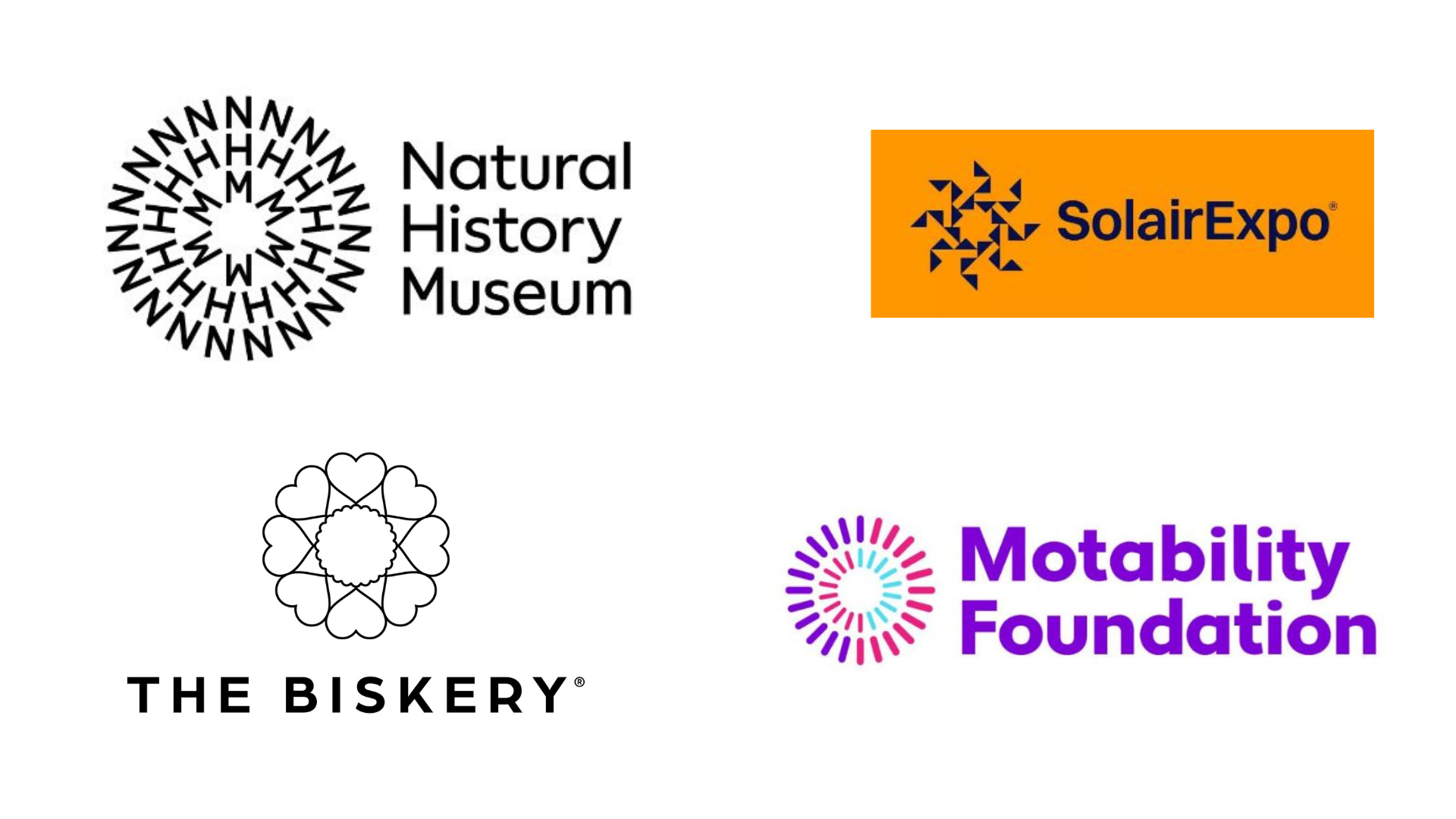
Clever use of shapes is also present in this trend. Pentagram played with the monogram NHM to create a kaleidoscopic circular motif for the Natural History Museum that’s connected to climate change; read about the design process in our interview.
Also on a nature theme, By Amine created a logo for renewable energy exhibition Solairexpo with a stylised sun in the centre, surrounded by fragmented geometric rays, showing the dispersal of light and energy.
In total rebrands, Motability became the Motability Foundation: its new logo reflects its need to be recognised as a disability charity; with its circular design created from simple line work, it could reflect wheels, wholeness or change. Meanwhile, All Good Agency rebranded Bloom Bakers as The Biskery, using fine lines to create a classic, minimalist logo. Heart icons around a biscuit shape promote the handcrafted personalised and custom-branded biscuits made for clients such as the BBC and Fendi.
05. Wide, poster-friendly wordmarks
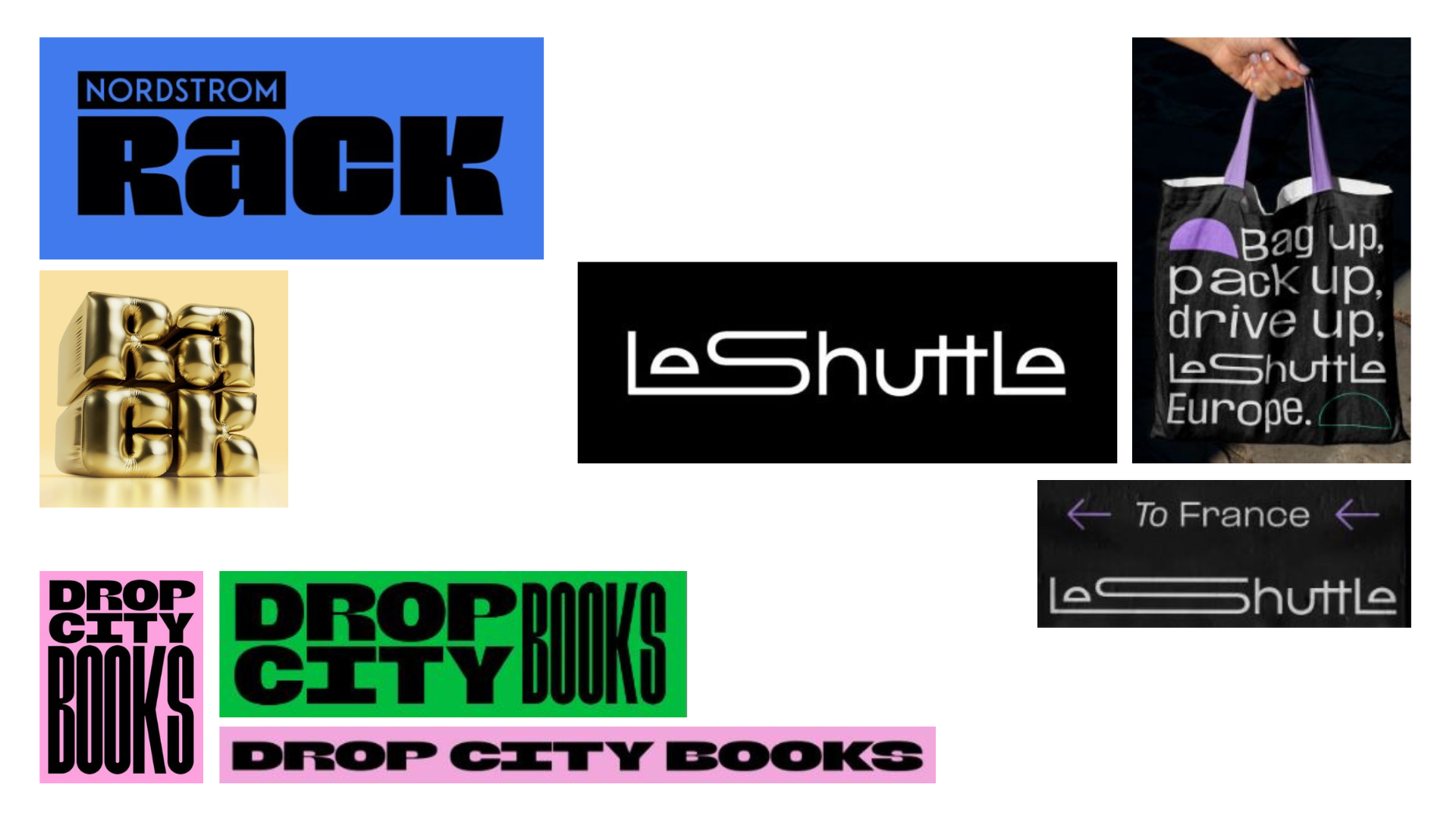
Wider wordmarks can look more friendly and, of course, take up more space. Nordstrom Rack, an offshoot of Nordstrom department stores, has a new look by Jones Knowles Ritchie. The extremely chunky type can also be stacked into a cube formation with the 'Ra' above the 'ck' (yes, like putting things on a rack!).
Salt and Sister’s logo for Drop City Books is similarly solid and stackable, with the word ‘books’ sometimes stacked like the spines of novels; the client called it "letterpress-meets-protest-board magic". Elkholy says that "bold minimalism is still going strong – it’s simple, clean, and stackable".
LeShuttle, formerly Eurotunnel Le Shuttle, also has a new logo that also goes wide. Agency Landor & Fitch crafted the eyes of the 'e' letters to represent the two points of the journey: leaving and arriving. Several letters are joined by ligatures, emphasising smoothness and helping the eye to travel; the letter 'S' is also stretched in some applications.
06. Hidden in plain sight
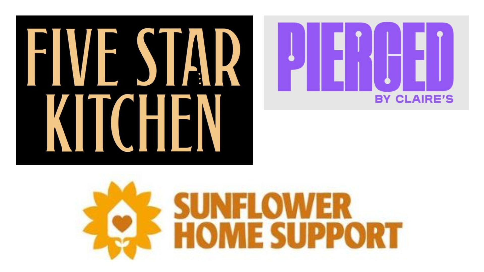
This trend is all about negative space, or in the counters of certain letters, for subtle hidden gems in versatile flat logos. Five Star Kitchen, a.k.a. Five Star Chef (different titles for Netflix and Channel 4) is a high-end cookery challenge show. Supple Studio founder and creative director Jamie Ellul, added a knife icon to the negative space: "We wanted a subtle hint through the negative space of the 'a'; it’s a classic design trick. At first you see this luxe design, then the penny drops and you remember it’s a talent show – it’ll be cutthroat," he says.
Meanwhile, Pierced by Claire’s (a child and tween favourite) narrows the counters from 'P', 'R', 'C' and 'D', employs tightly-kerned lettering, and adds circles representing lobe or helix studs, or even barbells.
For Sunflower Home Support, Vincent Walden of Studio Walden chose the ‘o’ letter bowls to be sunflower petals. It works for the client, a company that helps people who need extra care at home, and also fits the ethos of Studio Walden itself: eco-friendly, sustainable graphic design.
07. Rise of the rubber hose mascot
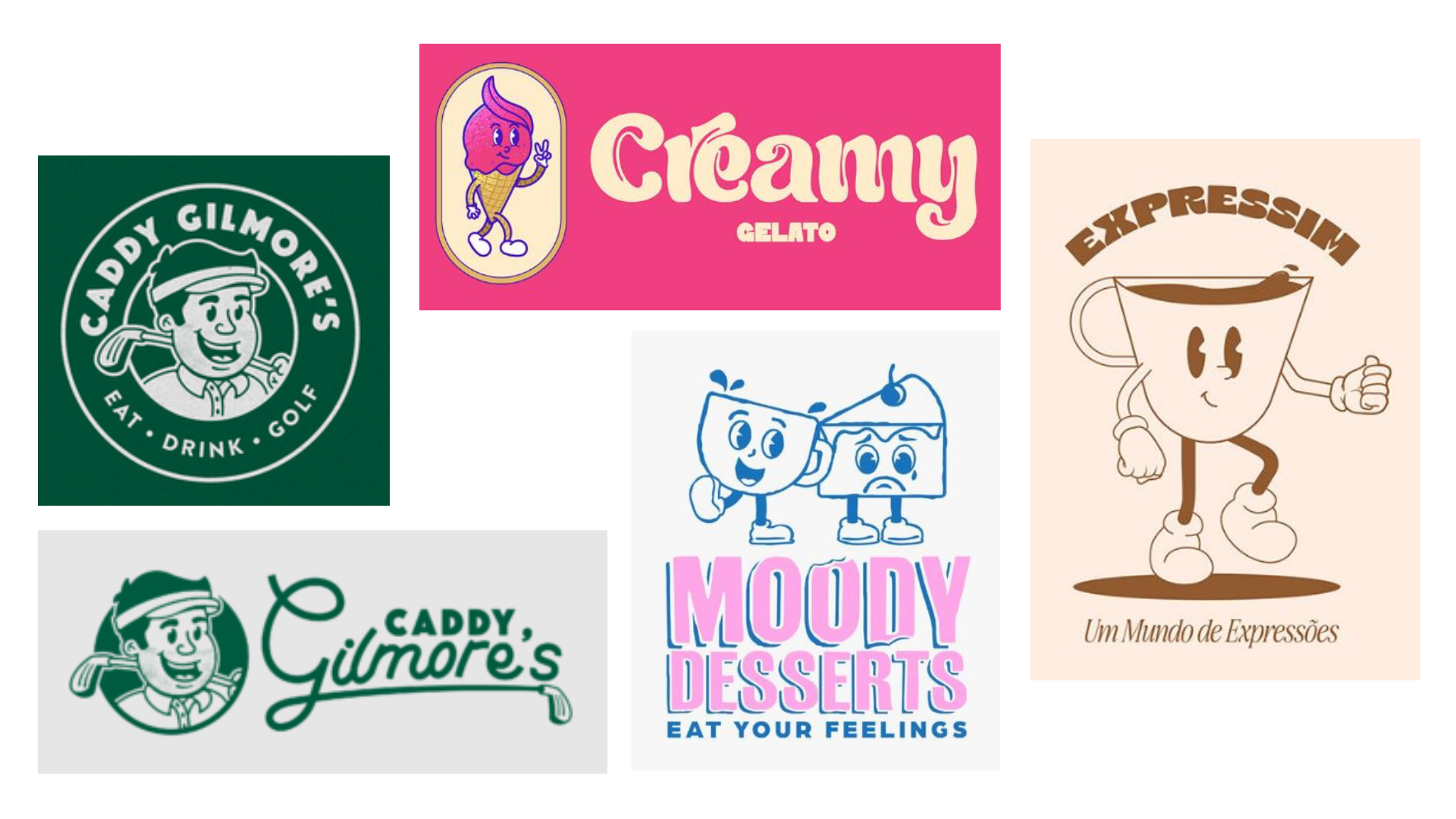
This trend comes from an animation style that first emerged a century ago. CJ Cawley explains his process for golf client Caddy Gilmore’s: "I introduced them to a design style called 'rubber hose', which was adopted by big brands like Disney and other animators in the 1920s and 30s.
"The core idea was a mascot character that adults and children could both resonate with. I used the traits of a traditional rubber hose-style illustration: simple shapes, soft edges and line work that feels like it's been drawn with a marker pen."
Other designers have introduced this style to promote football teams, electrical companies, and more, whereas a few years ago it was more commonly seen on streetwear brands or food trucks.
Gelato brand Creamy is aimed at younger customers, so Maya Parrilla paired rubber hose animation for her target audience with a pillowy-soft typeface called 'Cream cheese'. For coffee shop Expressim, she set the cartoon coffee cup on the move, and a tiny droplet of coffee at the cup’s rim. Nicole Weber hit us in the feels with her Moody Desserts logo: contrasting happy cup and sad pie faces go brilliantly with the slogan 'Eat your feelings'.
08. Archways and ovals
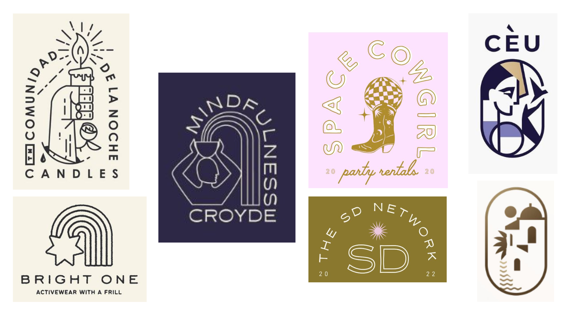
This trend embraces arch and oval outlines or arch-shaped text lock-up styles: a modern take on the emblems and badge-style merchandise logos that proved so popular over the years. Plus, arches and ovals have become a big interior design and architecture trend for 2023, highlighted by the likes of Architecture Daily.
For 2023, arches are often combined with metaphysical icons, like moons, eyes, hands and stars. Clara Jonas’s Mindfulness Croyde logo has a feeling of balance that suits the client’s wellness aims and her own ‘soulful branding’ ethos.
Damjan Ćorić, of Coric Design, frequently uses arch or oval motifs and text lock-ups in his work, and often nods to heraldry or medieval art in his symbolism. Irina Kolosovskay has a contemporary approach to ovals with her design for Cèu clothing and a work-in-progress cosmetics company project.
Suzy Grimsley, of Stellar Made Creative, explains the enduring appeal of arches as a visual frame, as seen in her brand identity 'Space Cowgirl' and her logo for The SD Network: "Arch-shaped logos add hierarchy, contrast and movement, and they’re appealing to the audience. They draw the eye inward to the focal point and add a sense of fluidity and balance, making the logo memorable."
Polly Allen is a freelance journalist and marketer based in Bristol. She specialises in travel and lifestyle journalism, including art reviews. As a marketer, she has worked for the charity sector, the travel industry, the museum sector, and healthcare organisations.
