Design for offline
Discover how offline first is forcing the next evolutionary step in good UX design.

Sign up to Creative Bloq's daily newsletter, which brings you the latest news and inspiration from the worlds of art, design and technology.
You are now subscribed
Your newsletter sign-up was successful
Want to add more newsletters?
Offline mobile experiences can be frustrating for users. You're on the train attempting to open an article you were reading earlier that morning but didn't get the chance to finish. You've loaded it once before, and you even have two bars of service. However, it just won't open. Your phone thinks it is online, but really it is not. You are offline.
What you're experiencing, day in and day out in a variety of ways, is a problem that we have all accepted as the standard yet haven't seen for what it truly is: a fundamentally flawed experience.
Regardless of whether you're a maker or a consumer of tech, we don't expect things to work offline, and decades of requiring constant internet connection has set us up to be blind to this issue.
As such, supporting offline experiences requires attention to be paid to the negative space, which is somewhere we didn't really know to look until Alex Feyerke introduced us to the concept of offline first.
Offline first

Offline is any scenario in which a user seeks information or functionality while being unable to access a supportive outside network. This may be experienced due to low bandwidth, a lack of internet connection, server outages, or countless other reasons.
At first glance it may seem like designing for offline is as simple as communicating to users that they cannot access the app or that any new data they enter will be lost, but this approach falls far short of what is possible with today's technology.
Instead, we should look at this as an opportunity to create a 'deployed' application that is as close to fully functional offline as it is online; blending the experiential line between native and web apps.
Sign up to Creative Bloq's daily newsletter, which brings you the latest news and inspiration from the worlds of art, design and technology.
The offline first methodology aims to be deliberate about these experiences by treating them as more than a patch. It views offline state as an issue of accessibility, and accessibility as the centre of the product.
It combines what we've learned from the mobile first and responsive design movements, with heavy emphasis placed on designing for the most constrained environments (offline) first and treating connectivity as a progressive enhancement.

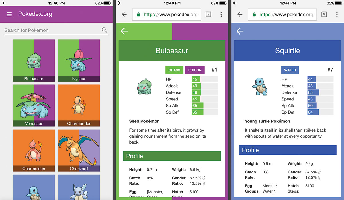
We now have an offline-enabled Pokedex, an open source tool for hospitals of the developing world with HospitalRun, Offline Gmail, and even browser games such as 2048 that can function entirely without connectivity.
Developers have proven the concept of offline design and are now managing to deliver real-life value with it.
The catch
This is awesome, but unfortunately with these types of things there is always a catch. Offline UX patterns maintain ambiguity and often open up more existential questions than we started off with. The question of what we are able to (and should) do with regard to offline state never seems to enjoy a succinct answer, and the huge diversity of internet-based software we're tasked to design certainly doesn't make the work any easier.
That's not to say that there haven't been some interesting developments in the field, though, and there's a foundation taking form for what offline first apps can be.
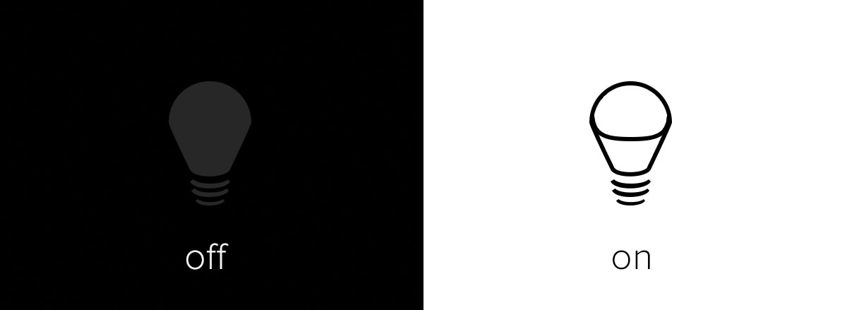
With most non-digital products that aim to improve our quality of life, we have an unspoken and true-to-form understanding of the full system state. We can visibly see that the desk lamp is on, or that a desk drawer is open. We can smell the cookies that are being baked or feel the warmth of the oven as it operates. If we didn't sense state with some of these objects, there could be real-world consequences.
With software, such indicators of state that naturally register with our senses don't come with the territory. State is manual and challenging to articulate, and to express it well we must pay proper attention to the environment the product is used in (or the unpredictability therein), and work with design patterns our users comfortably understand (or can easily come to rely on).
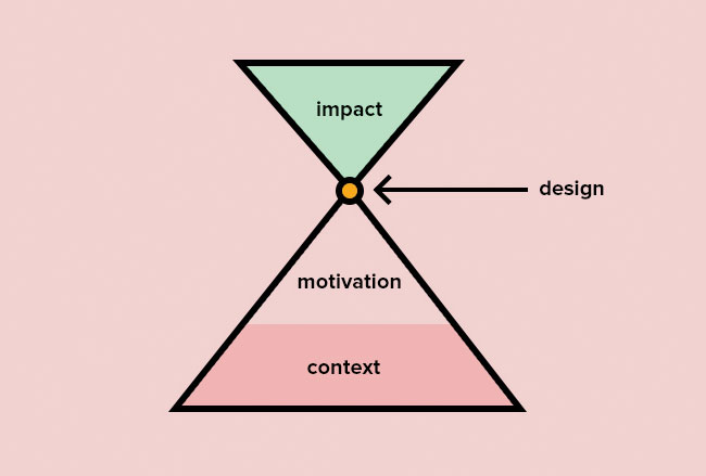
Good design is just as much about context and reliability as it is about the ease and pleasure of its use. Achieving the proper design begins with an understanding of the context and motivations of our users.
Luckily, when thinking about offline experiences, we're already in the right frame of mind. We've started with a complete lack of connectivity as our context and will attempt to provide value under these conditions. To do so, we'll need to see more of the picture, however. Our users could be offline and:
- Recording patient medical data when out in the field
- Reading while riding the train to work
- Trying to upload a photo to social media while on vacation in the desert (and fighting off a hyena)
The next – and often more challenging – steps are to gain an understanding of what the motivations for each use are, then to couple those motivations with the contexts we've outlined. From there we can choose from those couplings the ones that will most benefit from our attention in design.
Having a grasp on the crossover between motivation and context allows us to understand and serve our customers better, but can also provide answers to broader product questions.

We can then record the context and motivations in the form of a job story, a form of user story that centres around context and motivation. For a pharmacist whose prescription fulfilment system depends on the internet, we could write either of the following job stories:
- When a customer wants to buy something and I'm offline, I want to be able to collect payment anyway, so that we may be able to continue to serve customers the medicines they need.
- When I'm offline and I've marked a customer's prescription as having been fulfilled, I want to know that the system will perform this function when it has reconnected, so that I don't have to repeat my actions and record fulfilment elsewhere.
These stories are each meant to be a brief detailed objective that frames exploration of design and product teams. They guide our discovery of a proper design, and serve well when designing for offline experiences.
With an appropriate sense of context and motivation, it should become easier to judge what interactions and UI will be effective for our users.
Next page: Interaction models and offline UX design examples
