Hot new CSS rules to try now
Sign up to Creative Bloq's daily newsletter, which brings you the latest news and inspiration from the worlds of art, design and technology.
You are now subscribed
Your newsletter sign-up was successful
Want to add more newsletters?
Background-repeat (Round and Space)
Background-repeat has been a stable part of CSS for what seems like an eternity, but there are two lesser-known options available – Round and Space. Both of these options work by ensuring that 100 per cent of the background image declared is repeated and visible at all times. They work in slightly different ways and will make a subtle difference to how images appear.
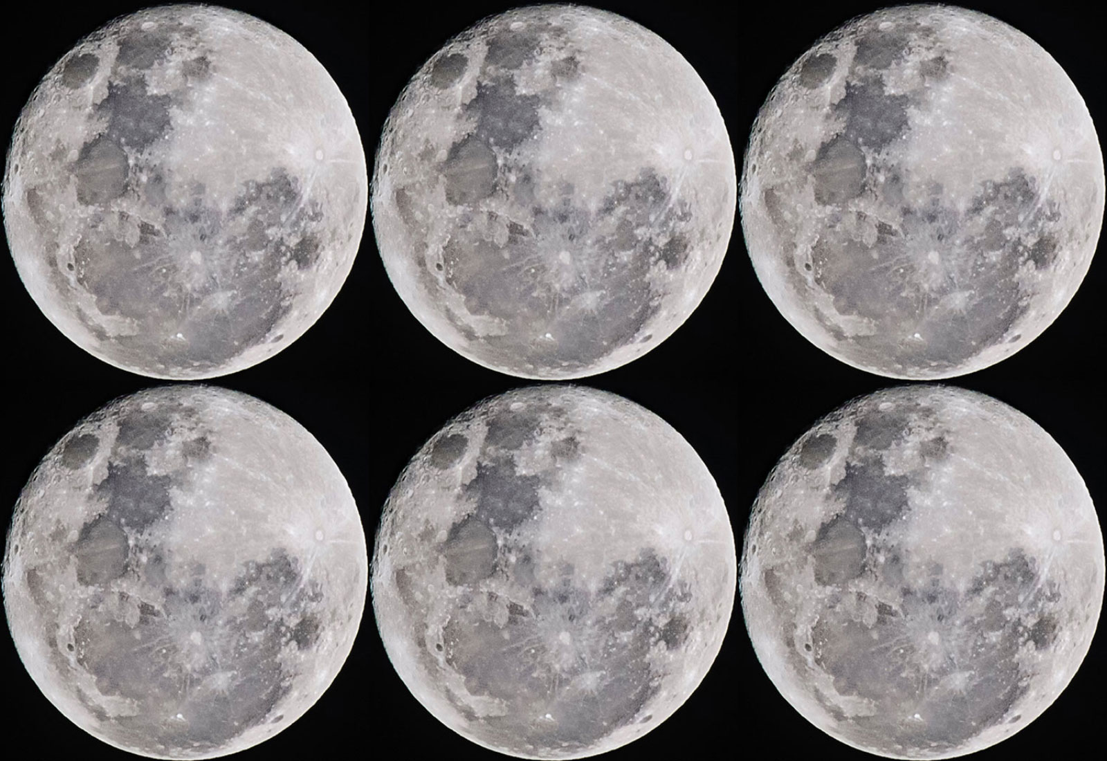
background-repeat: round; repeats your background image without ever cropping the image. Instead, it will resize the image evenly until there is enough space to fit in an extra tile.
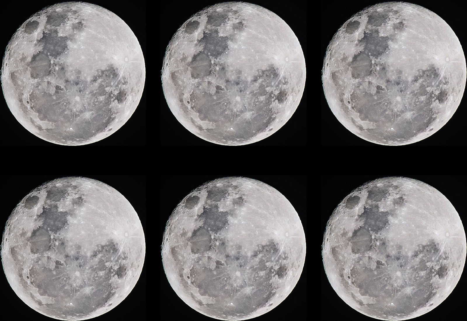
Background-repeat: space; tiles the image in both directions. It's similar to Round, except instead of resizing the image until there is more space to display another tile, it will instead create white space between the tiles until another row or column can be shown.
Article continues belowNeither of these options is that new, but they will give you that little bit of extra control over the way tiling takes place over various viewport sizes. What is also very useful about these options is that they are supported by every browser.
aspect-ratio media queries
The introduction of media queries changed the way we build websites. We were given the opportunity to build our layouts depending on the way the user viewed the page. More often than not this would be based purely on the viewport width or height, but recently there has been a new option added.
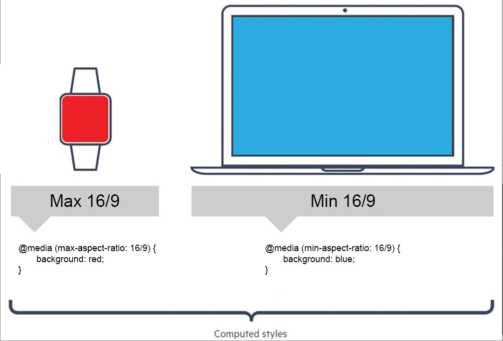
Now you are able to apply CSS based on the page’s viewport via a media query that detects the aspect ratio of the window you’re browsing with. You are also able to detect whether the window matches a maximum or minimum aspect ratio.
The code to use for this is fairly simple. It matches the convention used with any other media query declaration – something like:
Sign up to Creative Bloq's daily newsletter, which brings you the latest news and inspiration from the worlds of art, design and technology.
@media screen and (aspect-ratio: 16/9)  {
 Your CSS
}
@media screen and (min-aspect-ratio: 16/9) {
Your CSS }
There are only a few scenarios in which aspect-ratio media queries would be useful. If you are building something specifically for mobile devices, you could use the min/max aspect-ratio to target whether the user is browsing in landscape or portrait mode (although this use could also be addressed with orientation media query).
However, aspect-ratio is supported by all major browsers support it, with Internet Explorer support going as far back as version 9.
Blend-mode
Applying background images is typically a stable part of every project build. But sometimes it's good to be a little more creative with our background images, which is where blend-mode comes in.
Instead of just putting the background on top of the background colour, blend-mode combines the background image with the background colour in a defined style. The options you can use are normal, multiply, screen, overlay, darken, lighten, colour-dodge, saturation, colour and luminosity.
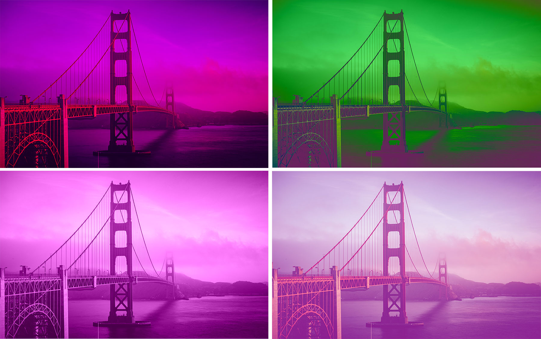
Let's take a look at some of the options. In the image above, we have:
Overlay (top left)
Mixes both the background image and colour together to echo the darkness or lightness of the backdrop area.
Difference (top right)
Subtracts the darker colours from the background image/colour from the lightest shades, to give a very high contrast effect.
Luminosity (bottom left)
Preserves the top colour while fading hue and saturation of the background, to give a washed-out, old photo look.
The code to use for blending your background is fairly simple – all you need is one line of CSS to merge the background image with the background colour:
background-blend-mode: *blending-option*;When it comes to applying blends to your background image you needn’t use just one mode. You can chain multiple blending modes together to create a more unique effect (shown in the bottom right of the image above) by using something similar to the code below:
background-blend-mode: multiply, darken;Blend modes are supported in almost all browsers (including all versions of Microsoft Edge), with the exceptions being all versions of Internet Explorer and Opera Mini.
Next page: Object-fit, shape-outside, currentColour and more
Current page: Background-repeat, aspect-ratio, blend-mode
Prev Page CSS filters and CSS variables Next Page Object-fit, shape-outside, currentColour and more