Hot new CSS rules to try now

As the web has rapidly evolved, it almost seems that apologetic CSS has been left behind. Each week something happens, but seldom where it matters – the interface. The internet follows an almost everlasting converge-then-diverge-then-converge model in applications, and now it’s the turn of CSS.
As more frameworks, ideas and standards have emerged, complexity has skyrocketed with more and more helper technologies being invented from necessity. Things have become far more complicated for developers as people expect more, but now they are slowly being merged into CSS as formal standards. CSS has become unrecognisable from its early inception in the 1990s. Wish things were simpler? Try a website builder.
And what to the future? We can probably say now that CSS of the future will see another divergence as different digital and physical devices and channels appear, even to a brand-new technology. We can probably also guess that CSS will provide straightforward access to even richer interfaces and that the ‘S’ curve in development complexity and development features will narrow and steepen (remember, if you are building a complex site, you'll need web hosting that can keep up and decent cloud storage to save and share design files).
Article continues belowBut what for now? These are our picks for the latest, greatest and most useful updates to CSS. Read on to learn how to use feature queries to check if a feature is supported before you start relying on it; build custom, print-style layouts with CSS Grid; DRY out your code with CSS variables; take control of backgrounds with two background-repeat options (Round and Space); explore aspect-ratio based media queries; create unique visuals with blend-mode; and make images adjust to fill content boxes with Object-fit; and more. Use the quick links box opposite to jump to the section you want.
Feature queries (@supports)
When building components that use new and potentially unsupported features, it’s important to include a fallback. Until recently, this was achieved using feature detection via JavaScript with plugins such as Modernizr. Now, it is possible directly inside CSS using the new @supports syntax (also known as a feature query).
With the addition of @supports, we can check whether the code we would like to use is or is not supported:
@supports (display: flex) {
 .hagrid { display: flex; }
}
When the page is loaded, a check will be performed to see if the browser in use supports the flex feature. If it does, the styling within the support braces will be applied by the browser.
Sign up to Creative Bloq's daily newsletter, which brings you the latest news and inspiration from the worlds of art, design and technology.
If it is not, it will be ignored – it is worth having a fallback option for when the feature being queried is not supported.
The most appropriate way to include the fallback code will depend on the project and what is being changed as there may be @supports code overriding default styling. In other cases, it may be preferable to include another @supports check to see if code is not supported. This is achieved with by negating the feature query:
@supports not (display: flex) {
 .dobby { display: block; }
}
Multiple checks can be combined to see if all the required features are supported at the same time, in order to apply either all or none of the style rules atomically. The syntax for this is very similar to combining media queries, such as applying styles on devices between specific sizes. This is achieved by using the ‘and’ operator and multiple feature queries:
@supports (display: flex)
and (transform: scaleY(3)) {
 .fluffy {
display: flex;
transform: scaleY(3);
}
}
The counterpart combination query for the and operator is the or operator, which checks if either of the feature queries matches and applies the style if at least one is supported:
@supports (display: flex) or (transform: scaleY(1.5)) {
 .grawp {
display: flex;
transform: scaleY(1.5);
}
}
Something which is useful given that we have already covered CSS variables is that with @supports you can also check to see if a custom property is supported or not, which can be done with the following approach:
@supports (--ron: orange) {
 body {
 color: var(--ron);
 }
}
With the above example a check will be carried out to see if the custom property condition is supported and when it is the body will have a font colour of orange applied. @supports is available to use in all browsers with the exception of IE 11 and below, although some polyfills are available if you do need to support as far back as Internet Explorer 9.
A final note: This is a great way to build in new styling rules, but it is also just as helpful at ensuring you build websites that degrade gracefully. If you use @supports then also use it to check if the browser does not support your CSS rules. This might double your workload, but it also ensures you create something that downscales browsers more elegantly.
CSS Grid

The arrival of Flexbox has allowed us to spend less time polluting our code with clear fixes, hacks and workarounds, and focus more on writing concise CSS and HTML. While Flexbox is essential for any UI dev’s toolbox, it’s best suited for working in one single direction at a time. This is usually enough, as we are usually only restricted on one axis at a time (for example, the width of the page is restricted, but not the height).
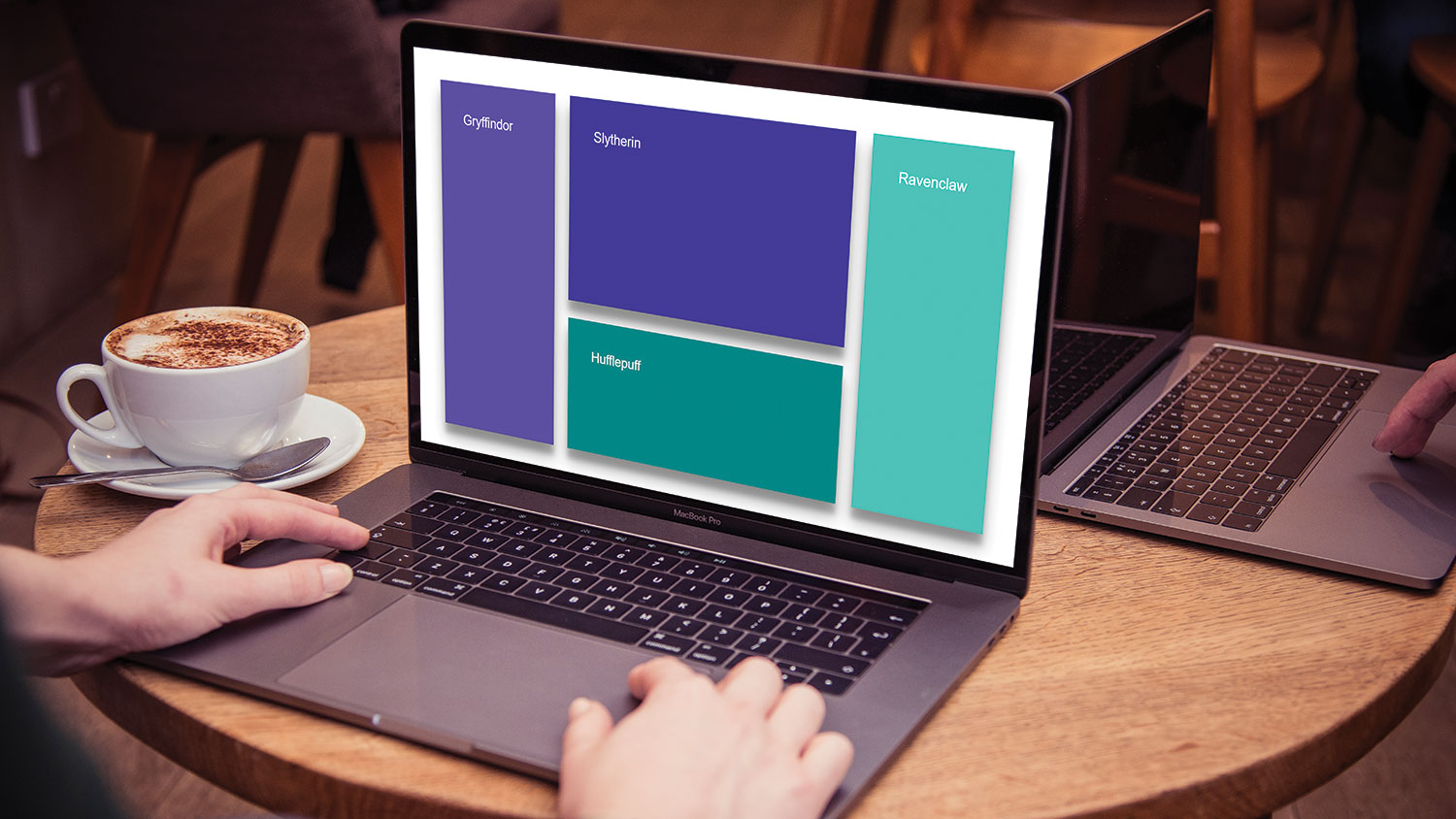
However, in the cases where we are restricted in both dimensions, say a dashboard style app, then CSS Grid is definitely one to shine. Starting off with the grid can be daunting at first, but it’s smooth sailing once you get to grips with the syntax. Say we have the following HTML structure:
<div class="container">
 <div class="gryffindor">Gryffindor</div>
 <div class="slytherin">Slytherin</div>
 <div class="ravenclaw">Ravenclaw</div>
 <div class="hufflepuff">Hufflepuff</div>
</div>
We can define the grid, set the dimensions, and then define named areas for our grid cells:
.container {
 display: grid;
 width: 100vw;
 height: 100vh;
}
.container > div {
 border: 2px solid #000;
}
.gryffindor {
 grid-area: gryffindor;
 background-color: #C91018;
}
.slytherin {
 grid-area: slytherin;
 background-color: #26A147;
}
.ravenclaw {
 grid-area: ravenclaw;
 background-color: #005782;
}
.hufflepuff {
 grid-area: hufflepuff;
 background-color: #FFD63C;
}
Finally, on the .container we can make use of the grid-template-areas property to lay out what we want the grid to look like:
.container {
 display: grid;
 width: 100vw;
 height: 100vh;
 grid-template-areas:
 "gryffindor slytherin slytherin ravenclaw"
 "gryffindor slytherin slytherin ravenclaw"
 "gryffindor hufflepuff hufflepuff ravenclaw"
}
Additionally there are a whole host of additional properties to fine tune the presentation of the grid. To name a few:
grid-column-gap: <size>; Gutter between columns
grid-row-gap: <size>; Gutter between rows
grid-template-columns: <size>; Width of columns, space separated for multiple
grid-template-rows: <size>; Width of row, space separated for multiple
align-items: <center | end | start>; Vertically align the contents of each grid cell
align-items: <stretch>; Vertically fill the cell entirely
justify-items: <center | end | start | stretch>; As above, along the horizontal axis
place-items: <align-items> / <justify-items>; Shorthand notation, combining align-items and justify-items
So in practice, we could update our previous grid:
.container {
 display: grid;
 width: 100vw;
 height: 100vh;
 grid-template-areas:
 "gryffindor slytherin slytherin ravenclaw"
 "gryffindor slytherin slytherin ravenclaw"
 "gryffindor hufflepuff hufflepuff ravenclaw";
 grid-column-gap: 10px;
 grid-row-gap: 15px;
 grid-template-columns: 200px auto auto 200px;
 align-items: stretch;
 justify-items: stretch;
}
This is all just barely scratching the surface of the possibilities of CSS Grid – there’s so much more that can be done. Currently this is supported in all modern browsers, with IE11 being the exception, whereas it supports the older syntax.
But, wait, there’s more! With the use of CSS Grid we’re finally able to centrally align content without the stress:
.container {
 display: grid;
 height: 100vh;
 place-items: center center;
}
Next page: CSS filters and CSS variables
