A comprehensive guide to using CSS Grid
How to create responsive layouts with the CSS Grid Layout module.
Sign up to Creative Bloq's daily newsletter, which brings you the latest news and inspiration from the worlds of art, design and technology.
You are now subscribed
Your newsletter sign-up was successful
Want to add more newsletters?
The CSS Grid Layout module introduces a new and versatile system for positioning elements within a website layout through the use of a highly customisable grid. CSS Grid is now supported by the last two versions of all major browsers so it’s about time we start adopting it in all our projects. In this tutorial we will take an in-depth look at how to use main properties of CSS Grid.
For other options, see our guide to the best website builder. And be sure to check your web hosting is working for your site's needs.
What is CSS Grid?

CSS Grid is an extremely powerful tool for element layout. It introduces unprecedented flexibility in layout, using just pure CSS and without absolutely positioning elements (a technique that can lead to many problems). CSS Grid enables us to achieve extremely diverse and device-specific layouts from the same exact HTML markup.
Article continues belowWe no longer have to rely on hacks, absolute positioning nor JavaScript DOM manipulation to realise dynamic, shape-shifting layouts. CSS Grid gives designers a blank canvas to create whatever layouts they desire without having to worry about how to achieve it, ushering in a new era of web design and development with freedom from the CSS limitations and workarounds of the past.
How to define the Grid
In order to create a grid within a container it must be given the CSS property display: grid. The number of columns and rows are determined by the number of space-separated sizes assigned to grid-template-columns and grid-template-rows respectively.
Sizes can be any valid CSS unit such as px or vw, or the auto keyword that enables columns or rows to stretch across available space. For instance, grid-template-columns: 10px auto leads to a 10px column followed by a second column that fills all available space.
Grid also uses a 'fractional' unit fr that causes any remaining space to be distributed to columns or rows based on the ratios of these units. grid-template-rows: 1fr 2fr creates two dynamic rows with the second twice the size of the first, while grid-template-columns: 1fr 1fr 1fr 1fr defines four equal-sized columns. The latter can be simplified using the new repeat() function to grid-template-columns: repeat(4, 1fr).
Sign up to Creative Bloq's daily newsletter, which brings you the latest news and inspiration from the worlds of art, design and technology.
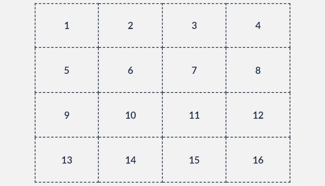
A grid can therefore be created inside a container of class grid with four equally sized, dynamic columns and four 75px tall rows (as shown above) using:
.grid {
 display: grid;
 grid-template-columns: repeat(4, 1fr);
 grid-template-rows: repeat(4, 75px);
}
Complex grids with unequal sized cells can be created by combining the different units mentioned earlier. We can also use the minmax() function to define the minimum and maximum sizes of dynamic columns and rows. Hence, grid-template-rows: 40px 2fr repeat(2, minmax(75px, 1fr)) leads to four rows with the first 40px tall, the other three stretched over remaining space in a 2:1:1 ratio, and the last two having a minimum height of 75px, which sets the minimum height of the second row to 150px.
Once a grid is created, grid lines, represented by dotted lines in the images, are automatically numbered from the top for rows or from the left for columns. The lines are also given a second, negative number relative to their index from the bottom for rows or from the right for columns.
For instance, the first dotted vertical line on the left in the grids above is 1 and -5, and the third line is 3 and -2. These numbers can be used as the boundary lines of items placed in the grid. The grid lines can also be named by adding a string between square brackets in the property declarations, e.g. grid-template-rows: [1st] 1fr [second-line] 1fr [last].
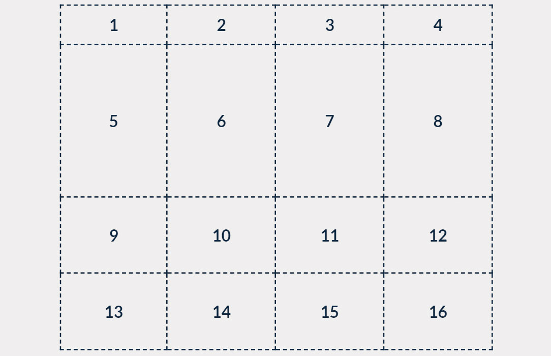
Similar to Flexbox, the horizontal and vertical position of items placed in the grid can be controlled by setting justify-items and align-items respectively, to start, center, end or stretch.
The same is applicable for grid column and row positions within a larger container using justify-content and align-content respectively. Valid options for these properties also include space-between, where extra space is divided between columns/rows, as well as space-around and space-evenly where space is divided evenly between columns/rows with the same or half the amount of space on the ends respectively. We can also define align-content and justify-content (in that order) using place-content, and align-items and justify-items using place-items.
Positioning items using line numbers
To place an item in the grid we can set its grid-column-start and grid-column-end properties to the vertical line numbers between which the item should be stretched. For rows, the properties are grid-row-start and grid-row-end – and of course the numbers refer to the horizontal lines.
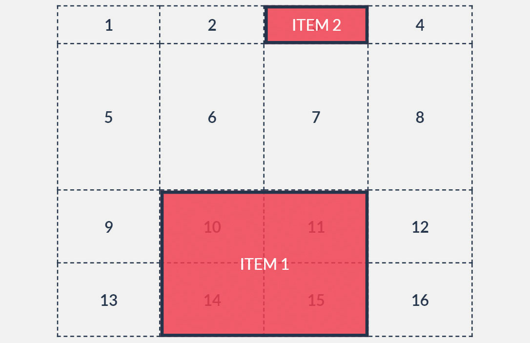
We could also make use of the shorthands grid-column and grid-row, by setting them to only the starting grid line, causing the item to automatically stretch to the next grid line only. As per the image above, using these methods, item1 can be placed between vertical lines 2 and 4 and horizontal lines 3 and -1 (last line or first from bottom), and item2 from vertical line 3 and horizontal line 1 to the next grid lines using:
#item1 {
 grid-column-start: 2;
 grid-column-end: 4;
 grid-row-start: 3;
 grid-row-end: -1;
}
#item2 {
 grid-column: 3;
 grid-row: 1;
}
To simplify further, the declarations grid-column-start: 2 and grid-column-end: 4 can be combined together as grid-column: 2 / 4, with the same applicable for rows using grid-row.
The caveat with using these placement methods is that some of the declarations are somewhat misnomers. For example, grid-column-end: 4 and grid-column: 2 / 4 can be misinterpreted as meaning 'end item placement in column 4' and 'place item in columns 2, 3 and 4' respectively. This is of course not the case as the numbers represent the grid lines rather than columns. To avoid this potential pitfall, we can declare the starting grid line number and the number of columns or rows the item should span across use the span keyword.
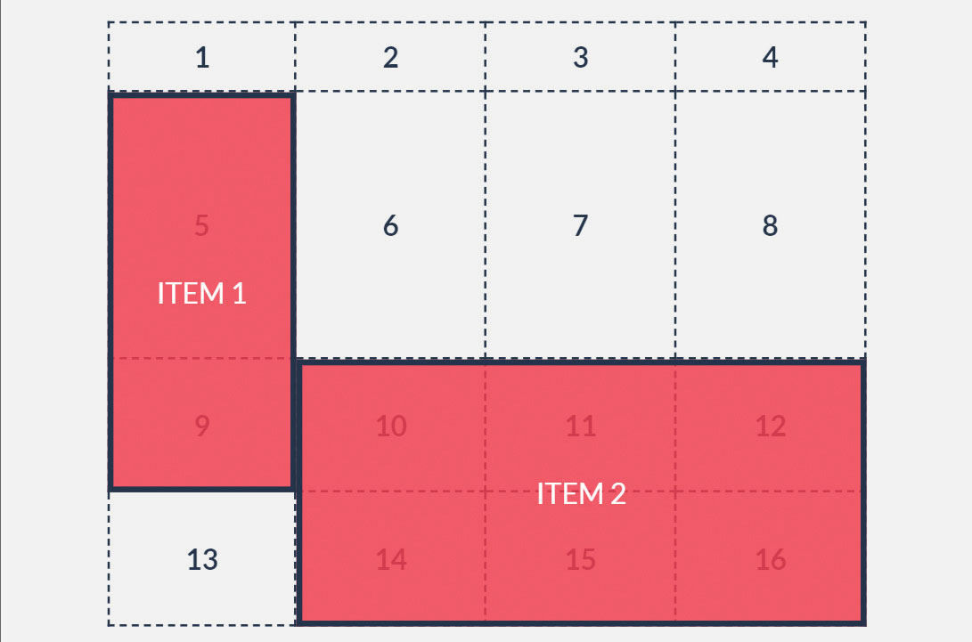
Using these methods, we can reposition item1 between horizontal lines 2 and 4 and vertical lines 1 and 2, and item2 starting from vertical line 2 and spanning across three columns and from horizontal line 3 spanning across two rows (as in the image above) using:
#item1 {
 grid-column: 1;
 grid-row: 2 / 4;
}
#item2 {
 grid-column: 2 / span 3;
 grid-row: 3 / span 2;
}
Believe it or not, item placement can be simplified even further with the property grid-area, which is a shorthand for grid-row-start, grid-column-start, grid-row-end and grid-column-end in that order. If only the first two properties are defined the item will automatically be placed between those lines and the following ones.
This grid property also enables line numbers to be combined with the span keyword. Applying these methods, we can reposition item1 and item2 as such:
#item1 {
 grid-area: 2 / 1 / span 2 / span 3;
}
#item2 {
 grid-area: 4 / 4;
}
Positioning items using area names
Although using grid line numbers and the span keyword is a great way of positioning items, there is an even more intuitive and easy way to place items in the grid. It involves using the grid-area and grid-template-areas properties.
To achieve this, each item to be positioned in the grid must first be given a name by setting its grid-area property to a string that can then be included in the grid’s grid-template-areas declaration. It then becomes possible to define grid-template-areas using a visual ‘map’ in which rows are enclosed in quotation marks, with the contents of each grid cell represented by a string pertaining to the grid-area names of the items.
Empty cells are symbolised by a full stop (.) and spaces signify vertical grid lines. The rows can be placed on new lines to provide a visual representation of the grid, as follows:
#item1 {
 grid-area: item1;
}
#item2 {
 grid-area: item2;
}
.grid {
 grid-template-areas:
   ". . . ."
   ". . . item1"
   "item2 item2 item2 item1"
   "item2 item2 item2 .";
}
How to create a responsive layout using CSS Grid
CSS Grid can be used with media queries to restructure items on different screen sizes without changing the markup. Item shape, size and position can all be completely changed, thus leading to a truly responsive and highly customised layout.
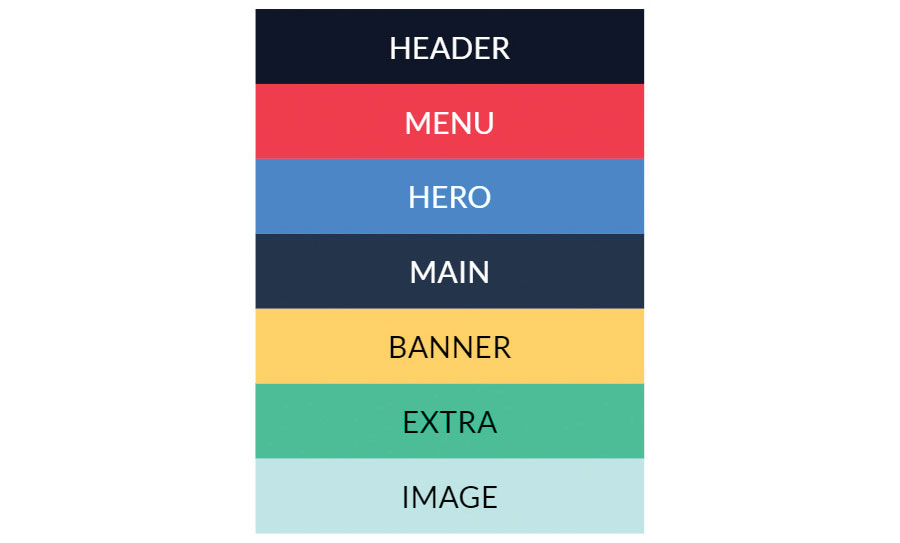
Let’s say we have a list of elements generated from this HTML markup (figure 1):
<div class="grid">
 <div class="header"></div>
 <div class="menu"></div>
 <div class="hero"></div>
 <div class="main"></div>
 <div class="banner"></div>
 <div class="extra"></div>
 <div class="image"></div>
</div> 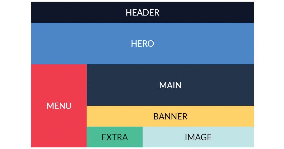
Using what we have learned about Grid so far we can apply styles for screens that are wider than 720px, using a media query (figure 2):
@media (min-width: 721px) {
 .header { grid-area: header; }
 .menu { grid-area: menu; }
 .hero { grid-area: hero; }
 .main { grid-area: main; }
 .banner { grid-area: banner; }
 .extra { grid-area: extra; }
 .image { grid-area: image; }
 .grid {
   display: grid;
   grid-template-columns: repeat(4, 1fr);
   grid-template-rows: 40px 2fr repeat(4, 1fr);
   grid-template-areas:
     "header header header header"
     "hero hero hero hero"
     "menu main main main"
     "menu main main main"
     "menu banner banner banner"
     "menu extra image image";
 }
} 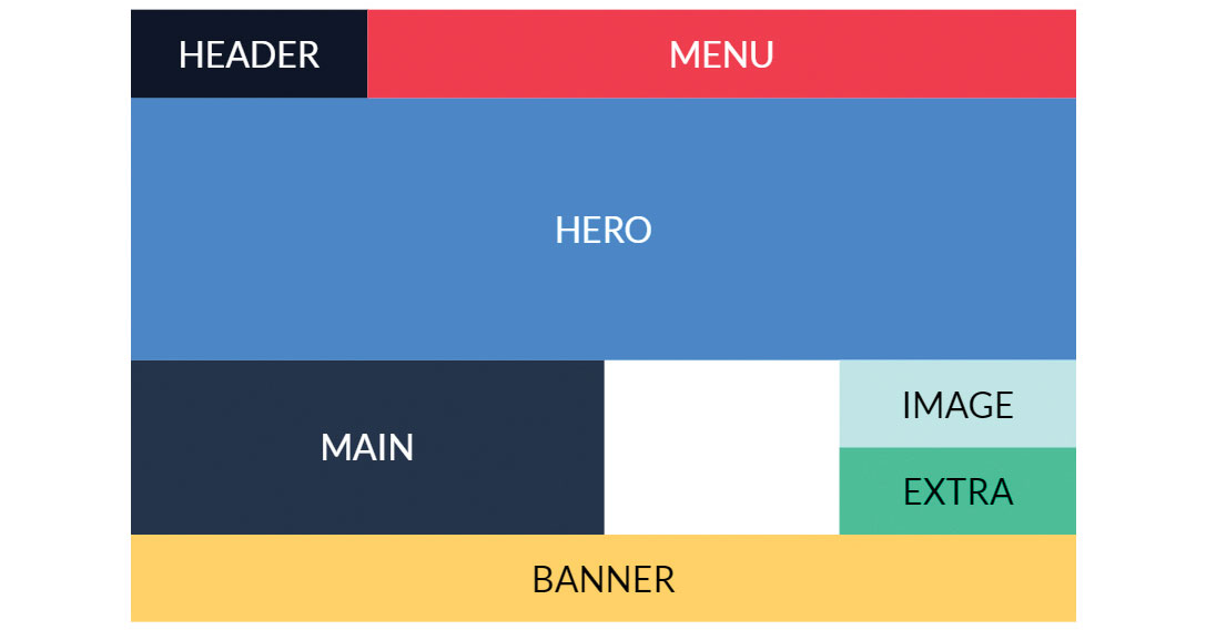
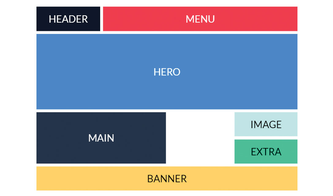
We can also easily reposition and resize the items for larger screens that are wider than 1000px using another media query (figure 3):
@media (min-width: 1001px) {
 .grid {
   grid-template-areas:
     "header menu menu menu"
     "hero hero hero hero"
     "hero hero hero hero"
     "main main . image"
     "main main . extra"
     "banner banner banner banner";
 }
}
That’s not all – the number of grid columns and rows can even be changed to make allowances for certain screen sizes, if this is desired, by redefining grid-template-columns and/or grid-template-rows within the media queries.
Overlapping elements can also be achieved using CSS Grid. Multiple items can occupy the same grid cells and hence can overlap with one another, utilising the z-index properties of the items to control the order in which they stack.
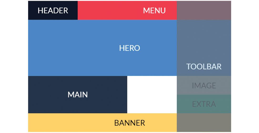
For example, we can add a semi-transparent element with the class toolbar inside the grid container and position it in the right-most column so that it overlaps with all the other elements (figure 4):
.toolbar {
 grid-column: 4;
 grid-row: 1 / -1;
 opacity: .85;
 z-index: 1;
} 
The final aspect we will discuss is the spacing between columns and rows or gaps (figure 5). Items in the grid can be separated using the grid-column-gap or grid-row-gap properties that set the size of the gap between columns and rows respectively. The shorthand property grid-gap can set both.
CSS Grid fallbacks for older browsers
Laying out CSS Grid properties below mobile properties ensures browsers that still don’t support Grid will ignore it and render the mobile version. We can alternatively add a basic fallback layout using @supports, a query that applies rules based on browser support for a specific CSS feature. We can thus set a fallback layout for screen sizes wider than 720px:
@supports not (display: grid) {
 @media (min-width: 721px) {
   .header,
   .extra {
     float: left;
     width: 50%;
   }
 }
}
If for some reason you need this fallback to be shown for Internet Explorer 10 and 11, which don’t support Grid nor, ironically, the @supports query, you can use a well-known query that applies styles only in IE10 and 11:
@media (min-width: 721px) and (-ms-high-contrast: none), (-ms-high-contrast: active) {
 .header,
 .extra {
   float: left;
   width: 50%;
 }
}
If you require IE9 and older support, load an additional stylesheet in the HTML with the relevant styles using:
<!--[if IE]><link rel="stylesheet" href="ie.css" /><![endif]-->CSS Grid resources
For more information and tutorials on the CSS Grid Module have a look at the following resources.
MDN web docs
As always, the Mozilla Developer Network web docs site is a great place to start with – or continuously return to depending on how strong your memory is – for web developer resources. Its CSS Grid layout page in particular has explanations for all of Grid’s properties, as well as interactive examples for you to try yourself.
Scrimba interactive: CSS Grid tutorial
Scrimba is an interactive code courses platform. You can pause the videos, edit the code in them and see the results before resuming the tutorial. It’s a fantastic way to learn coding and Per Harald Borgen’s free, 14-part CSS Grid course is great for those who prefer video tutorials.
Grid Garden game
A great interactive way of learning to code is through games. Grid Garden is an online game that has you watering a carrot garden by typing CSS Grid properties into an editor. It’s a lot of fun and surprisingly satisfying, even if your harvest is just a digital one.
Designing a site as part of a team? Your cloud storage service will help everyone stay on the same page.
This article was originally published in net, the world's best-selling magazine for web designers and developers. Buy issue 309 or subscribe.
Read more:
