How to use logos in web design
Sign up to Creative Bloq's daily newsletter, which brings you the latest news and inspiration from the worlds of art, design and technology.
You are now subscribed
Your newsletter sign-up was successful
Want to add more newsletters?
When you’re building a website, where should you place its logo? A quick glance around the most popular sites on the web provides a clear consensus. It needs to go in the top-left corner.
Need evidence? Just check out YouTube, Vimeo, Amazon, Instagram, eBay, Adidas, BBC, Wikipedia, Reddit, Dribbble, Netflix, Ford, BP, Levis, Shell, O2, Sony, NASA and even this very site.
If you're building a new site, keep it simple with a website builder. Need more resources? Try our guides to web hosting and cloud storage.
Article continues below 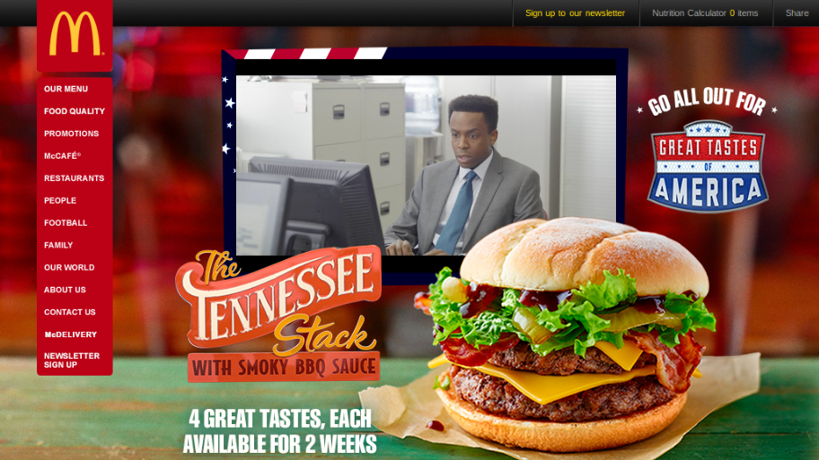
In these particular examples, the logos are all wordmarks. But it's the same deal when it comes to symbol logos, as can be seen on the Airbnb, Spotify, Nike, Facebook, Pinterest and Apple websites.
So is that it? Should you follow the crowd and stick your logo in the same place that everyone else does?
Centre logos for a print look
Well, if you were to centre your logo or place it in the top-right corner, you wouldn't be entirely alone. One category of website that often centres its logo is that of newspapers and magazines.
The approach here is to replicate the familiar look of the printed version’s masthead. Examples of sites that follow this convention include Washington Post, The New York Times, Los Angeles Times, The Boston Globe, The Times, Financial Times, The Spectator, New Statesman, British Vogue, Radio Times and Wired.
Sign up to Creative Bloq's daily newsletter, which brings you the latest news and inspiration from the worlds of art, design and technology.
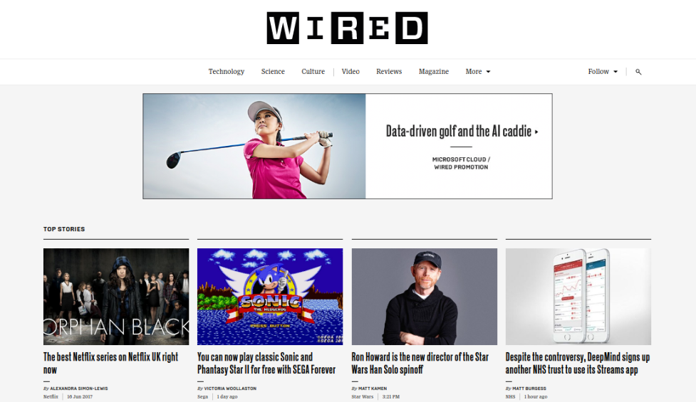
Even if you're not a newspaper, you may still want to convey the feel of a traditional printed document, newsletter or newspaper by centring your logo in this headline-style way.
Examples of this strategy can be seen on this sites for Virginia’s Smithfield Station hotel, the foundation for artist Richard Diebenkorn, and fashion house Sunspel.
However, let’s be clear: print publishers are in no way united on centring their logos online. Most British newspapers, for instance, stick to web norms by placing their logo in the top-left corner, including The Sun, The Mirror, Daily Telegraph, Mail Online and Daily Express. Doing so signals that the publications are forward-facing and fully immersed in developing their digital offerings.
Logo placement outliers
Away from traditional print publishers, examples of logos on websites that are centred or placed on the right are few and few between.
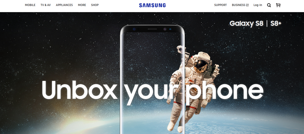
There are some other sites that centre their logos, including Samsung, while the sites for Amnesty International and the Guardian have theirs placed on the right. But in the main, these are lonely outliers.
Another notable exception to the rule appears to be search engine homepages, including Google, Bing, Yahoo, Duck Duck Go, Wolfram Alpha and Baidu, where the logo appears next to or above the search bar, although this can be very much considered a special category of website.
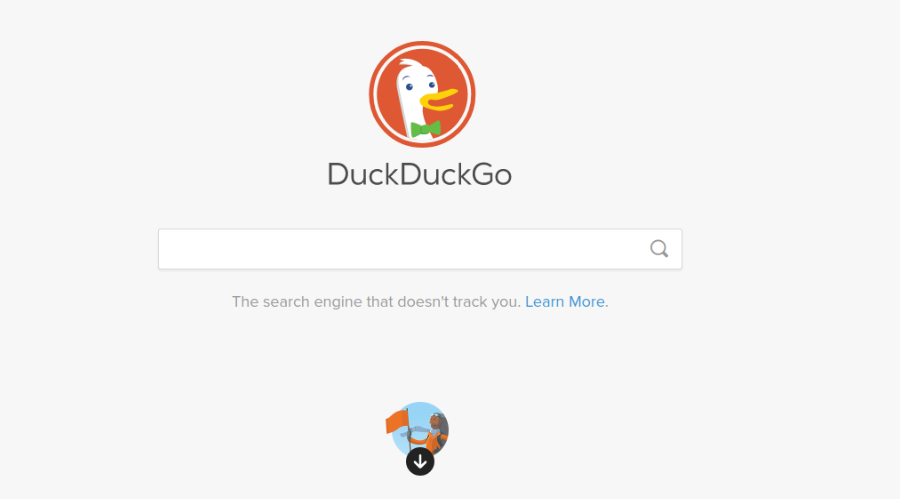
So what’s behind this overwhelming consensus about where to place the logo?
Why are logos usually placed top-left?
Historically, placing the logo on the left was partly a function of how browsers rendered websites on screens. A fixed browser width meant that if your logo was positioned on the right (or even in the centre) it might not have appeared at all, depending on the size of the screen and the shape of the browser window.
For the client who was already urging you to 'make the logo bigger', that was always going to be a no-no.

The shift to the left also relates with how those in the West (as opposed to Asian and Arabic cultures) traditionally read printed content: left to right, and top to bottom. These deep-seated habits have naturally carried over to reading on digital devices, as eye-tracking research from the Nielsen Norman Group has shown.
Why buck the logo placement trend?
Given that the pattern of placing the logo top-left is so established, the only logical reason for placing your logo elsewhere is to deliberately flout this convention, perhaps in an attempt to catch people’s eye and make your site look different and innovative.
And you might think that’s fine. Because although you’d never consider confounding users by moving the search box, menu button or main nav bar from their standard positions, that doesn’t apply to logos because they have no functional purpose, right? Wrong.
Whether you realise it or not, your users do expect that logo to serve a functional purpose. Which is that when they click on it, they’ll be returned to the homepage. And so if it’s not where they expect, it’s going to massively disrupt their normal customer journey.
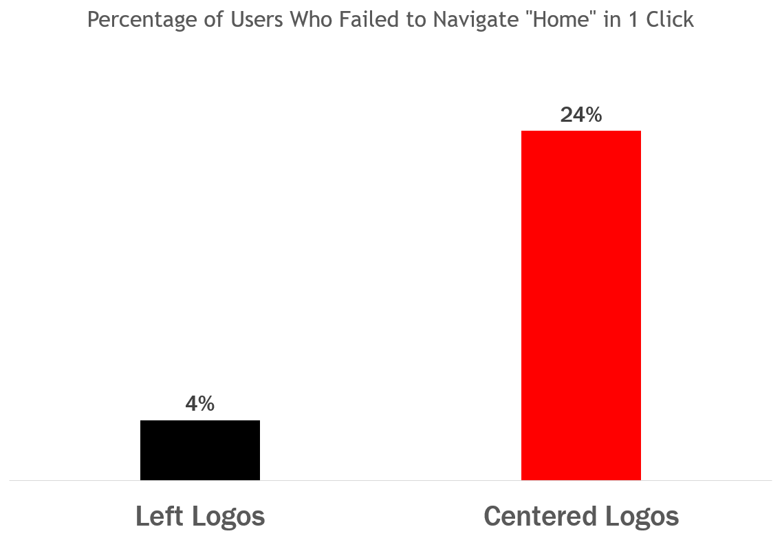
In fact, according to research, users find getting back to the homepage about six times harder when the logo is placed in the centre of a page compared to when it’s in the top-left.
Maybe if you have a centred logo but a ‘Home’ button in the top-left corner, as Aberdeen agency JAMstudio does, then users won’t feel quite so disrupted.
But in general, we’d recommend that if you’re trying to make your design eye-catching and innovative, you should probably just find a better way to do it.
Logos in multiple places
Placing your logo in the top-left corner doesn’t mean you can’t also feature your logo elsewhere on the page, of course. Many sites like to give more voice to their branding by also including the logo in the sidebar or footer.
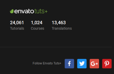
A good example of this is the Envato Tuts+ network of free tutorial websites. It’s easy to imagine clicking through from Twitter, following an entire tutorial and still not noticing which site you’re visiting, so it makes sense to add a little extra emphasis to its branding in this way.
But while there’s nothing wrong with including multiple instances of your logo on your website, always bear in mind that users will expect each and every one of these to function as a link back to the homepage.
Surprisingly, this is something Google currently fails to do on many of its satellite sites, such as Gmail or Google Drive. Even though the Google logo is widely associated with its search page, clicking on it within these services actually takes you back to the homepage for the sister service, rather than to google.com.
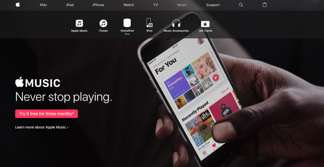
In contrast, on all web pages in Apple’s network, including iTunes, clicking the Apple logo always takes you back to your local version of apple.com.
Thanks go to Stewart Ainslie, WithPrint, Montgomery Kern, Mark B and Alon Koppel for their help in writing this article.

Tom May is an award-winning journalist specialising in art, design, photography and technology. His latest book, The 50 Greatest Designers (Arcturus Publishing), was published this June. He's also author of Great TED Talks: Creativity (Pavilion Books). Tom was previously editor of Professional Photography magazine, associate editor at Creative Bloq, and deputy editor at net magazine.
