Product packaging pattern trends for 2020
Packaging is a layer of communication between a product and the customer. It serves the practical purpose of holding and protecting the product, but also needs to draw eyes to the product on a crowded shelf or online storefront. To stand out from all the competing options, it needs to tell us something about what makes the product different.
There’s been a trend in packaging design towards minimalism in recent years, with clear and clean layouts breaking down the noise that accompanies the surfeit of choice on the shelves. Now tougher economic conditions and increased competition are leading to renewed use of stronger patterns and illustrations to create greater emotional connection with the customer and stand out from the competition. Here we round up seven pattern trends to look out for in packaging this year.
01. Nature
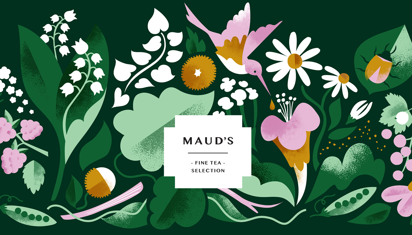
Flat nature-inspired patterns and illustrations continue to be
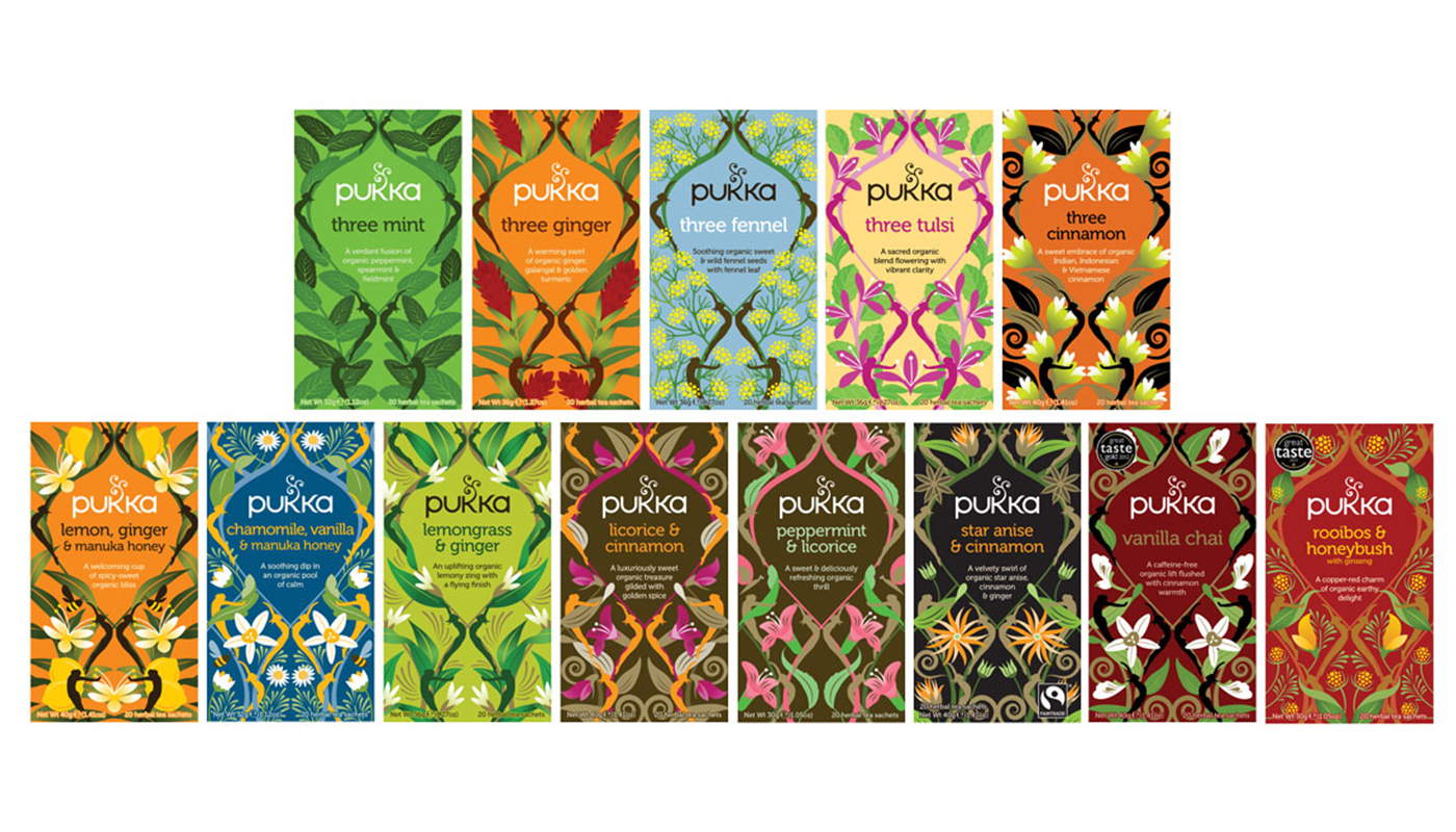
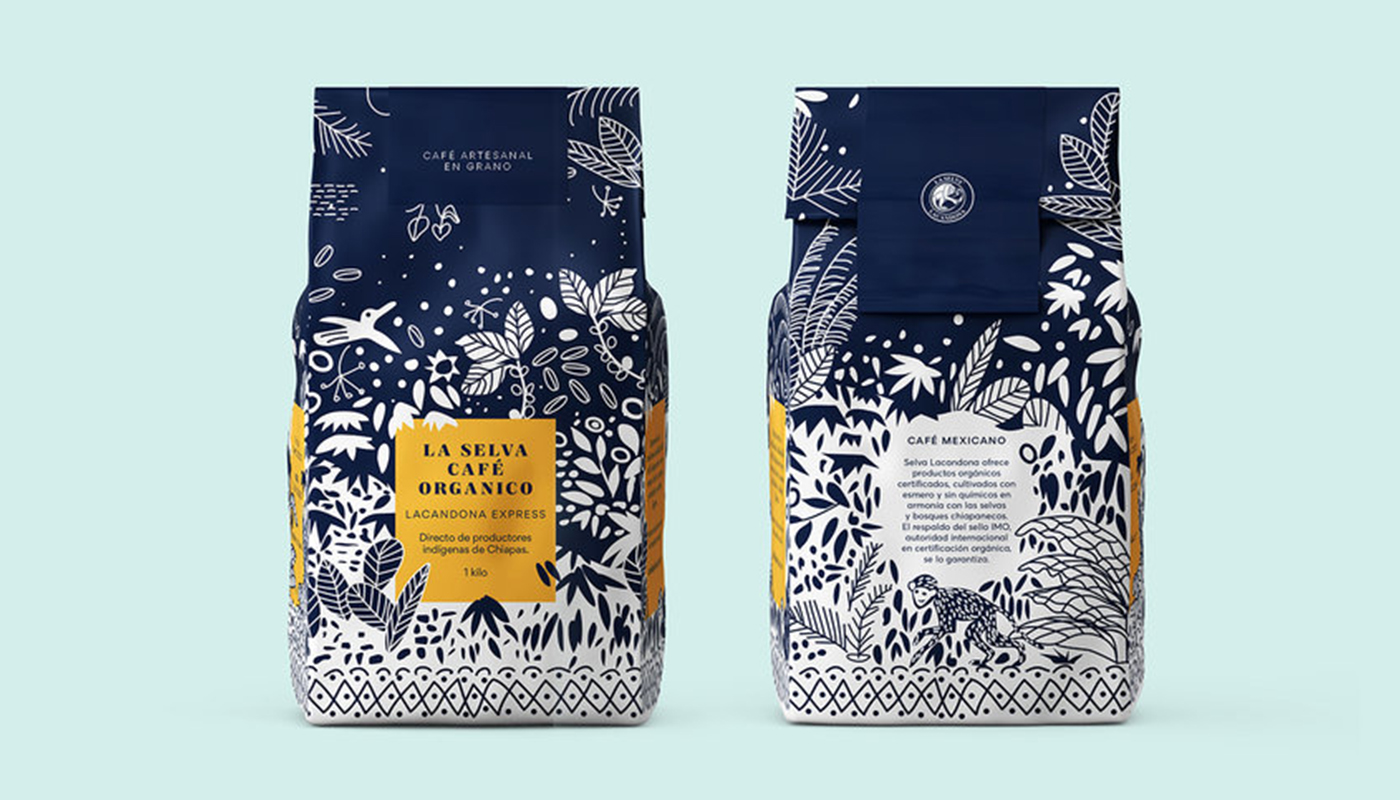
Everyone wants to be seen as nature-friendly at the moment and many brands are seeking to communicate their green credentials in their packaging. Patterns inspired by nature can suggest organic, natural ingredients in food and cosmetics, and a general concern for the environment.
Like all over the design world, a lot of this is happening through flat design, such as in Darling Clementine’s illustrations for Maud’s Teas. But designers are taking influence from everything from vintage botanical illustrations to the bold forms of CW Stockwell's classic Martinique banana leaf wallpaper. Greens and browns are being joined by more varied vibrant but still earthy colours. In eye-catching pattern designs for Pukka teas, The Space Creative gave the products vivid colour schemes and patterns with repeated motifs evoking each flavour.
Expect to also see a return to more detailed patterns and illustrations. Examples like Mamba Studio's concept for La Selva coffee show a return towards a maximalist trend, of which more later. Of course, if the product is being presented as green and natural, for credibility design is best followed through with the use of recycled and recyclable materials.
02. Geometric shapes
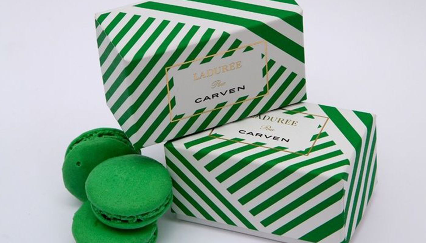
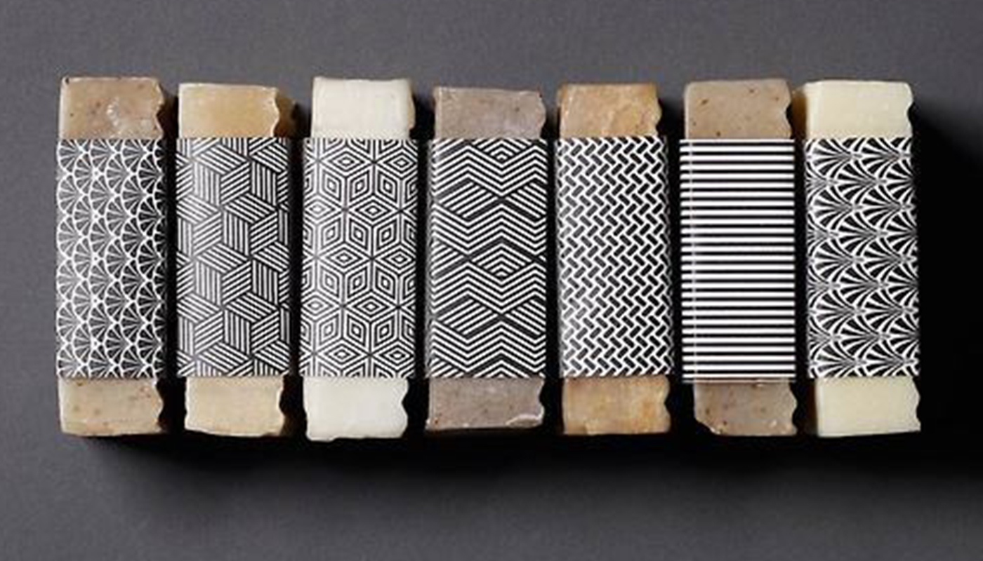
Though hardly a new trend, the use of geometric shapes in packaging design continues to be strong in 2020. Expect to see those shapes getting bolder and taking on more extreme dimensions in darker monochromatic applications in a bid to stand out.
This could be by zooming in closer on thick lines, with less repetition of a pattern like in the packaging for French confectioner Ladurée’s range of macarons that pays homage to Carven by using the fashion house’s traditional brand green in thick, bold stripes. Conversely, using very fine lines in black and white can achieve an Art Deco or even tribal-looking feel that conveys a raw energy and more organic aesthetic in the packaging developed by One Darnley Road for London Fields Soap Company.
03. Textures
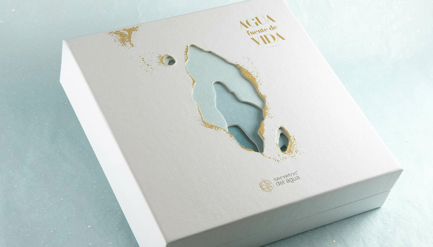
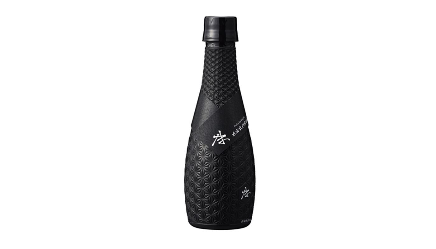
Pattern can be created through texture as well as colour and illustration. This is something we're seeing more of as brands continue to experiment with packaging materials. Textured patterns can create a mature, sophisticated feel. Die cut windows offer the chance to create patterns that reveal the product itself, or to make layered patterns that produce clever effects. Meteorito Studio were awarded at the 2019 Pentawards for its layered packaging design for Secretos del Agua’s Christmas gift pack. The packaging tells a story about the beauty brand's mission and use of water by layering die cut shapes to create depth and give the impression of a grotto as a natural source of water.
Textured patterns can also transform the feel of packaging substrate. Japan's DNP used a black matte polyolefin wrap with a textured pattern to give plastic the premium feel of glass in their bottle design for Awanama sake. They used a pattern that resembles traditional Japanese Satsuma Kiriko cut-glass design to create a sense of heritage and luxury while also serving as a light-blocking barrier to extend the shelf life of the drink inside. The innovative design won the diamond award at the DOW Packaging Innovation Awards.
04. Metallic and holographic patterns
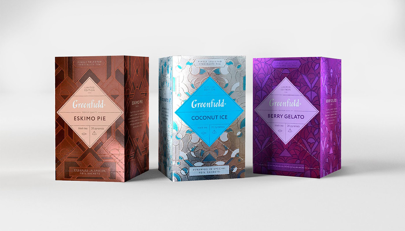
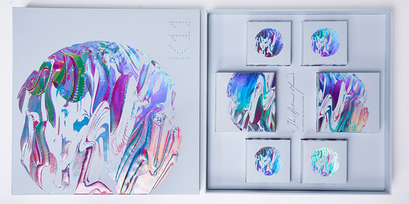
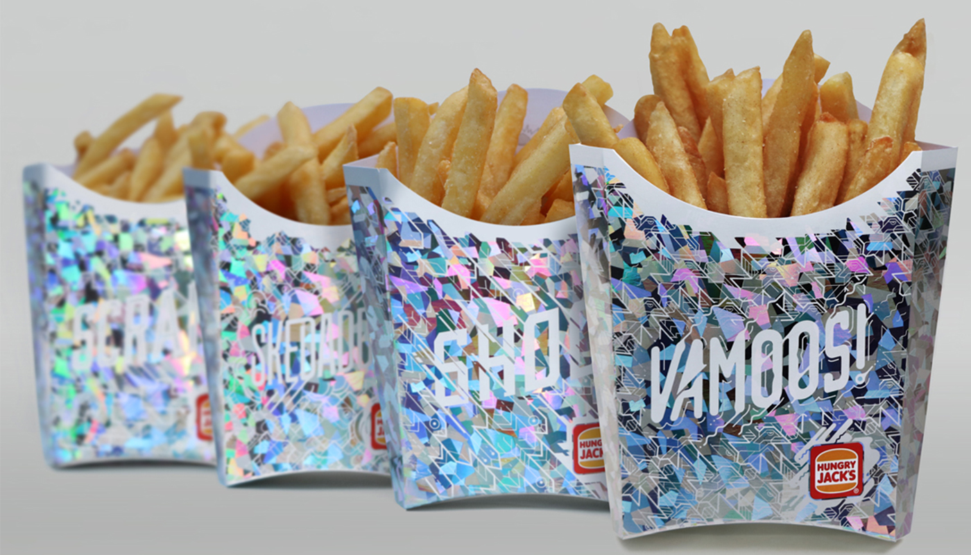
The application of patterns in special colours using foil stamping can make a product dazzle on the shelf. Metallic patterns in gold and silver have long been used to add a classy vintage feel to products like chocolate, but more vibrant metallics and holographic patterns can appeal to younger customers. Iridescent and holographic patterns have been most used for packaging cosmetics but are now being applied to all kinds of packaging, from tea to fries. It can create a modern, even futuristic look, particularly for exclusive, limited-edition products.
Foil stamping on Greenfield tea packaging designed by Alice Macarova created a look that was as novel as the brand's limited-edition ice cream-inspired flavours. Embossed stamps with twin varnishing in matte and gloss play with light and shadow to conjure up the iciness of the unusual inspiration.
In China, mooncakes are an important gift during the Mid-Autumn Festival. With so much competition among manufacturers, the use of laser holographic foil stamping to create abstract iridescent patterns representing the moon’s rugged surface make K11’s product stand out as a limited-edition luxury option that feels like a work of art. Holographic patterns are being used for even the most humble of products. In Australia, Hungry Jacks (Burger King) used holographic packaging for fries to deter Seagulls from pinching them, and raised ordering a side of fries to an Insta-worthy moment in the process.
05. Blur
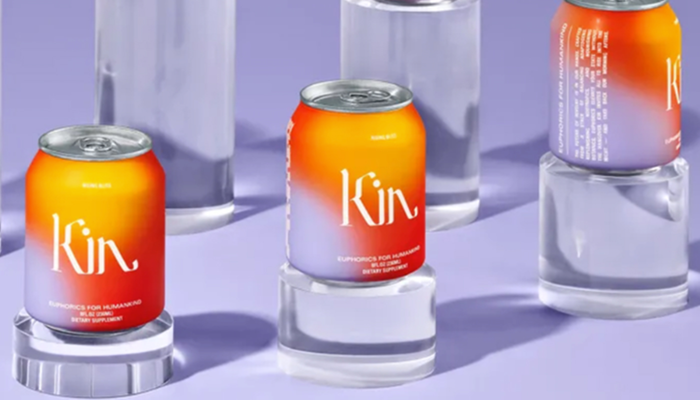
The gradient trend has been all over digital and print design and is now firmly in product packaging too. Gradients provide visual interest and dynamism without overwhelming information on the packaging. Something that’s grown out of the trend is the use of multiple gradients or hazy, blurred patterns to evoke a mood or sensation. The cans for Kin, a range of non-alcoholic drinks made from nootropics, adaptogens and botanicals, use warm hazy backgrounds to echo the products' claims to create a feeling of euphoria without the headache the morning after. The look taps into the current retro futurism trend to create a sense of nostalgia coupled with an optimistic vision of the future.
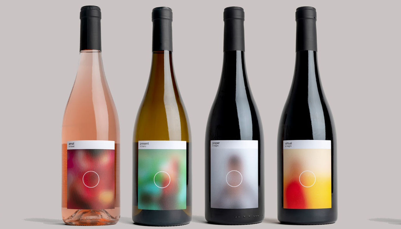
Ingrid Picanyol’s labels for Jaume Jordà’s Viamic range of wines initially look like blurred abstract patterns but are designed to resemble Instagram-like images. The sense of mystery is intended to invite us to disconnect from the online world and reconnect physically over a bottle. The imagery is strikingly abstract and creates a clear brand identity across the range.
06. Maximalist design
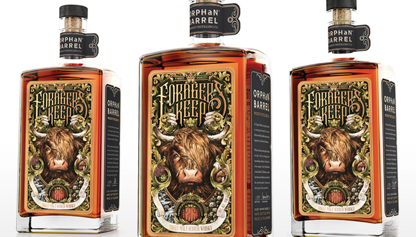
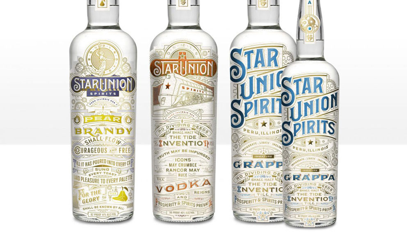
Many of the trends we’re seeing show an overarching tendency to step back from the recent penchant for minimalism to inject louder personality into designs. Tougher competition on both physical and virtual shelves means brands are tuning up their presentation to grab attention and create a desire to know more. Considering that 81% of consumers have tried a new product because of its packaging, it makes sense. Although minimalist designs cut out the nonsense, many consumers like the mystery that more complex packaging design can provoke, and packaging that makes a statement is also more likely to be shared on social media.
The label for Forager’s Keep whiskey designed by Greg Coulton uses ornate leaf motifs to give a magical, almost fairytale-like fantasy sense of fun to the product. Kevin Cantrell Studio gave another drinks maker, Star Union, cut-out patterns, illustrations and type covering the majority of the surface area on bottles of brandy, vodka and grappa leaving no chance that the products go unnoticed, even if they're seen in a thumbnail image on an online retail site.
07. Neatly structured layouts
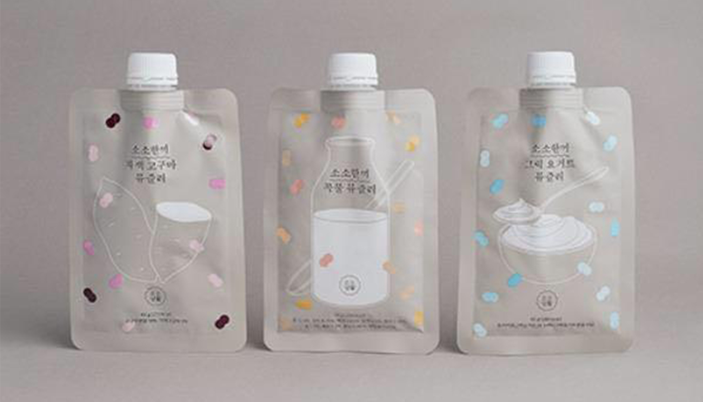
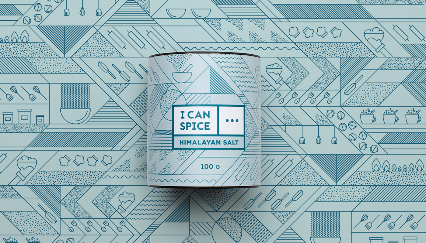
Despite the return of maximalism and more elaborate patterns, there is still a lot to be said for the minimalist trend seen in recent years with neat, structured layouts creating an almost apothercary style. What we’re seeing now is that apothecary-style minimalism combining with brighter colour and pattern to produce something that is still very clean but with a less austere feel. This kind of 'minimalism plus' boasts the simplicity and tidiness of minimalist design but with added fun and warmth.
SOSOLIFE's packaging designed by Korea’s Triangle Studio uses dabs of colour to add a sense of whimsy to their otherwise understated packaging for biscuits, soups and noodles. Packaging for Slovakian spice range I Can Spice designed by Dekoratio uses a crisp central label but on a bright patterned background to give the product more personality on the shelf, while still being simple to interpret.
Read more:
Sign up to Creative Bloq's daily newsletter, which brings you the latest news and inspiration from the worlds of art, design and technology.

Joe is a regular freelance journalist and editor at Creative Bloq. He writes news, features and buying guides and keeps track of the best equipment and software for creatives, from video editing programs to monitors and accessories. A veteran news writer and photographer, he now works as a project manager at the London and Buenos Aires-based design, production and branding agency Hermana Creatives. There he manages a team of designers, photographers and video editors who specialise in producing visual content and design assets for the hospitality sector. He also dances Argentine tango.
