Printing tips: how to choose the right image type
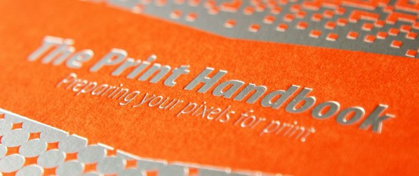
When you're printing images, you need to choose the optimum image file type for the best results. Andy Brown, author of The Print Handbook, explains how.
Sign up to Creative Bloq's daily newsletter, which brings you the latest news and inspiration from the worlds of art, design and technology.
You are now subscribed
Your newsletter sign-up was successful
Want to add more newsletters?

Andy Brown is a designer and creator of This is a Print Handbook, a handy little piece of literature crammed full of helpful tips and advice to help the transition from screen to print."This handbook won't tell you how to think like a great designer, or teach you the history of typography," he stresses. "But it might just help you with some of the stuff that's, well, helpful to know." Here, Andy explains how to choose the optimum image file types to get the best printed results.
1. Question 300dpi
It's extremely easy to fall into a mindset whereby you believe setting up a bitmap at 300dpi is going to make every print job come out perfectly. This is something we've really highlighted in This is a Print Handbook because, even at 300dpi, some image file types aren't going to measure up to a vector file.
Simply setting up a TIFF or PSD file at 300dpi might not produce perfect results. So it's not necessarily going to be your best option.
Article continues below2. Use vector artwork
It won't be suitable for some types of artwork but, where you can, try to create vector art to get the best results. Graphics that come out really sharp and crisp when you run them out from an EPS or AI file simply might not work so well, even in TIFF format.
You might think this would be perfect but, because of the way it pixellates the image. But we've found it can produce a line that isn't nearly so crisp.
3. Spot colour removal
You can't include spot colours if you're saving a JPEG as a CMYK file ready for print. Any Pantones are changed to CMYK, so you need to avoid using JPEGs if you want to use a spot colour in a raster file.
Also, stay away from image file types designed for the web, as PNG and GIF files can't handle CMYK either and only save in RGB. They do convert to CMYK if you drop them into InDesign and then save a PDF. But you won't be in control of the conversion.
Sign up to Creative Bloq's daily newsletter, which brings you the latest news and inspiration from the worlds of art, design and technology.
4. Don't rush RGB conversion
If you're working on a photograph that was created as an RGB file, it can often be worth leaving it as an RGB file while you make alterations and tweaks, and then making your own conversion at the end.
This puts you in control of the way in which the file is converted and, if your screen is set up correctly, you should be able to see a rough example of how it should look when printed.
Also read: Print packaging 101: everything you need to know.

The Creative Bloq team is made up of a group of art and design enthusiasts, and has changed and evolved since Creative Bloq began back in 2012. The current website team consists of eight full-time members of staff: Editor Georgia Coggan, Deputy Editor Rosie Hilder, Ecommerce Editor Beren Neale, Senior News Editor Daniel Piper, Editor, Digital Art and 3D Ian Dean, Tech Reviews Editor Erlingur Einarsson, Ecommerce Writer Beth Nicholls and Staff Writer Natalie Fear, as well as a roster of freelancers from around the world. The ImagineFX magazine team also pitch in, ensuring that content from leading digital art publication ImagineFX is represented on Creative Bloq.
