Document your design systems with Fractal
Introducing Fractal, a pattern library tool to help you document your design system and keep your files in sync.

Sign up to Creative Bloq's daily newsletter, which brings you the latest news and inspiration from the worlds of art, design and technology.
You are now subscribed
Your newsletter sign-up was successful
Want to add more newsletters?

Five times a week
CreativeBloq
Sign up to Creative Bloq's daily newsletter, which brings you the latest news and inspiration from the worlds of art, design and technology.

Once a week
By Design
Sign up to Creative Bloq's daily newsletter, which brings you the latest news and inspiration from the worlds of art, design and technology.

Once a week
State of the Art
Sign up to Creative Bloq's daily newsletter, which brings you the latest news and inspiration from the worlds of art, design and technology.

Seasonal (around events)
Brand Impact Awards
Sign up to Creative Bloq's daily newsletter, which brings you the latest news and inspiration from the worlds of art, design and technology.
Do you fancy learning more about design systems? Then don't miss senior UI engineer Mina Markham at Generate New York on 28 April, where she will discuss how she created Pantsuit, the design system that powered many of the applications hosted on hillaryclinton.com. And on the west coast, at Generate San Francisco on 9 June, Stephanie Rewis will share some of the lessons she learned while building the Salesforce design system.
By now, many of us are familiar with style guides. But there is a new breed of design system documentation gaining steam: the pattern library. The major difference between the two is the primary source of the tool’s documentation.
A style guide's documentation tends to originate from a markdown file, so to show the markup the author is often forced to copy and paste it into the markdown. This is nearly impossible to maintain when fitting multiple components together.
A pattern library, on the other hand, treats our component HTML files as first class citizens. Each component gets its own page, where it displays the markup and rendered HTML directly from the HTML file. This ensures the HTML files and documentation never get out of sync.
Pattern libraries are often built using a templating language rather than plain HTML. Templates can include variables and other logic, then we can pass in various sets of data, allowing variations of a component to be displayed.
It is possible to combine several templates to create more complex displays, or even full pages. These files are so flexible they could even be used in production! Any changes made to our pattern library are automatically picked up by our website, as all markup – for the library or for production – originates from a single set of canonical templates.

Enter Fractal
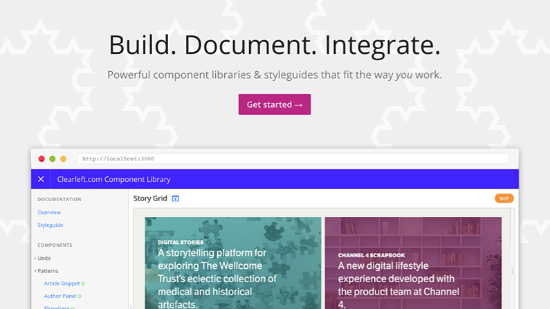
Created by Clearleft, Fractal helps you build and document web component libraries, and integrate them into your projects. In this tutorial we'll take a closer look at how it works (download a finished version of the demo at here).
Sign up to Creative Bloq's daily newsletter, which brings you the latest news and inspiration from the worlds of art, design and technology.
Fractal is a Node.js module that is installed via NPM. First you want to install the module globally so you can generate a new project:
npm install --global @frctl/fractalWith this package installed, create a new project:
fractal new project-nameThis command fires up an installation guide that walks you through the setup process. It will ask you for the title of the project; the names of the components, documentation, and public folders; and if you'll be using Git for version control. Once those questions are complete, Fractal will install all the required modules and set up a folder structure just as specified.
If you want to skip the global install and create the project manually, the manual install instructions can be found at here.
Spinning it up
Now you have a fully installed Fractal project, spin it up by stepping into the project folder cd project-name and running the Fractal sync command. This starts a local server, watches the files for changes and automatically starts Browsersync:
fractal start --syncAnd just like that, you've got a working instance of Fractal. Open your browser of choice and navigate to http://localhost:3000 to see the start of your new Fractal project. To avoid requiring everyone to install Fractal globally, create a script in your package.json that calls the Fractal binary.
 "scripts": {
    "fractal": " ./node_modules/.bin/fractal start --sync"
}
Now you can use npm run fractal without having to install anything globally.
Adding a component
Now you've started a Fractal project, it's time to add some components. The starter files come with a component called 'example', but we’re going to get rid of that and make a new one from scratch.
One of the best things about Fractal is that you can organise your components however you like inside the components folder, and it will automatically mimic that organisation in the pattern library navigation.
For the first component, we'll create a new primary button inside a button folder. To do that, create with a template file at components/buttons/primary-button/primary-button.hbs. Fractal supports Handlebar templates out of the box, so use the .hbs file extension:
<button class="primary-button">{{text}}</button>The {{text}} string inside the button tag is a variable placeholder, and this lets you reuse the template, passing in different values for text from the data file.
To create the data file, use the same base name as the Handlebar file, but with a different yml extension. Now the primary-button.config.yml sitting inside the components/buttons/primary-buttons folder should look like this:
title: Primary Button
context:
    text: Click Me
All of this together creates your first new component, the Primary Button, a member of the Button category, with the text: 'Click Me'.
Component variations
Fractal supports variations of the same component, allowing us to display the same component with various modifier classes or attributes. So let's say we wanted to have the option of using a dark themed button. We could create a new template file called primary-button--dark.hbs next to our original template (the double dash denotes these component variations). In this template we'll apply a modifier we can hook into to attach new styles.
<button class="primary-button" data-theme="dark">{{text}}</button>
Now when we write our CSS, we can include the following selector to alter this template with modifying styles.
.primary-button[data-theme="dark"] { }Data variations
Just as we can define variations by creating multiple template files, we can also create variations within our data. We can do this inside the primary-button.config.yml file by adding a variants array.
title: Primary Button
context:
    text: Click Me
variants:
    - name: Download
    context:
        text: Download Now
    - name: Install
    context:
        text: Install Now
This will create new variations named 'Download' and 'Install', with different text passed into the button. A more practical example might be if you were using this same primary-button.hbs template in Fractal as well as production. In this case, rather than creating a brand new template for your dark theme, you could pass the theme value in as a variable and use the data variations to show all the different button themes.
<button class="primary-button" data-theme="{{theme}}">{{text}}</button>

title: Primary Button
context:
    text: Click Me
    theme: light
variants:
    - name: Dark Theme
    context:
        text: Click Me
  theme: dark
Handling other assets
Fractal will also handle files other than markup and data. Any CSS, JavaScript, images or other assets that you add to the component folder will be displayed in the 'Assets' tab. You can specify a README.md file for the component so that you can write notes about how the component is used, or link to other parts of the documentation.
Next steps
Repeating the previous example for all of your core components creates a useful catalogue of your site's main building blocks. But the real power of a pattern library comes from the ability to combine these pieces together. Be sure to check out the Fractal documentation to learn how you can start creating more complex components by combining smaller atomic elements to create larger ones.
The docs folder is a great place to put traditional style guide information and supplementary notes. This might cover things like onboarding documentation, guidelines on your brand's voice and tone, lists of colours and variables, and so on. It follows the same folder-based navigation as components do, and if you organise your files within subject folders you'll find navigating the Fractal docs a breeze.
Fractal also supports more complex data sources. If you need to generate a large set of data for a template, or want to pull it in from some third party API, you can use component-name.config.js to return a JavaScript object in place of the YML file data.
Lastly, Fractal allows you to use a number of different templating languages. Be sure to check out the full list in its documentation. And most of all, have fun!
Book your tickets to Generate today! In New York you can learn from Mina Markham, who built the design system for Hillary Clinton's presidential campaign, and in San Francisco Stephanie Rewis will explain how you can architect and build a modern CSS framework for a 'living design system' at enterprise scale.
This article was originally published in net magazine issue 285, buy it here
