How to create stylised game artwork
Discover how to illustrate an environment scene The Long Dark way, using bold shapes and painterly brush work.
Sign up to Creative Bloq's daily newsletter, which brings you the latest news and inspiration from the worlds of art, design and technology.
You are now subscribed
Your newsletter sign-up was successful
Want to add more newsletters?
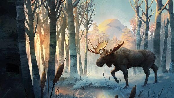
The art style of first-person survival video game Long Dark can be deceptively difficult to capture. The style from the video game can end up looking either too realistic or too whimsical. We want the player to feel like they’ve stepped into a world that feels familiar but also unique – a world both beautiful and dangerous.
In this Photoshop tutorial, I’ll walk you through my process of capturing the style of the Quiet Apocalypse.
From the early days of the game we wanted the art style to come across as painterly. The art style has been achieved in a collaborative process by the concept artists, the 3D artists, and the tech artists at Hinterland.
Article continues belowI can sum up the basics this way: broad areas of subtle texture encased in sharp and simple silhouettes.
I’ll take you through my process, where we’ll use the shapes that we achieve in the sketch as the basis for the final silhouettes. Using simple composition guides to ensure the overall image is balanced, we’ll give the image a painterly look using texture brushes and bold brush strokes. We can retain those strong silhouettes and bold shapes with one of my favourite secret weapons: Photoshop’s Lasso tool.
We’re adding another wild animal, the moose, to the list of adversaries that you may encounter in the game. And we’ll focus the illustration around this giant of the forest.
01. Give yourself (or client) options
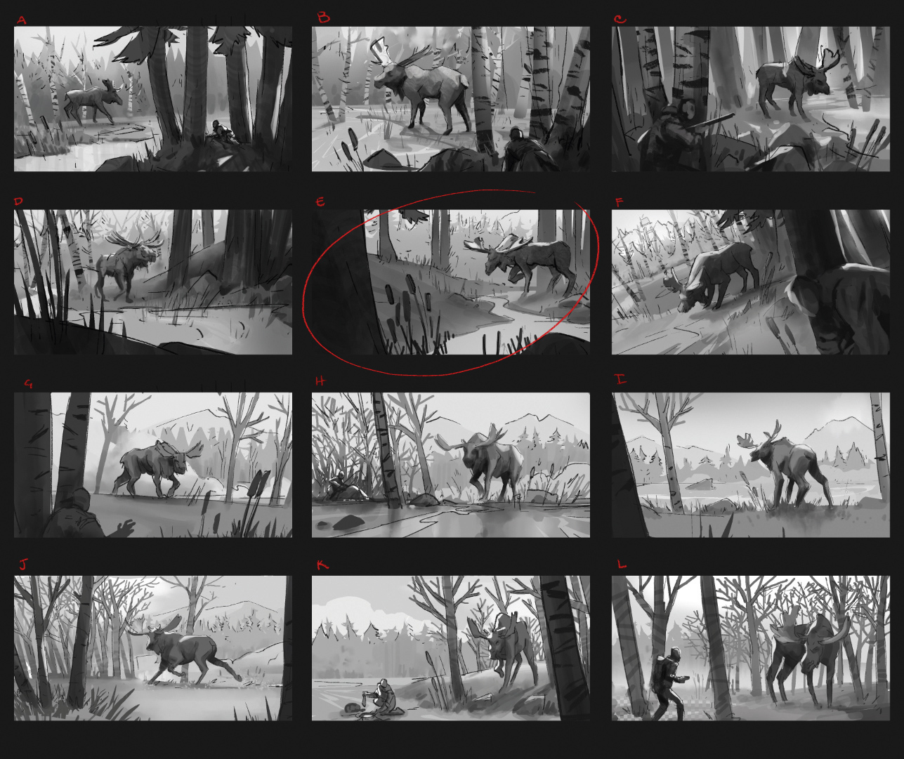
The task was to have the moose by water, near birch trees, and featuring cattails prominently, which they eat. There are many number of ways for staging these elements. I came up with 12 thumbnails to give myself options and generate ideas. I came up with both first- and third-person options, for the creative director and art director to look over.
Sign up to Creative Bloq's daily newsletter, which brings you the latest news and inspiration from the worlds of art, design and technology.
02. Solve as many problems as possible
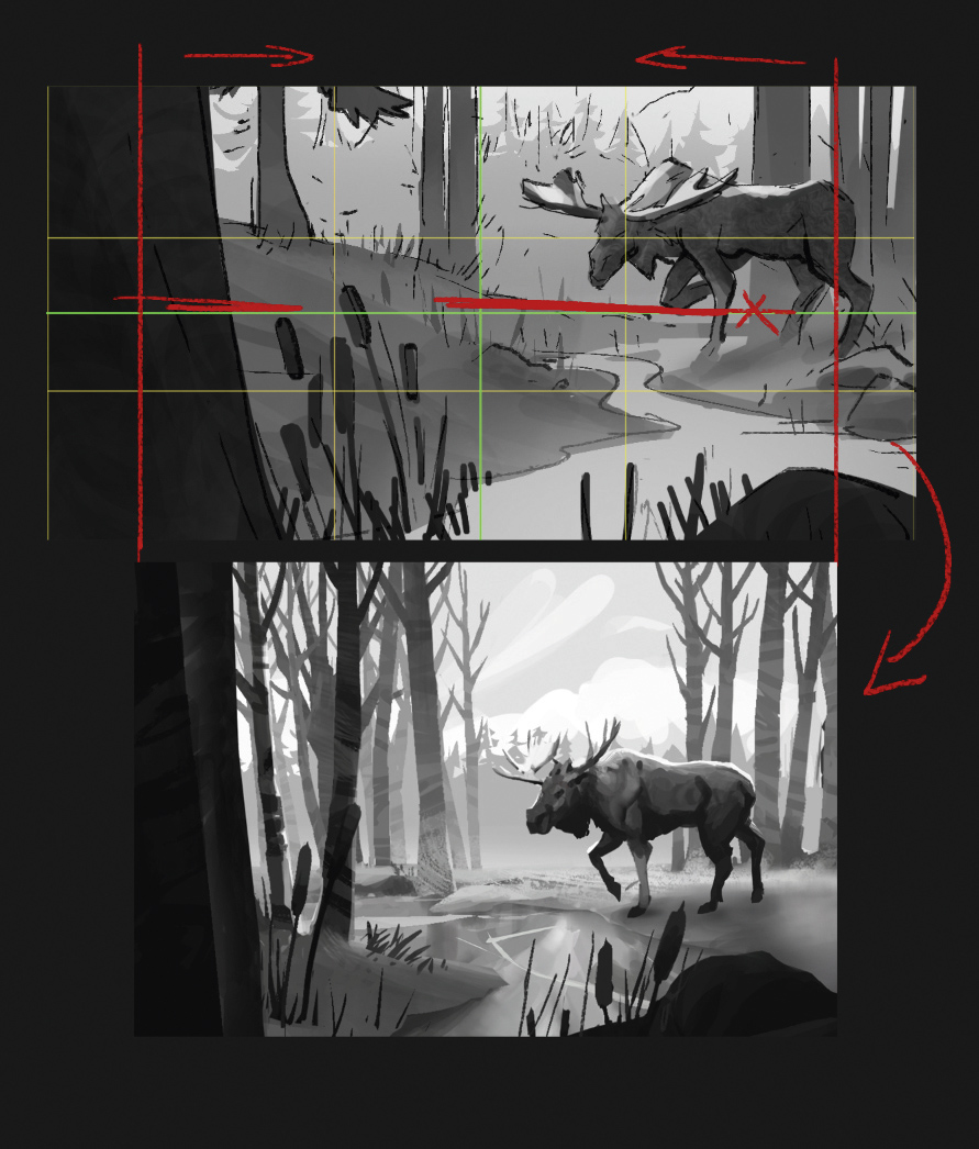
The chosen thumbnail shows strong fore and background elements, and a good sense of scale for the moose. I refine it, using a composition guide that identifies the centre of the image, and the Rule of Thirds.
However, the horizon line is at the centre of the frame, left and right are equally weighted, and the lower left cattails are distracting. So I lower the horizon to the bottom third, adjust the staging of the moose, and add the birch trees.
Pro secret: Composition checks
Use tools to figure out the centre and Rule of Thirds. These can help you stage a pleasant composition, and avoid silly and amateur mistakes, such as putting the horizon at the middle point of the frame.
03. Organise your sketch
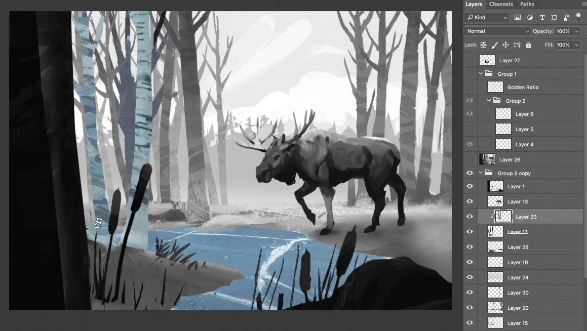
I spend time developing a well-composed sketch in Photoshop, and split it into the layers. This will help me use the sketch shapes in the final painting.
I also take some high-resolution screen grabs from the game and use these screenshots as reference, to both keep the work in the style of The Long Dark and as a base for texture. I use the shapes of the sketch as a clipping mask (right-click>Clipping Mask) for the brush strokes and textures.
04. Don’t be afraid to use the Transform tools
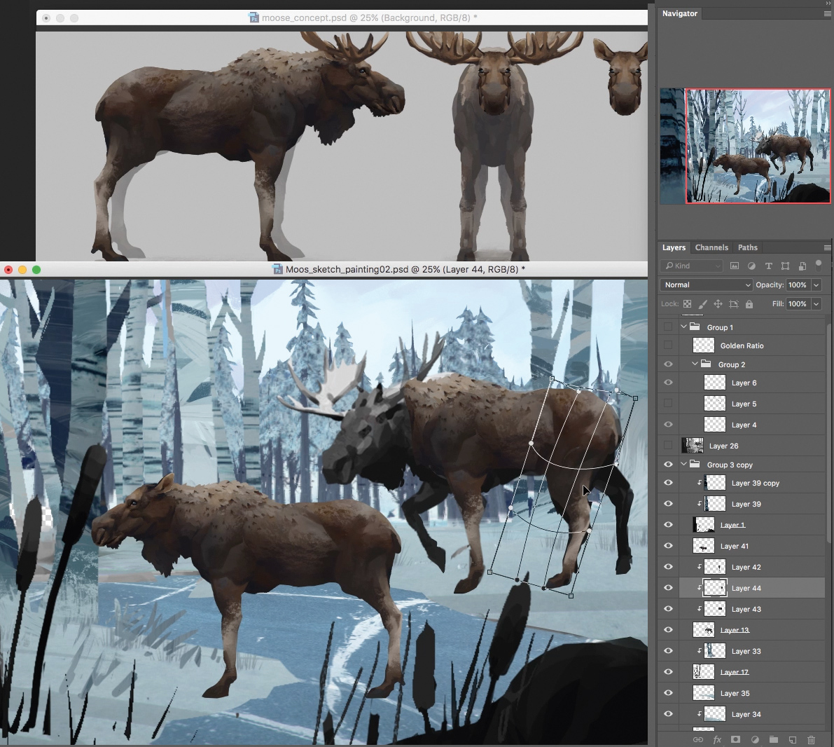
I continue to use the established shapes of the sketch as a clipping mask, starting with the moose. I concepted the original moose design for the game, so I use the established concept to help block in the shape of the animal.
I use the Free Transform and Warp tools (Cmd+T, right-click>Warp) as necessary to get it looking mostly correct, and paint over any leftover problems.
05. Enhance the focal point
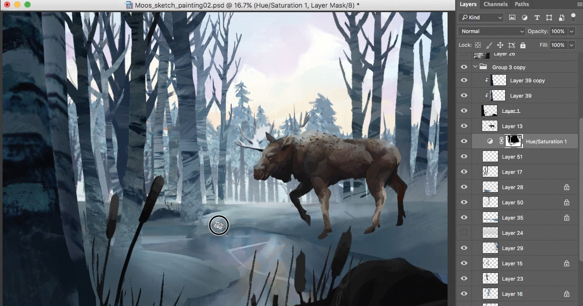
I use a Hue and Saturation layer to darken the foreground and the trees to help frame the head of the moose. I then use the clipping mask again and duplicate the Hue and Saturation layer a number of times. Making sure I keep my bigger shape layers separated, I clip them above each individual layer before I flatten them. Then I start painting branches with my brushes.
06. Mask with selection
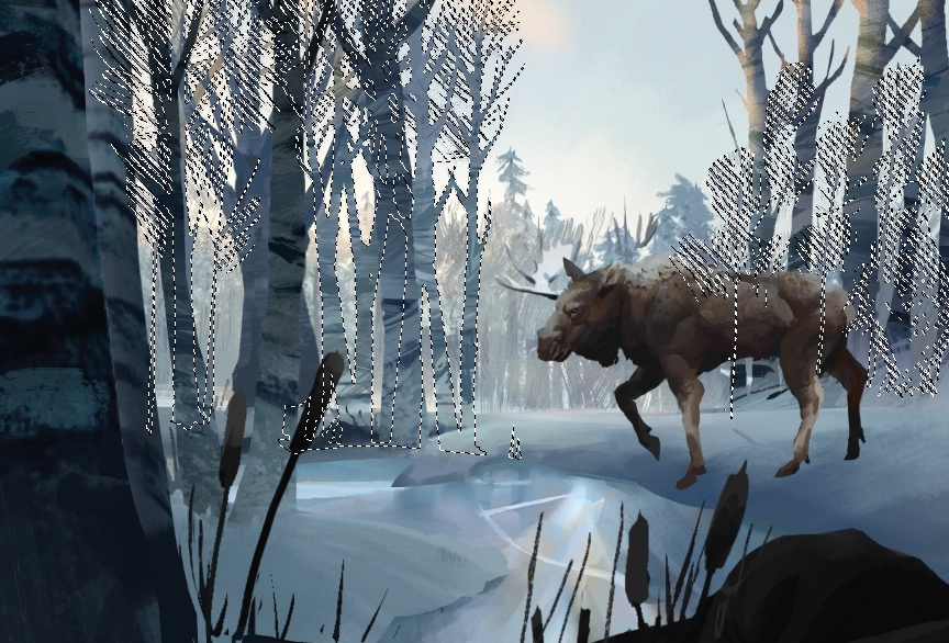
Another way I mask where I’m painting is by using my layers to create selections. I’ve painted in more branches and trees at this point. Now I want to start adding some light hitting the top of the trees. I create a selection mask (Cmd+Shift+click layers).
07. Reference the lighting
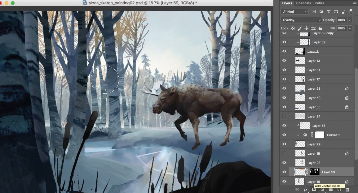
I then take the selection mask I made in the last step and turn it into a vector mask. I set the layer to Overlay and start adding some warmth of the setting sun to the top of the trees. With an idea for the palette, I spend a good amount of time getting reference and observing how the sun hits the top of the trees at sunset.
08. Lasso that selection
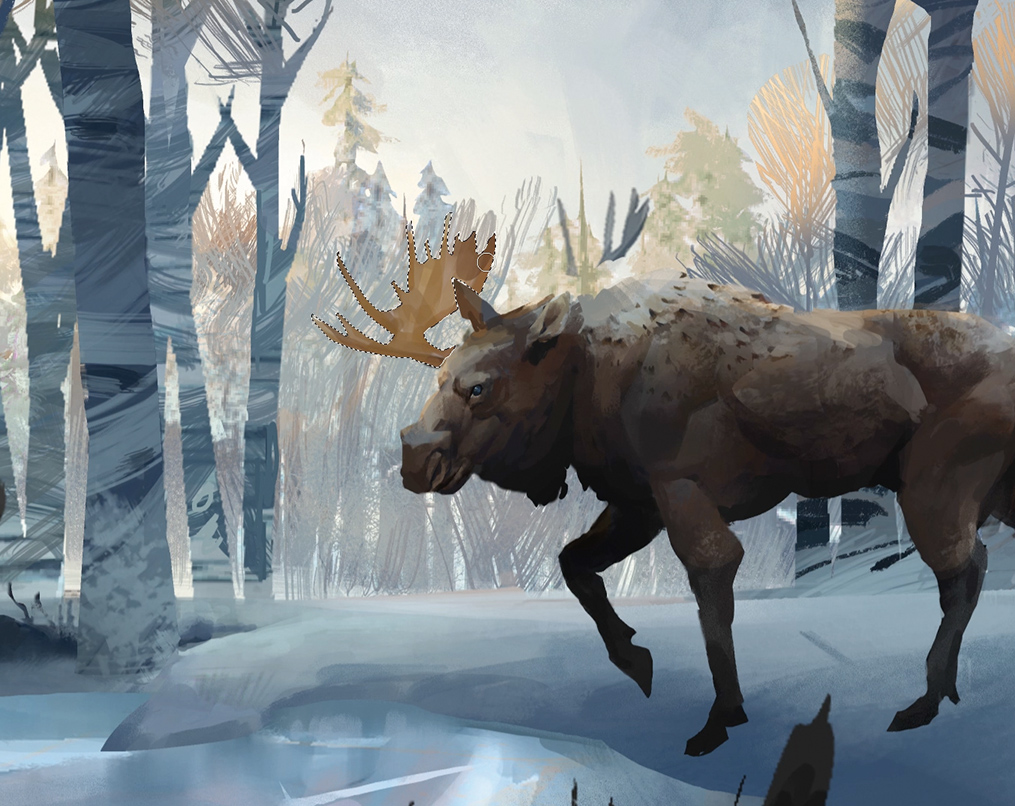
Now that I have an idea for the lighting, I turn my attention to the moose. I love using the Selection tool (L) to create strong shapes that I can fill with bold brush strokes. I trace over the sketch of the antlers with the Lasso tool, and use bold and long brush strokes to hint at a subtle texture of the antlers.
Pro secret: Lasso is my secret weapon
The Lasso Selection tool is one of my favourite Photoshop tools. I use it to draw shapes, and to combine organic round forms with sharp straight ones. Some shortcuts to keep in mind: L (Lasso tool); L+Cmd+lift stylus off tablet (get point-to-point straight lines); L+Shift (add to selection); and L+Alt (subtract from selection).
09. Bring on the texture brushes
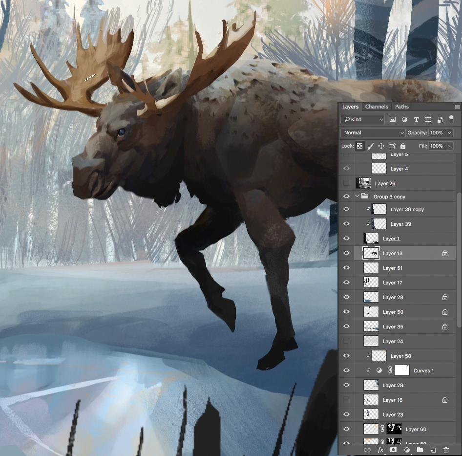
Once I’ve blocked in the antlers, I lock the transparency on the moose layer (click the checkered box at the top of the layer window). I now start defining the form of the antlers, and using textured brushes to give the image that subtle painting texture reminiscent of The Long Dark. I also have lots of reference of moose antlers to really understand their shape and how they catch light.
10. Refining the palette
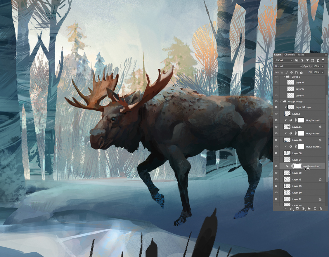
I realise that the image is quite muted. The colours need to be bolder, so I use a Hue and Saturation layer. I increase the Saturation slightly and adjust the Hue, too.
I then repeat the process in step 5. I duplicate the Hue and Saturation layer, making sure I keep my bigger shape layers separated. Finally, I clip the Hue and Saturation layers above each individual layer before flattening them.
11. Warmth of the sun
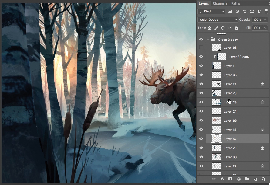
I start adding the warm glow of the sun poking through the trees on the left side of the image, using a Color Dodge layer. I put it behind some of the background tree layer, but not other trees in the foreground. I then add another Color Dodge layer and put it behind all of the trees to get that blown-out look of the sun.
12. Enhance the focal point
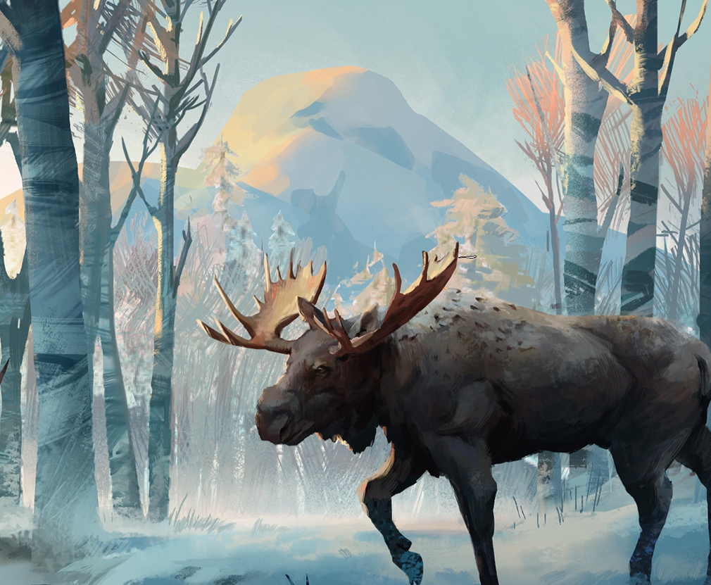
I start working in the area around the focal point of the painting, which is the head of the moose. I make sure that the beast’s eye looks correct. I also notice that the sky above the moose is introducing too much contrast to the area above the head. My solution is to block in a mountain with a simple Round brush.
Pro secret: Practise with your brushes
Texture Photoshop brushes can appear to be the secret sauce that makes a good painting. They are not. Like any tool, they require practice. I have two brushes that I use all the time. I like practising with them by doing studies of film stills, the work of Old Masters or photo studies. Without the need to invent the subject, it enables me to focus on technique.
13. Start to add detail
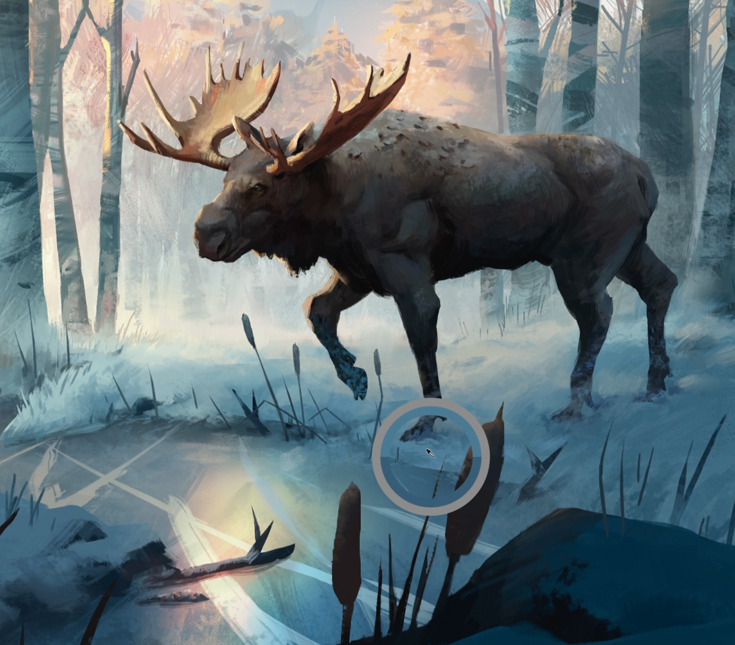
I receive some feedback to exaggerate the size of the antlers, so I increase their size. And them, being mindful not to doodle too much, I start adding details to the scene. If I use texture brushes then I make sure to let the texture do the heavy lifting. This may take several strokes to get right so I Cmd+Z a fair bit until I get the one brush stroke that’s perfect.
14. Finalising with fresh eyes
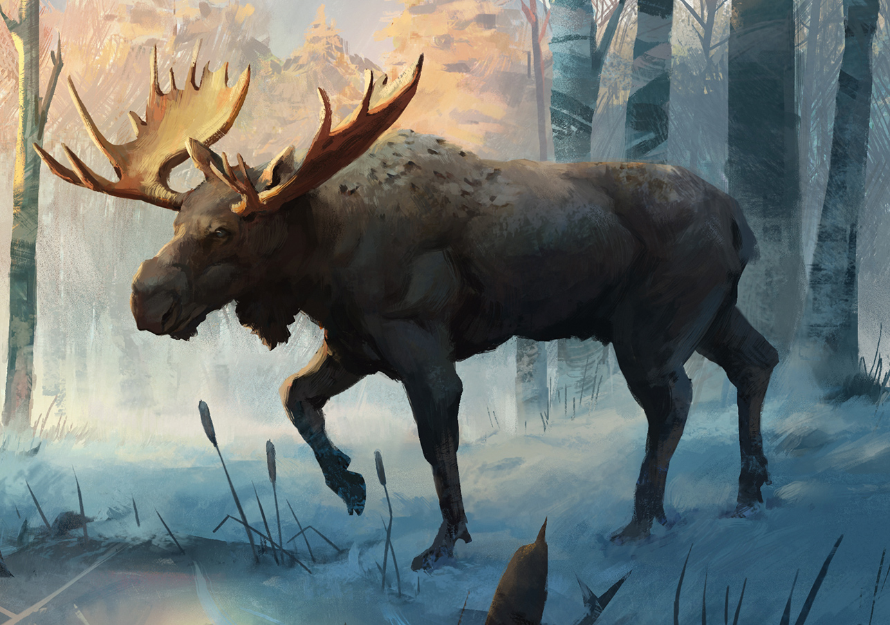
I spend some time away from the painting to see it with a fresh perspective and realise that further details are needed on the moose as the focal point. I also spend time loosening edges with painterly brush work, keeping in mind the style of The Long Dark the entire time. I then send the work to the creative director and art director to get the art approved. Once approved, the painting is complete!
This article was originally published in ImagineFX magazine issue 157. Buy it here.
Related articles:

ImagineFX is the No.1 selling digital art magazine for fantasy and sci-fi enthusiasts! Featuring digital and traditional drawing skills, game design, manga and film art each issue is crammed with training and inspiration from leading artists in their fields. Whether it's learning from comic art's Adam Hughes, fantasy art's John Howe, or digital painting's Loish, ImagineFX has you covered. ImagineFX has been inspiring artists for over 20 years!
