How to use stock photography creatively within your design work
We demonstrate how stock imagery can add the vital ingredient to help you create stunning designs.
Sign up to Creative Bloq's daily newsletter, which brings you the latest news and inspiration from the worlds of art, design and technology.
You are now subscribed
Your newsletter sign-up was successful
Want to add more newsletters?
Rather than being a last resort, stock imagery can and should form an essential part of your creative arsenal. From stock vector icons to textures and background imagery, there's a world of assets out there to get creative with.
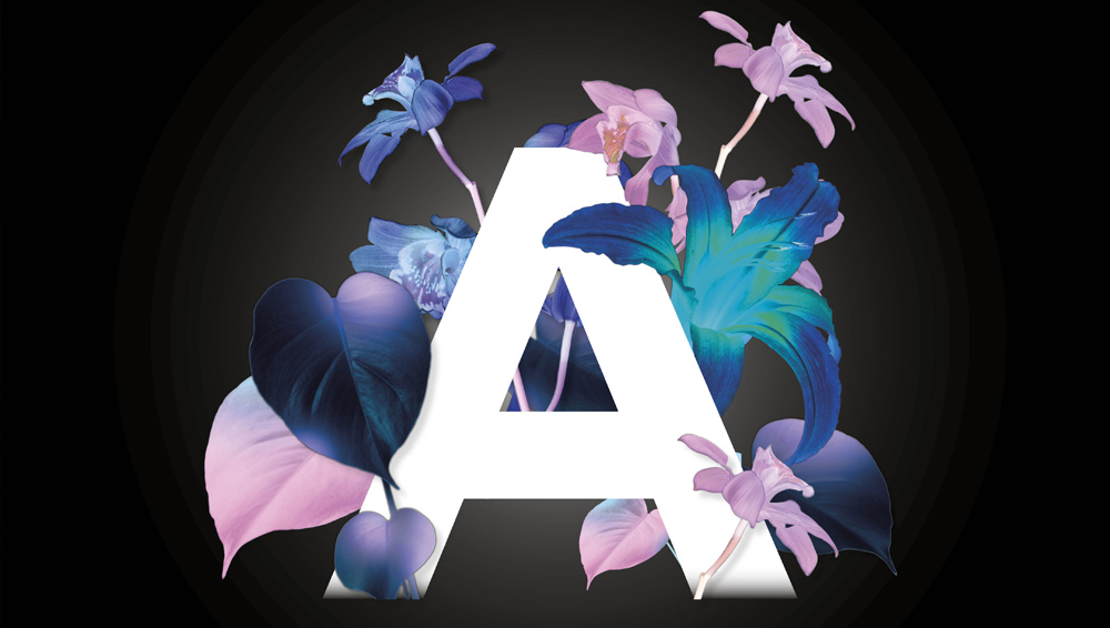
Through this short walkthrough I'll demonstrate how some floral imagery can be used to create a striking typographic illustrated poster using Photoshop and InDesign.
With a little creative thinking, stock imagery can be used in surprising and inspiring ways, so start thinking outside of the box and get creative with stock!
Article continues below01. Source the right stock images
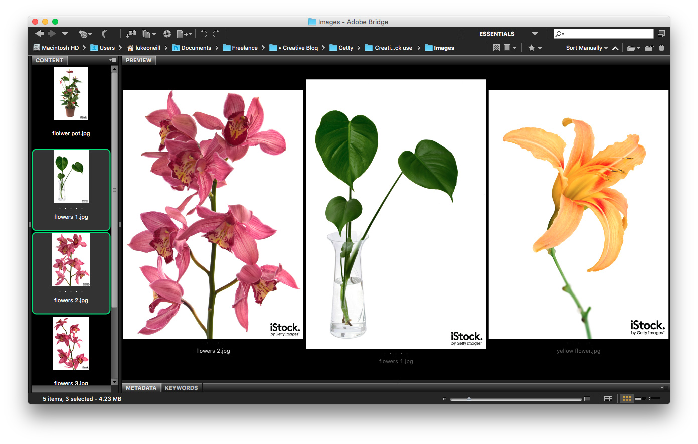
Start scouring a library like iStock for suitable imagery that will work within your design. For this typographic illustration, we’re looking for opportunities to wrap elements around the type, so isolated leaves and flowers will work best. Also think about the kind of imagery you choose. We want stylised and exotic, not Grandma's flower arrangement.
02. Mask off the flowers and foliage
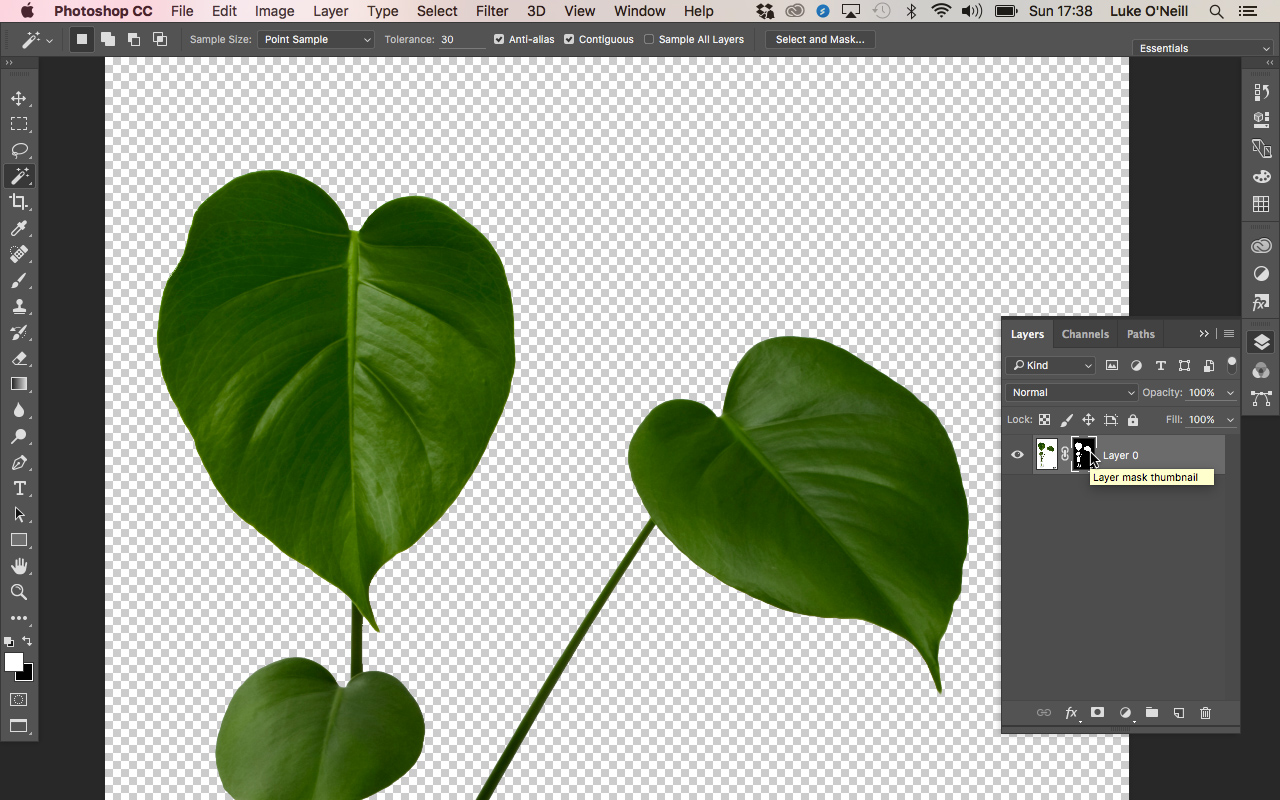
Now to Photoshop. We’ll start by masking off the flowers from the background so that we can wrap them around our typography later. As we’ve chosen high contrast images on white backgrounds, this job is made a lot easier.
Use the magic wand tool at a tolerance of 30 to select all of the white areas surrounding the flowers, holding shift to add to the selection. Once you're happy, hit shift+cmd+I to invert the selection and then hit the layer mask button in the layers panel.
If there are any small untidy areas left then simply use the pen tool to make selections and with the layer mask selected, paint black onto the selection to add to the layer mask. Repeat this process for all the images.
Sign up to Creative Bloq's daily newsletter, which brings you the latest news and inspiration from the worlds of art, design and technology.
To refine the mask, double-click on the layer mask icon to bring up refinements panel, where you can smooth, shift and feather the edges of your selection.
03. Invert and adjust colours
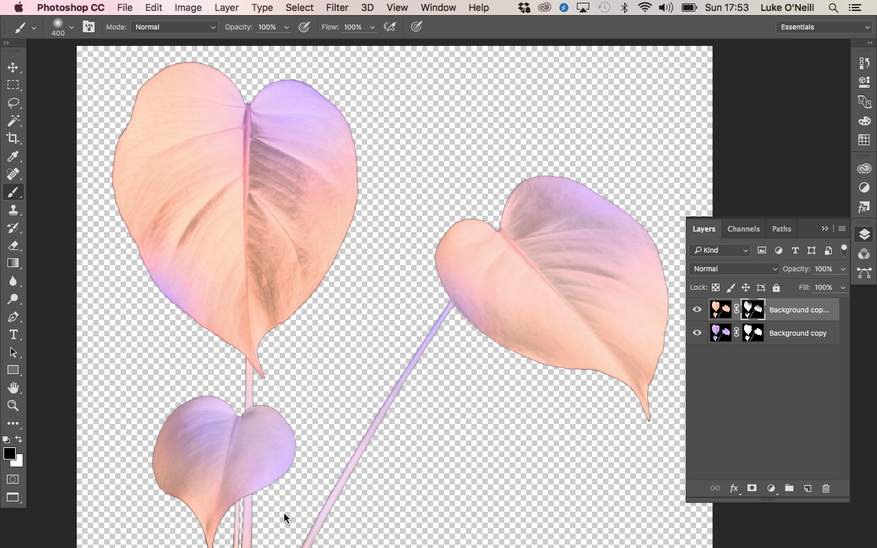
Select the image thumbnail in the layers panel and hit cmd+I to invert the colours. Now duplicate the layer and adjust the colours in the adjustments (adjust Hue and Saturation).
Now select the layer mask again and with a large soft black brush, brush away at the top layer layer mask to create interesting combinations of both the colour schemes. Repeat this process for all of your images varying the colour schemes.
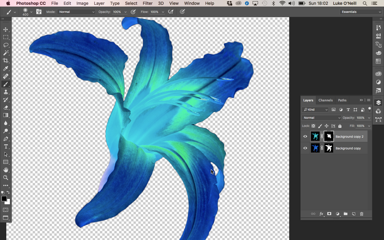
04. Create the typography
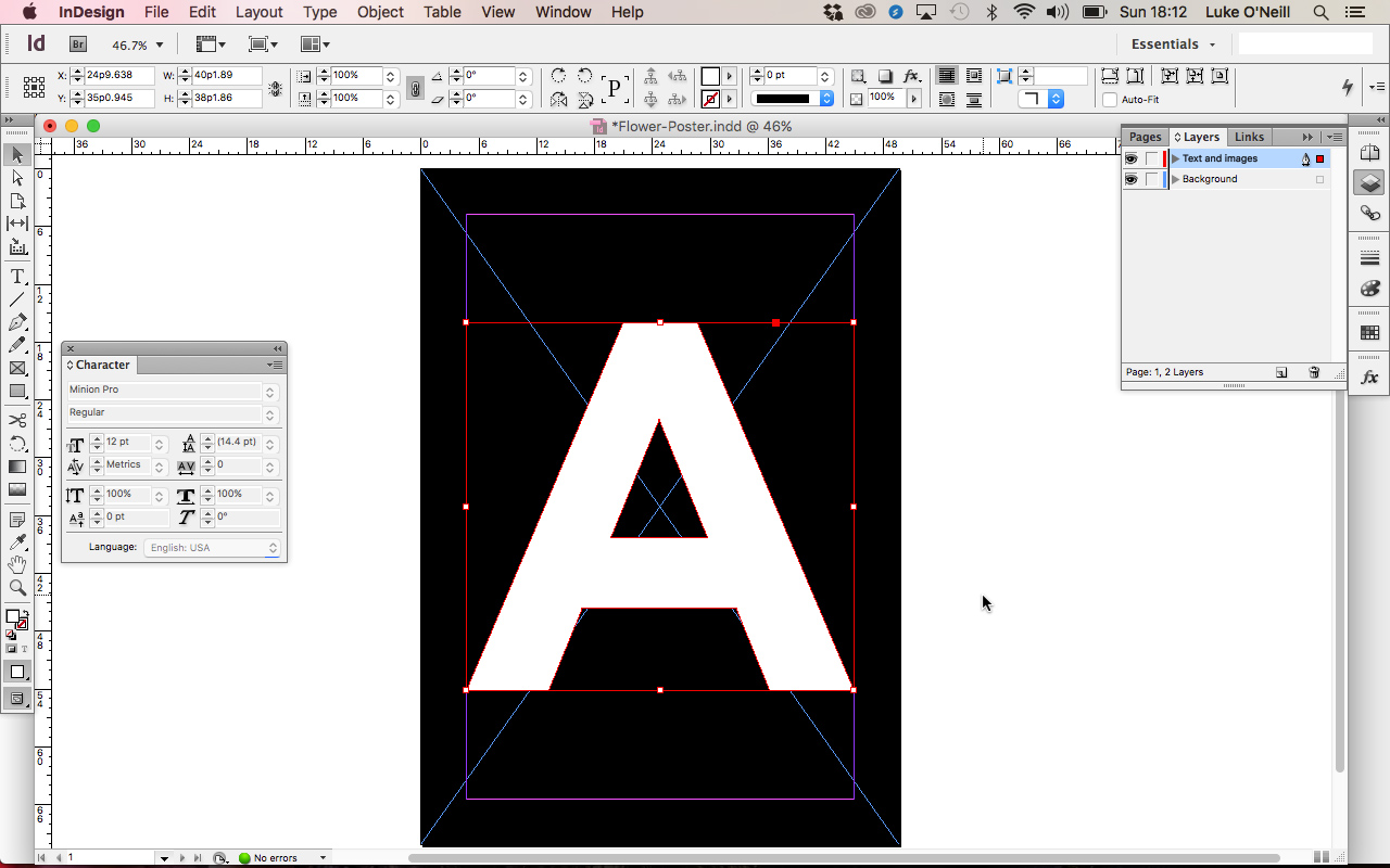
Now move over to InDesign, setup a new document and using the type tool, create your central typography. In this case I've chosen a single letter so as not to overcomplicate things but you may wish to try whole words if you're feeling confident.
The reason we’re using InDesign at this stage is so that the typography remains vector and crisp rather than being treated as an image as it would be in Photoshop.
Outline the typography by navigating to type: create outlines so that the character will act as a vector graphic rather than live type.
05. Image comps
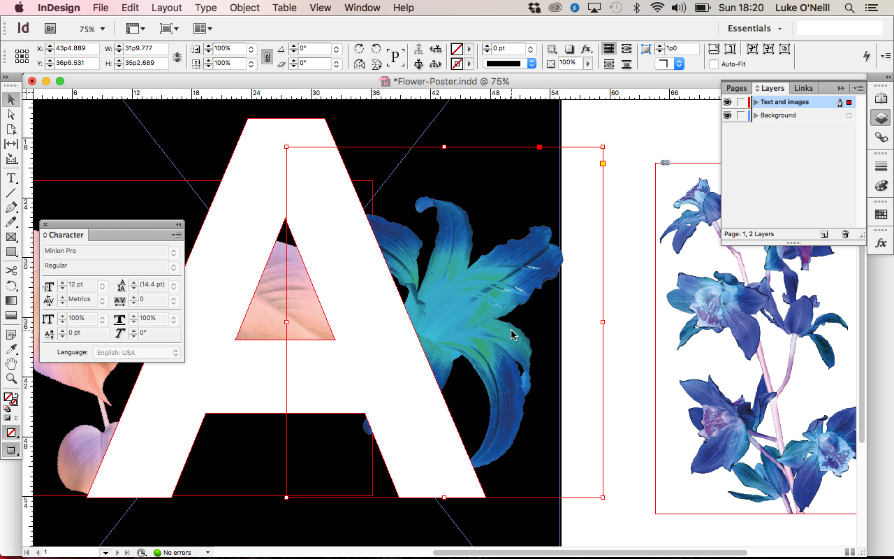
Now for the fun to begin. Start placing our cutout flowers into the InDesign doc using cmd+D. Set the images to multiply in the effects panel so that you’re able to see how they’ll all work together and overlap. Aim to have areas where stems and leaves will intertwine around the character.
06. Step and repeat.
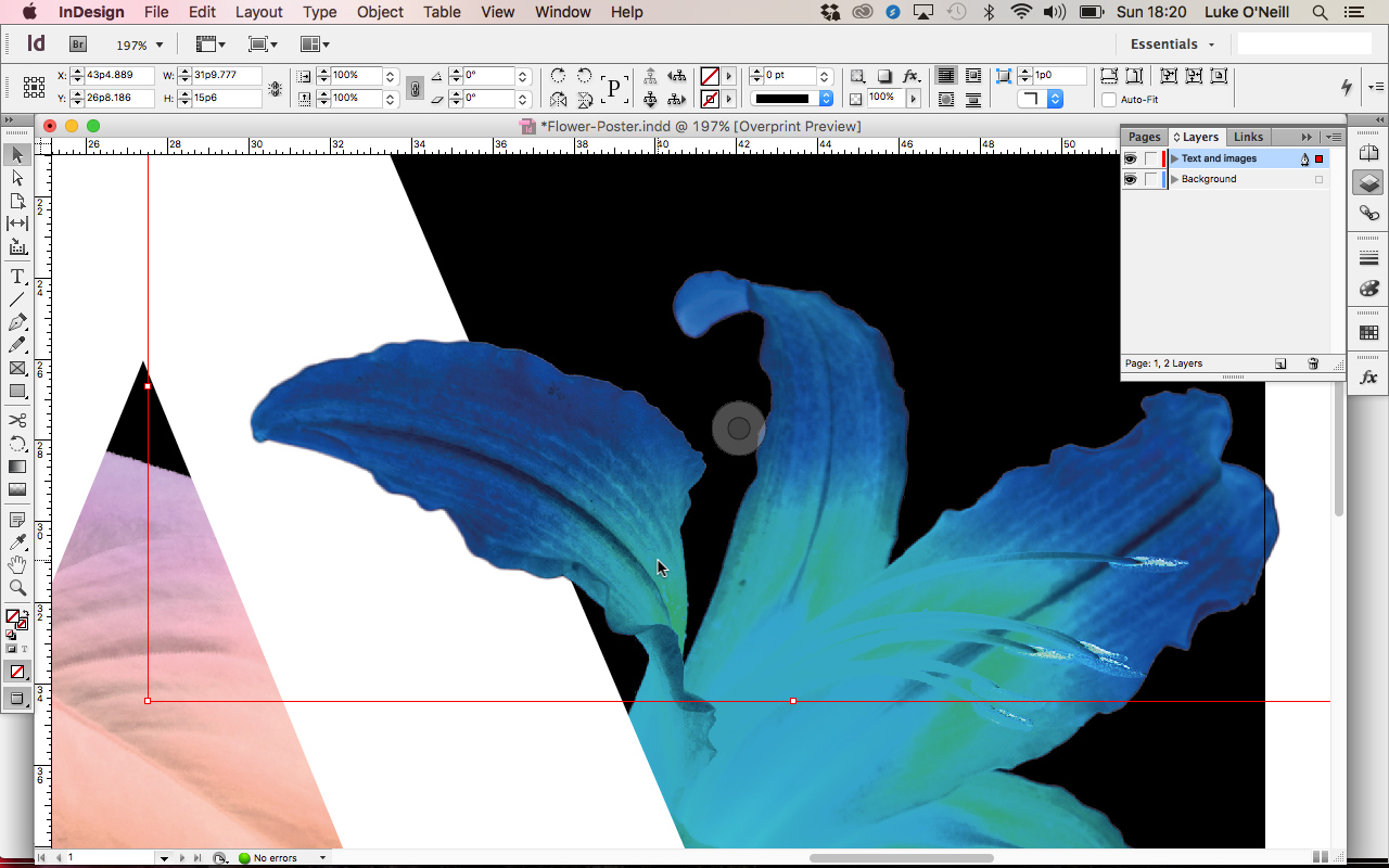
Once you’re happy with how the images will integrate with the typography, set the blending mode back to normal and send all the images to the back of the layer using shift+cmd+(.
Now select your first image and use the step and repeat cmd to duplicate it on the spot. This will bring the image to the foreground and enable you to adjust the image frame so that the overlaps only occur where you want them to. Repeat this for all the images. With some of the images you may need to cut into the image frames by using the pen tool and the subtract cmd from the Pathfinder panel.
Finally, add any final details such as a gradient and shadow on the main character and shadows where the elements overlap.
Note: This stage could also be completed in Photoshop by setting up new document, comping in the layer masked flowers and foliage, and then simply brushing away at the layer masks of the individual layers where you wish there to be overlaps.
Luke is a creative director, visual designer and digital artist, who works at THG Studios in Manchester as creative director of beauty. He previously worked for Future Publishing, where he was art editor of leading magazines such as Guitarist, T3 and Computer Arts.
