Illustrating a book cover in Painter and Photoshop: 13 top tips
Discover how artist Todd Lockwood developed this book cover from concept to a polished piece of art.
Sign up to Creative Bloq's daily newsletter, which brings you the latest news and inspiration from the worlds of art, design and technology.
You are now subscribed
Your newsletter sign-up was successful
Want to add more newsletters?
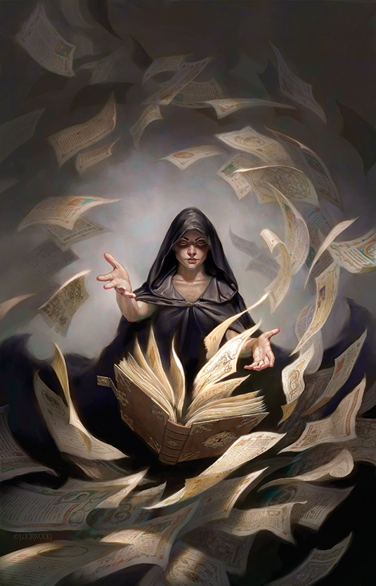
The truth is, I have no set way of working. What I do can be at odds with what I teach when it comes to how to draw. The final image is always in the forefront of my mind however, and the image always begins with the narrative. In this case the client has a solid idea of what he wants to see.
The book's title is Unbound, from Grim Oak Press, a collection of short stories with no overall theme. The simple idea is that a wizard causes the pages of a book to become literally unbound.
As I begin the task, the thumbnail is only in my head. I've broken rule number one. However, I know that I want a formal composition, with the figure facing the viewer and the book – which should look like a magic tome – hovering magically front and centre. With such a straightforward approach, it'll be more about the energy and the details.
Article continues belowThe magician will attract the eye first, so I intend to put as much emphasis on the book as I can. The star of this painting is the thing that's happening, so the tome is important. By keeping these two prominent elements close together, I enhance that narrative.
I want this piece to look like it was done in watercolours, so I stick primarily with Painter's Digital Water set of brushes. They require a little more planning to take best advantage of their special qualities. By adjusting certain settings, and then working methodically, they capture the essence of wet-into-wet and the softness of watercolour paper. Parameters set, I begin...
01. Beginning sketch
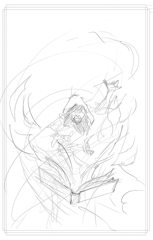
With my thumbnail in my head, I start sketching. I begin with the energy: loose swirling lines that more or less describe the paths of the pages or the flow of the character and his garments. Then I lay elements in along those lines.
02. Proof of concept
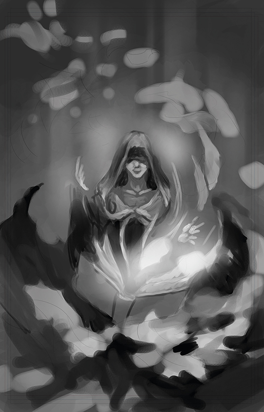
In relatively little time, I decide that I don't want the character to be a male wizard but rather a female sorceress, which gives a softer impression. I don't want this piece to look violent, but contemplative. Achieving the right mood and light will be as important as the movement in the scene. Composition is going to be key.
Sign up to Creative Bloq's daily newsletter, which brings you the latest news and inspiration from the worlds of art, design and technology.
03. Reference is important
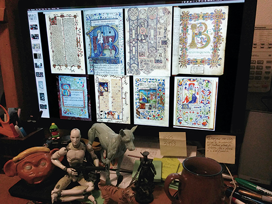
I photograph my assistant Stacie Pitt for the sorceress, under appropriate lighting. Then I gather what I call 'swipe' from all over the internet to get a feel for flying paper, swirling fabric and old, cabalistic texts. I arrange the best on my left monitor, take a screen snap, then stack those snaps for quick visibility.
04. The drawing begins
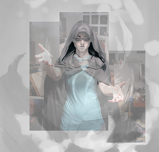
With my proof of concept sketch and my Stacie Frankenstein on their own layers, ghosted back to serve as guidelines, I begin my drawing. The client is after a specific look, so I use images from the internet to alter Stacie's features to my needs. Sorry, Stacie!
05. Depicting flow and movement
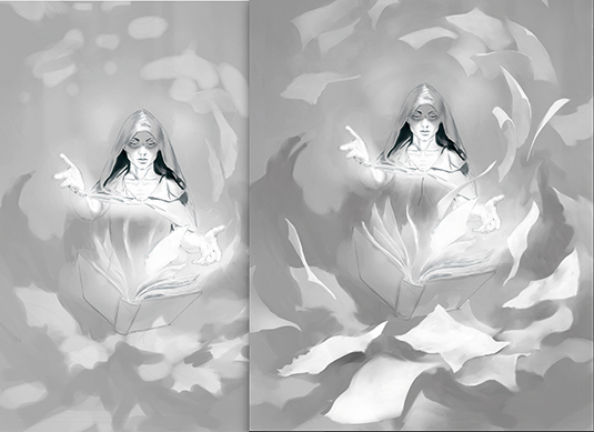
Satisfied with the figure and the placement of the tome, I begin the most exacting part of this painting: working out the flow and movement of all the flying pages. I keep my tones light, because I want to preserve the texture of the digital paper for the next stages.
06. Painted into a corner
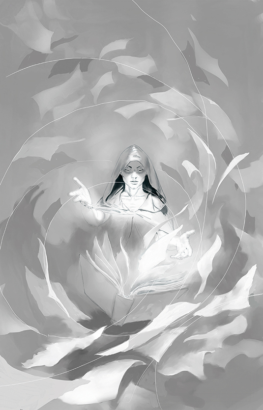
The painting looks flat and lifeless to me. I realise that I've lost my movement as I worked on my paper shapes. To resolve this, I create some new lines of movement to build on. They'll become the prominent edges of sheets, the centre lines of moving masses, or the flow of fabric.
07. Refining elements of the image
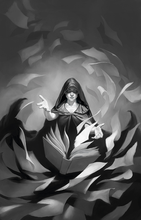
I work out the flow and movement, designing the composition to highlight the star. I want the most contrast to be within the focal point: contrast not just of value, but also of texture, light, colour, motion, detail, focus, angle... indeed, anything that separates it from the rest of the painting and makes it stand forward. I concentrate on making sure that I maintain the overall texture of watercolour paper.
08. The colour underpainting
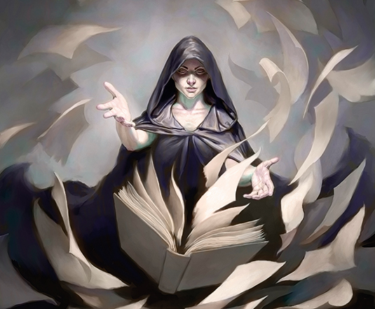
Using a combination of Color Balance, the Gradation and/or Bucket tool set in Color mode (in Photoshop), I apply warm tones to the centre of the painting and cooler tones to the borders, then pick out some specific areas for spot colours, such as cool flesh shadows and pink nose or lips with a brush that's also set in Color Mode.
09. Washing in tone
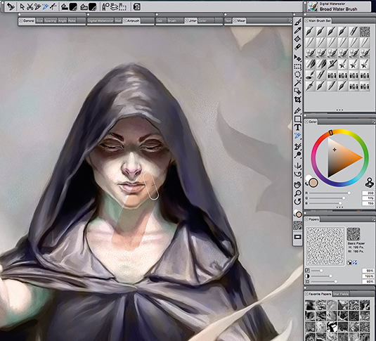
I was inspired by the art of Eric Fortune to build this piece slowly and carefully, using washes of colour in Digital Water that preserve the paper texture and exploit the strengths of this particularly wonderful brush set in Painter to create wet margins and soft transitions.
10. Introducing details
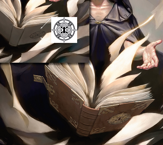
I begin with the details of the tome, using artwork that Stacie created for the interior of Unbound (you can see her art at www.staciepitt.com). Her lock medallion is the perfect centrepiece for the front cover. I warp it into the proper perspective in Photoshop and drop it down where I can paint over it, then create corner guards and a hasp in a similar style.
11. Tackle the contents of each page
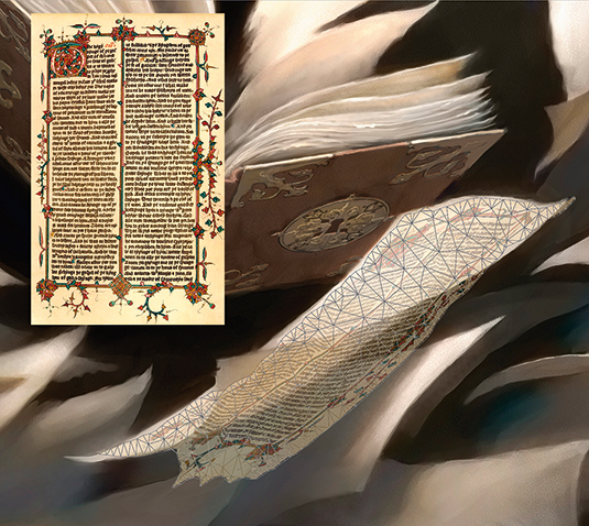
Now I start decorating the many flying pages. At first I use copyright-free images from ancient books, employing Puppet Warp in Photoshop. It works, but it's tedious and awkward. I give up on it after a few pages – I scarcely had enough swipe for every page in any case.
12. Going old school
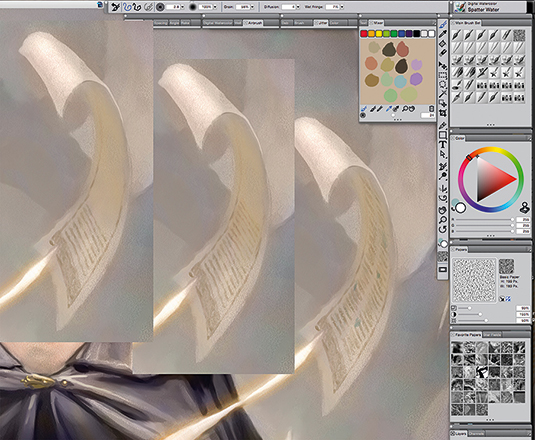
If digital paint can be 'old school', that is! I decide to paint the pages by hand. The challenge is to find simple ways to greek in the text and images without getting bogged down in minutia. The Digital Water serves me well, using a combination of the Round Water Blender and the Spatter brush.
13. Into the final stages
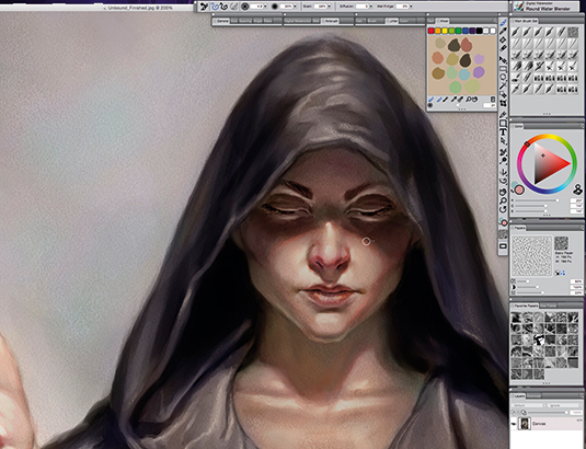
I balance my values, shading the sorceress down so that the pages leaving the book are the brightest thing, fine tune my shadow edges and add warmth to the transitions between light and shadow. And that's my artwork finished.
This article was originally published in ImagineFX magazine issue 130.
