What happens when famous logos swap colour palettes
Watch famous logos take on new meanings as they switch colour palettes.

Sign up to Creative Bloq's daily newsletter, which brings you the latest news and inspiration from the worlds of art, design and technology.
You are now subscribed
Your newsletter sign-up was successful
Want to add more newsletters?
Choosing the right colour palette is a fundamental part of creating an eye-catching brand that people want to interact with. Get your colours right and you've got a brand that will last for years and boost your business. Get it wrong and... well, you'll be hiring another graphic designer sooner than you think.
When it comes to deciding which colours will work for your brand, you'll need a solid grasp of the theory of colour. With this knowledge, you'll be able to determine which colours are suited to your sector and what the different hues imply.
It's all too easy to brush off colour theory as a pseudoscience, but the team at Printsome set out to prove just how important it is to pick the right colour scheme for your business.
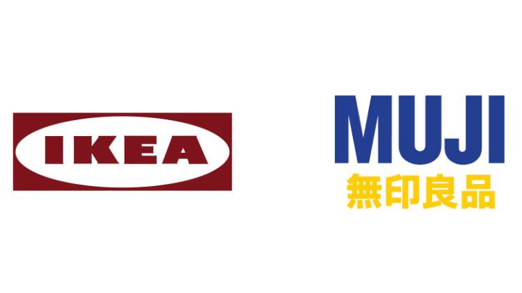
Article continues belowAs part of a series in collaboration with graphic designer Natasja Van Dinther, Printsome swapped the colours of famous logos to create strange and unsettling alternatives.

Take Airbnb and Booking.com. They're similar companies, but with branding colours at opposite ends of the spectrum. Swap them around and Airbnb starts to look like some Silicon Valley startup, while Booking.com's web address name is at odds with the warm Rausch pink of its competitor.

Printsome has described the colour swap between Marvel and DC as the least dramatic switch, but we're sure that fiercely loyal fans of each publication will disagree. Marvel seems to lose its dramatic impact with a blue logo, while DC's chunky typography looks over the top with a red palette.

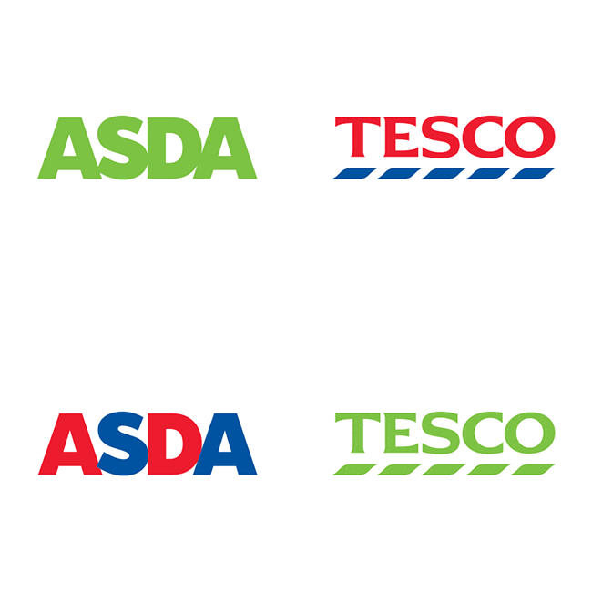
Asda and Tescos might run similar operations, but their mission statements have resulted in contrasting logo colours. Asda's focus on freshness has lead to a refreshing green logo, whereas Tesco has an emphasis on helping people, which resulted in a palette more reminiscent of an airline or a bank.
Sign up to Creative Bloq's daily newsletter, which brings you the latest news and inspiration from the worlds of art, design and technology.
Changing them round simply doesn't work because the typography and graphics have been tailored towards each supermarket's goal.

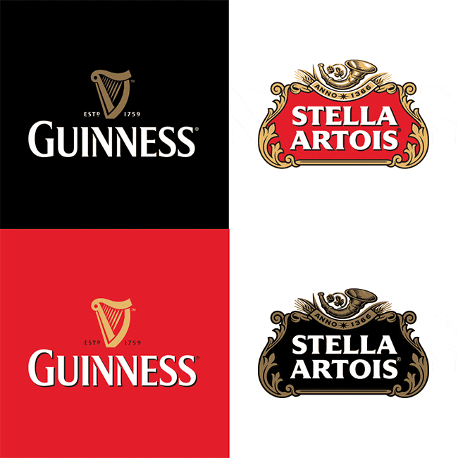
Colours have a huge impact on how customers perceive taste. By switching the colours of Guinness and Stella Artois around, we expect different flavours from the brands.
The heavy taste of Guinness suits the uncompromising black colour scheme, but with a red background the beer comes across as having a lighter flavour. Stella Artois doesn't look too bad with a black finish, but it doesn't reflect the drink's piquancy.
Related articles:

Dom Carter is a freelance writer who specialises in art and design. Formerly a staff writer for Creative Bloq, his work has also appeared on Creative Boom and in the pages of ImagineFX, Computer Arts, 3D World, and .net. He has been a D&AD New Blood judge, and has a particular interest in picture books.
