Then and now: The evolution of 3 iconic logos
These famous logos have all changed radically over the years.
Sign up to Creative Bloq's daily newsletter, which brings you the latest news and inspiration from the worlds of art, design and technology.
You are now subscribed
Your newsletter sign-up was successful
Want to add more newsletters?
Very occasionally, a branding genius nails an iconic, timeless mark first time – and it just needs the occasional polish. Other times, a once shiny, on-trend brand fades and dulls with time, and is left to wither before more progressive rivals.
If your brand falls into the former category, you're lucky – make it count. If it's the latter, you're lazy – sort it out. More often than not, iconic brands and the world's best logos evolve over time. They aren't born fully formed, but must go through stages of refinement.
In the case of many household-name brands, that process took decades. The changes in between rebrands can be subtle, or they can be so dramatic that the earliest iterations are almost unrecognisable to modern-day consumers.
Article continues belowRead on to discover three stories of well-known logos that have been on a long journey to reach the form we know today...
01. IBM
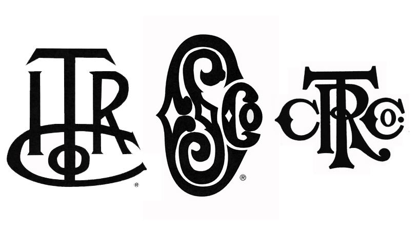
Okay, so it may be a bit of a cheat to include a company that's changed its name, as the logo will inevitably be unrecognisable. But the journey from International Time Recording Company to International Business Machines, better known as IBM, is a fascinating one nonetheless.
Back in 1888, ITRCo was encapsulated in a rather clumsy and confusing five-character monogram. By comparison, the 1891 monogram logo for the Computing Scale Company was beautifully decorative, albeit fairly illegible.
In 1911, the even more catchily named Computing-Tabulating-Recording-Company – a fusion of the two – found a middle ground between its predecessors' logos, locking four letters together in another monogram, complete with ornate serifs.
Sign up to Creative Bloq's daily newsletter, which brings you the latest news and inspiration from the worlds of art, design and technology.
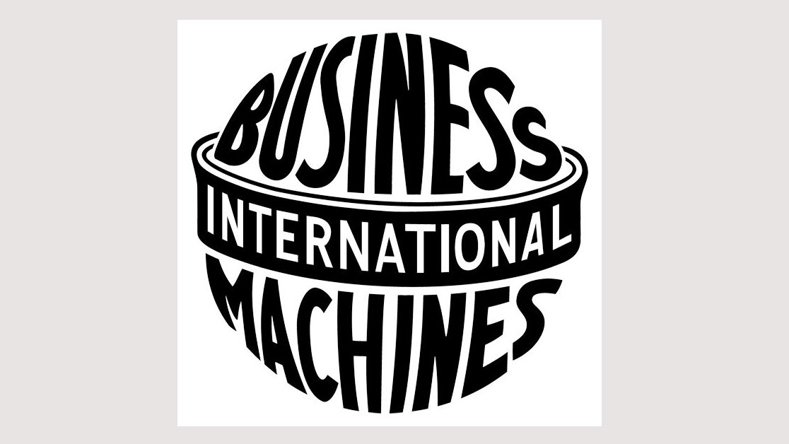
It wasn't until 1924 that the name IBM finally came along. For the first and only time in the brand's history, the logo design spelled out the name – wrapped boldly and futuristically around a globe shape – rather than settling for an acronym.
Those famous three letters made their appearance in 1947, set in a chunky, outlined slab serif typeface. Eight years later, in 1956, the legendary Paul Rand refined the letterforms – adding distinctive details such as exaggerated, even more chunky slab serifs, square counters within the 'B', and a razor-sharp spike on the 'M'.

Rand improved on his own work in 1967, defining the shape of the logo using 13 equally sized, equally spaced blue horizontal bars. He refined this further in 1972, to just eight bars. In the early days of computers when a logo had to be crudely rendered on a low-resolution screen, it was a stroke of genius to turn such a restriction into a strength.
02. Pepsi
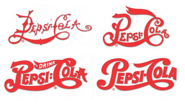
Until the 1960s, Pepsi had a script-style logo not unlike that of its arch-rival, Coca-Cola. Its original, spindly 1898 mark – which joined the 'P' of Pepsi with the 'C' of 'Cola' with a swoosh-like flourish – was further developed in 1905 to smooth out the letterforms, scale up the capitals for emphasis, and add a fluttering banner to the 'C'.
Arguably it was all flourish and no substance, as the brand name was barely discernible – the smaller letters dwarfed by the flamboyant 'P' and 'C'. Evidently Pepsi thought so, as just one year later, in 1906, the logo was reworked again – fattening up the letterforms, refining the overall shape and making the whole mark tighter, as well as setting the word 'drink' inside the banner.
This iteration had a respectable lifespan until 1940, when a neater, pared-back version was introduced. It kept a few flairs and flourishes – including the distinctive loop on the 'C' – but ultimately felt much bolder and more confident.
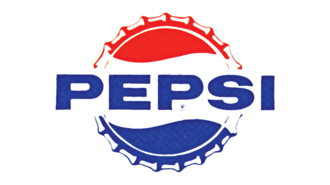
Perhaps to detach itself from its rival's distinctive Spencerian script, swooshes and fondness for red, Pepsi ditched its script logo (and the 'Cola' part of its name) in 1962 in favour of modern, all-caps sans serif type. It was set over a stylised red, white and blue bottle cap, a device first introduced in 1950 alongside its script logo.
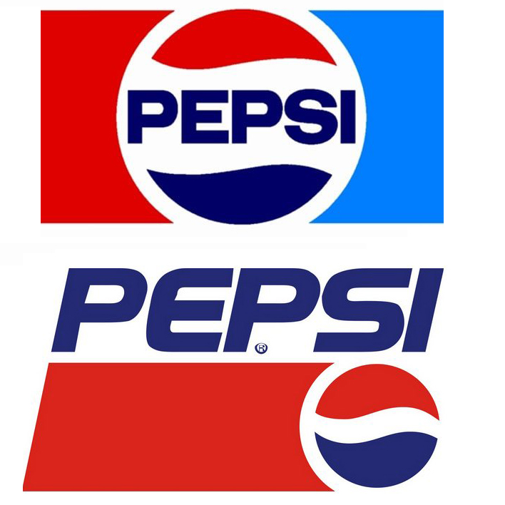
Wavy red, white and blue stripes within a circle have helped define Pepsi ever since, despite many other changes to its logo. The simplified, flat-colour mark introduced in 1973 stayed put for almost 20 years until 1991, when for the first time, the brand name was pulled out, leaving the circle as a standalone symbol.

After two more cosmetic overhauls, with an increasing number of graphic effects added, Pepsi pared things back once again with its widely criticised 2008 rebrand. Both the circle and the thin, lowercase type have a certain distorted wobble about them, but that's the only similarity to the logo's spindly 19th century origins.
03. AT&T
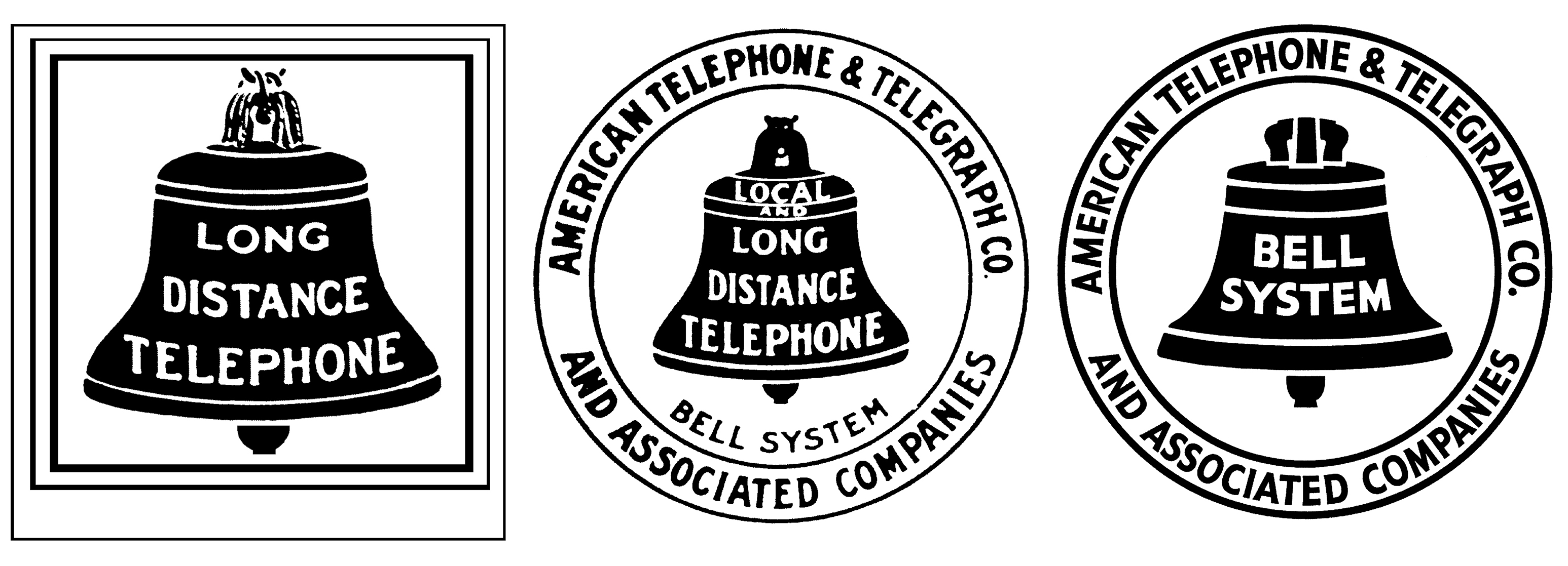
Back in 1889, the company we now know as AT&T – Bell Telephone Company – was represented simply with a bell in a box, a nod to the company's founder Alexander Graham Bell as well as the device he created in 1876.
A little over a decade after Bell's game-changing invention, the bold claim 'long distance telephone' inside the black bell would no-doubt have been enough to get the general public excited – no company name required.
'American Telephone and Telegraph Co and Associated Companies' was added in all its glory in 1900. There was an additional claim, too – now, the bell announced both local and long-distance telephones, with Bell System beneath for good measure. To say the 1900 iteration of AT&T's logo was wordy is an understatement.
By 1921, the novelty value of offering both local and long-distance calls had probably worn off, and Bell System instead took pride of place on the distinctive bell, which had remained largely unchanged as a symbol for over 30 years.
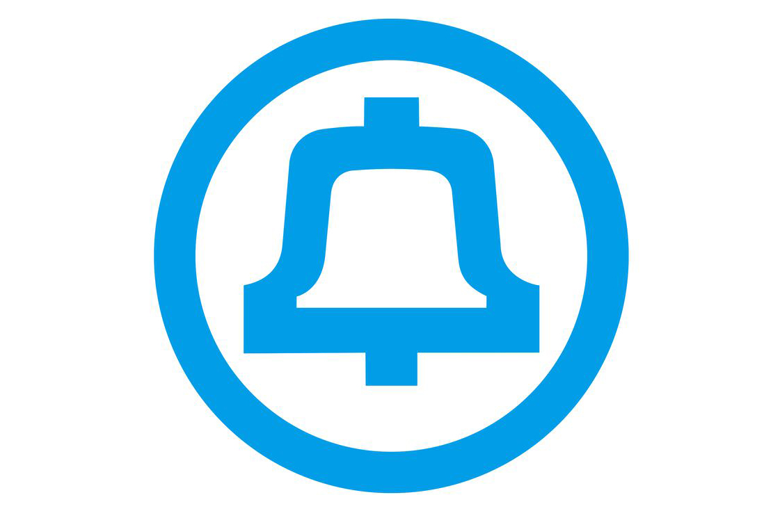
In 1969 – thanks to the magic touch of another legendary brand designer, Saul Bass, the bell was given a stylised, modern look, and the now-distinctive cyan blue was first introduced to the brand. But a bell it remained.
In 1983, however, the bell – a symbol of AT&T in one form or another for almost a century at that point – was replaced by a striped globe.
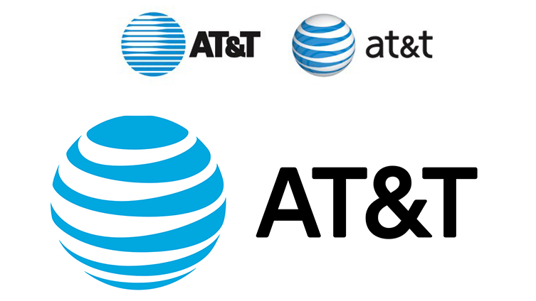
The USA, as the birthplace of AT&T, is subtly indicated in the fluctuating pattern of the lines on the globe, although the resulting mark was also nicknamed the Death Star by employees. Several more iterations later, we have the modern-day logo – reworked by Interbrand in 2016. Without bells on.
Read more:

Nick has worked with world-class agencies including Wolff Olins, Taxi Studio and Vault49 on brand storytelling, tone of voice and verbal strategy for global brands such as Virgin, TikTok, and Bite Back 2030. Nick launched the Brand Impact Awards in 2013 while editor of Computer Arts, and remains chair of judges. He's written for Creative Bloq on design and branding matters since the site's launch.
