The WWE unveils its new logo
Sign up to Creative Bloq's daily newsletter, which brings you the latest news and inspiration from the worlds of art, design and technology.
You are now subscribed
Your newsletter sign-up was successful
Want to add more newsletters?
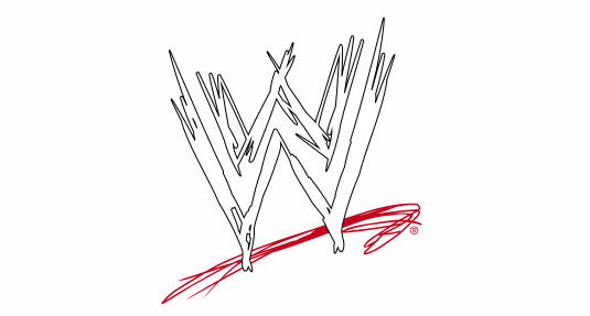
Those of us who grew up marvelling at the antics of 'Stone Cold' Steve Austin and The Rock may still call it WWF, and fondly remember the old 'scratch' logo shown below.

But in 2002 the organisation previously known as the WorldWide Wrestling Federation had to change its name due to a lawsuit with World Wildlife Fund. It was then that the company got rid of the 'F' on the scratch logo and rebranded itself as World Wrestling Entertainment:

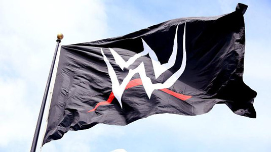
Now, however, the time has come to update it, with the company unveiling a new logo to mark the WWE network going worldwide to more than 170 countries (see below):
Article continues below 
Created by WWE's in-house team of designers, the new logo abandons the scratch lettering completely.
The new design will appear on all the WWE's branding and is currently flying about the company's head offices in Stamford, Connecticut.


What do you think of the new logo? Let us know in the comments!
Sign up to Creative Bloq's daily newsletter, which brings you the latest news and inspiration from the worlds of art, design and technology.

Tom May is an award-winning journalist specialising in art, design, photography and technology. His latest book, The 50 Greatest Designers (Arcturus Publishing), was published this June. He's also author of Great TED Talks: Creativity (Pavilion Books). Tom was previously editor of Professional Photography magazine, associate editor at Creative Bloq, and deputy editor at net magazine.
