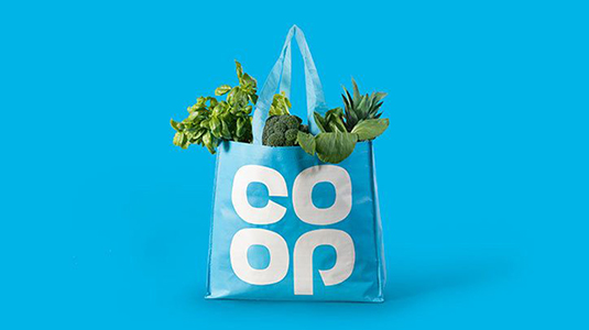
Designers react to the new Co-op logo
Yesterday saw the relaunch of the Co-op clover-leaf logo, but what do designers think of its return?
Sign up to Creative Bloq's daily newsletter, which brings you the latest news and inspiration from the worlds of art, design and technology.
You are now subscribed
Your newsletter sign-up was successful
Want to add more newsletters?

The Co-op started to roll out its new brand identity yesterday, which saw the return of its clover-leaf logo. Despite falling back on a previous logo design instead of creating something new, the revival of the wordmark that first adorned shops in 1968 seems to have gone down well with designers.
With a deceptively basic yet distinctive typeface, the clover-leaf logo appears to be the perfect piece of design to represent the Co-op. Both shoppers and designers seem happy to see it return. And those not familiar with the design previously have also been struck by how simple and effective it looks.
It's a brave move but I think the Co-op's 1968 logo has stood the test of time and still looks great https://t.co/IBurHgyuBDMay 23, 2016
Really like the new/old Co-op brand refresh https://t.co/yRXCQi8Lq3May 24, 2016
@benterrett really great. Love it.May 23, 2016
The new @TheCooperative branding is really nice. https://t.co/kbueDDeB0w pic.twitter.com/t2lBr0tsS2May 23, 2016
By deciding to call themselves simply the 'Co-op' again, the company also reflects how shoppers actually talk about the brand. When was the last time someone said they were popping ot the Co-operative Food for milk and bread?
Article continues belowThe return of the logo and this attention to how the brand is perceived is all part of an aim to bring back the Co-op programme and promote the company's core ethical values. It seems to be paying off, as even the logo's critics can't help being won over by the clover-leaf's nostalgic charm and nerve.
would be great to see something new but still love the return to the clover logo! https://t.co/7TYOVHQjA3May 23, 2016
Reviving the Co-op logo is a great idea but why not fix it? I’d forgotten that criminal “p” https://t.co/zAB7W5JBpeMay 21, 2016
Well, nearly all the critics are happy.
Co-Op go back to horrible old logo. Makes me feel bit ill. Reminds me of warm from-concentrate orange juice #design https://t.co/CE5JcLIIwKMay 23, 2016
For a company that has recently weathered bad publicity due to its finances getting put under the microscope, bringing back an old logo is a clever move to reassure shoppers of what the Co-op stands for. Perhaps we'll see other businesses bring back their iconic logos in the future?
Sign up to Creative Bloq's daily newsletter, which brings you the latest news and inspiration from the worlds of art, design and technology.

Dom Carter is a freelance writer who specialises in art and design. Formerly a staff writer for Creative Bloq, his work has also appeared on Creative Boom and in the pages of ImagineFX, Computer Arts, 3D World, and .net. He has been a D&AD New Blood judge, and has a particular interest in picture books.
