Brand Impact Awards 2023: All the winners revealed
Explore all the winners at the 10th-annual BIAs – plus download the 90-page winners showcase.
Sign up to Creative Bloq's daily newsletter, which brings you the latest news and inspiration from the worlds of art, design and technology.
You are now subscribed
Your newsletter sign-up was successful
Want to add more newsletters?
We're delighted to reveal the winners of the Brand Impact Awards 2023.
We had a record 232 entries in our 10th year. To mark this milestone, our biggest-ever judging panel was packed with world-class expertise from the agencies and clients behind Best of Show-winning projects over the past decade, a constellation of previous Gold and Silver Award winners, plus other hand-picked branding specialists from across the globe.
In a new judging process for 2023, every judge had three weeks to review and rate the entries independently – and then small specialist panels of 5-6 came together to debate the final results in their allocated categories.
Article continues belowAround a third of entries made it through to the shortlist stage: a total of 65 projects, from 38 different agencies. Several received multiple awards apiece: in our largest-ever crop of trophies, we're proud to announce 7x Gold Awards, 41x Silver Awards and 30x Bronze Awards, plus our overall Best of Show.
Scroll down or click the links above to jump straight to each award tier. All projects are also featured in a special 90-page winners showcase:
Download the 2023 winners showcase
Decade Awards
To mark 10 years of the Brand Impact Awards in 2023, we also presented two special awards at the winners' drinks reception on 5th October.
Client of the Decade
The BBC

- Client of the Decade: Winner
- 1x Best of Show (2019)
- 5x Gold, 1x Silver, 1x Bronze (2015–2023)
- bbc.co.uk
Marking 10 years of the Brand Impact Awards in 2023, the first of our two special Decade Awards recognises the brands and client-side teams that have performed consistently well at the BIAs.
Sign up to Creative Bloq's daily newsletter, which brings you the latest news and inspiration from the worlds of art, design and technology.
It was a no-brainer for our panel: one client stood head and shoulders above the others, with its partner agencies picking up eight trophies in total – including five Golds – for a range of different brand projects since 2015.
Congratulations to the BBC: our Client of the Decade, adding yet another trophy to the haul in 2023 with its Silver-winning rebrand of BBC Nordic.
Also in contention were:
- London Symphony Orchestra (Best of Show 2017 with The Partners)
- Mr Lyan (Best of Show 2022 with Magpie Studio)
Read the full story about all our Client of the Decade candidates. They are also featured in our winners showcase.
Small Studio of the Decade
Johnson Banks
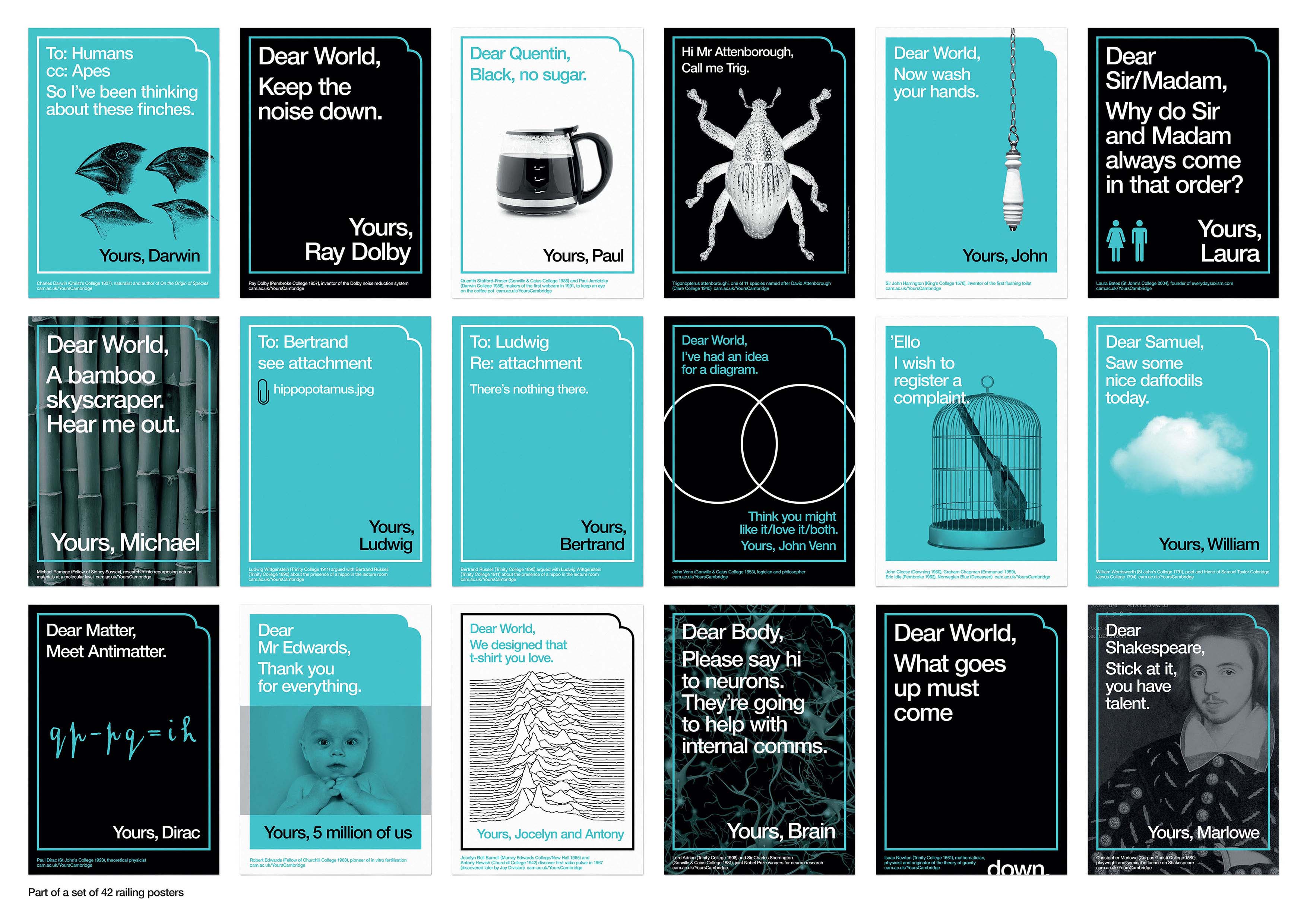
- Small Studio of the Decade: Winner
- 2x Best of Show (2015 and 2016)
- 9x Gold, 5x Silver, 3x Bronze (2014–2023)
- johnsonbanks.co.uk
Our second Decade Award, Small Studio of the Decade celebrates smaller independent studios that have consistently punched above their weight at the BIAs alongside larger, better-resourced counterparts.
There's no better example of this phenomenon than Johnson Banks, the small but influential Clapham-based studio founded by Michael Johnson in 1992. Known for defining, then designing, brands that make a difference, Johnson Banks has taken home a staggering 19 BIA trophies over the past decade – including nine Gold-winning projects, two of which were voted Best of Show.
Also in contention were:
- NB Studio (runner-up)
- Magpie Studio
- Studio Sutherl&
Read the full story about all our Small Studio of the Decade candidates. They are also featured in our winners showcase.
Top 16 Agencies
Top-performing agencies over the past decade
As well as celebrating the four small studios above, we've also compiled a ranking of the 16 top-performing agencies over the past decade.
We awarded five points for a Best of Show trophy, three points for a Gold Award (formerly Winner), and one point for a Silver Award (formerly Highly Commended). Bronze Awards were left out as these did not exist pre-2020.
Here's the list at a glance, with several agencies tied on points:
1. The Partners
2. Johnson Banks
3. Superunion
4. NB Studio
5. R/GA
6. Jack Renwick Studio
=7. Turner Duckworth
=7. hat-trick design
=9. Magpie Studio
=9. COLLINS
=11. Studio Sutherl&
=11. ManvsMachine
=13. For The People
=13. Taxi Studio
=13. Purpose
16. Design Bridge and Partners
Read the full story about all our Top 16 agencies.
Brand Impact Awards 2023: full results
Best of Show
All Gold Award winners were considered for the prestigious Best of Show accolade, and after a panel-wide vote of all 40 judges, three emerged as front-runners. But there could be only one winner...
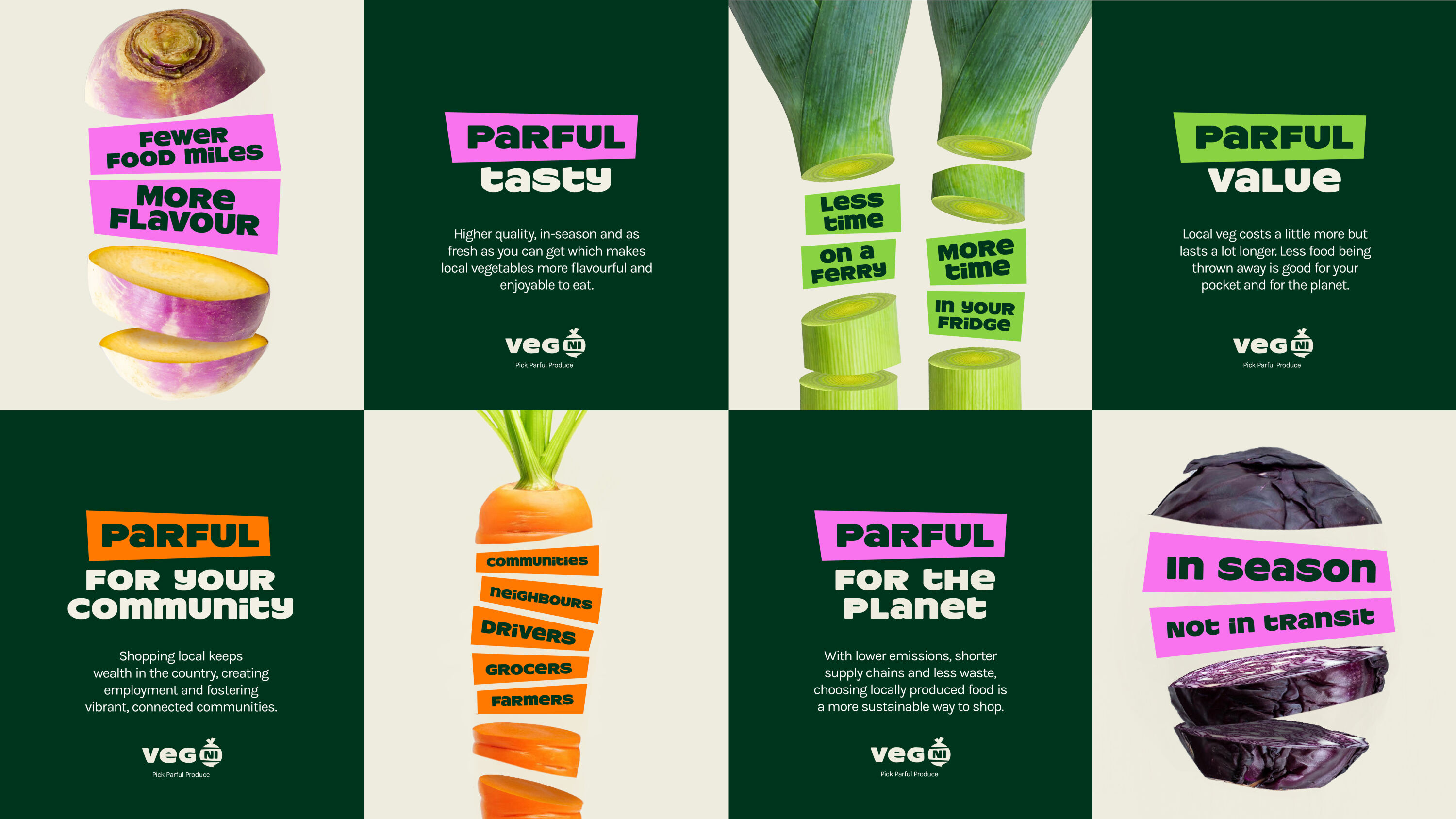
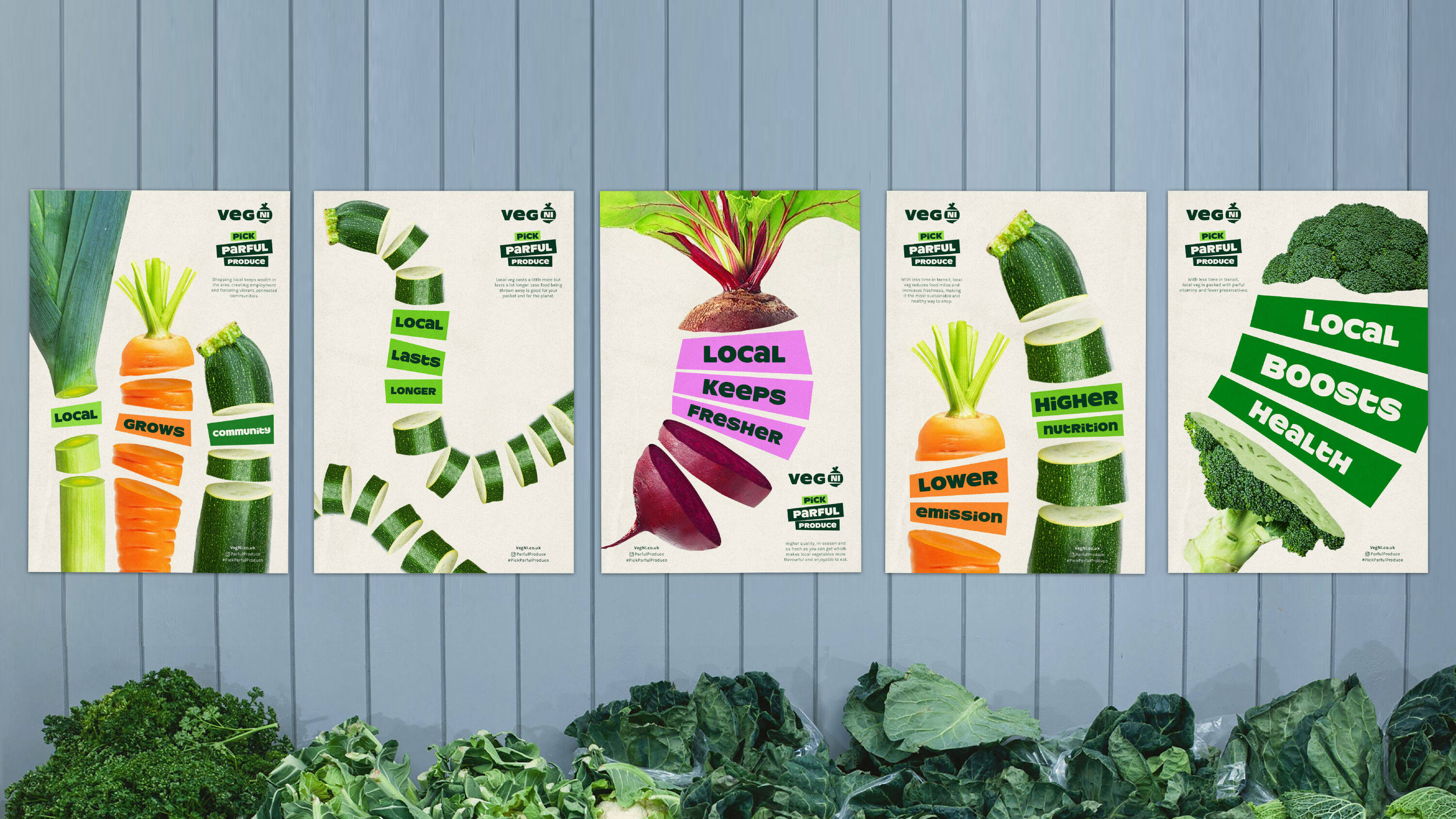
Veg NI by Jack Renwick Studio
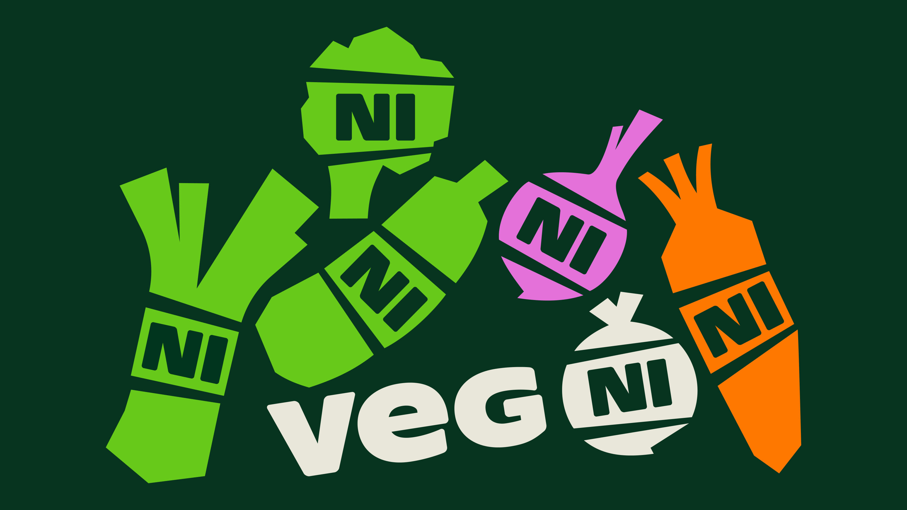
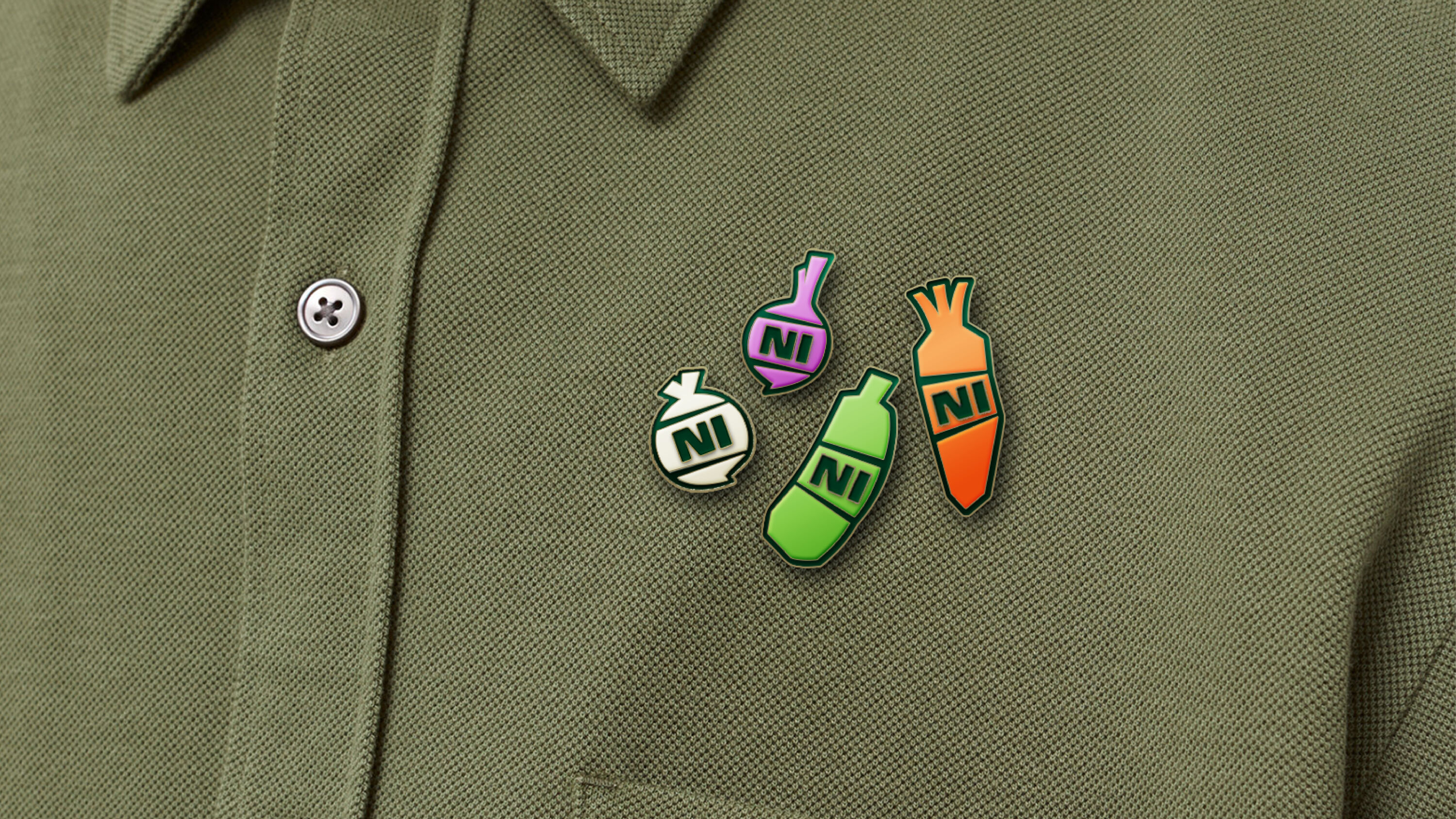
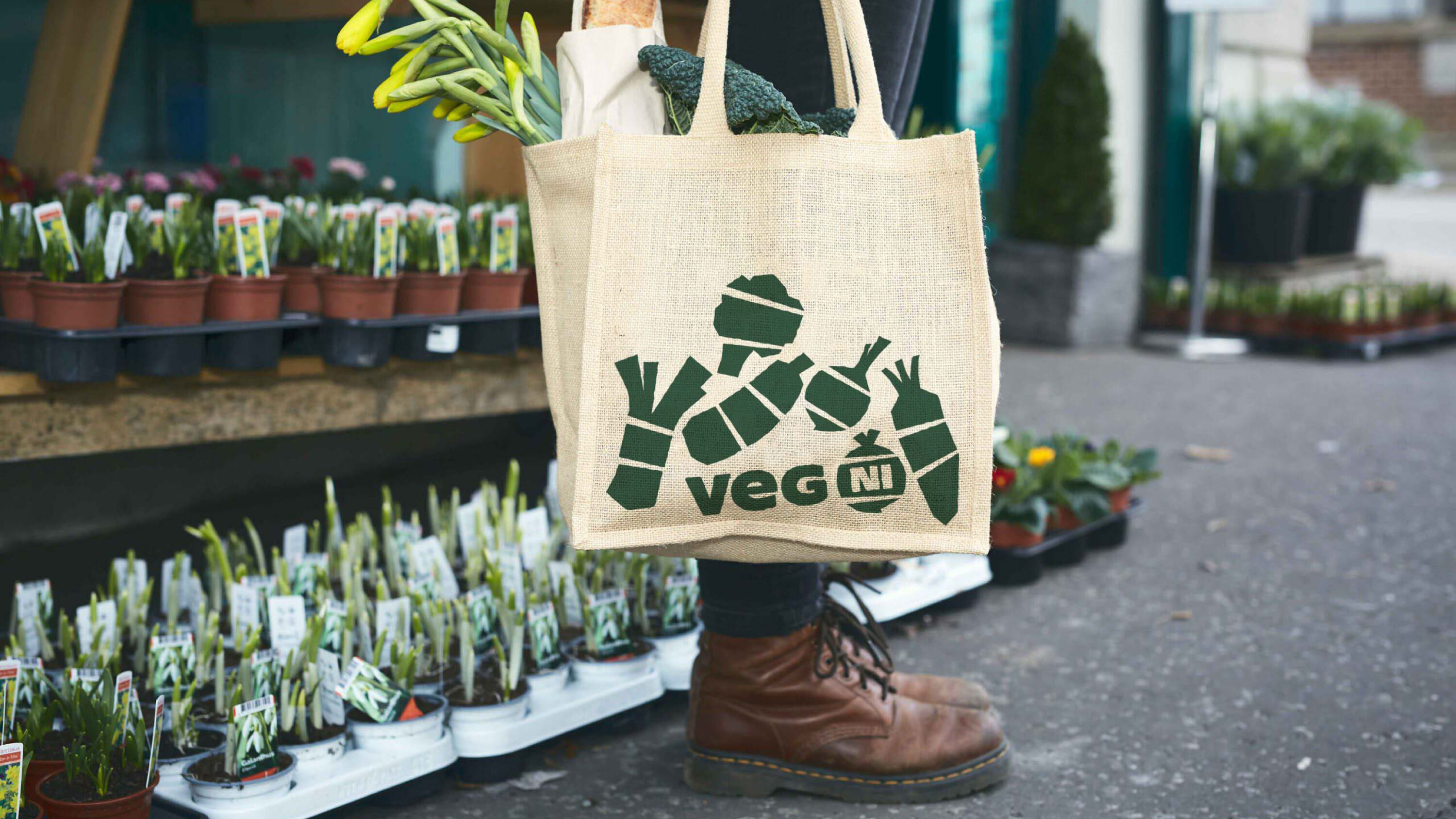
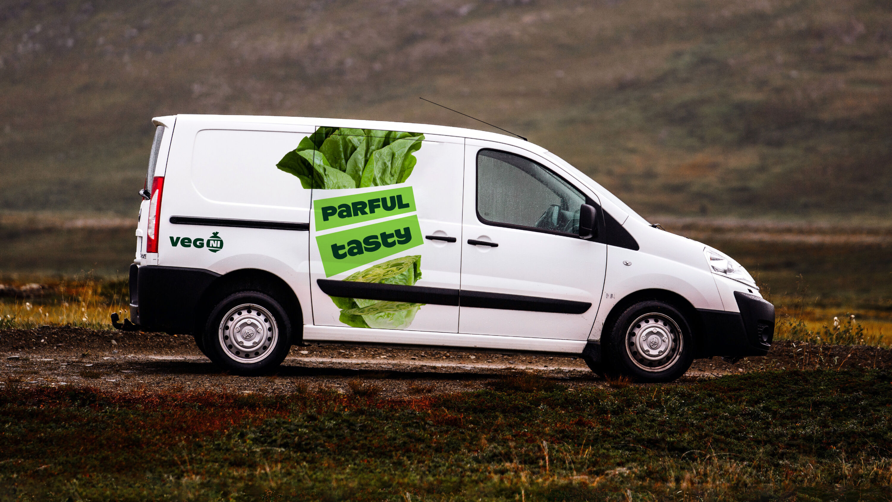
- Best of Show: Winner
- Social Impact: Winner
- Gold Award: Not-for-Profit
- jackrenwickstudio.com
Scooping both the Social Impact Award and this year's Best of Show after a closely-fought panel-wide vote with two other Gold-winning projects, Veg NI is a triumph of beautiful design in the face of a very tight budget. This is the second year in a row in which a small studio has taken home the top prize, after Magpie's win in 2022.
Playful and clever, with beautiful applications.
Kwame Taylor-Hayford
A cooperative of growers in Northern Ireland, Veg NI was set up by four farmers to promote their produce in the face of narrowing margins and fierce import competition. They aim to get local produce onto the plates of local people, benefiting them, the industry and the planet, supporting local producers, farmers and growers to build strong, rural, future-proof businesses.
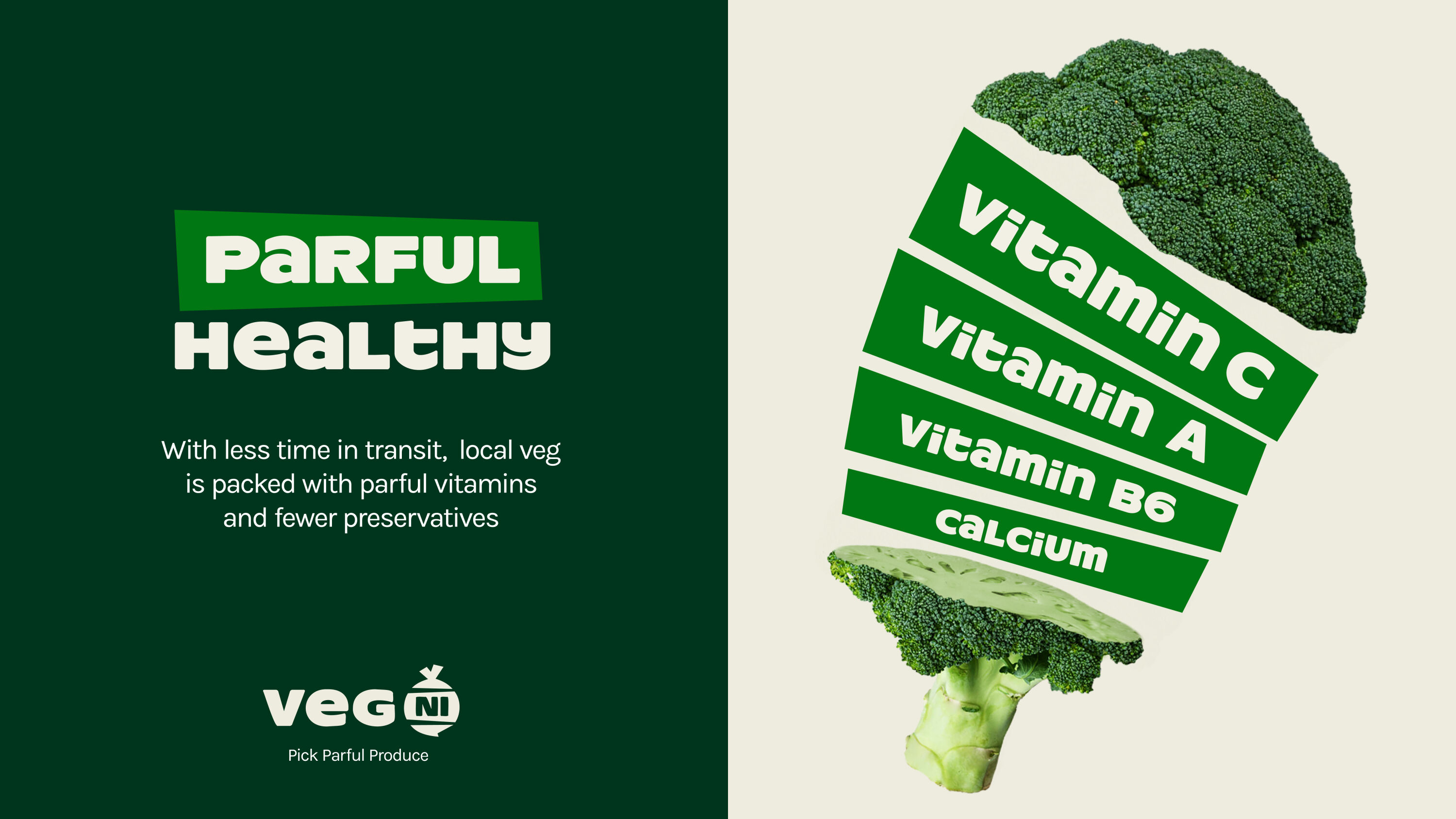
The positioning, messaging and identity centres around the core idea: 'Parful Produce' ('Powerful Produce' in NI dialect). Fresh, in-season, vibrant and packed with flavour, it's had less time to lose valuable nutrients, so is fantastic for our health. By lowering emissions and waste in the supply chain, it also has a positive impact on the planet. And keeping things local means keeping money local, so it's parful for farmers, growers, drivers and grocers, creating employment and fostering vibrant, connected communities.
In Jack Renwick Studio's flexible branding system, the veg literally bursts with goodness – explaining that it's what's inside that makes the difference. This differentiates Veg NI from other fruit and veg initiatives in the sector, which often focus on pure produce shots and dishes of food. The logo puts Northern Ireland at the heart of it all, building ownership and pride in their produce. The vegetables change to reflect the specialism of each farmer, providing a cost-effective, individualised way for them to feel recognised as part of a bigger collective.
Lovely personality. Feels fresh, friendly, optimistic and rooted in its community.
Rebecca Walton
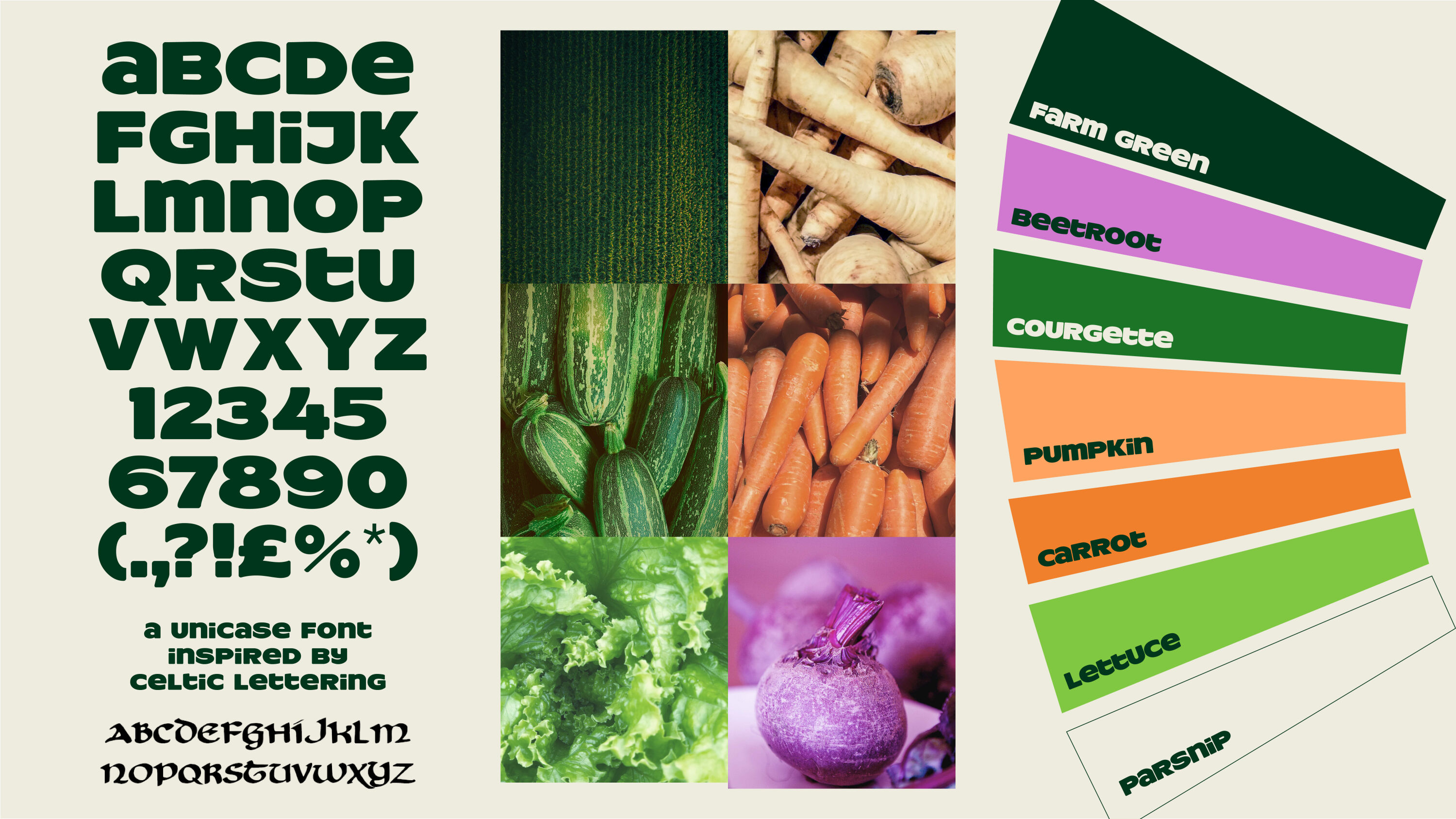
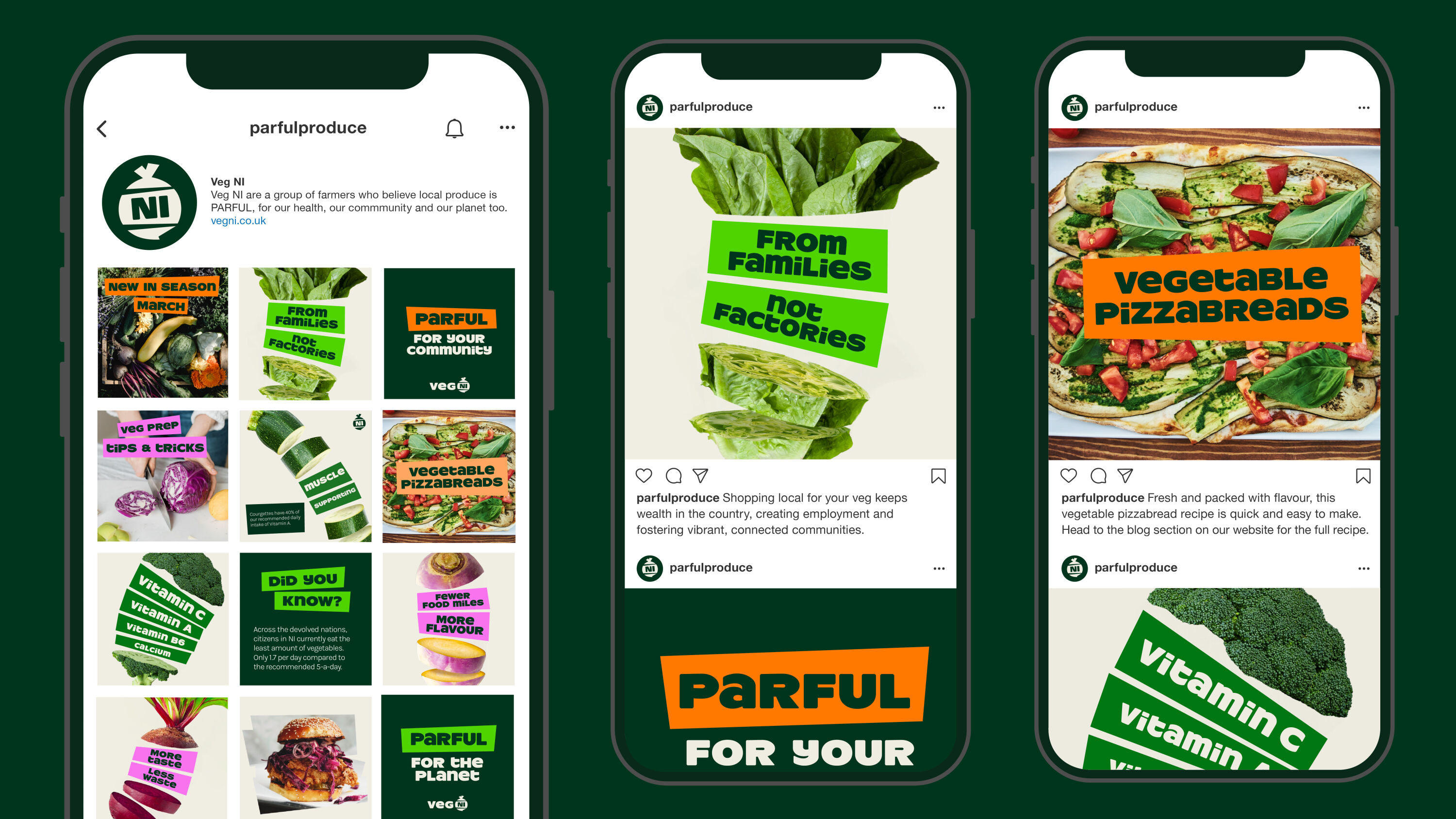
With no budget for photoshoots, a low-cost, easily adapted approach was needed to represent the variety of farmed NI produce and its many benefits. The veg imagery is created from a composite of low-cost stock photography, with graphic veg slices holding easily updatable messaging. The $12 characterful Unicase typeface adds a nod to traditional Celtic lettering.
The brand is seen across Northern Ireland through social media, trade shows, farm shops, and stickers on vehicles and crates. Local shops and restaurants are proud to support that they stock, sell and serve NI's Parful Produce.
Squarespace – Make The Next by ManvsMachine

- Best of Show: Shortlisted
- Gold Award: Technology & Telecoms
- Gold Award: Motion
- Read more about this project at mvsm.com
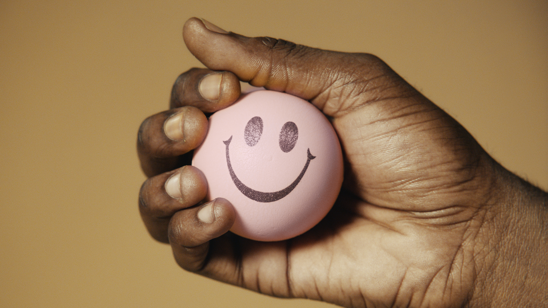
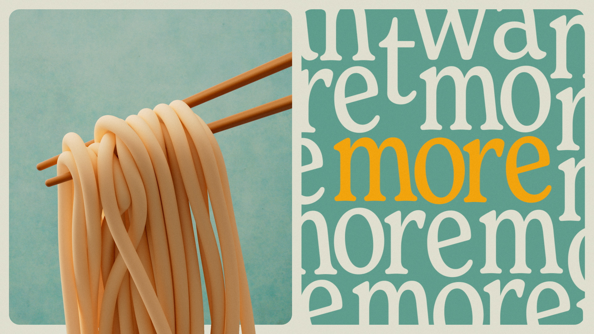
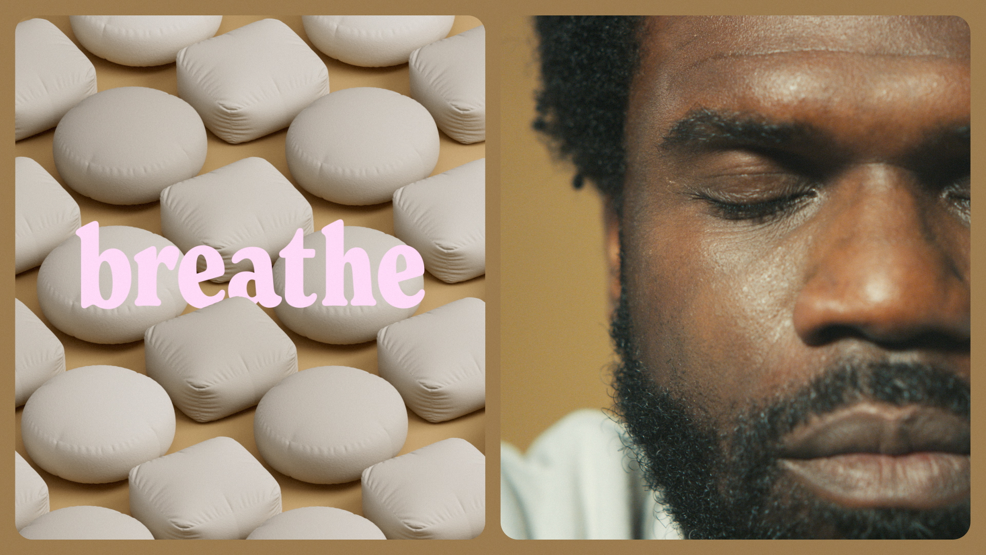
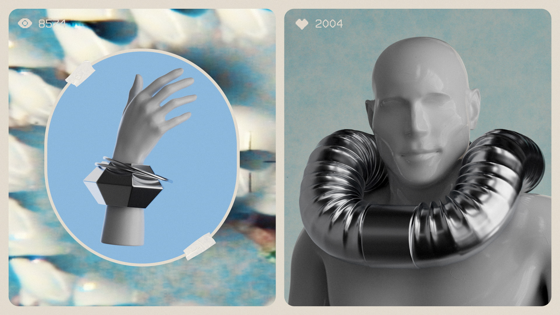
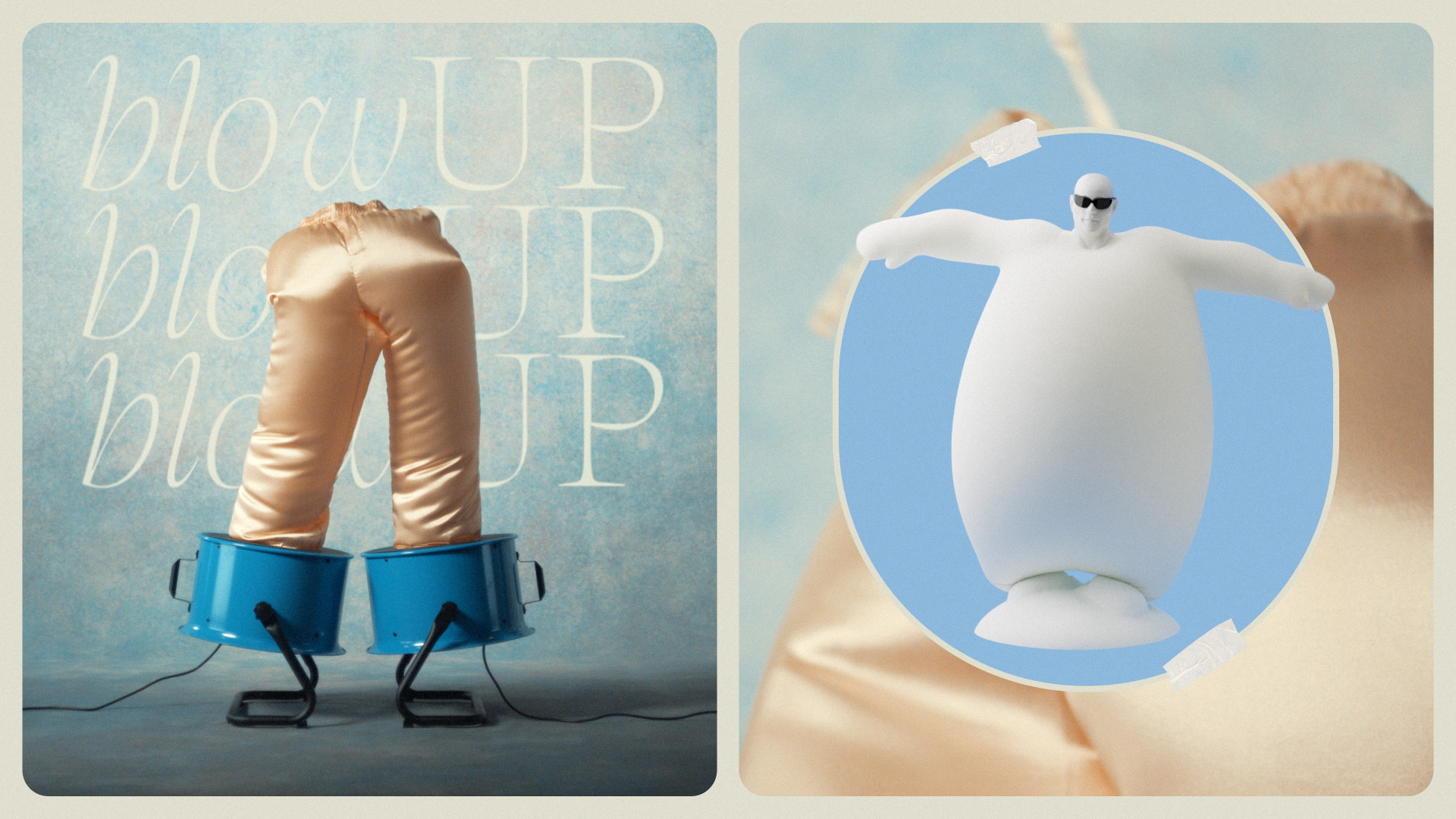
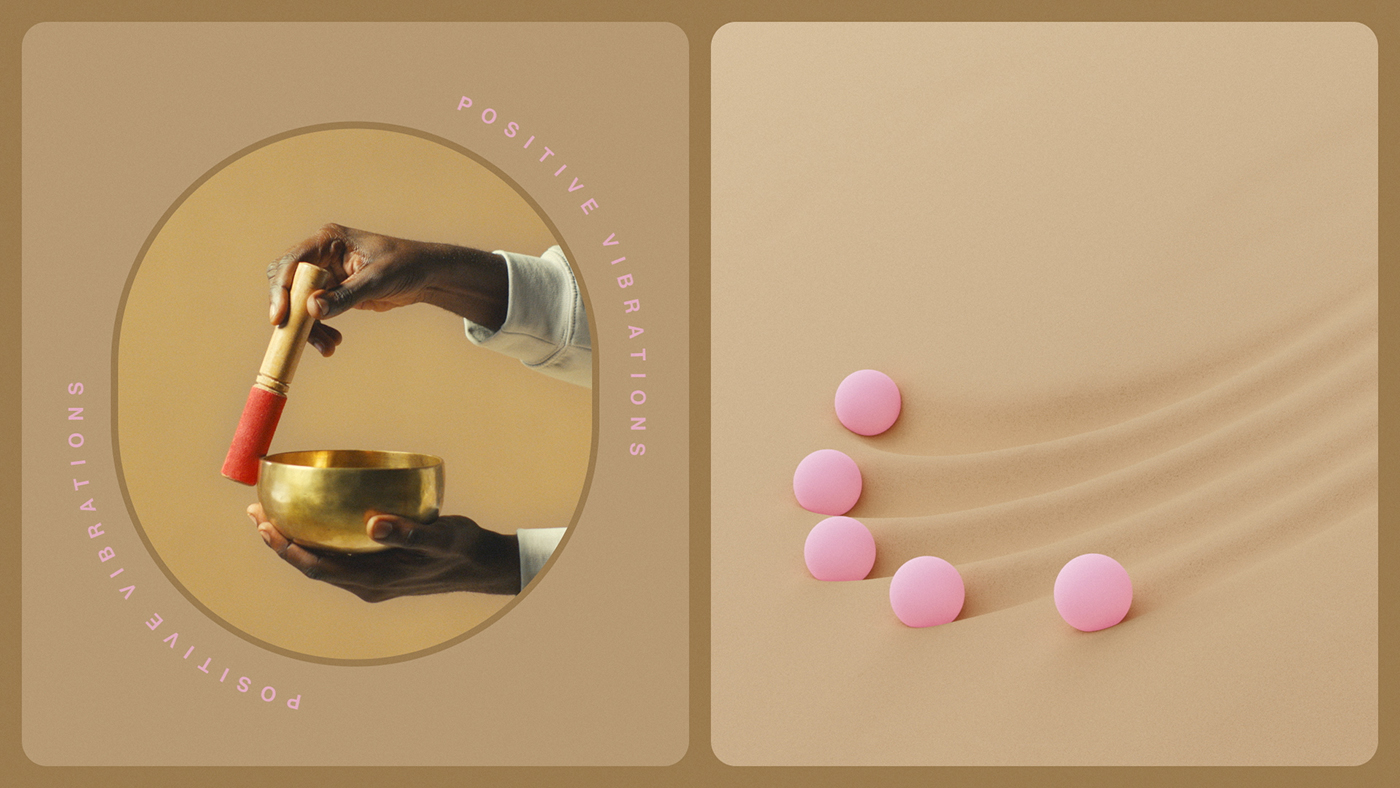
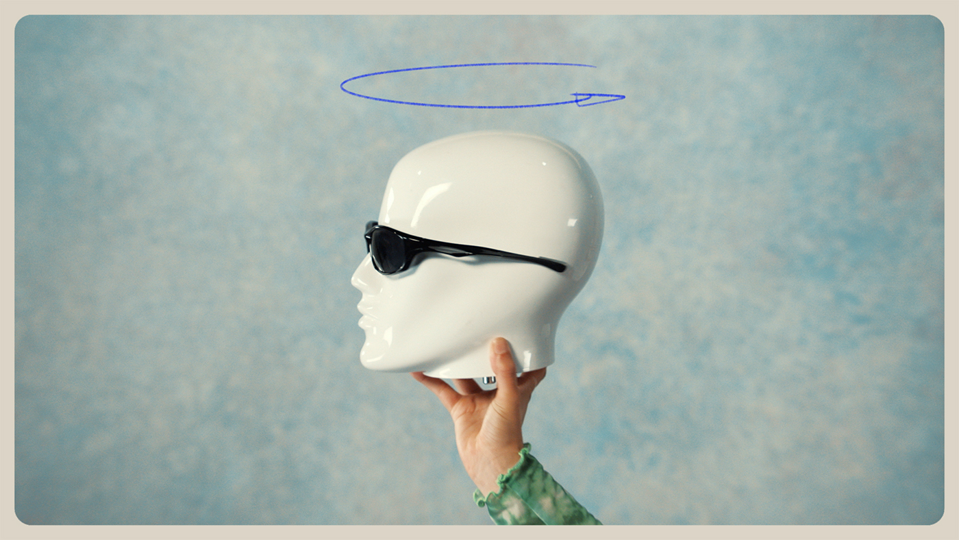
Coming a very close second in our race for Best of Show, ManvsMachine's stunning campaign for Squarespace was nonetheless well rewarded at this year's BIAs, as the only project to pick up two Golds in two different categories.
Working closely with the client's in-house team, ManvsMachine conceptualised, designed and directed a set of commercials for Squarespace's latest campaign: 'Make The Next'. The brief was to make the spots feel seamless and personable, whilst delivering a clear, easy-to-understand message for the platform's diverse global audience.
Brimming with wit and flavour
Winston Duke
Squarespace provided three loose scripts outlining a range of fictional entrepreneurs with one thing in common: they used the platform to turn their passions into an empire. Blending 2D and 3D animation with live action, ManvsMachine's trio of commercials use striking visual vignettes to illustrate each sentence of the scripts.
The three different creative approaches are woven together with a distinct tactile motion language, which enables type, 3D vignettes and live-action to live and work harmoniously within the overall design system.
Eurovision by Design Bridge and Partners

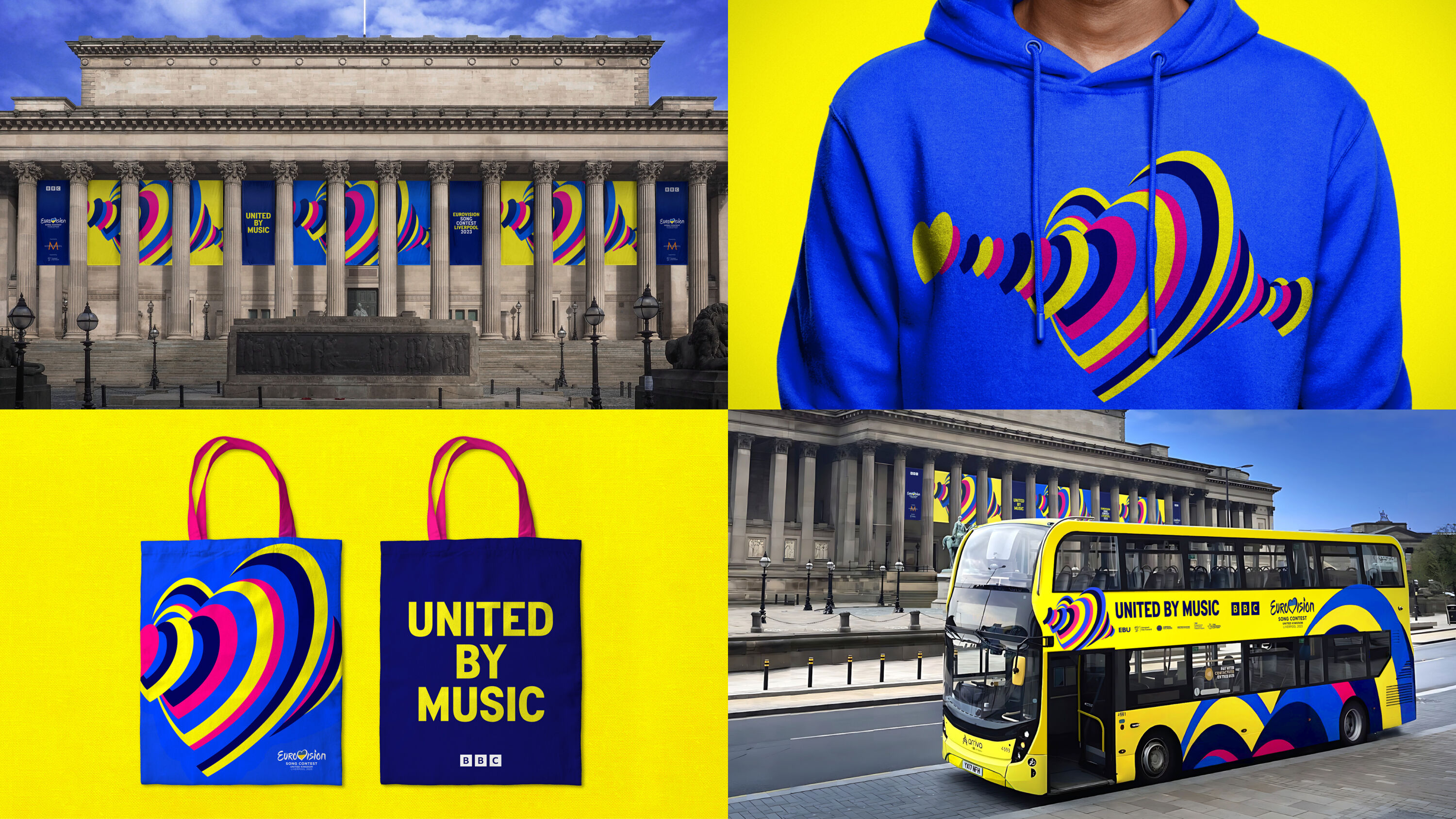
- Best of Show: Shortlisted
- Gold Award: Brand Strategy
- Read more about this project at designbridge.com
This is the first year at the BIAs for the newly-formed Design Bridge and Partners, although the senior creative teams at its pre-merger predecessors Superunion (and The Partners before that) are no strangers to our awards, with four Best of Show awards and a significant haul of trophies between them.
Design Bridge and Partners has had an excellent maiden year in 2023 too, with 14 trophies in total – including two Golds.
These kind of projects can easily get crushed beneath the weight of expectation. The thinking here hangs together and they took it all the way. Play Jaja Ding Dong!
Dan Radley
Bringing nations together since WWII, Eurovision's unifying nature took on new significance in 2023. This year's identity needed to reflect Ukraine and UK partnering as winner and host due to conflict in Ukraine, Liverpool hosting within the UK, and 37 competing countries creating a week of music.
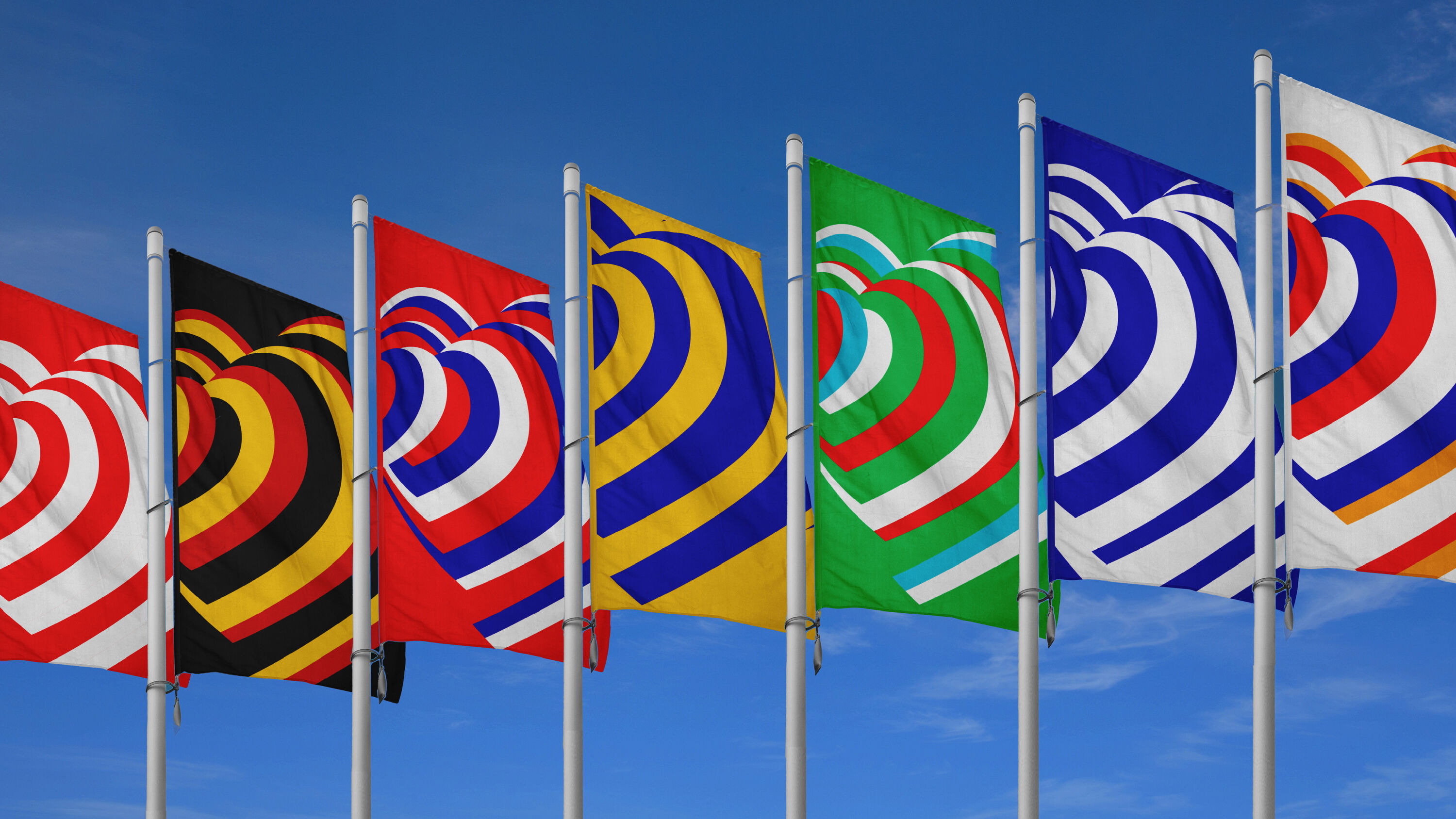
Design Bridge and Partners' challenge was to make 'unity' fresh and exciting again for old and new audiences. The answer was right there within Eurovision's logo: hearts are the universal symbol of love, but heartbeats are also the first sound heard inside the womb and the first sign of life – a shared primordial rhythm.
Further research revealed that, when experiencing live music together, our hearts synchronise. This insight inspired '160 million hearts beating as one' – a concept that embodies unity, and reflects Eurovision's global audience in an accessible, cross-cultural way.

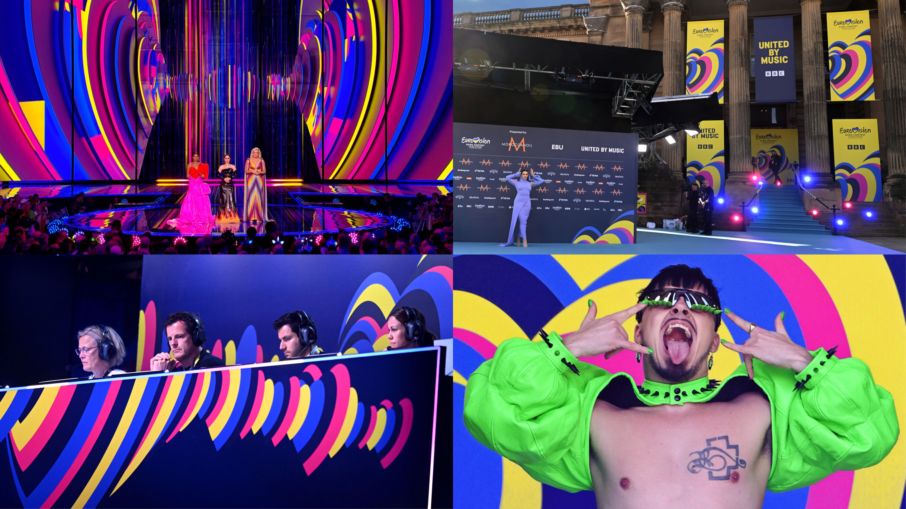
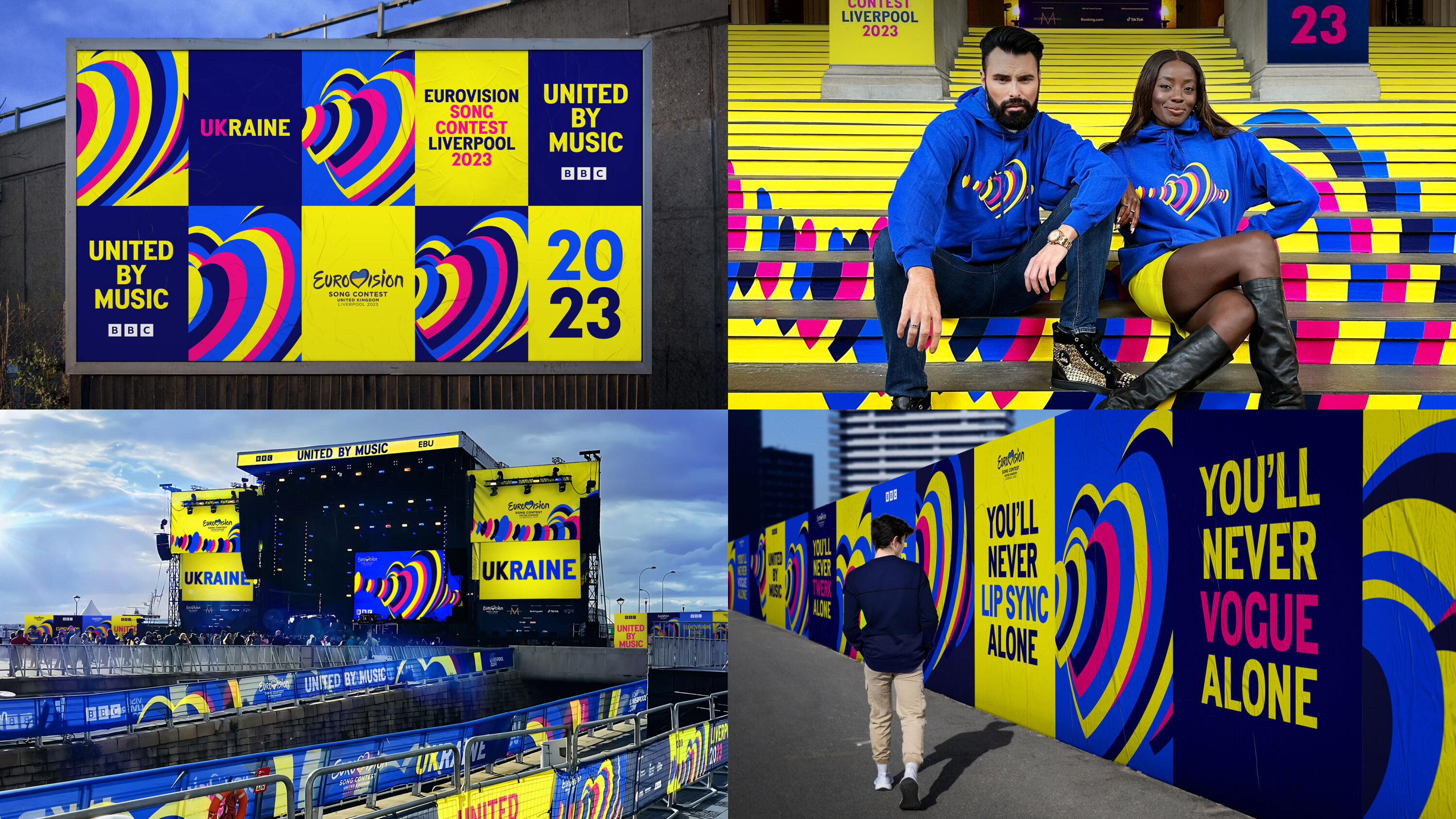
Design Bridge and Partners developed a strategy to leverage the emotions surrounding this year's event and infuse new meaning into Eurovision's iconic symbol. The expression became a sound wave of synchronised hearts, while key players are heroed through through colours inspired by the host flags.
Very Eurovision: retro vibes, loudly uncomfortable, but weirdly addictive.
Louise Kyme
As the host city, Liverpool got its share of playful references too – from the Liverpudlian street-sign-inspired 'Penny Lane' typeface, to copywriting that playfully references Liverpool FC's iconic anthem 'You'll Never Walk Alone'.
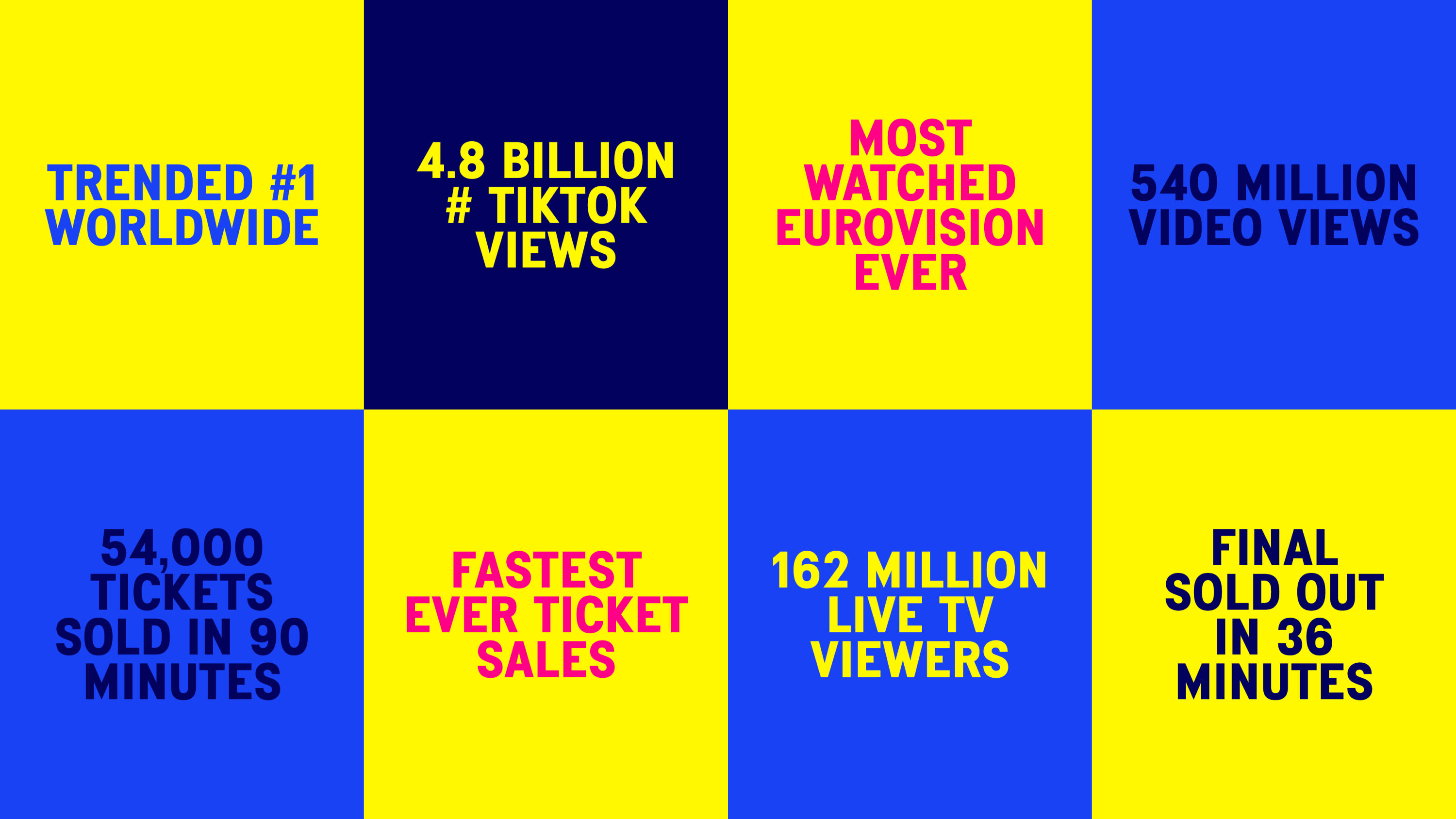
There were 4.8 billion views of #Eurovision2023 on TikTok, and all 54,000 live show tickets sold out within 90 minutes of release – a first in Eurovision history. With 162 million viewers, the Grand Finale trended #1 on Twitter globally, making it the most-watched Eurovision ever.
Gold Award winners
Brand Impact Awards 2023: Gold Awards
The following three projects received at least one Gold Award trophy at the Brand Impact Awards 2023.
Download full winners showcase
Aston Martin by Design Bridge and Partners
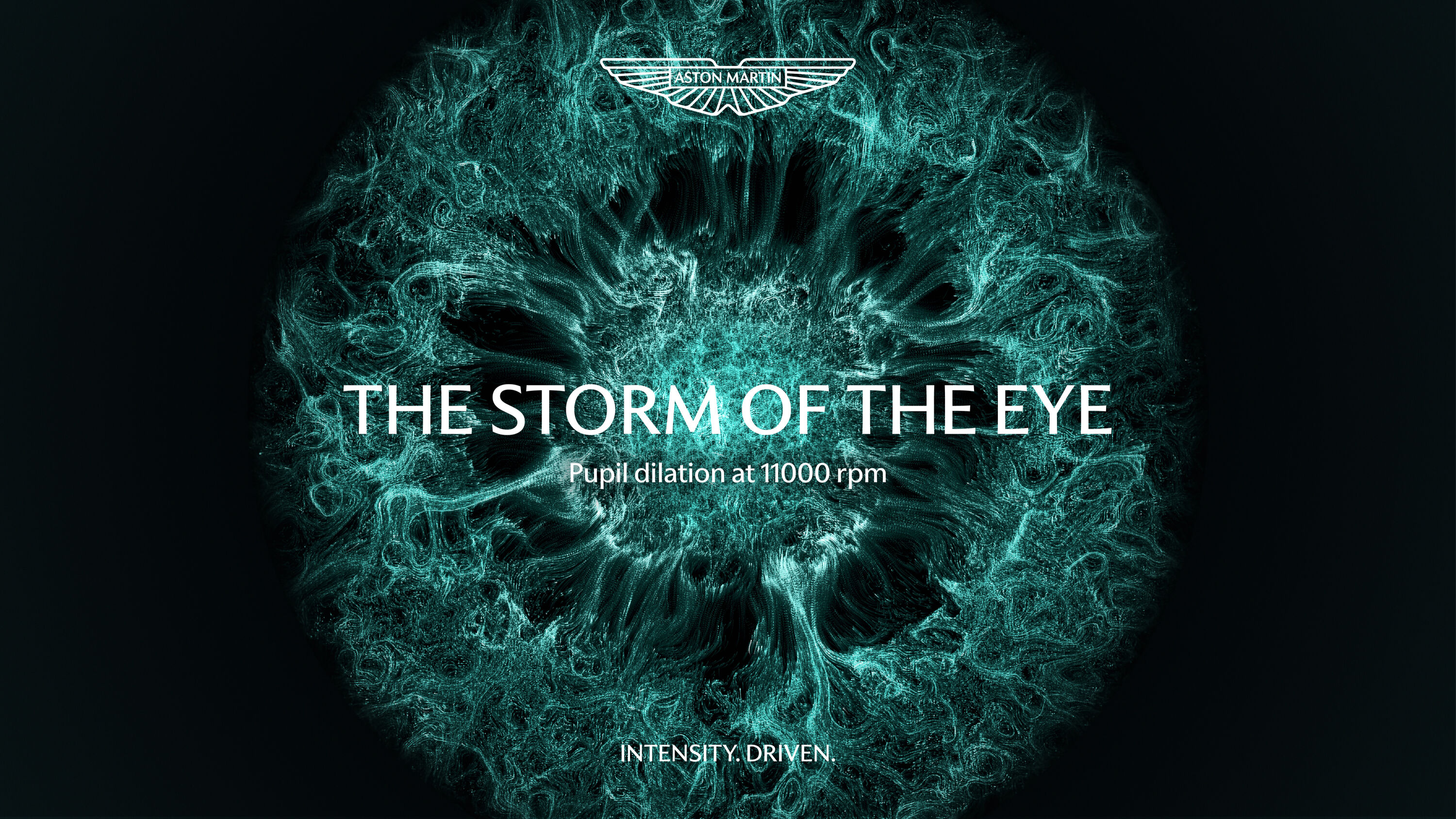
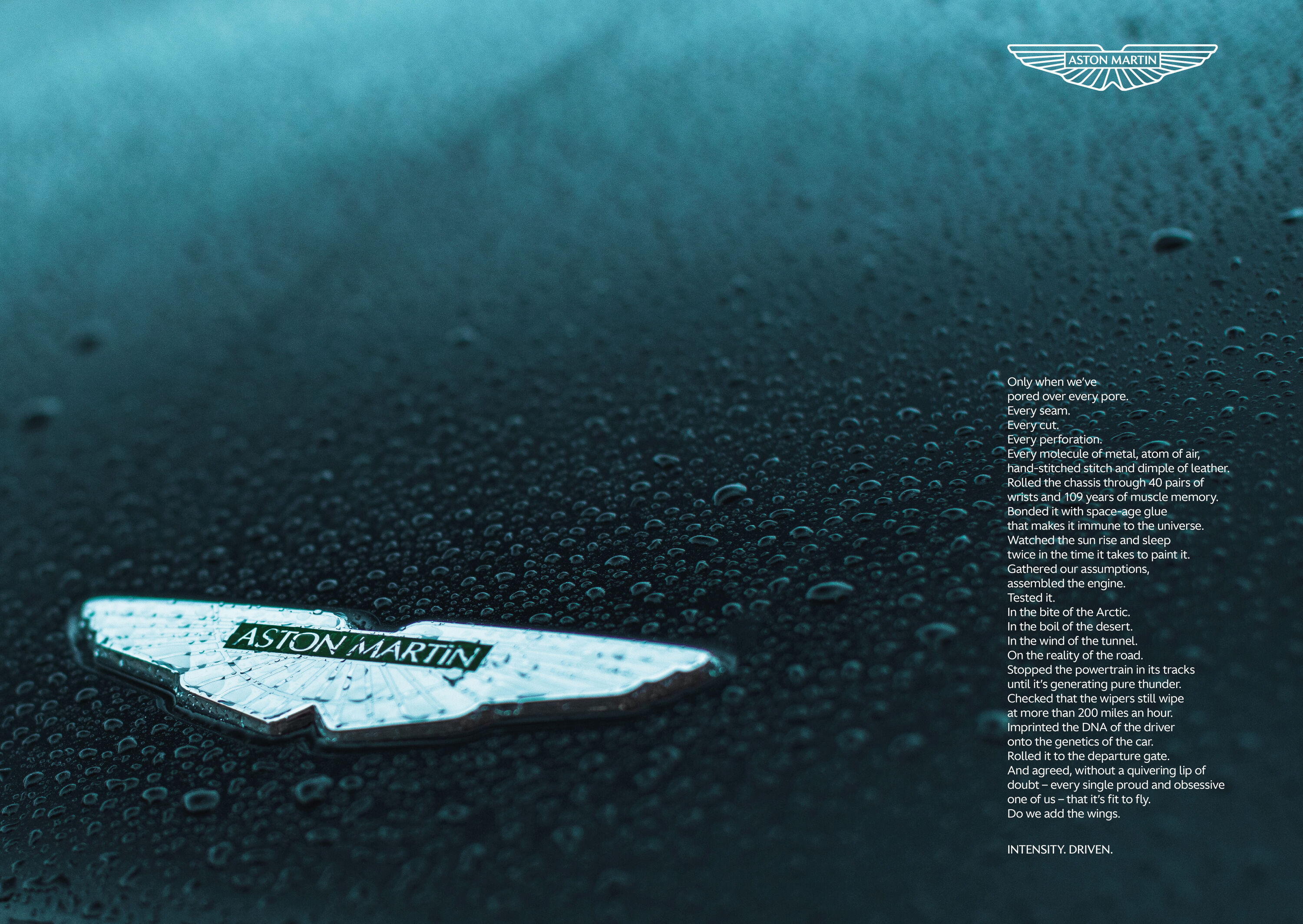
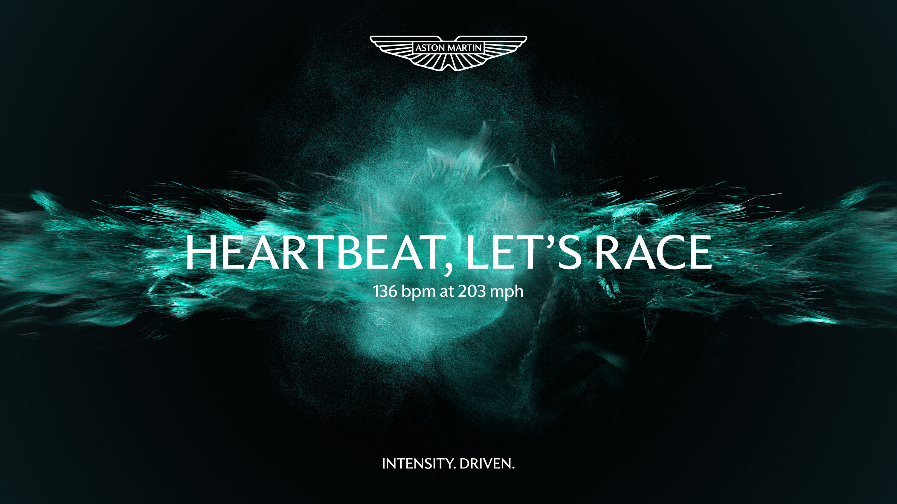
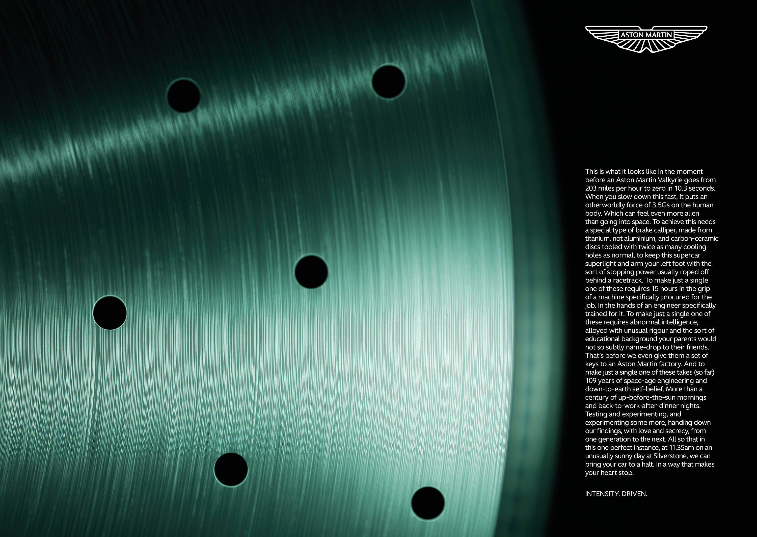
- Gold Award: Copywriting (for Intensity.Driven)
- Silver Award: Automotive (for Intensity.Driven)
- Silver Award: Brand Strategy (for Intensity.Driven)
- Silver Award: Motion (for Ferocity.Driven)
- designbridge.com
Technical details and luxurious elements never feel inauthentic or forced: they all contribute to the thrilling emotive experience of driving an Aston Martin.
Daniel St Vincent
Despite being a British cultural icon and globally recognised ultra-luxury brand, Aston Martin cars were known more as grand tourers than for their outright performance. Design Bridge and Partners' challenge was to modernise and increase the performative aspect of the brand, capturing the human emotion of the driving experience.
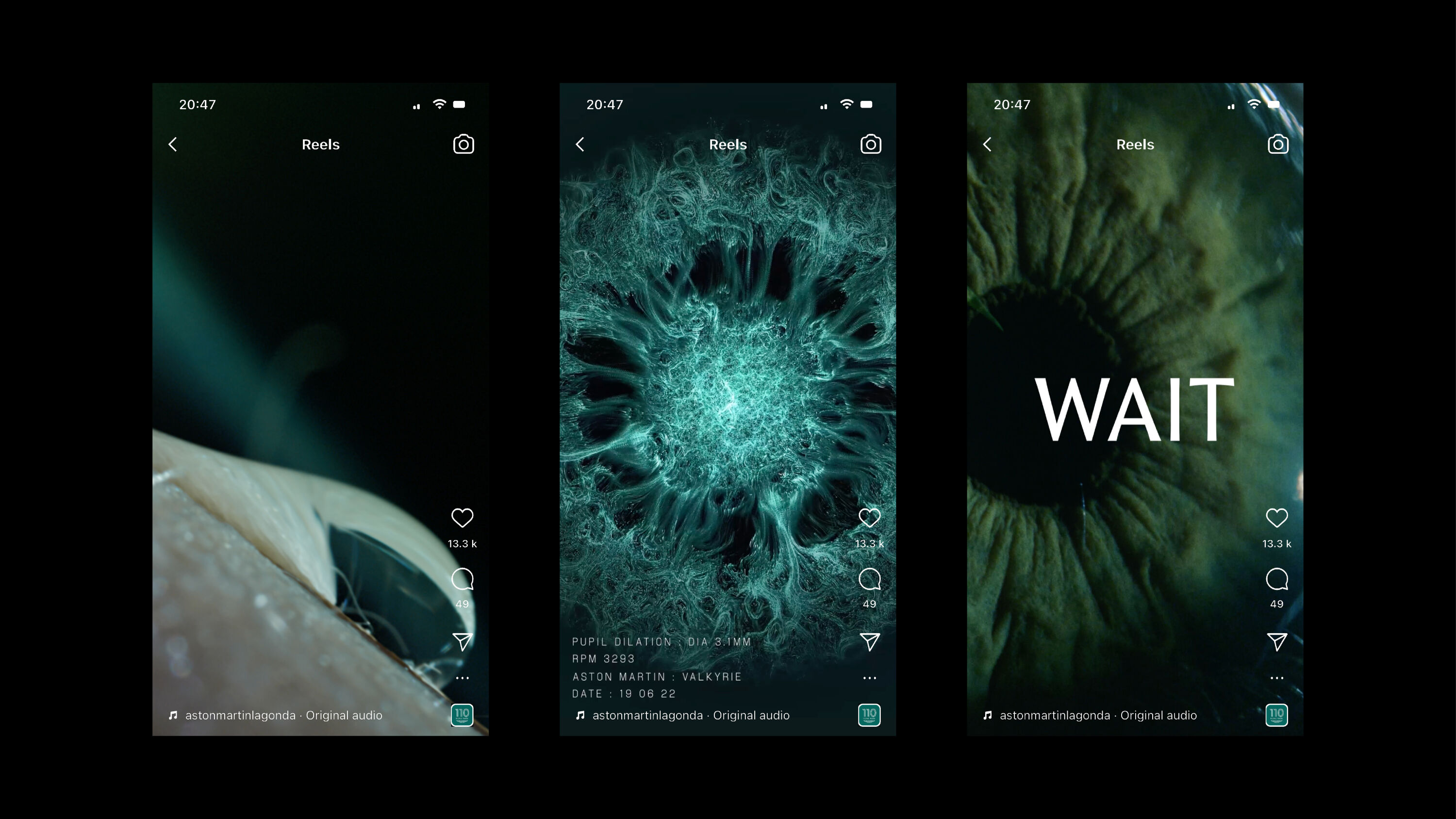
Aston Martin's new brand platform, 'Intensity.Driven', captures both the human emotion of the driving experience and the performative luxury of the sports cars themselves. Data visualisation captures the authentic emotion of driving, while close-ups amplify the sense of power and performance.
I devoured every word. Almost every headline is a banger.
Nazy Farkhondeh
Interviews with racing drivers helped the team capture the intensity of the experience – all brought together with an editing style that blends longer dwells with sudden sharp cuts to build and break tension.
Emotive, poetic long-copy is a vital part of the overall brand strategy, and it's in the Copywriting category that Aston Martin takes home its Gold. Every piece of writing is meticulously detailed and exhaustively researched, drawing on insights about the manufacturing process, the history of the marque, and the incredible sensation of racing the car – as narrated by a racing driver with first-hand experience.
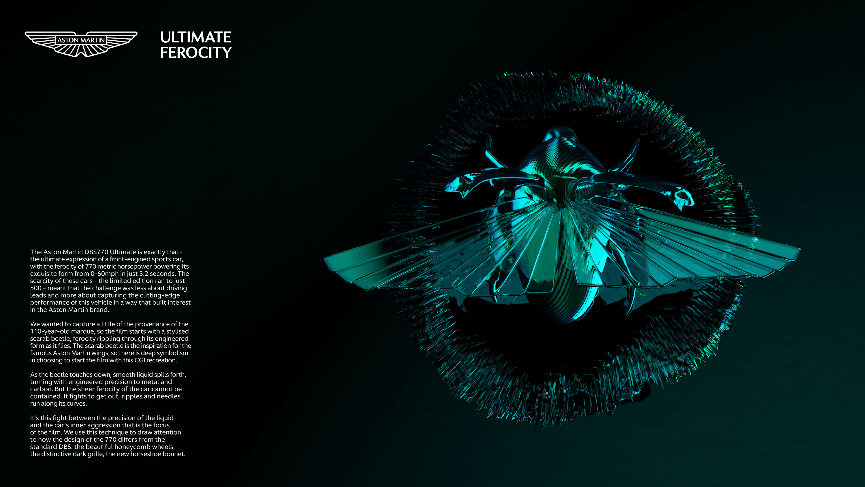
In the Motion category, meanwhile, Ferocity.Driven is a fully-CGI brand film that celebrates the cutting-edge performance of the ultra-limited-edition Aston Martin DBS770 Ultimate. It opens with a stylised scarab beetle, ferocity rippling through its engineered form. Smooth liquid spills forth, creating compelling tension between the engineered precision of the liquid and the car's inner aggression.
Norwich Castle by The Click

- Gold Award: Culture
- Read more about this project at theclickdesign.com
I love this. Simple, bold and clever. The designers must have had a lot of fun putting it all together.
Simon Elliott
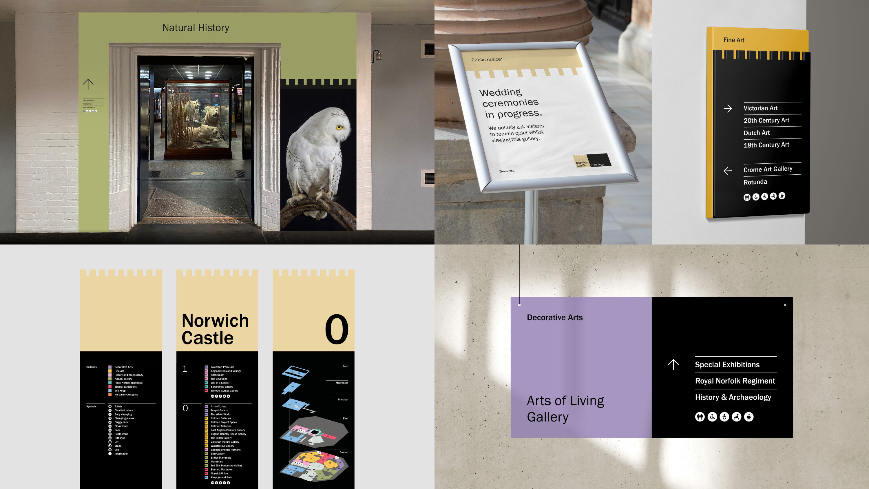
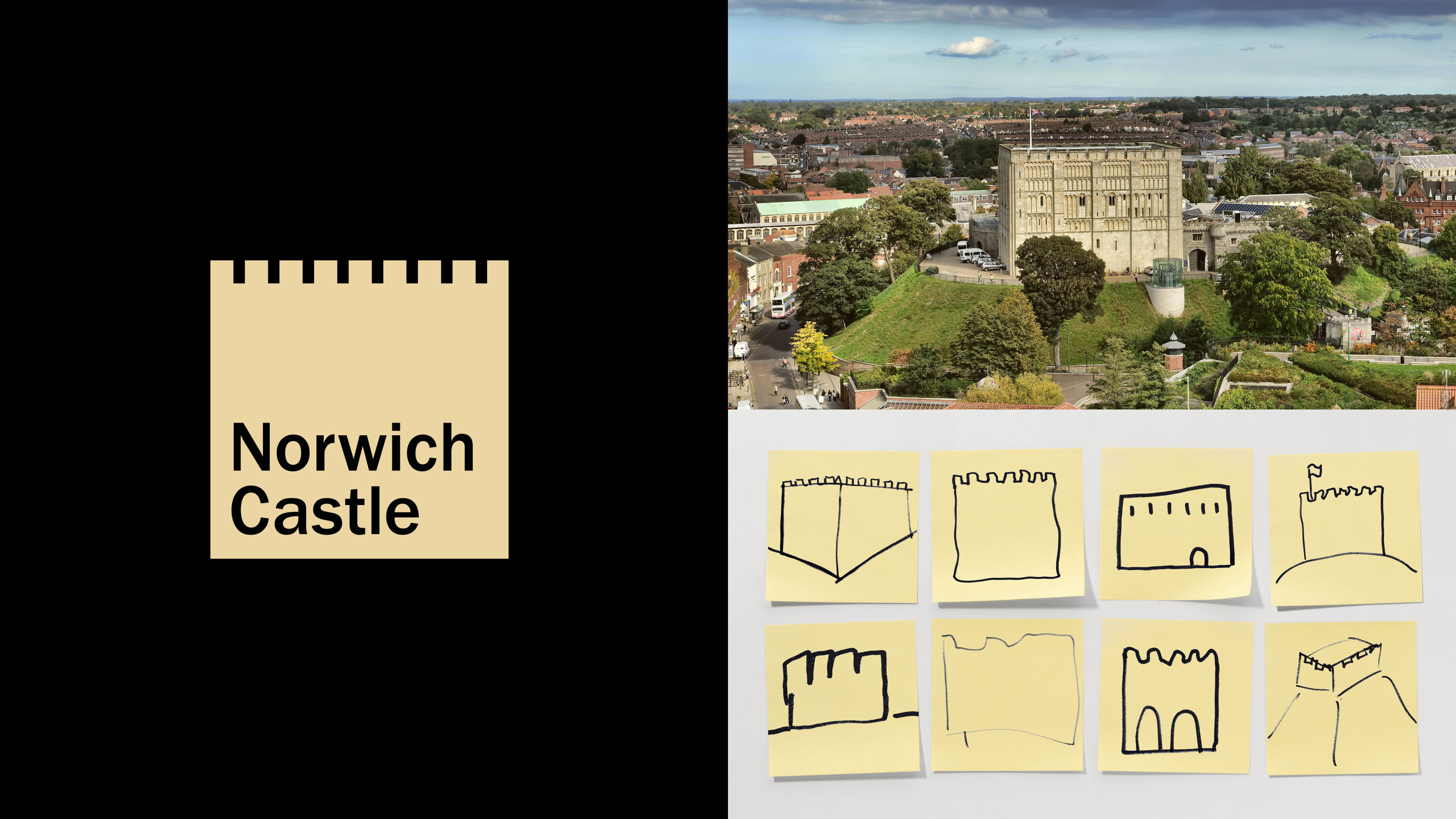
An iconic historical landmark, Norwich Castle proudly dominates the city's skyline. Established by William the Conqueror almost 1,000 years ago, it has since been a fortification, a royal palace, a prison and, more recently, a museum and art gallery.
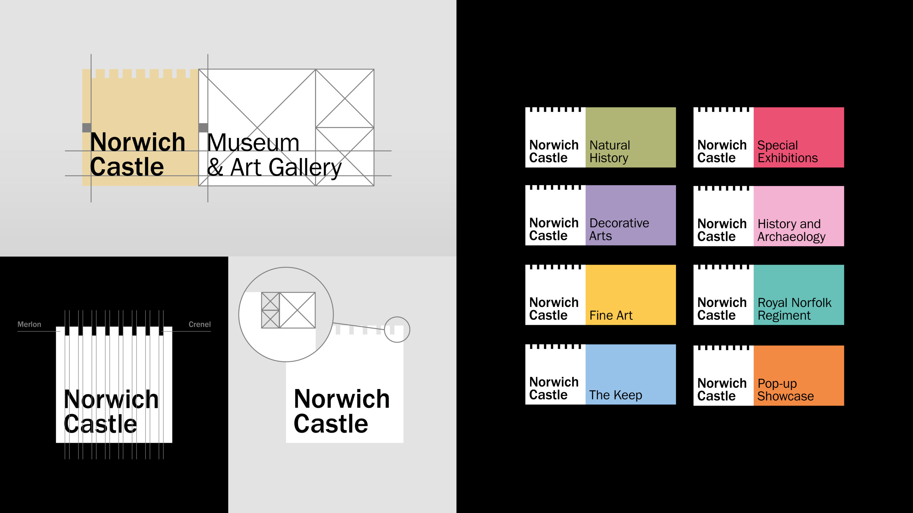
Mid-way through a major revamp, the castle needed a new brand identity to coincide with the reopening of its refurbished Keep and new visitor spaces. After challenging members of the public to draw a 10-second Post-It sketch of the castle, purely from memory, The Click found that its distinctively cube-shaped structure could be a powerful brand asset.
Effective, refined and memorable. I like the minimalism: it's a brave approach to cut out the clutter.
Susan Ayton
Accordingly, the agency distilled the logo to its most iconic form: a mark that, despite its uncompromising simplicity, still unmistakably portrays Norwich Castle.
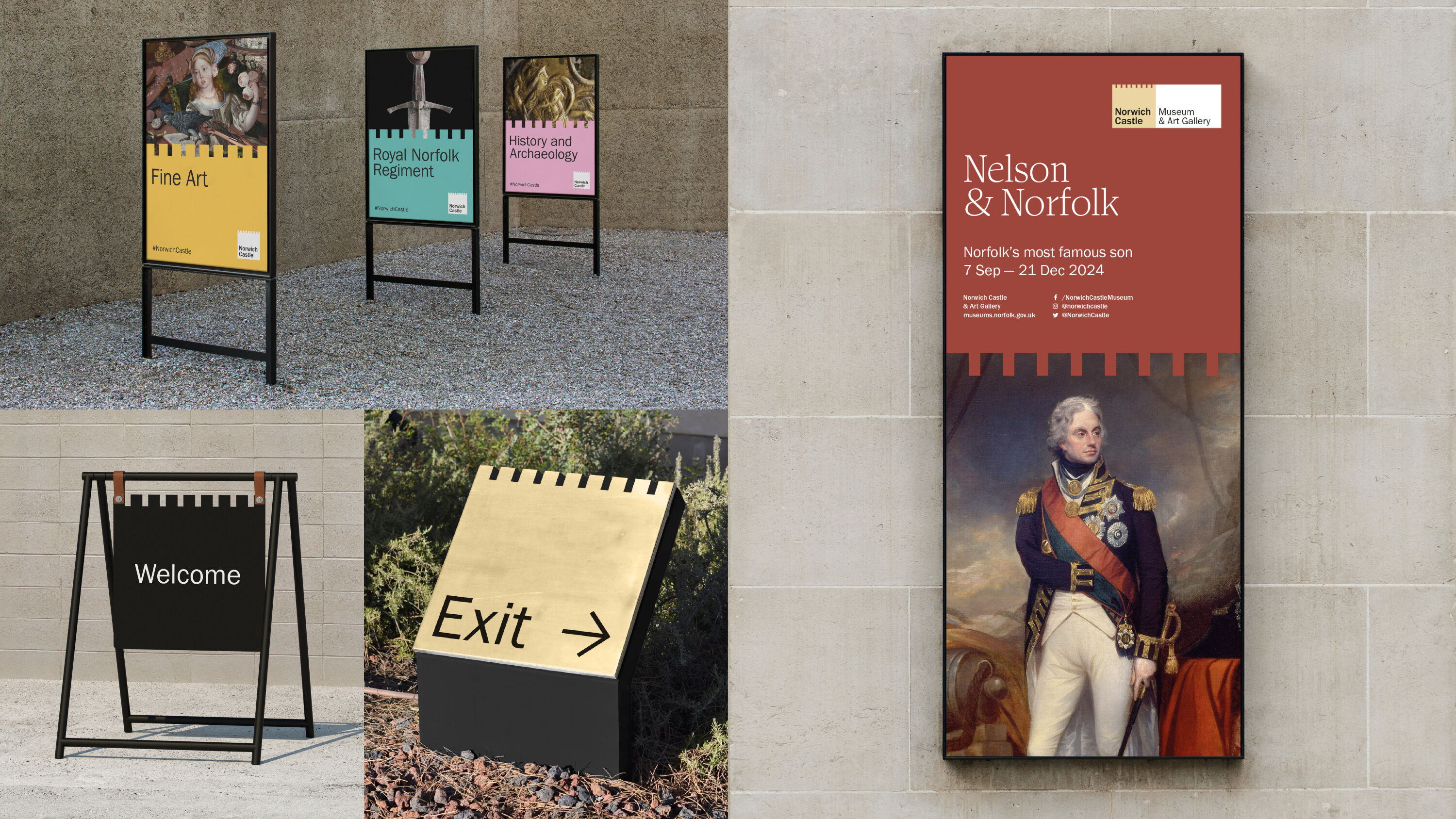
In turn, the geometry of the core brand logo informs a unique nine-column grid that references the number of merlons on each aspect of the castle. Largely formed by squares, the modular design system provides an easy-to-use and coherent format for wider templates and applications – with endless opportunities for striking merchandise and bold production techniques.
KatKin by Sonder & Tell
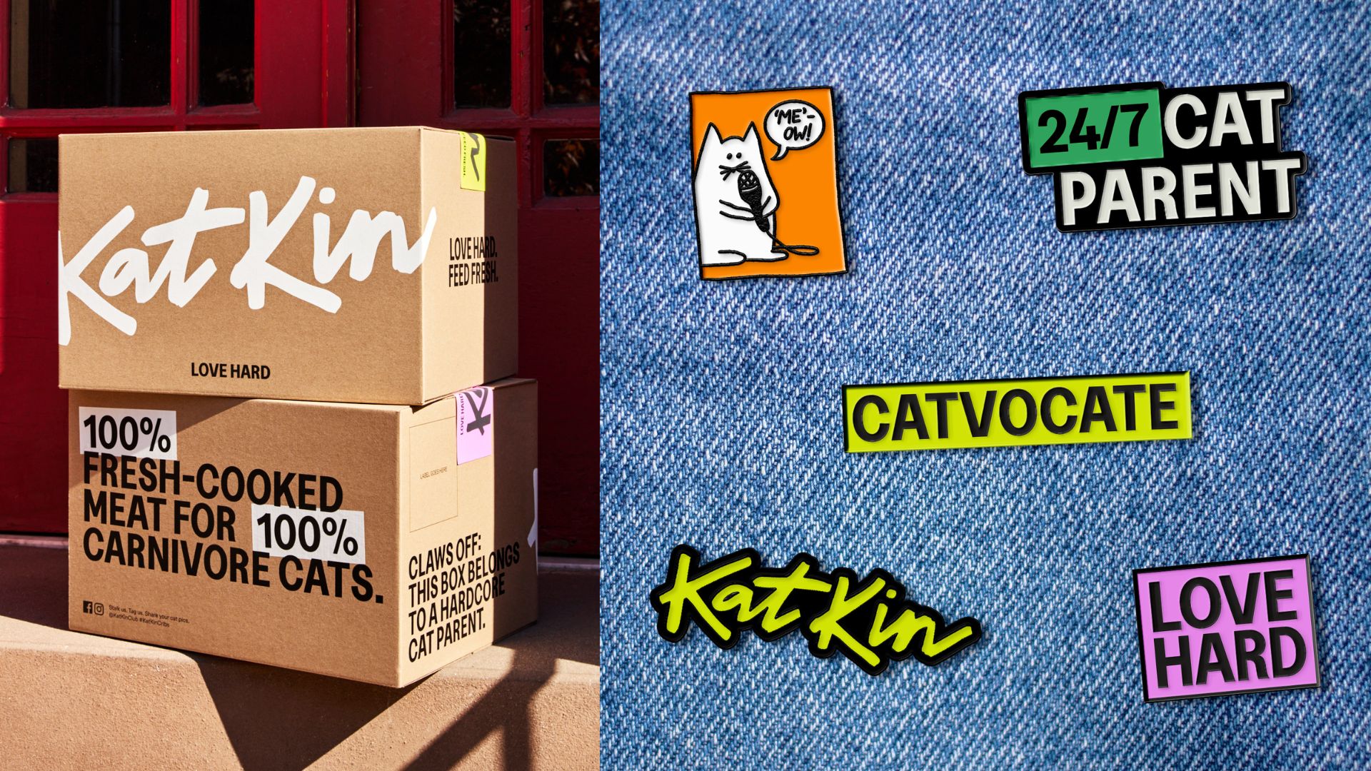
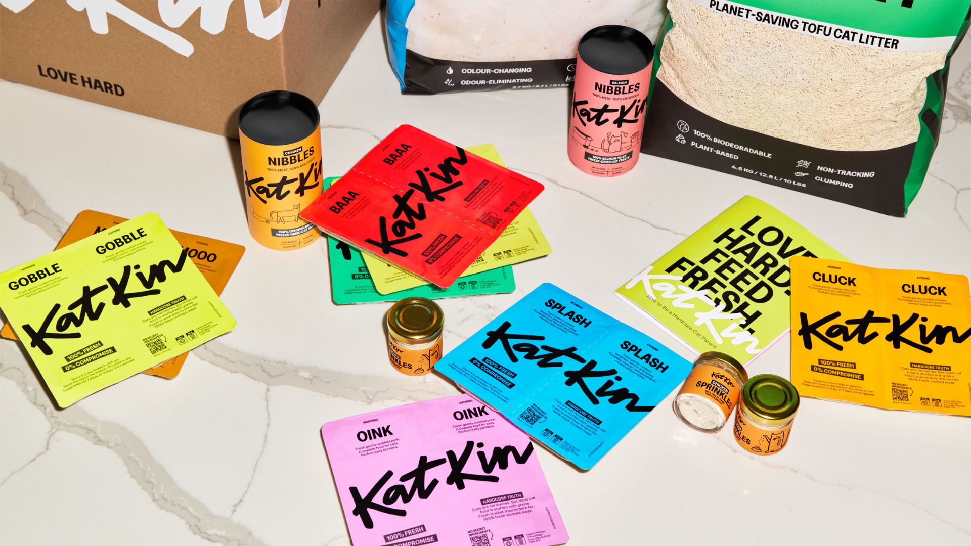
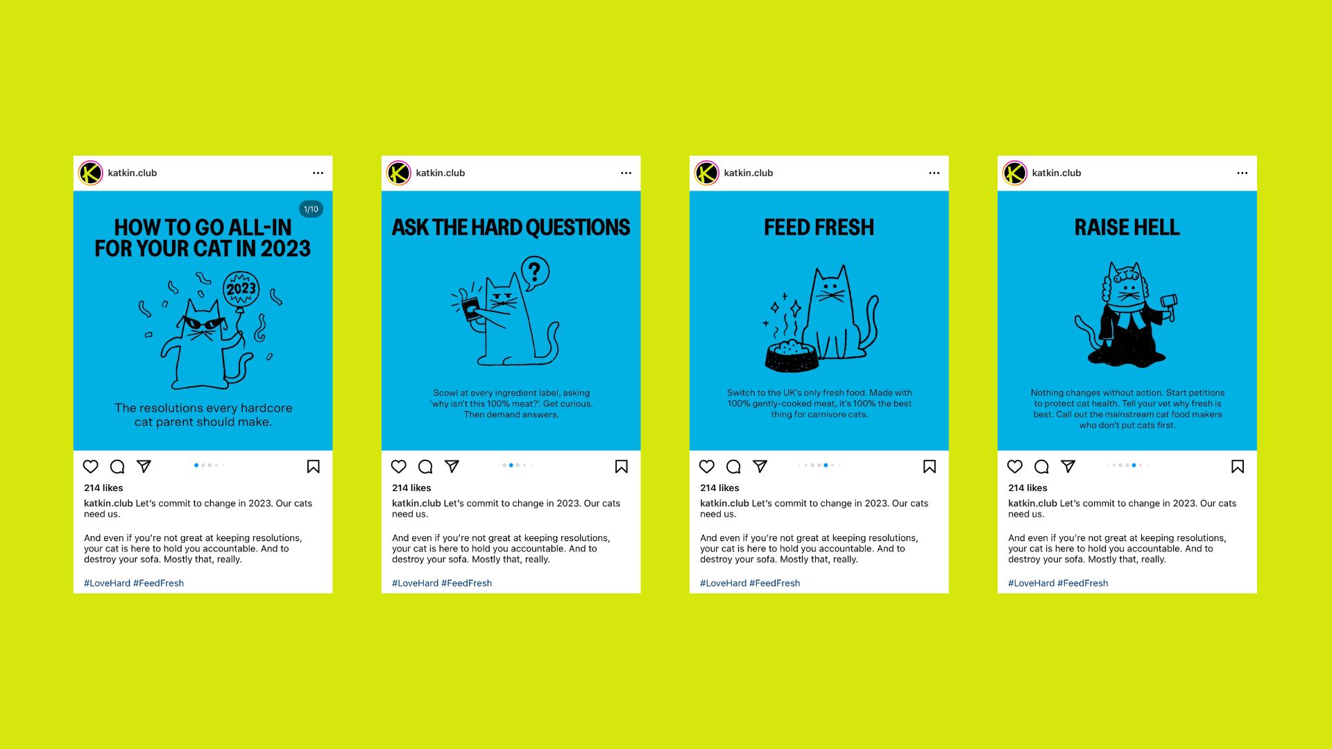
- Gold Award: Brand Strategy
- Read more about this project at sonderandtell.com
Lively and fresh.
Louise Kyme
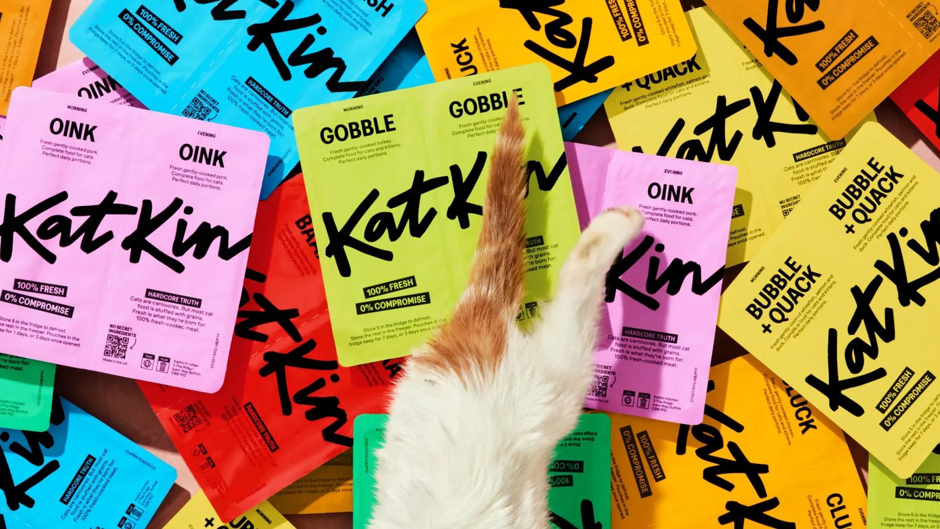
Having taken shortcuts for too long, the cat food industry was ripe for disruption. With £22m of funding to revolutionise the category, KatKin needed a powerful new brand that could cut through – and a strategy that could expose corporate fat cats and capture cat owners' attention with its 100% meat product.
Sonder & Tell set out to find a deep human insight around which to build KatKin's new brand. The team scoured vet reports and Reddit threads, frequented local cat cafés, and explored out-of category disruptors – from baby products to menstrual brands.
An insight-driven identity born straight out of the target cat-obsessed audience.
Natalie Burns
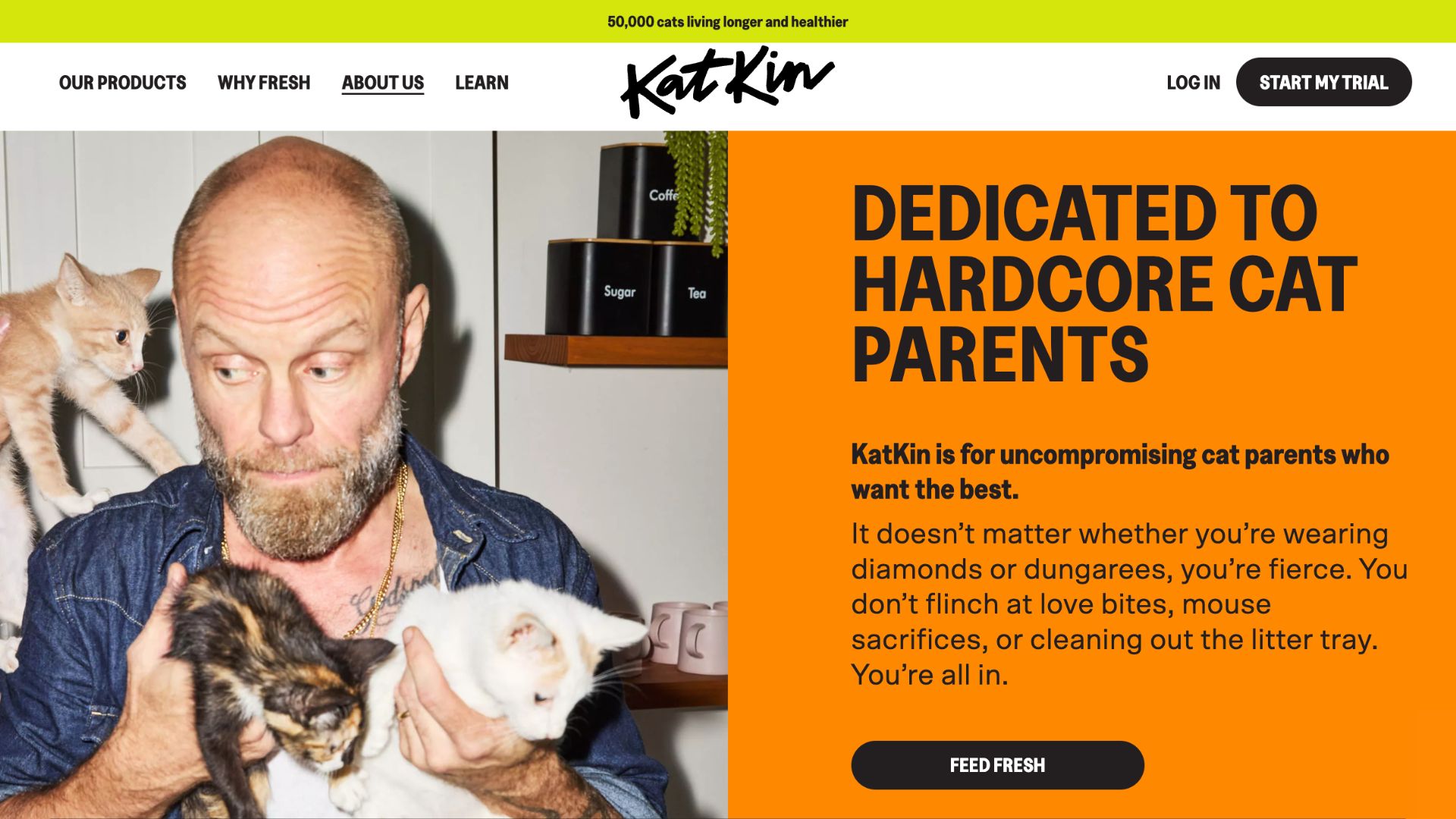
The resulting insight: cat parents are the most hardcore of all pet owners, flying in the face of the sweet, fluffy stereotype. No flinching at love bites, mouse sacrifices or getting eye-level with the litter box. They're fierce. And so is KatKin.
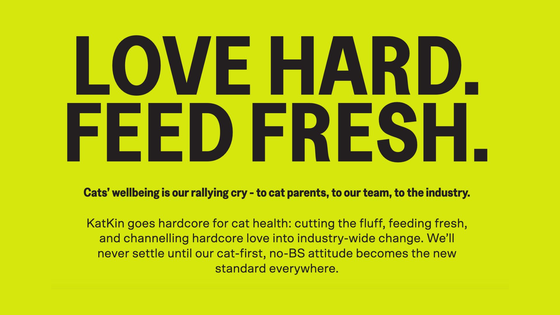
So Sonder & Tell set out to make hardcore love the new standard of cat care. KatKin became a brand that hardcore cat parents can trust to go as hardcore as they do for their cats. Cats' wellbeing is the rallying cry, resulting in an uncompromising creative idea: Love hard. Feed fresh.
Silver Award winners
Brand Impact Awards 2023: Silver Awards
The following 33 projects received at least one Silver Award trophy at the Brand Impact Awards 2023.
Download full winners showcase
The Running Towards by Studio Sutherl& and Tom Sharp
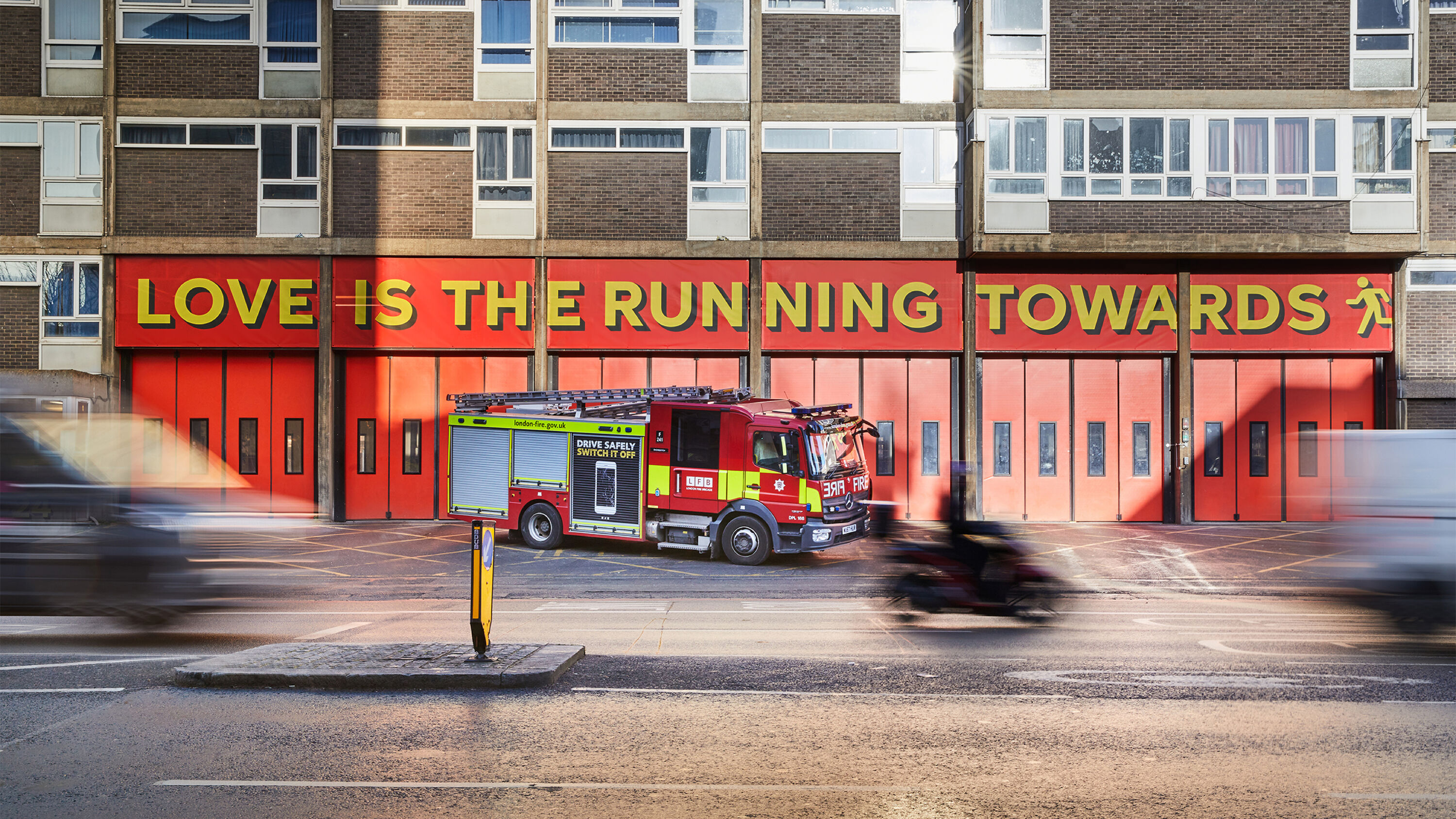
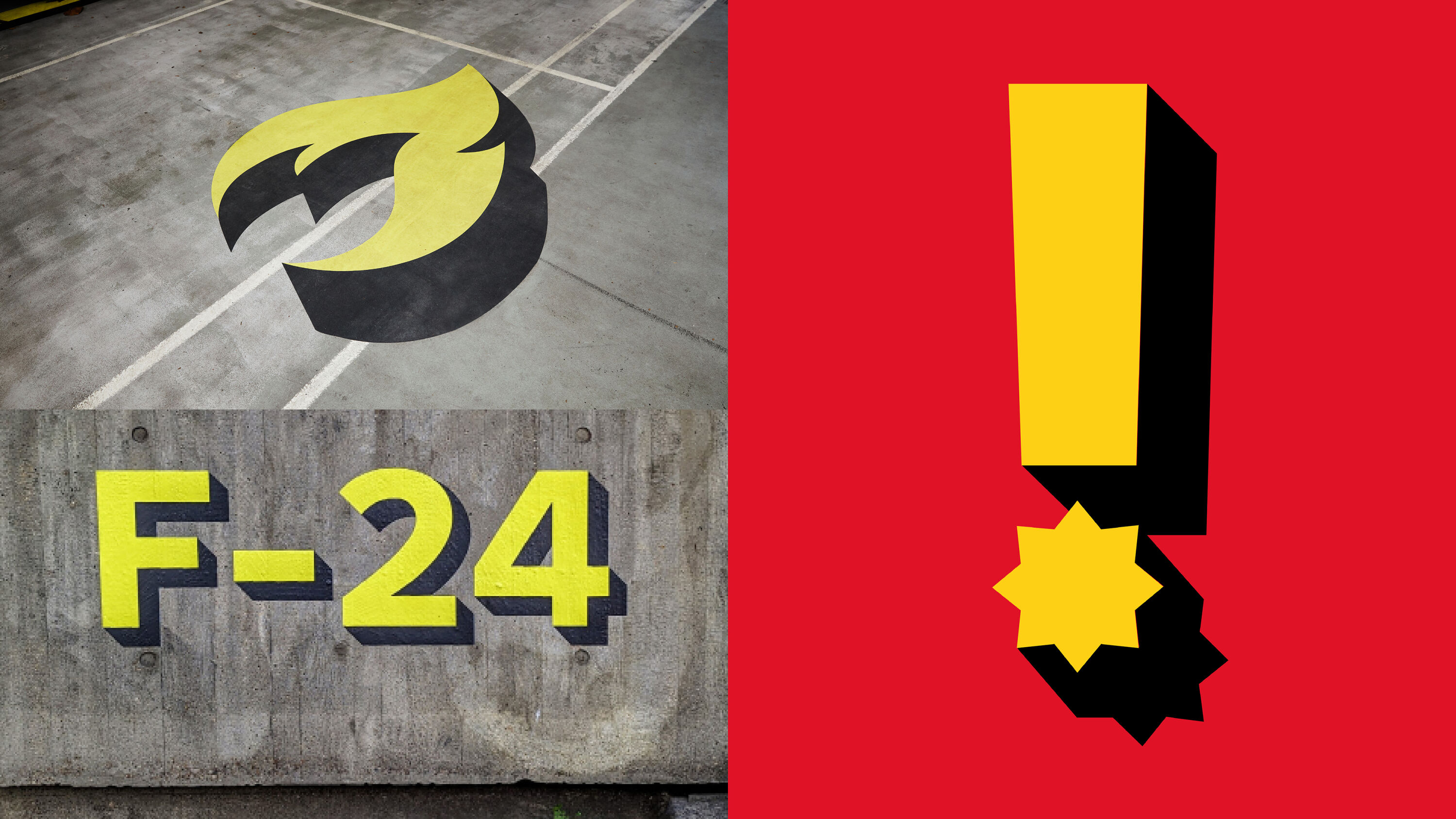
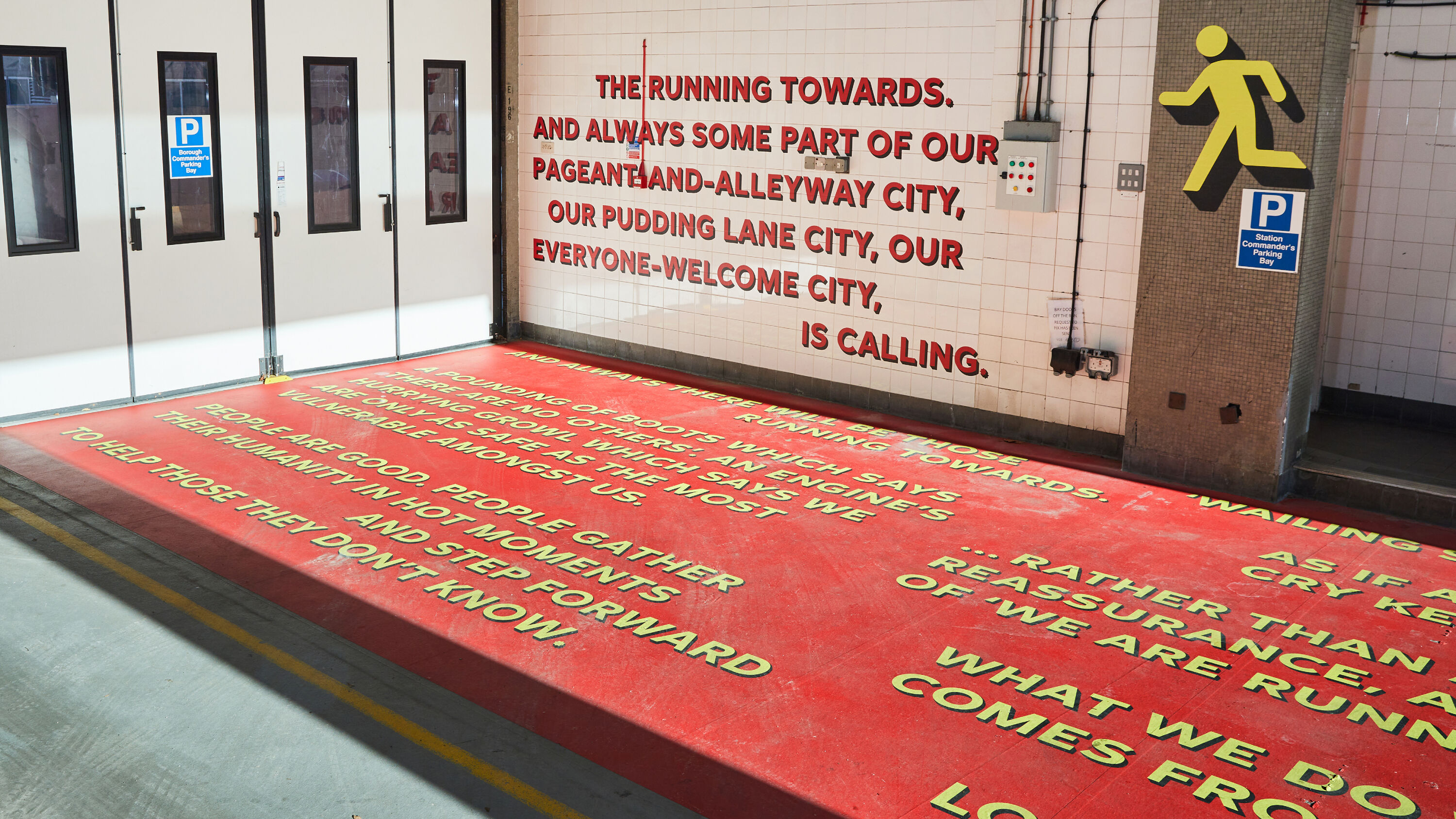
- Silver Award: Public Sector
- Silver Award: Copywriting
- Silver Award: Typography
- studio-sutherland.co.uk
- thepoetryofitall.com
London Fire Brigade (LFB) had previously talked about its vital work in relation to safety advice and narratives around specific incidents. Studio Sutherl&'s task was engage people on a much more emotional level.
Direct and powerful, brave and memorable.
Susan Ayton
This triple-Silver-winning project encapsulates the bravery and selflessness of people who deliberately head into peril, rather than away from it. Designed to be universal, the core idea of 'running towards' also applies to parents running instinctively towards their children in times of trouble, or members of the public performing incredible acts when disasters happen.
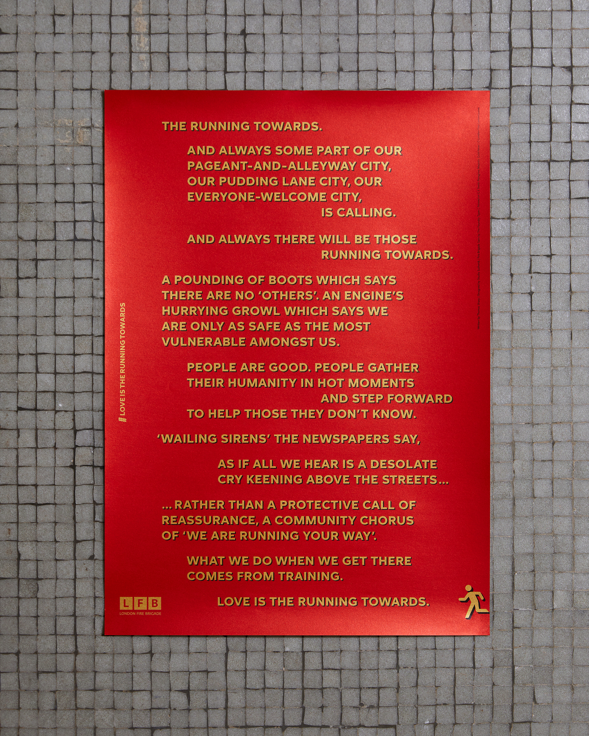
In collaboration with Tom Sharp, The Running Towards became a poetic celebration across large-scale murals and posters at London fire stations. The typography provides pace and drama ti to there writing – mirroring the steady run towards, the zig-zagging around danger, and the leaps of bravery. Inspired by old LFB engines, the bespoke typeface plays with the idea of flames casting shadows.
Snap!Gammon by Studio Sutherl&
- Silver Award: Self-Branding
- Silver Award: Illustration
- Bronze Award: Typography
- studio-sutherland.co.uk
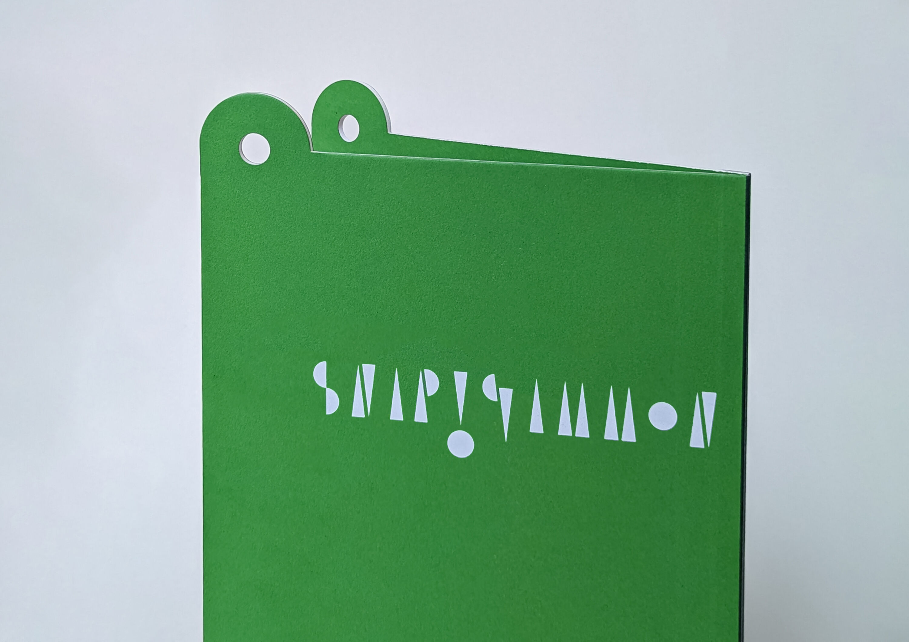
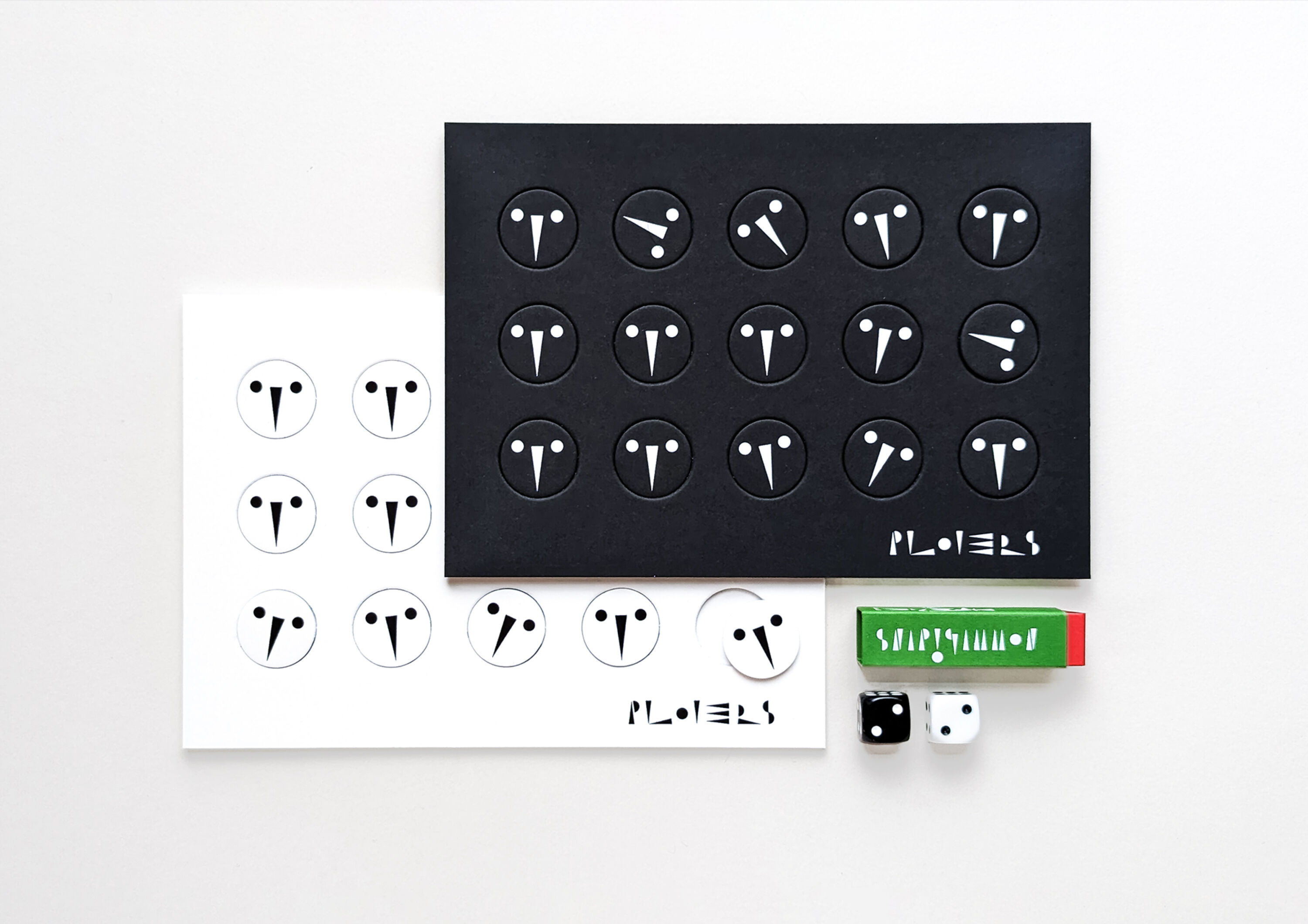
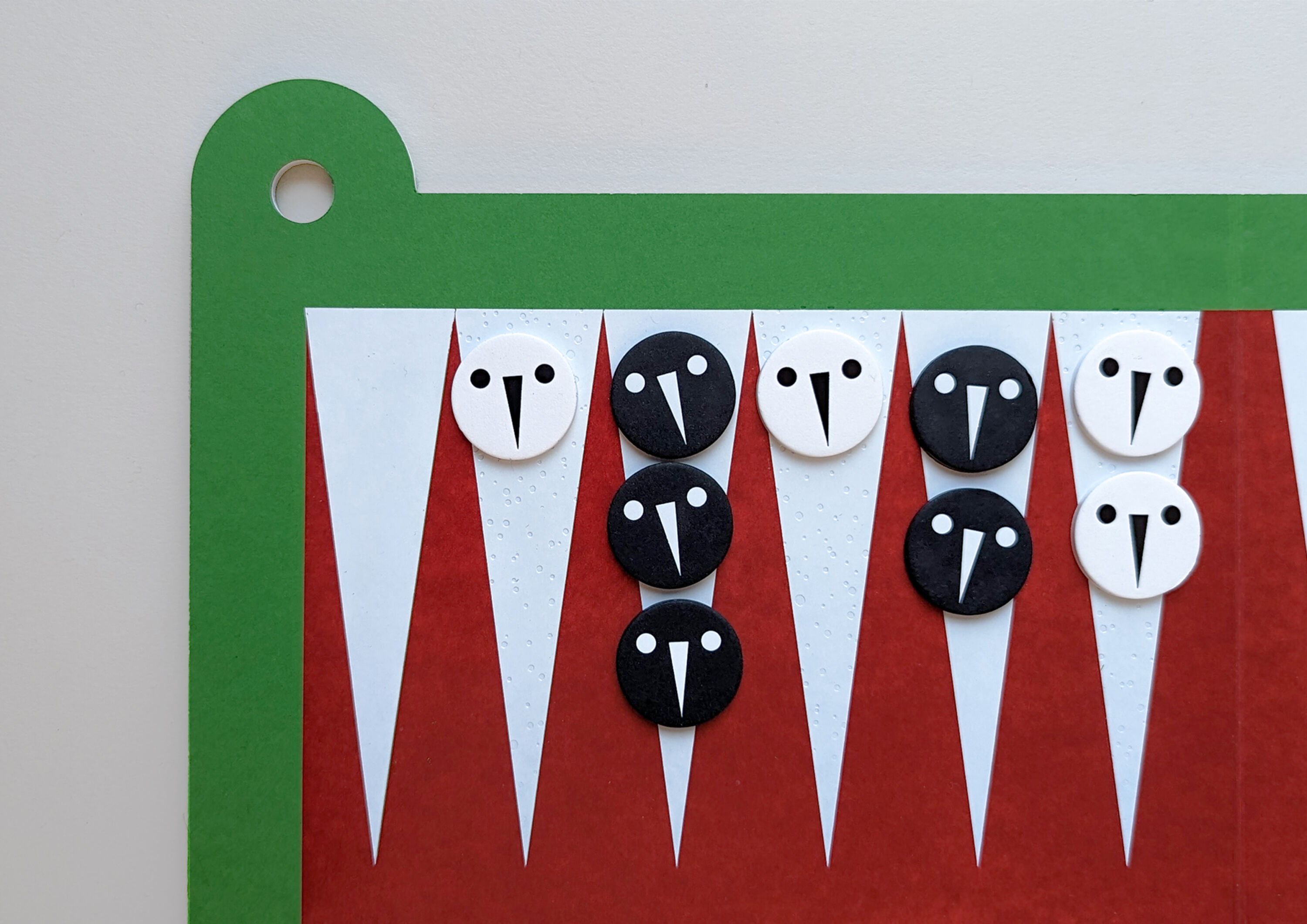
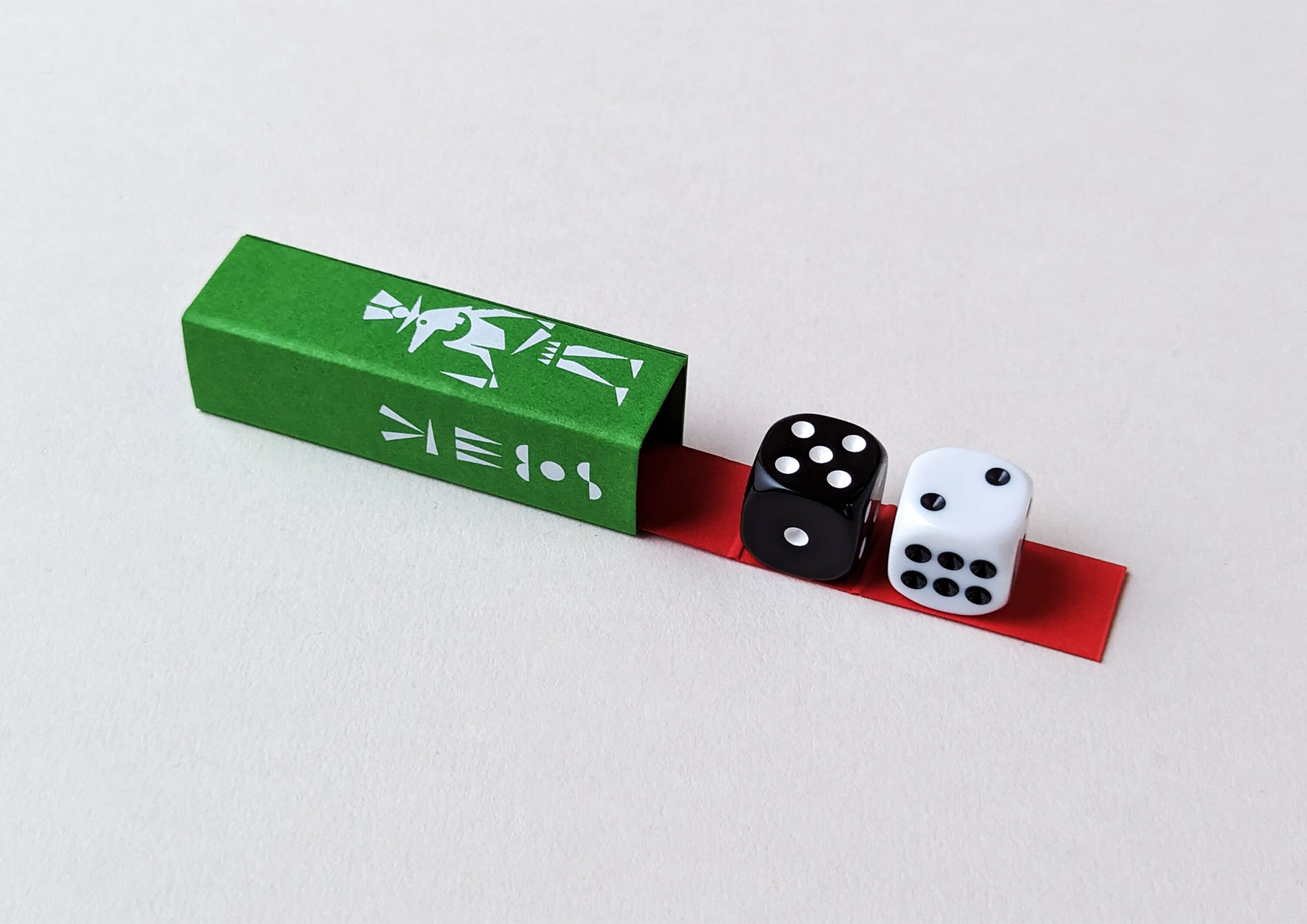
A self-initiated project to reflect Studio Sutherl&'s love of play, Snap!Gammon – like The Running Towards – has been awarded across multiple Craft disciplines. A children's version of Backgammon, it's the latest instalment in a series of games created by the studio, including chess and playing cards.
Clever and playful. Made me smile, and want to play it.
Simon Elliott
Pushing the iconic format of the much-loved game into a new visual field and narrative, Snap!Gammon turns the familiar board into a crocodile's mouth, with the pieces – Egyptian plover birds – moving along the teeth.
The accompanying story, in a concertina shape to reflect the crocodile's teeth, features each of the characters from the game's origin story: Niall, who travels through Sumeria via Crocodopolis to Egypt; Ereshkigal the Goddess; Sobek the Crocodile God; and Cleopatra.
Entirely built from triangles and circles, the typography and illustrations reference cuneiform lettering – which, like Backgammon itself, hails from Sumeria. And the dice are dedicated to Sobek, the crocodile god – for luck.
The Jockey Club by Thisaway
- Silver Award: Brand Strategy
- Silver Award: Illustration
- Read more about this project at thisaway.co
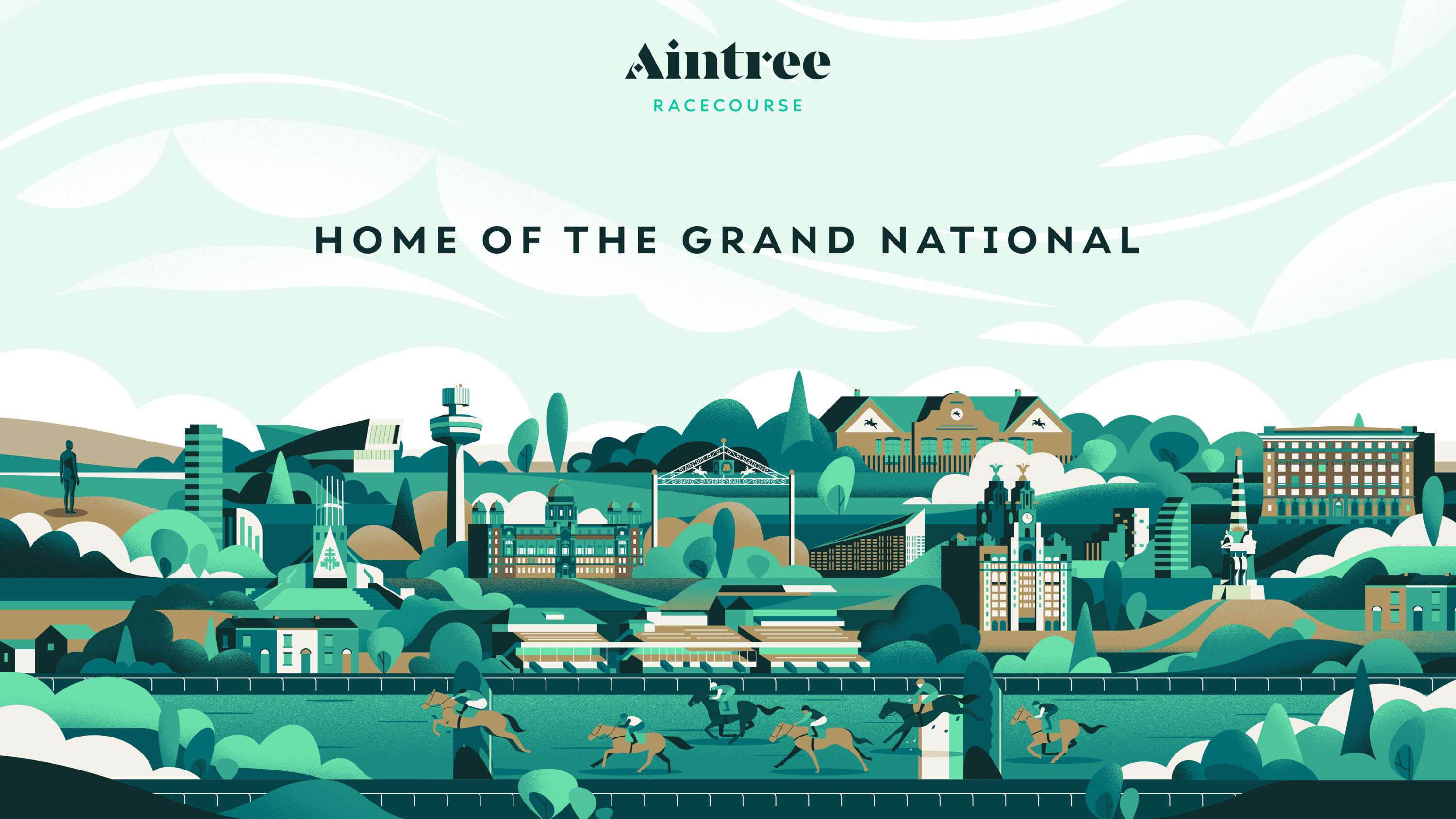
With a heritage dating back to 1750, the Jockey Club runs 15 of the country's leading racecourses. To ensure future growth and funding, the brand needed to raise its profile – whilst allowing individual racecourses their own identity.
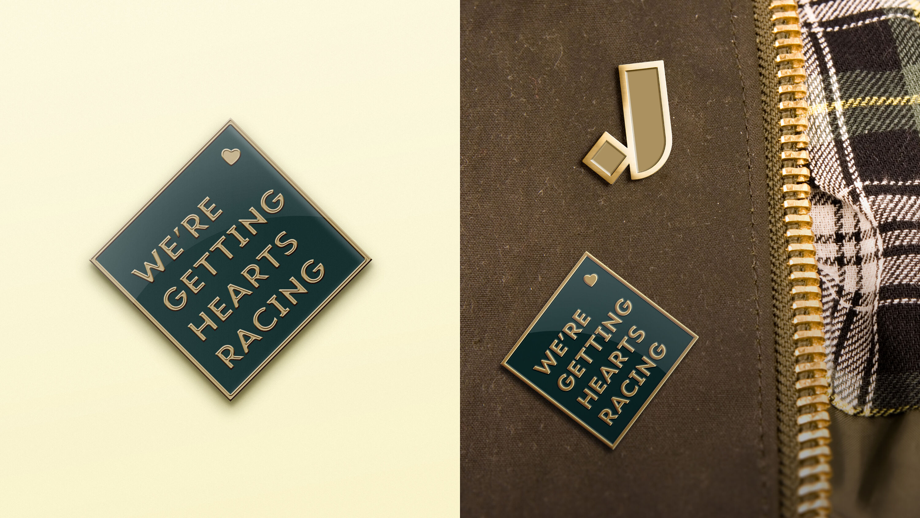
'Getting hearts racing' is a beautiful line that really conveys a dynamic and energetic vibe.
Paul Bailey
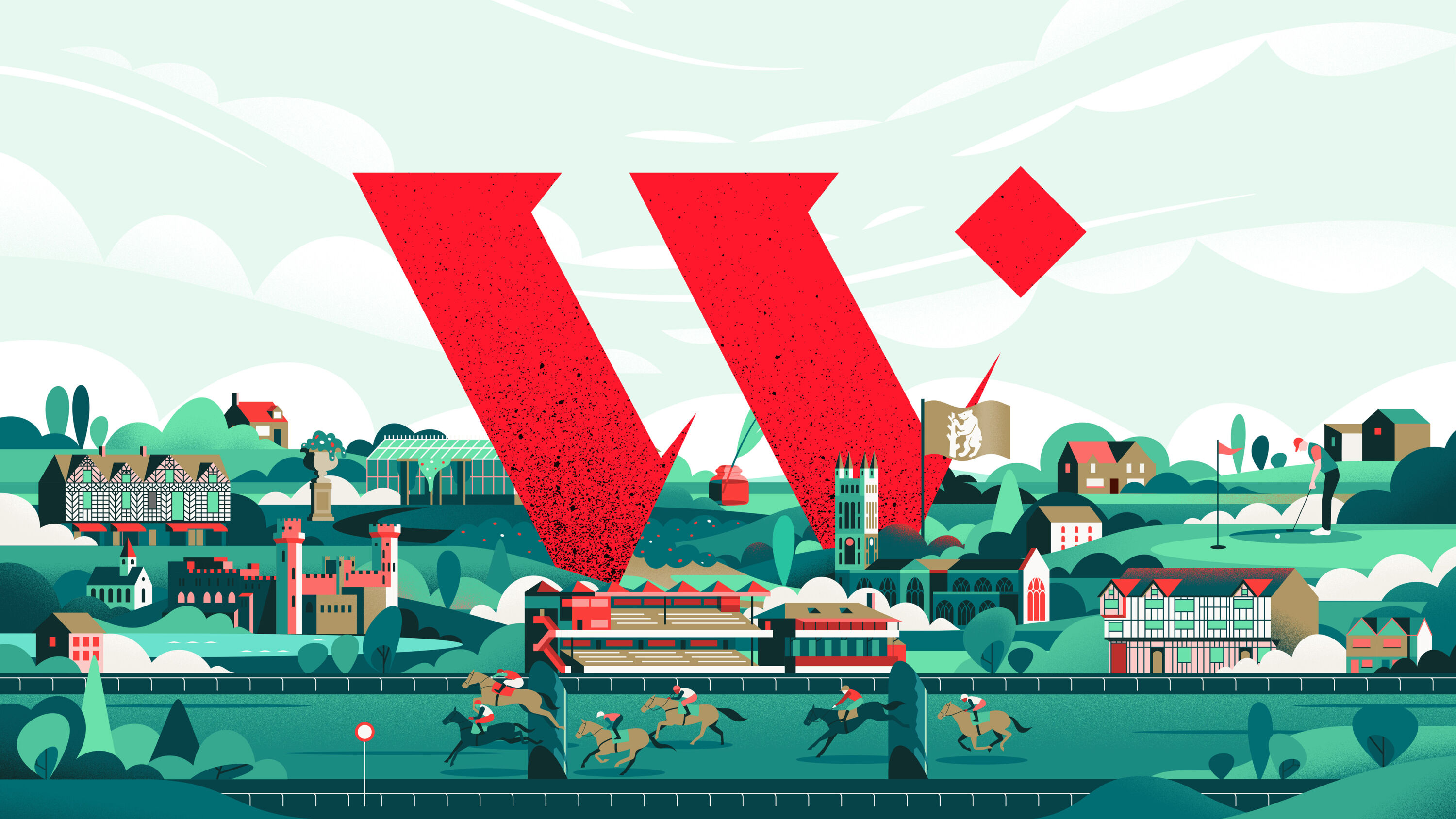
Thisaway developed a brand hierarchy that elevated flagship events The Grand National, Cheltenham Festival and The Derby licence into full marquee brands, while other courses put their own spin on the masterbrand.
A new brand purpose – For Racing. For Good – captured The Jockey Club's position as the sport's custodian, and provided a forward-facing thought-leadership stance. Meanwhile, a new customer promise – Getting Hearts Racing – embraced the drama of the sport, and enabled the brand to be more dynamic, expressive, and energetic.
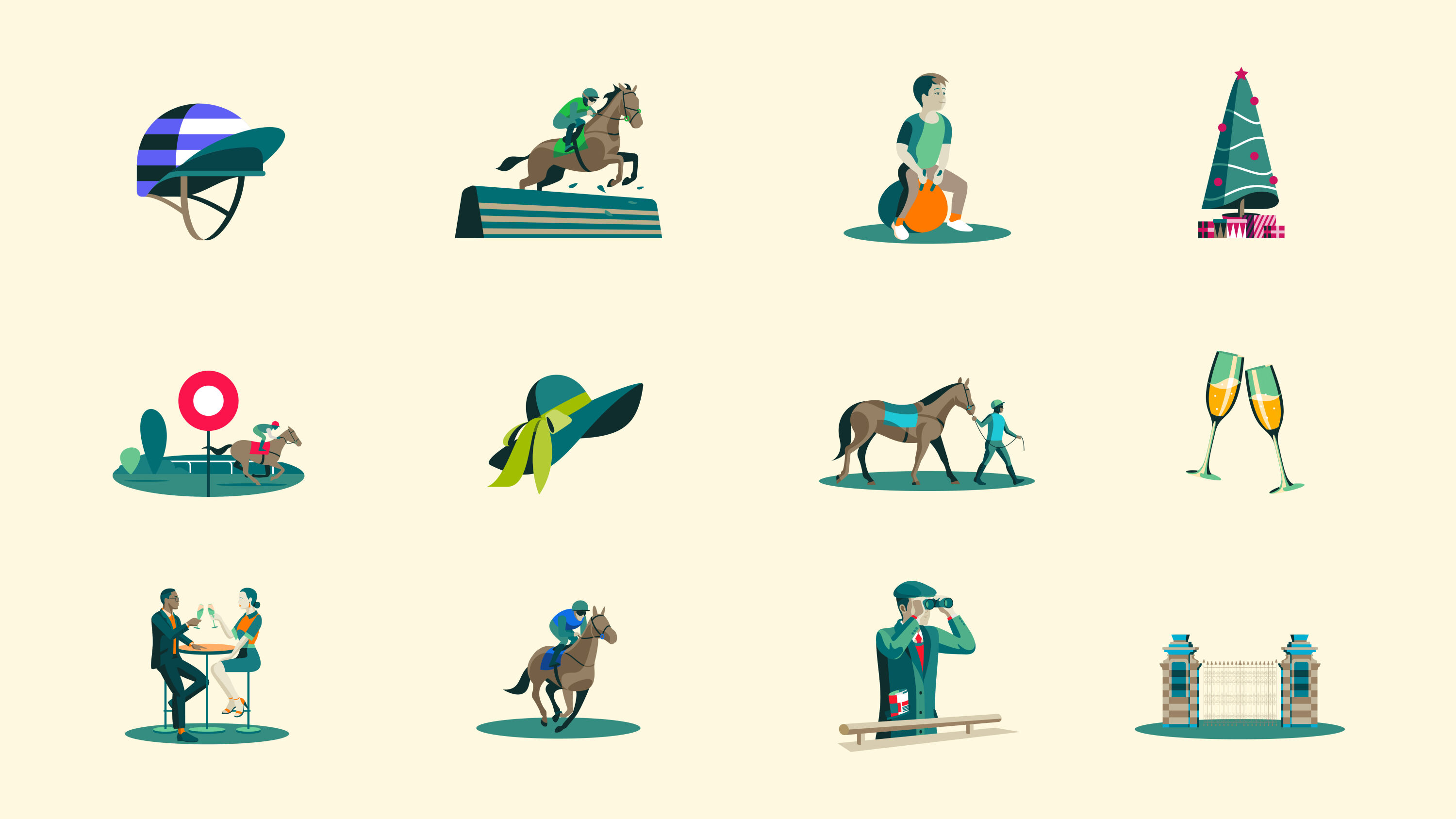
While retaining the brand's heritage and gravitas through its already well-established diamond motif, Thisaway added a contemporary twist with a fresh illustration style, showcasing unique aspects of each racecourse and surrounding landmarks.
Thredd by Design Bridge and Partners
- Silver Award: Financial Services
- Bronze Award: Brand Strategy
- designbridge.com
At the heart of the digital finance revolution since 2007, Global Processing Services (GPS) was the trusted technology partner for the world's leading fintechs and challenger banks, processing billions of transactions every year for the likes of Revolut, ANNA, and Starling Bank.
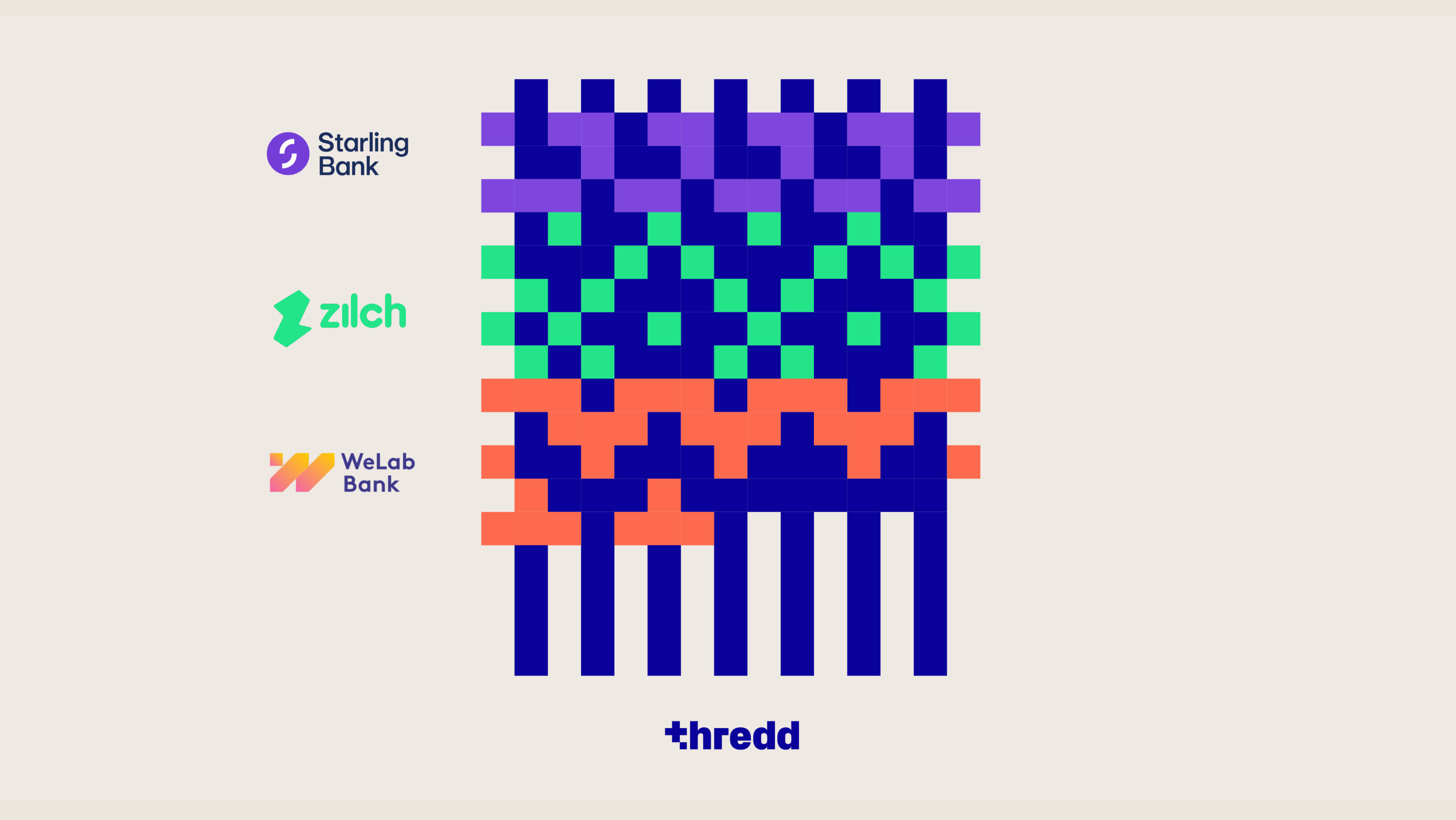
There's a solid idea to weave everything together, but it still feels contemporary and techy. The use of the partner brands' colours is a nice connection.
Jack Renwick
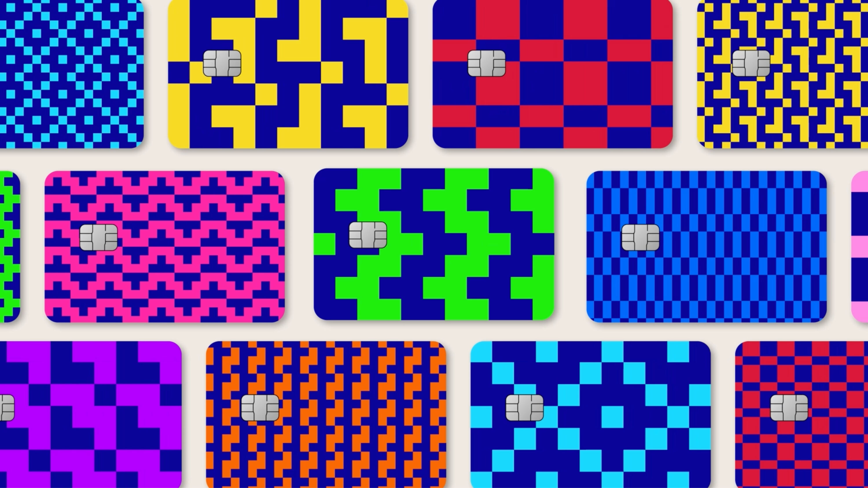
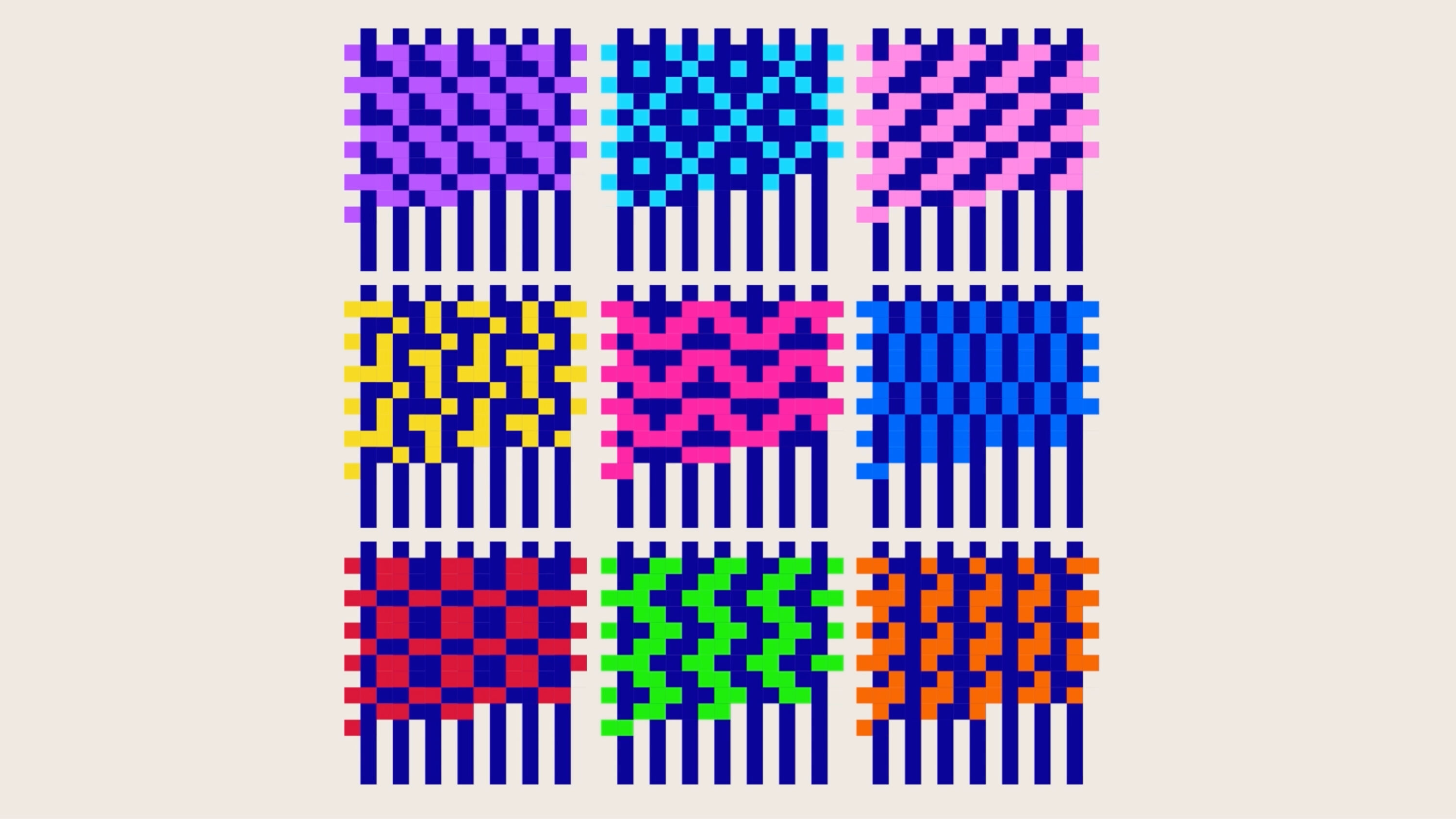
Design Bridge and Partners developed a new name and visual identity to match GPS' global reputation. Inspiration came from the history of computing: in 1804, the Jacquard loom revolutionised the weaving industry. Using binary-code patterns on interchangeable punch-cards to automate the weaving process, it directly influenced the first programmable computers.
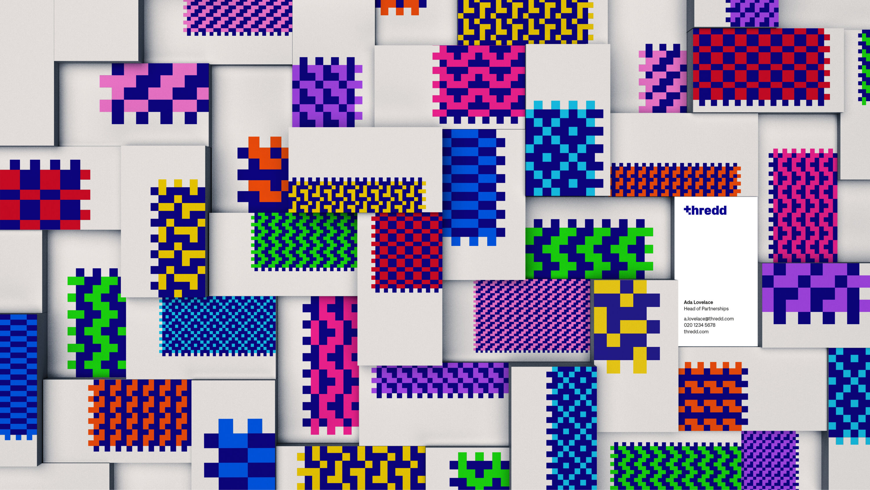
Paying homage to these origins, GPS became Thredd – part of a brand overhaul that highlights its tailor-made tech solutions. Digitally generated binary-code patterns represent its many partnerships. These can reduce to square glyphs, and the typeface and icon style echo the square grid they're built on.
Woven together, these patterns represent the rich tapestry of partnerships that make up Thredd's business. Thredd itself is represented by a dark-blue vertical thread, the 'common thread' holding together its brightly coloured fintech collaborators.
Team GB by Thisaway
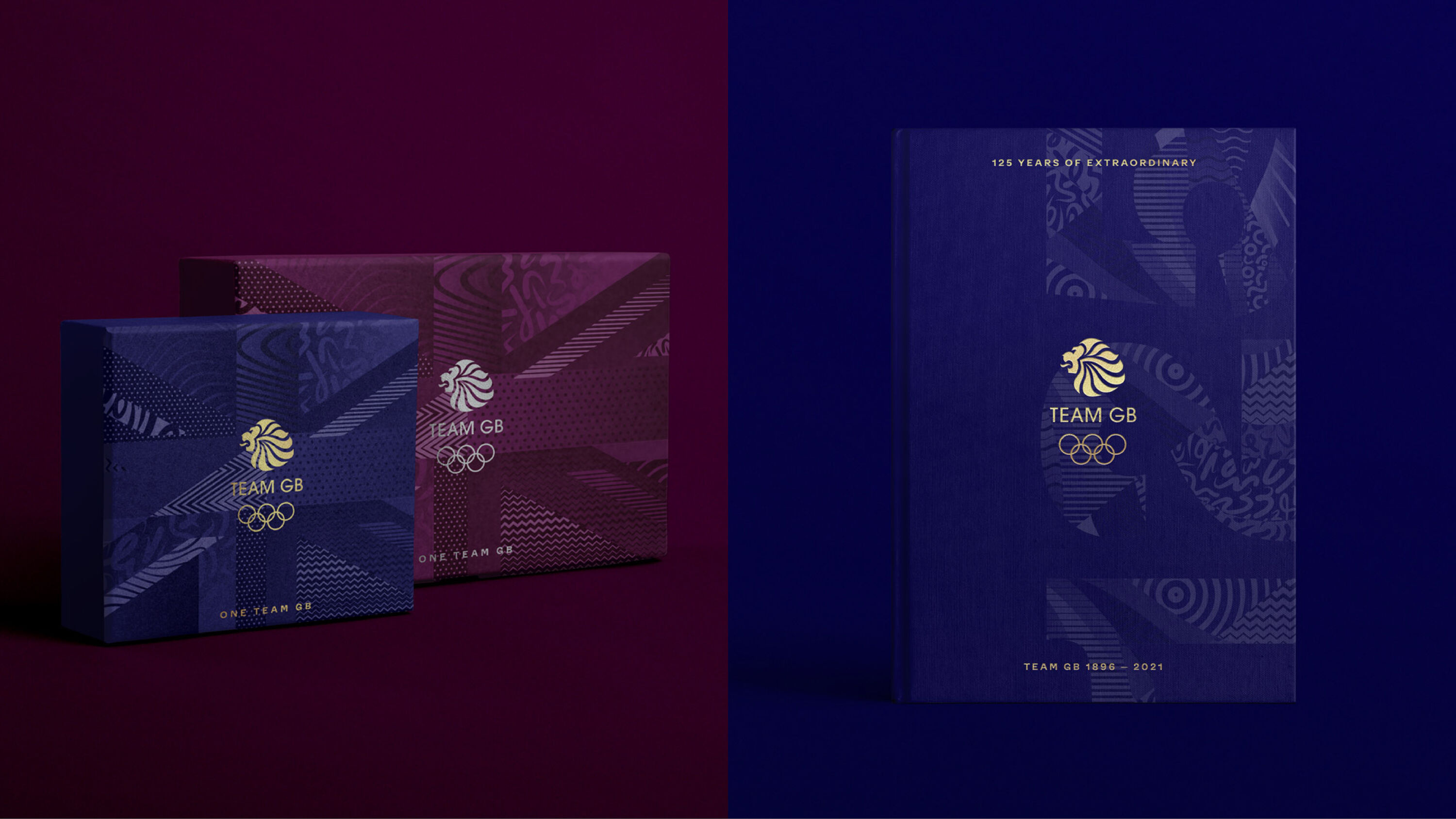
- Silver Award: Brand Strategy
- Bronze Award: Illustration
- Read more about this project at thisaway.co
As the external face of the British Olympic Association, Team GB needed to grow the profile of its brand ahead of Paris 2024. Engagement was invariably high during the Olympics themselves, but Team GB needed relevance outside of Games time.
Comprehensive, colourful, dynamic, and joyful. Lots of depth, from simple and bold through to complex and special. Love it.
Kate Marlow
'Believe in Extraordinary' was the existing brand idea, which focused on performance and proved popular with athletes and coaches. But it risked painting elite sports as too elitist – elevating athletes into untouchable superhumans.
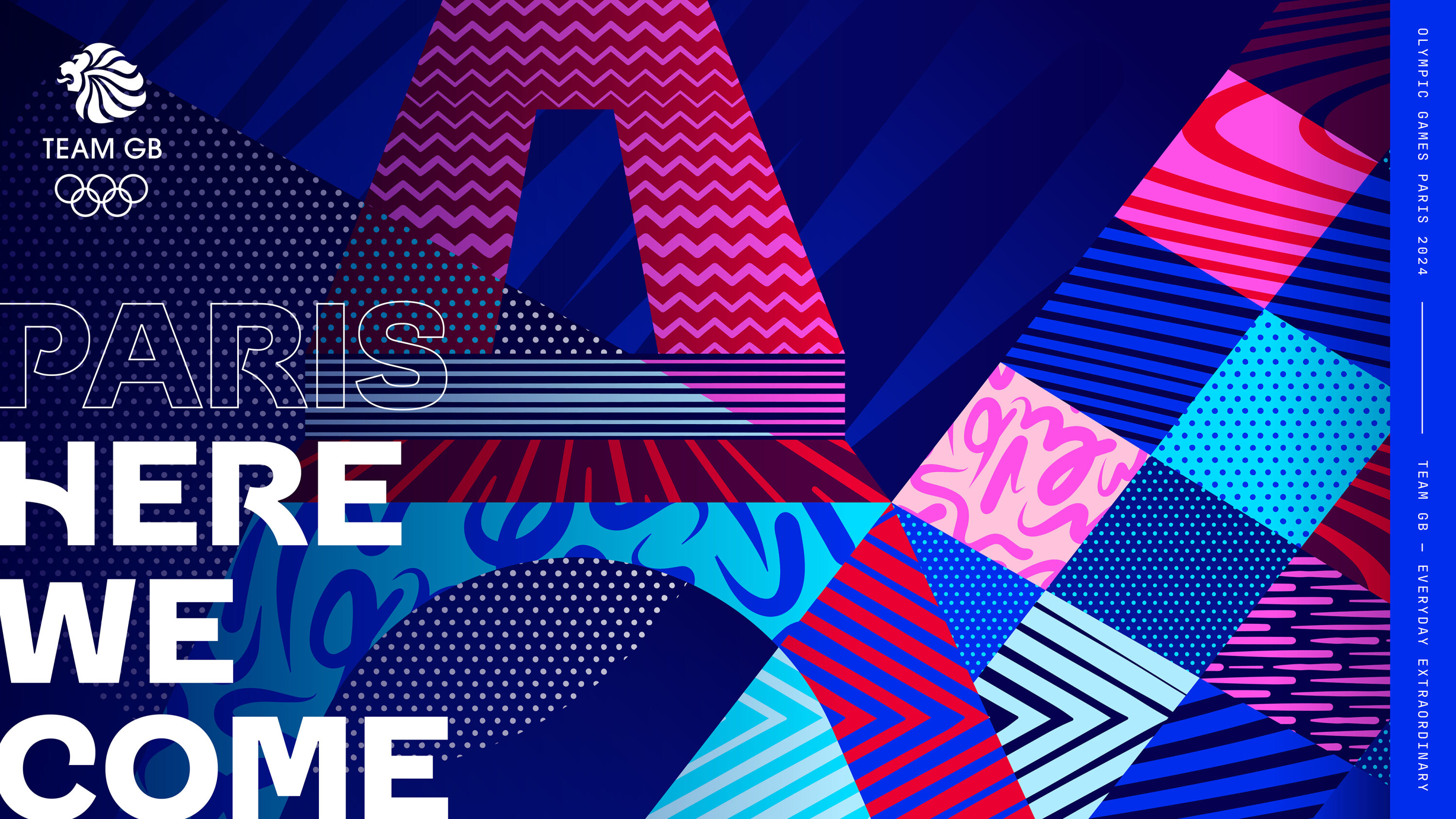
Thisaway developed a new strategy to express how Team GB facilitates ordinary people to achieve extraordinary things. A new brand idea – 'Everyday Extraordinary' – champions the superhuman endeavours that make athletes special, but also the humanity that grounds them.
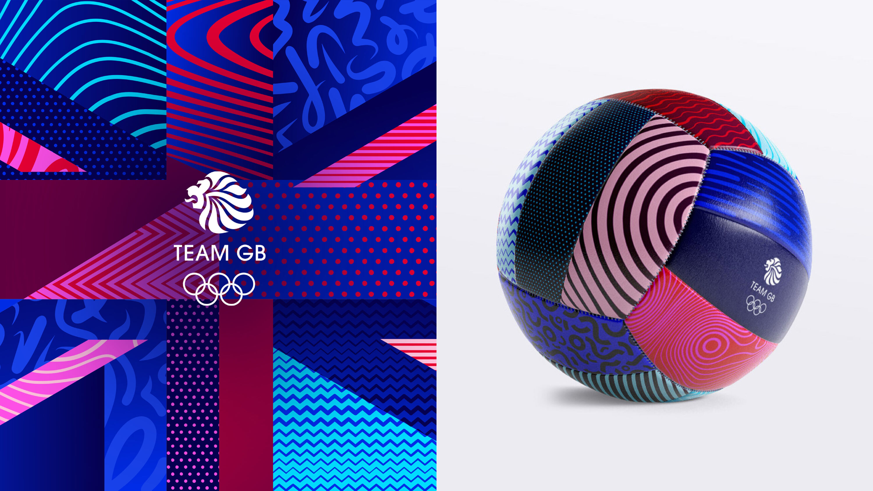
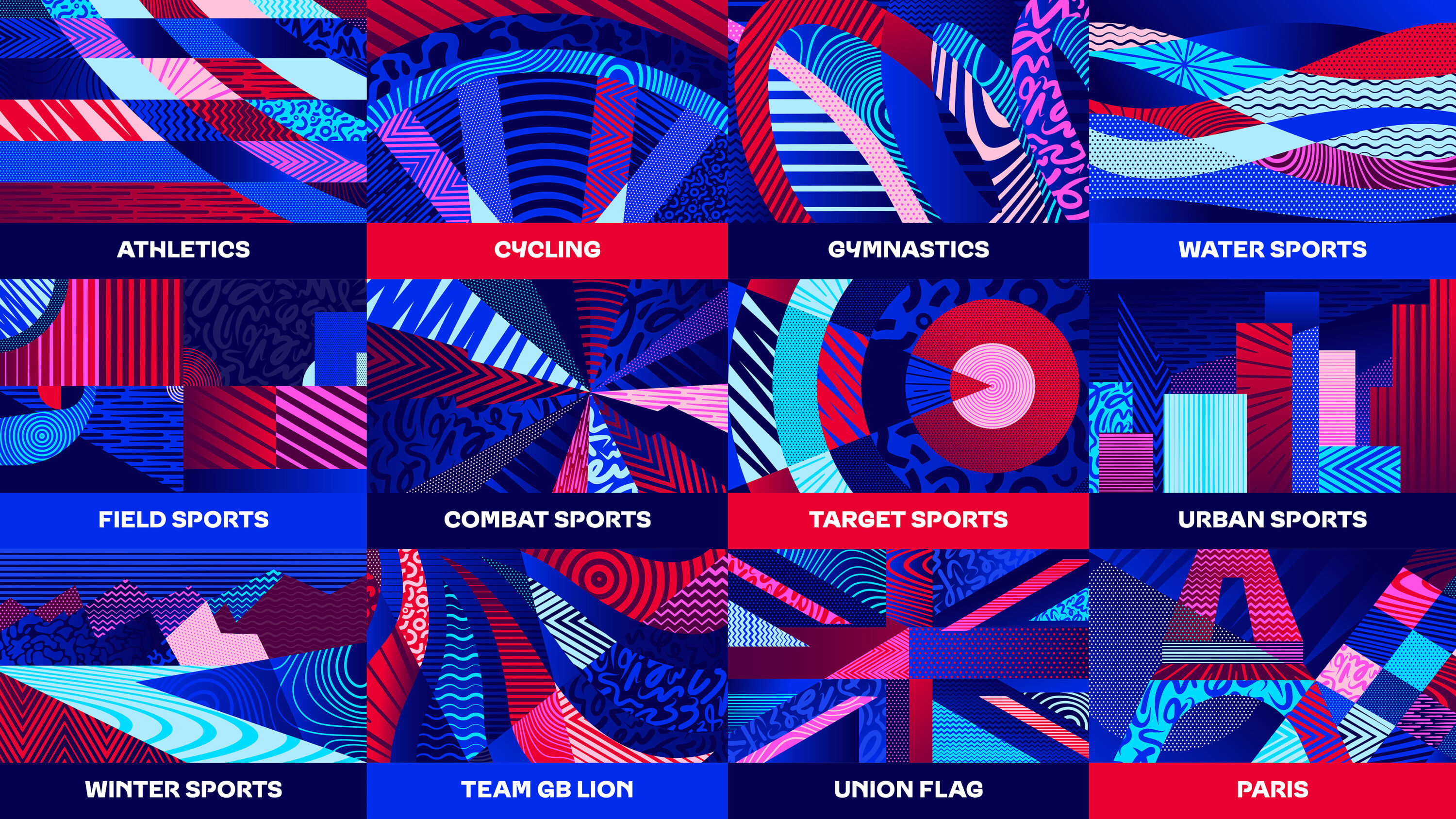
With a set of patterns inspired by key athlete attributes, the new brand identity puts a modern twist on the familiar red, white and blue – supported by a uniquely flexible typeface that blends classic British influences with energy and diversity.
The Land of Warriors by Design Bridge and Partners
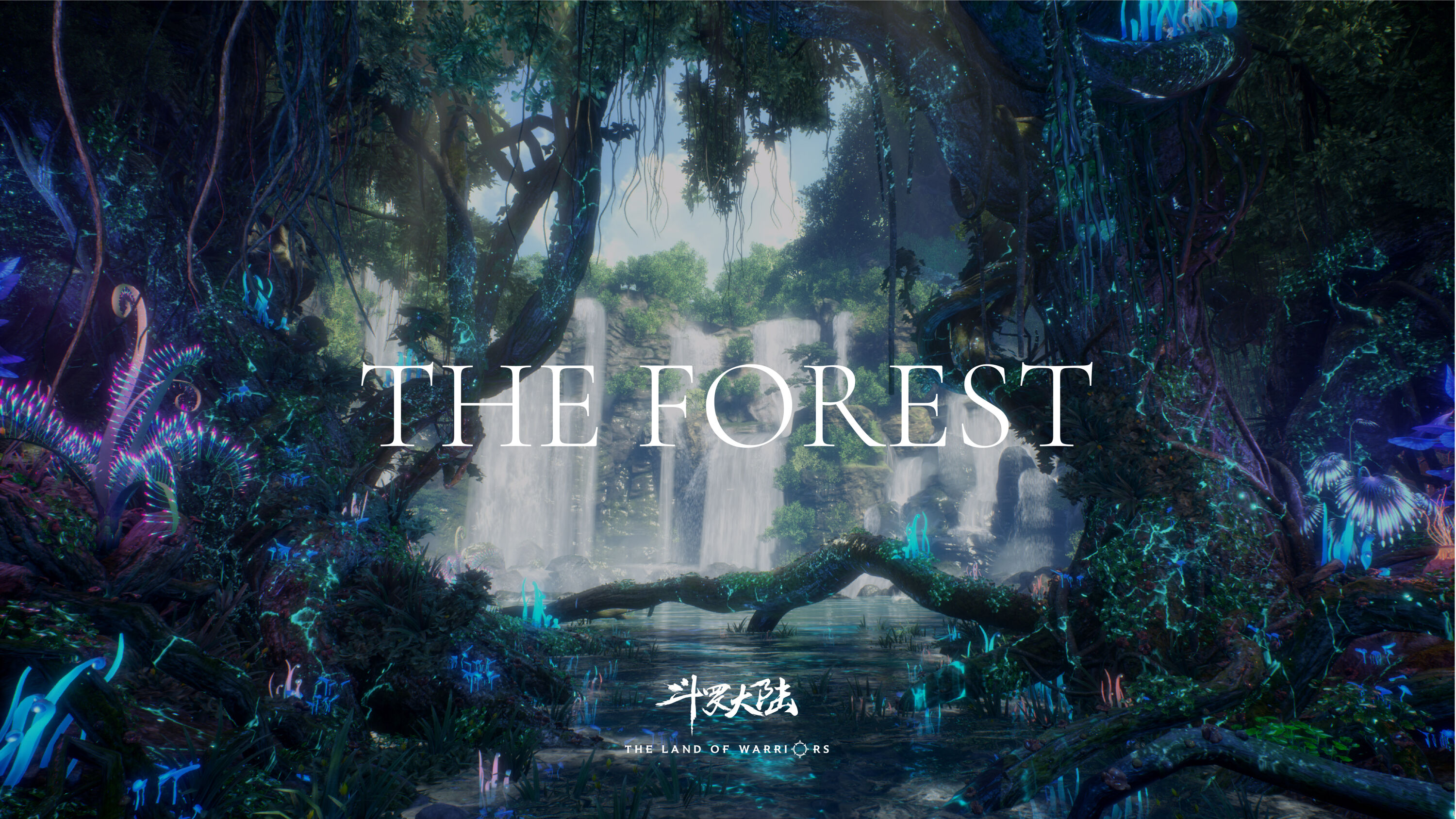
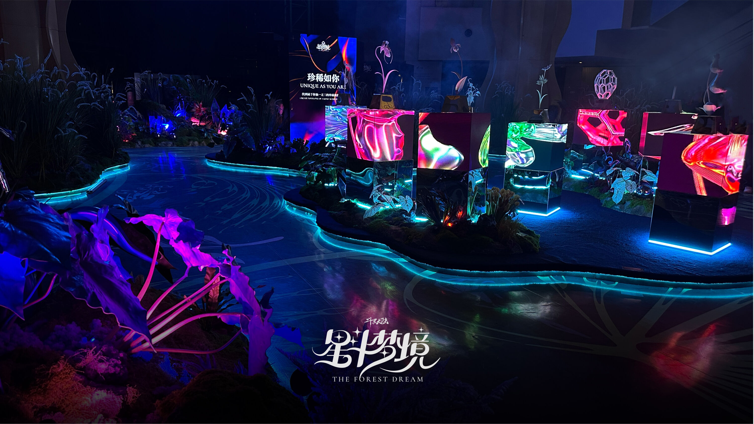
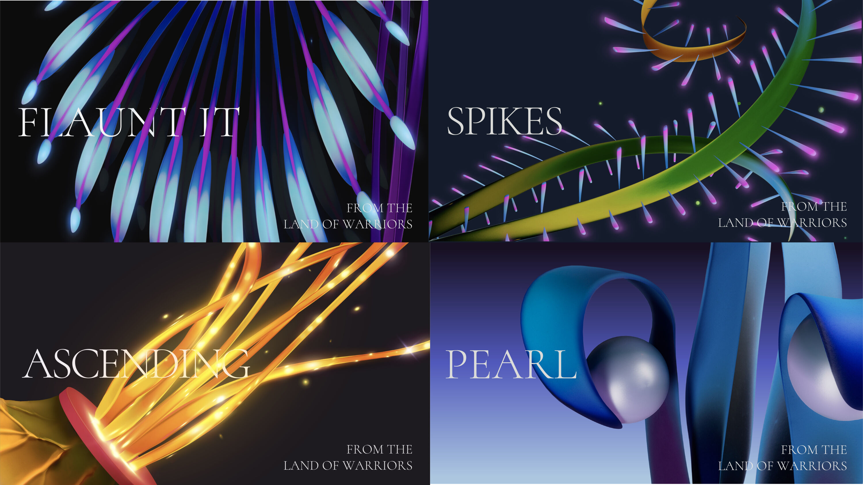
- Silver Award: Illustration
- Bronze Award: Entertainment
- designbridge.com
Like a science photo library gone mad.
Victoria Sawdon
As the top streamed animated fantasy series in China, The Land of Warriors is a flagship show for leading Chinese streaming platform Tencent Video. It has spawned many high-profile brand collaborations, particularly aimed at younger audiences.
Scenes set in the mystical Starry Forest enjoy particularly high fan engagement. A sacred place where characters retreat to advance their souls, the forest bears witness to their growth – and it's built an identity as a character in its own right.
Beautifully executed. It's so easy to lose yourself in there, and feel captivated.
Raafaye Ali
Design Bridge and Partners worked with Polish artist Pawel Nolbert to recreate the Starry Forest's beautiful botany in his distinctive style. In turn, these artworks informed the look and feel of the overall brand.
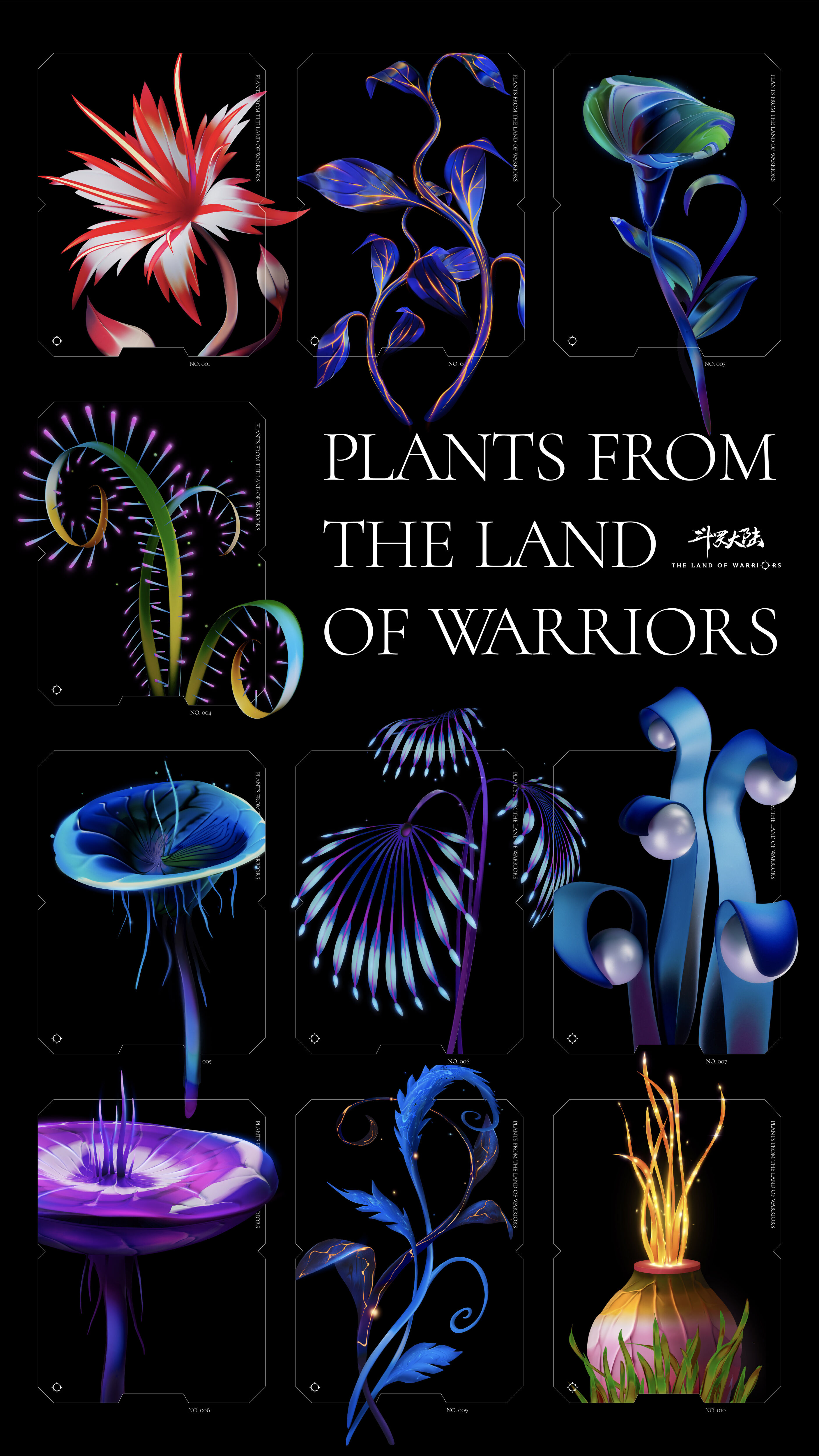
In spring 2023, the Starry Forest concept came alive at Joy City shopping centre in Shanghai. Visitors to the Forest Dream Exhibition experienced the mesmerising forest realm through a series of immersive settings and interactive AI installations, raising awareness of the world's endangered plantations.
Graza by Gander
- Silver Award: Artisan
- Find out more about this project at takeagander.com
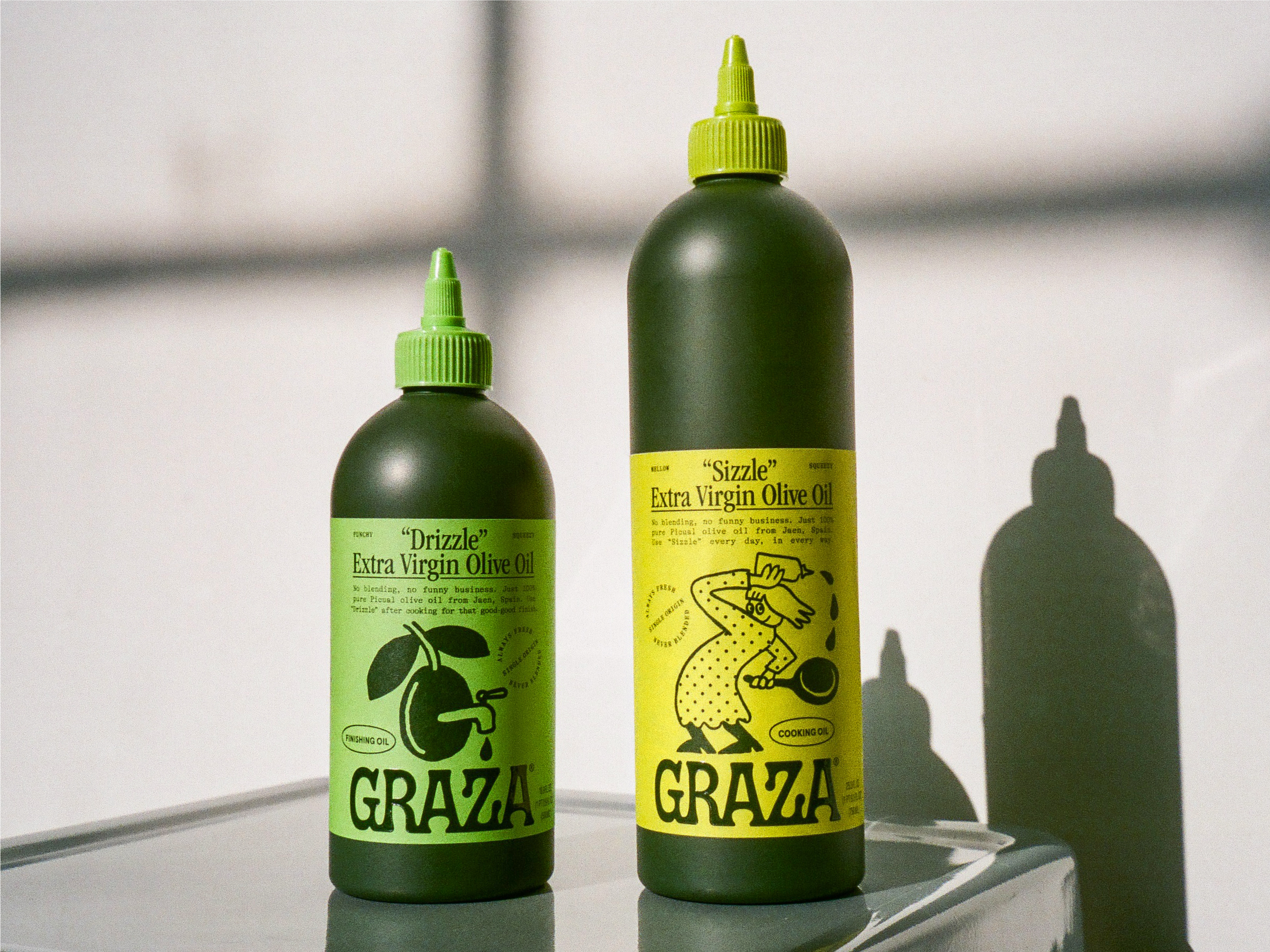
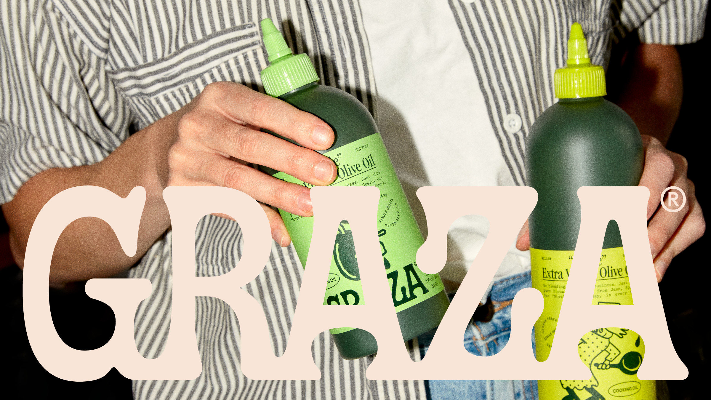
Graza came to Gander to help sell incredibly high-quality, single-origin Spanish olive oil in a squeeze bottle: in other words, very fancy oil in a decidedly un-fancy format. Graza's new brand identity reflects this unexpected union, granting people permission to finally have fun with their oil.
Makes a ubiquitous product feel fresh, unique and desirable,
Fiona Dinsdale
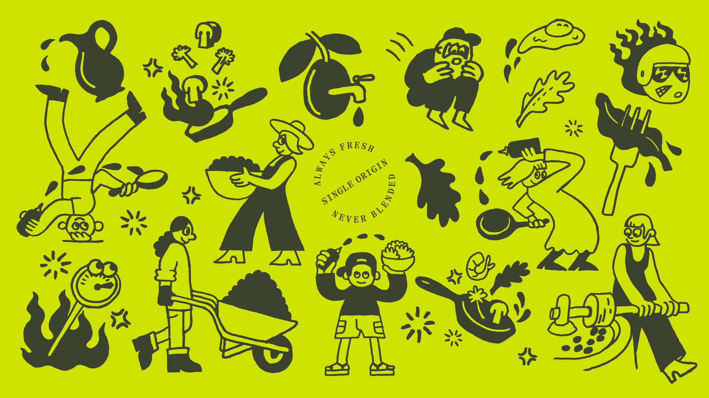
Foregoing the faux heraldry and decorative European flags typically found in this sector in favour of radical honesty and playfulness, Gander helped put the message front and centre that good olive oil should be used every day, in every way. Demystifying the olive oil shopping experience, Graza wins shoppers' trust by sharing everything they need to know to pick a better olive oil.
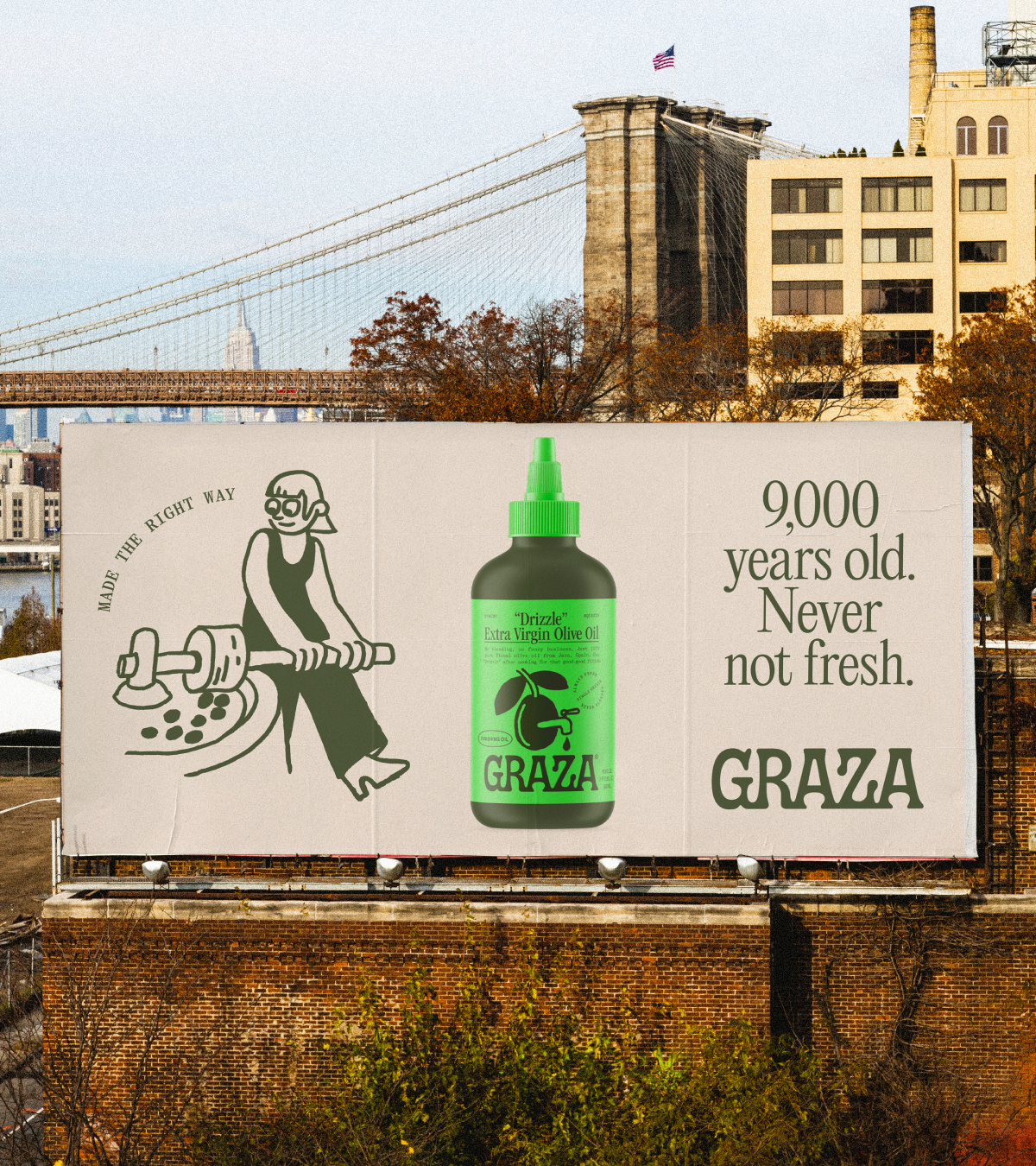
Little educational moments throughout the brand experience help explain the benefits of this age-old elixir in a more casual way. The 'Graz-o-pedia' is your source for explaining all things olive-oil-related, while fun illustrated facts keep things light and accessible.
Byron Burgers by Taxi Studio and Reed Words
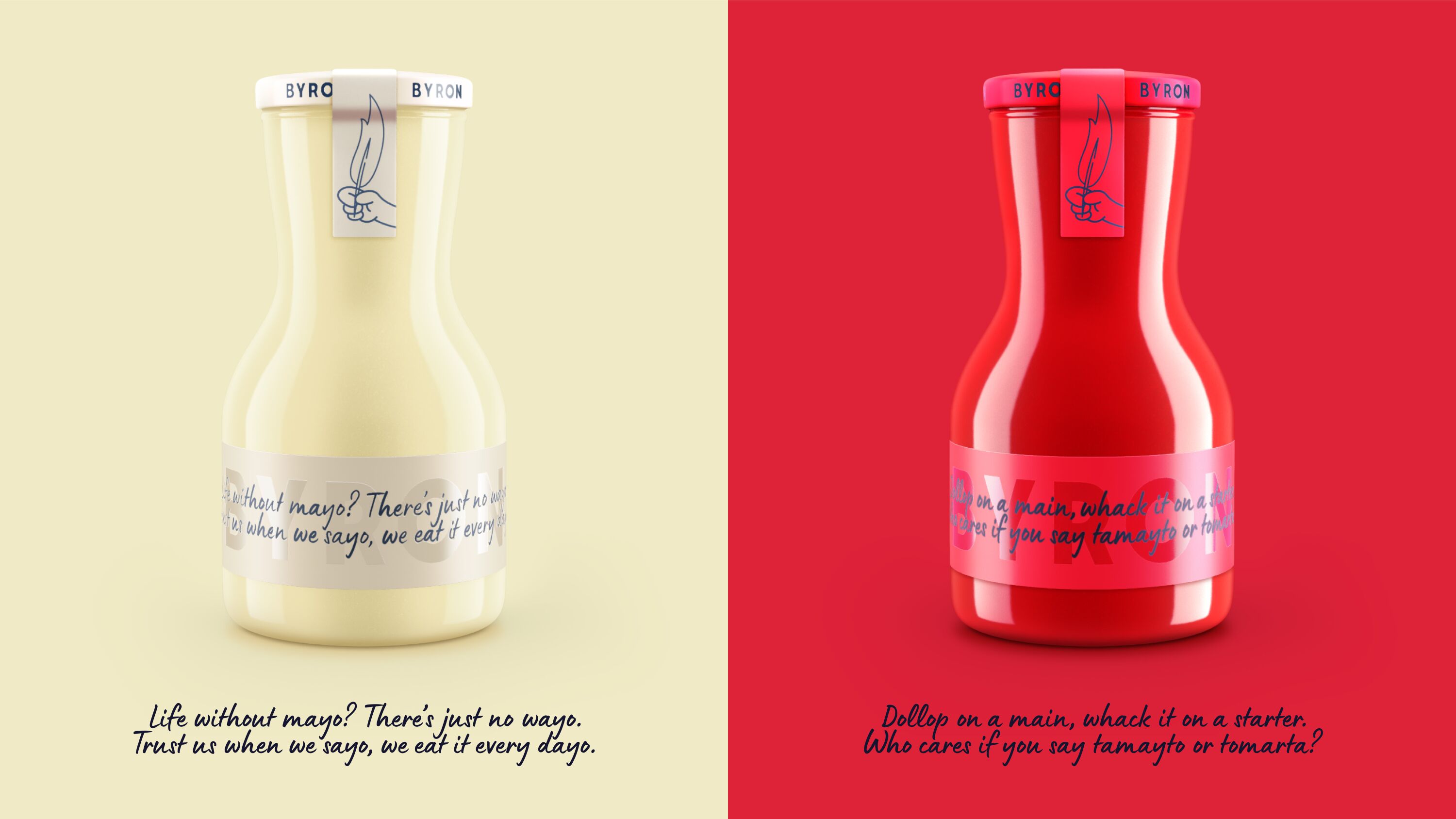
- Silver Award: Bars & Restaurants
- Find out more about this project at taxistudio.co.uk and reedwords.com
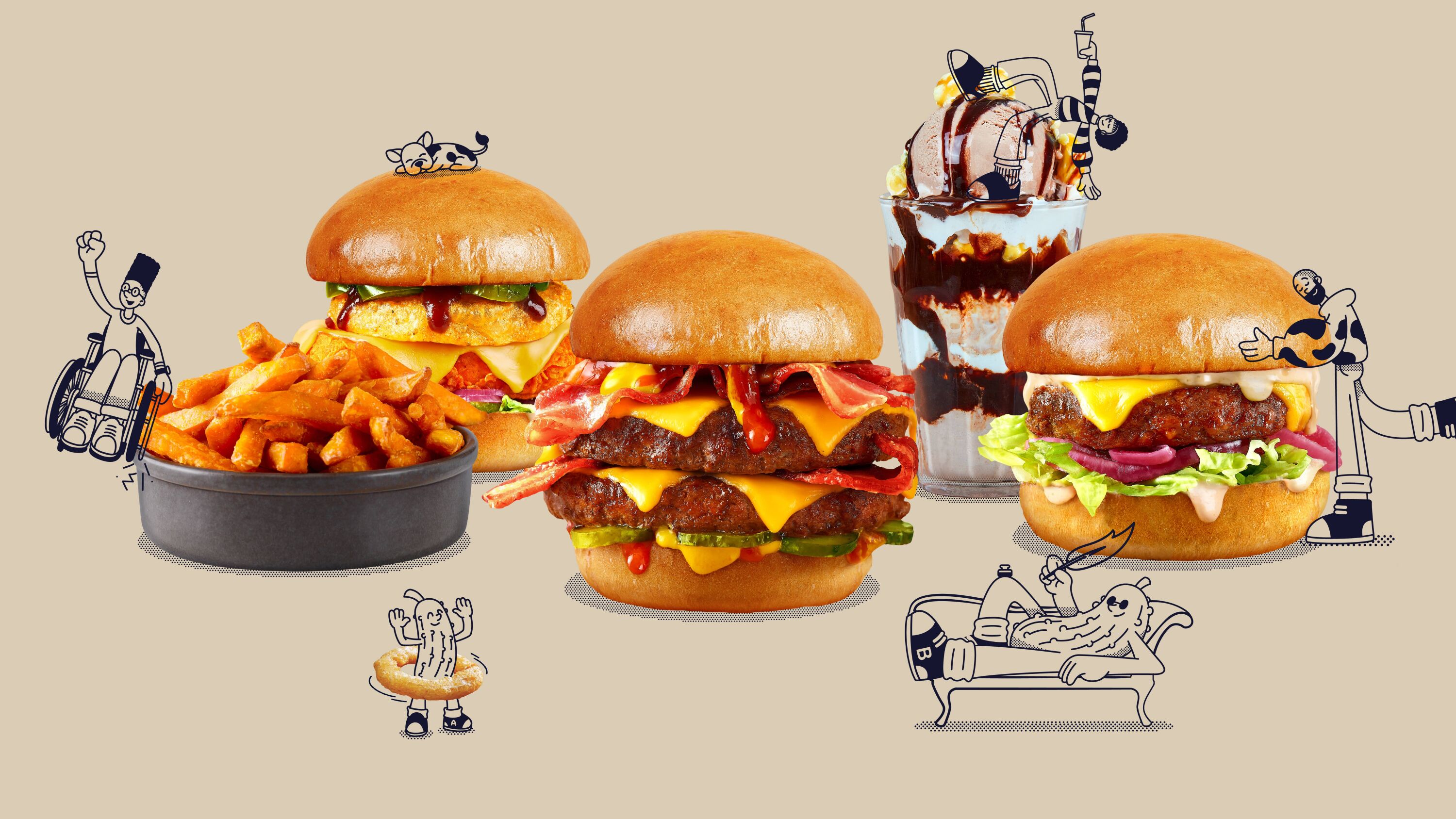
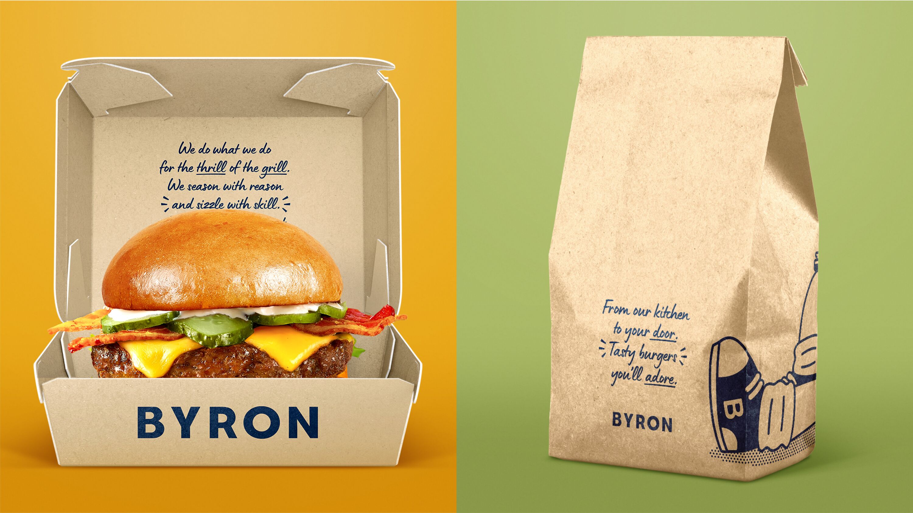
UK burger pioneer Byron needed a new design system that was flexible, simple and coherent, without diluting the brand's eclecticism, eccentricity, and verve.
The poetry idea is an effortless fit for the brand.
Sarah Moffat
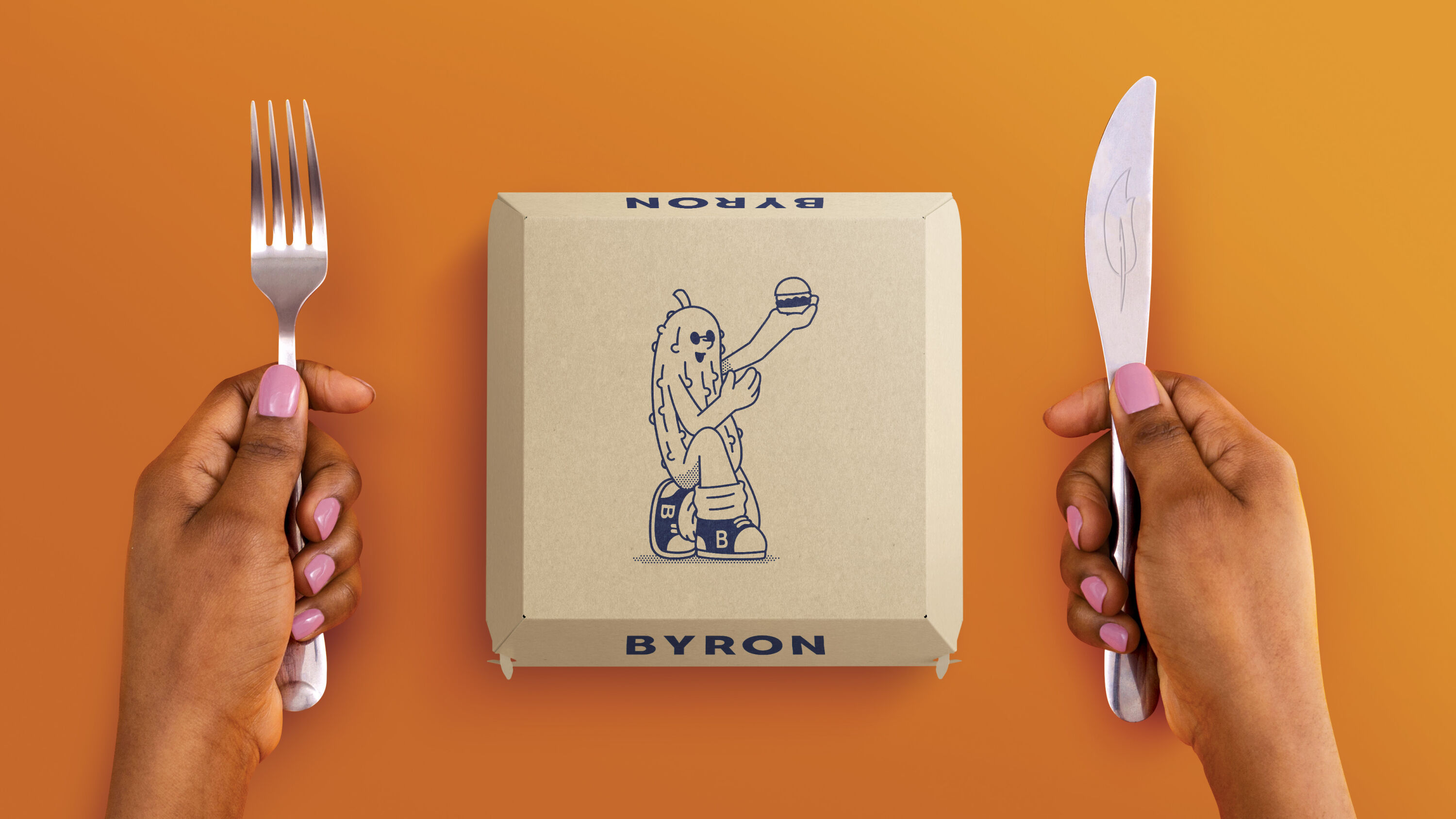
The solution: a brand world as delicious as Byron's burgers. Reflecting the flair and creativity poured into the food and the wider dining experience, Taxi Studio developed a new creative platform: 'burger artistry'.
A new strapline, 'Poetry in a bun', nods both to Byron's artistic flair and to Lord Byron – who became the foundational idea for the brand rejuvenation. Channeling the flamboyant Romantic poet's wit, whimsy and mischief, Taxi collaborated with copywriting agency Reed Words to produce a playful, rhyming tone of voice.
Led by George, the dry-witted, poetic pickle, Byron's existing characters were reimagined as 'The Byronistas' – a diverse suite of mascots assigned to different menu categories. A new colour palette highlights different flavour profiles, aiding digital navigation and providing a more vibrant visual experience for customers.
Woven by Magpie Studio
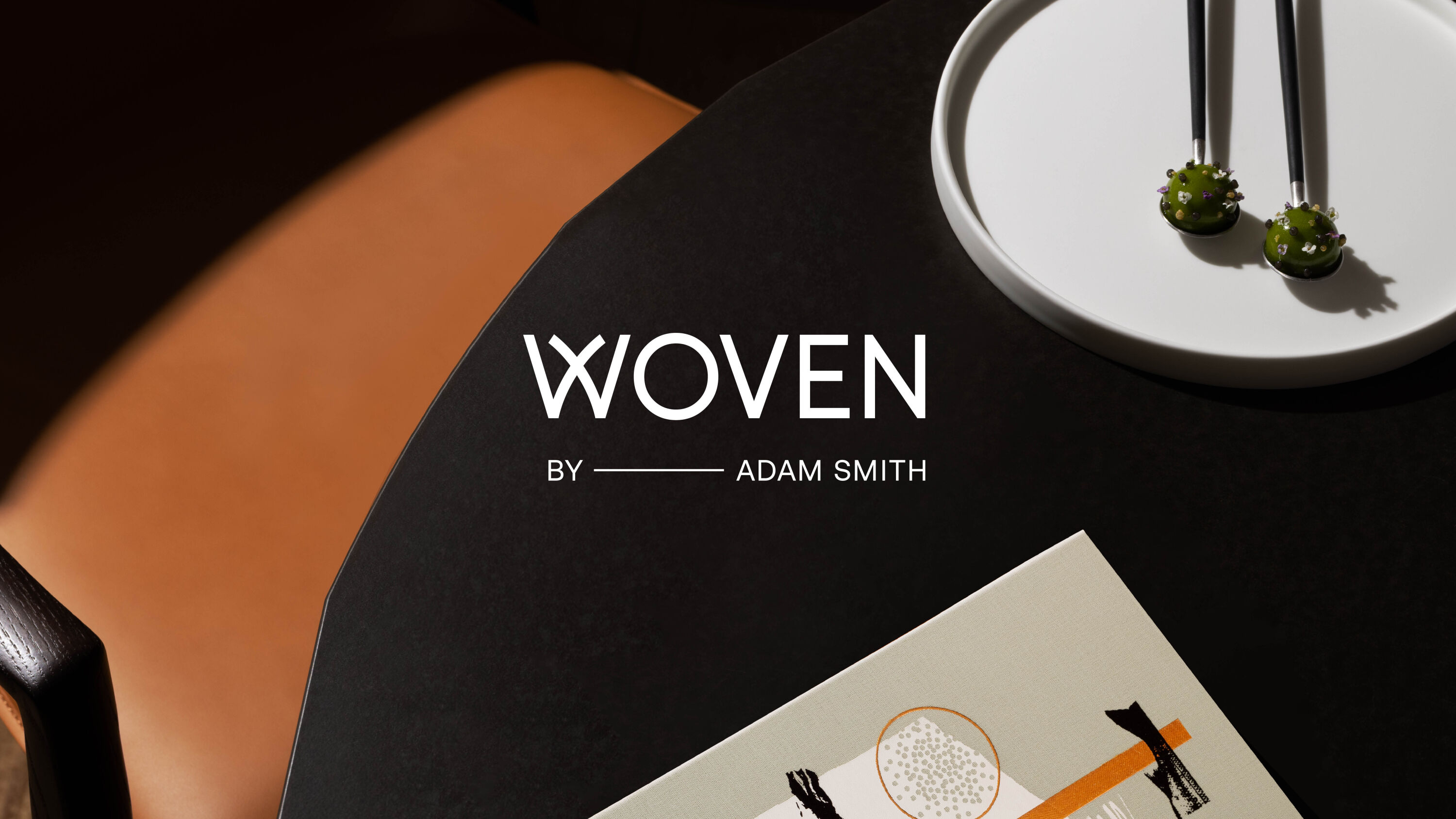
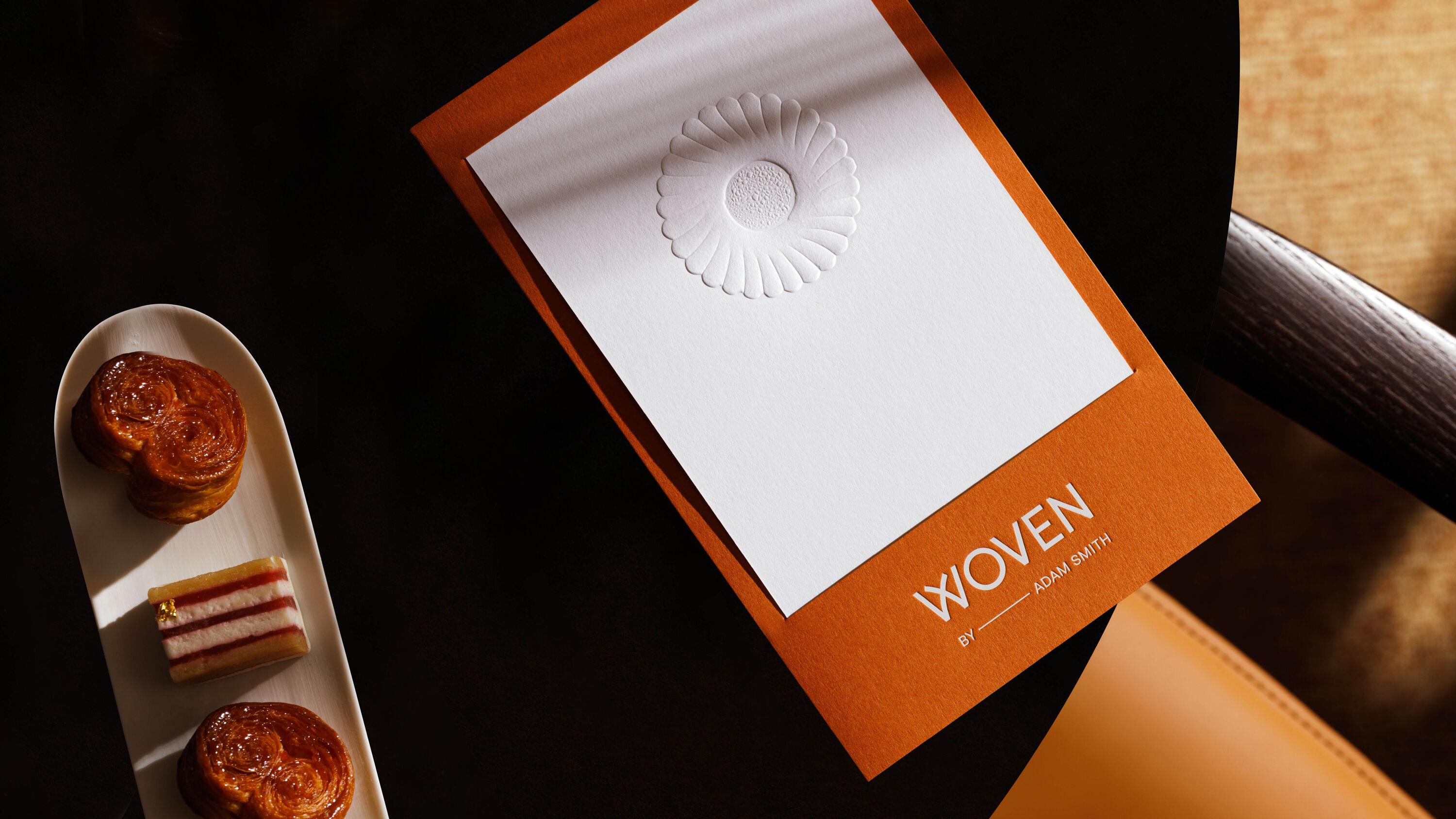
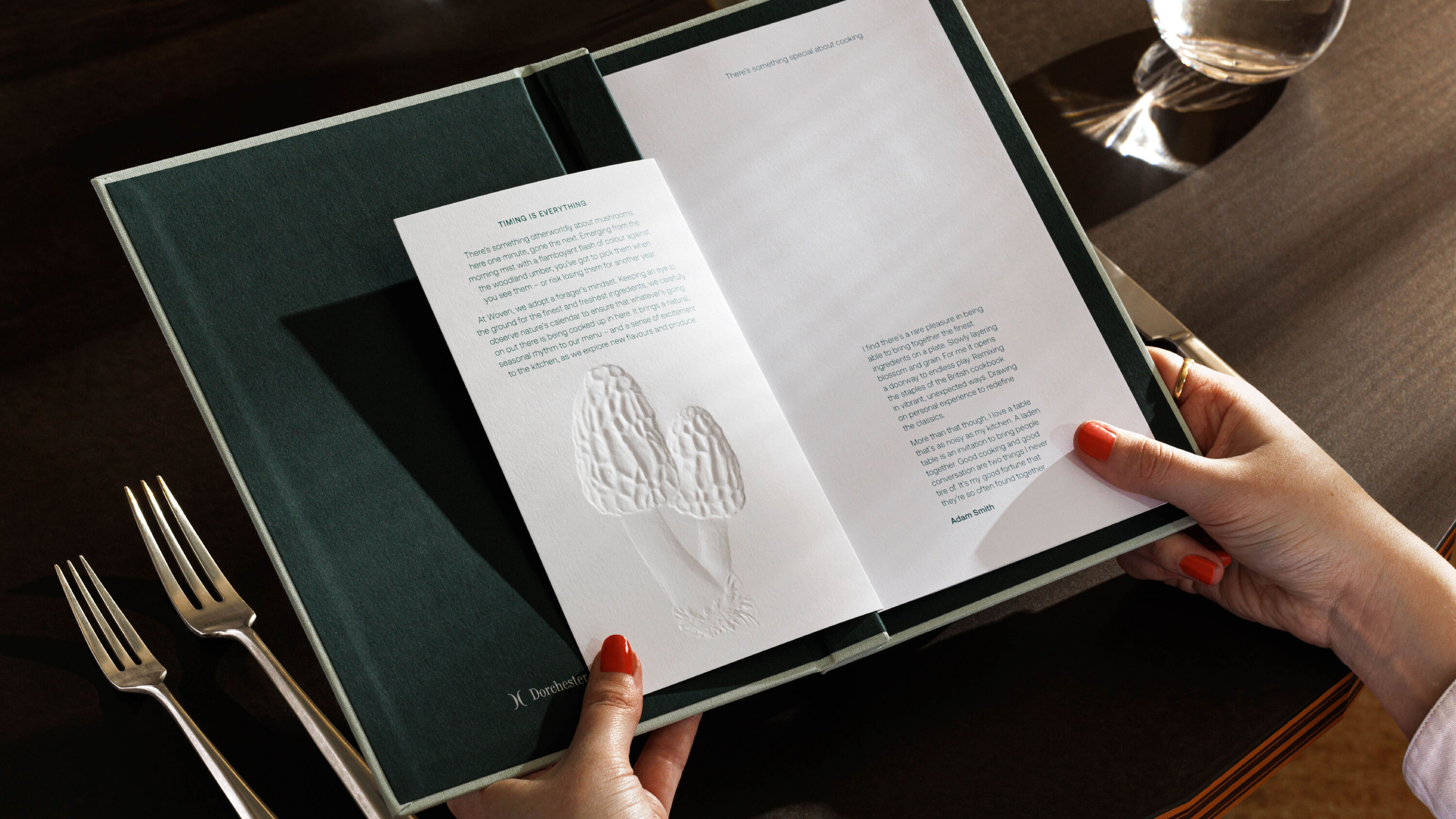
- Silver Award: Bars & Restaurants
- Find out more about this project at magpie-studio.com
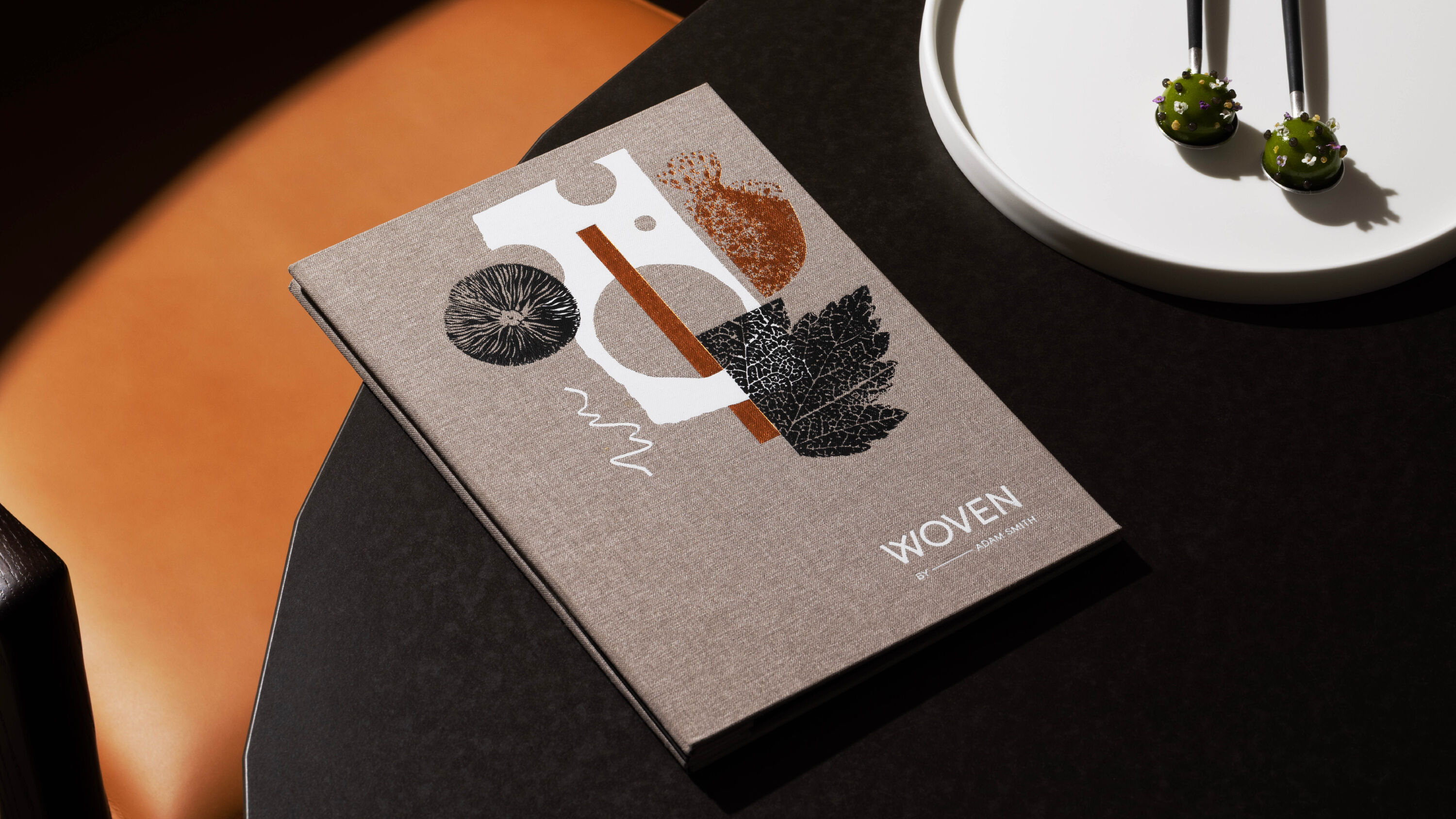
Despite an exceptional reputation, the restaurant at luxury hotel Coworth Park has always been considered a table to reserve during your stay, rather than a dining destination in its own right. Magpie's rebrand matches the artistry of the kitchen, elevating the profile of head chef Adam Smith.
Whimsical and well executed.
Sarah Moffat
A new name – Woven – evokes Smith's care and craft, weaving together exceptional ingredients, textures and flavours into menus that blend strands of memory and personal experience.
From here evolved a highly textural, expressive identity, layered with humble personal stories. From Nan's roast dinners, to a chippy tea at the seaside, to a ceremonial plate of jammy dodgers, these nostalgic, unpretentious references set a playful tone for each course.
With sculptural signage that collides materials, expressive collages on the menus, and evocative storytelling at the table, Magpie's new identity captures the spirit of Adam Smith's food philosophy, revealing itself slowly throughout experience.
Vineyard Theatre by NB Studio
- Silver Award: Brand Strategy
- Find out more about this project at nbstudio.co.uk
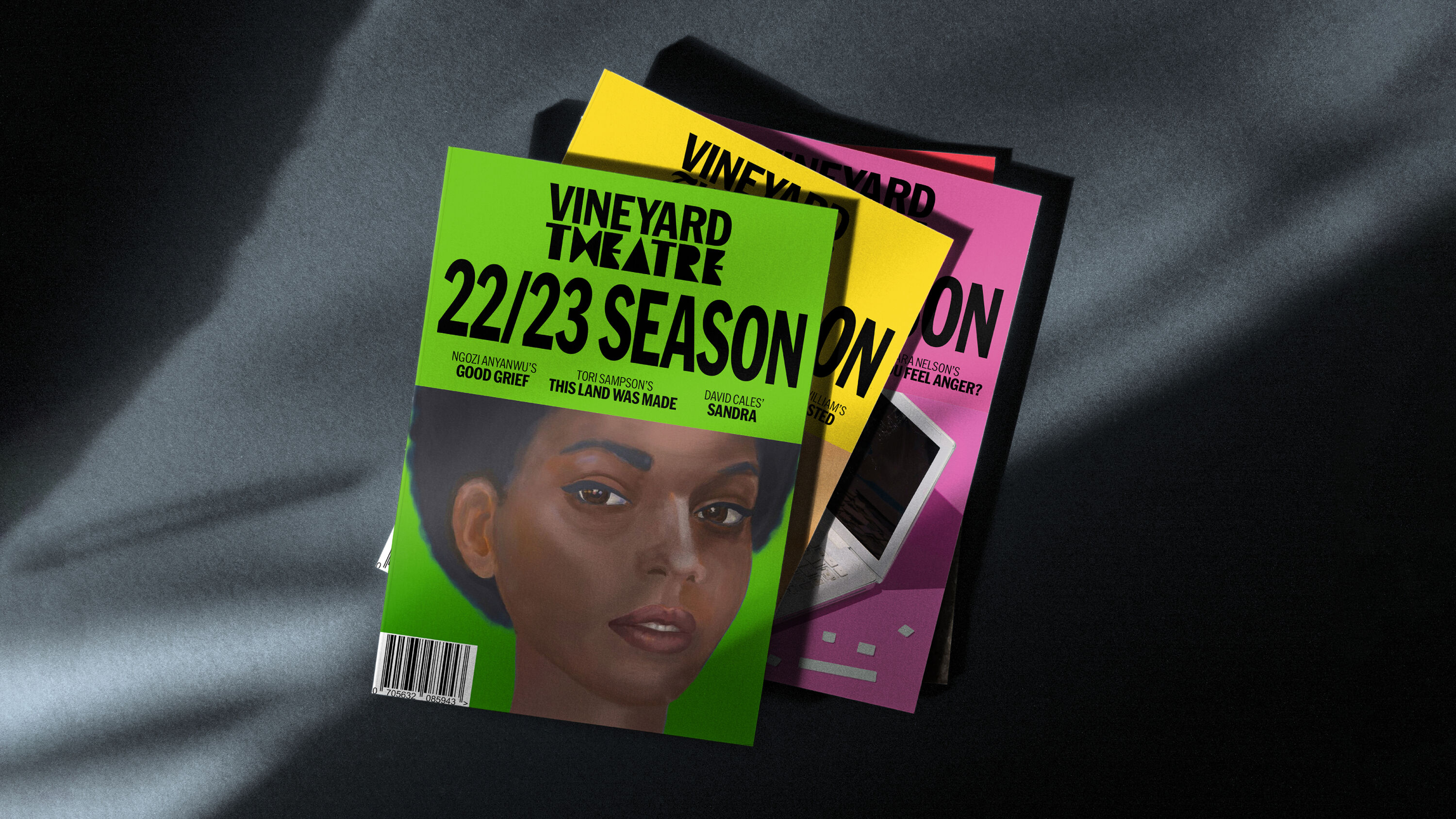
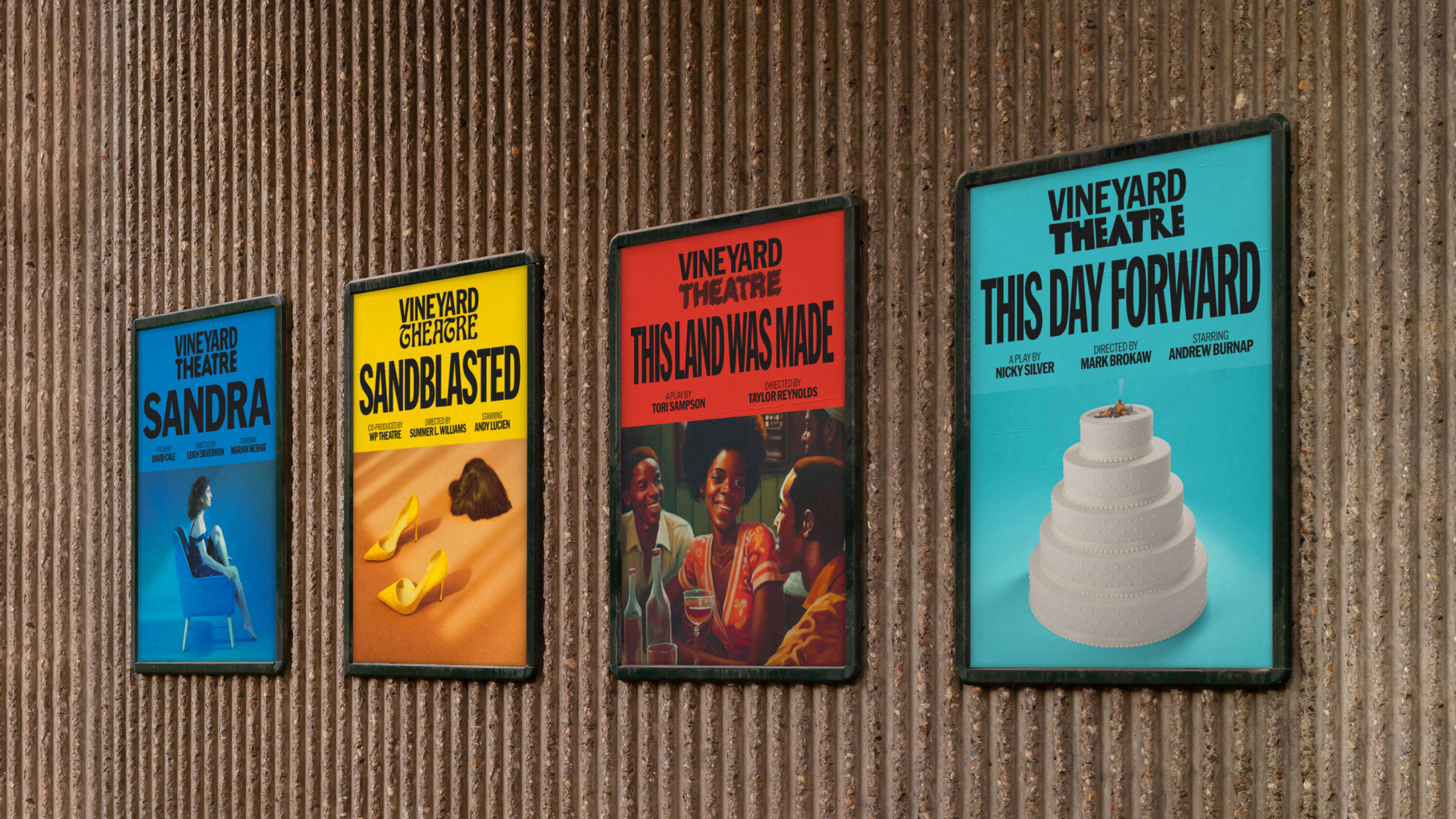
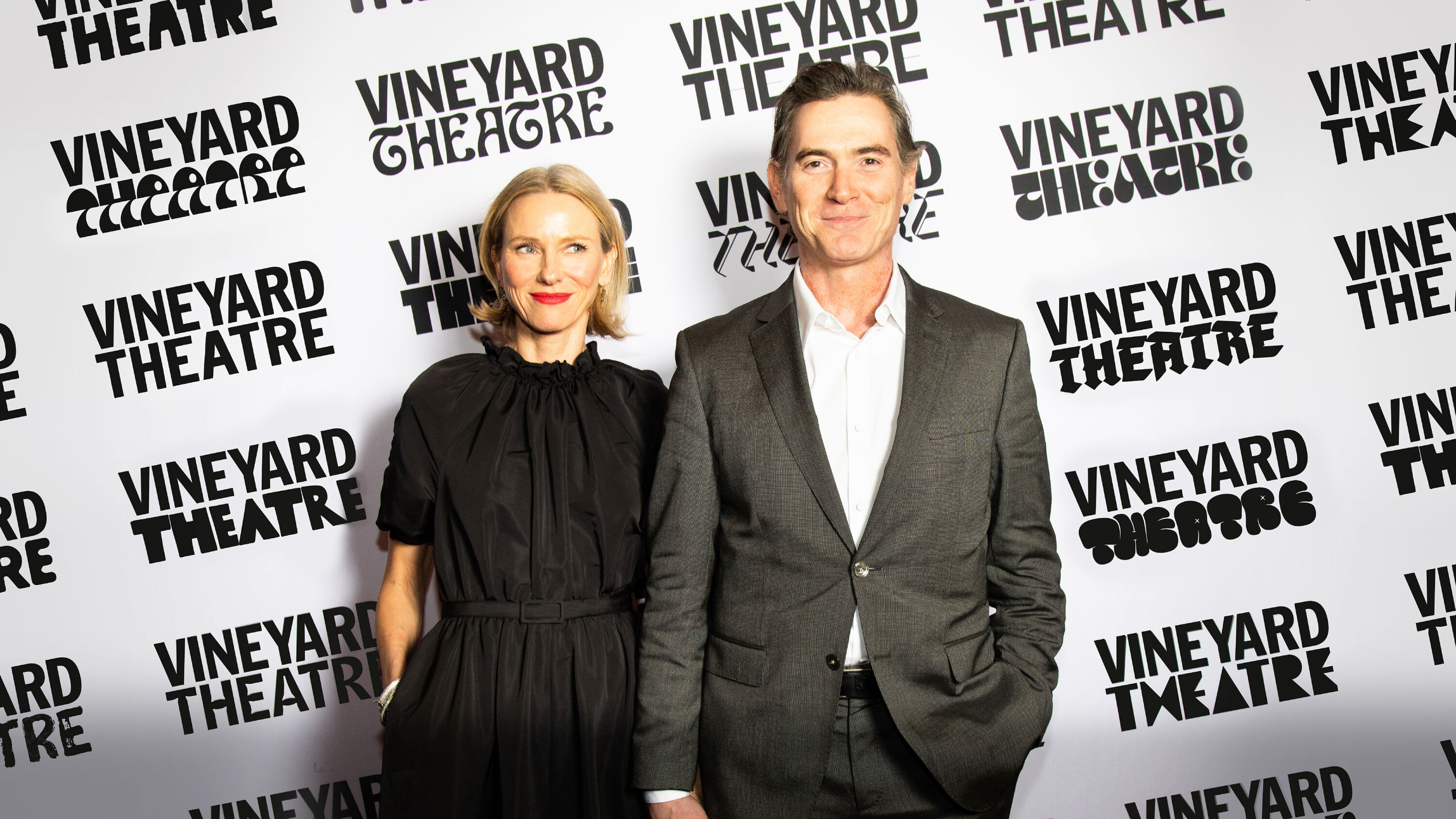
An Off-Broadway theatre in New York, Vineyard Theatre prides itself on upending expectations and making theatre firsts. But it wasn't getting the recognition it deserved. NB's challenge was to design a brand identity that reflected a groundbreaking approach to theatre whilst placing the Vineyard name firmly in the limelight.
Ties the location into a far wider creative community than just the folks on stage, creating a delectable visual system that flexes in tone for each performance.
Natalie Burns
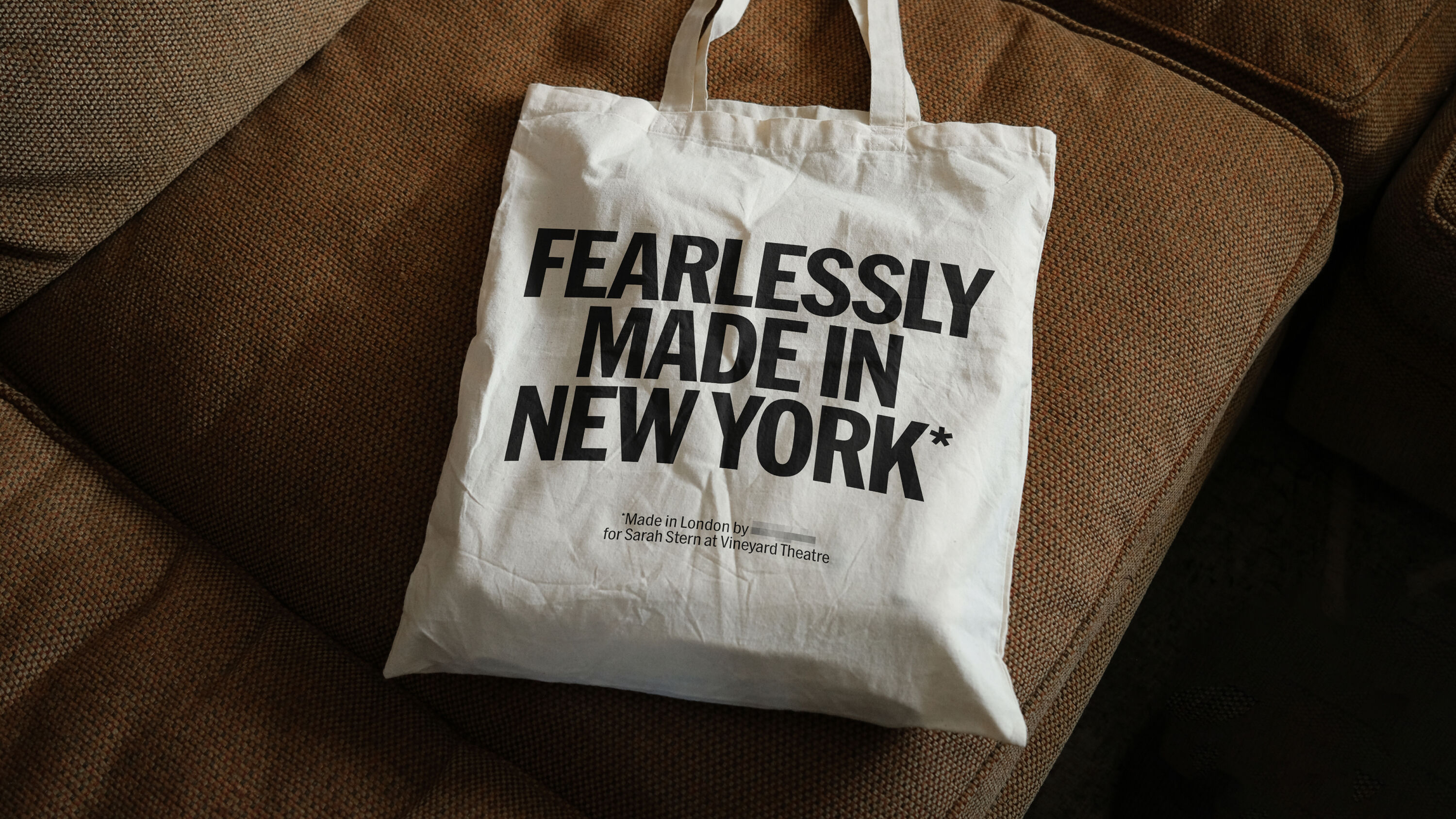
Vineyard's new brand strategy focuses on makers, inviting daring artists and diverse audiences – playmakers, changemakers and dreammakers – to be part of a collective experience. In turn, this positions the theatre as the place where daring art is cultivated.
Visually, this is expressed through an ever-changing wordmark: 'Vineyard' remains constant, but 'Theatre' is reinvented for every show. And every piece of type designed by a native New Yorker. Together, the two elements create a dynamic identity that celebrates a fearless approach – just like a Vineyard show, the logo is never the same twice.
Picnic by big fish
- Silver Award: Illustration
- Find out more about this project at bigfish.co.uk
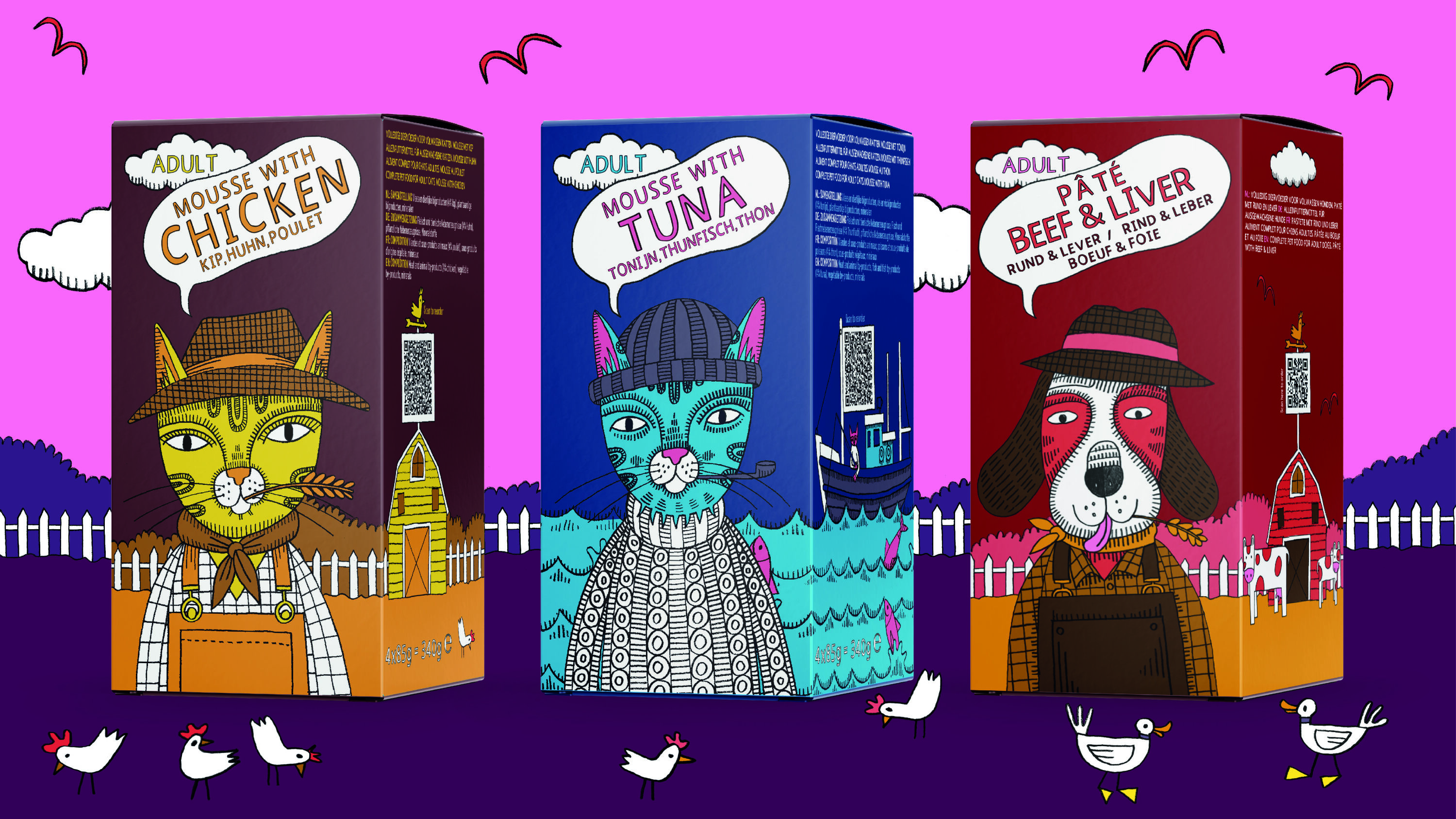
As a brand aimed at families, Picnic has an Instagram feed filled with excited kids waiting at their windows for their vans to arrive. As animal lovers themselves, the big fish team approached this brief with a deep understanding of how important our pets are as part of the family.
Colourful, playful, and distinct in a category that doesn't have anything like this.
Raafaye Ali
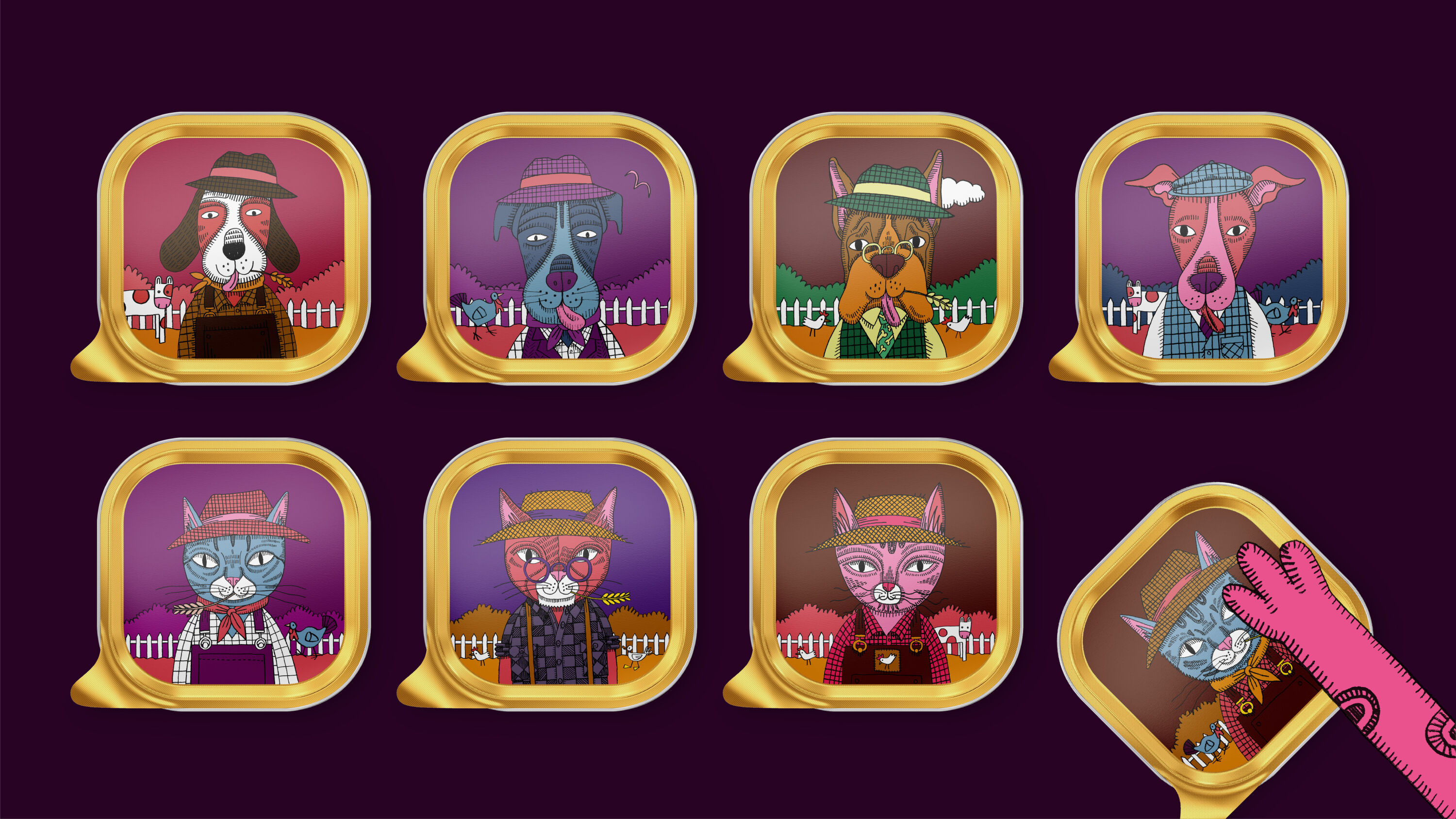
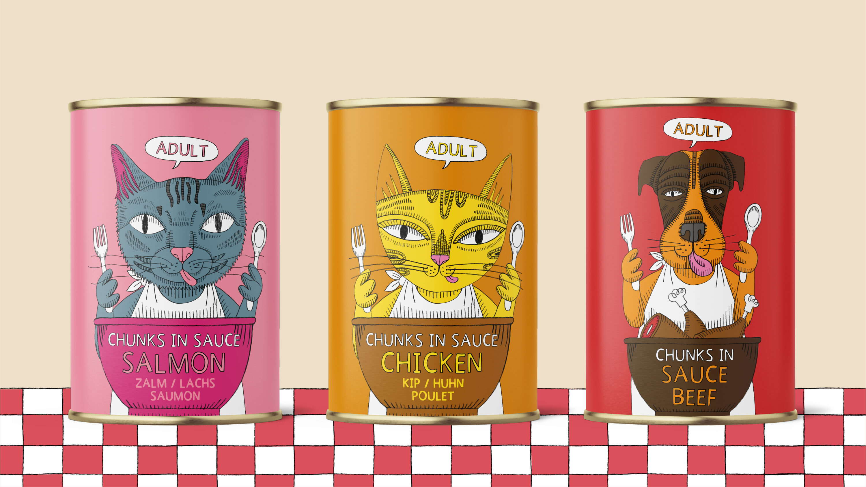
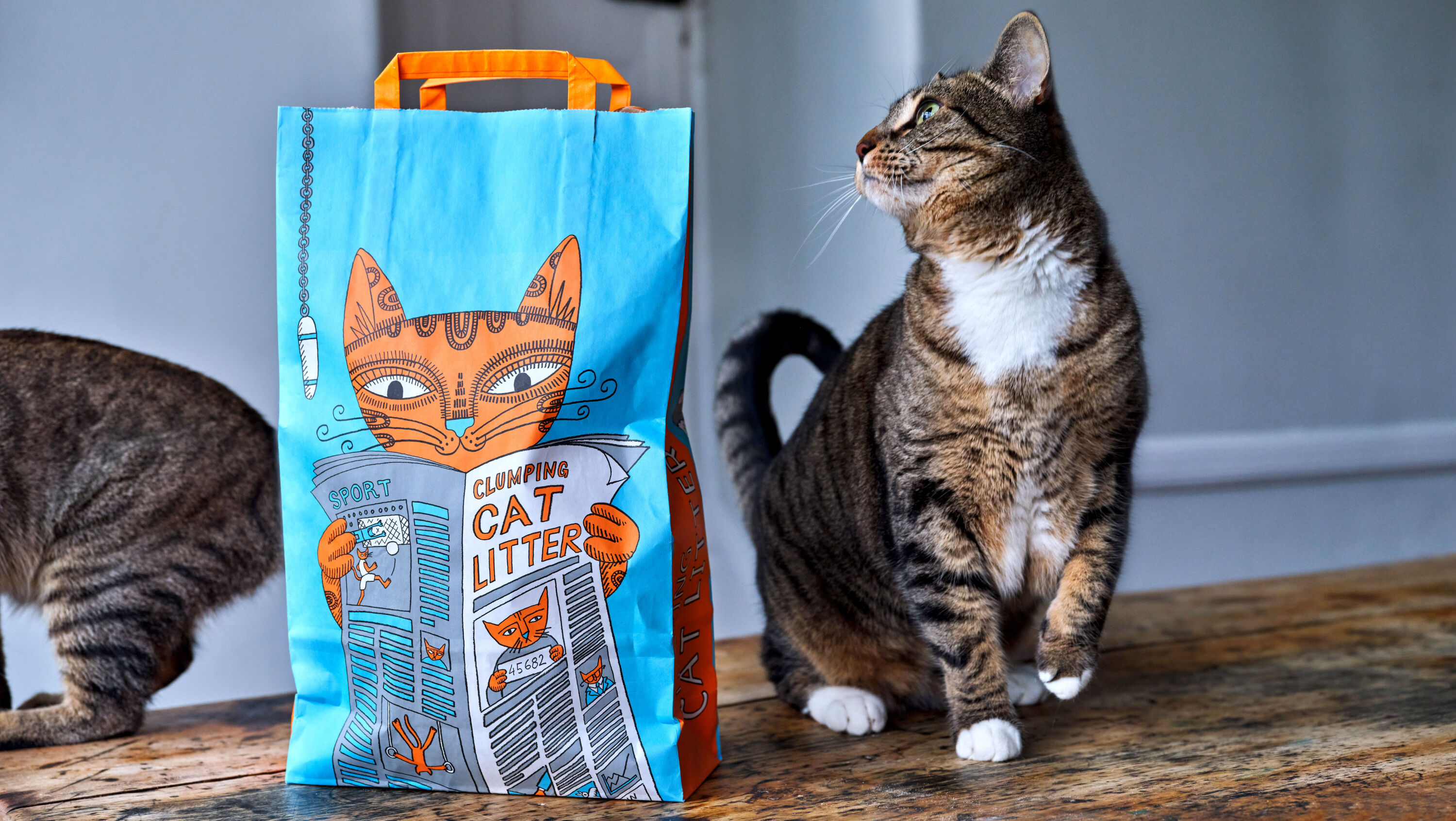
To hero the four-legged friends at the heart of the brand, the agency created an illustrated array of characters to sit across Picnic's huge range. Just like in real life, each cat and dog is different – unlike traditional pet food, where a photo of the same animal is typically used across the whole range.
Colourful and characterful, the illustrations give a humorous, light-hearted twist to the packaging: the dog holding the beef sticks is a lumberjack; the dental chews feature a dentist; there are cat and dog farmers and fishermen. And the litter bag cat is sat on the toilet reading the daily paper.
BBC Nordic by weareseventeen
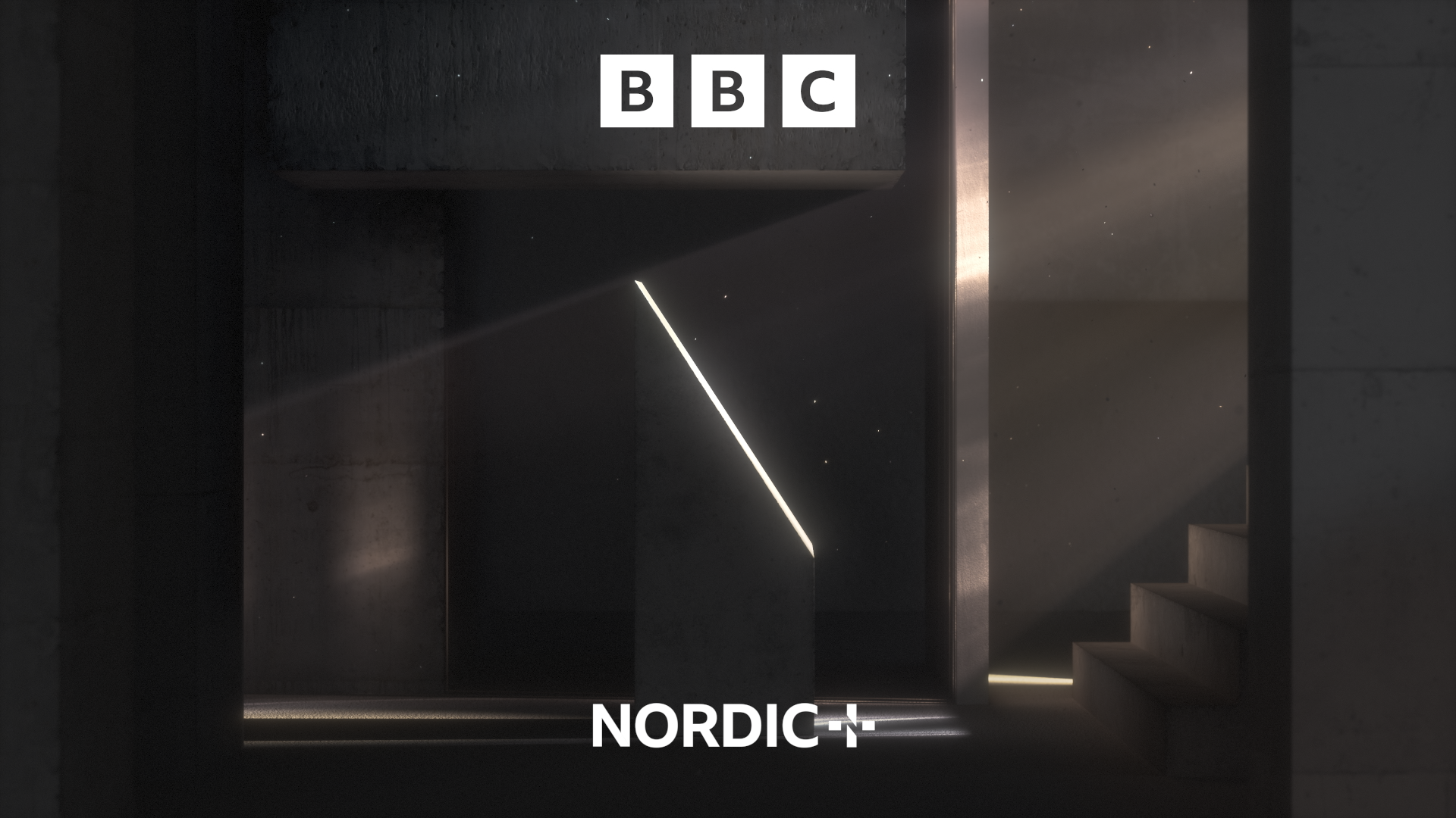
- Silver Award: Motion
- Find out more about this project at weareseventeen.com
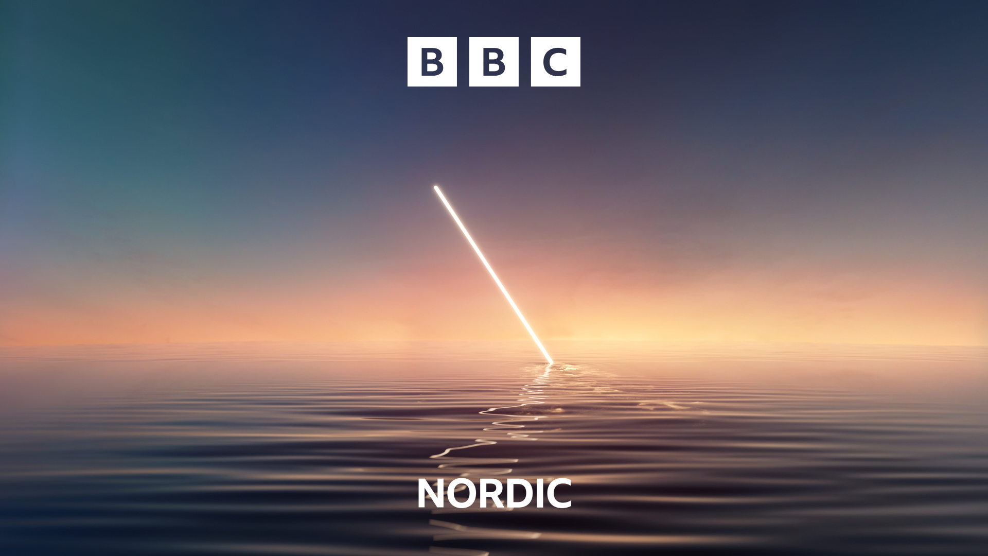
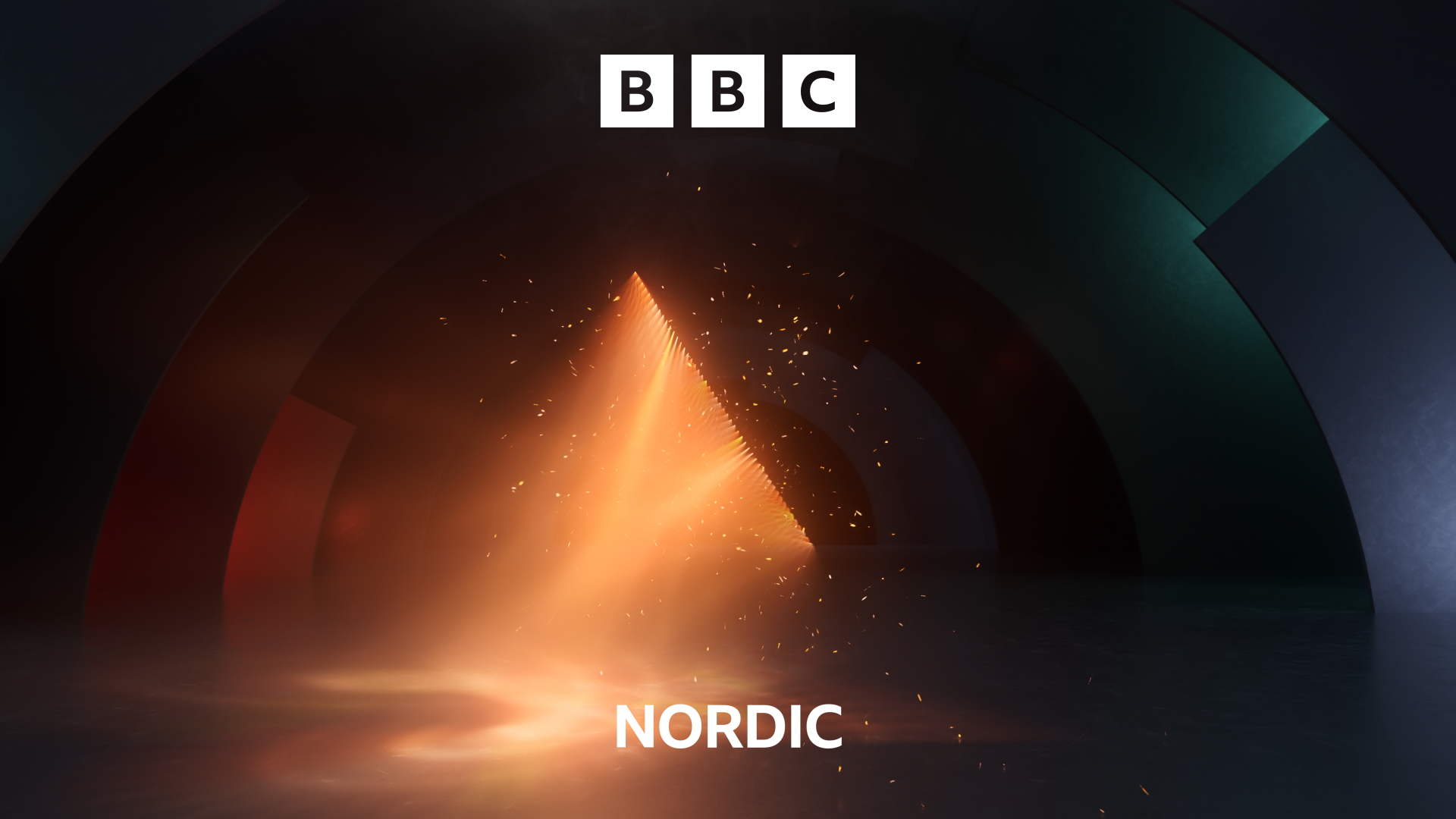
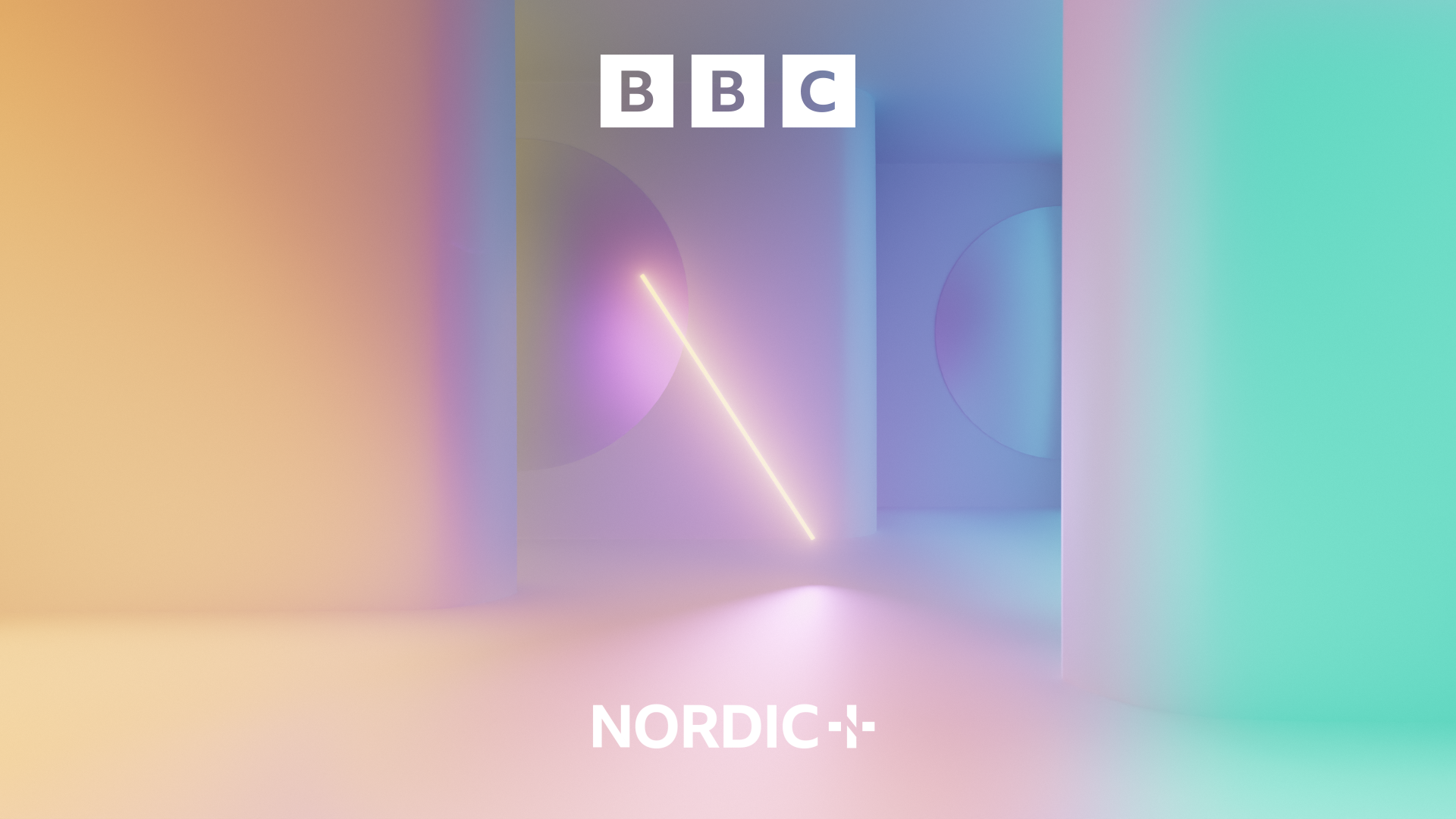
BBC Nordic is a new channel that merges BBC Earth and BBC Brit in Scandinavia. The brief called for an evocative design system and unique motion language: it had to feel distinctively 'BBC', but also cater authentically to the Nordic audience's tastes.
Beautifully executed, elegant, and iconic.
Jessica Tan
To highlight the channel's multi-faceted nature, weareseventeen proposed a new brand idea – 'The Bright Side' – with four key pillars. 'Bright Entertainment' highlights BBC Nordic's spark and optimism; 'Warm Connections' celebrates the affinity between the UK and Scandinavia; 'Illuminating Moments' foregrounds enlightening documentaries; and 'Cultivating Contrasts' celebrates the contrasts that drive the emotional appeal of the channel's programming.
Inspired by Nordic landscapes and the classic muted tones of Scandinavian design, the identity features a diagonal stroke that references the central line of the Nordic 'N'. Called the 'Prism Edge', this radiates and transforms light in a series of ident animations that convey the different brand attributes.
Meta Quest Pro by ManvsMachine
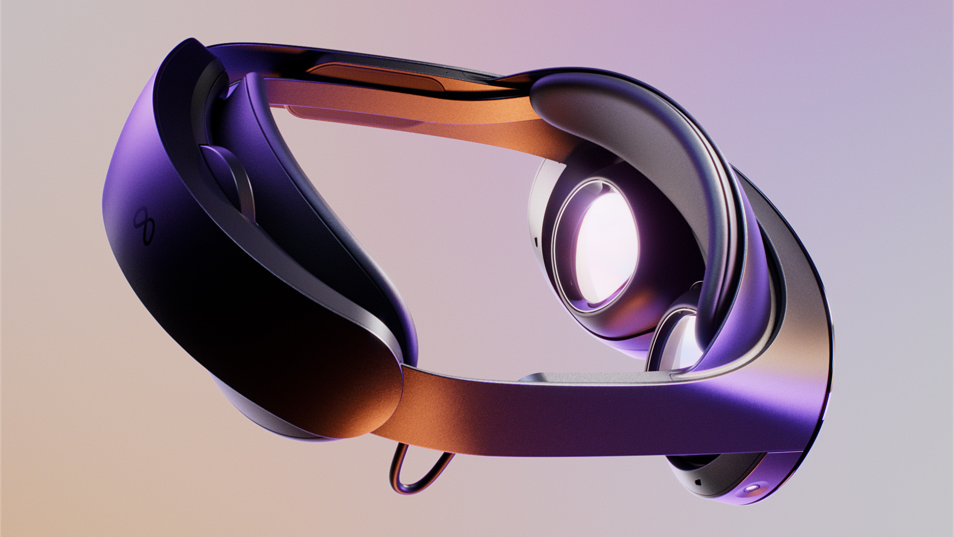
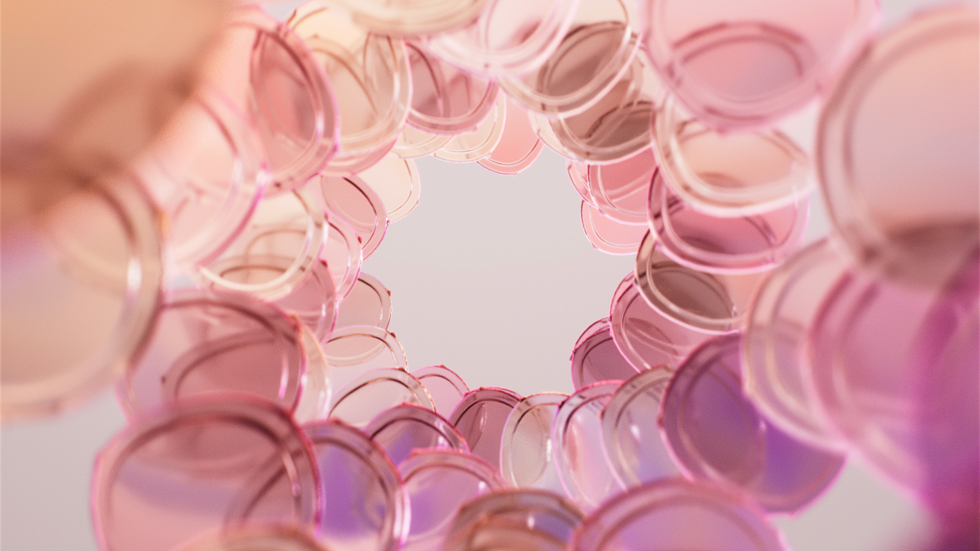
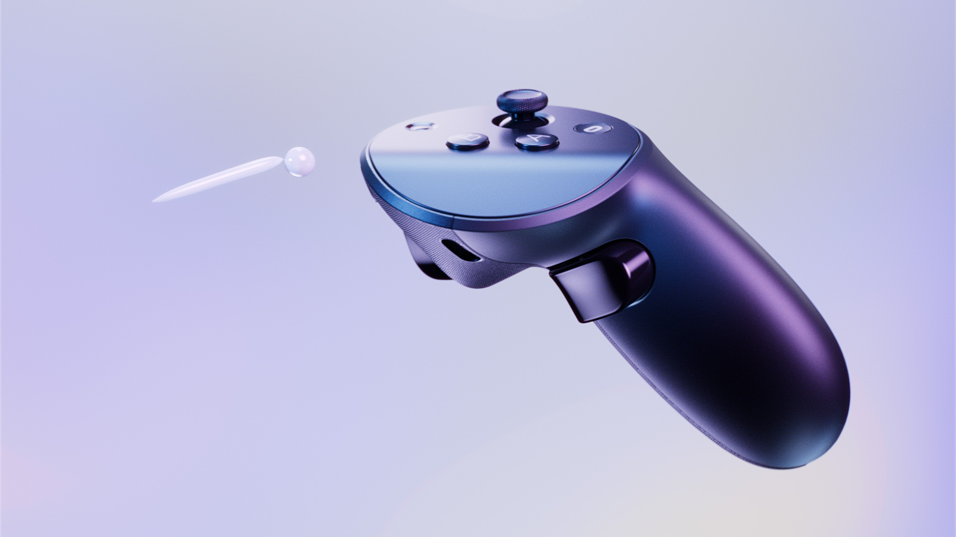
- Silver Award: Motion
- Find out more about this project at mvsm.com
Meta collaborated with ManvsMachine on this exciting, mind-bending, and highly polished innovation film to introduce Meta Quest Pro – Meta's most advanced VR headset to date.
Excellent execution and deep craft.
Jessica Tan
The key objective was to present the product as a tool for everyday use. Meta Quest Pro unlocks new possibilities for working, creating, and collaborating – and the film had to demonstrate how the headset can slot into any home to enable groundbreaking creativity and otherworldly exploration in the fields of design, architecture, and more.
Presenting abstract otherworldly visualisations alongside real-world environments required a well-thought-out approach. Having initially designed an elevated home for the product to inhabit, ManvsMachine then focussed on the key components of the product – abstracting, extrapolating, and transcending them far beyond their physical properties to illustrate the creativity and escapism enabled by the headset.
Reese's by ManvsMachine
- Silver Award: Motion
- mvsm.com
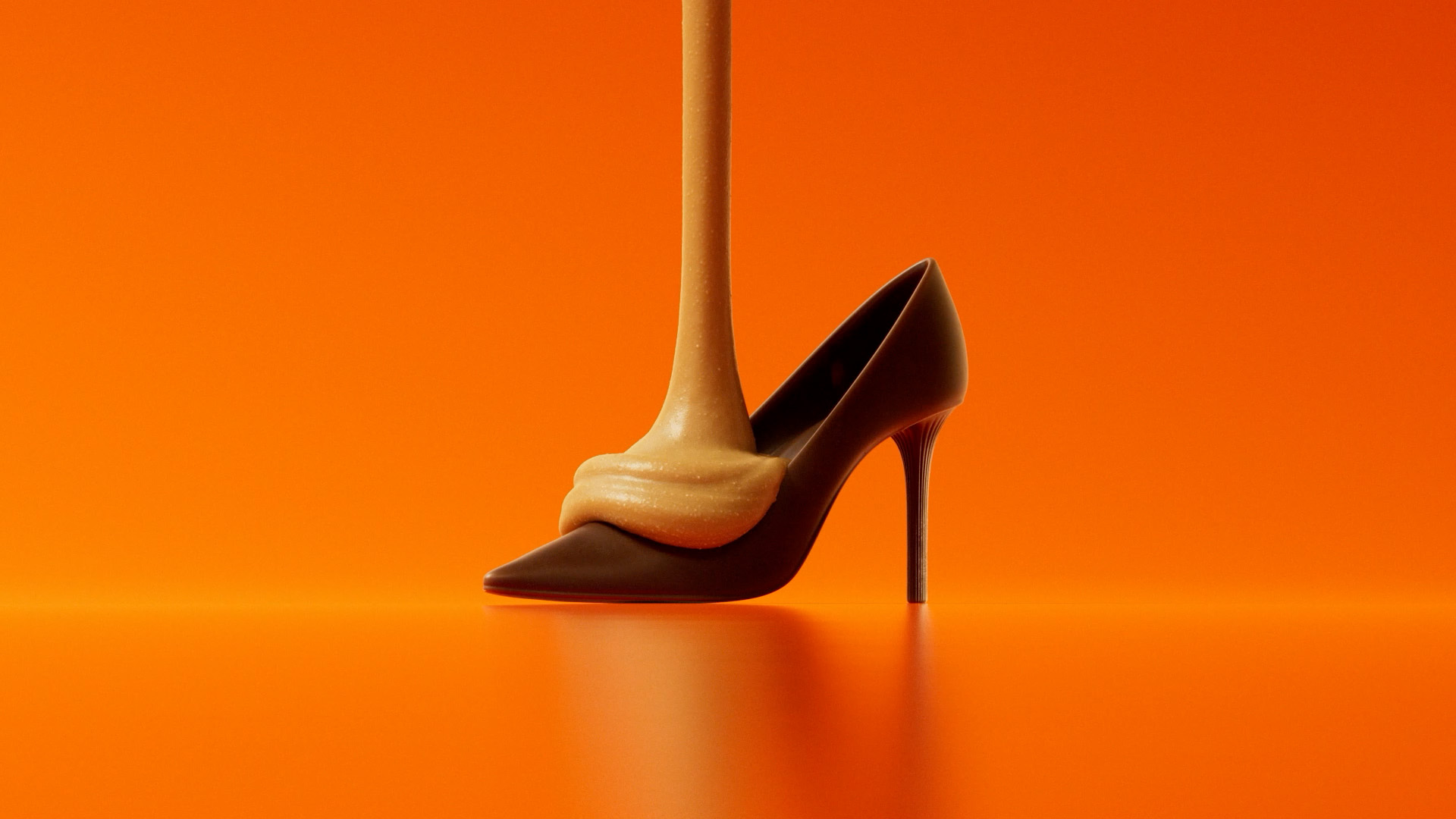
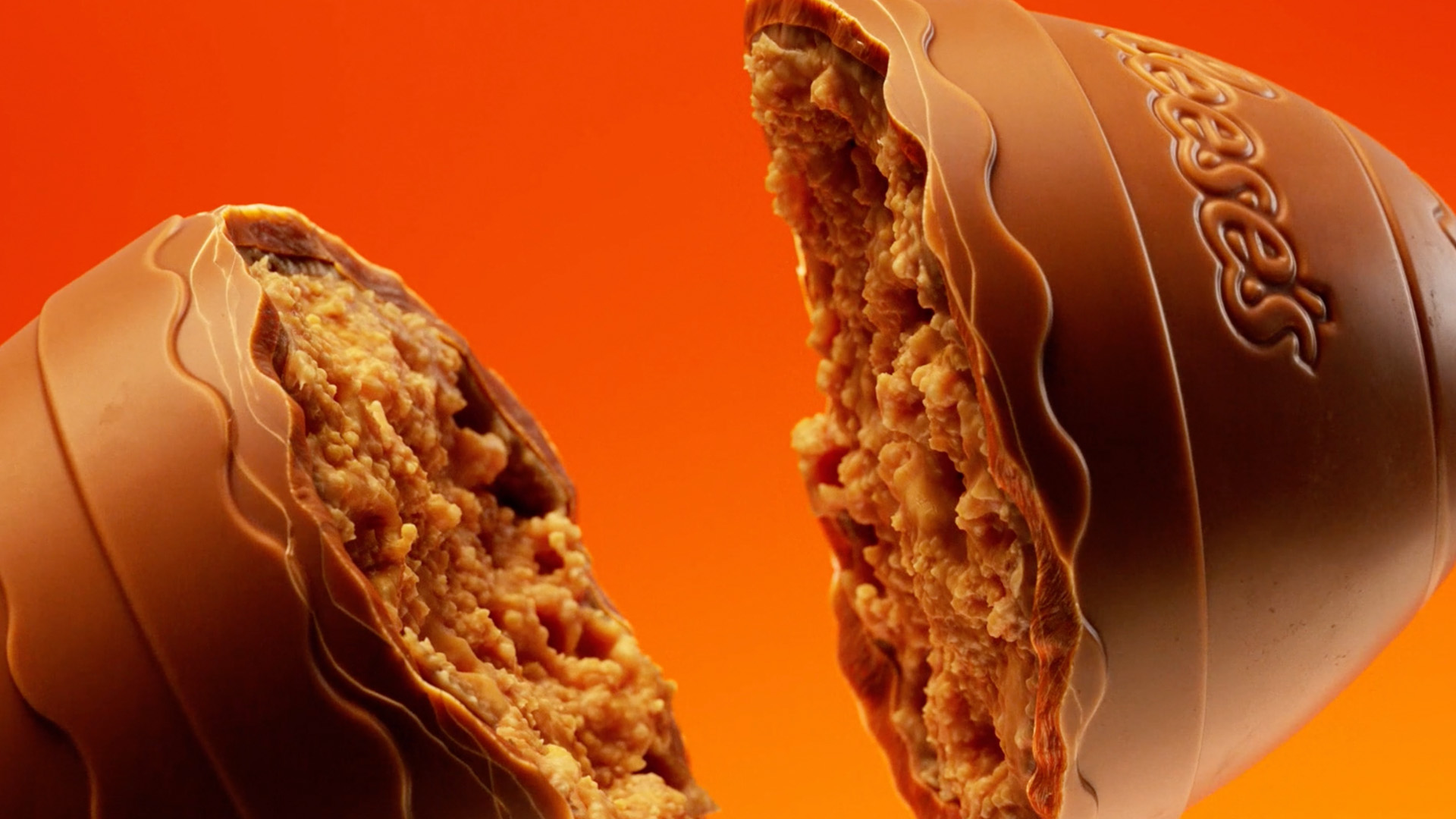
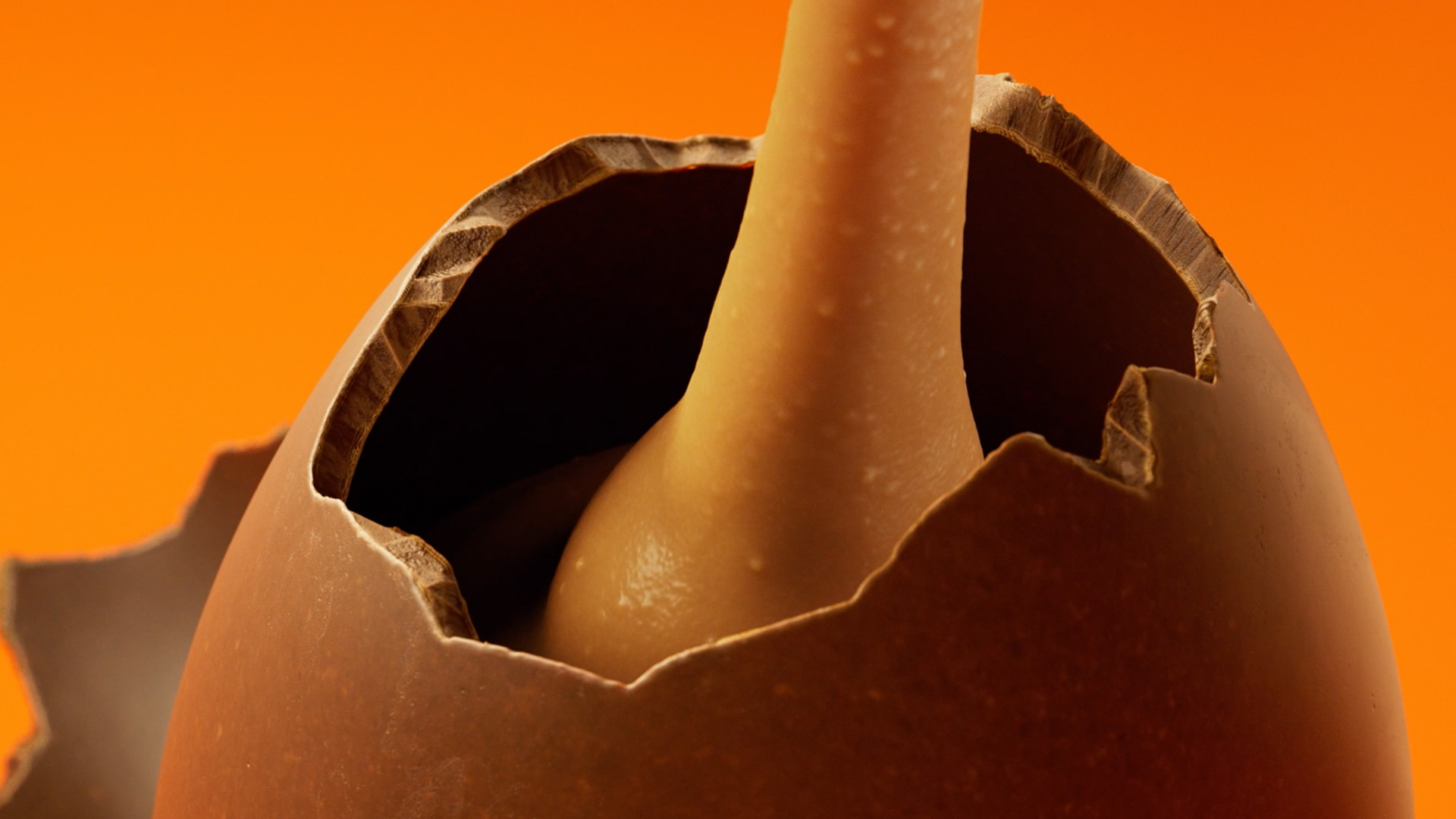
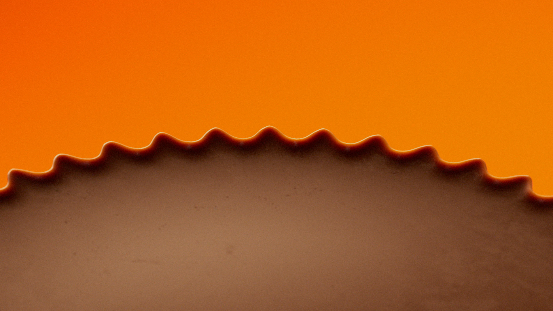
This campaign for Reese's explores the underreported psychological urge to put peanut butter in stuff. The aim: to help people understand that this is very common, very normal and very enjoyable. Especially when that stuff is chocolate.
Beautifully rendered, and the hilarious VO really adds to its uniqueness.
Winston Duke
As design and direction partners, Mother London entrusted ManvsMachine with creating a branded world in which an endless list of chocolate-ified objects could be smothered in peanut butter.
The result: a series of deliciously surreal short films showcasing high-heeled stilettos and other ordinary objects being doused in nutty goodness against a clean, theatrical and infinite Reese's orange backdrop.
Paired with a sultry voiceover from comedian Henry Paker, the campaign entices the viewer with a highly distinctive tongue-in-cheek sensibility. ManvsMachine also created a toolkit to future-proof the campaign, so that any desired object could be rendered in chocolate and covered in peanut butter – enabling the brand to react to breaking news and poke fun at hot topics.
M&Ms by Jones Knowles Ritchie
- Silver Award: Motion
- Find out more about this project at jkrglobal.com
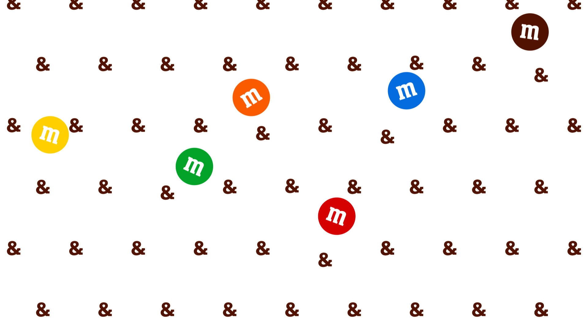
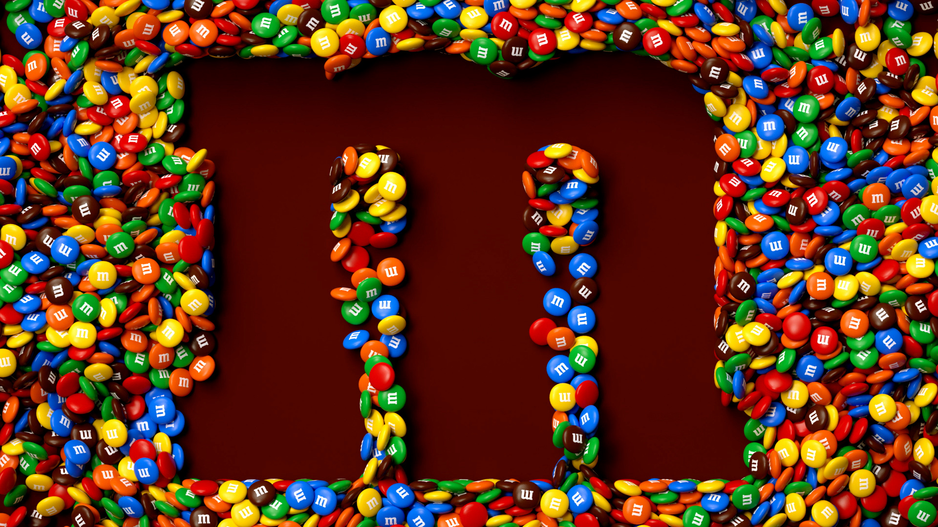
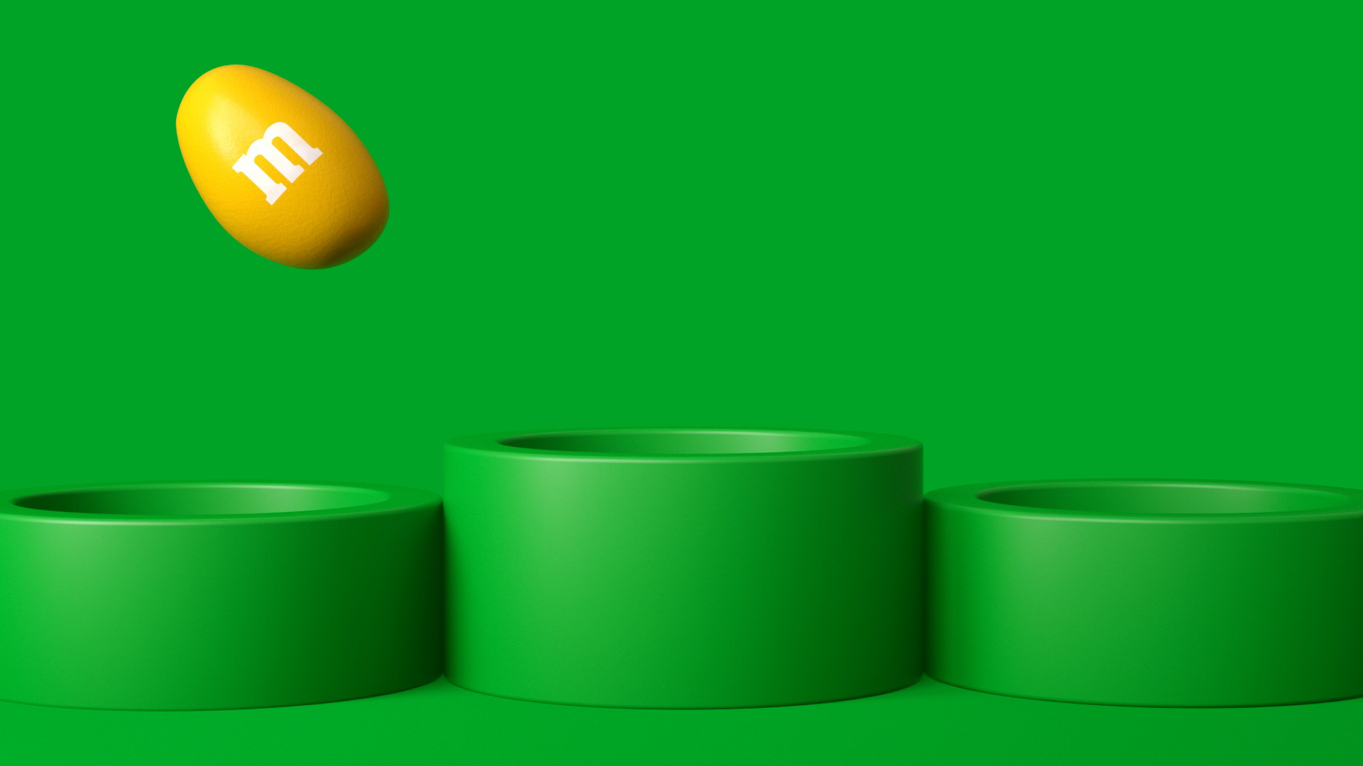
As part of a major rebrand, M&Ms wanted to inject more personality, meaning, and fun into its brand assets. JKR defined the role and unique behaviour of each and every asset, from the logo and the iconic M to the lentils themselves, and brought them gloriously to life using fresh, colourful animation and CGI.
Brillantly executed.
Liza Enebeis
Everything came together in a a free-flowing playground of possibility: a place where 2D mixed with 3D, text with image, and reality with imagination. Each flowed effortlessly into the next, all joyfully working together to spread their core message of fun for everyone.
Since their creation, the motion assets have been showing up everywhere – from TikTok to Times Square. M&Ms use them across all social channels, on their website, in stores globally, and at internal and external events – captivating audiences and helping drive a 10% surge in growth.
Eames Institute of Infinite Curiosity by Manual
- Silver Award: Culture
- Find out more about this project at manualcreative.com
A non-profit organisation that brings Ray and Charles Eames' iconic methodologies to life, the Eames Institute of Infinite Curiosity encourages anyone and everyone to use design to solve problems. Accordingly, it needed a brand that could appeal to everyone from curious non-designers to the most discerning design professionals in the world.
Does a great job of capturing Eames, whilst still feeling inviting for new non-design audiences.
Alexis Waller
Another challenge was to honour the Eames' legacy without falling into the traps of nostalgia and mid-century pastiche. With activities and outputs spanning digital, physical, experiential, and editorial, the Institute needed a flexible design system and toolkit that its various creative partners could implement easily.
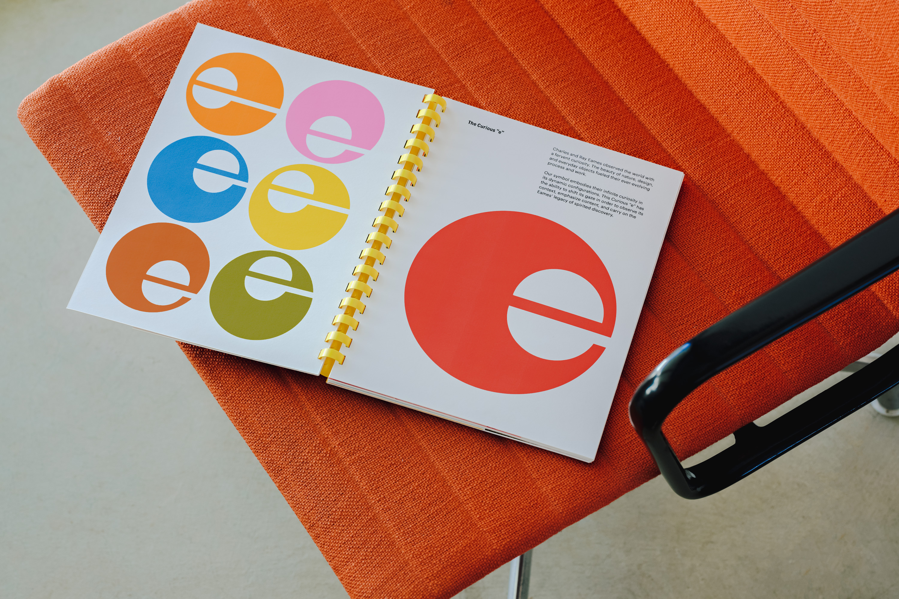
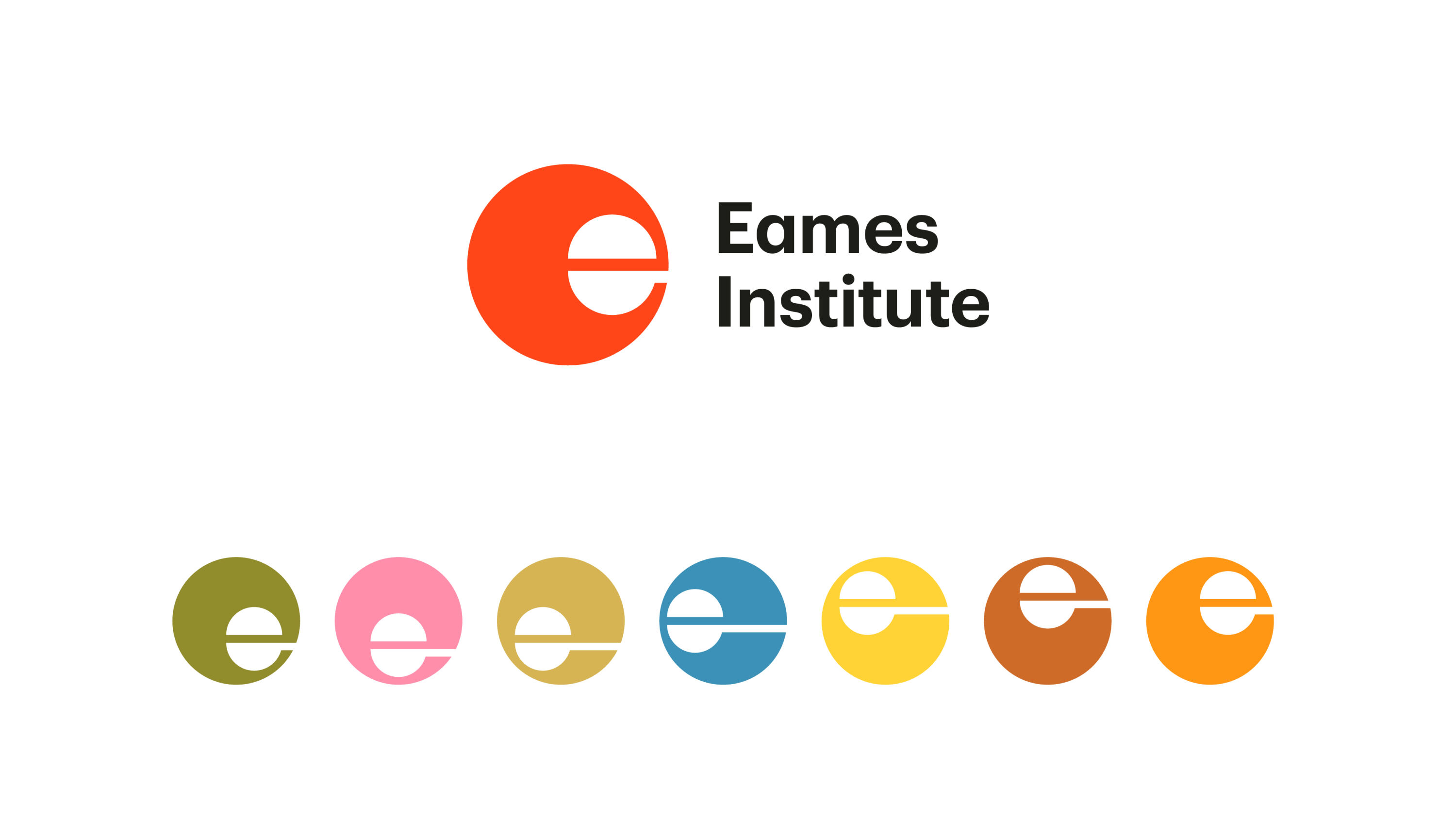
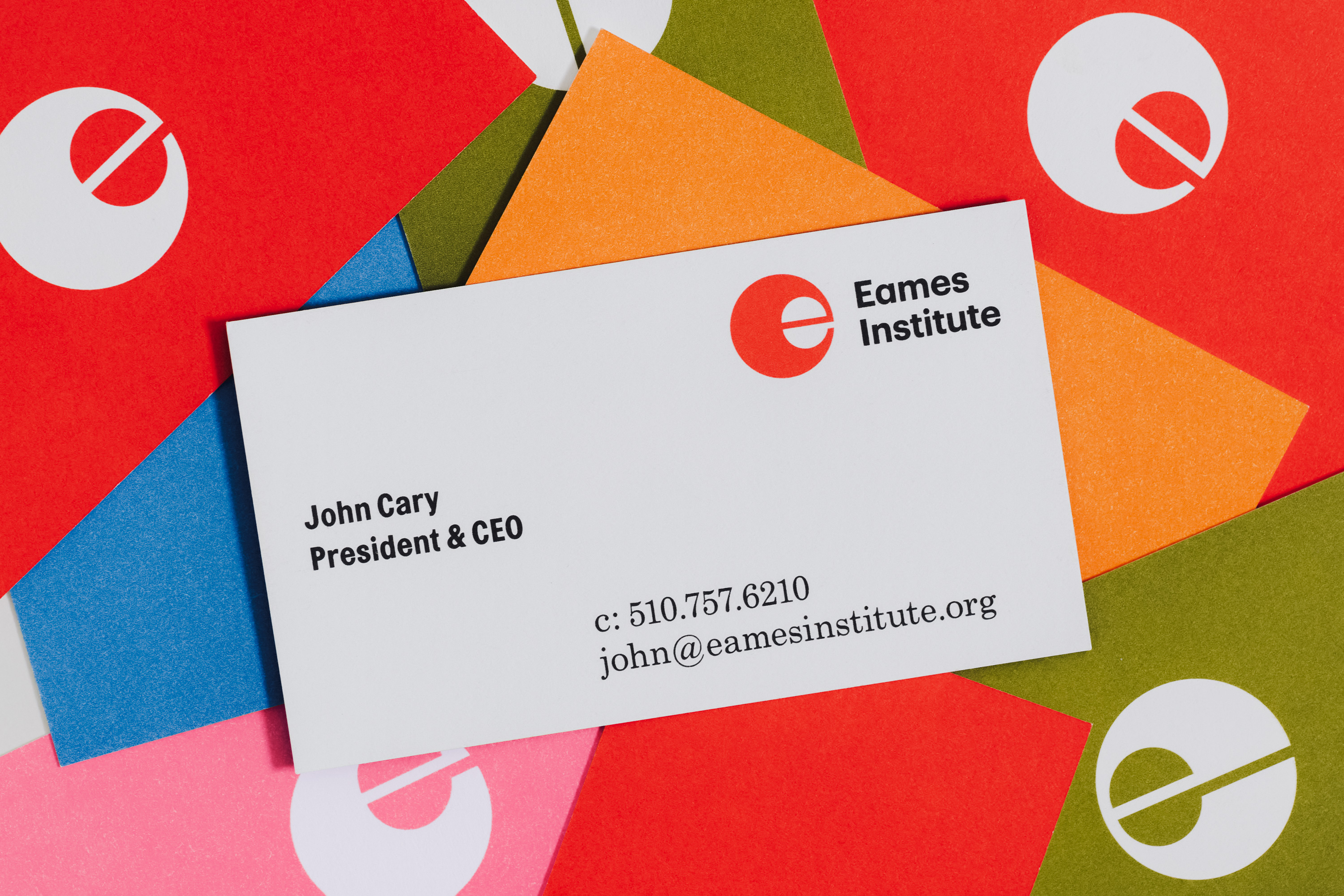
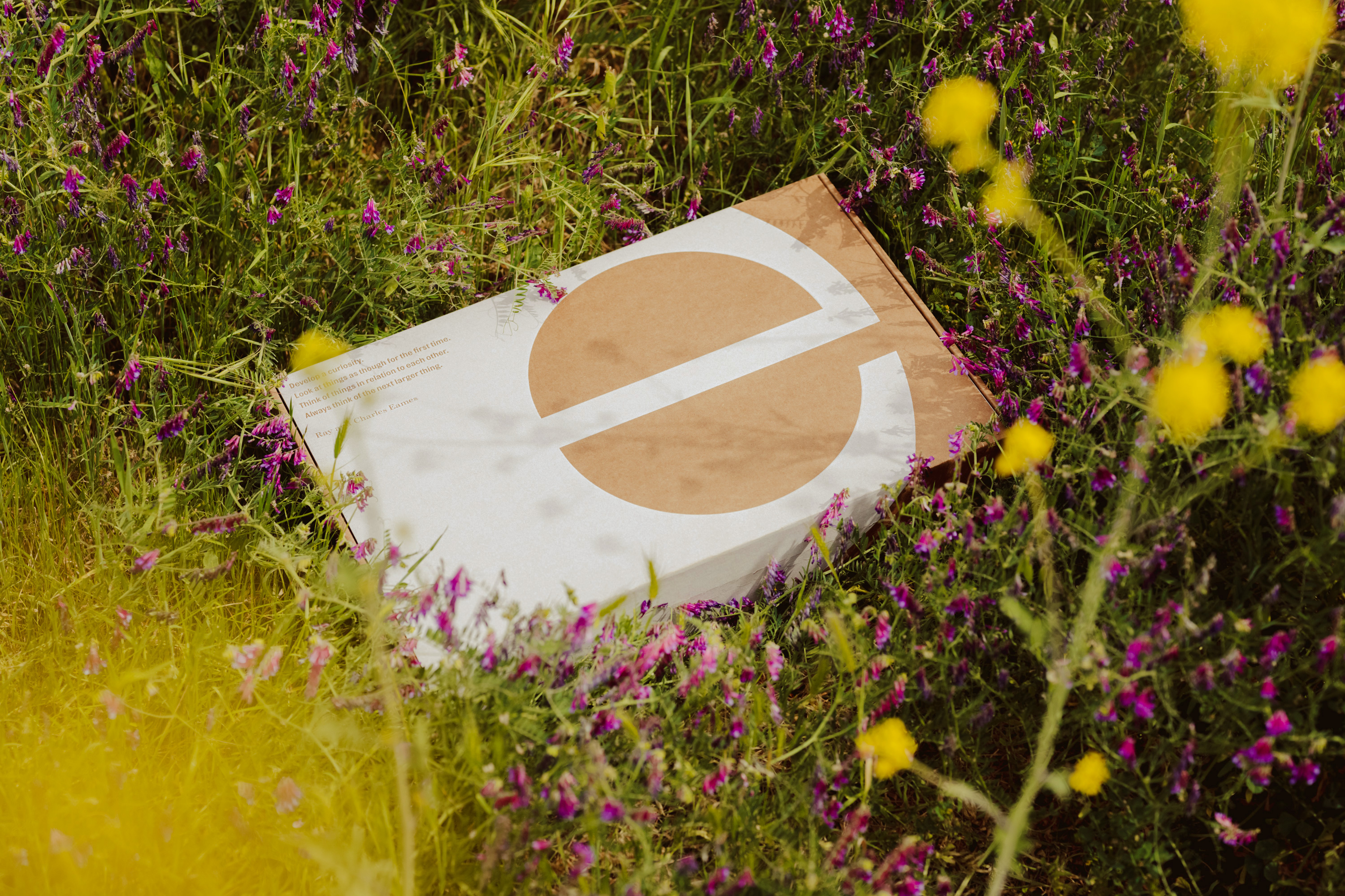
Manual translated the spirit of the Institute into a contemporary and future-facing identity. At its heart is 'the curious e', a symbol that embodies infinite curiosity in its dynamic configurations. The logo shifts its gaze to observe its context, emphasise content, and carry on the Eames' legacy of spirited discovery.
Cardiff Metropolitan University by Baxter & Bailey
- Silver Award: Education
- Find out more about this project at baxterandbailey.co.uk
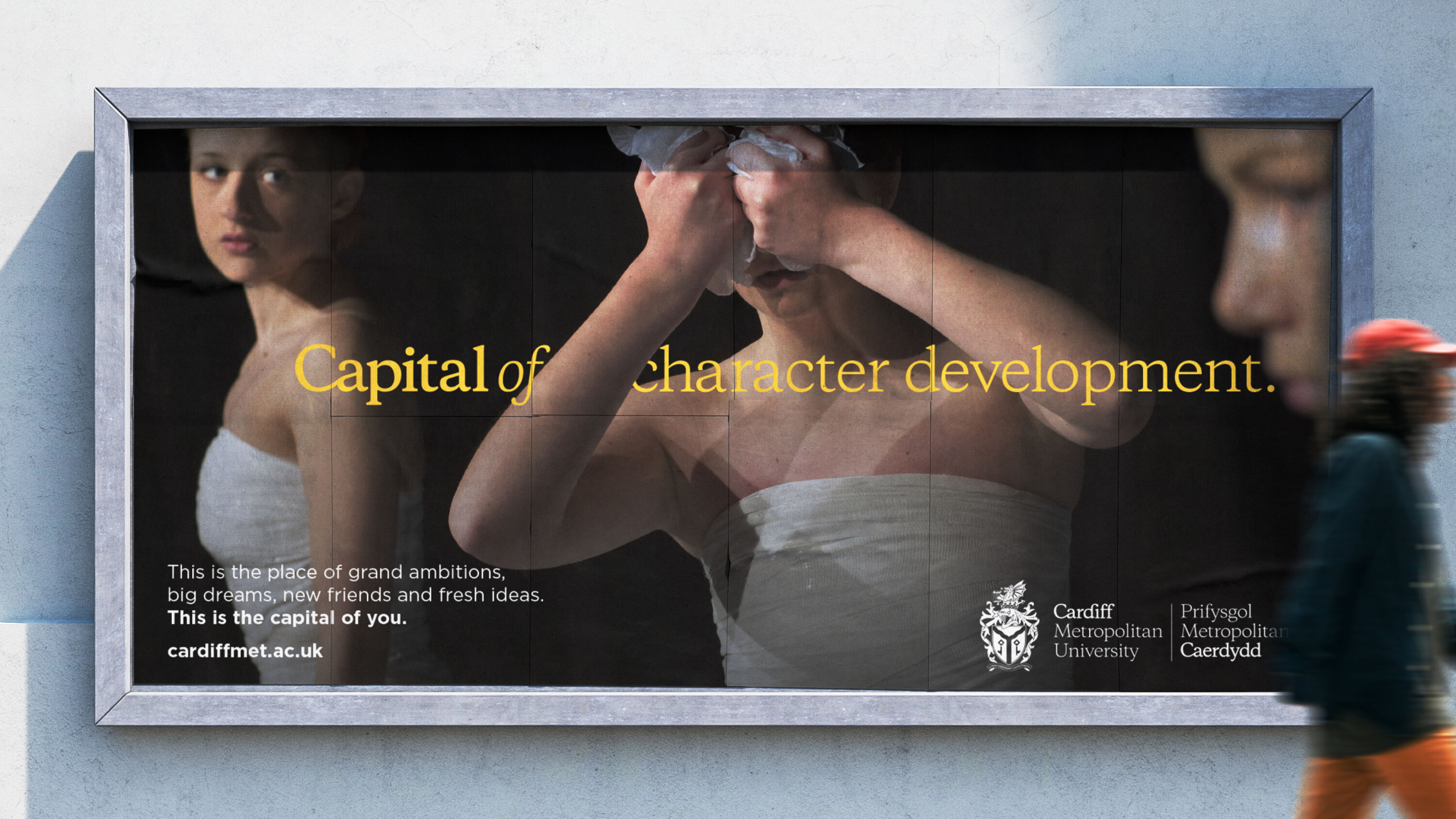
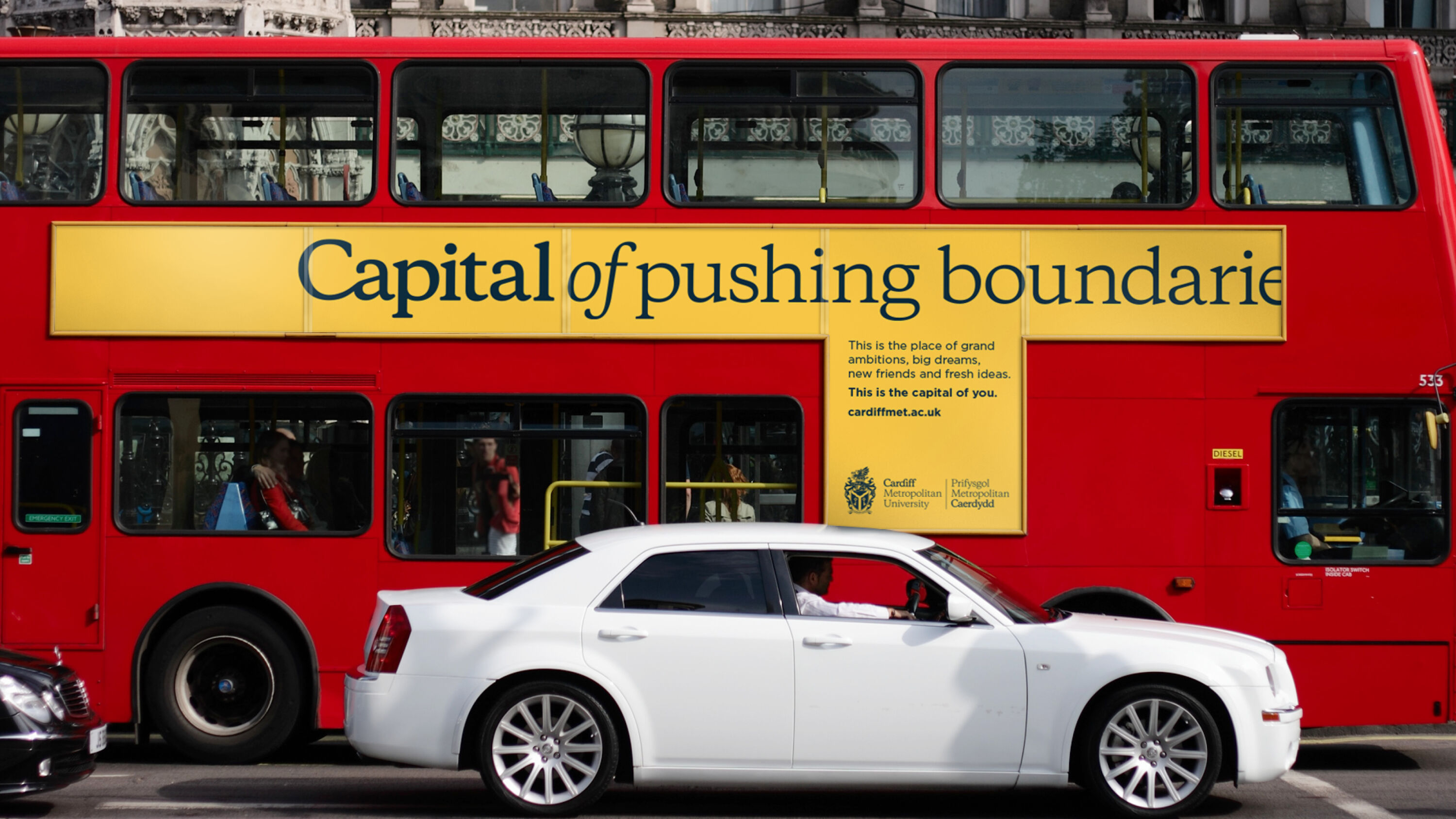
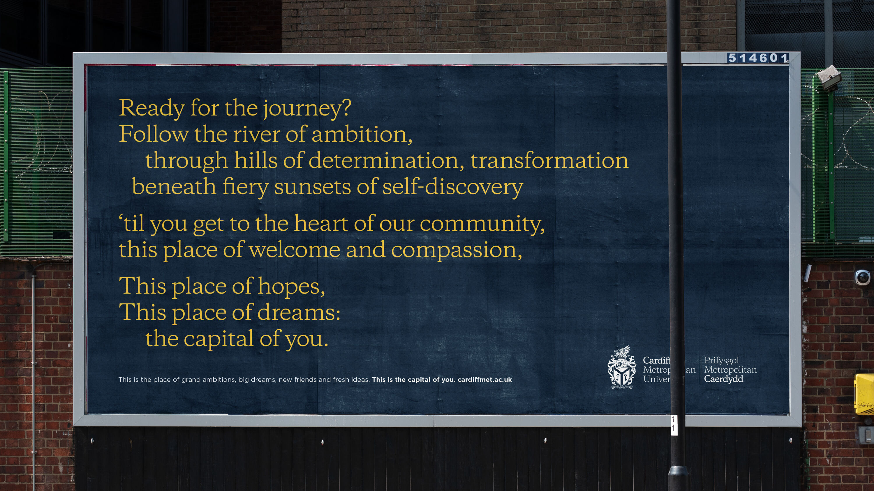
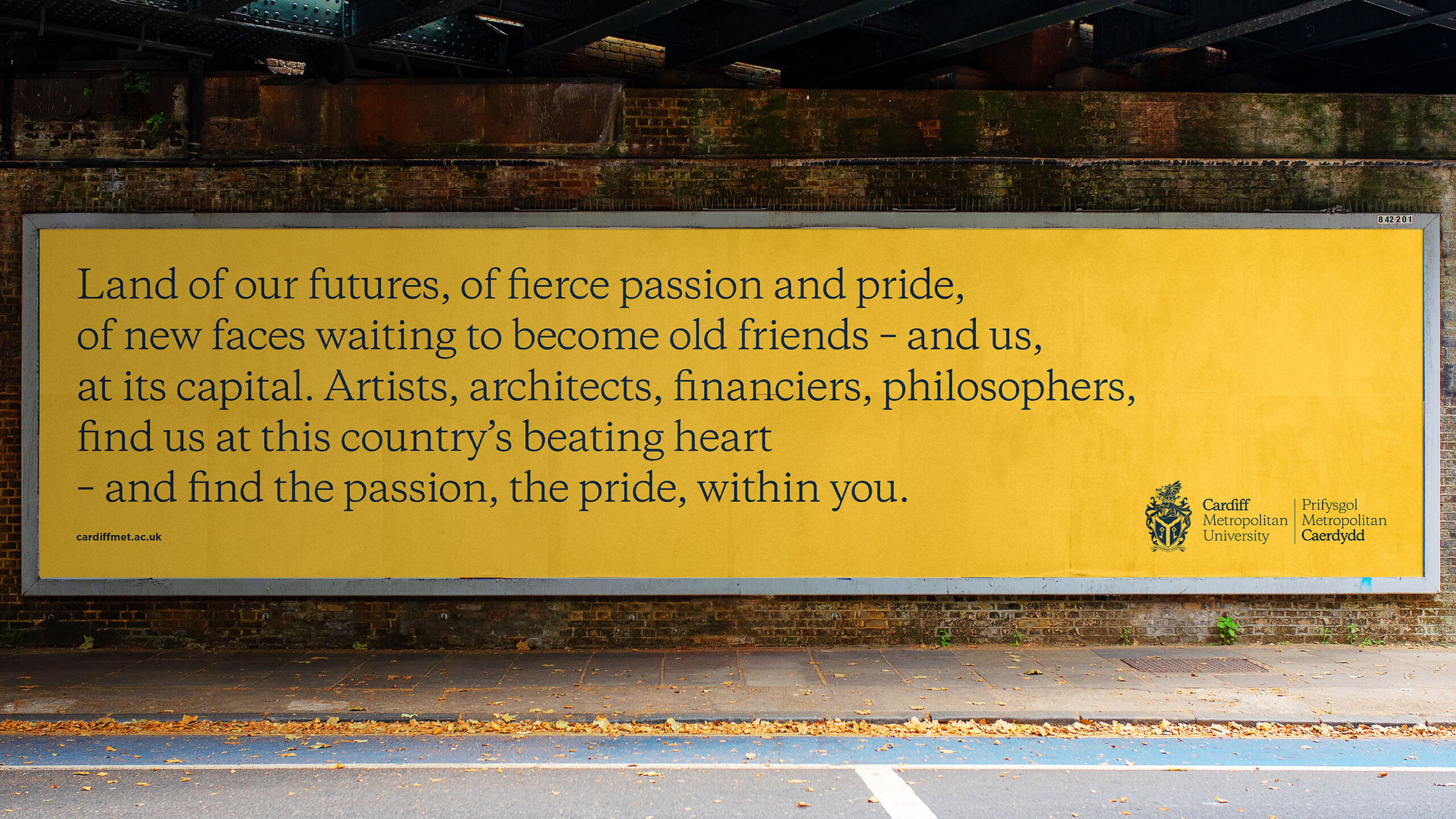
Cardiff Metropolitan University (CMU) is a small community with a strong sense of belonging, but it sits within a global capital filled with world-class arts and culture. CMU asked Baxter & Bailey to show prospective students why the university is so special: the resulting campaign leant into the city's status as a place of ideas and concentration of culture.
Bold, emotive and inspiring. The core concept holds everything together and is instantly recognisable and memorable.
Rebecca Walton
Working with award-winning writer Kate van der Borgh, the agency developed a solution full of powerful, poetic messaging and bold, confident colour, ensuring that the world-class teaching and facilities of Cardiff Met felt synonymous with the city's world-class capital status.
The campaign expanded into easy-to-use guidelines, animations, a launch film, a UCAS exhibition, and a colourful collection of roll-out communications. Ultimately, it positions CMU as a distinctive place that sums up the spirit of something larger, and a place to become your best self: The Capital of You.
The Bond by Common Curiosity
- Silver Award: Property & Construction
- Find out more about this project at commoncuriosity.co.uk
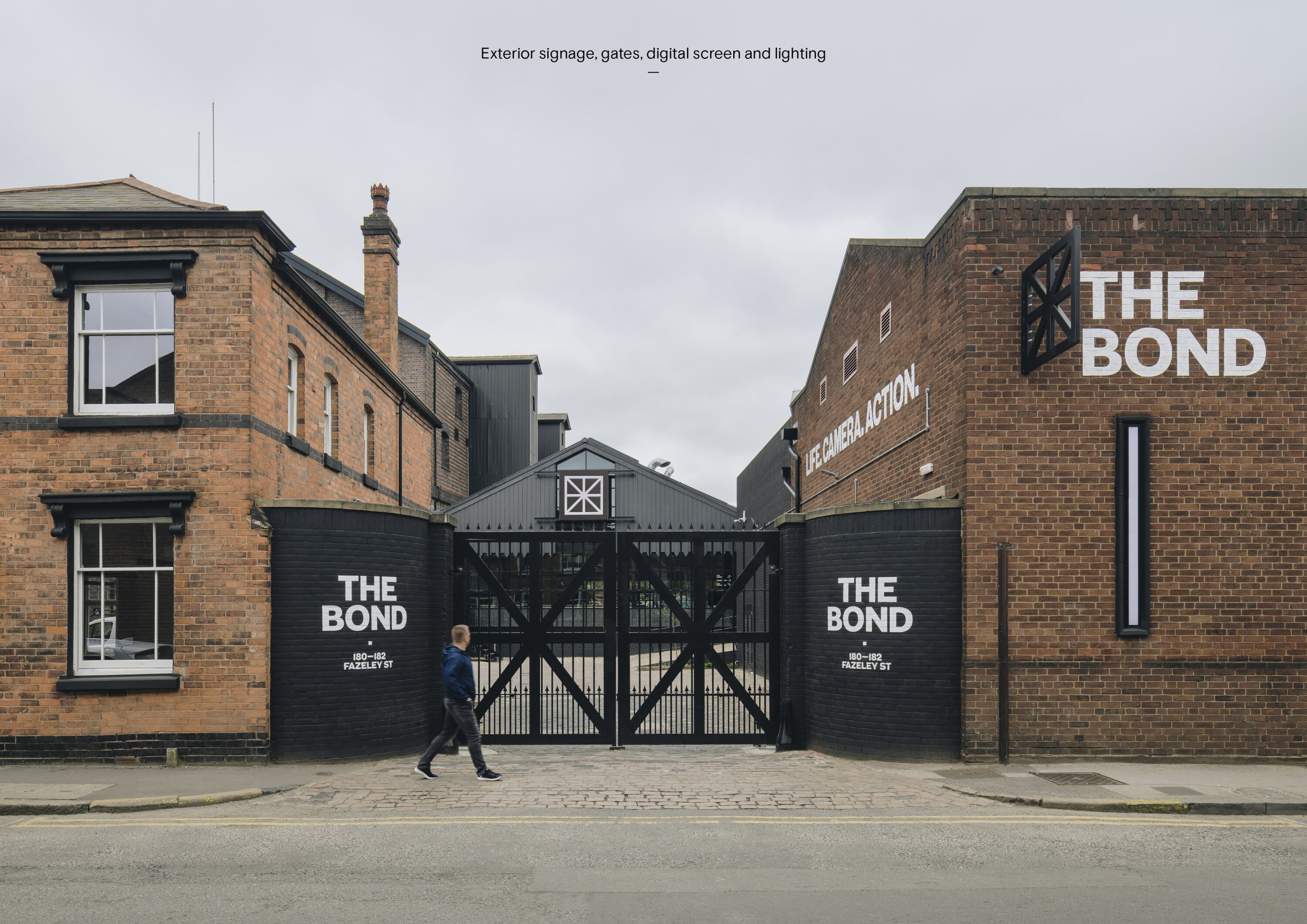
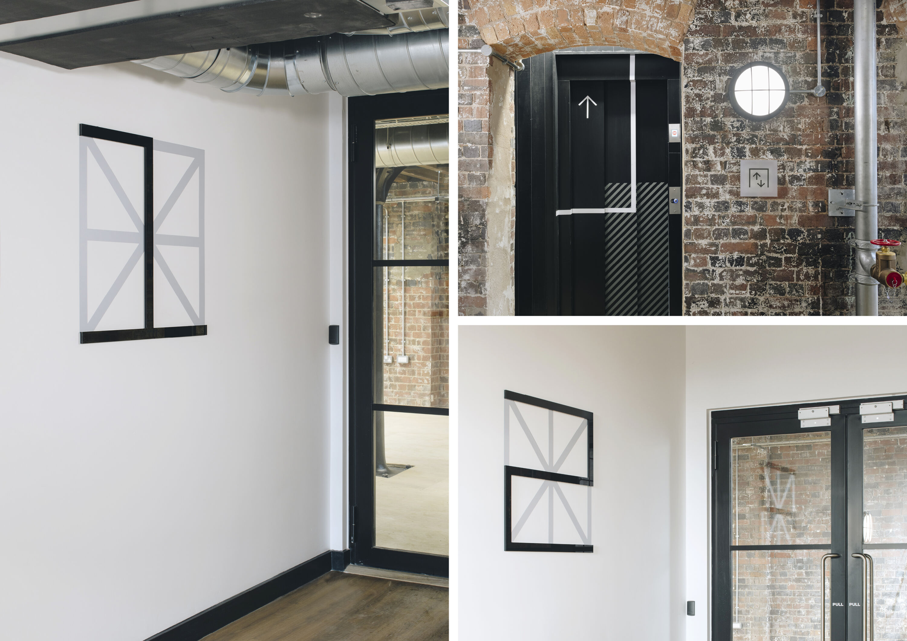
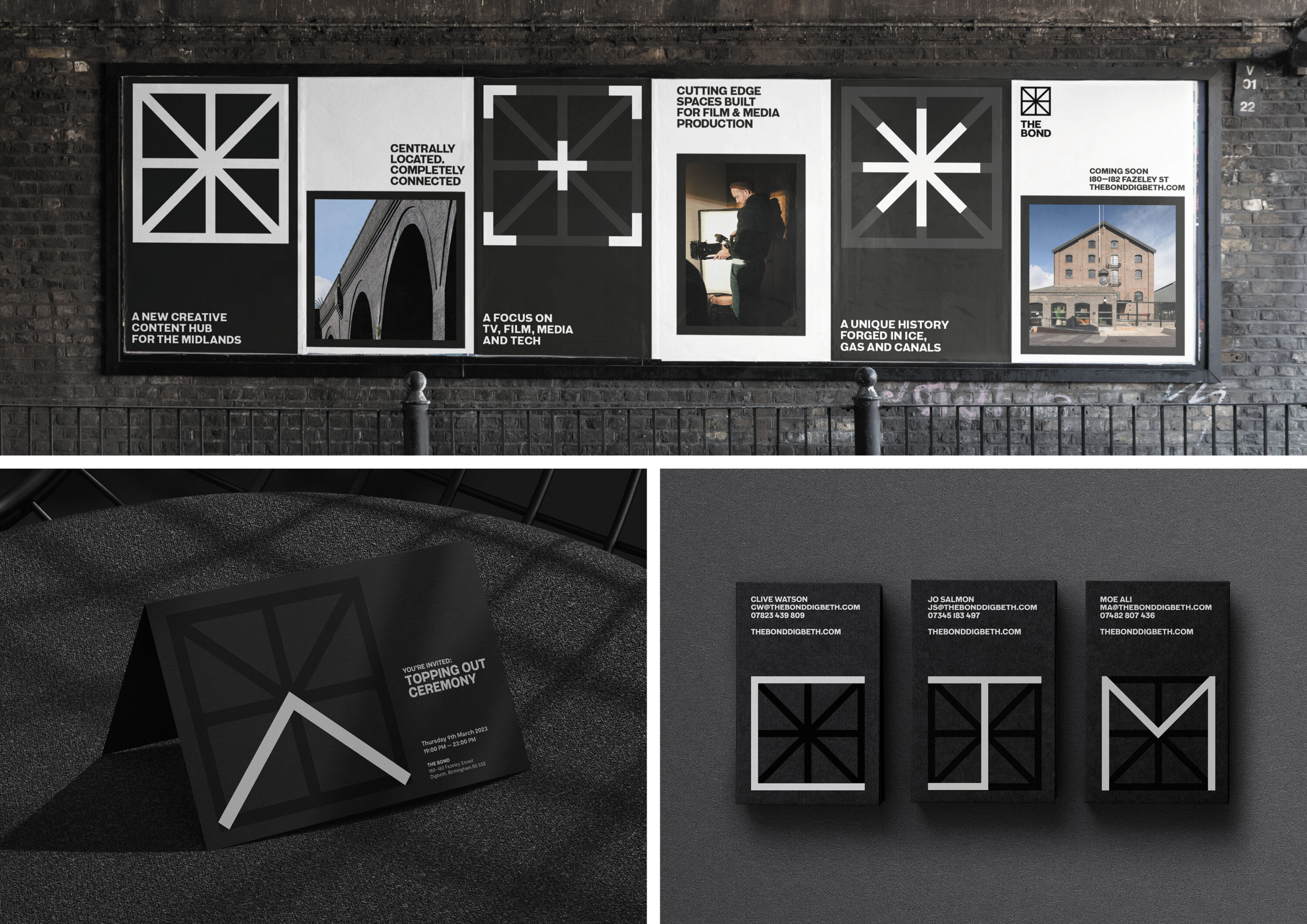
A new creative content hub in Digbeth, Birmingham, The Bond is an outstanding contemporary urban space that focuses on TV, film, media and tech.
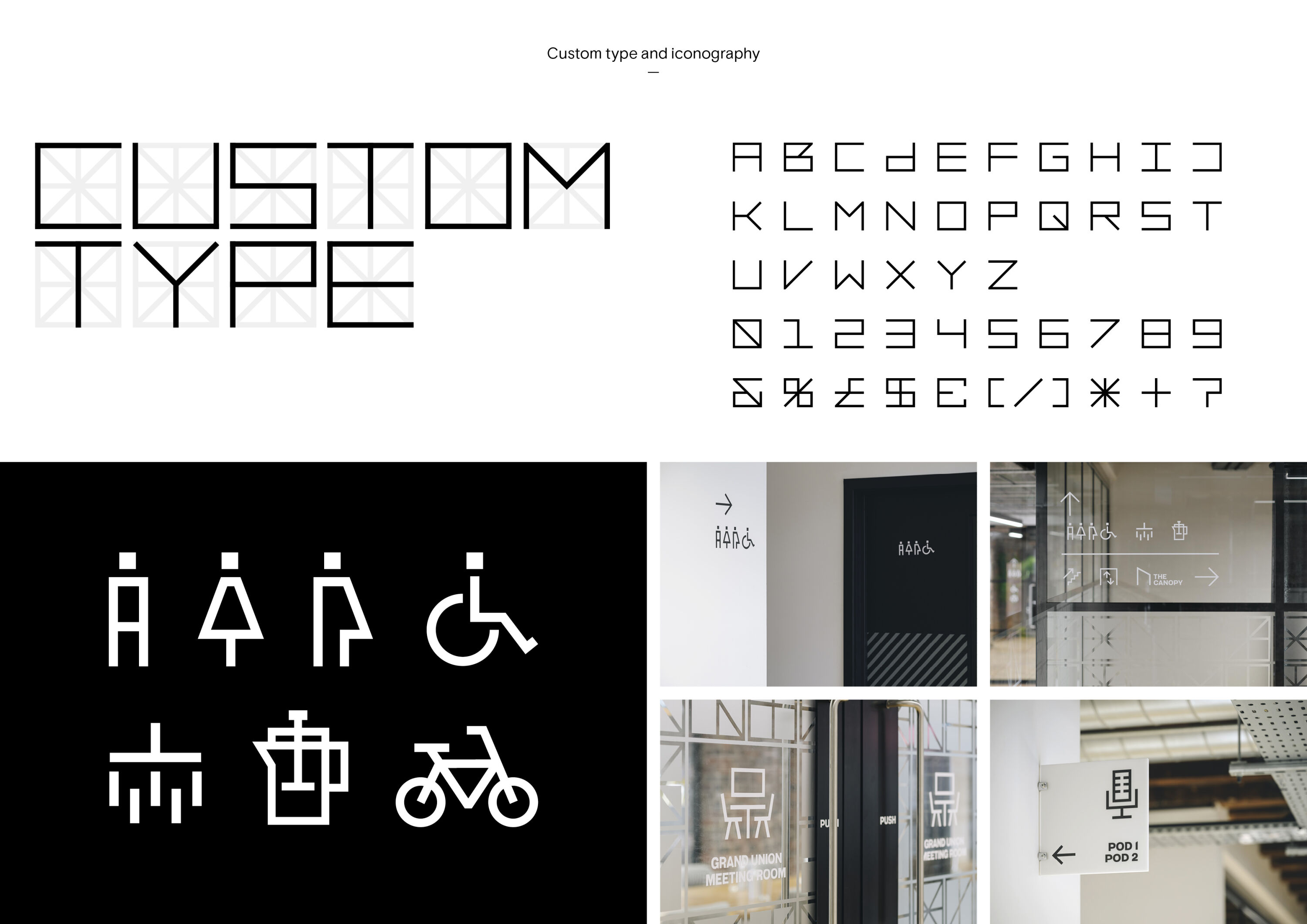
Sympathetically restored from a landmark industrial building by Oval Real Estate, historic features are allowed to shine. Common Curiosity took a similar approach with the brand identity – inspired both by architectural features and its new purpose as a content hub, it helps tell the story of The Bond, past, present and future.
This bold, punchy identity is carried across all applications in a focussed but adaptable manner.
Louise Kyme
Using authentic techniques typical of the industrial era, the scheme comes to life with forged metal signage and hand-painted signs, juxtaposed with modern touches such as digital LED screens to show animations and films.
In the main building – the Ice House — the brand symbol underpins navigational devices, mimicking ice with frosted acrylic panels and vinyls to hint at the building's heritage while allowing its raw industrial fabric to show through.
Carlsberg & LFC – Walking Together by Taxi Studio
- Silver Award: Wine, Beer & Spirits
- Find out more about this project at taxistudio.co.uk
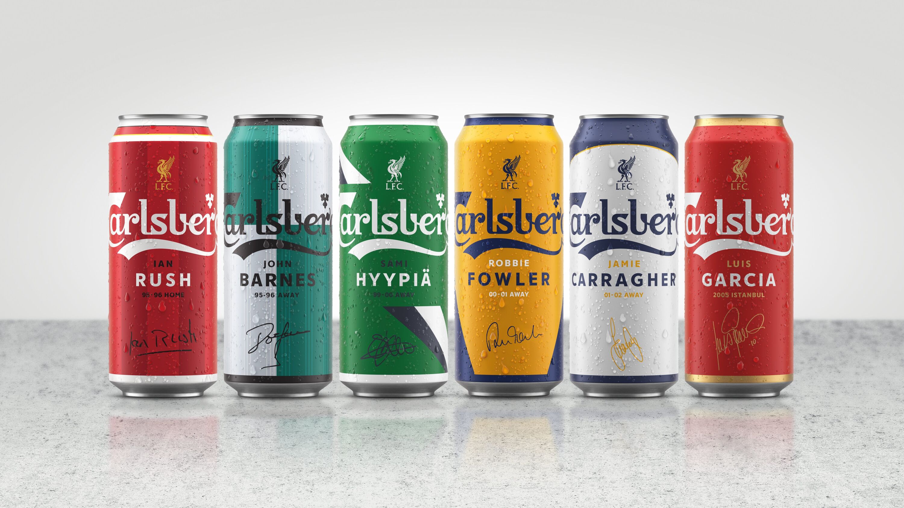
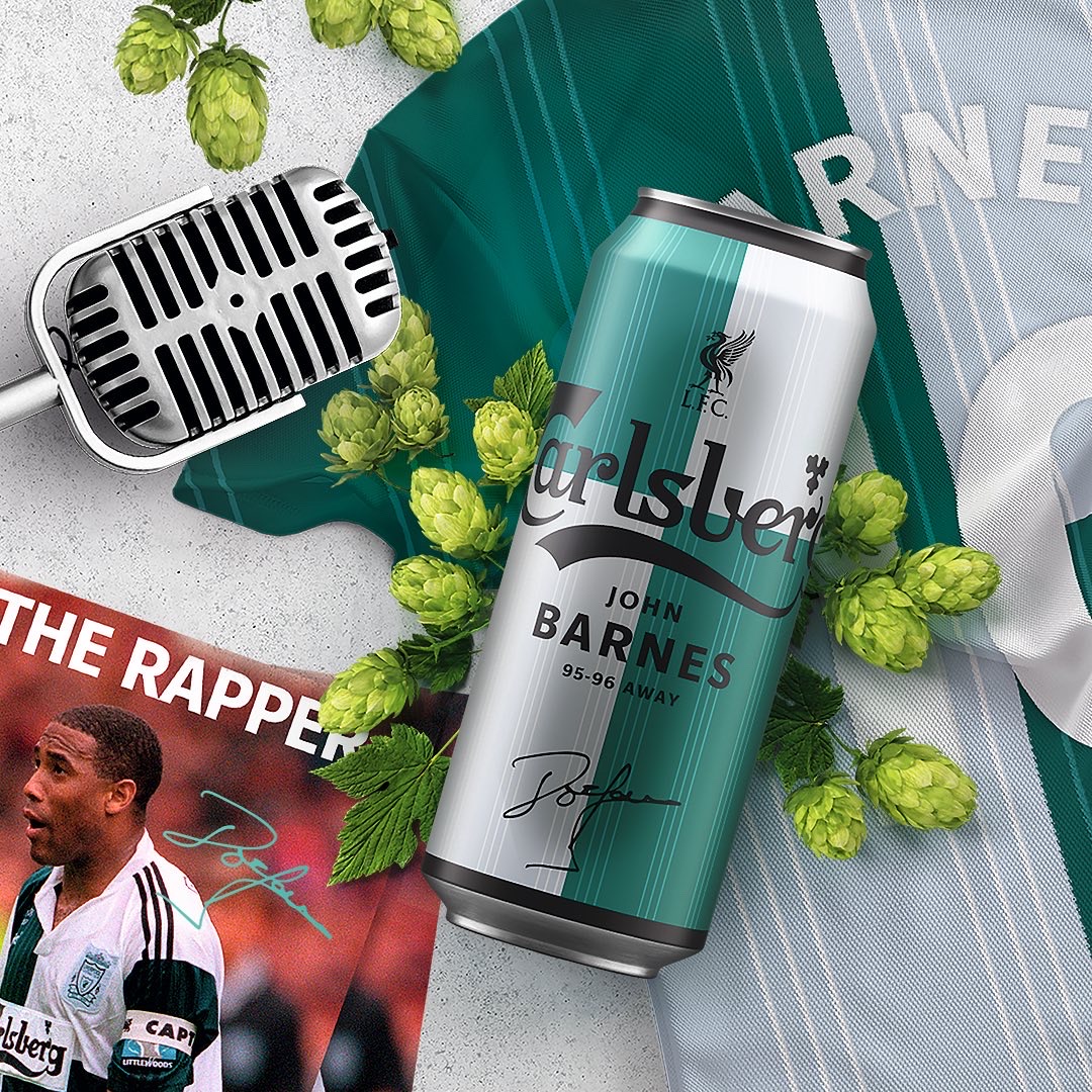
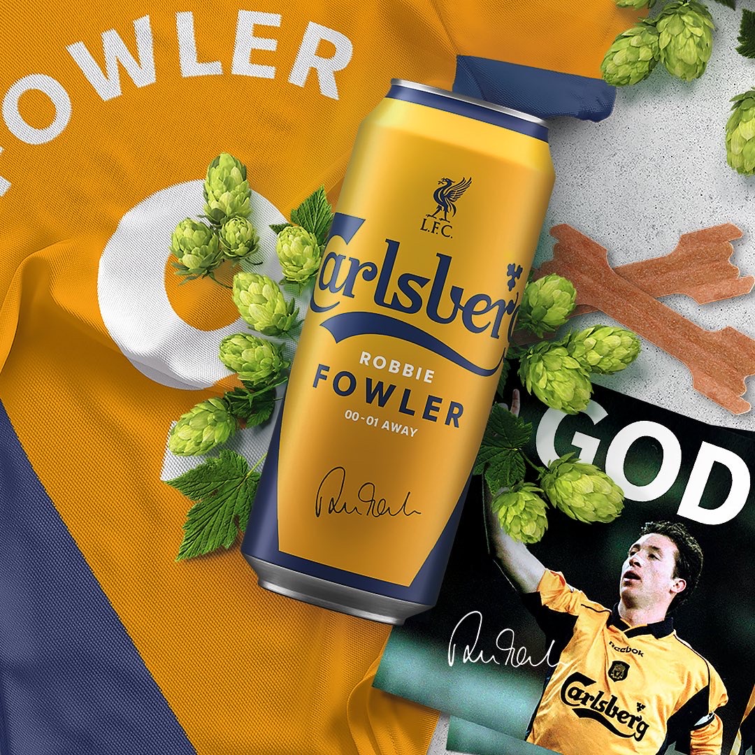
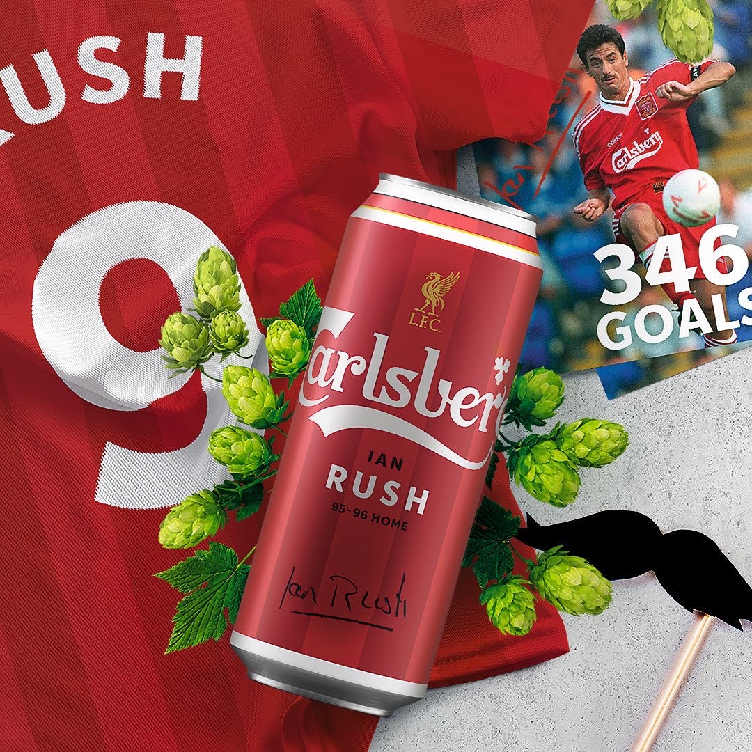
Carlsberg Group and Liverpool Football Club have shared an extraordinary journey, walking side-by-side since 1992 – making it the longest-standing partnership in the history of Premier League Football.
Simple, bold, and hugely collectable.
Victoria Sawdon
Taxi Studio collaborated with Carlsberg to mark the 30-year milestone by transforming six iconic players – Ian Rush, John Barnes, Sami Hyypia, Robbie Fowler, Jamie Carragher, and Luis Garcia – into a limited-edition range.
With meticulous attention to detail, each design became a vibrant homage to each player, embellished with their illustrious signatures, iconic numbers, and the resounding chants that echoed through the electric stadiums. The outcome? A range of crafted limited-edition cans that became tokens of reverence for fans and collectors alike.
Stella Artois – Moments of Beauty Around the Table by Jones Knowles Ritchie
- Silver Award: Wine, Beer & Spirits
- jkrglobal.com
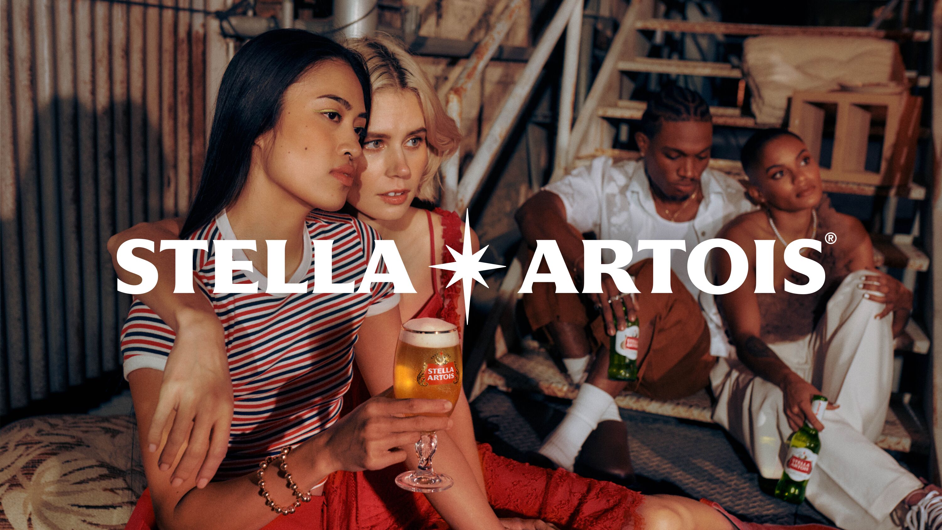
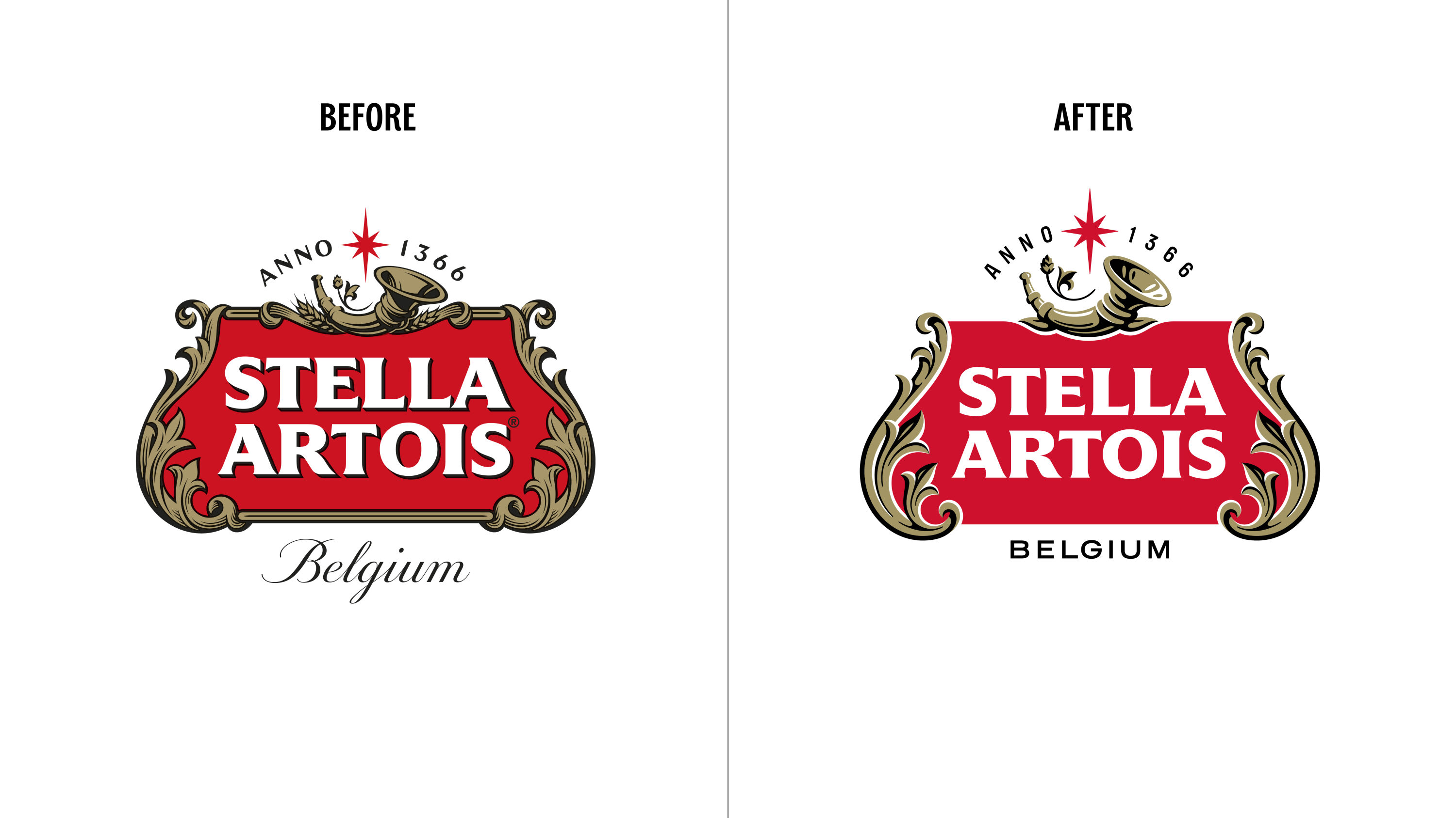
Stella Artois is an iconic beer with an unmistakable heritage, but it needed to evolve to stay relevant. It needed a refreshing new brand world to appeal to contemporary audiences – one that was future facing and that reflected modern codes of premium.
Beautiful new brand mark, typography and art direction.
Raphael Abreu
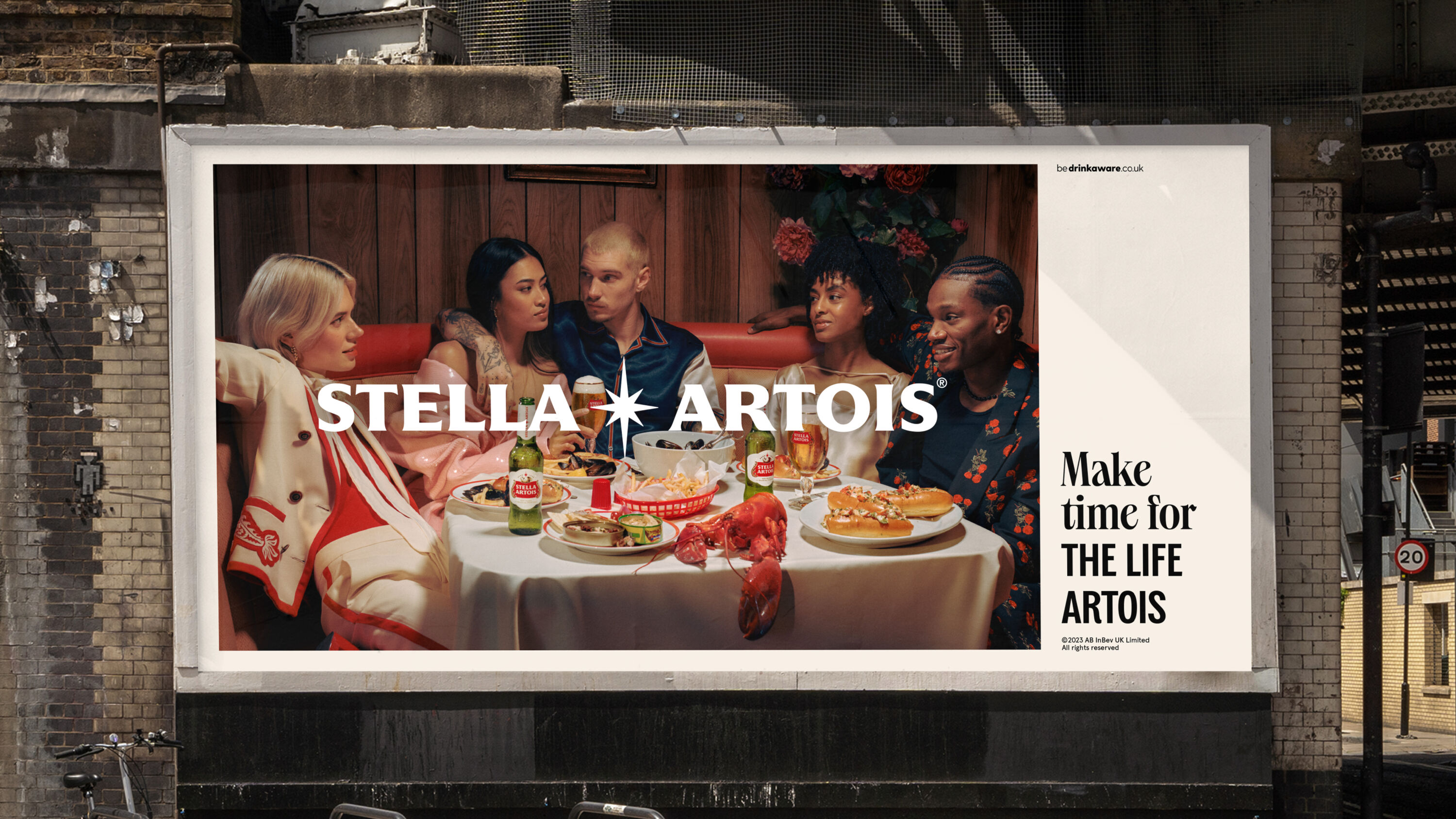
JKR reinvented Stella Artois as if it were a lifestyle brand. Borrowing cues from the world of fashion, the new brand world uses editorialised photography to give everything a cinematic, hyperreal quality. It's all centred around the modern table: the shifting, sometimes improvised places where people gather to eat, drink and connect. In these moments, we glimpse genuine intimacy and revel in the unpretentious and unexpected.
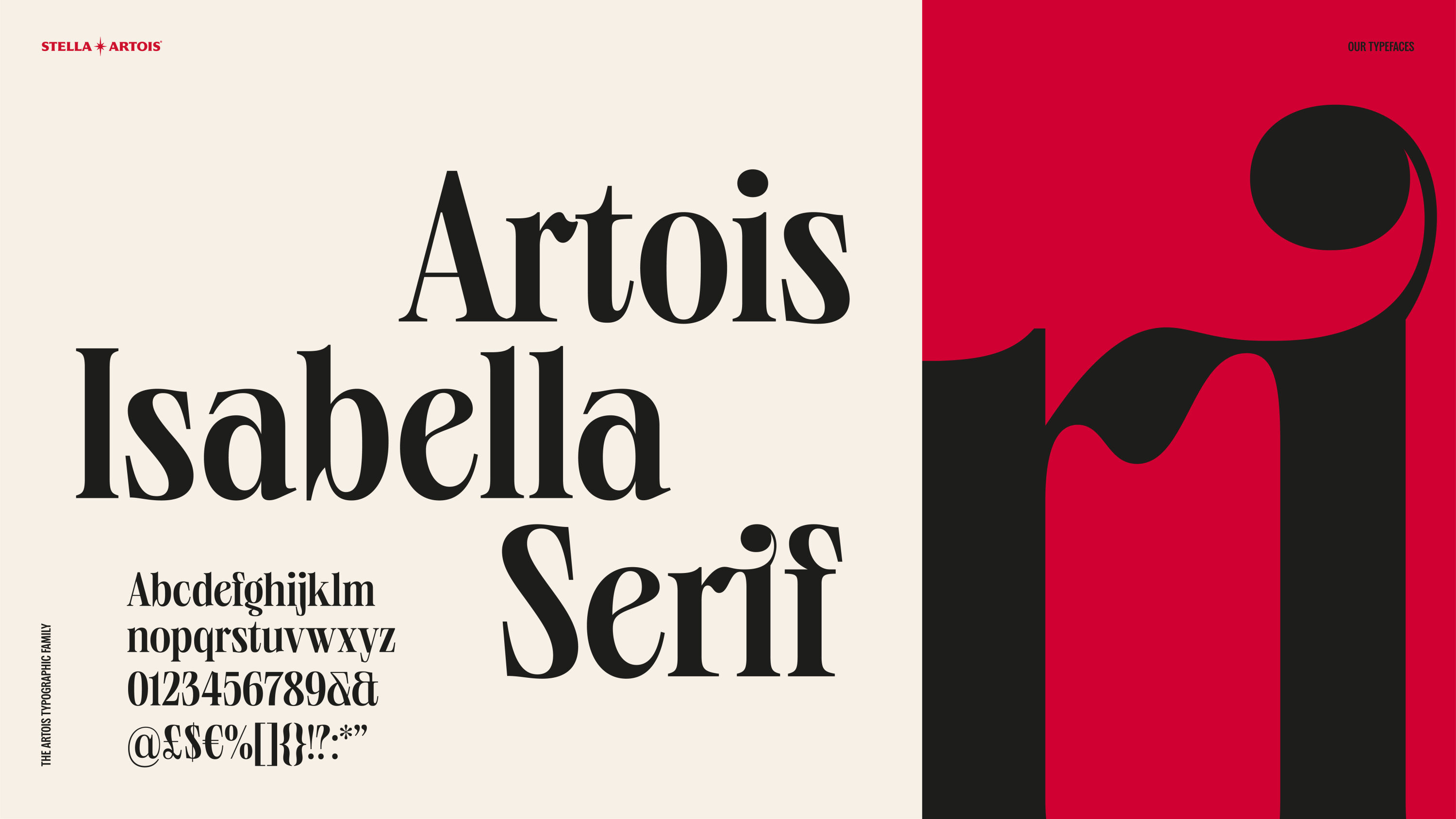
In tandem, a new design system works harmoniously across every Stella Artois touchpoint. This includes a bold horizontal logo, two charismatic typefaces, a fresh colour palette, and a reimagined packaging architecture. The result is an unmistakable and immersive experience that acknowledges the brand's past, while moving it unapologetically forward.
Beat The Peaks by B&W Studio
- Silver Award: Not-for-Profit
- bandwstudio.co.uk
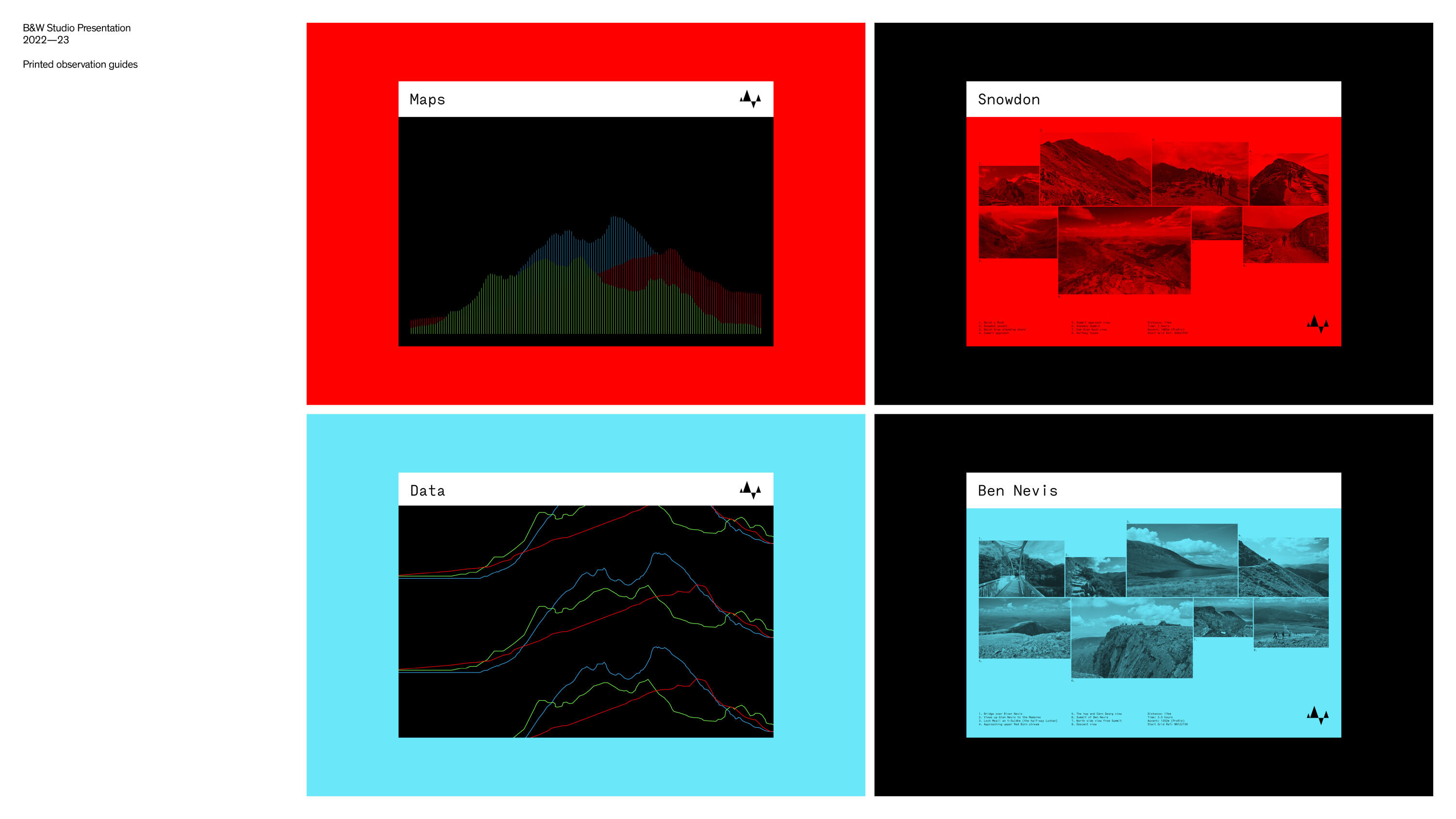
In 2022, Lee Bradley from B&W Studio and Oliver Leigh from Nike ran the three peaks to raise money for British Heart Foundation. Having both lost a parent to heart-related issues in 2020 they wanted to make as big an impact as possible.
Stunning. Feels more tech than charity, refreshing given the endless charity clichés we see. I quite enjoyed the 'blokeishness' of it too.
Louise Kyme
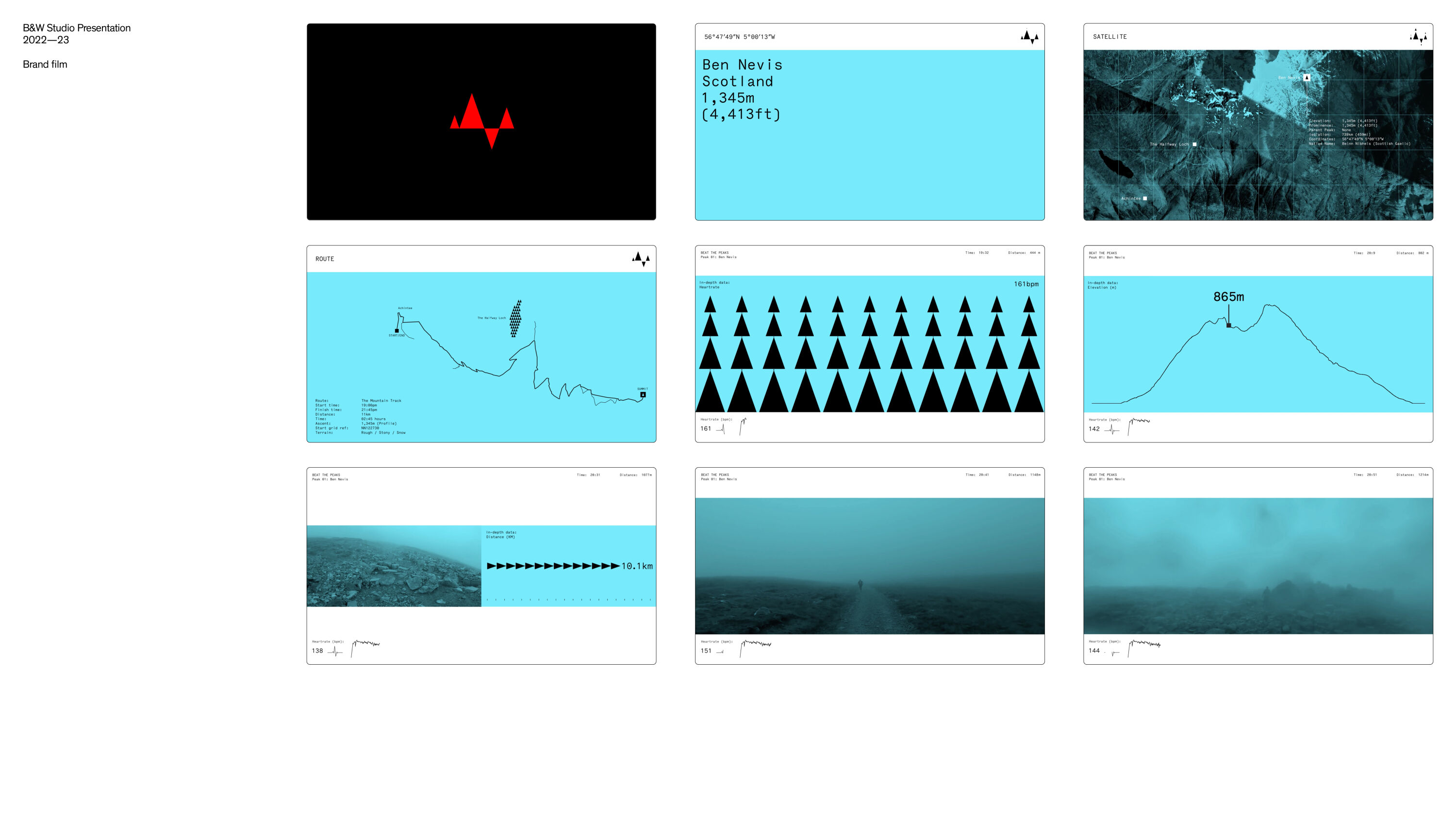
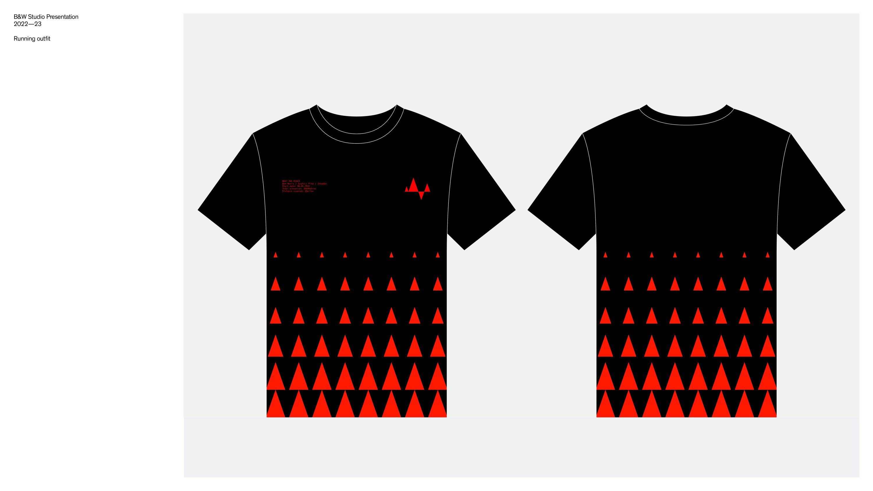
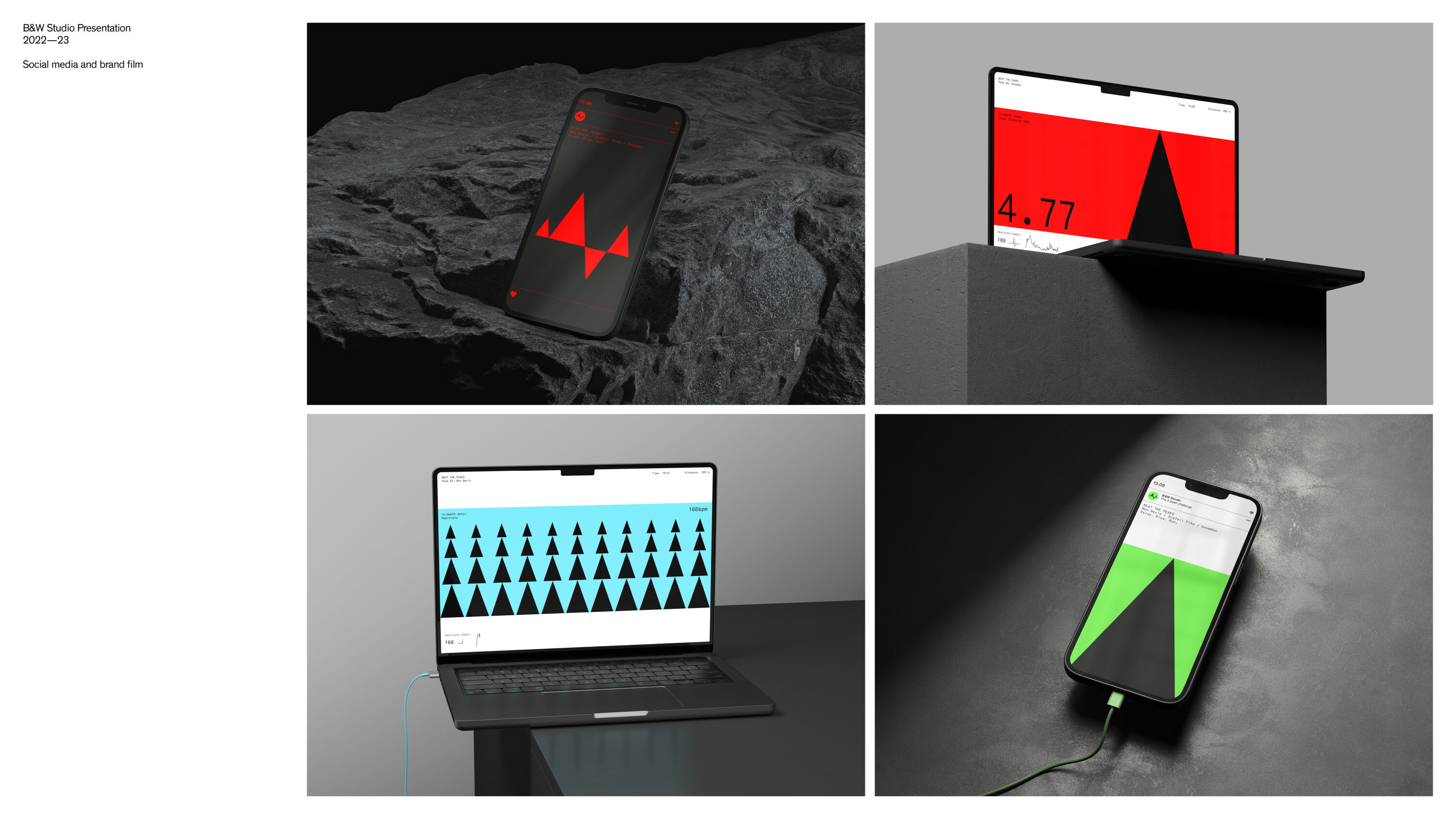
While many walk the route, they wanted to go further and run all 23 miles and 3064 metres of ascent in under 20 hours. To drive awareness, B&W branded the social media campaign with an ownable and unmissable visual language based on triangles to represent the three mountains, and capture both the rhythmic intensity of the physical challenge and the painful spike of a heart attack.
Both runners wore heart monitors and head-cams throughout the experience, and a three-minute campaign film mapped real BPM data against raw authentic footage, giving viewers a sense of being there on the mountain with them. In total, the pair raised £3,000 for BHF.
The Royal Parks by Rose
- Silver Award: Not-for-Profit
- rosedesign.co.uk
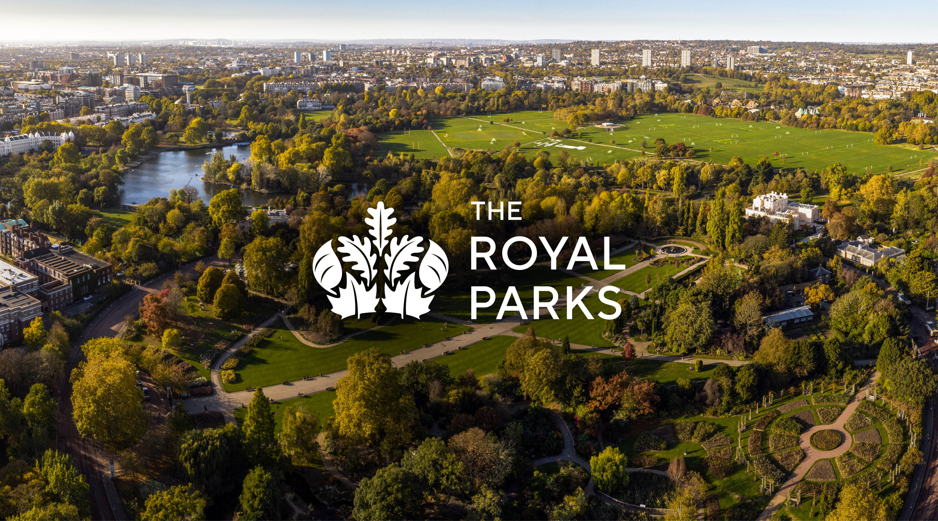
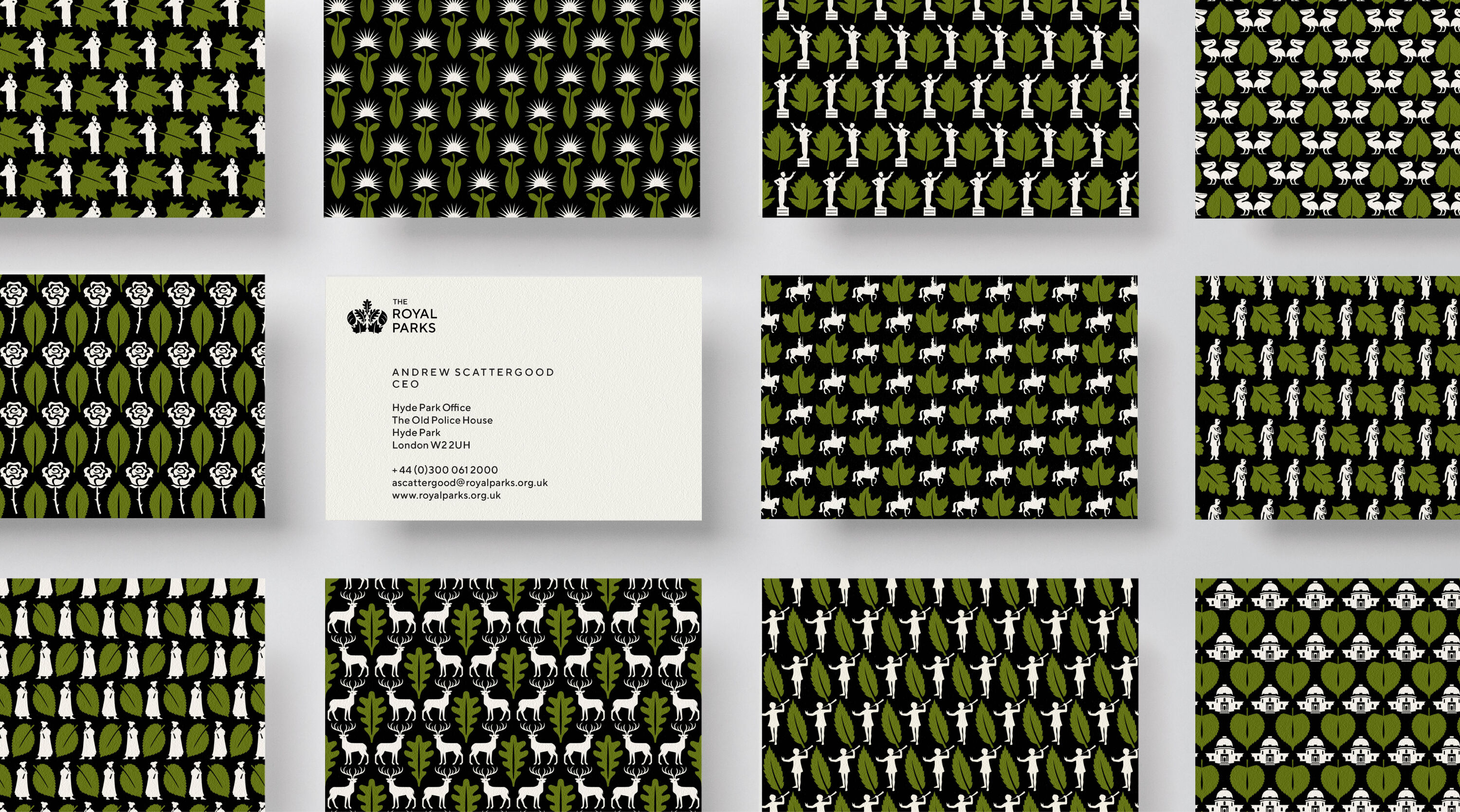
The Royal Parks cares for the most famous collection of urban parks in the world. But research suggested the charity was perceived as elitist, authoritarian, and not for everyone.
Sleek and modern. Breathes new life into an antiquated and imperialist brand.
Rebecca Brooker
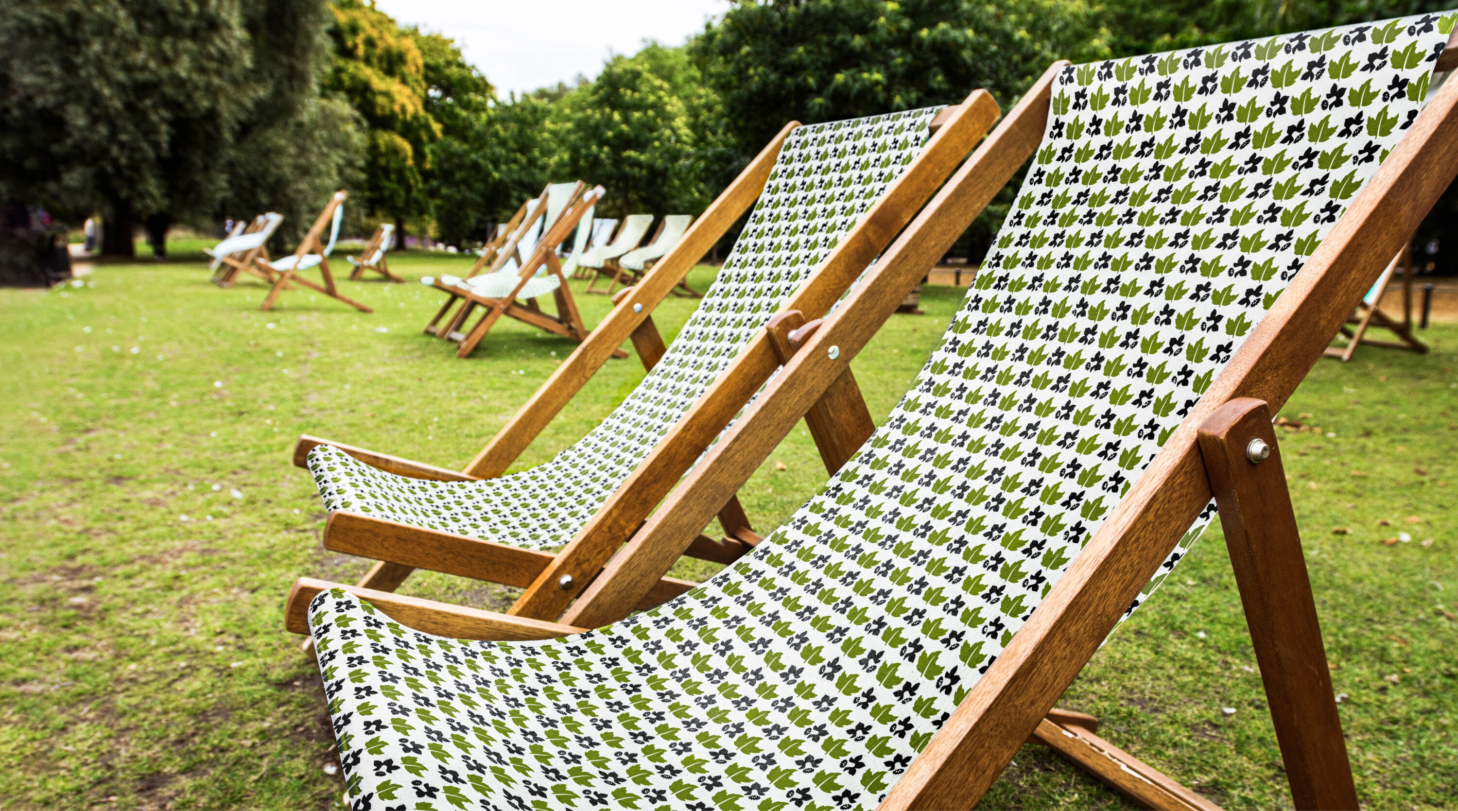
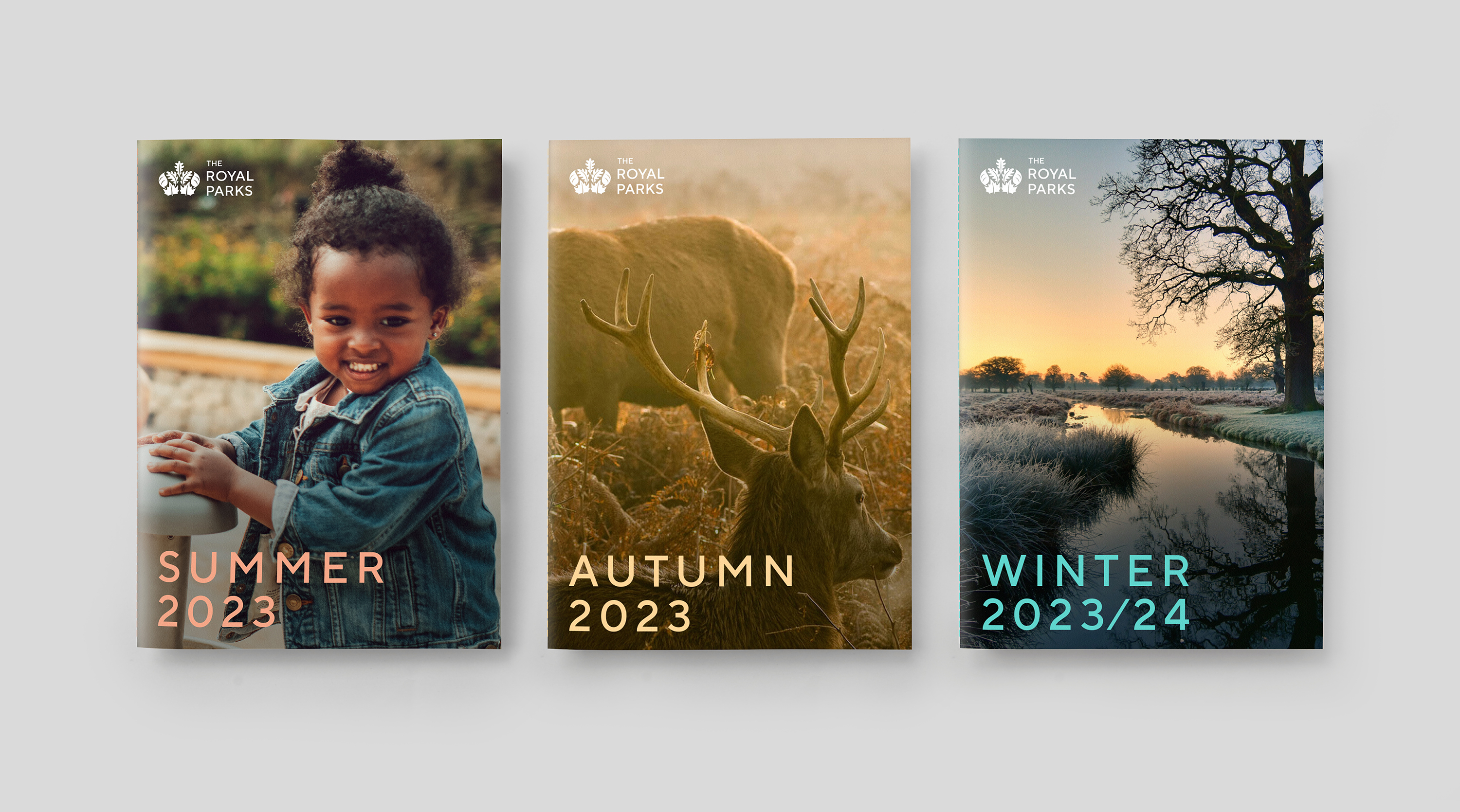
As part of a sensitive evolution, Rose redrew the original marque to be fit for purpose in digital environments. An elegant, modern sans serif replaced the stuffy serif that The Royal Parks had been using, and instead of dark pine green a fresher deciduous green better reflected the trees found in most of the parks, and helped signage stand out.
Taking inspiration from the crown marque, each park received its own prominent leaf and iconic landmark. Rose worked with illustrator Rebecca Sutherland to create a family of graphic patterns. Writer Jim Davies helped craft a warmer, more welcoming tone of voice. And the legendary Quentin Blake replaced generic symbols with characterful illustrations to raise a smile from visitors when asked to respect park rules.
Undaunted by Johnson Banks


- Silver Award: Not-for-Profit
- Find out more about this project at johnsonbanks.co.uk
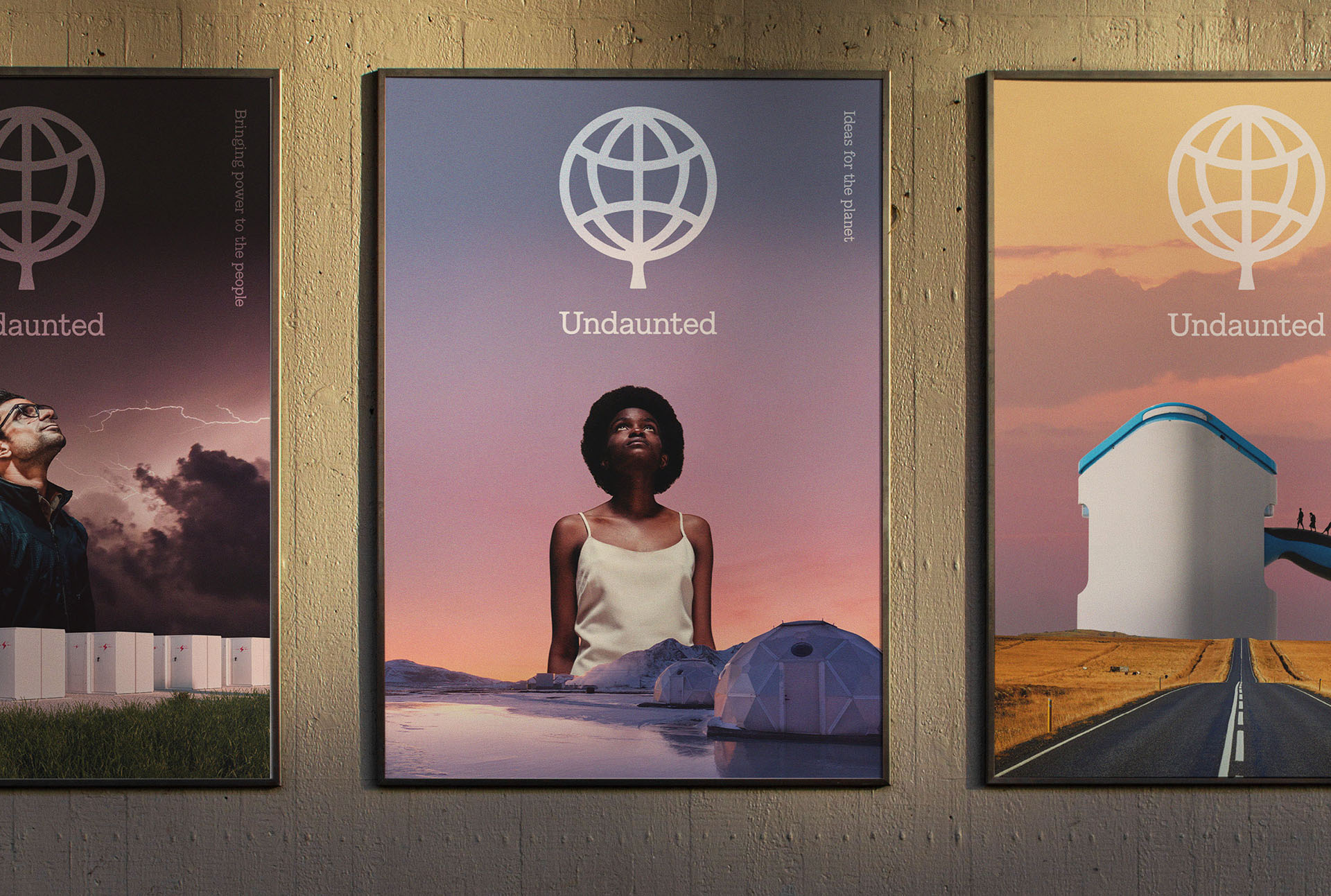
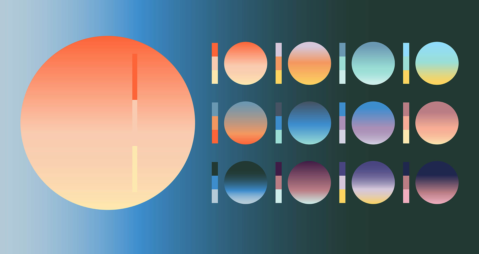
The Royal Institution and Imperial College London's Grantham Institute approached Johnson Banks to name and brand their new climate change innovation centre – which needed to differentiate itself from other university equivalents, climate organisations and accelerators.
I love this! The name is perfect, and so distinctive in a sector full of acronyms. The brand feels challenging but optimistic, authoritative but fresh. And the logo transformation carries so much meaning.
Rebecca Walton
After much exploration, the resulting name was Undaunted – meaning neither discouraged nor intimidated by difficulty. This perfectly encapsulated the aims, ethos and determination of the centre as it sought out ways to mitigate the effects of – and adapt to – the climate crisis.
In the world awash with 'green' projects, cutting through with the visual branding was also a challenge. Johnson Banks set out to find something that felt universal, but also irrefutable.
At first glance, Undaunted's new symbol is a simple Earth icon. But its central section morphs into a leaf shape, visually symbolising 'green ideas for the globe'. At once familiar and new, it opens up a whole identity system based on their current and future aims for the planet.
Mux by For The People
- Silver Award: Technology & Telecoms
- Find out more about this project at forthepeople.agency
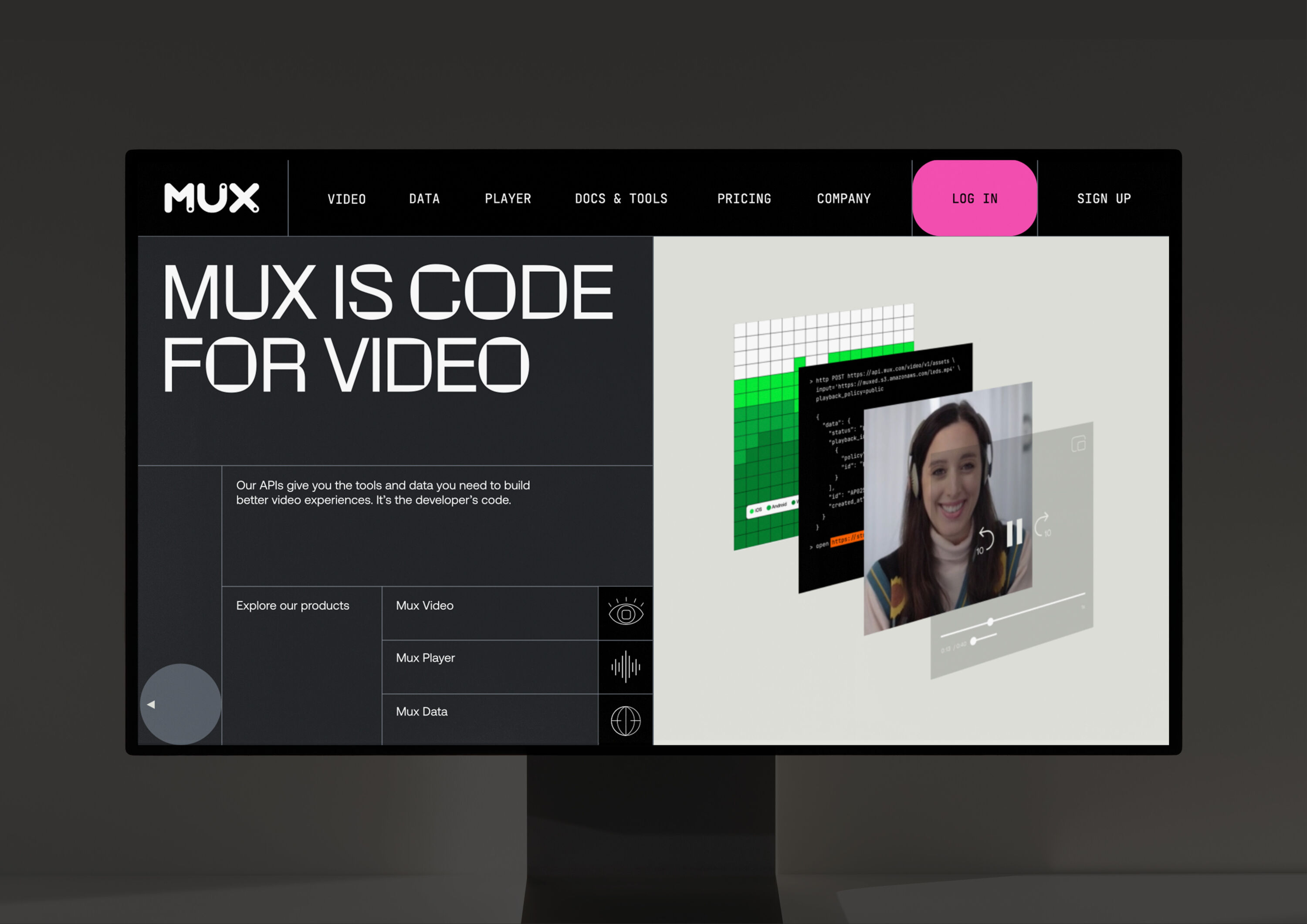
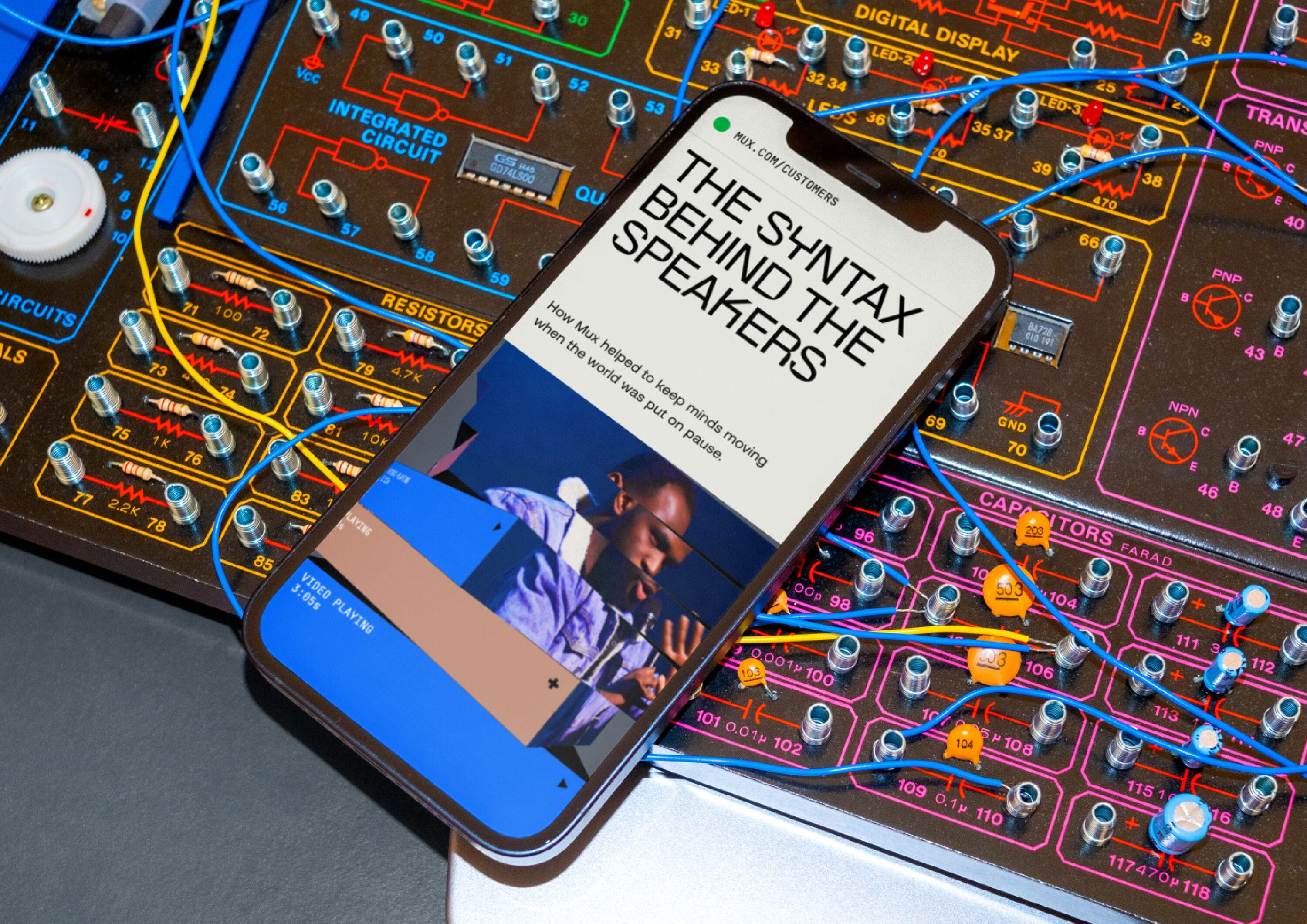
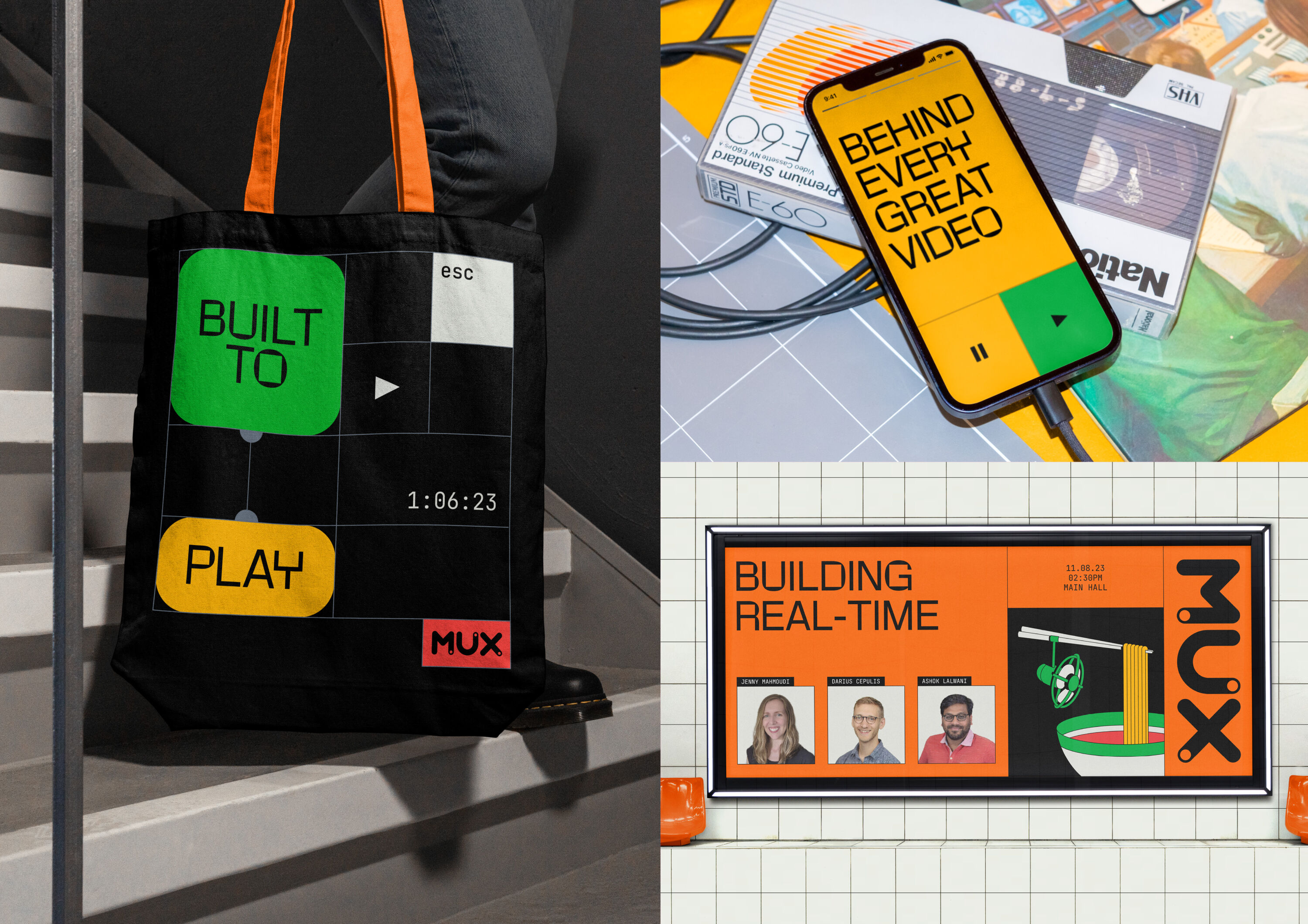
An all-in-one platform by developers, for developers, Mux provides an efficient, intuitive way to build and monitor video online with just a few powerful lines of code. It has been used by the likes of Vimeo, TED, Paramount and the Super Bowl.
Refreshing, fun, and connects well together.
Daljit Singh
But like much of the tech sector, Mux had fallen into the trap of confusing their brand with transactional product benefits. To truly demonstrate the value of its technology, Mux's new identity needed to express the creativity it unlocks – whilst still elevating the code behind it all.
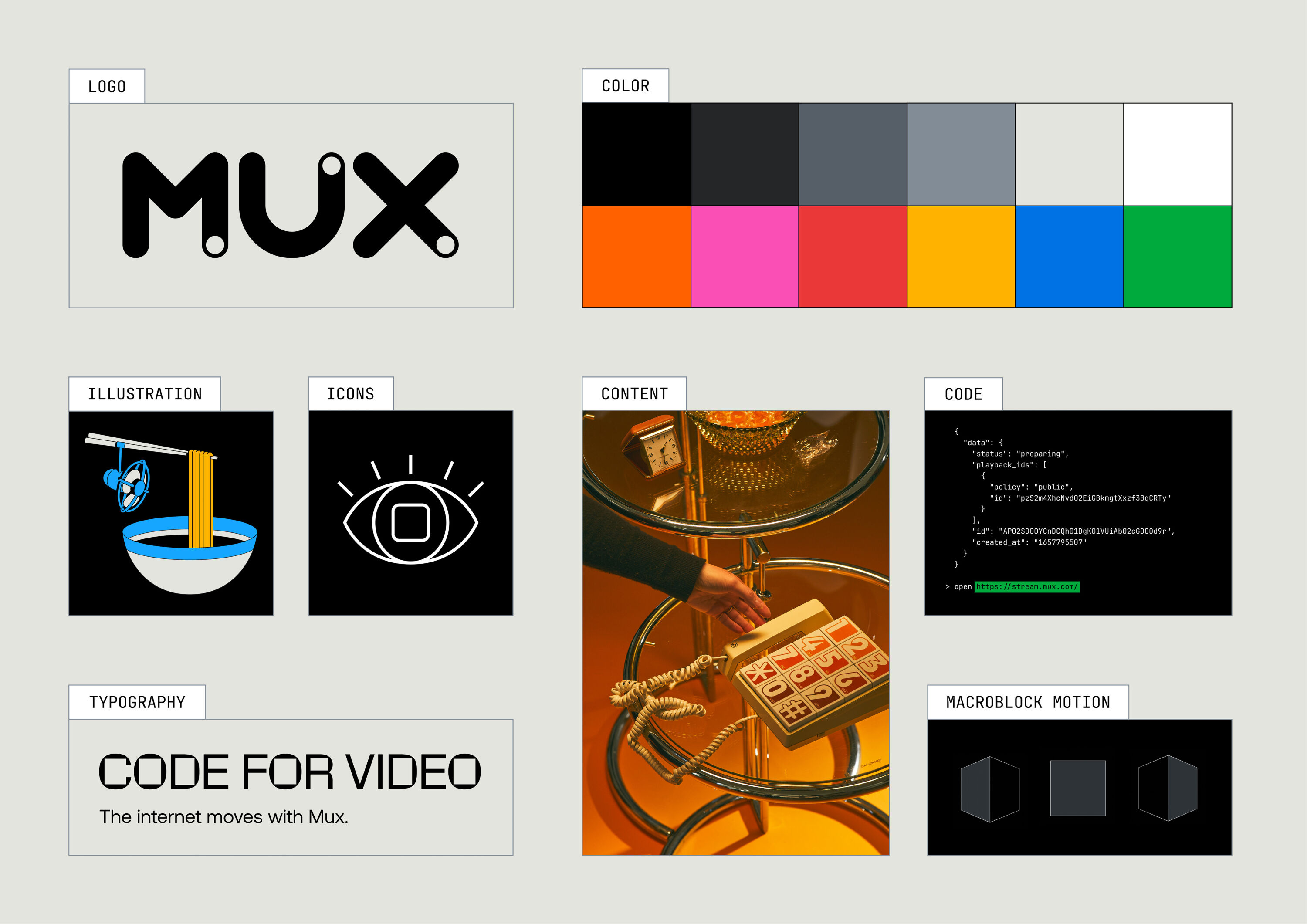
For The People repositioned Mux as the infrastructure for creativity: a platform Built to Play. The identity goes behind the screens of video, leveraging macroblocks (the smallest processing unit of video) to create a flexible, infinitely scalable grid that comes to life through motion.
With icons, illustrations and a palette ranging from neutrals to neons, the system brings code and creativity together.
SleepyTV by Magpie Studio
- Silver Award: Entertainment
- Find out more about this project at magpie-studio.com
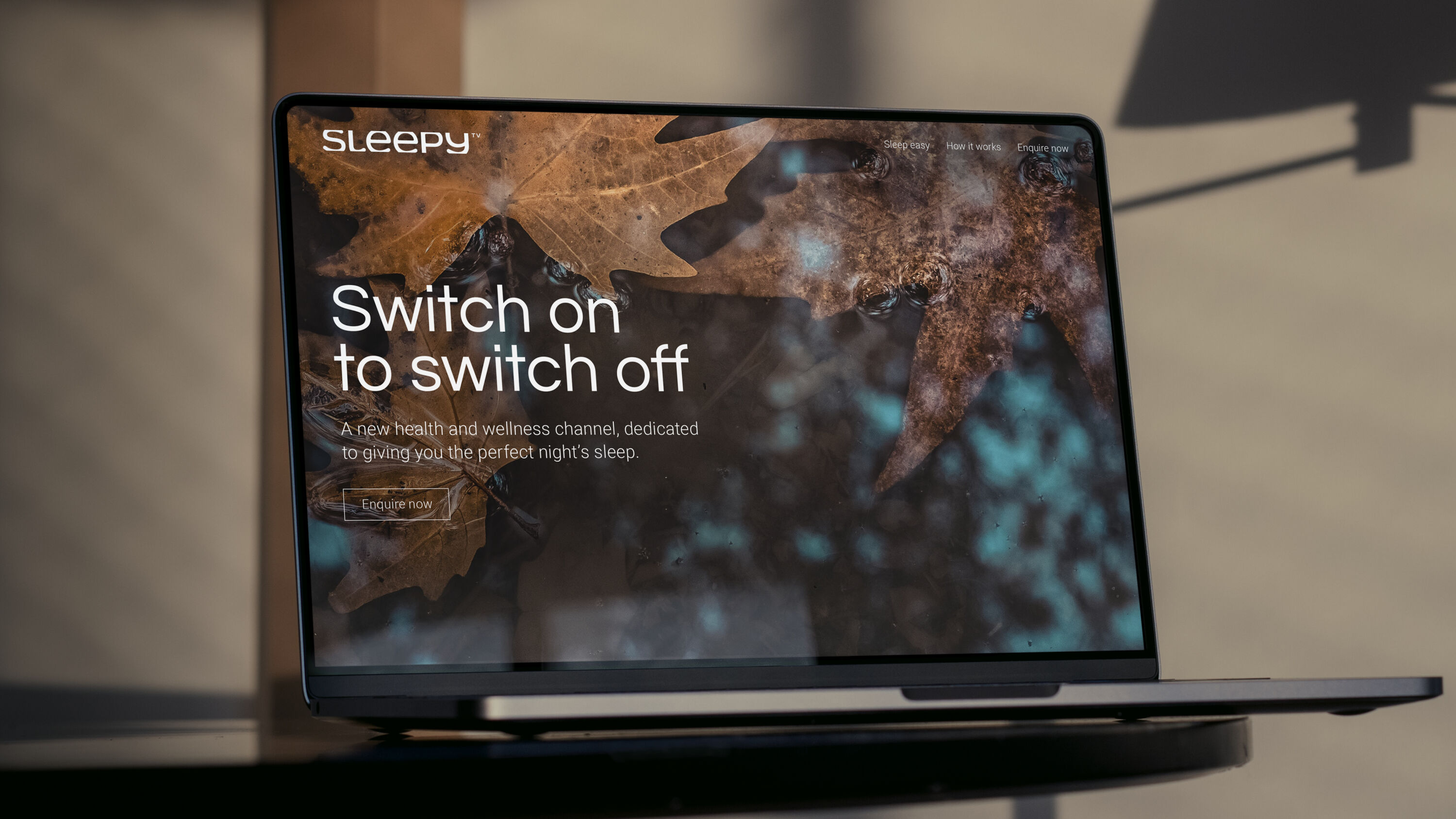
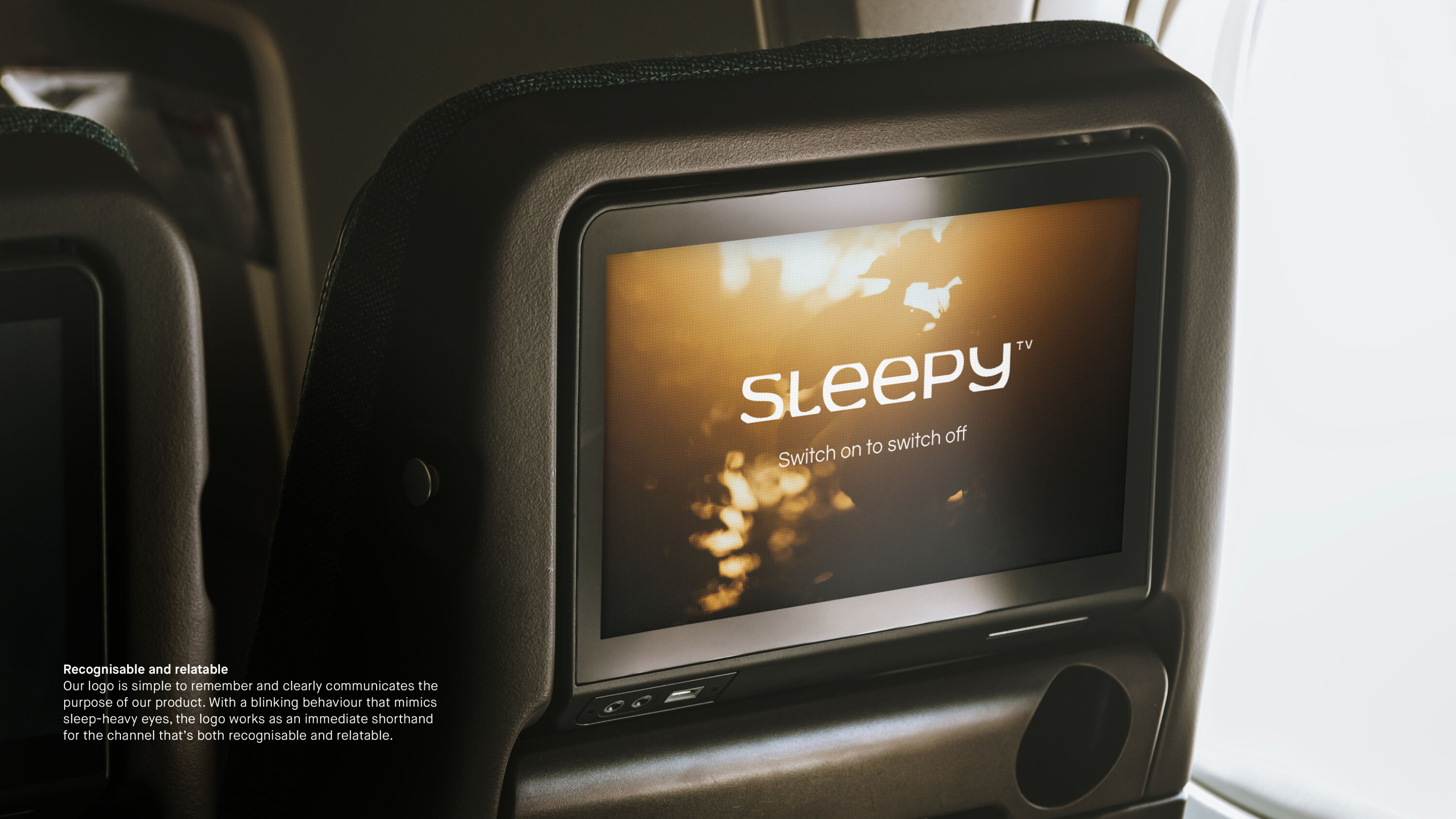
Different time zones and unfamiliar surroundings can play havoc with our sleep patterns, making it difficult to concentrate and regulate emotions. Created for the travel industry, SleepyTV is a new on-demand health and wellbeing channel that helps soothe tired viewers in airplane seats and hotel rooms to sleep.
Love this. The calm, relaxing logo and visual language aligns beautifully with the brand's intentions.
Simon Elliott
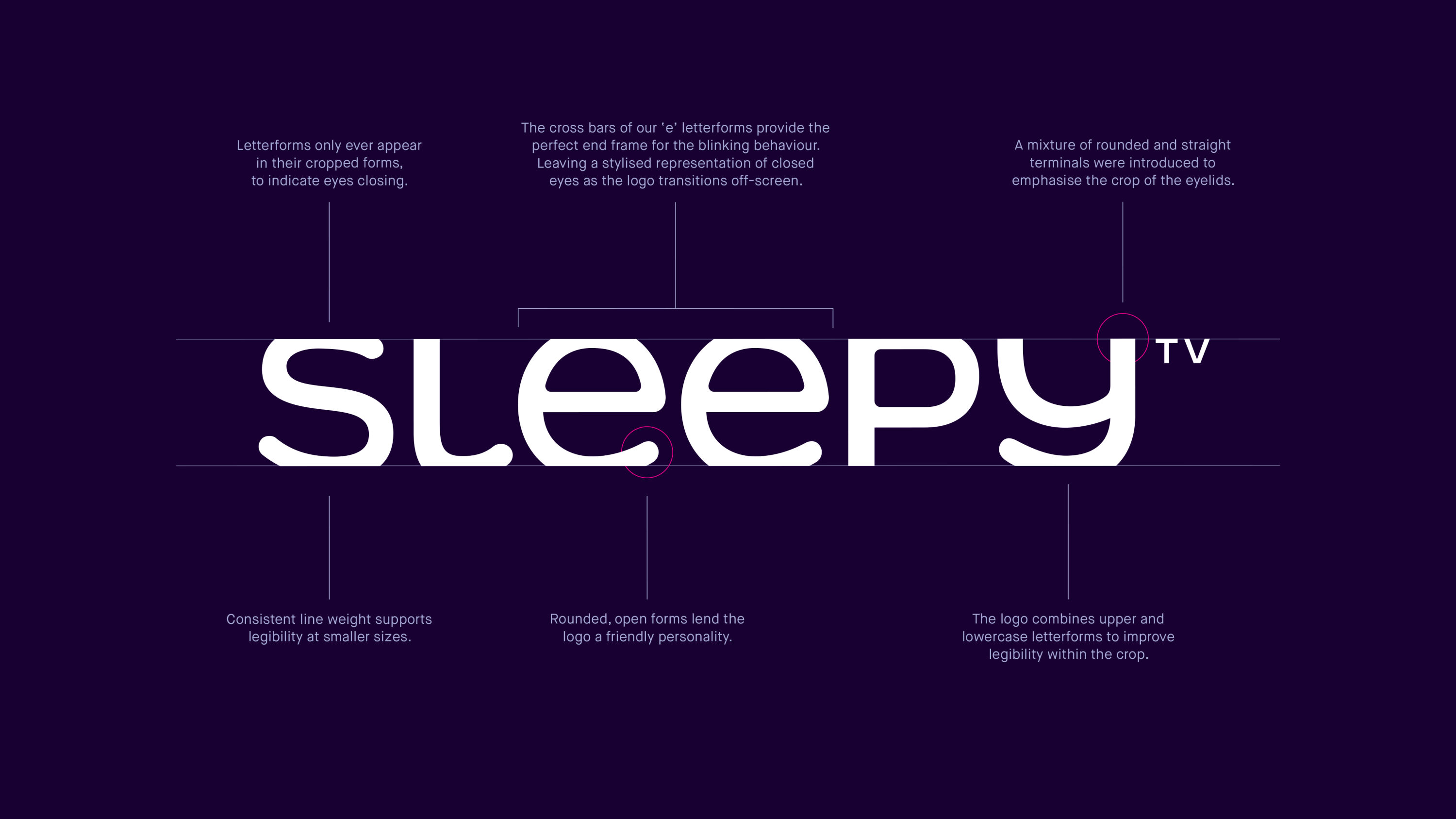
To cater to a broad audience of frequent flyers and business travellers, while avoiding the tribal divisions of the health and wellbeing sector, Magpie created an expressive 'blink' logo to bring emotional warmth and immediacy to the platform. Best experienced in motion, the logo mimics the blinking behaviour of sleep-heavy eyes, a simple gesture that's an immediate shorthand for the channel.
Used as a bumper to introduce content, the logo provides a natural transition to content as the eyes close and the screen fades to black. While other bumpers are designed to grab attention, SleepyTV’s quietly expressive logo soothes the viewer into their relaxing content.
Kit by Re
- Silver Award: Financial Services
- Find out more about this project at re.design
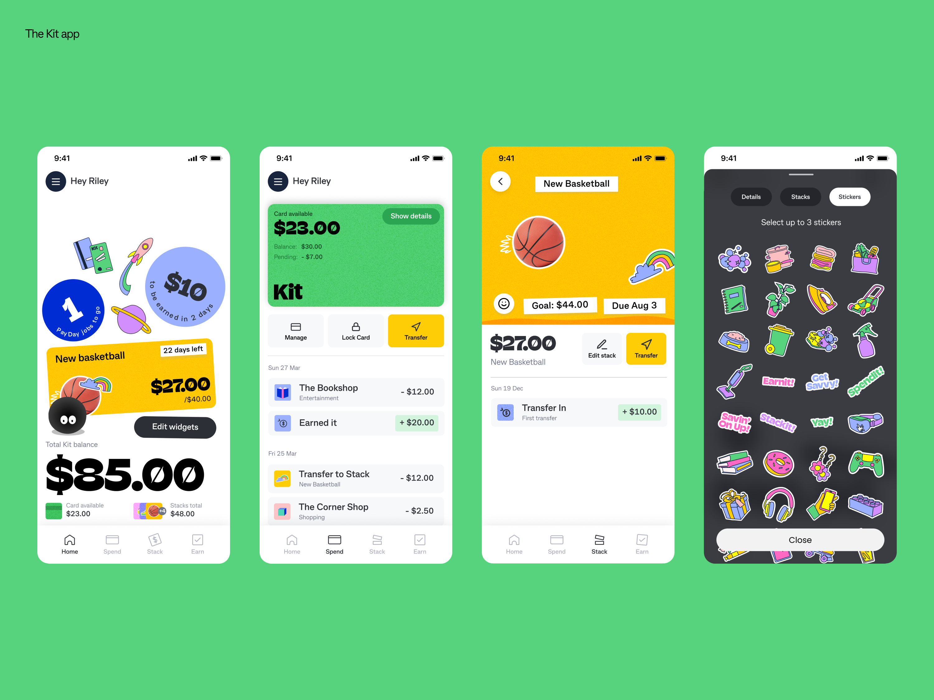
Built by Australia's biggest bank, CommBank, Kit is a money app for kids and their grown-ups to use together – and helps young people do more with money.
A survey of six- to 16-year-olds revealed that while many focused on what they'd buy when thinking about money, just as many wanted to use it for things like helping mum with rent, or saving for university.
Contemporary and friendly – nails the brief of finding something compelling for children alongside grown-ups.
Farbod Kokabi
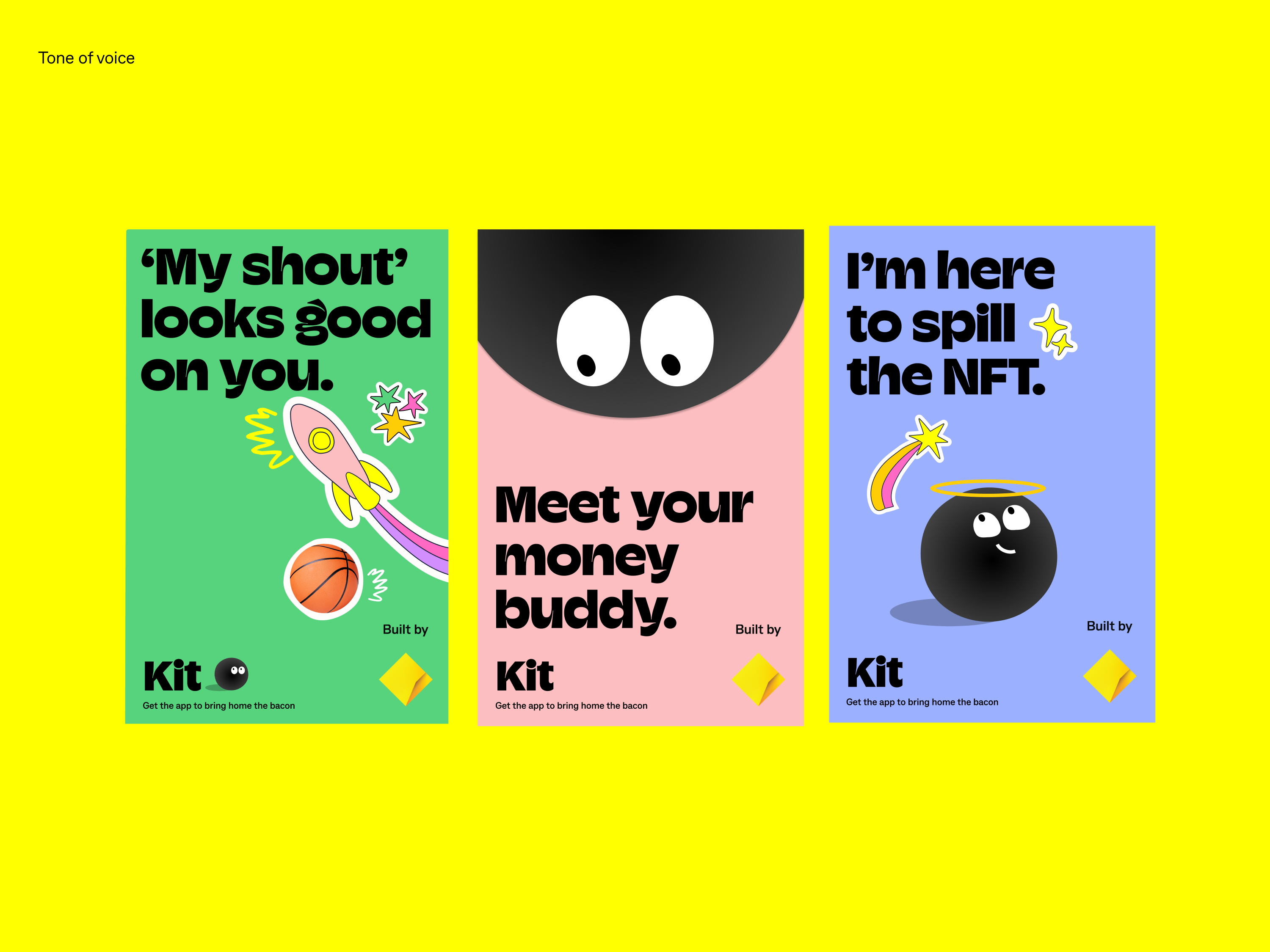
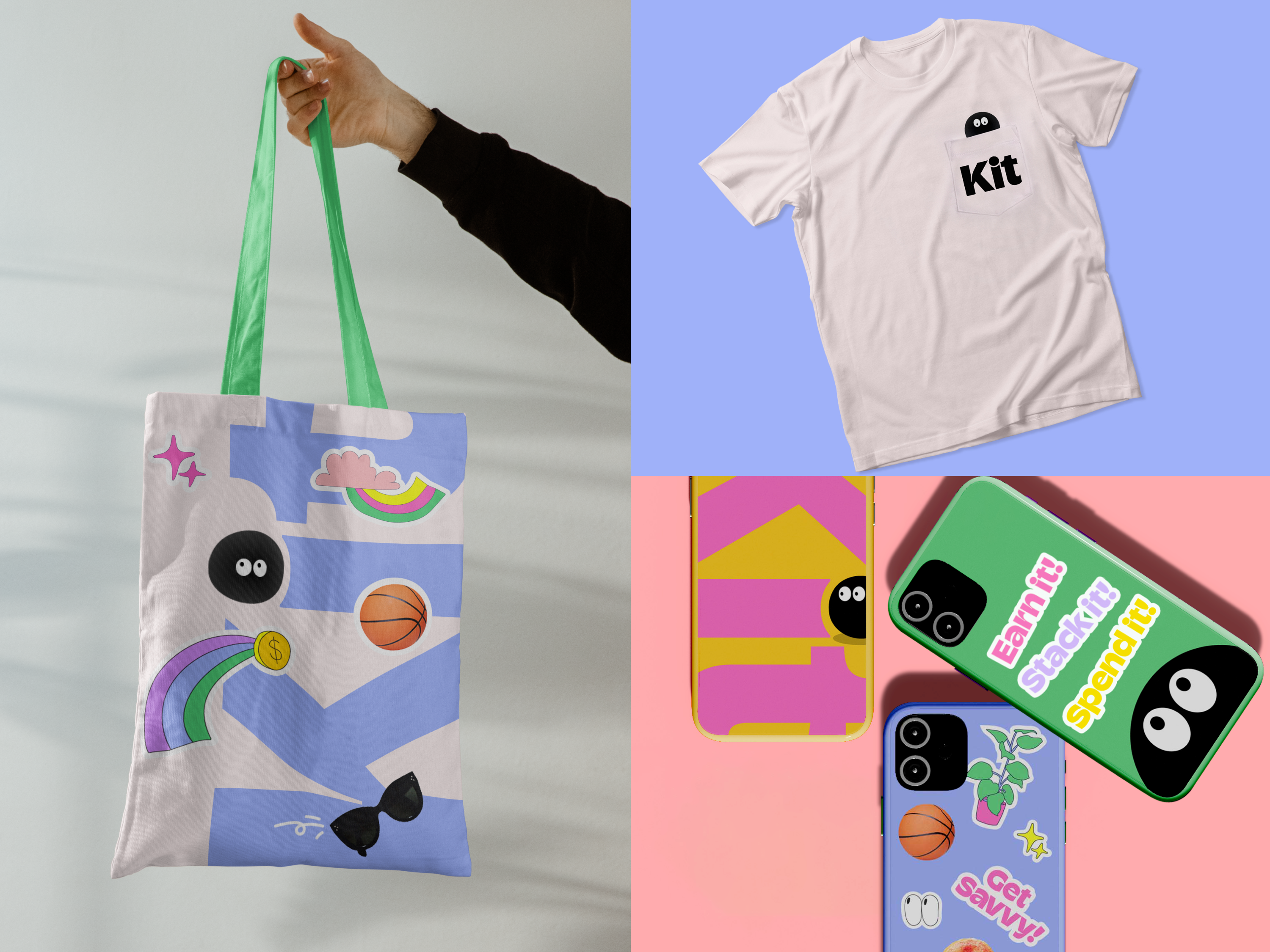
Kit needed a brand that kids would actually want to interact with – and that grown-ups could trust. Spurred on by the survey results, Re developed an exuberant, quirky brand world to get kids excited about walking in a grown-up's world.
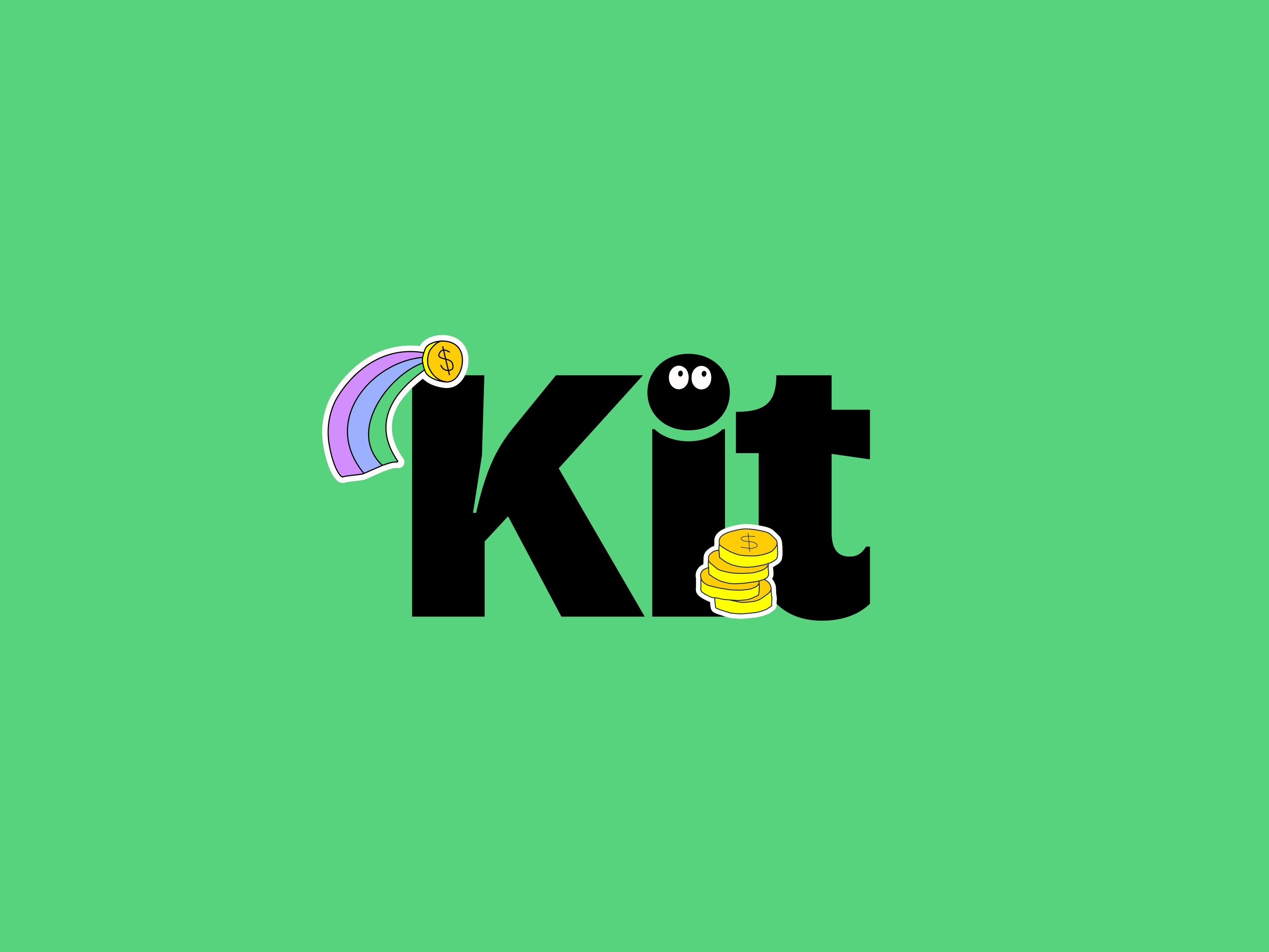
Playful and aspirational, it encourages kids to use the app while they get better at managing money. Colourful illustrations, kid-friendly language and jokes elevate the app experience, while the tittle of the 'i' in Kit becomes a hero character to guide people through.
Sprite by Turner Duckworth
- Silver Award: FMCG
- turnerduckworth.com
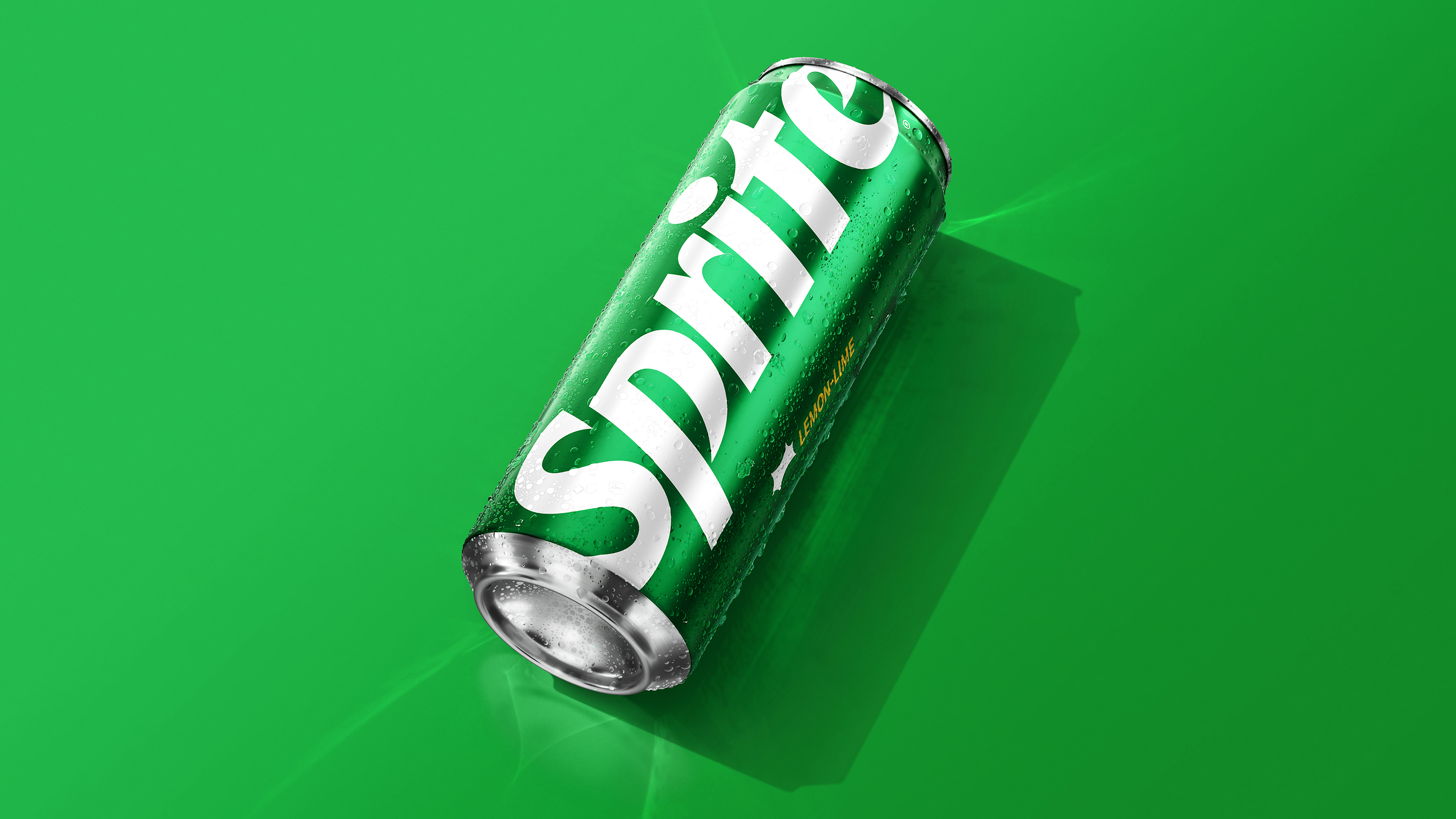
With so many global market needs, the Sprite brand had become inconsistent, buried under several visual equities, and often played into category norms for refreshment and flavour cues. Turner Duckworth developed a new positioning based around clarity, to re-establish Sprite's status as a global icon.
Strong idea, simple, bold and iconic execution. And its impact results prove the power of good design.
Lisa Smith
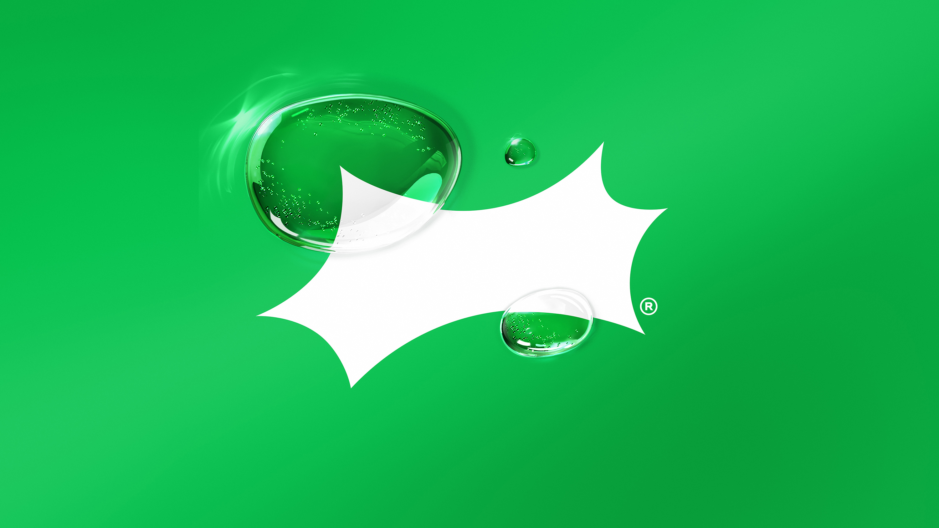
Uncoupling the wordmark from the Spark, aligning it on a horizontal baseline, and re-crafting the unique letterforms revealed how powerfully recognisable the Sprite brand is with just a few simple elements.
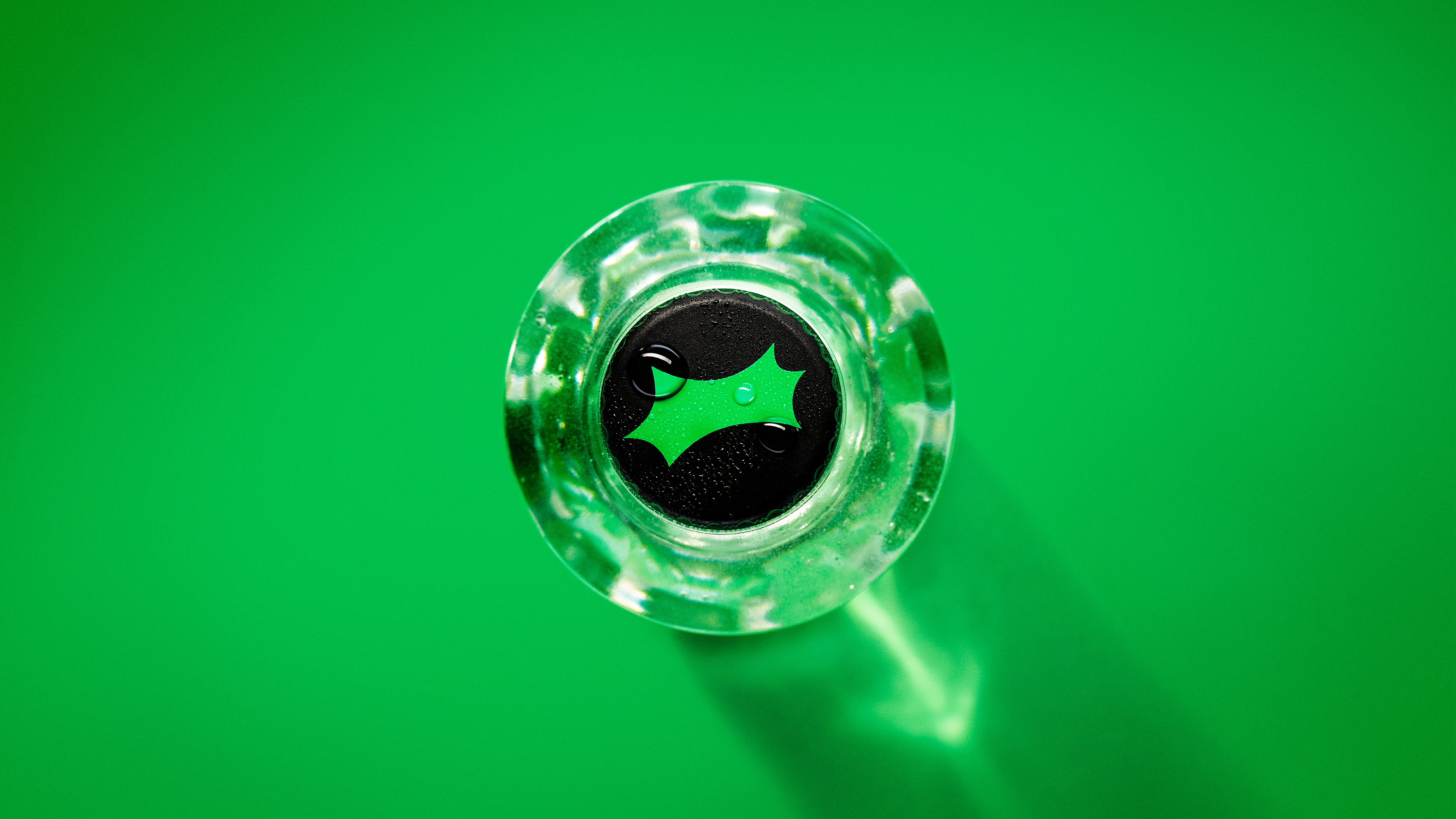
The re-crafted Spark became a standalone symbol, to be used as secondary sign-off in layouts, or as a bold shorthand for Sprite in contexts where the brand is already understood.
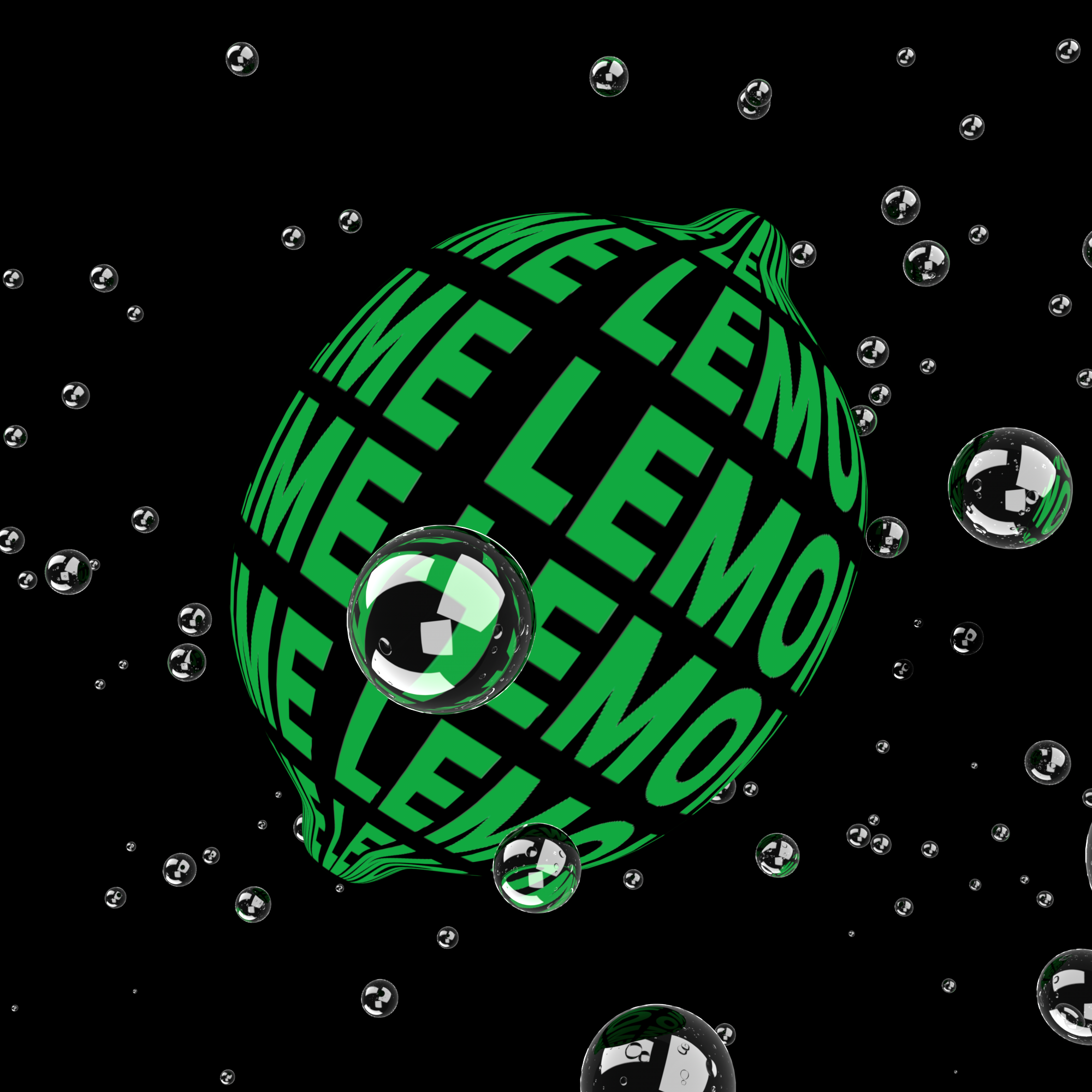
The secondary system employs high-contrast lighting and emphasising refraction and distortion. A custom display weight of Aktiv Grotesk brings expressive details from the wordmark and Spark into headlines. And graphic animations play with transparency to put a more abstract twist on traditional refreshment cues.
Uncrap The World by Who Gives A Crap
- Silver Award: FMCG
- whogivesacrap.org
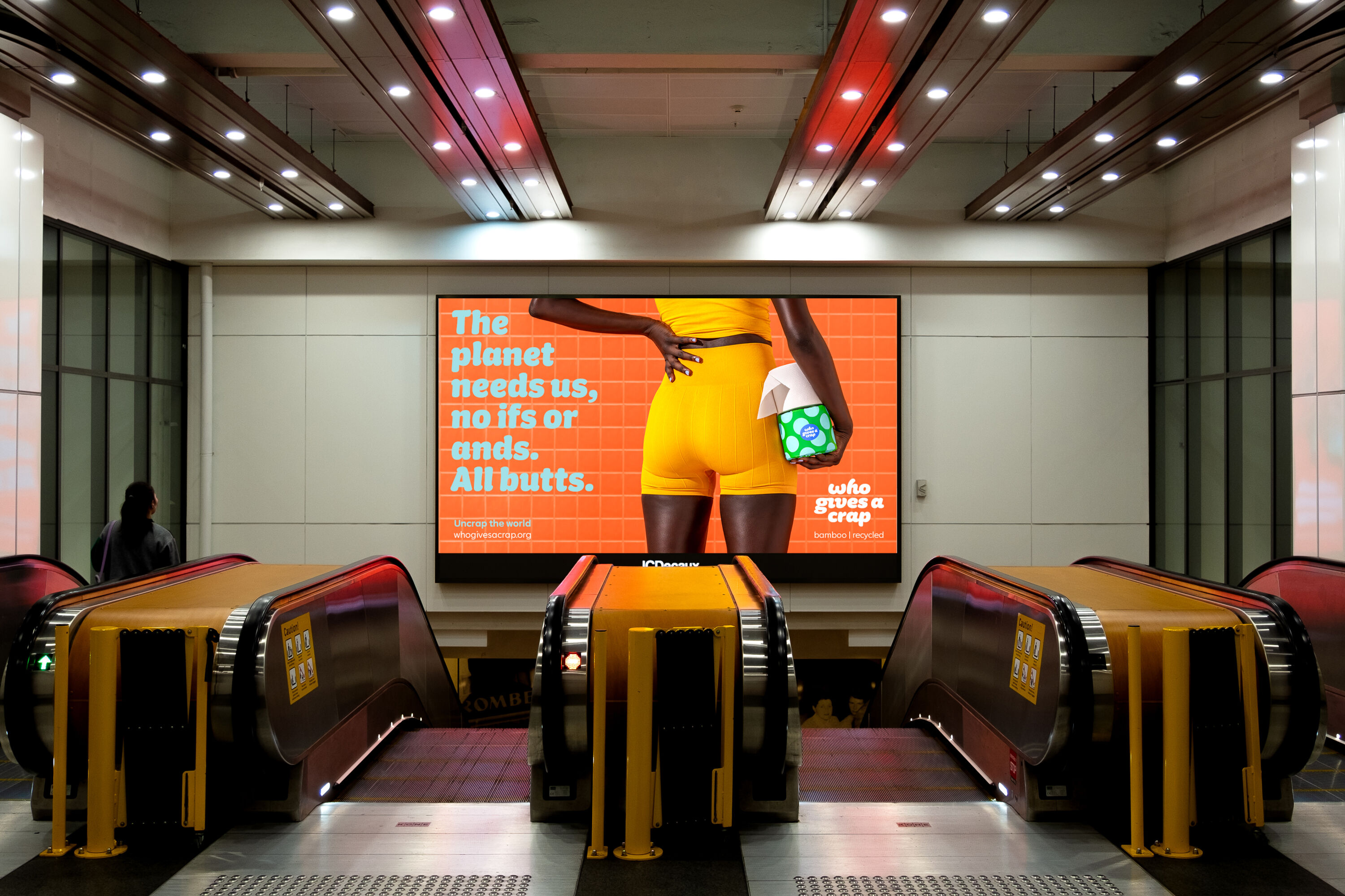
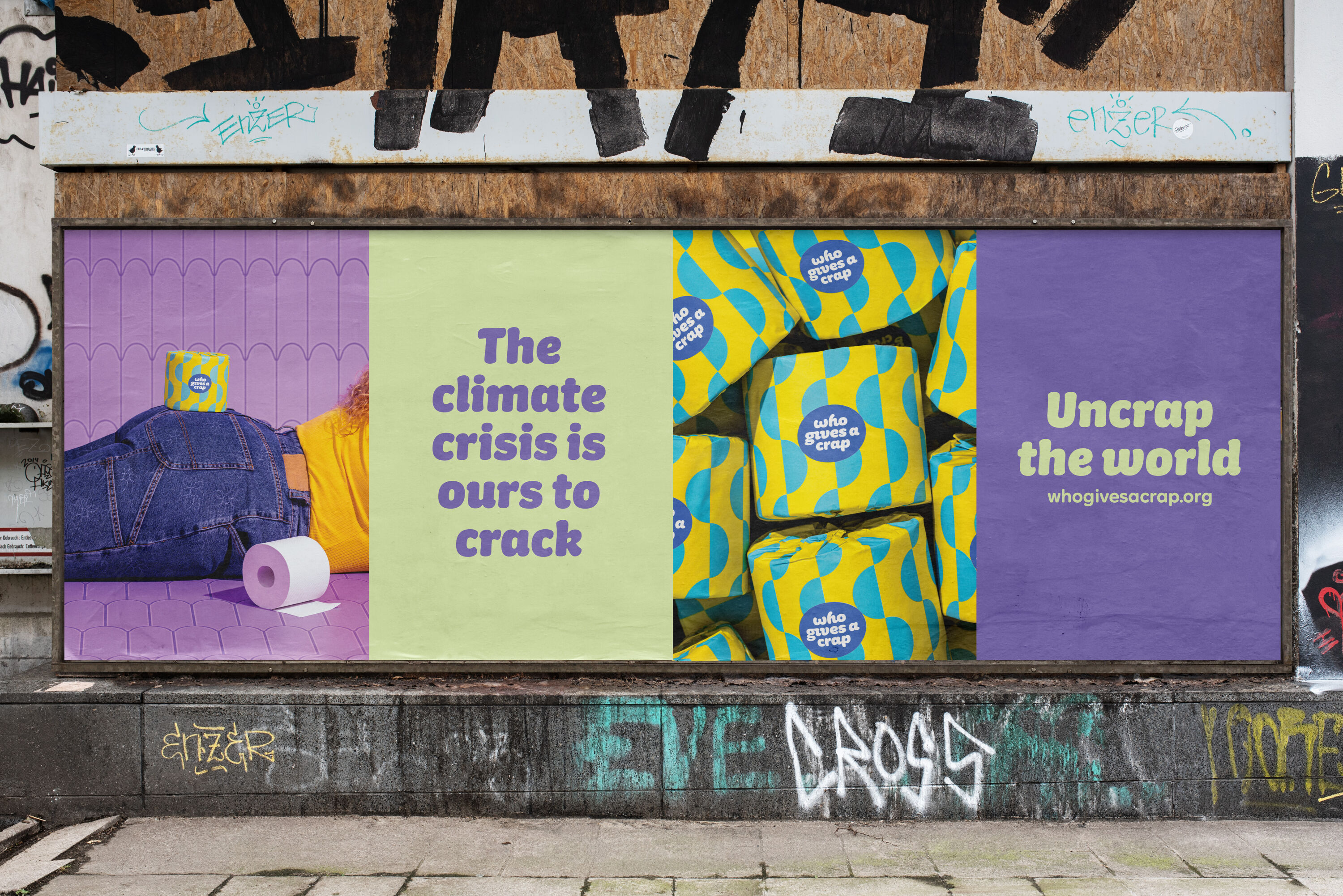
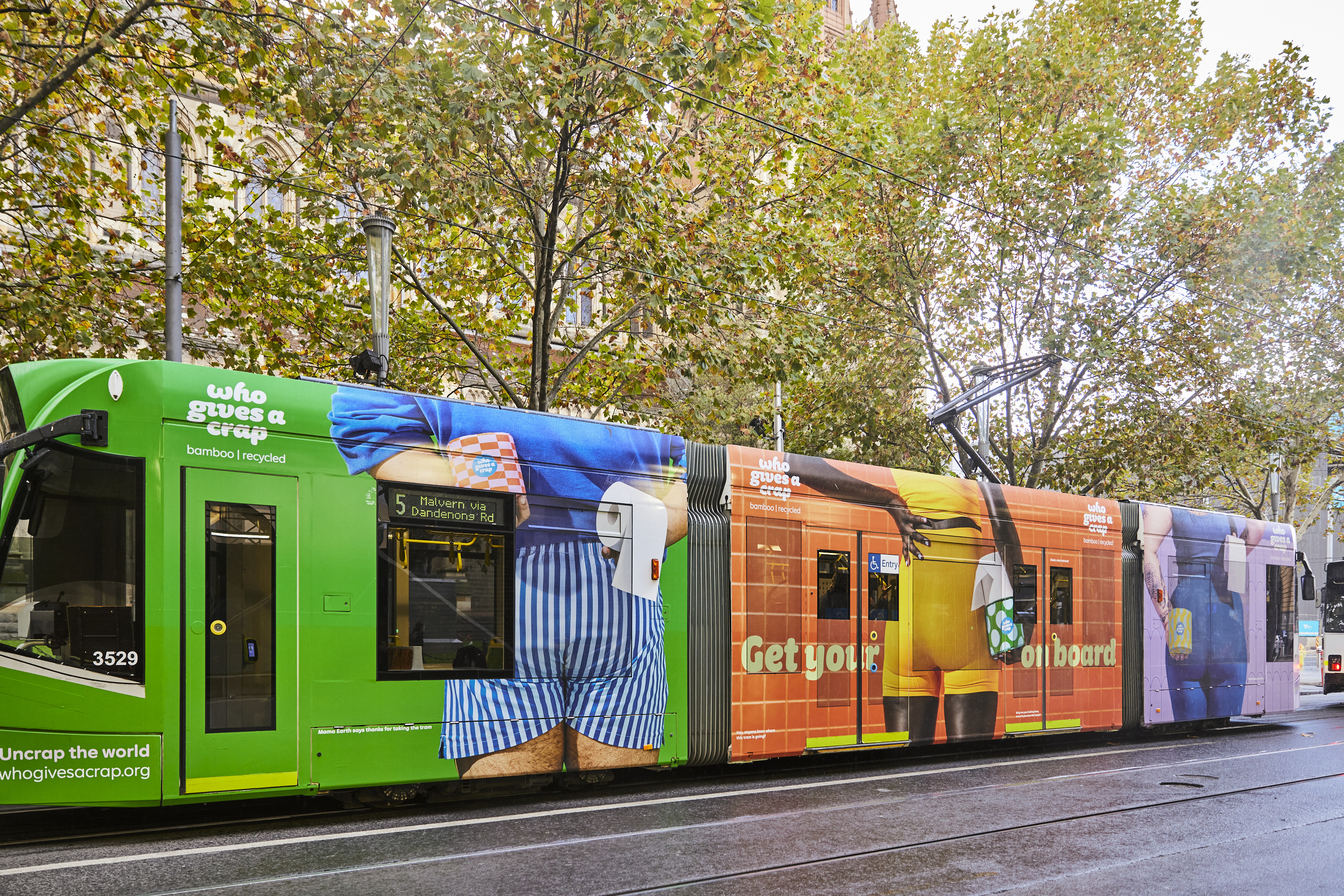
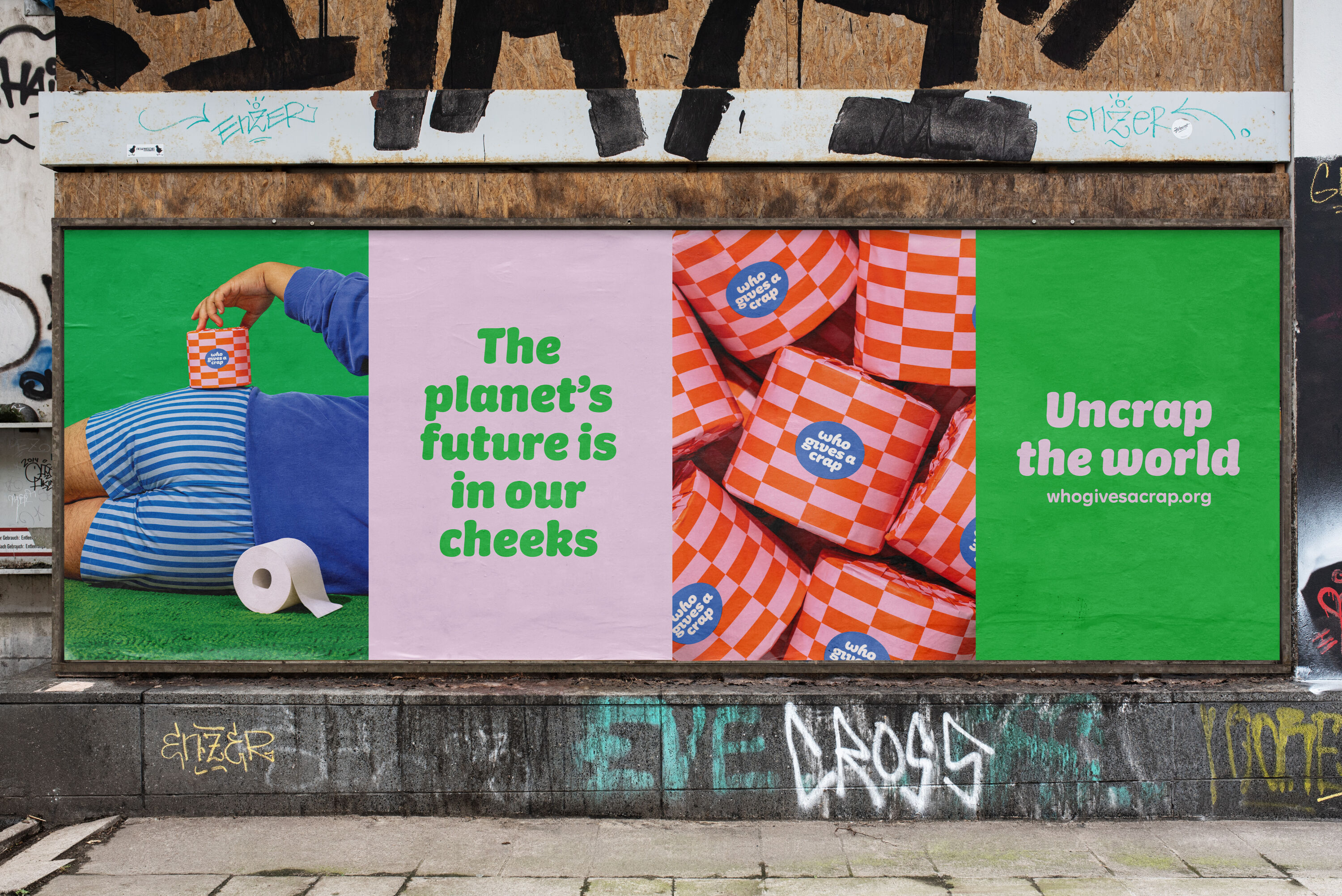
Over 1 million trees are cut down every day to make regular toilet paper. The Uncrap The World campaign draws attention to the enormous effects that this industry has on deforestation and, as a result, climate change.
A welcome change from puppies and bears.
Sarah Moffat
Made entirely from eco-friendly materials like recycled paper or bamboo, Who Gives A Crap toilet paper shows that a sustainable alternative is possible. Rather than painting a bleak picture, the brand deployed its playful tone of voice to add a sense of levity and optimism. The key message: things are bad, but your bum can uncrap the world.
Bums of all shapes, sizes and colours play the hero throughout the campaign, and vibrant colours cut through the noise and challenge category stereotypes for eco-friendly brands. People's choice of toilet paper isn't typically high on the agenda: Who Gives A Crap brings it to the centre of the conversation.
Godminster by big fish
- Silver Award: FMCG
- bigfish.co.uk
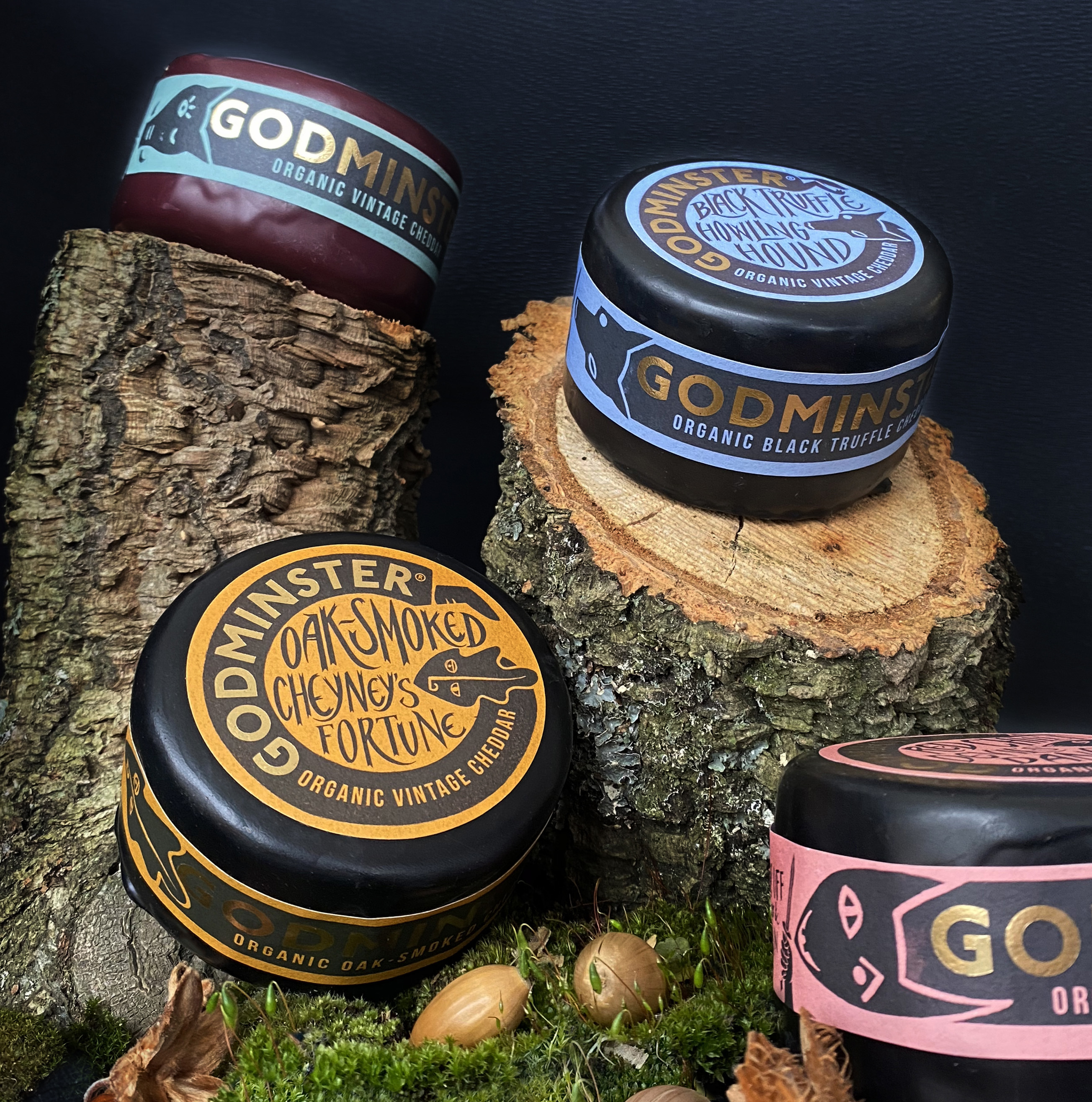
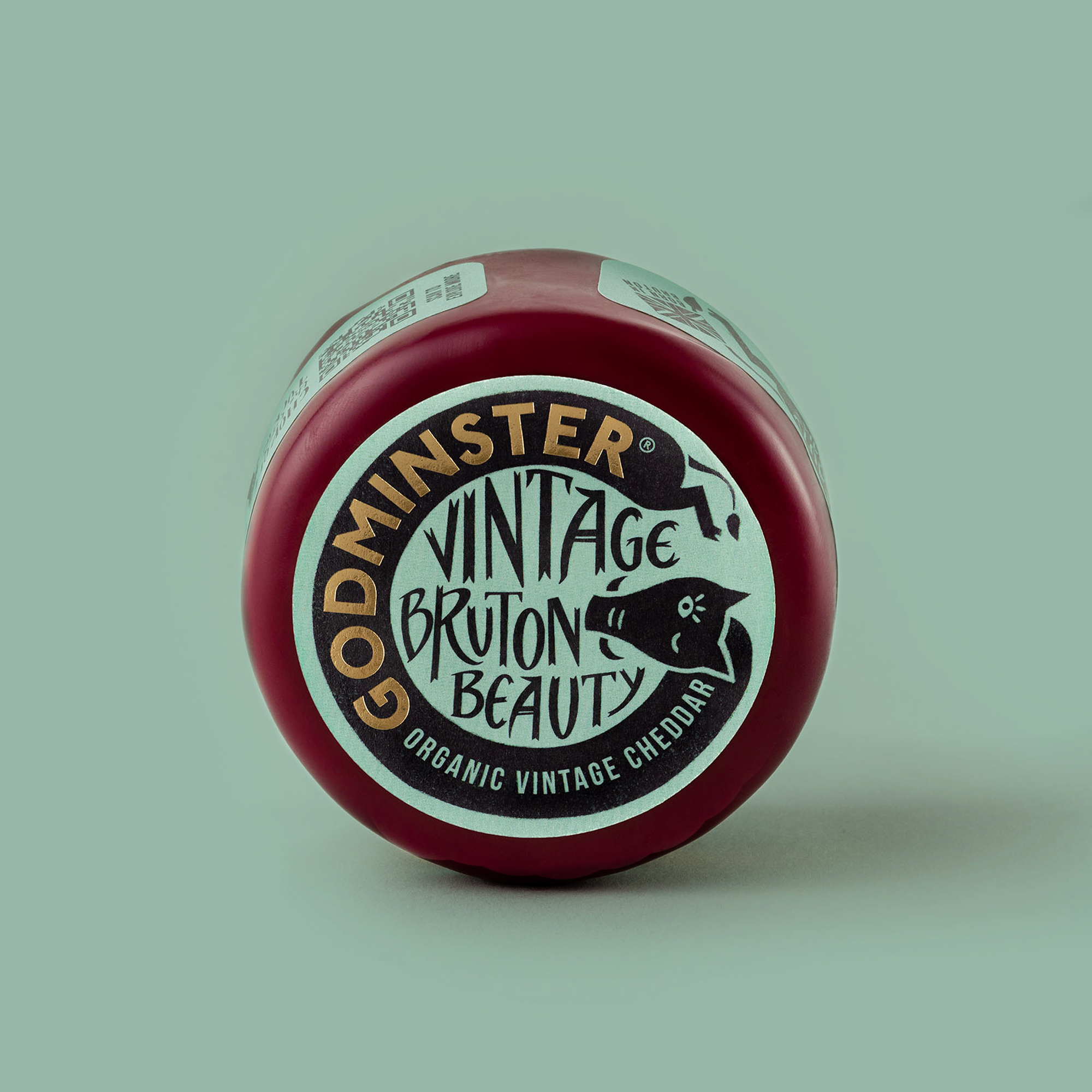
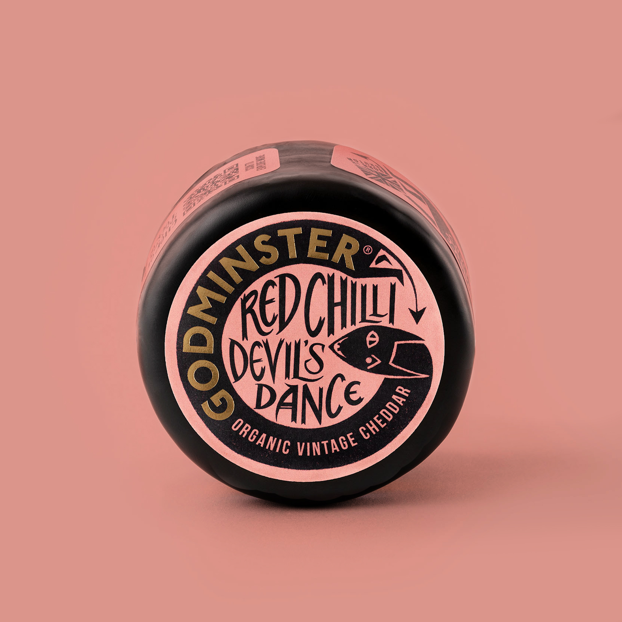
Deep in the heart of Wessex, where landscape and legend intertwine and character and curiosity are around every corner, lies Godminster. Born in Bruton, the brand brings the spirit of Somerset to the cheeseboard. Every truckle tells a tale – of myth and mystery, taste and tradition.
A huge improvement. The illustration is brand-appropriate, distinctive and memorable. A charming design.
Sarah Moffat
Godminster's old pack design was draped in a Union Jack: big fish's challenge was to celebrate its Britishness in a less obvious way. Playing on Somerset folklore, the answer was found in storytelling. Packed with character and curiosity, illustrations come to life off-pack to give each cheese its own story and character.
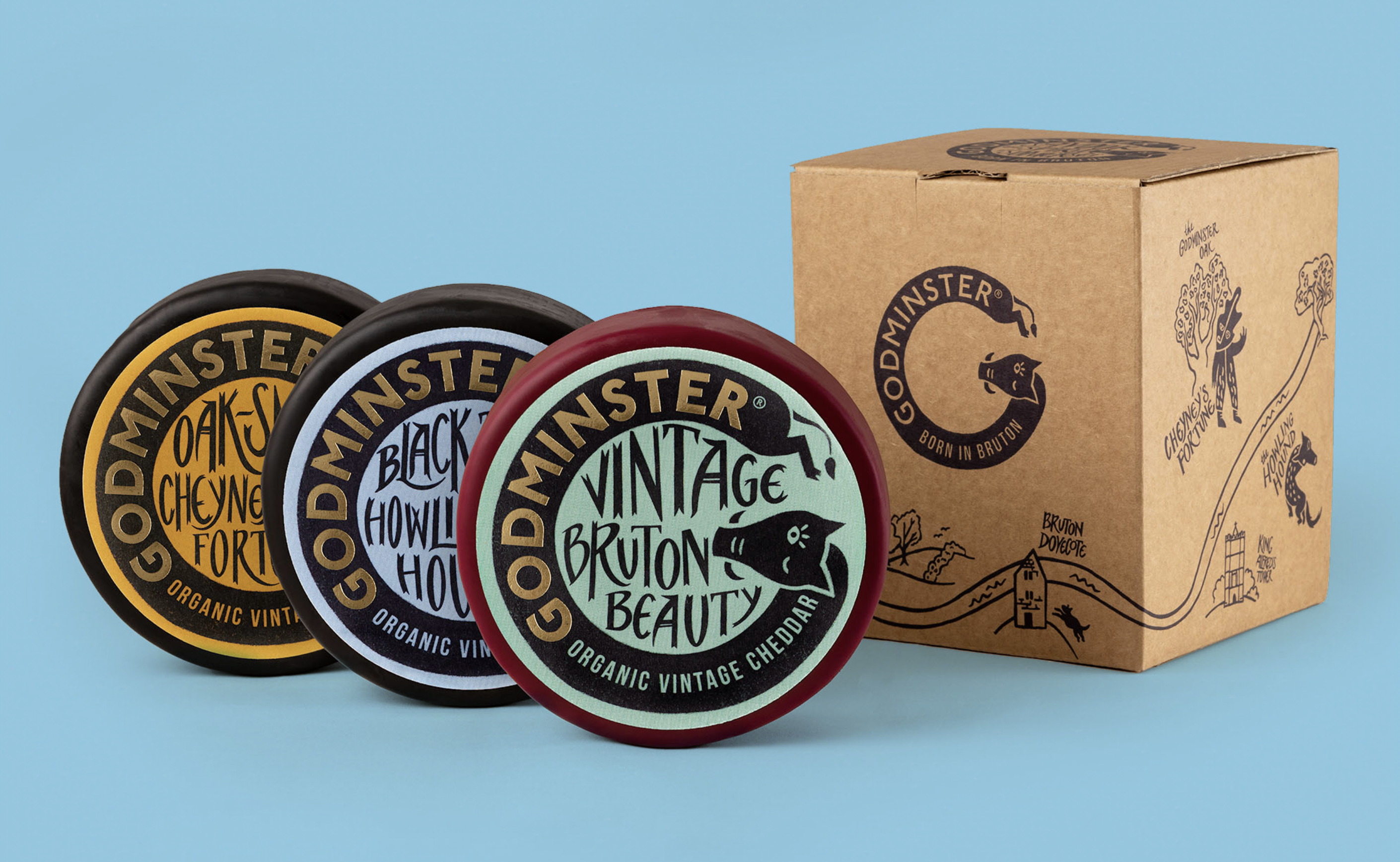
Wax-wrapped cheddars display all their information on the lid as standard – but this tends to be hidden on shelf. In a category first, big fish introduced a belly-band to ensure the design works hard even when stacked.
Chasing Lucky Rabbits by MetaDesign China
- Silver Award: Self-Branding
- Find out more about this project at metadesign.com
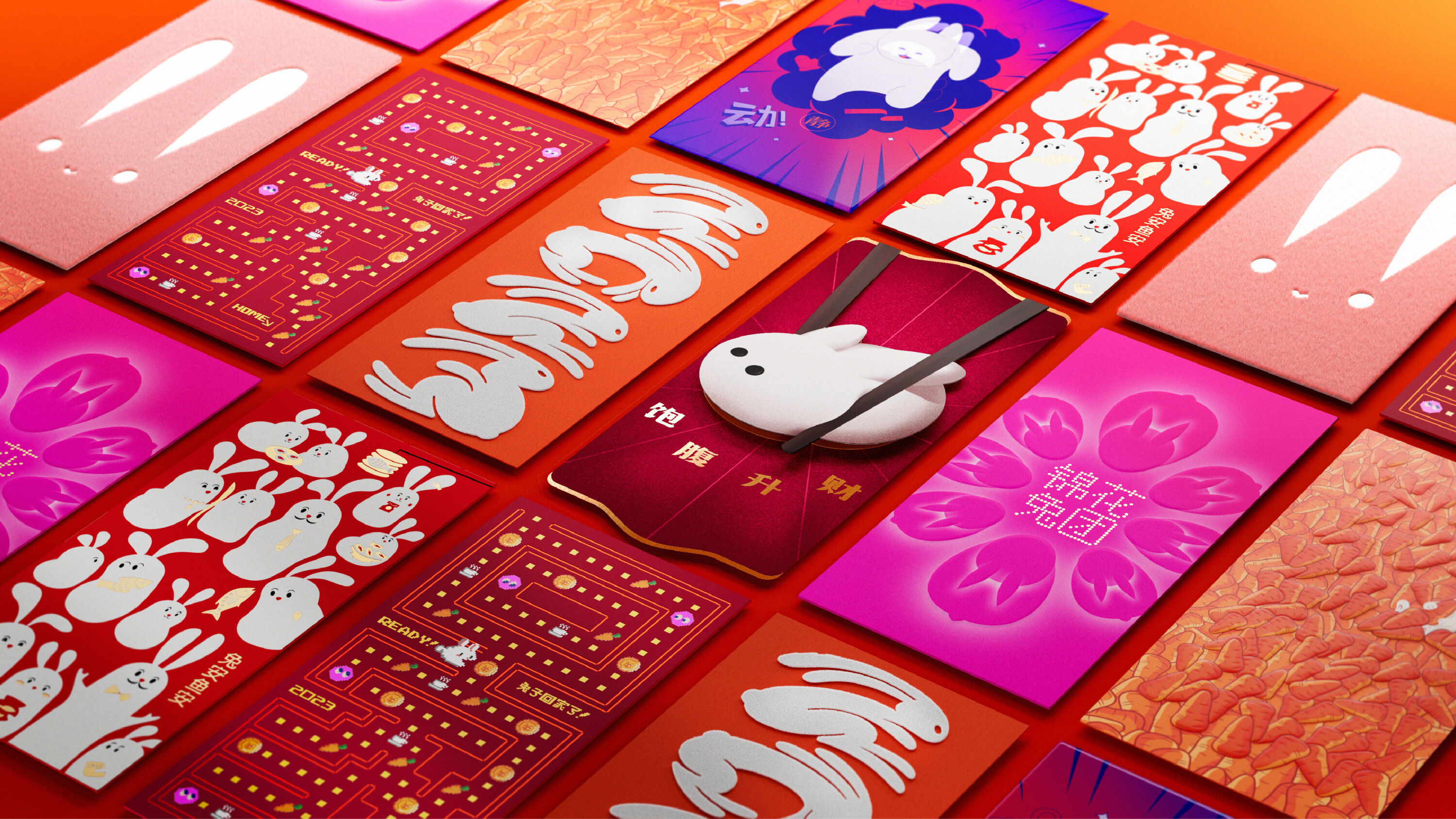
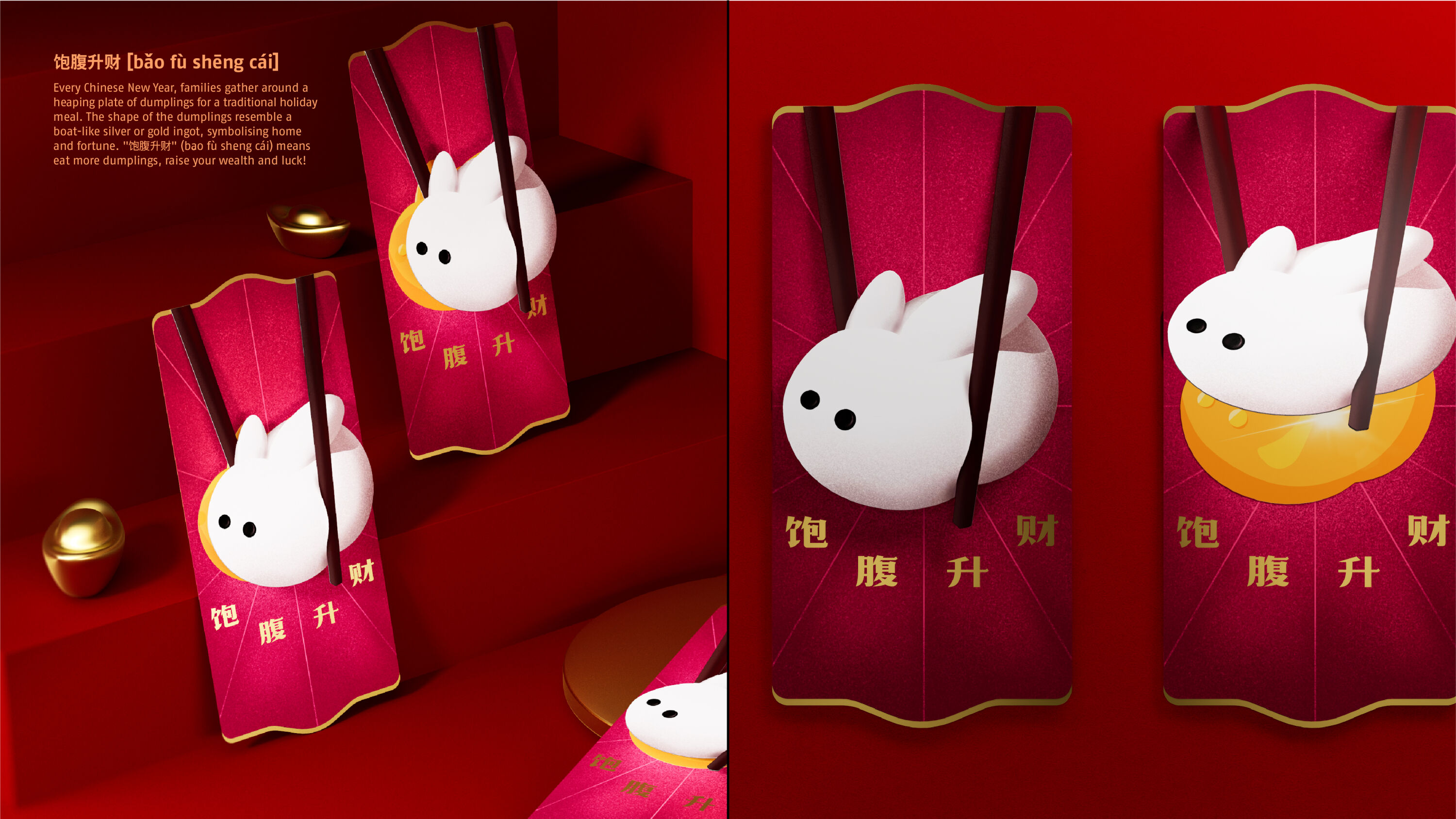
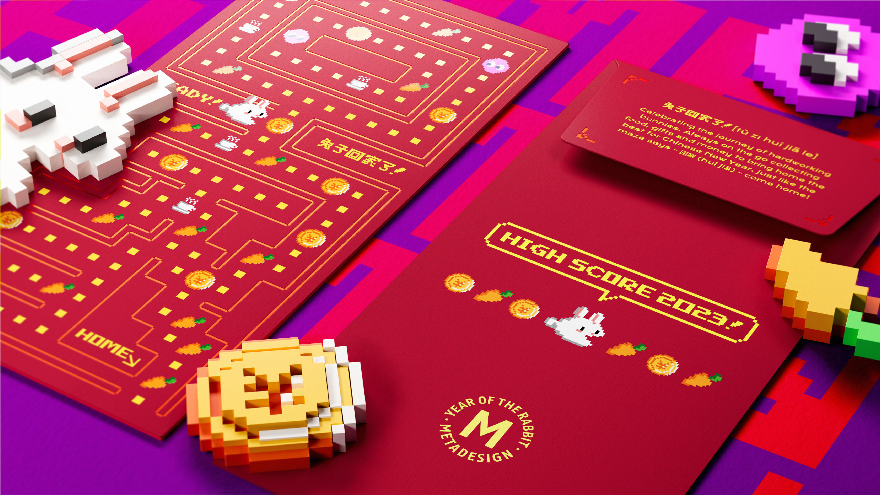
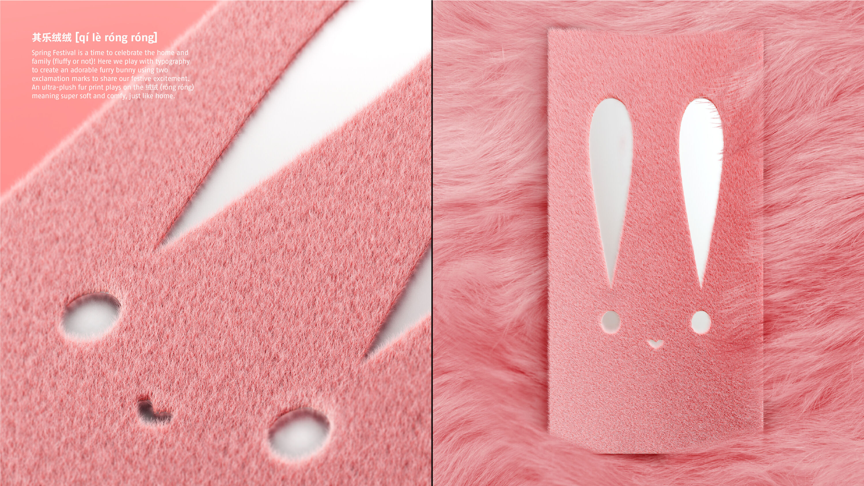
Also known as Spring Festival, Chinese Lunar New Year is China's most important holiday period – ushering in the start of spring. Continuing a longstanding tradition of celebrating the festival through design, MetaDesign China put a modern spin on the Year of the Rabbit with a set of Hongbao (红包).
There's so much imagination and fun in this campaign. I can see why clients love to receive these.
Fiona Dinsdale
Hongbao are (traditionally red) envelopes, filled with money as gifts to mark special occasions. For MetaDesign China, they became a self-promotional tool to send to clients, colleagues, family and friends.
In Chinese culture, the rabbit symbolises abundance, charm, agility, and of course, a love for carrots. And as eight is the luckiest number in China, it followed that there would be eight different designs – diving into the world of the rabbit, putting new twists on classic idioms, and playing on 兔 (tù), the Chinese character for rabbit.
The resulting collection is at once culturally playful, artistic, and experimental – using a range of production techniques to enhance the designs.
Taikoo Li – The Temple by Design Bridge and Partners
- Silver Award: Retail
- Find out more about this project at designbridge.com
An iconic hospitality, entertainment and retail destination in Chengdu, China, Taikoo Li was forced to go quiet during long nationwide Covid lockdowns. It had to reconnect and reengage patrons with its unique flavour of experience – from home.
Beautiful and romantic idea – and intent.
Farbod Kokabi
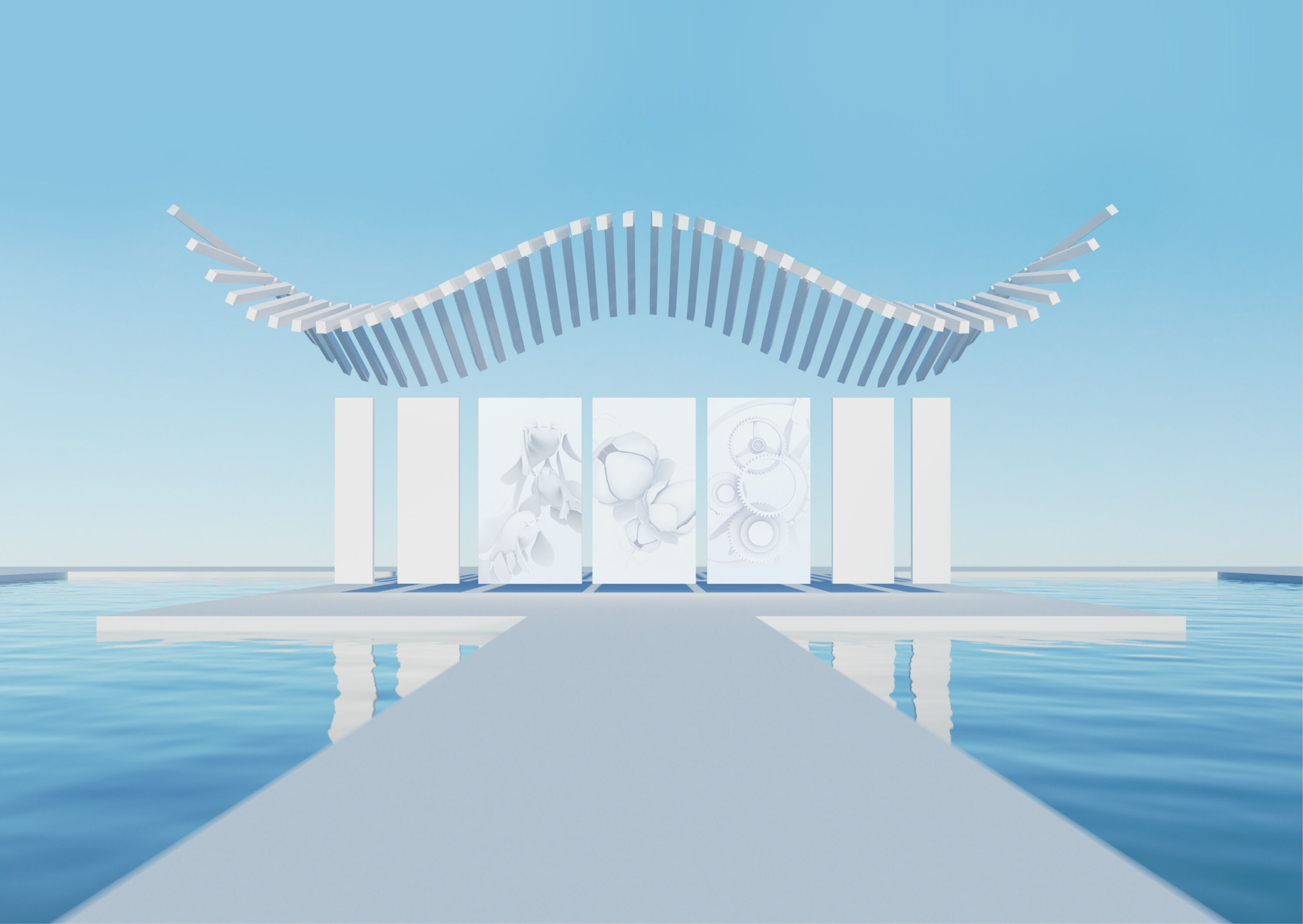
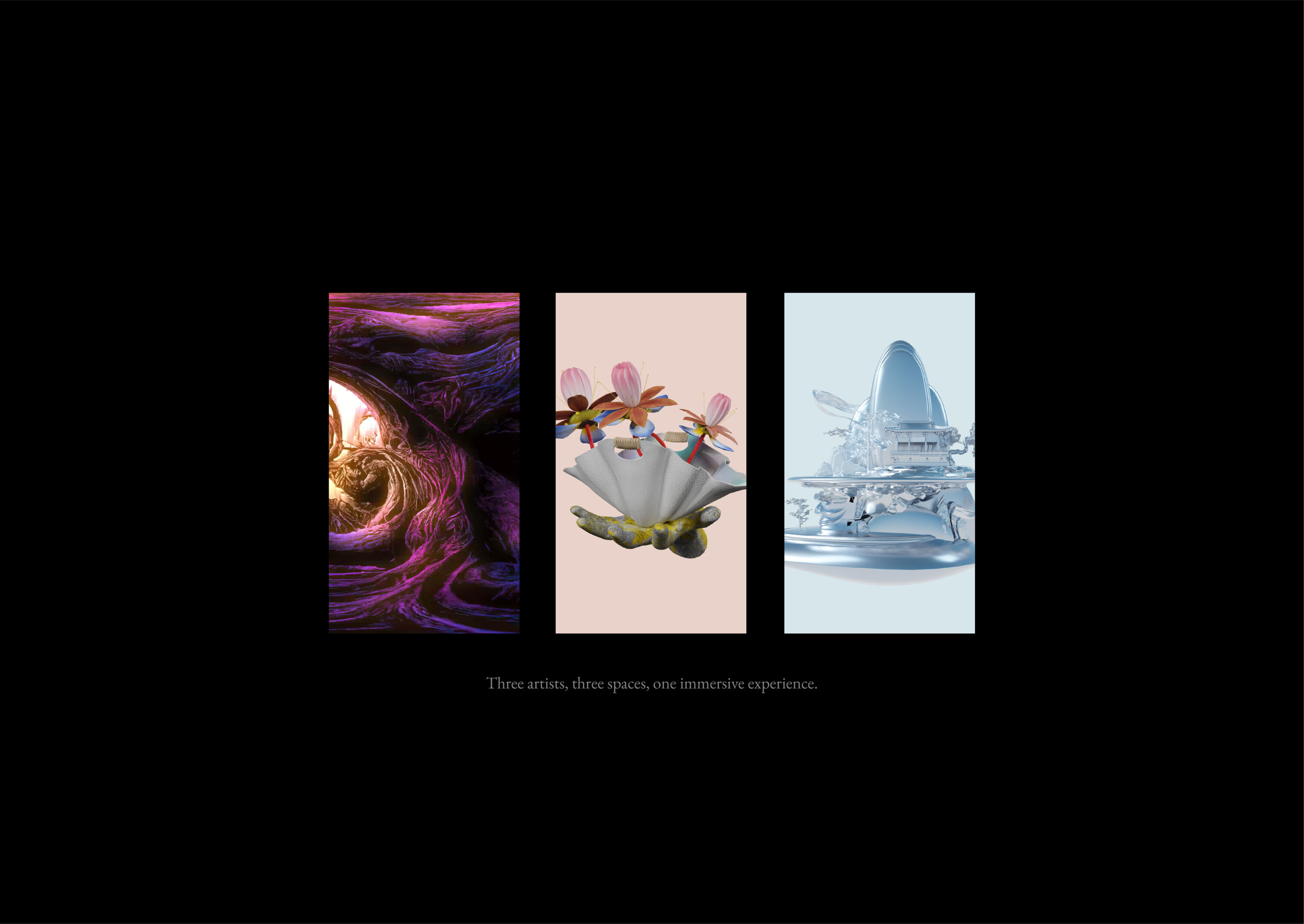
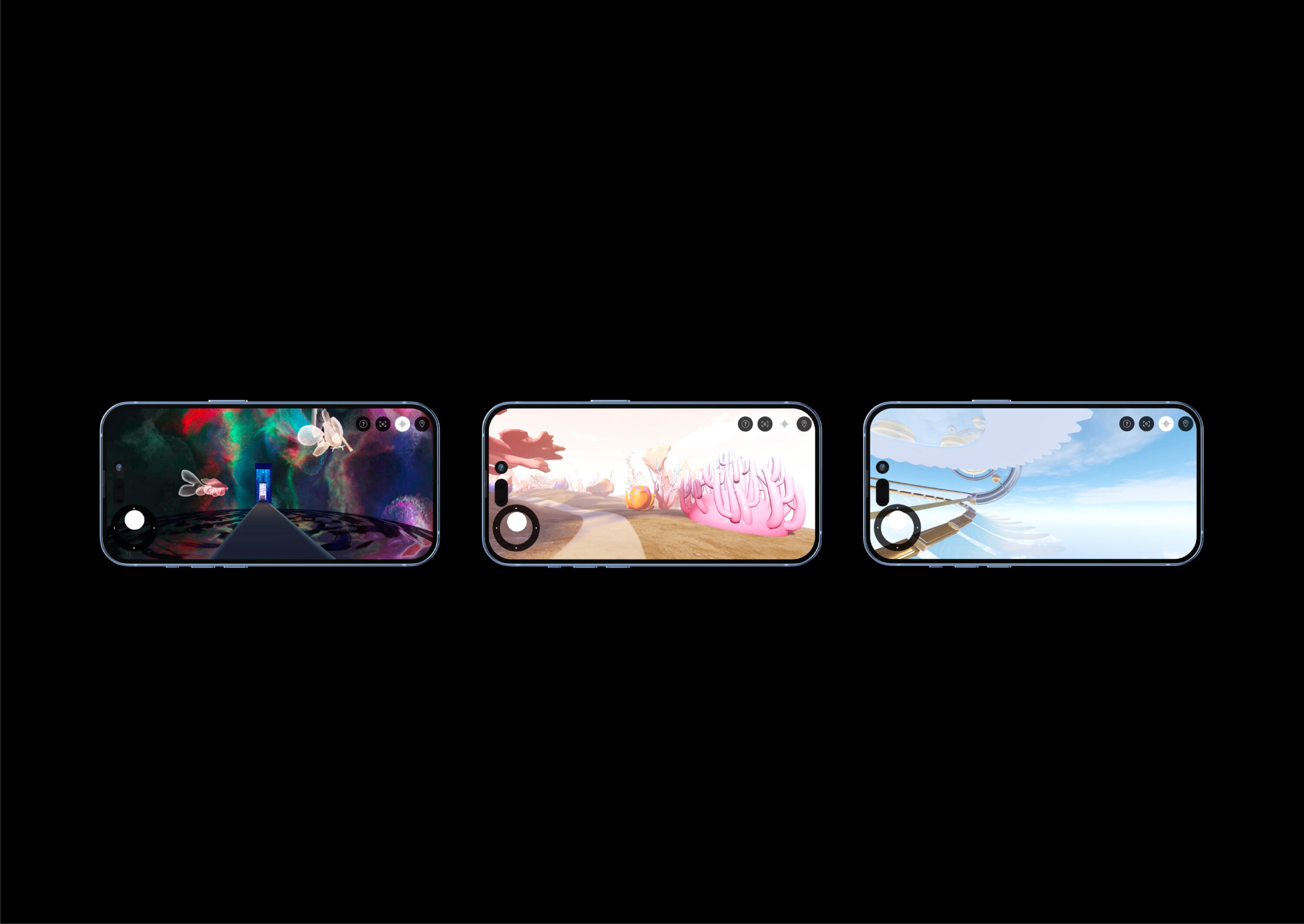
To keep loyal patrons feeling connected, Design Bridge and Partners reimagined the experience and brought it to them through The Temple – an immersive digital arts space, inspired by the 1800-year-old Daci Temple at the heart of Taikoo Li.
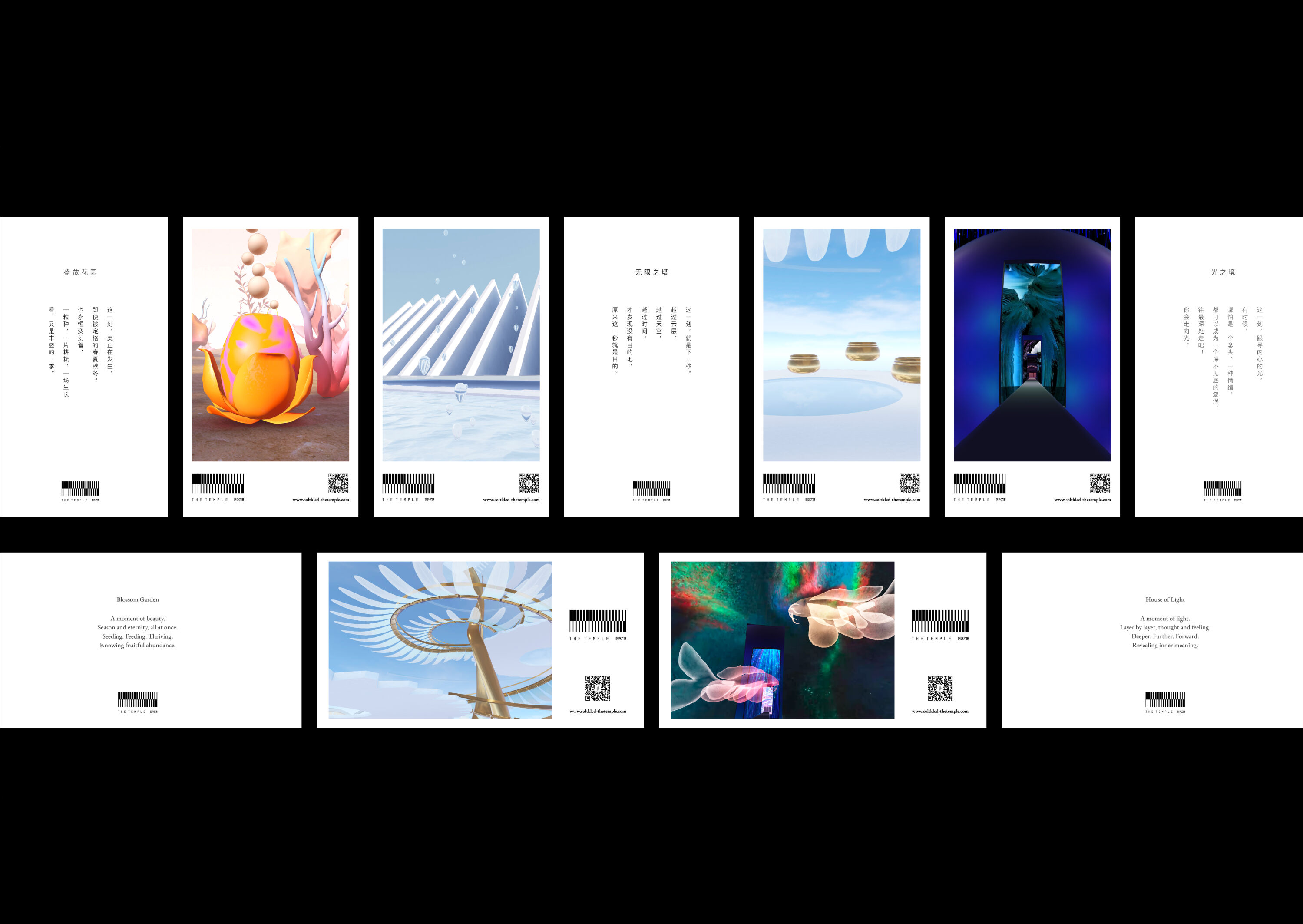
The Temple reimagines the contemporary experiences of Taikoo Li, its cultural heritage, and its reputation as a patron and collector of the arts. It includes three distinct rooms – The House of Light, The Blossom Garden, and The Infinity Tower.
Each room is inspired by rituals within the Daci Temple: from observing movement of light and shadows to reveal inner meaning, to releasing a koi carp, to the melody of interactive singing bowls and water meditation.
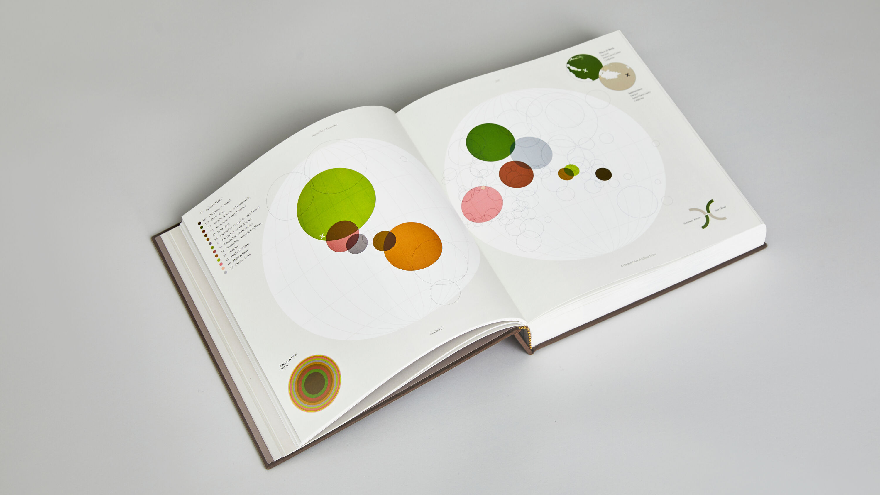
De.Coded by Studio Sutherl&
- Silver Award: Publishing
- studio-sutherland.co.uk
Exploring the human capital of Silicon Valley, De.Coded is the culmination of a four-year research project. Over the course of a year, local leaders nominated individuals from their communities who are making significant contributions to the region and represent the very best of service to society.
A lovely project that delivers layers of storytelling about a place and its people. While simple, the circle is a strong motif that nicely ties together many disparate elements. This project's strength may be its timelessness.
Andrew Schapiro
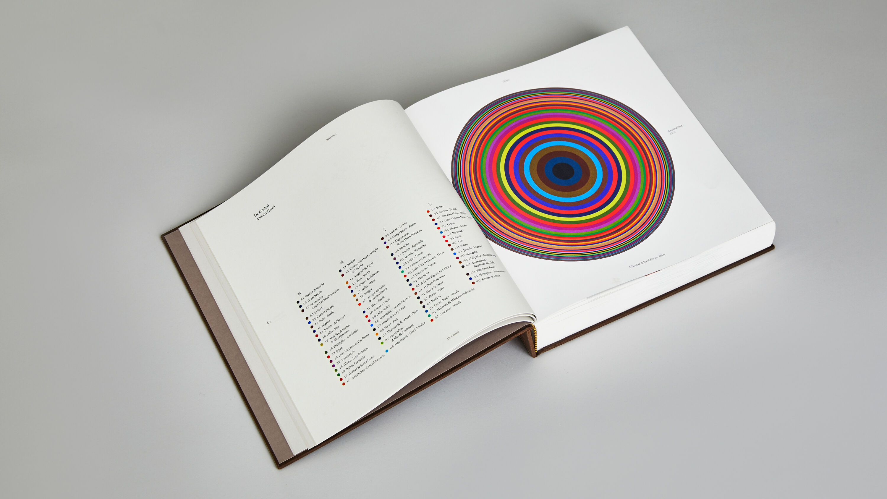
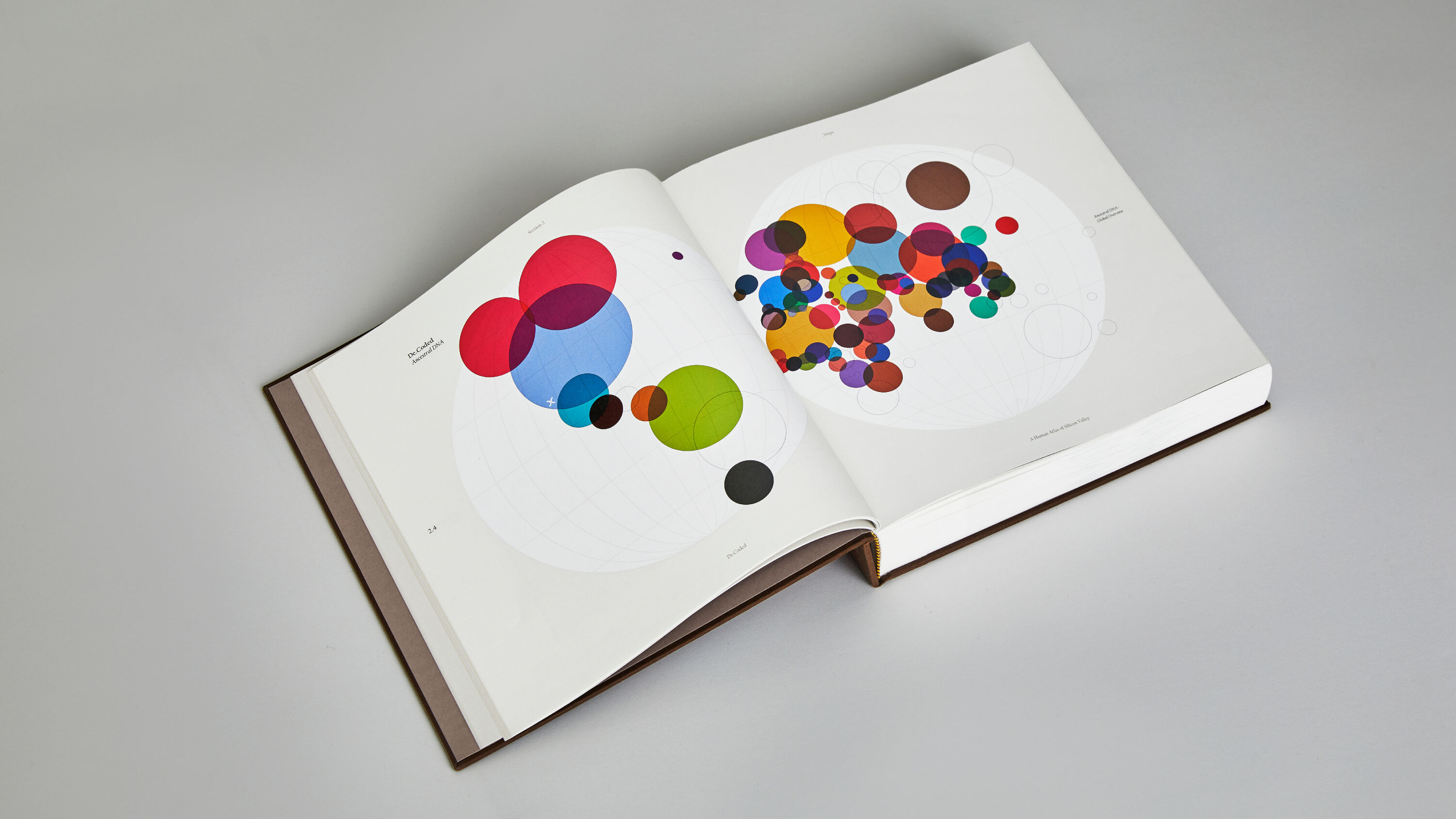
The project maps these remarkable individuals through photographic portraits, app-based image-activated soundtracks, and ancestral DNA mapping to create a deeper understanding of the peninsula and beyond.
Studio Sutherl& created a set of modular logotypes that are designed to be decoded. To express the idea of a world without borders, DNA is expressed through circles – decoded in the top corner, reflected on the map, and reimagined as an infographic that represents each featured person.
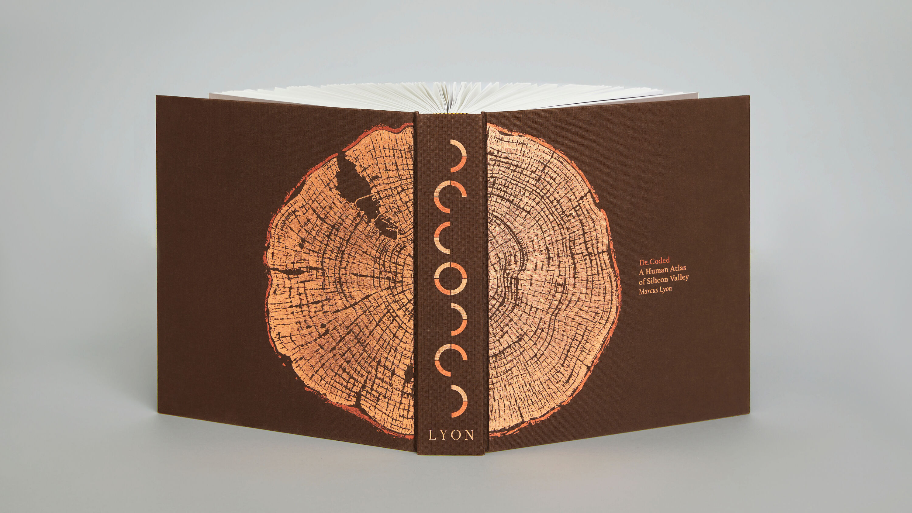
Printed from a fallen Californian Sequoia, the cover represents generations and the passing of time – and the Bay area has been carefully retouched into one of the cracks. To echo the theme, ages are denoted by tree rings throughout the project.
NSW Government by For The People
- Silver Award: Public Sector
- Find out more about this project at forthepeople.agency
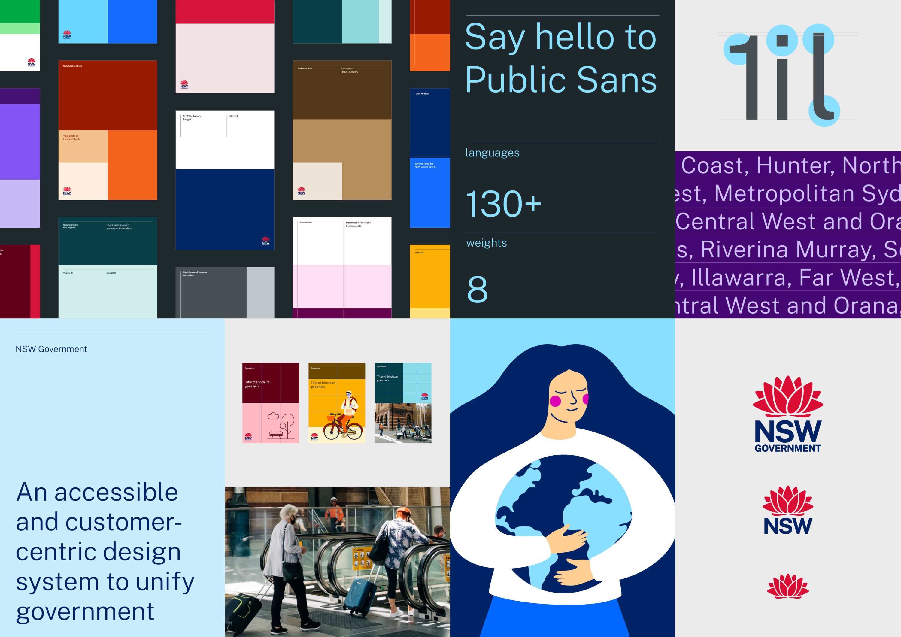
New South Wales is a vast state, home to nearly a third of all Australians across agricultural hubs, remote towns and dense urban centres. The NSW Government is also the largest organisation in the country with over 400,000 employees, managing a complex array of services and responsibilities in communities across the region.
It's hard to keep a feeling of humanity and individuality when working on this scale, but they've managed it.
Susan Ayton
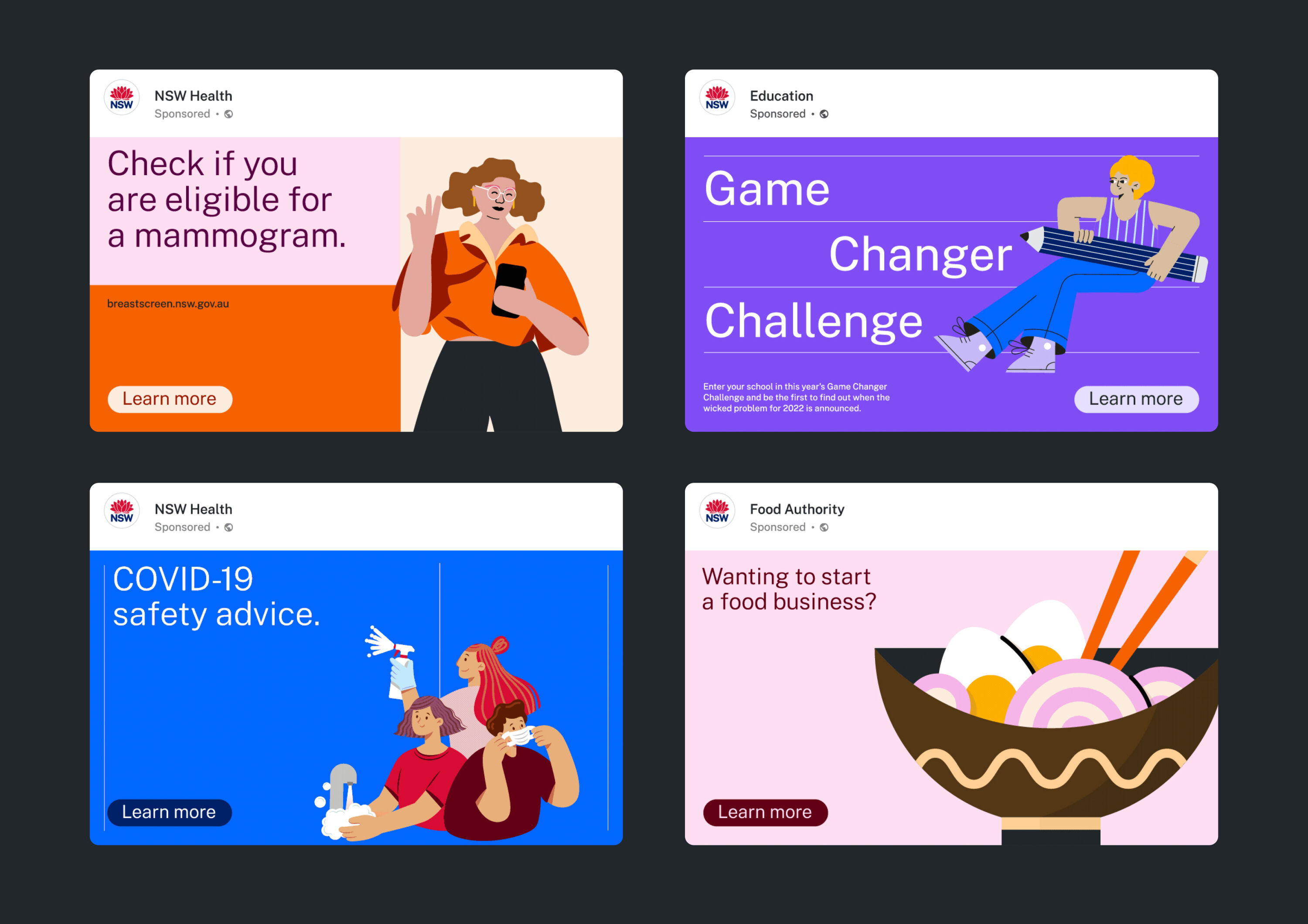
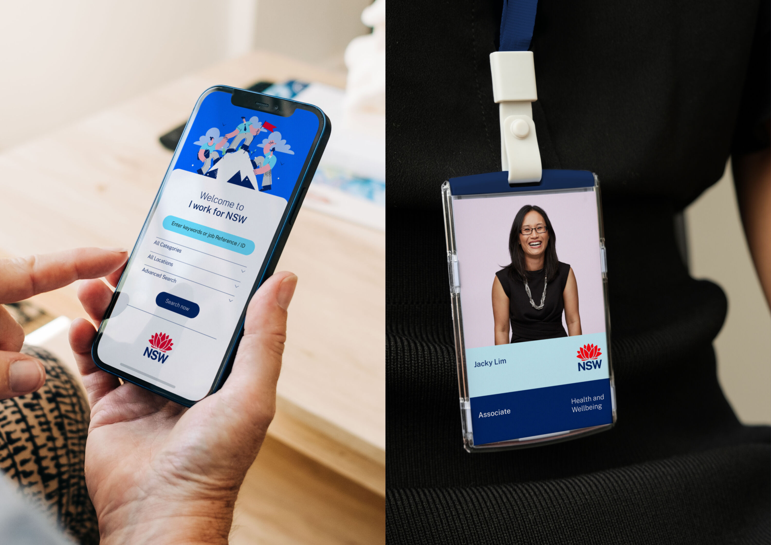
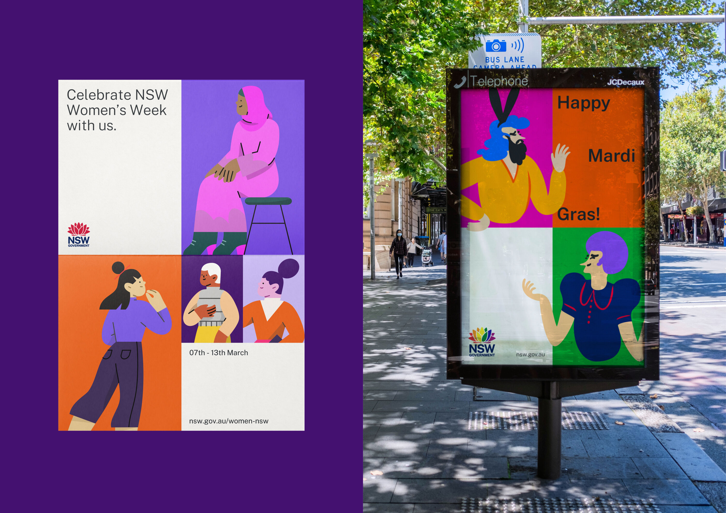
With over 8 million customers and more than 800 external-facing brands, a customer-centric approach to communications is vital. Having adopted a masterbrand strategy in 2020, the Government aimed to bring even greater purpose and clarity to how they engage with the public.
For The People restructured the entire NSW Government brand architecture, developing a visual identity system that leveraged the existing Waratah logo. Its new holistic design system supports and responds to the needs of both Government and its customers across a range of services in a much more succinct and flexible way.
Bronze Award winners
Brand Impact Awards 2023: Bronze Awards
The following 26 projects received at least one Bronze Award trophy at the Brand Impact Awards 2023.
Download full winners showcase
AERO by Magpie Studio
- Bronze Award: Automotive
- Find out more about this project at magpie-studio.com
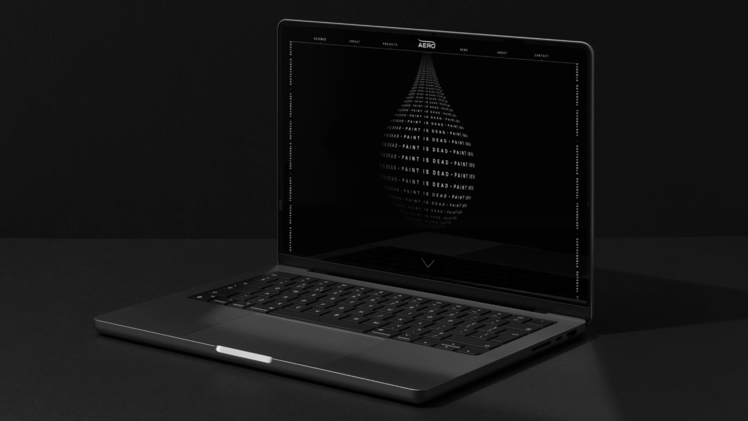
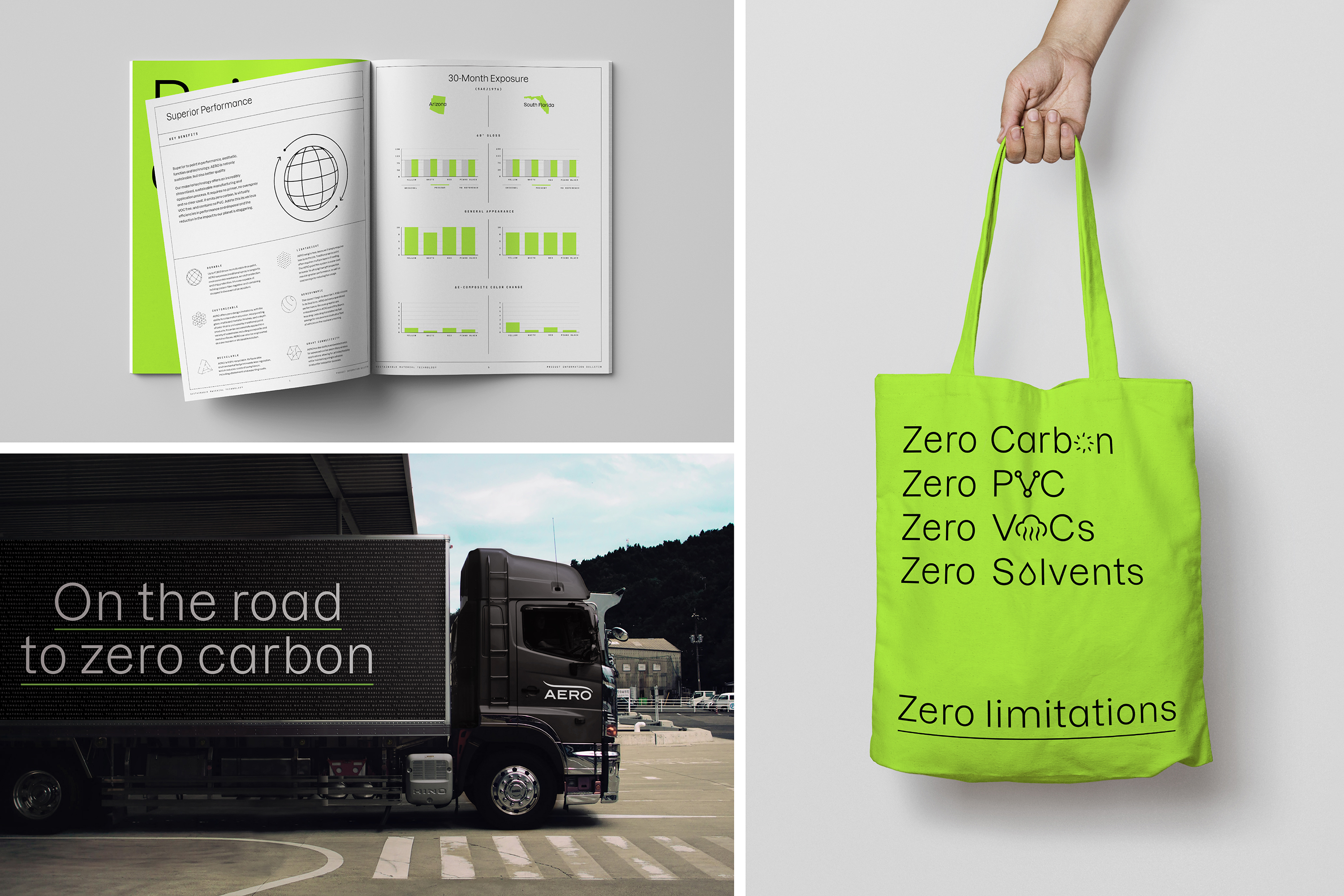
Revolutionary film-based paint alternative AERO helps solve a huge environmental problem. Magpie repositioned the brand from humble film-based coating maker to pioneering sustainable material technology company with a simple brand idea: 'Engineered from the molecule up.'
The confident identity is led by a provocative copy line: 'Paint is Dead.' Streamlining the existing logo, Magpie ditched the corporate blue for an electric green, developed an impactful yet accessible TOV, and a suite of hi-tech brand assets. The new brand has proved instrumental in repositioning AERO in the automotive sector, enabling them to win partnerships with brands such as Jaguar Land Rover as Tesla.
Frango Assado by Design Bridge and Partners
- Bronze Award: Bars & Restaurants
- Find out more about this project at designbridge.com
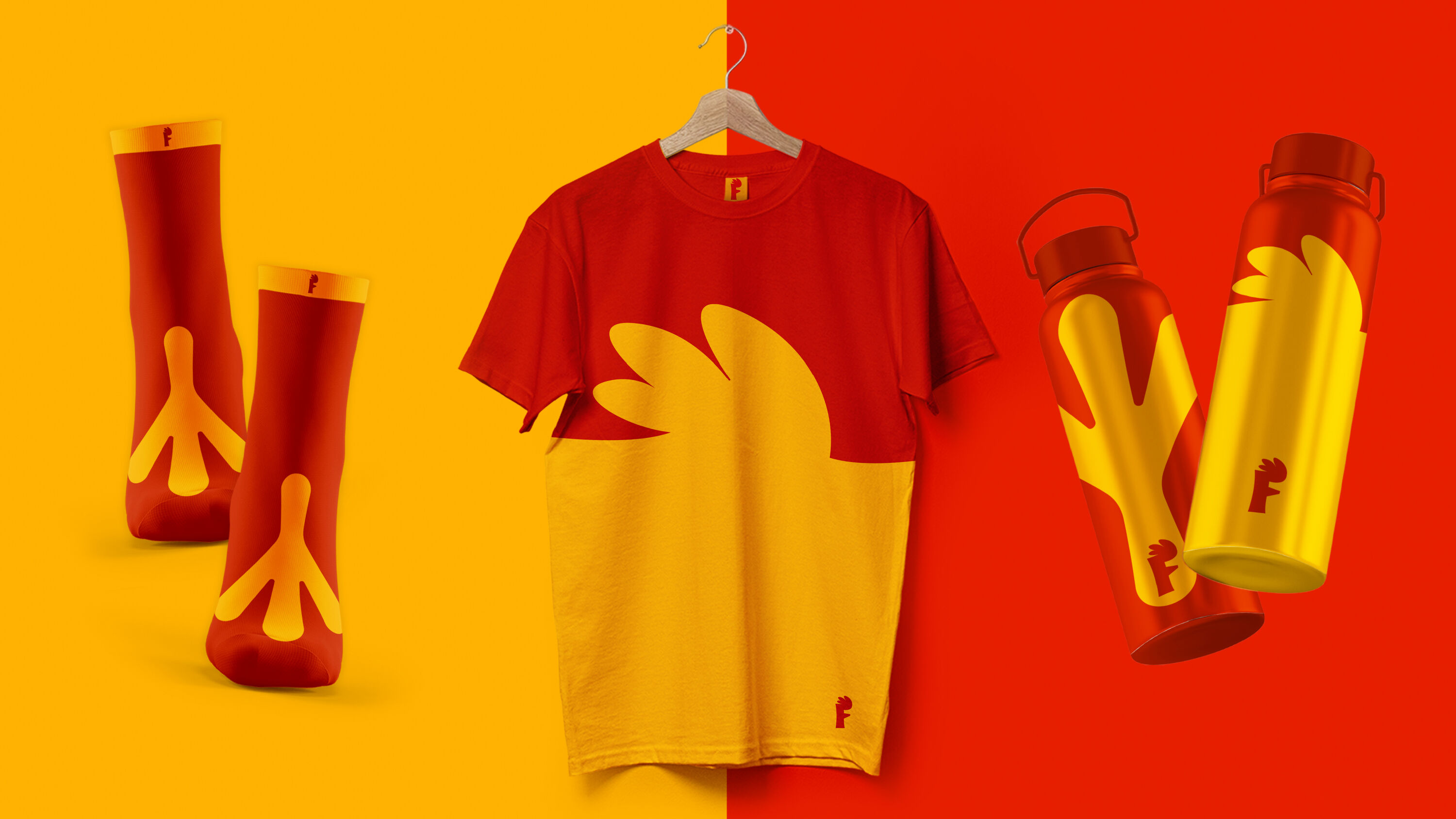
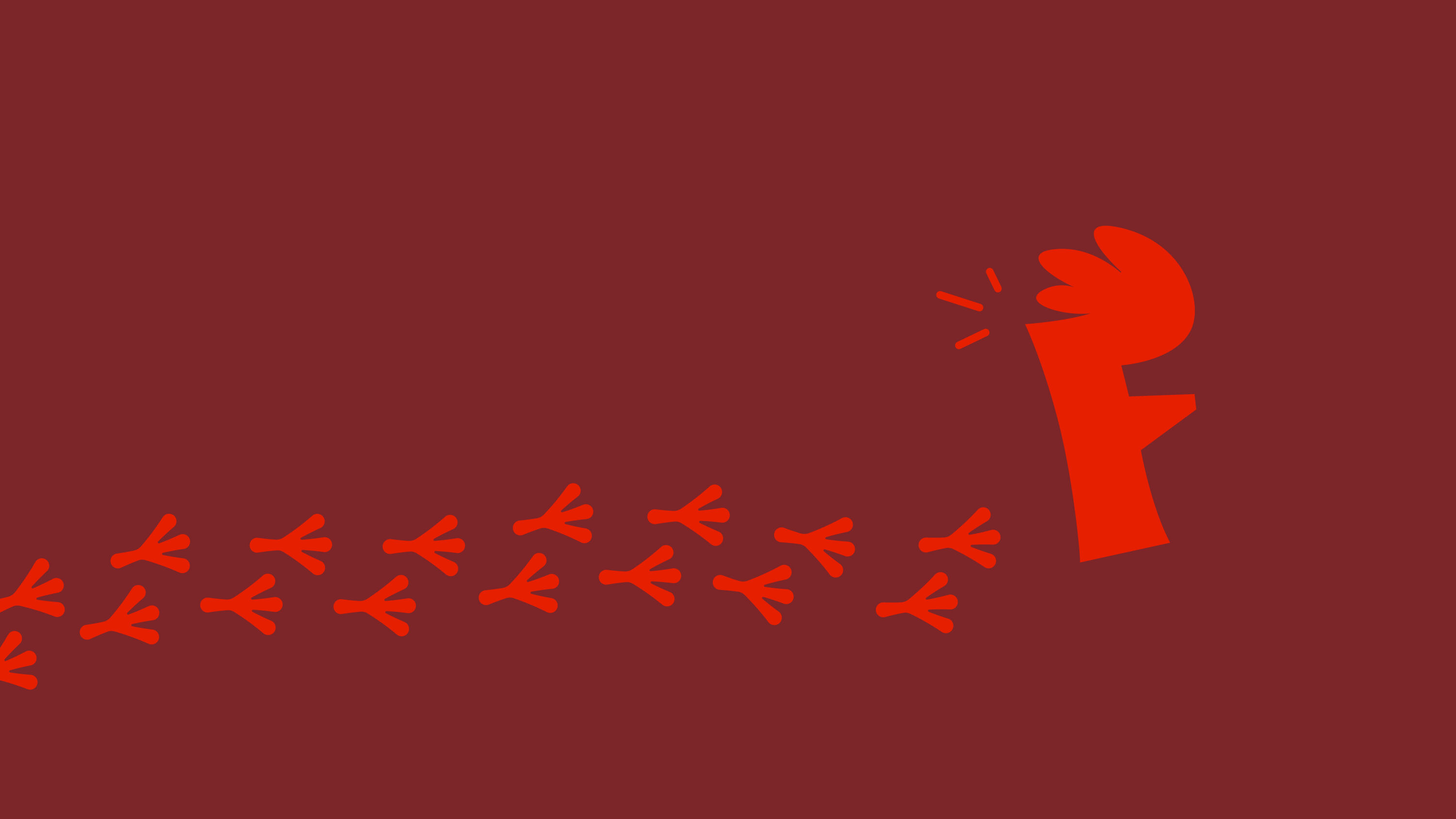
A favourite place for São Paulo's motorists to stop, rest and refuel, both body and car, Frango Assado has 26 locations across the state. But the brand needed to appeal to a new generation. Enter 'Fran', the funky chicken-inspired logo at the heart of a proudly modern and dynamic identity.
Bold, flat colours give Frango Assado a stylish vintage feel with a truly modern twist, brought to life through a series of joyful animations. The new brand identity balances the equity and familiarity of 70 years of heritage with enough fresh flavour to satisfy customers both old and new.
R1 Racing by Design Bridge and Partners
- Bronze Award: Brand Strategy
- designbridge.com
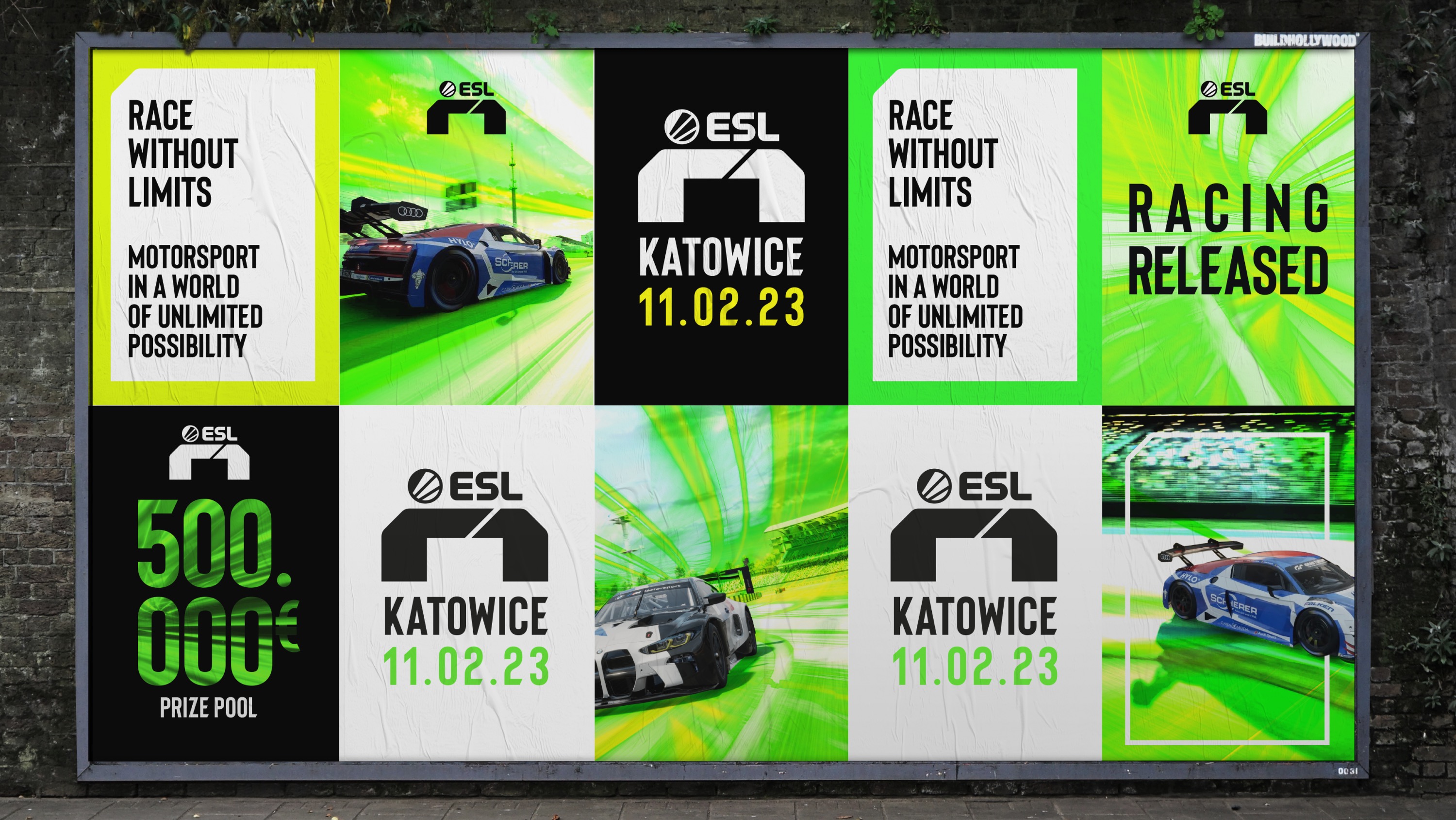
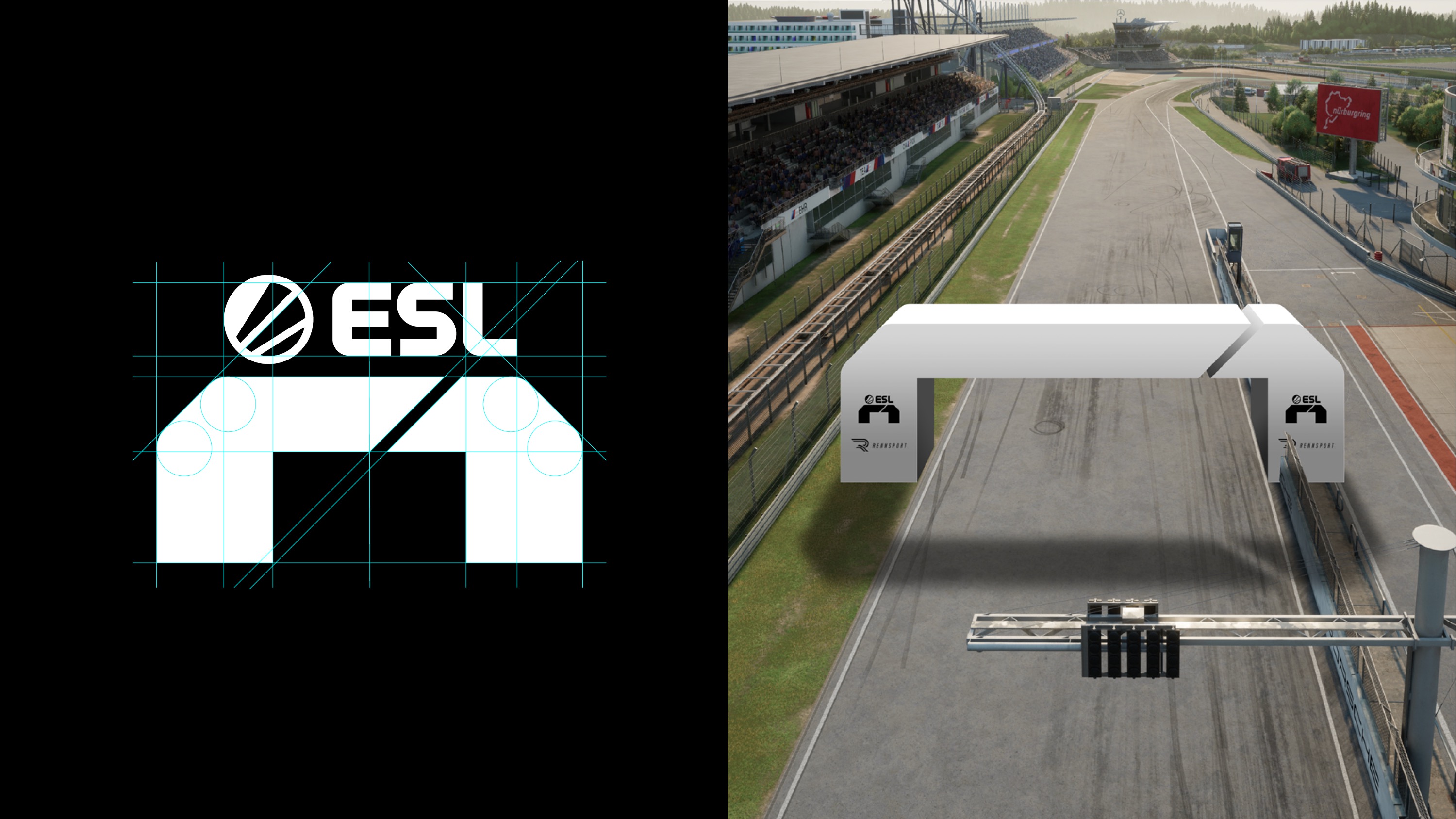
Ultra-realistic sim-racing game Rennsport partnered with ESL, the world's leading esports company, to create ESL R1 – a new esport where pro-gamers race on a virtual circuit. The strategic ask was to broaden the appeal of digital motorsport to wider gaming and sports audiences.
The key insight: sim-racing shouldn't replicate its real-life counterpart. It should extend what's possible, balancing the ultra-realism needed to attract the world's best drivers with a whole new kind of interactive experience. Design Bridge and Partners positioned ESL R1 as a revolution, fusing accurate driving physics with a hyper-real world of unlimited possibility. The tagline: 'Racing Released.'
Ashurst by Design Bridge and Partners
- Bronze Award: Brand Strategy
- designbridge.com
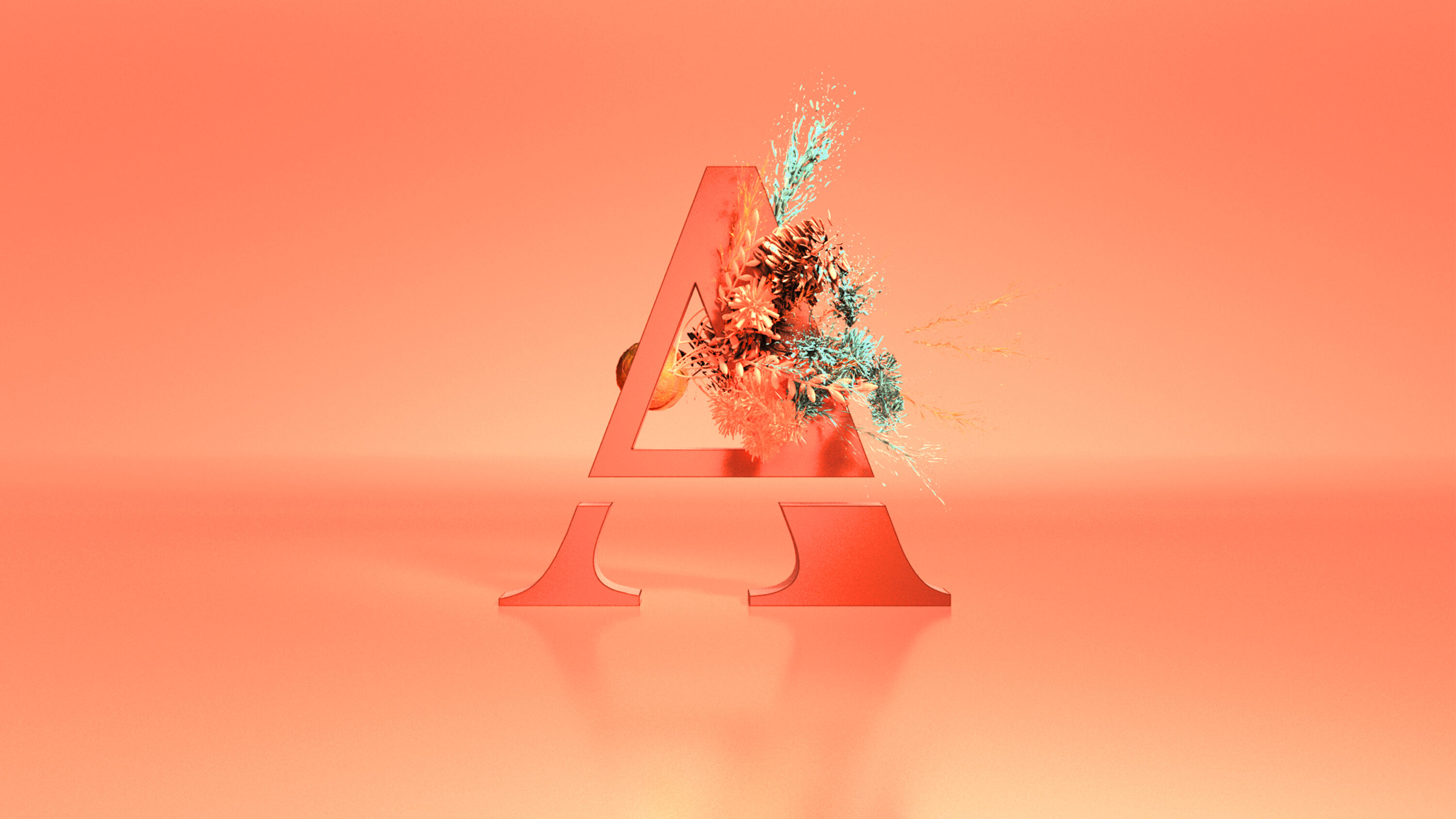
Founded 1822 in London, Ashurst is a global law firm in a sector experiencing significant disruption. While professional services giants expand their legal capabilities, innovative 'law-tech' startups offer more agile, cost-effective solutions, leaving many traditional legal firms struggling to keep pace.
Ashurst has been progressive for 200 years: its founder, William Henry Ashurst, was an early advocate for minority rights – including the Abolishment of Slavery – and even installed the first-ever telephone in a legal office. Design Bridge and Partners built the Greek symbol for change (Δ) into the firm's new identity, and its new brand positioning – 'Outpacing Change' – acknowledges its innovative heritage.
Tirlán by Siegel + Gale
- Bronze Award: Brand Strategy
- Find out more about this project at siegelgale.com
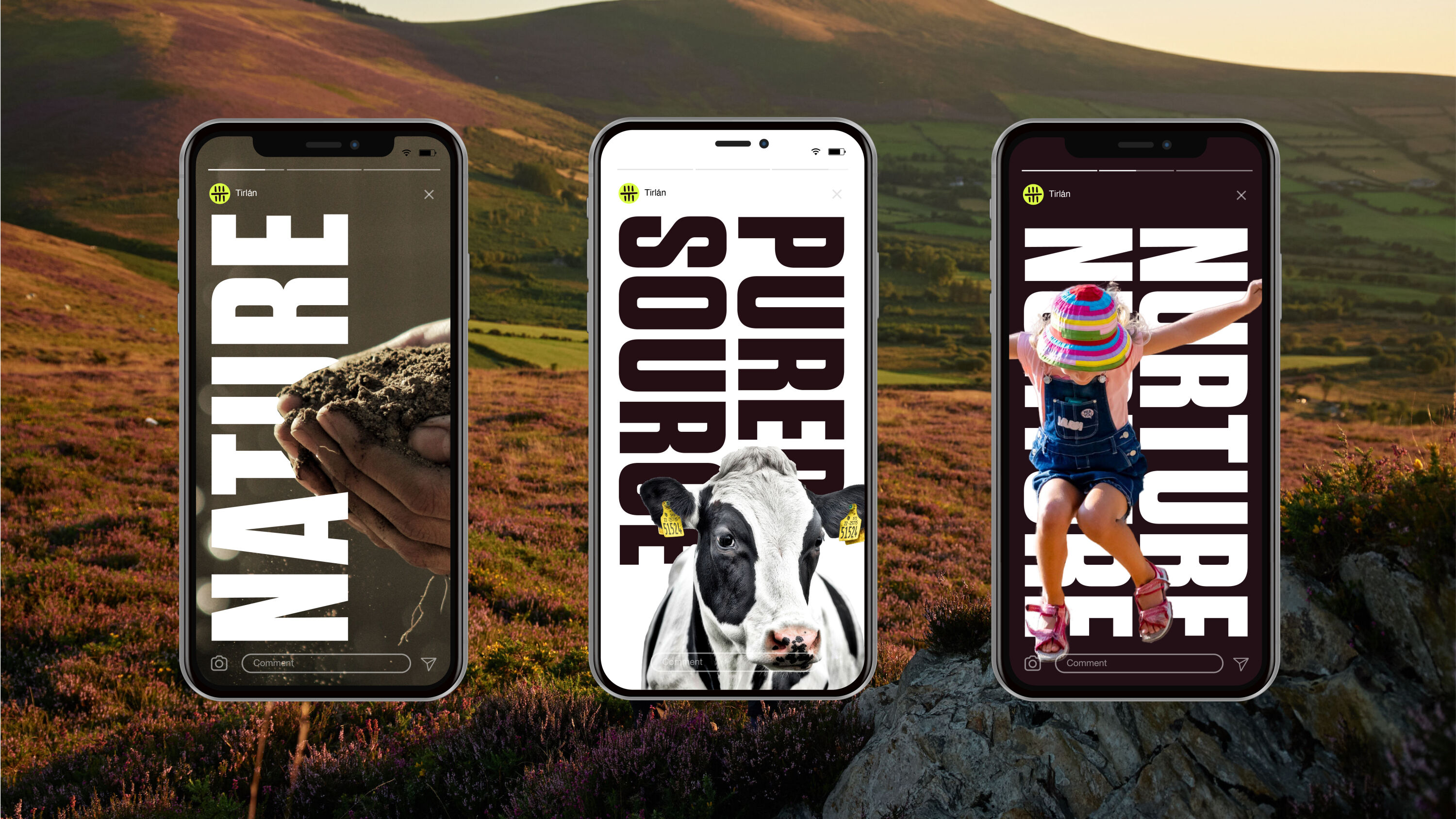
Siegel+Gale named and branded Irish farmer co-operative Tirlán, crafting a strategy to build trust and highlight its sustainability efforts, adaptability, and agricultural heritage to markets both globally and locally.
The name 'Tirlán' combines the Irish words for 'land' and 'full', while the symbol was born from the medieval Irish alphabet found on stone monuments.
100% farmer-owned, responsibility is shared amongst Tirlán's members. Siegel+Gale's strategy differentiates the brand by leading with heart – a warm, relatable and trustworthy way to engage with farmers and other key stakeholders, while communicating its global sustainability commitments.
Arctic Iced Coffee by Halo
- Bronze Award: Brand Strategy
- Find out more about this project at halostudio.love
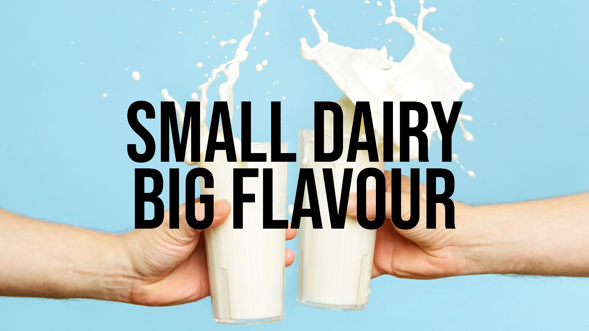
Arctic Iced Coffee is the UK's number-one independent iced coffee. In a market dominated by huge names like Starbucks and Costa, Halo's strategy helps Arctic punch up.
Research revealed an opportunity to focus on younger consumers who choose iced coffee for its sweetness and energy boost, with little interest in roasts, blends, origins and tasting notes. Not coffee geeks: simply iced coffee lovers. A new proposition – 'Taste of Independence' – sets it apart from the corporate ubiquity of the global competition and connects to the brand's fans on a personal level, recognising their choice as a statement of self-identity and personal taste.
Royal Mail – Pride by NB Studio
- Bronze Award: Illustration
- Find out more about this project at nbstudio.co.uk
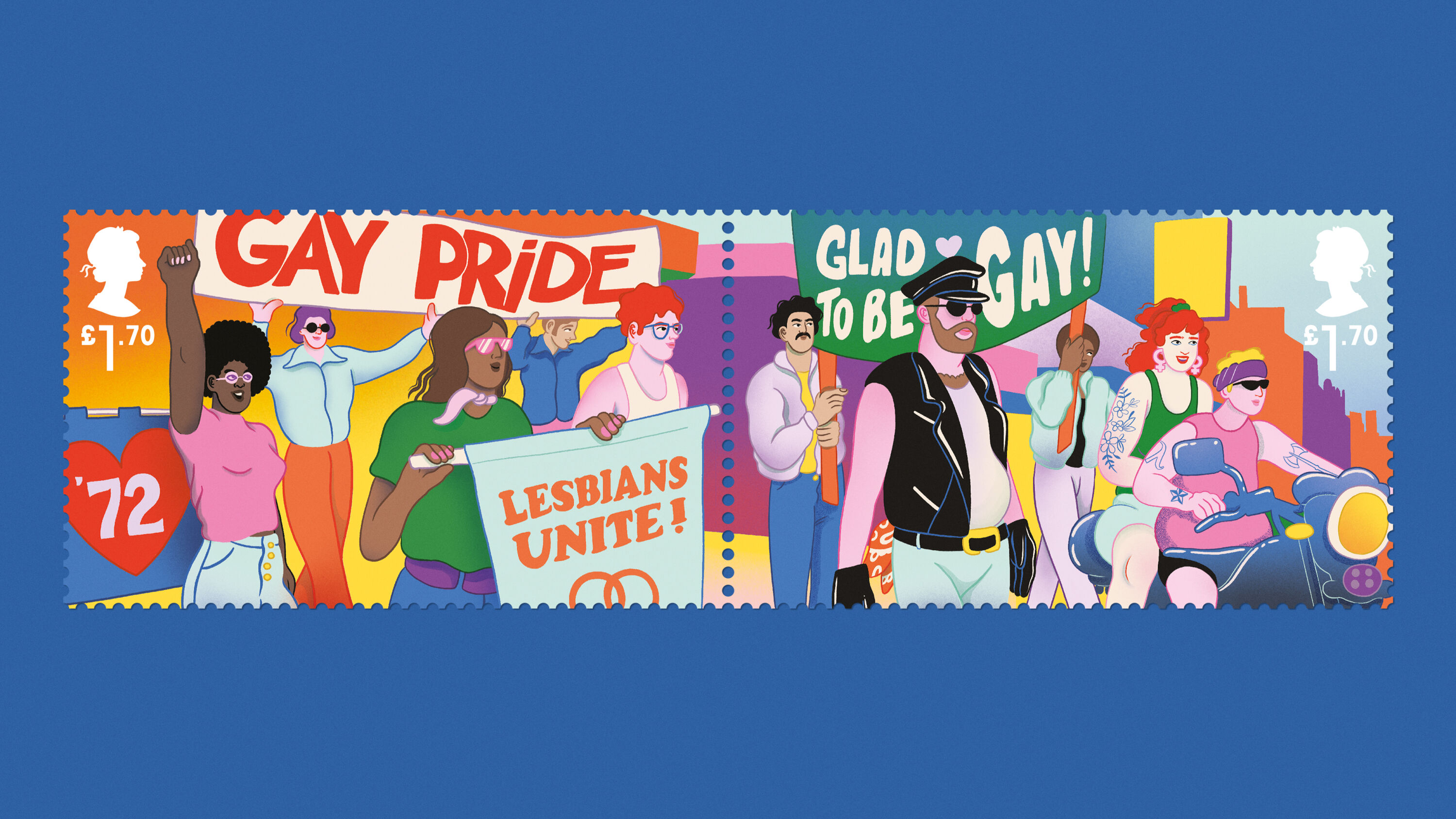
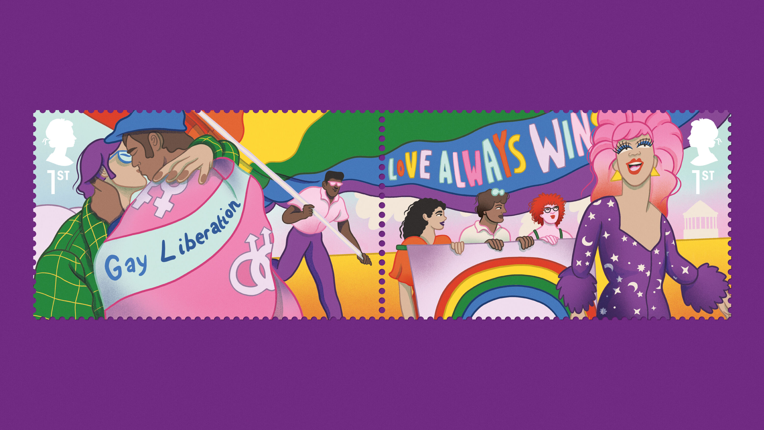
On 1 July 1972 protestors marched from Trafalgar Square to Hyde Park chanting: “Gay is fun! Gay is proud! Gay is beautiful!” 50 years on, Royal Mail challenged NB Studio to develop a set of special-release stamps and a suite of collectables to mark the anniversary of the UK's first Pride rally.
The collection pays tribute to each decade of Pride. NB engaged Pride organisations UK-wide to ensure symbolism – flags to tattoos, clothing to handkerchiefs – was respectful to all identities featured. Queer British artist Sofie Birkin provided free-flowing illustrations to tell the story of a community fighting for and celebrating its right to exist and be heard.
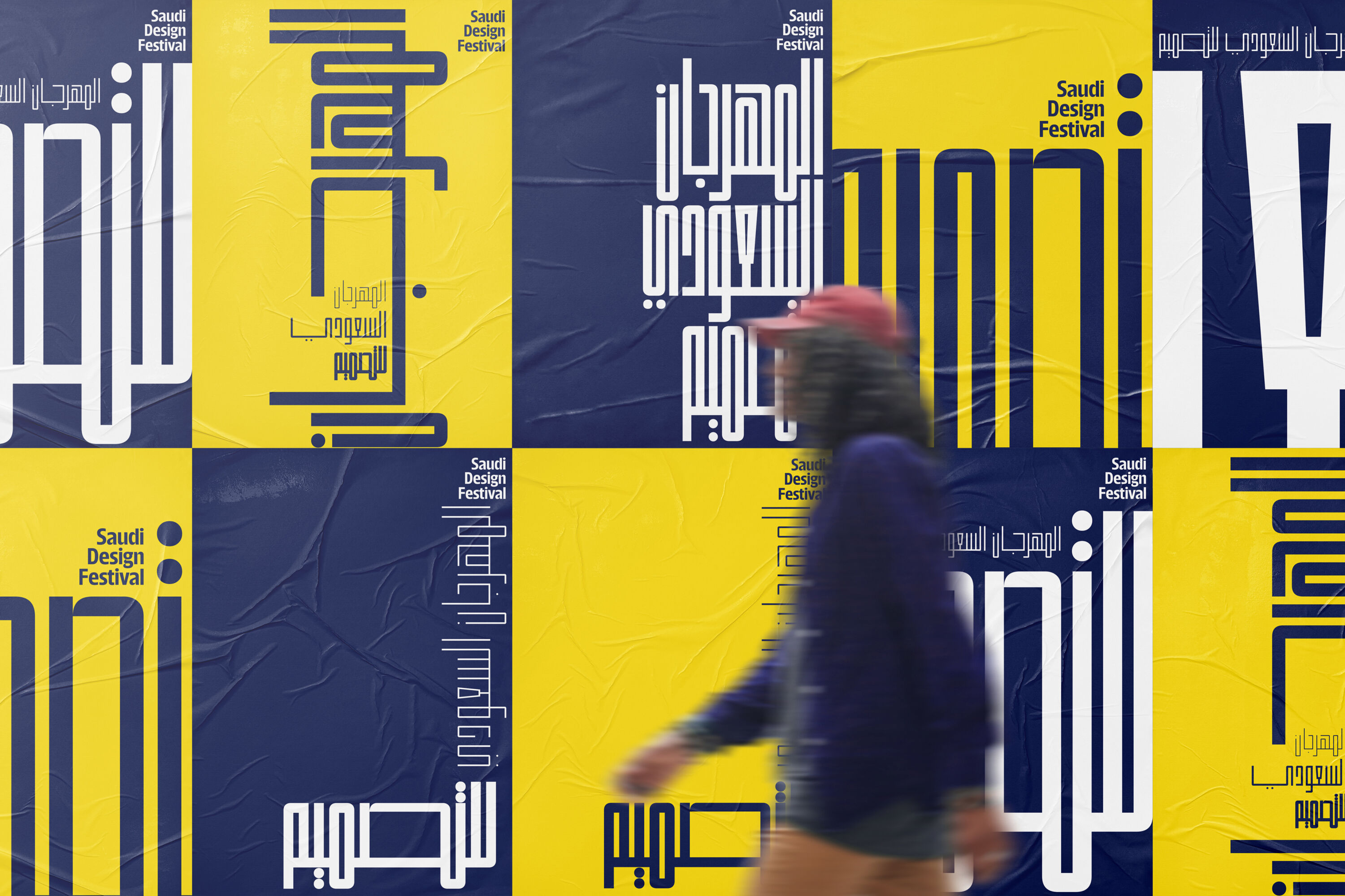
Saudi Design Festival by Tarek Atrissi Design
- Bronze Award: Typography
- Find out more about this project at atrissi.com
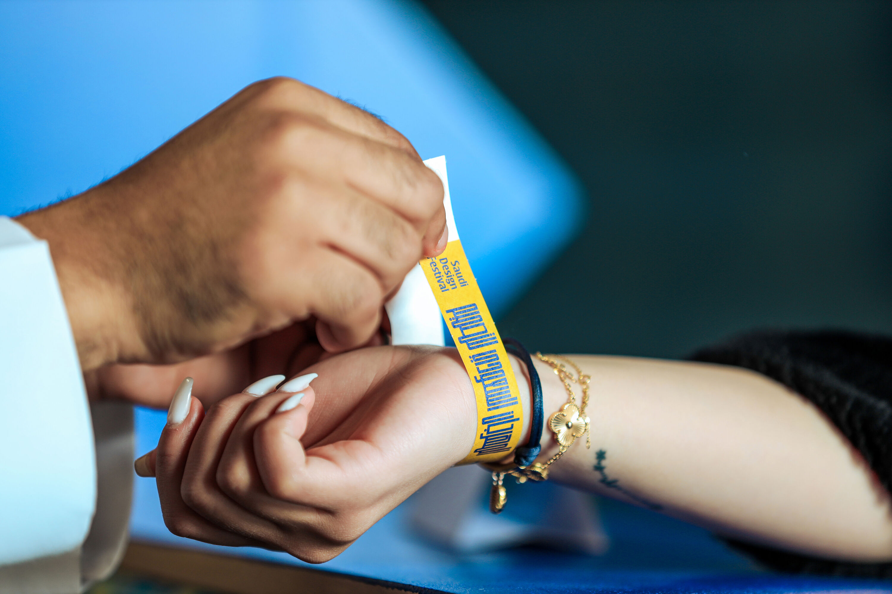
To redesign the visual identity system for the Saudi Design Festival in Riyadh, Netherland-based Tarek Atrissi Design drew inspiration from the striking geometry found in traditional Arabic calligraphy.
Working with variable font technology in the Glyphs app, the studio transformed this geometry into infinite typographic design possibilities. At the heart of the identity is a wordmark controlled by four axes, which shift to adjust the weight, width, height and spacing of the letterforms.
The result is an interactive typographic language that informs a rich, flexible visual identity – providing a broad range of possible usages across branded collateral for the festival.
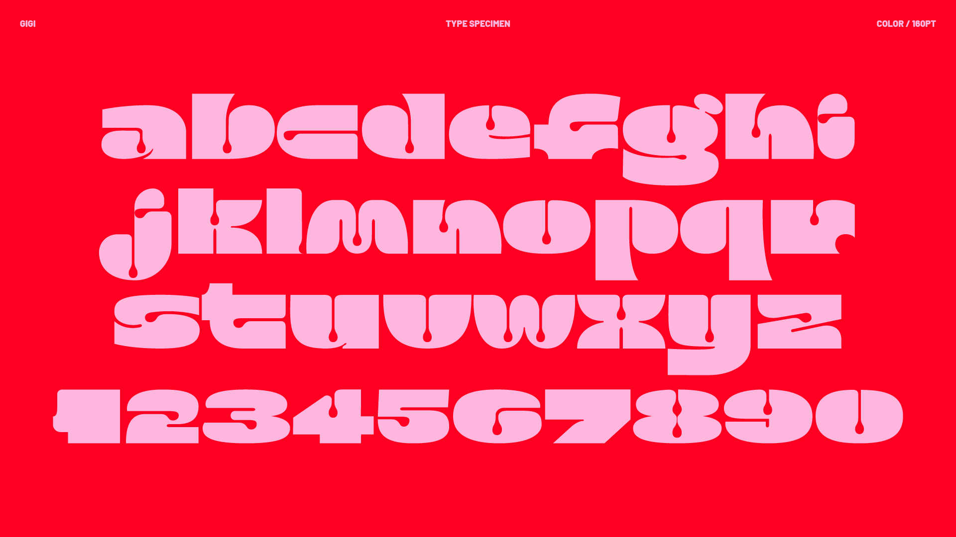
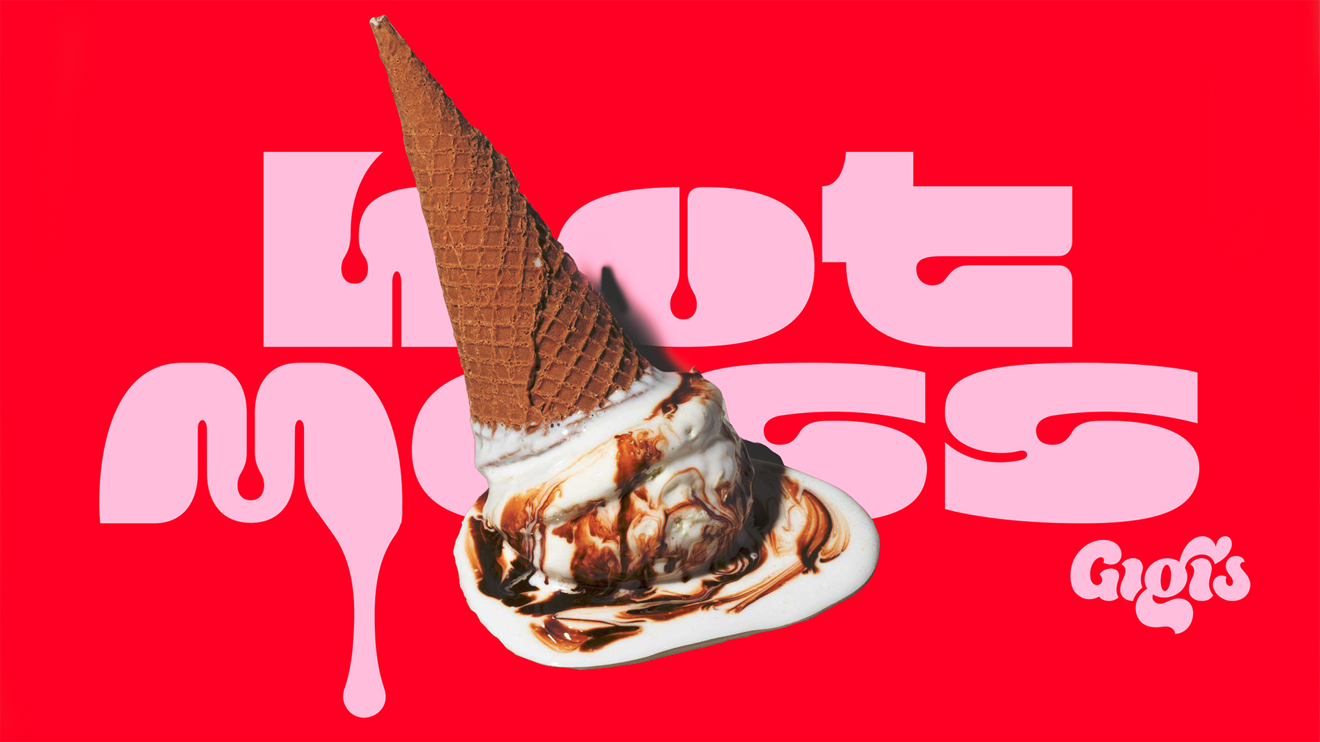
Gigi's Gelato typeface by Design Bridge and Partners
- Bronze Award: Typography
- designbridge.com
Gigi's Gelato celebrates the love of a messy, flavourful life served with a scoop of sweetness. Quickly becoming a staple fixture at New York's Rockaway Beach, Gigi's draws year-round loyalists searching for a blend of nostalgia and newness.
To capture its playful spirit, Design Bridge and Partners developed a custom typeface inspired by graffiti culture, blended with the joy of that first taste of gelato. Reflecting the proud roots of Gigi's local neighbourhood, the bold, bright primary colour palette evokes the ingredients, flavours, and hues of endless lazy summer summers – reminding the world that life is both messy and sweet.
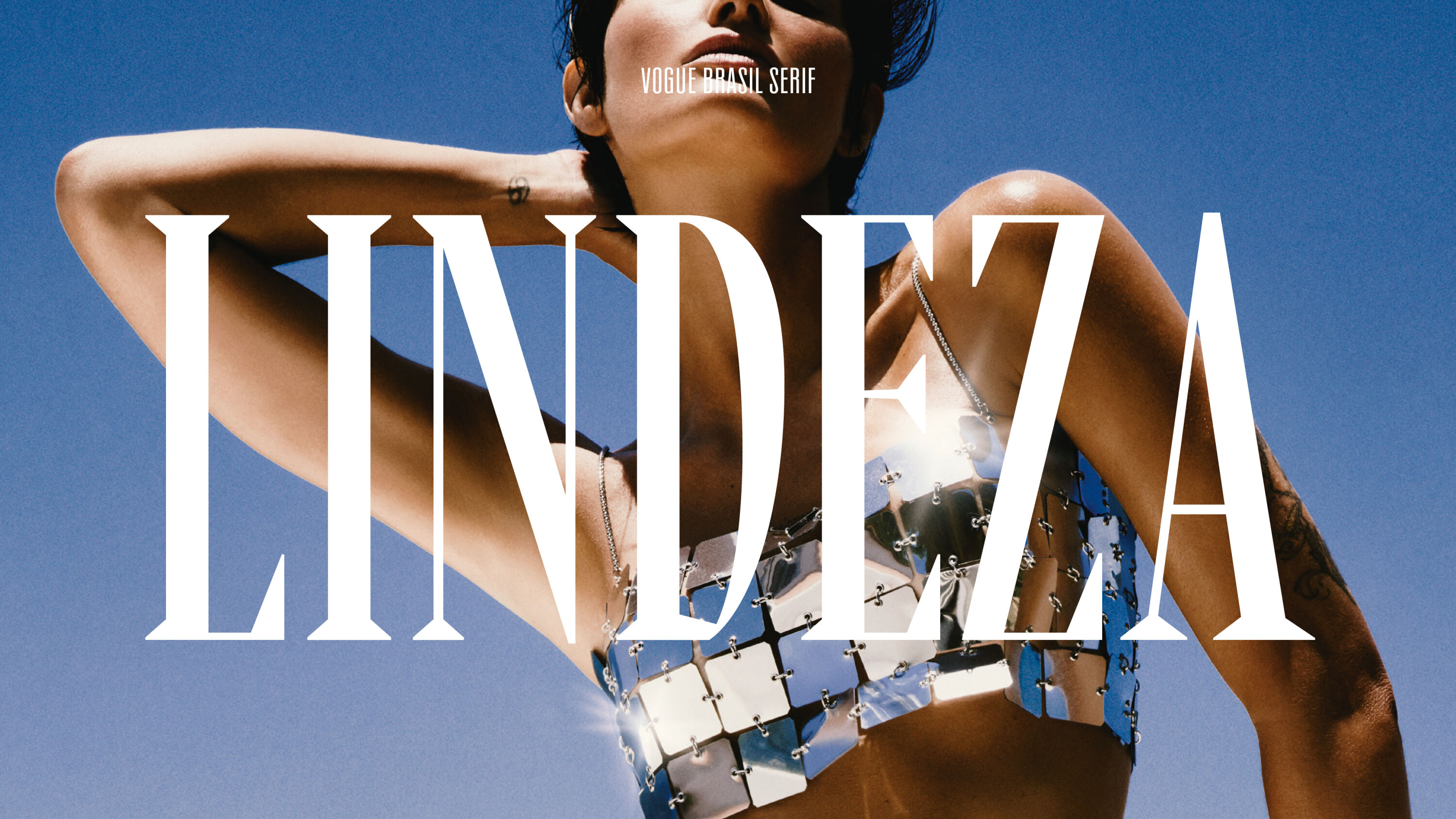
Vogue Brasil typeface by Studio DRAMA
- Bronze Award: Typography
- studio-drama.com
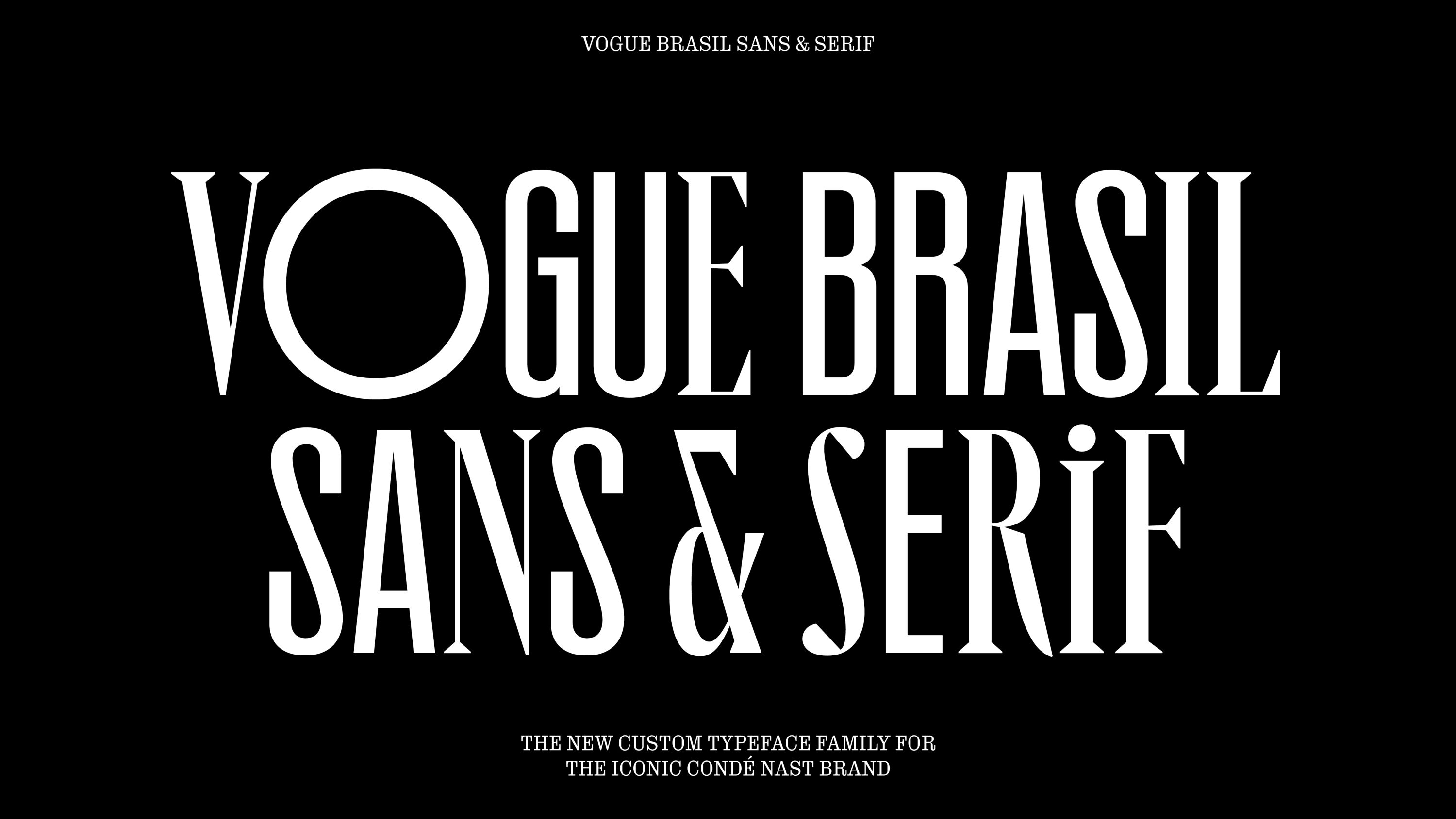
To coincide with Vogue Brasil's 2023 redesign, Studio DRAMA created a dualistic headline typeface family. The team researched Brazil's art, graphic design, literature, architecture, film, and music scenes – as well as the vernacular hand-painted typography found in the streets of cities like São Paulo.
Iconic and timeless, the resulting typeface has both sans-serif and serif styles, which complement each other with shared proportions – while unexpected geometric forms and alternates add flair and variety. At the heart of the typeface family are two polarising ideas: 'vernacular' and 'elegance'. Taken together, they infuse the iconic Vogue brand with the rich cultural and typographic heritage of Brazil.
Harlaxton by UnitedUs
- Bronze Award: Education
- Find out more about this project at unitedus.co.uk
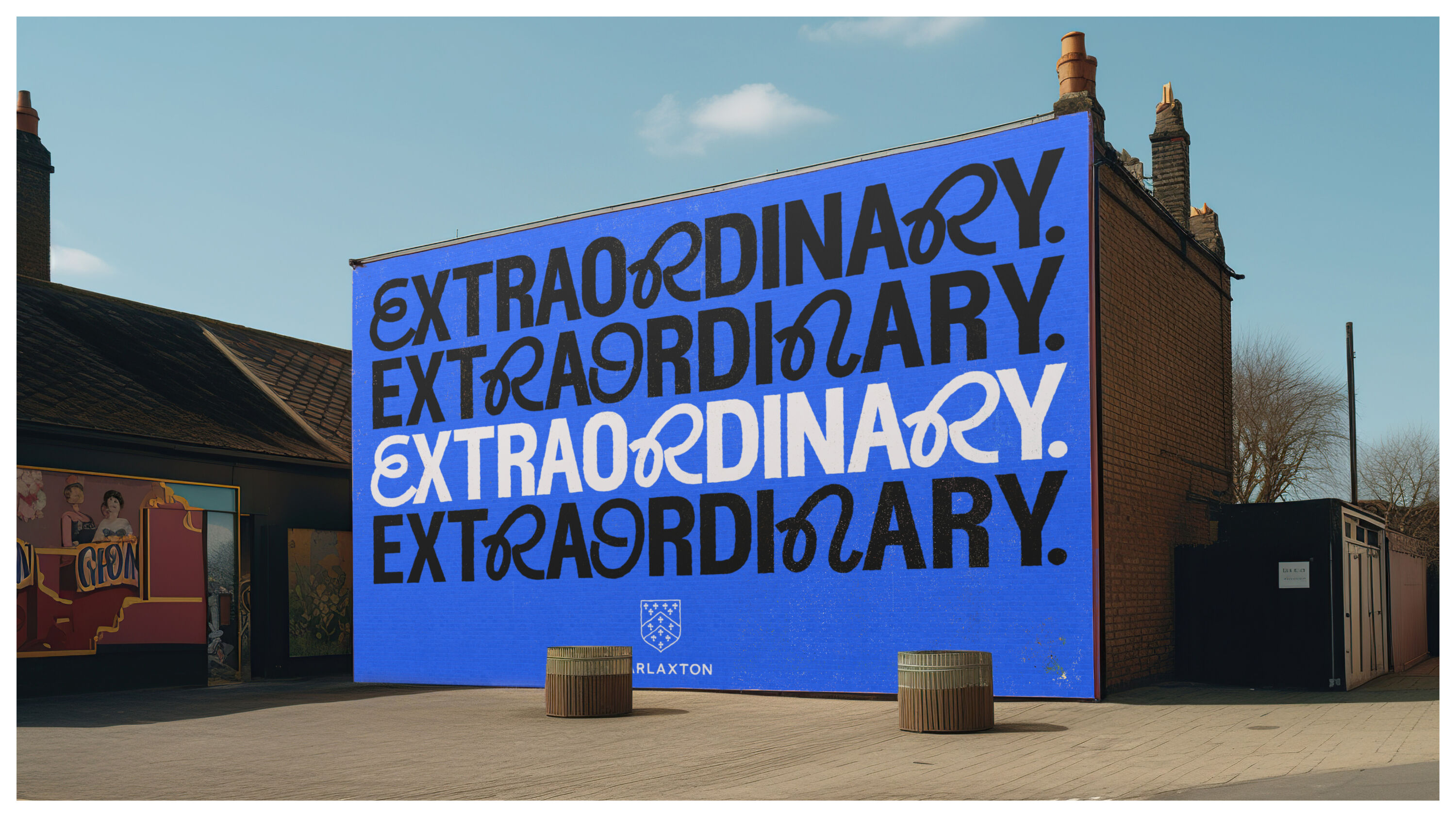
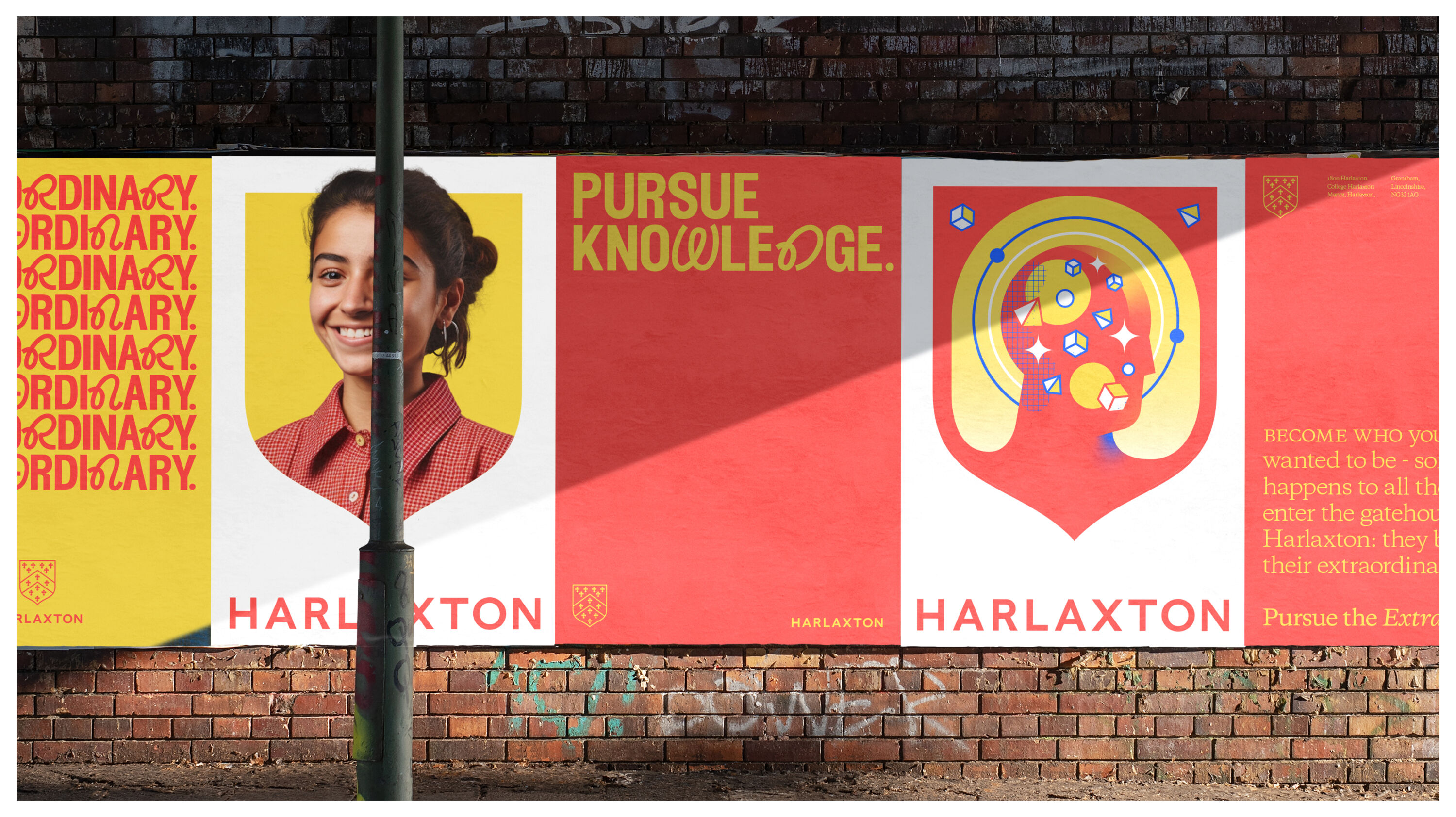
Harlaxton Manor has been a hub for challengers of the status quo since 1831. Housing the University of Evansville's study abroad centre, Harlaxton College shapes transformative experiences for students who question the value of traditional studies and seek more from their futures.
Breaking ties with a Hogwarts-esque aesthetic, UnitedUs built a brand that blends trailblazing heritage with modern-day relevance. Anchored with an empowering lead message – 'Pursue The Extraordinary' – the new identity system prioritises personality, flexibility and unity.
Harlaxton's shield evolves from a college badge into a powerful visual framing device, reflecting how the College brings eclecticism together and emboldens its students to pursue the extraordinary.
Glenfiddich – Time Re:imagined by Here Design
- Bronze Award: Luxury
- Find out more about this project at heredesign.com
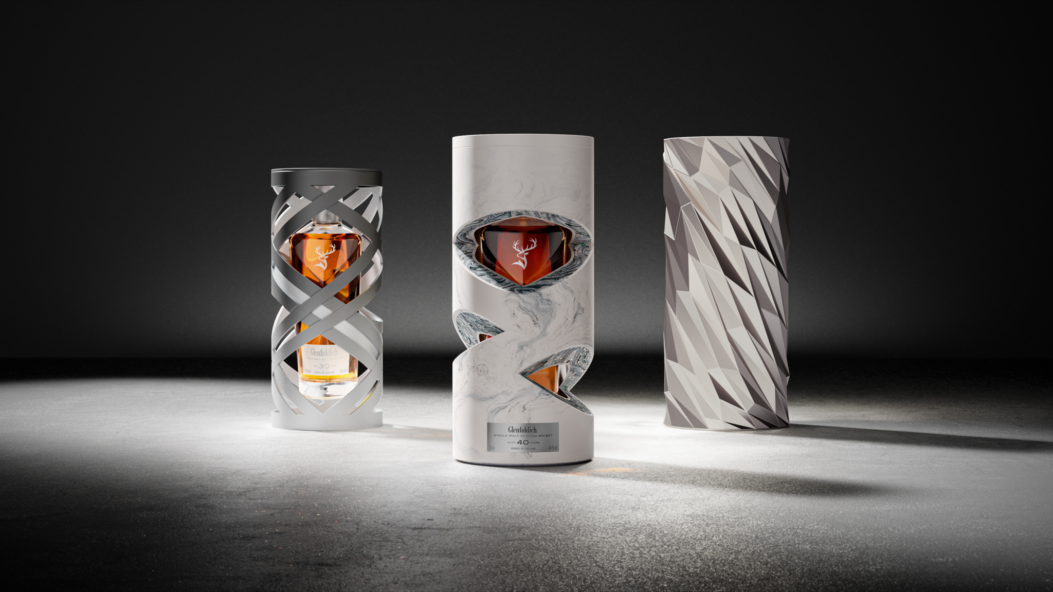
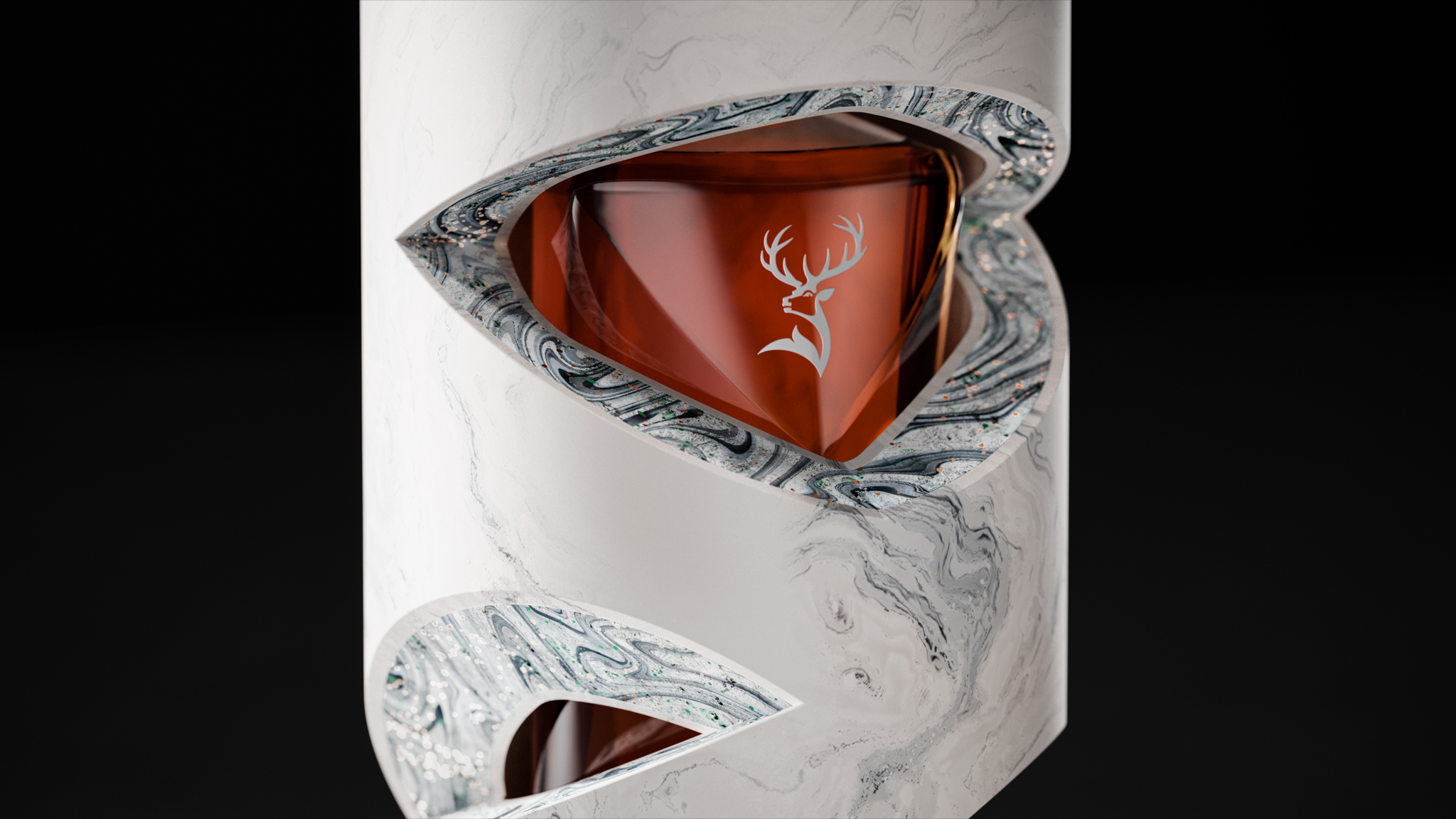
Glenfiddich's latest series sees the ever-shifting force of time embodied in three incredibly rare whiskies. Crafted from premium materials, Here Design's sculptural packaging for each variant reimagines time in a luxurious way – designed to be as precious as the liquid as they contain.
Seemingly suspended in mid-air – and in time – the 30-year-old is housed within a complex fluid ribbon design. The 40-year-old nods to the distillery's unique process with a sculptural container made from white jesmonite. And for the 50-year-old, computational architect Manuel Jiménez decrypted climatic data gathered over those unrepeatable 18,250 days, transforming it into an algorithm and finally a physical design language that shaped a bespoke outer casing.
Guy's Cancer Charity by Studio Sutherl&
- Bronze Award: Not-for-Profit
- Find out more about this project at studio-sutherland.co.uk
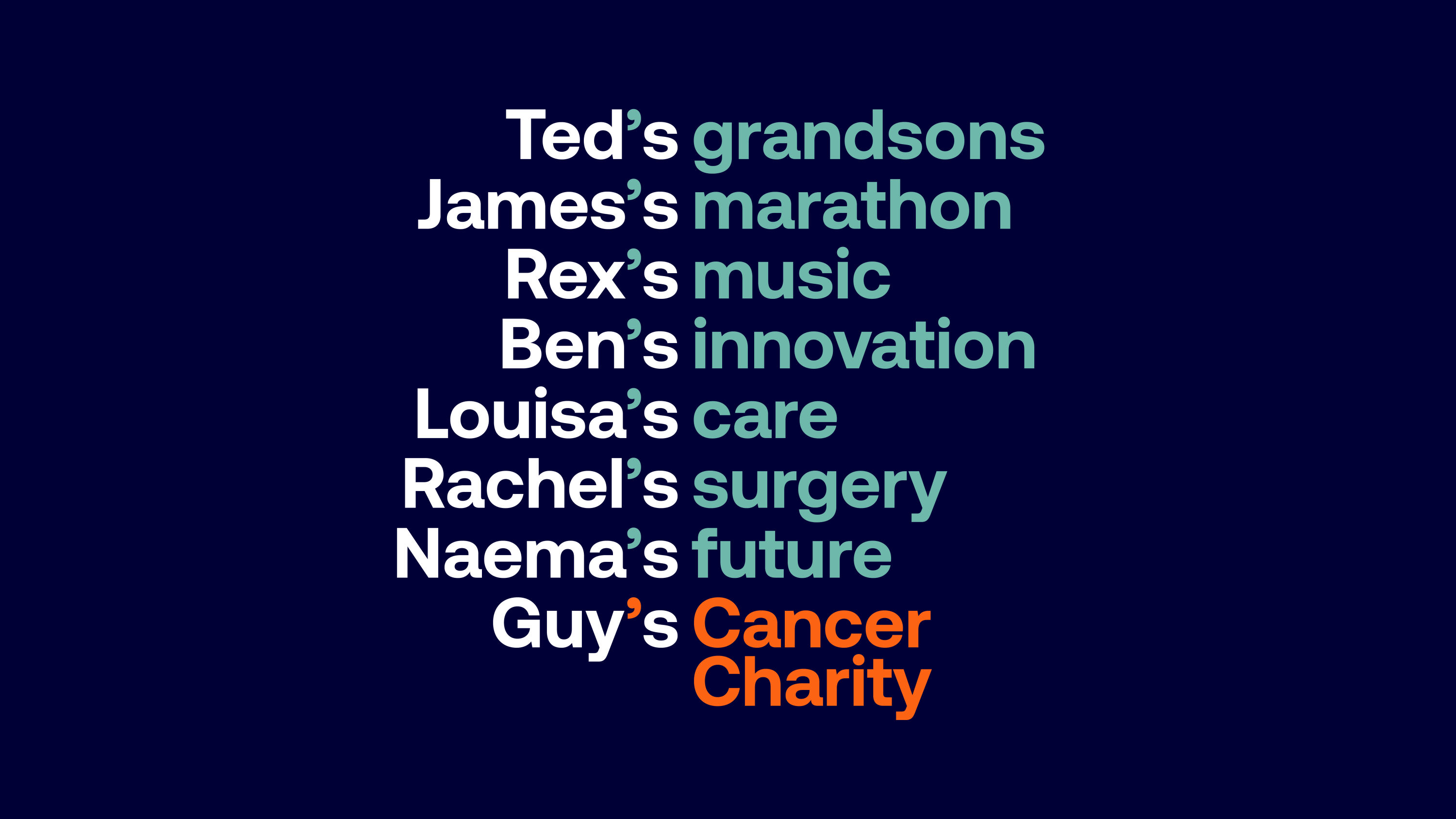
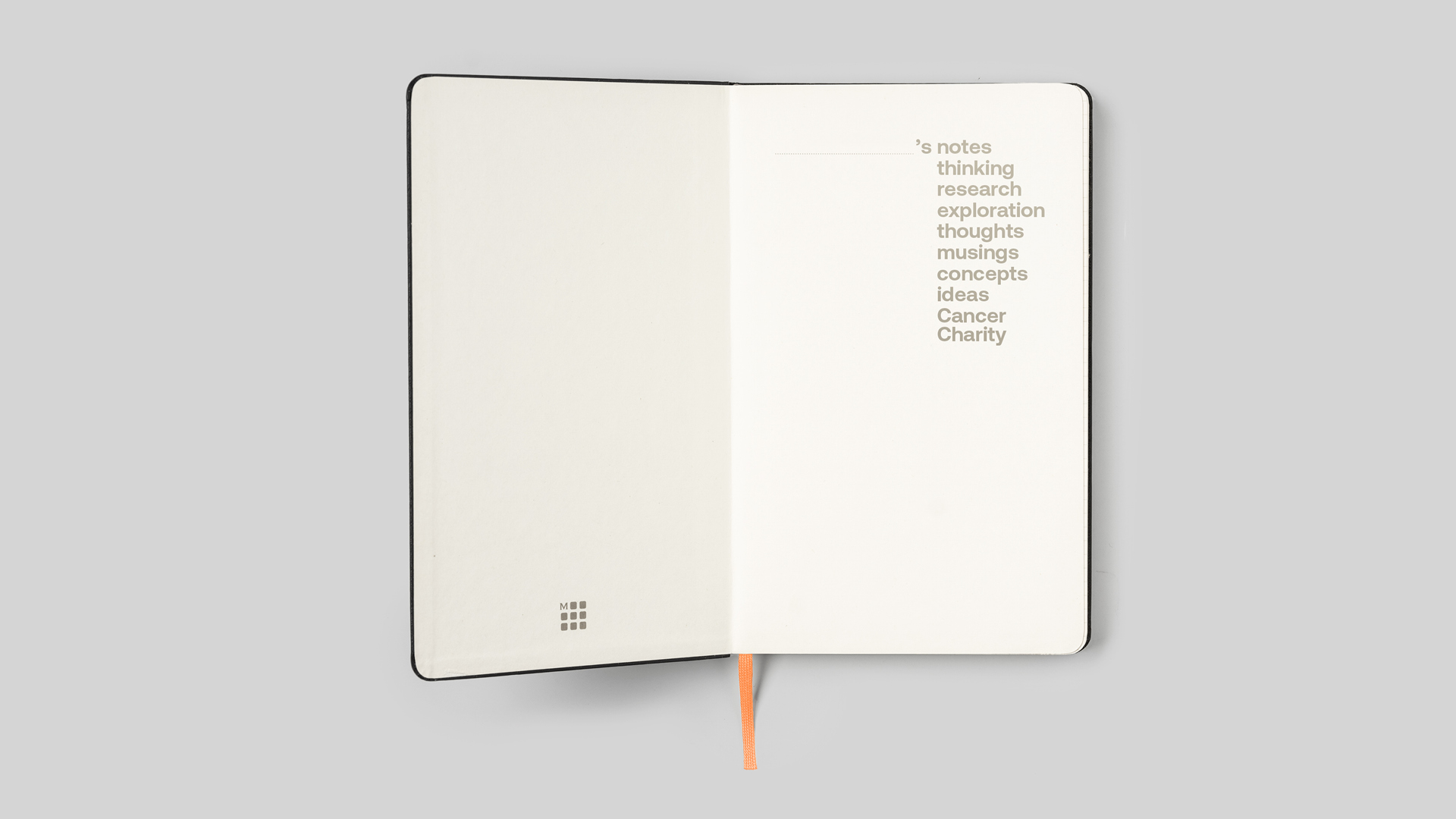
Studio Sutherl& created a confident, distinct and powerful concept for Guy's Cancer Charity, enabling the logotype to can be endlessly adapted and personalised. It becomes Yinka's Cancer Charity, Deepak's Cancer Charity, Maya's Cancer Charity, My Mum's Cancer Charity…
In the moment when tough news is given, Guy's Cancer belongs to the listener. Elsewhere, researchers dedicate themselves totally – reshaping Guy's Cancer daily. And when supporters raise money in memory of someone who'll never be forgotten, Guy's Cancer moves forward in their name. This variable identity uses all their names and stories to create a bespoke, forever-expanding set of assets.
NYC Pride by Lippincott
- Bronze Award: Not-for-Profit
- Find out more about this project at lippincott.com
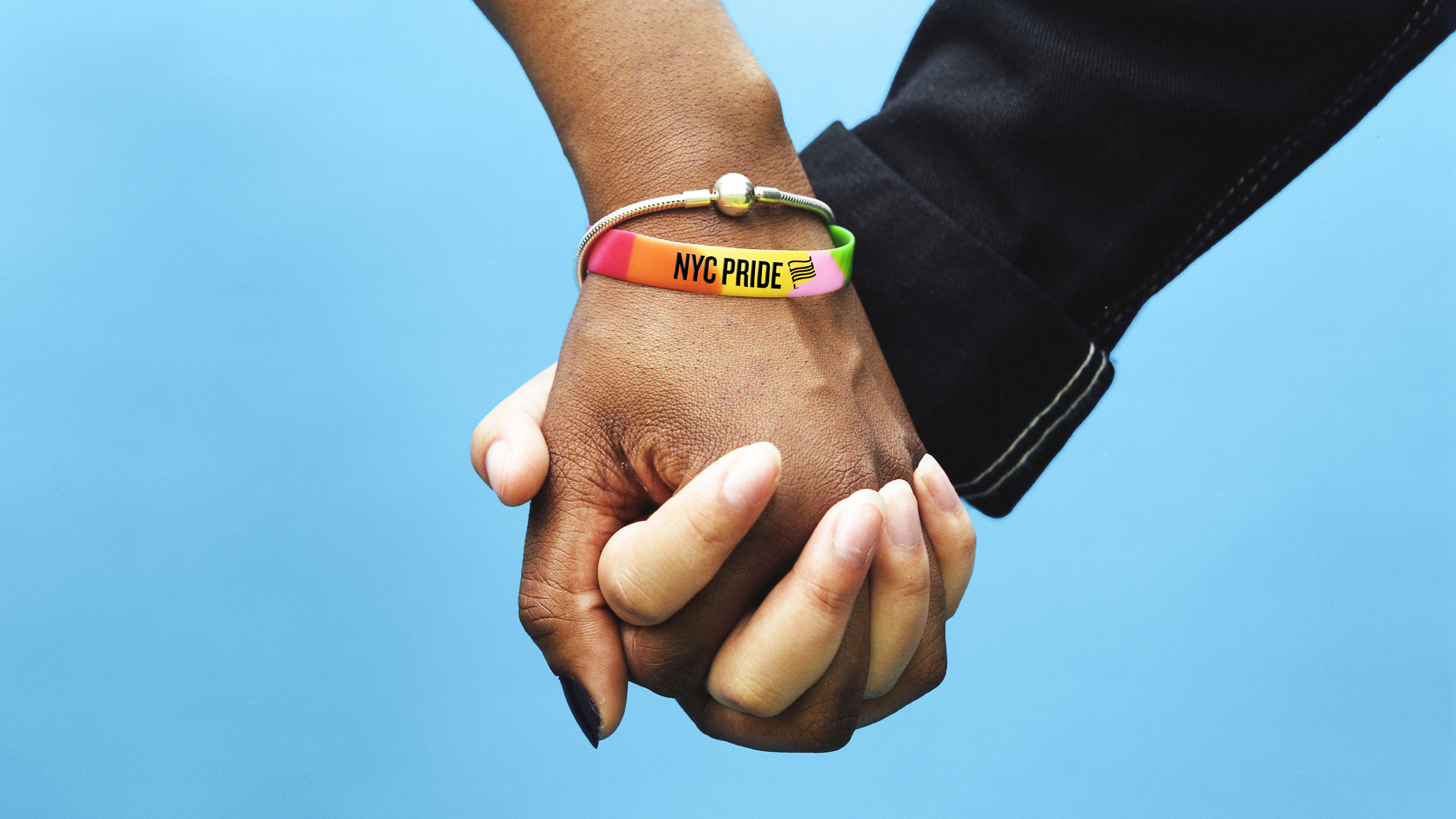
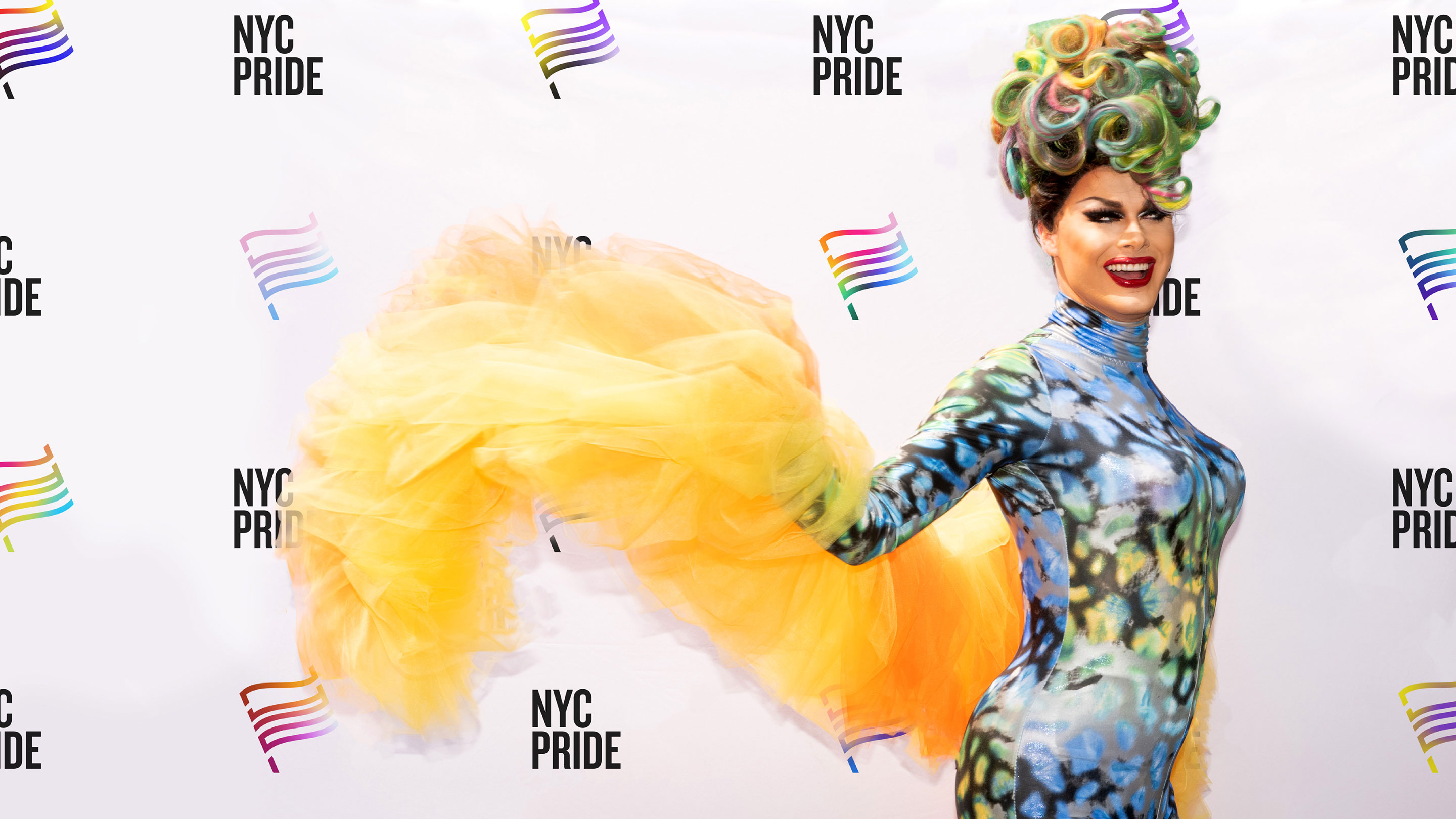
Heritage of Pride, a nonprofit born from the events of the Stonewall Uprising, knew it was time for an evolution. The organisation and its trademark event, NYC Pride, had an inconsistent brand identity that changed each year. And as the LGBTQIA+ community continued to grow, NYC Pride needed to ensure its identity was inclusive of everyone.
Lippincott helped put the community at the centre of its identity. Featuring an adaptive gradient, the iconic Pride flag in the logo provides inclusivity for different subgroups within the LGBTQIA+ community, while the supporting visual system is bold and direct, adapting to campaign themes.
Time dot com by For The People
- Bronze Award: Technology & Telecoms
- Find out more about this project at forthepeople.agency
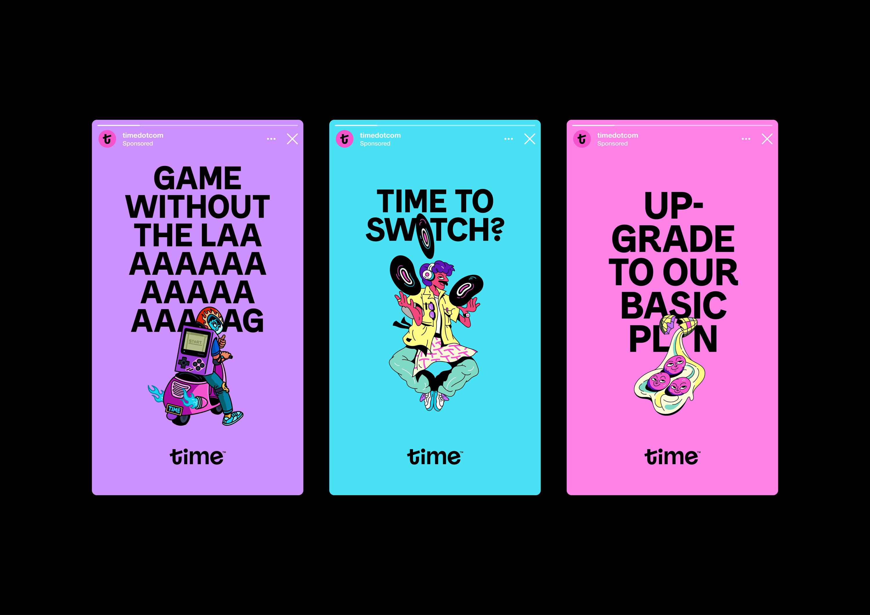
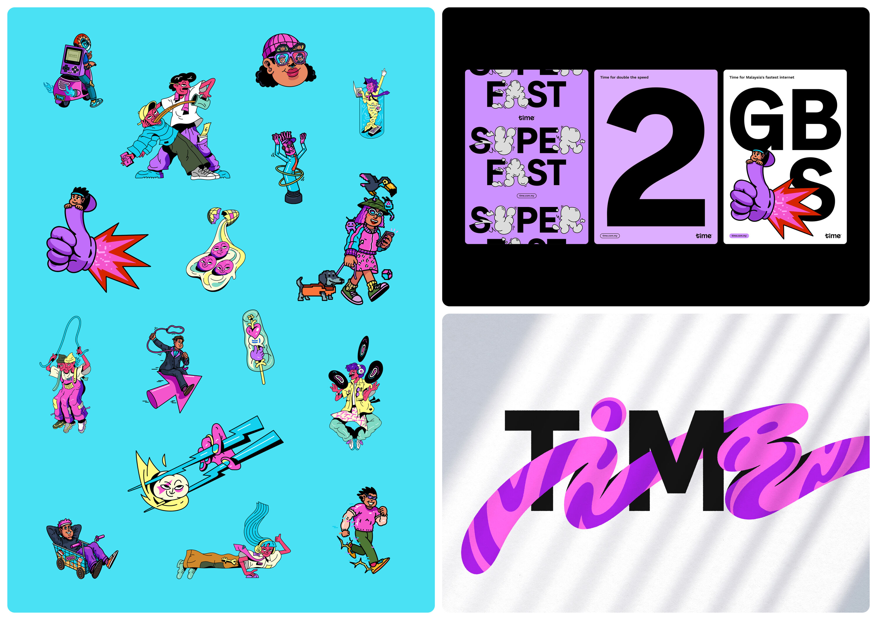
Malaysia's number-one challenger internet provider, Time had long used its purpose-built infrastructure as a selling point – delivering industry-leading speed and reliability. But when new legislation forced its to share this with its competitors, their point of difference was lost overnight.
Time needed to strengthen its brand, staying true to its playful personality while establishing it as Malaysia's most helpful brand. For The People we set out to show that good internet service is essential to our lives, with a voice-led, typographic system that celebrates and amplifies Malaysian culture – including playful illustrations by local artists that bring the country's customs and humour to life.
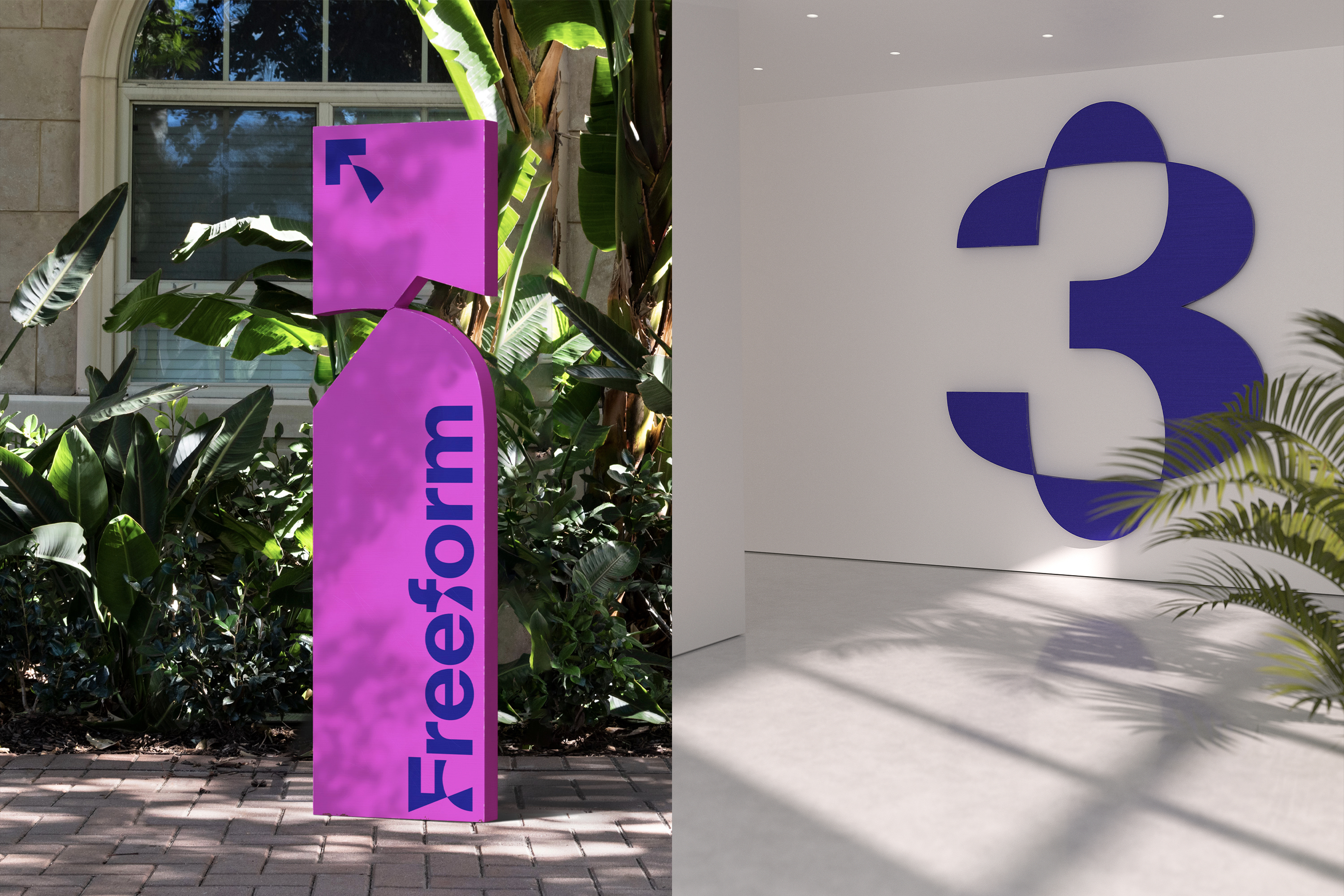
Freeform by COLLINS
- Bronze Award: Entertainment
- Find out more about this project at wearecollins.com
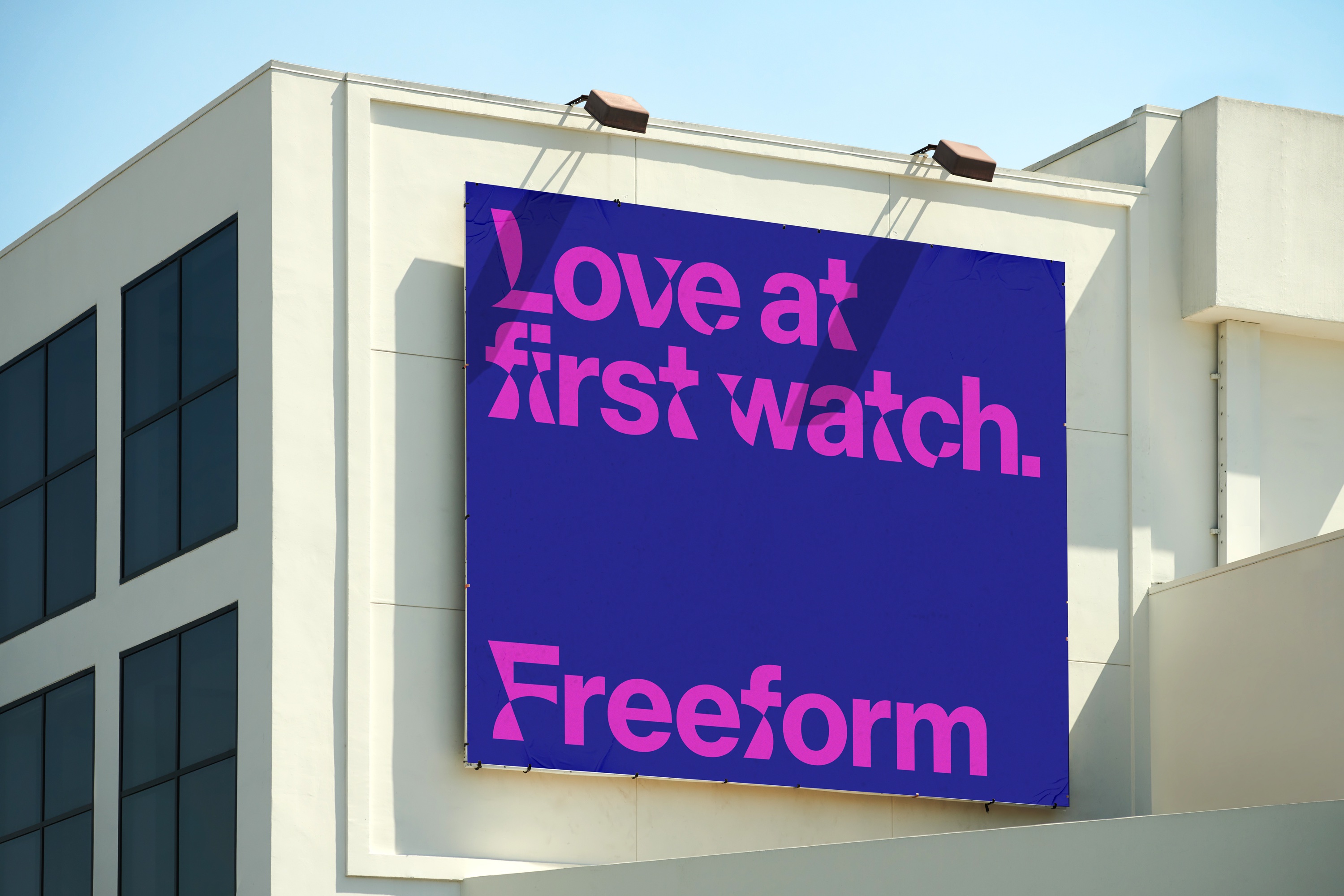
Saturated with algorithm-driven choices, streaming platforms tend to stick to known formulas to win over the code. Freeform backs young adult stories that buck tropes and curb conventions, giving a platform to narratives usually on the periphery.
Freeform unearths deep stories from emerging perspectives, which help people shape their place in the world. Like any great story, its new brand by COLLINS twists and turns, reinventing itself through colour, shape and movement.
When the brand speaks, it's through iconic typeface Neue Haas Grotesk – reworked so it never resolves and is always turned on its head. As a result, Freeform's voice invites you to look again and again.
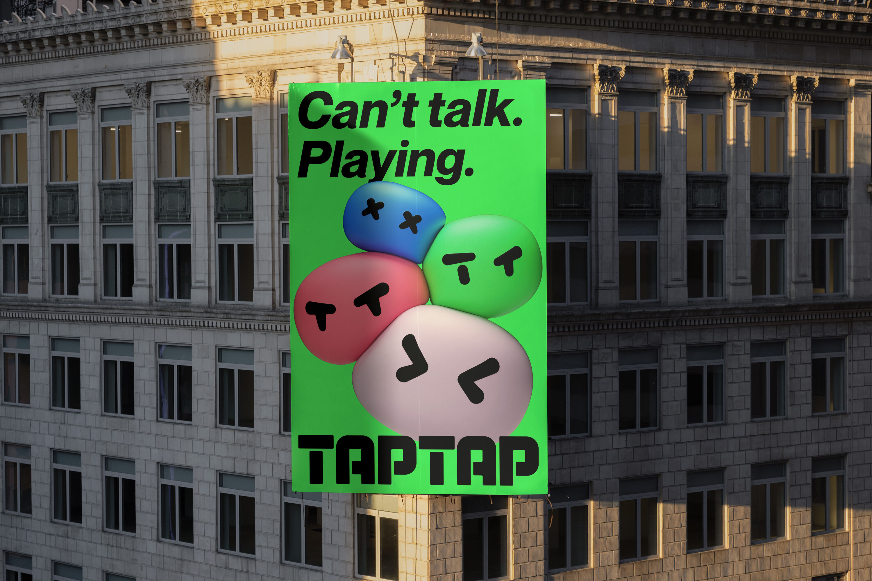
TapTap by DesignStudio
- Bronze Award: Entertainment
- design.studio
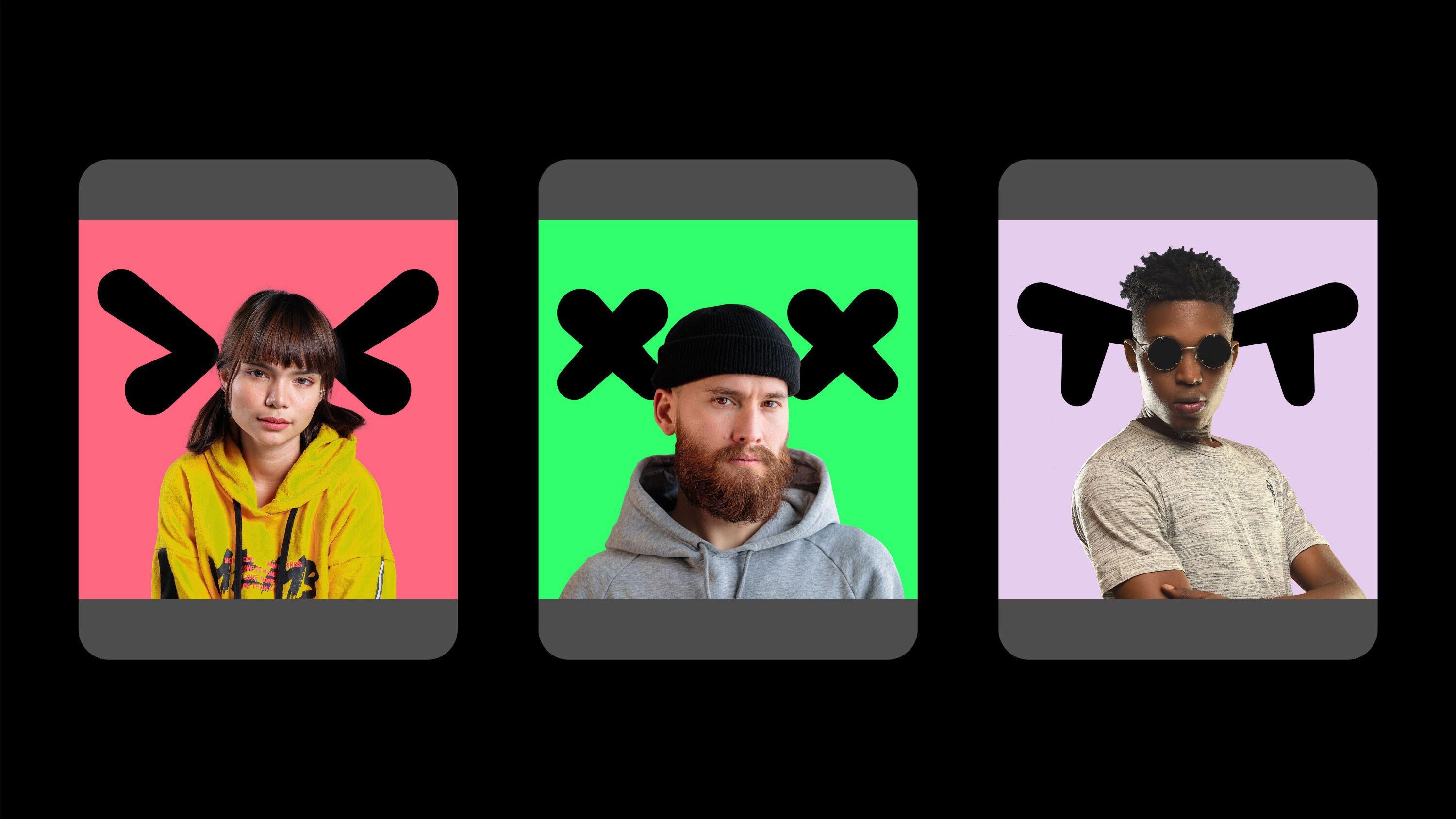
TapTap is a mobile gaming community platform from Chinese developer XD, where mobile gamers meet mobile creators to connect over the games they love. To introduce TapTap to the US, DesignStudio amplified the unabashed optimism at the heart of the platform, with a central brand idea: 'Gamers In'.
Warm and welcoming, TapTap is packed with personality and playfulness. Fronted by a loveable mascot called Tato, it embraces gaming's broad audience – from pro to casual, newb to battle-hardened. In a world where gaming has become big business yet is built on tropes of masculinity, aggression and moodiness, TapTap reminds us what it’s all about: community, creativity, and having fun.
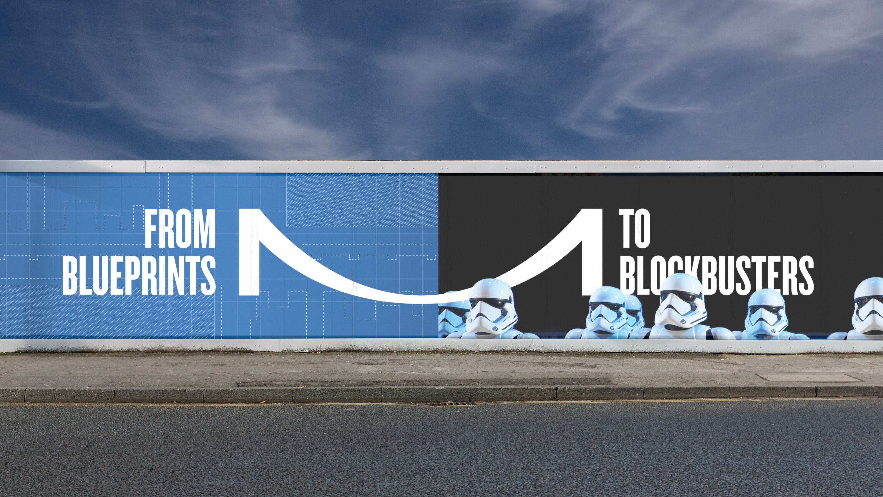
Marlow Film Studios by Saboteur
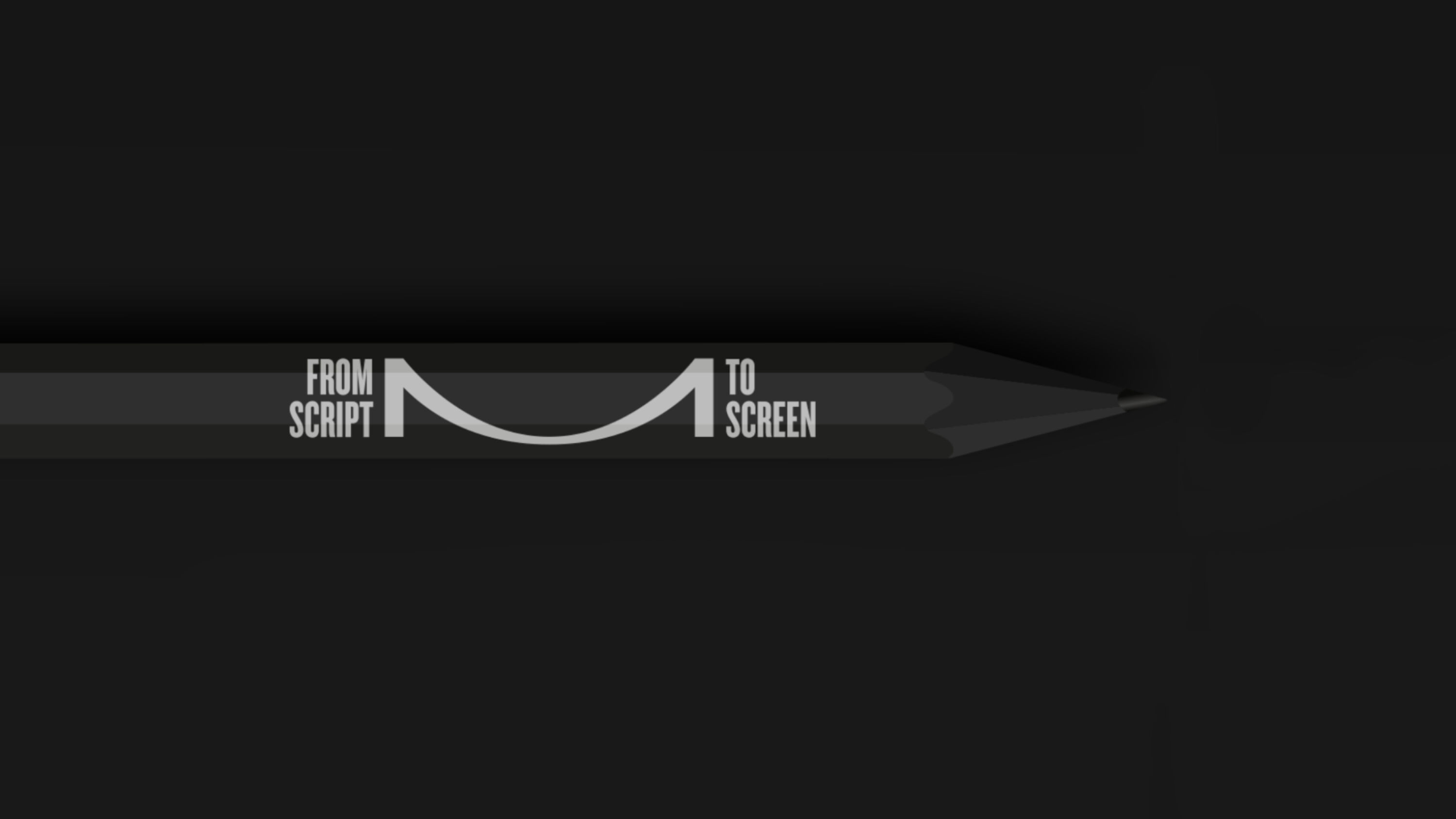
- Bronze Award: Entertainment
- Find out more about this project at saboteur.studio
Despite producing some of the world's most renowned storytellers, most UK film studios are outdated and inadequate. Marlow Film Studios is different: a state-of-the-art hub for British filmmaking, it's set to become the premier destination for high-end TV and film production.
Local community engagement was vital, but the brand also had to appeal to global film-makers looking for state-of-the-art facilities to bring their stories to life.
Based on the historic suspension bridge that crosses the Thames in Marlow, the M-shaped logo is a metaphor for the bridging of ideas and skills. Directors to distributors, camera to action, script to screen, the device connects Marlow to the world.
Swift by Work Less Ordinary
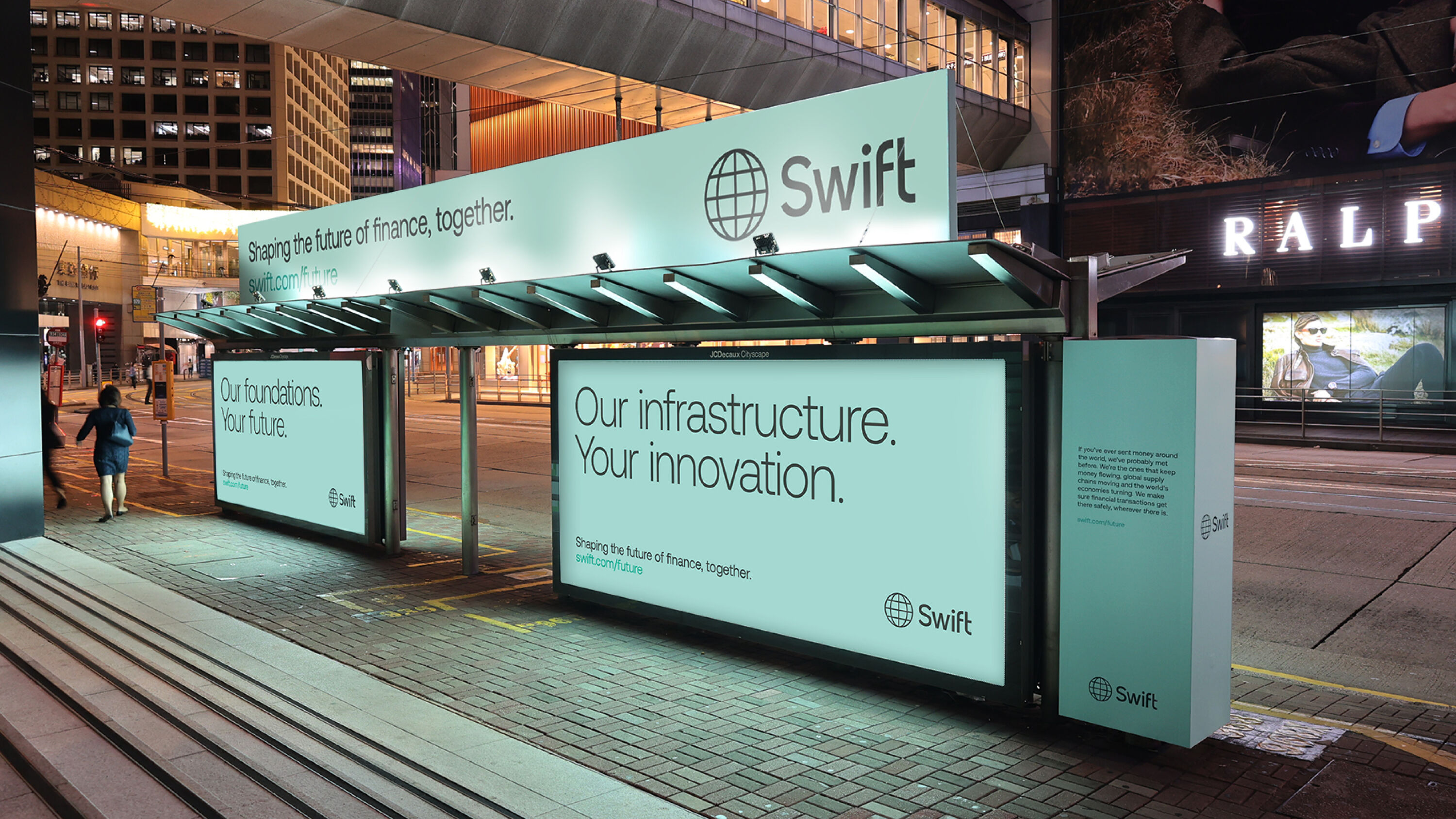
- Bronze Award: Financial Services
- worklessordinary.co
A global co-operative with 4000 employees worldwide, Swift is fundamental to the global economy. But it was perceived as slow and old-fashioned compared to innovative new fintechs. Work Less Ordinary gave Swift a much-needed overhaul to emphasise its mission: 'To empower the financial community to create an inclusive digital economy.'
A suite of CGI treatments help portray Swift as modern, capable and innovative in a fast-changing market, while its new turquoise and dark-green colour palette conveys neutrality, sophistication and heritage in a competitive sector – giving it the confidence to stand its own in a sea of young start-ups.
Rack This Way by Jones Knowles Ritchie
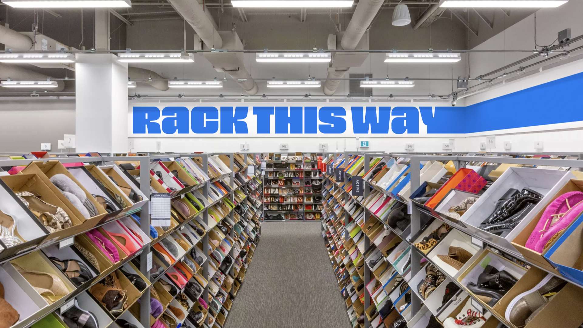
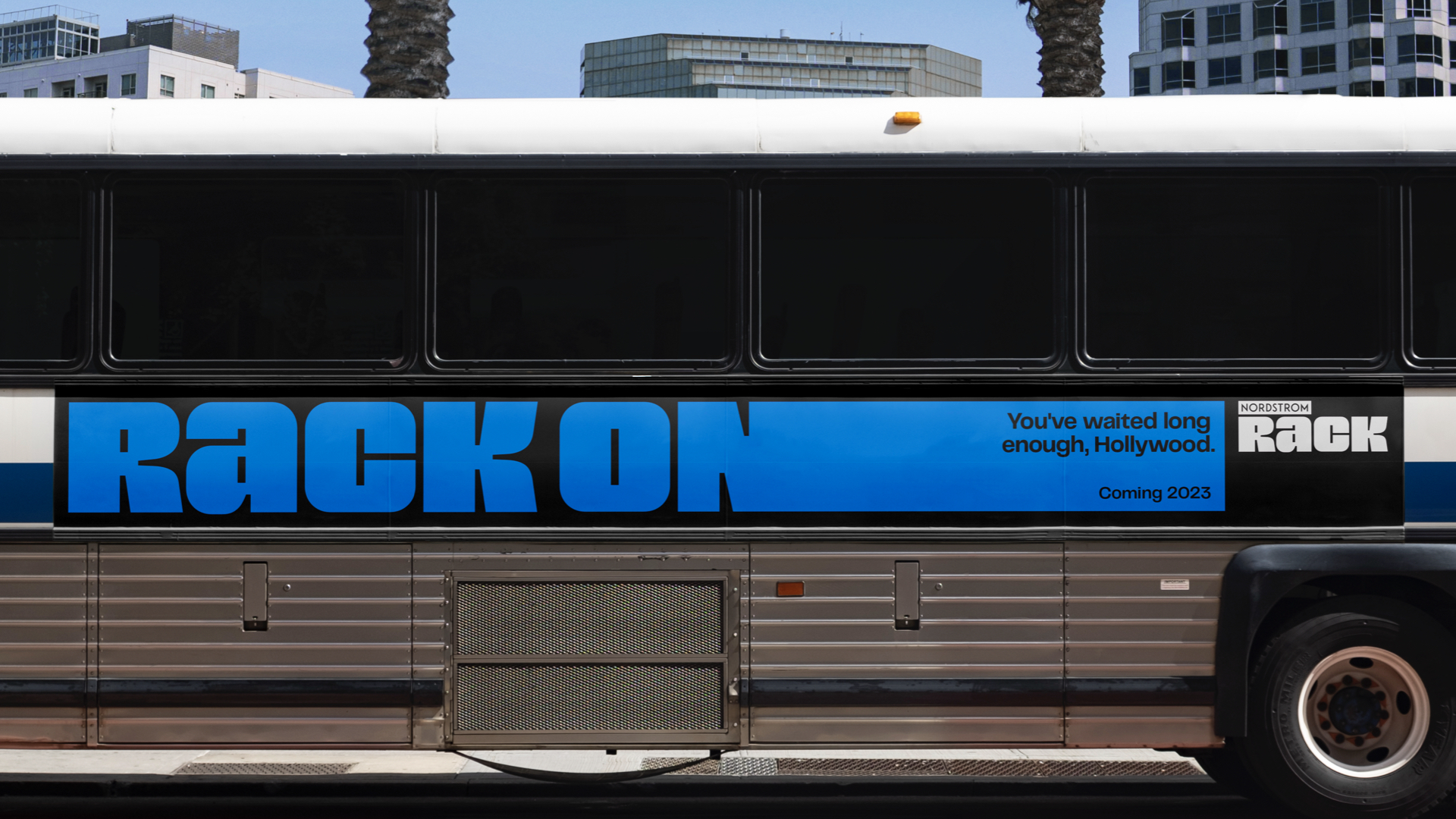
- Retail: Bronze
- jkrglobal.com
Nordstrom Rack needed to stand out in the crowded off-price retail space, and live for more than just deals. JKR approached the project with the philosophy that the only thing better than the deals at Rack, is the customer shopping for them. To capture that energy, the new brand is infused with real swagger – just like Rack aficionados.
Bright, bold and confident, the fully responsive identity system features a variable typeface, a new logo, and bespoke wordmarks custom-fitted to every application – URL to IRL. Photography heroes not just great fashion, but the people who know how to find it – bubbling with personality and life.
Pop Up Grocer by Gander
- Retail: Bronze
- takeagander.com
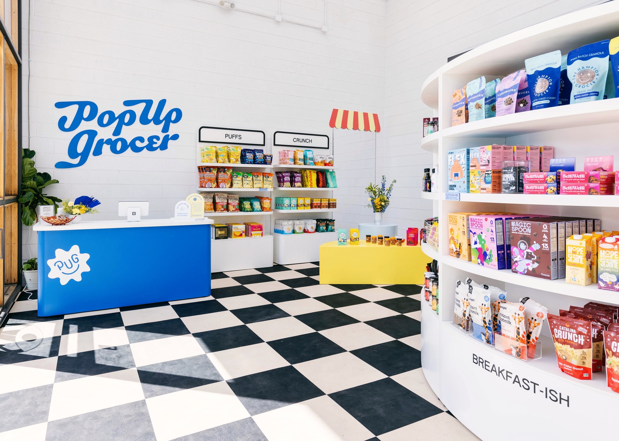
With narrow aisles of food that rarely hold up to modern tastes, the modern grocery store is tired. Oversize shopping carts encourage overconsumption as overplayed soft-pop jingles overhead. A certain joy is missing.
Reliable and delightful, Pop Up Grocer is a neighbourhood grocer in New York and Miami with as much care for the community as for the items it sells. Celebrating small food and new ideas, it encourages discovery – not just shopping.
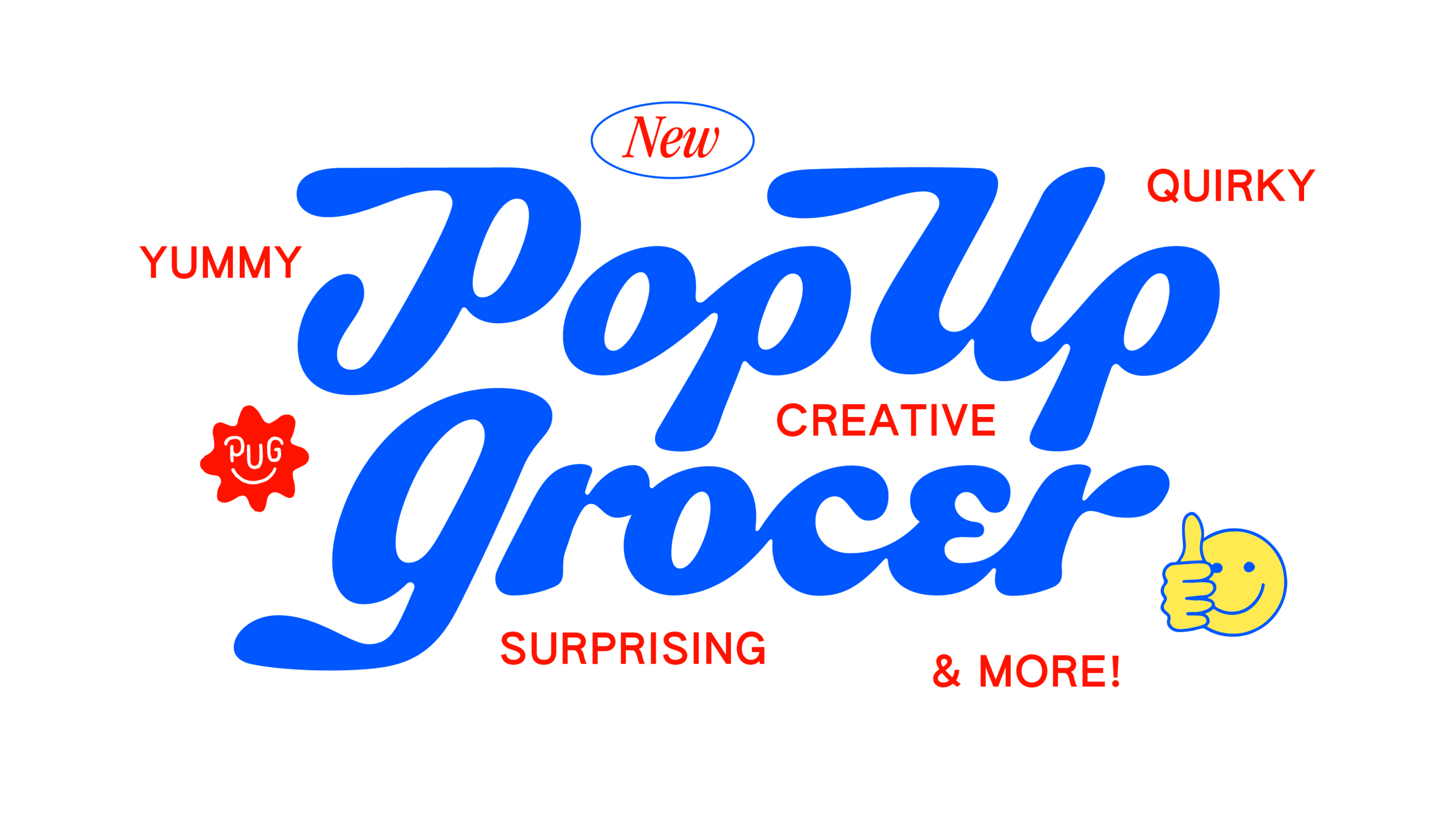
To build this kind of throwback trust, Gander took inspiration from old-school typography and Americana signage, and designed a custom 'penny tile' font. Elevating the discovery of food culture, Pop Up Grocer fits into the lives of modern consumers in a permanent way.
The Week by Elmwood
- Publishing: Bronze
- Find out more about this project at elmwood.com
Part of a group of respected magazines that cover weekly political commentary, The Week is famed for its balanced point of view. Despite a loyal readership, it was keen to recruit new readers through digital and print comms.
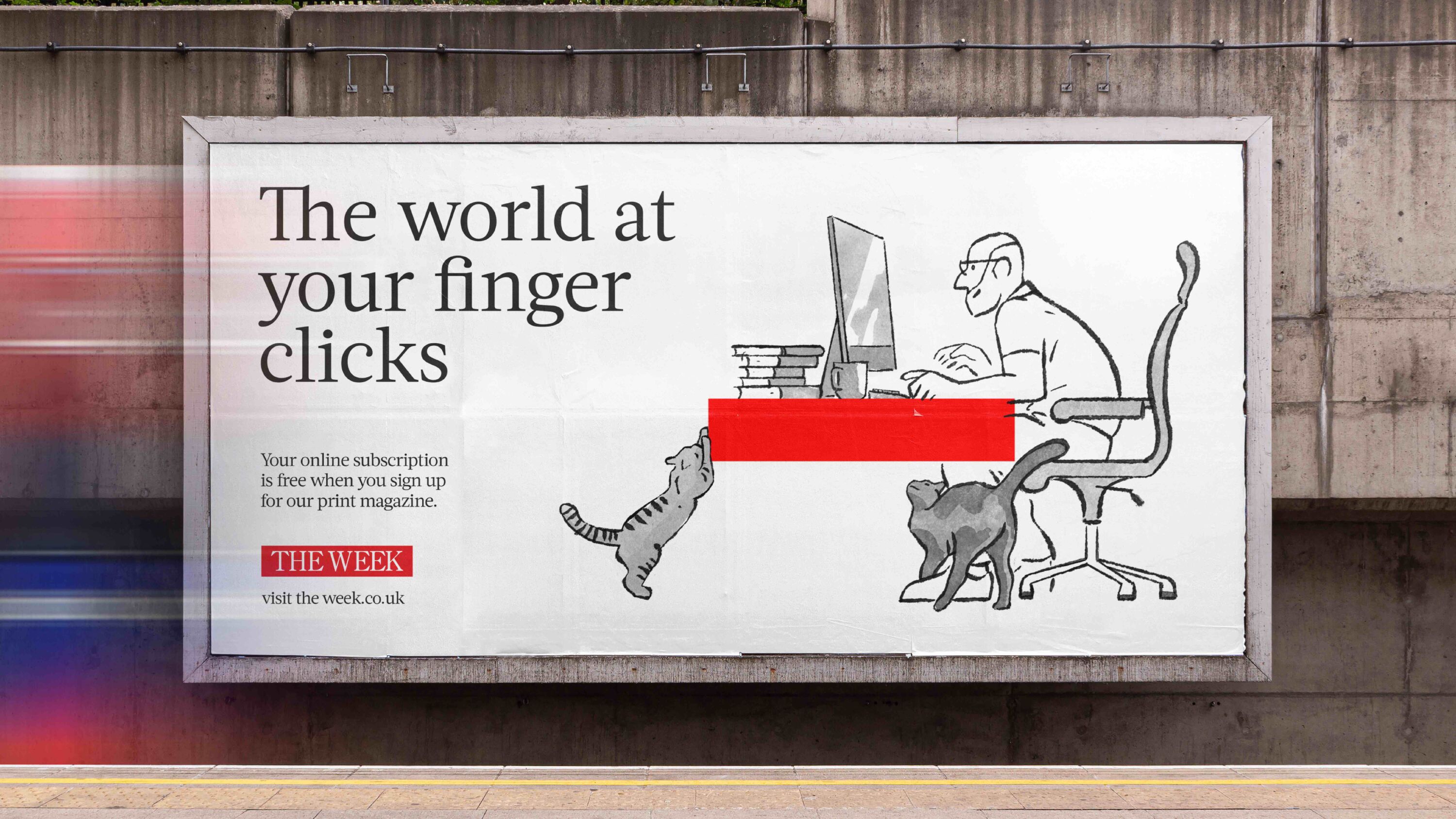
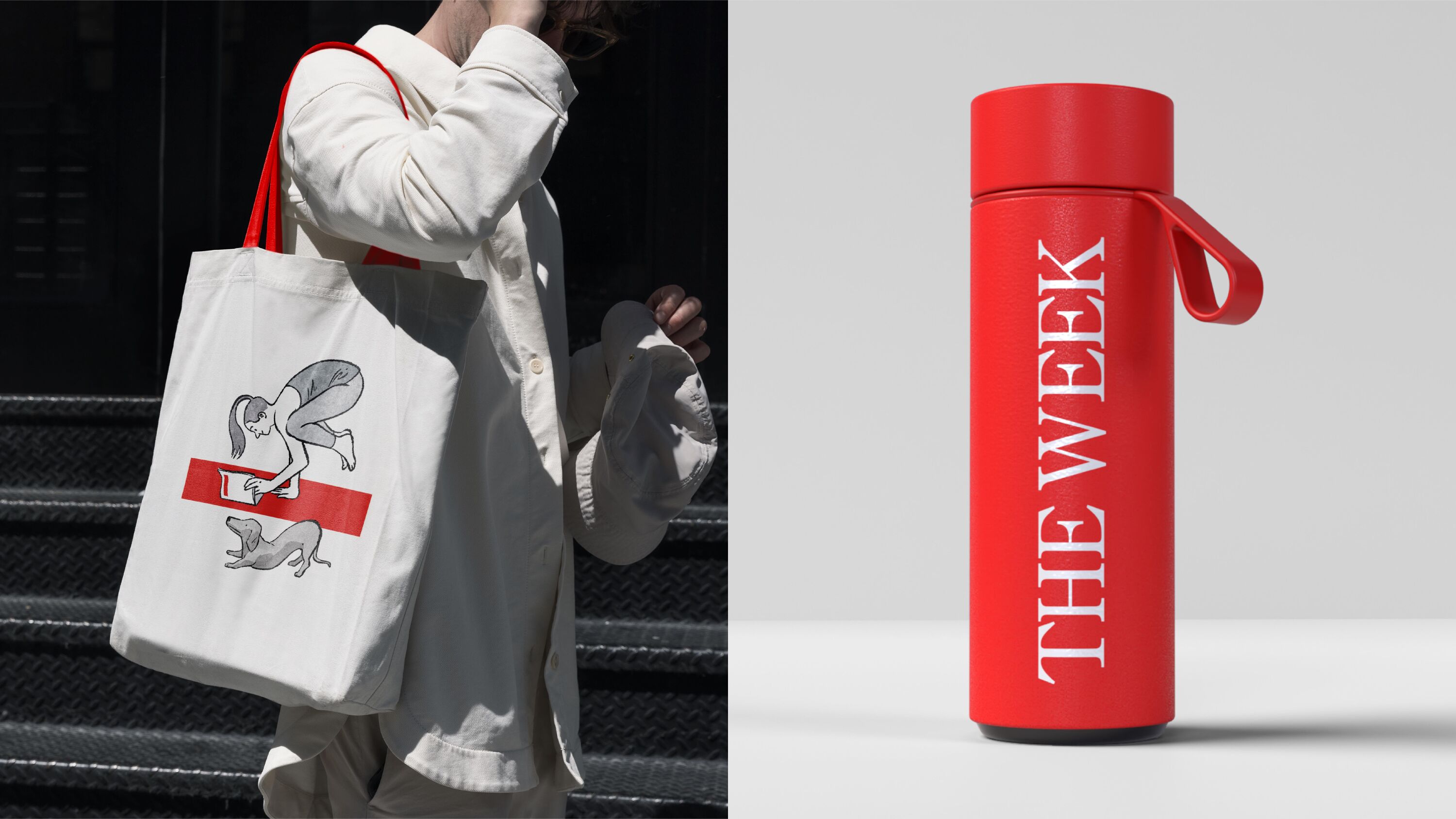
Known for its illustrated covers depicting political satire, there was little room for Elmwood to play within the existing brand toolkit. The iconic red masthead proved a perfect solution: a powerful shorthand device for the brand.
This simple red bar was the gift that kept on giving; at the heart of new scenarios and copy solutions to entice new readers and blend a measured news voice with moments of visual wit.
Compartment Syndrome by Studio Sutherl&
- Publishing: Bronze
- studio-sutherland.co.uk
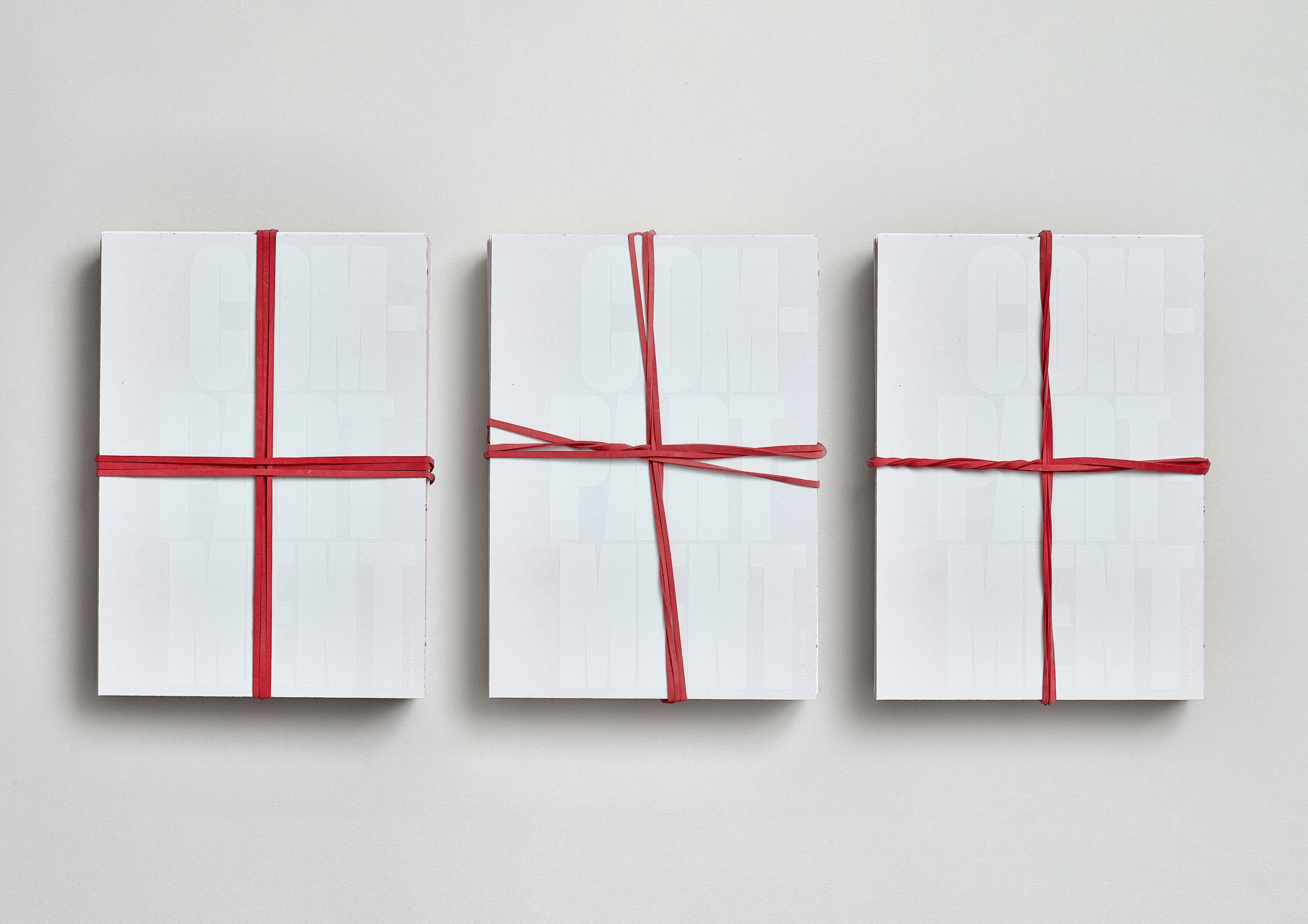
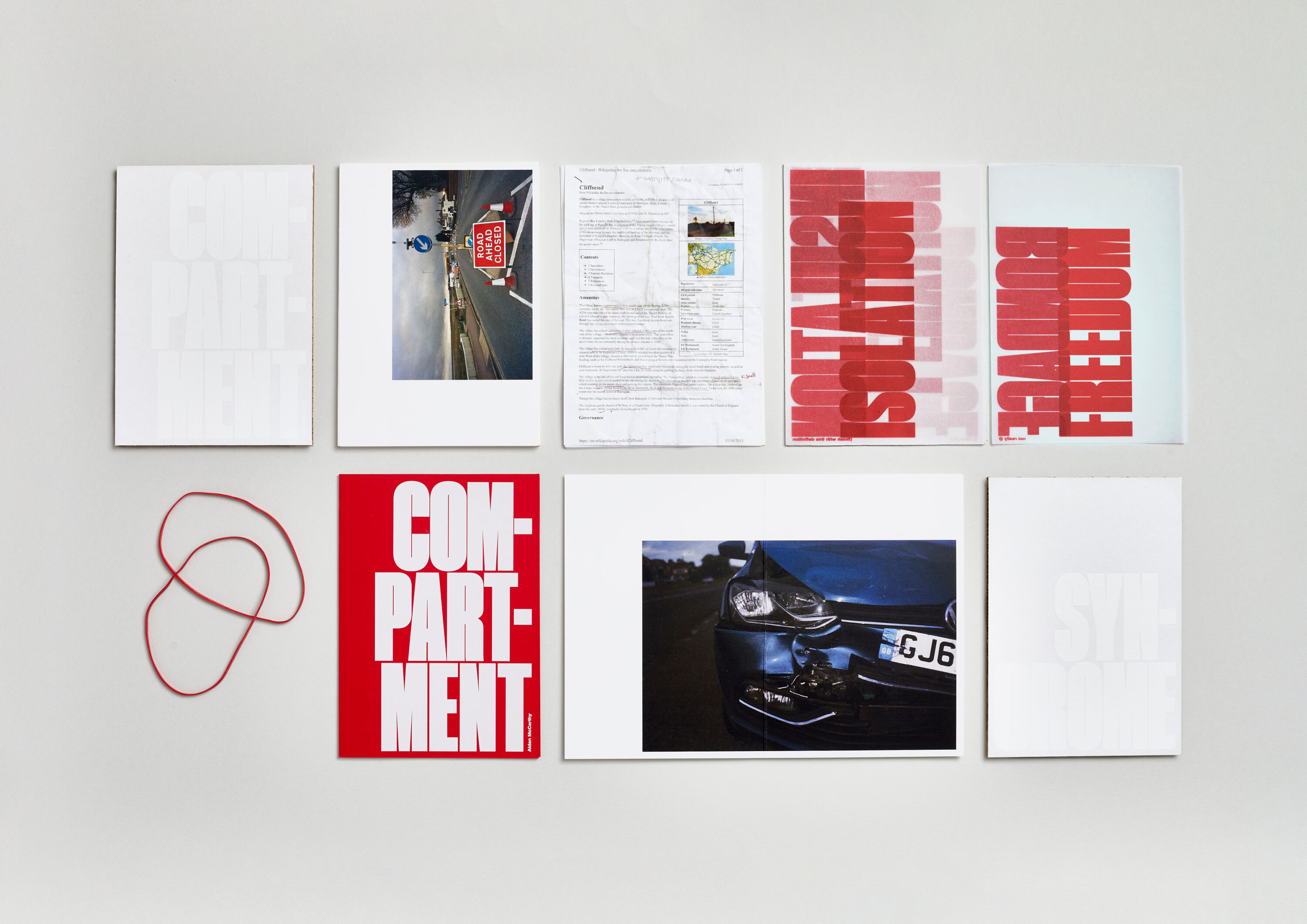
Compartment Syndrome examines the elusive characteristics of Englishness through the lens of a small village on the Kent coast – with particular focus on the divisions that resulted from the Brexit Referendum.
Compartment Syndrome is a medical condition where pressure builds inside a muscle, restricting blood flow and causing pain. As both an end-of-the-line destination and a frontier, the village represents both freedom and restriction.
To symbolise the disparate, random ingredients of Englishness, Studio Sutherl& opted for a loose-leaf format. Typography is super-condensed and expanded to represent compression, while the binding red elastic bands compress the loose-leaf sheets together in the shape of St George's Cross.
Script IP by Mytton Williams
- Bronze Award: Professional Services
- Find out more about this project at myttonwilliams.co.uk
New law firm Script IP makes things simple, champions ideas, and protects the IP that matters. But the brand was outdated, and the firm needed to articulate that difference to attract more hi-tech, high-calibre clients.
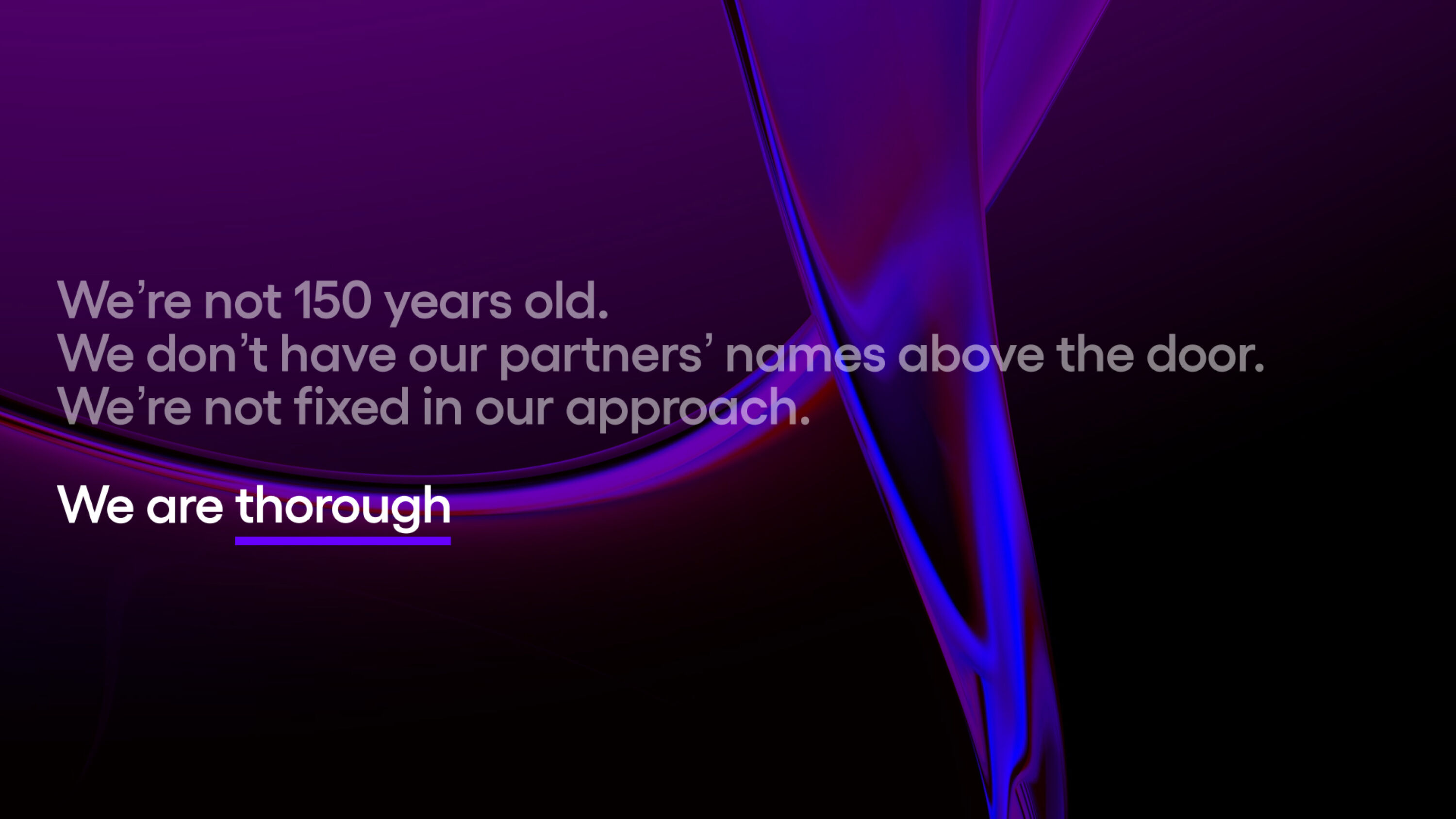
Mytton Williams created a bold, progressive tone of voice to set out Script's stall. A flexible underline device highlights what matters – from the 'IP' in their name, to individual words, sentences or parts of images.
Bright, punchy and modern, the new brand positions Script as purposefully small and future-facing. And in a world facing unprecedented changes, with continued development in AI and ways of working, it's proudly future-facing.
Be Equitable by For The People
- Bronze Award: Professional Services
- Find out more about this project at forthepeople.agency
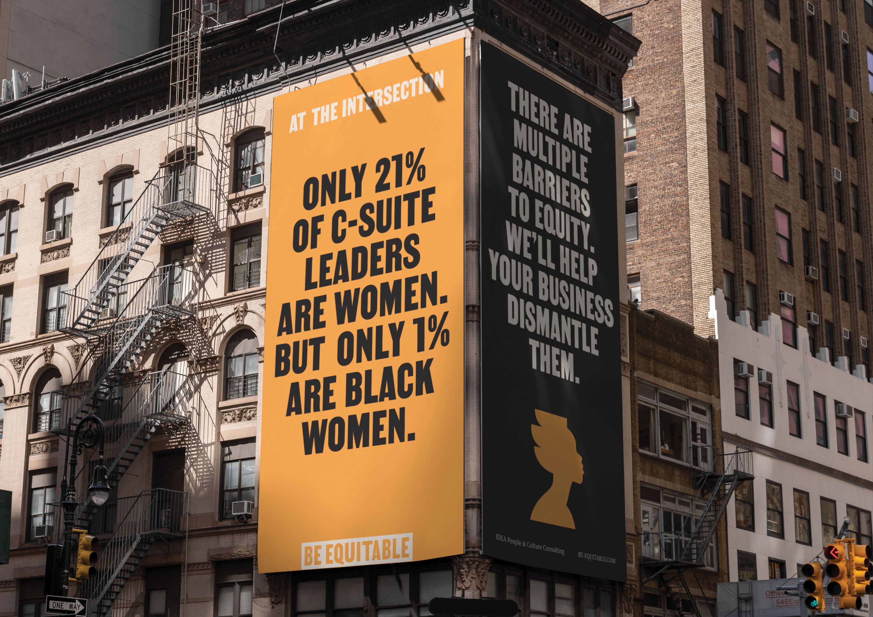
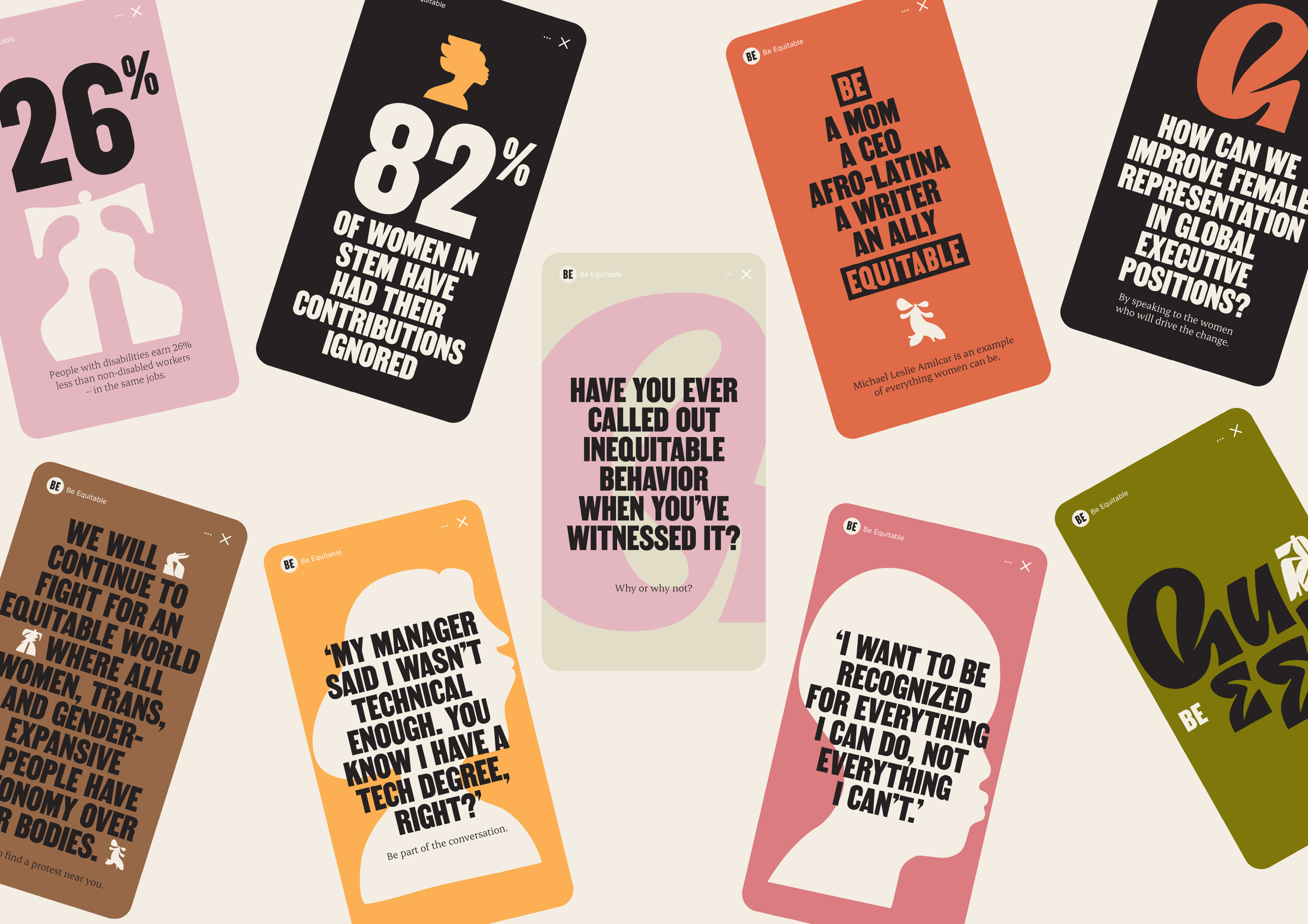
Minority-owned and operated firm Be Equitable is on a mission to cultivate a more inclusive, diverse, equitable and accessible world of work. Over the past 30 years, they've delivered Unconscious Bias training for clients such as NASA, Nintendo, and Verizon.
After Black Lives Matter placed equity at the forefront of the conversation, and businesses began making public commitments to strengthen their commitments. But Unconscious Bias Training wouldn't be enough: they needed systemic organisational change.
Balancing optimistic visuals with an outspoken approach, For The People's new identity invites clients to start that complex journey. Visuals celebrate difference, defy stereotypes, and demonstrate what it truly means to be equitable.
Center Parcs Europe by DesignStudio
- Bronze Award: Transport & Travel
- Find out more about this project at design.studio
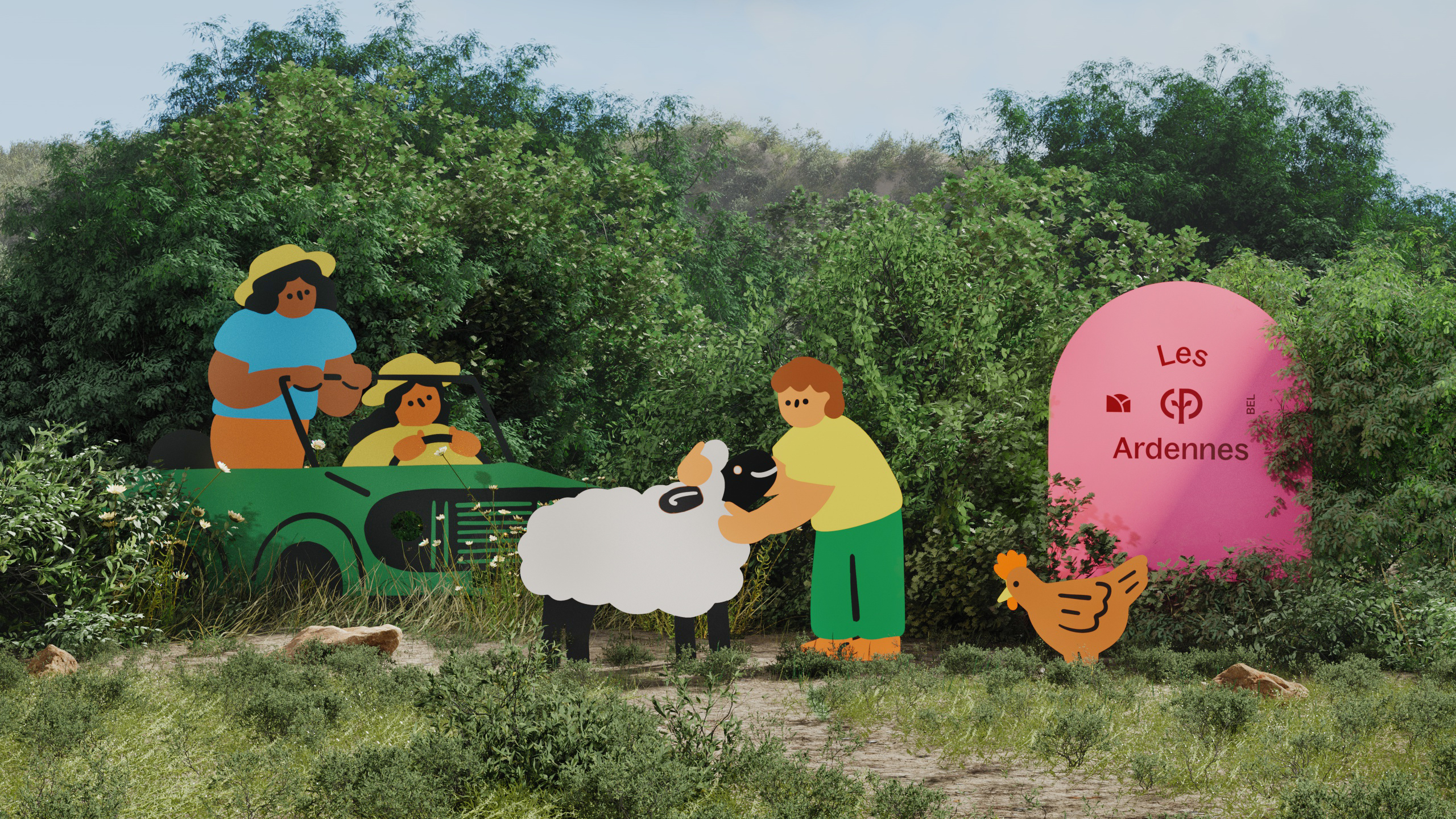
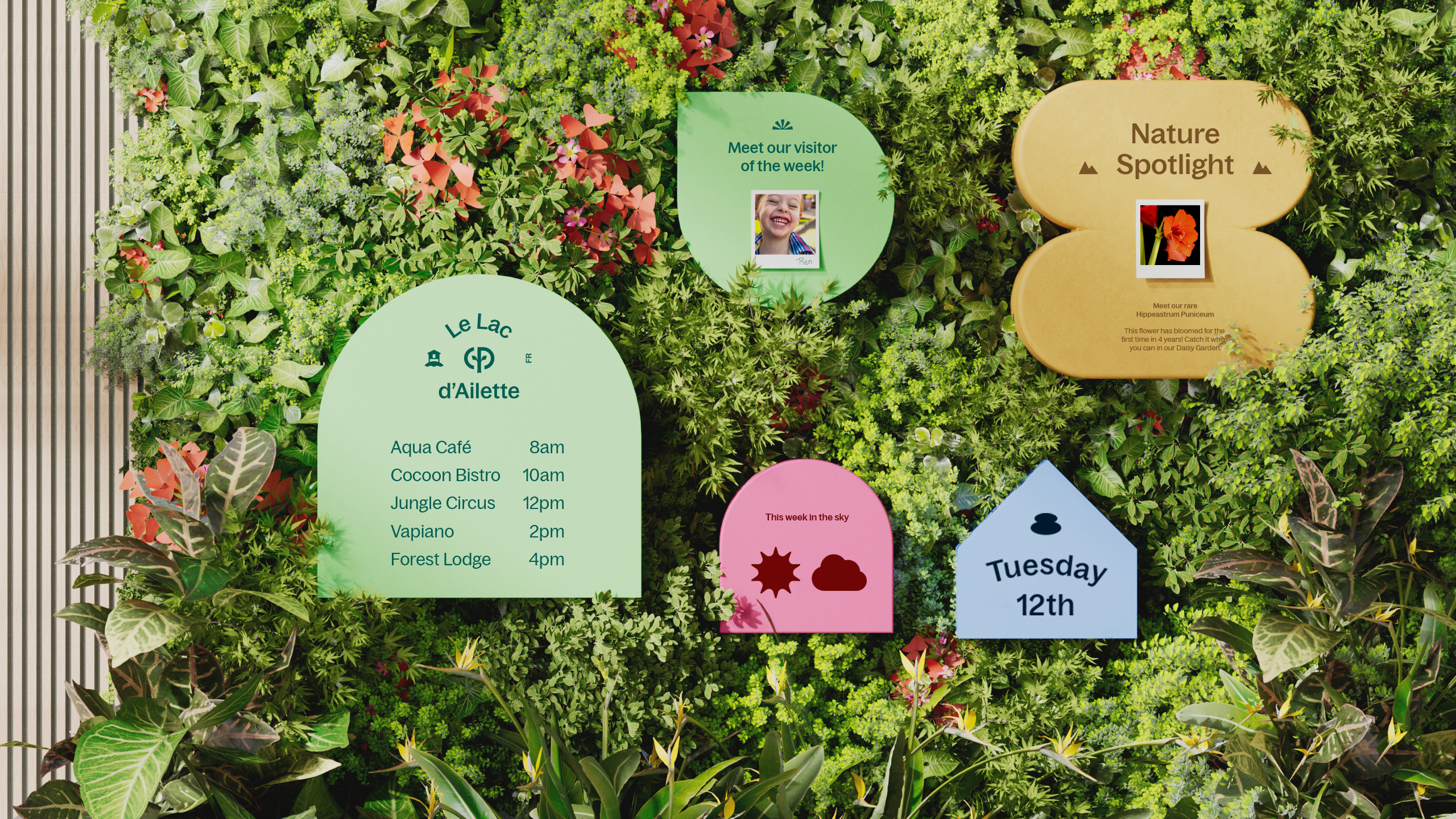
For half a century, Center Parcs Europe has been a pioneer of European travel and hospitality. But it needed a new brand to match its new and improved parks. The organisation was founded on the concept of 'man + nature', and DesignStudio's new brand idea – 'Human Nature' – celebrates these roots.
New brand colours move beyond the expected green, introducing an eclectic, vibrant palette inspired by all facets of the natural world. Location badges celebrate the uniqueness and heritage of each location. And illustration injects warmth, joy, and a human touch across the system – providing Center Parcs Europe with a new way to share stories and ideas.
Download winners showcase
Congratulations to all winning agencies
Thank you to everyone who submitted entries, and congratulations again to all our worthy winners.
Full project credits (as supplied with the entries) are included within the winners' showcase, which you can access below:
Download the 2023 winners showcase
See you in 2024!
Nick has worked with world-class agencies including Wolff Olins, Taxi Studio and Vault49 on brand storytelling, tone of voice and verbal strategy for global brands such as Virgin, TikTok, and Bite Back 2030. Nick launched the Brand Impact Awards in 2013 while editor of Computer Arts, and remains chair of judges. He's written for Creative Bloq on design and branding matters since the site's launch.
