The Euro 2024 logo is packed with clever Easter eggs
UEFA 2024 has begun, so you have probably started to see a lot of the Euro 2024 logo. The vibrant design is being used everywhere from promotional materials and TV graphics to shirt sleeves on the pitch.
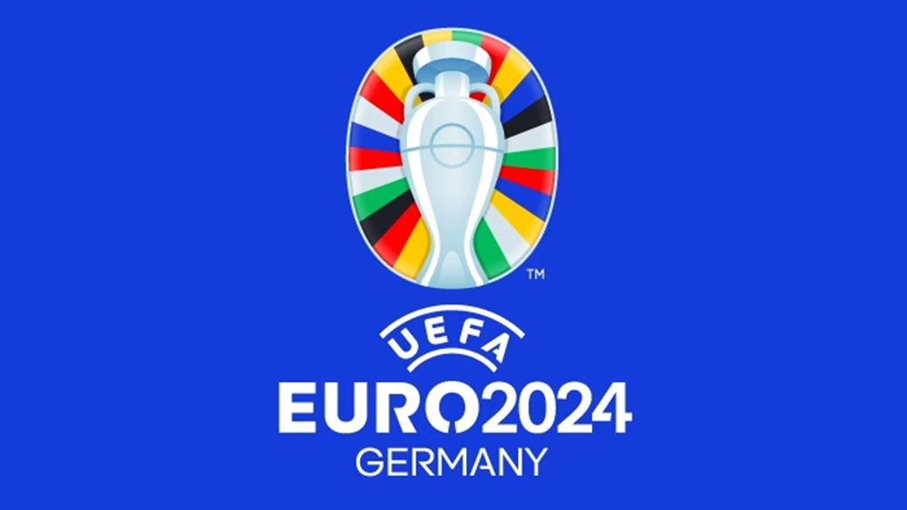
At first glance, the colourful design shows the European Football Championship trophy, the Henri Delaunay cup, much like the logos for the last two editions (see our history of the UEFA Euro logo. This time there's the addition of football pitch markings on the cup itself, and a colourful oval backdrop. But closer inspection reveals several little Easter eggs packed into the design (we do love nice logo design secrets).
The Euro 2024 logo meaning

The design will be appearing everywhere for the duration of the European Championships in Germany from June 14 to July 14, so let's take a look at what the Euro 2024 logo means.
Article continues belowFirst, we have the Henri Delaunay cup. Named after UEFA’s first general secretary, who promoted the idea of a European Championship, this is the trophy that's been received by the winning team since 1960. Those aren't random colours behind it. There are 24 stripes to represent the 24 teams competing in the tournament, while the colours themselves are taken from the flags of UEFA’s 55 member associations. This is a design decision that's intended to promote diversity, avoiding the frequent tradition to use national colours.
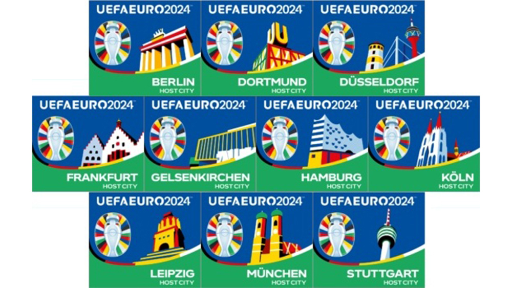
And if you're thinking the shape of the Euro 2024 logo is a bit unusual, there's a reason for that. It isn't a classic oval shape and that's because it's based on the form of the roof of the Berlin's Olympiastadion, the host venue for the Euro 2024 final on July 14. Other design assets for Euro 2024 include designs for each of the ten host cities, each showing a famous landmark in similarly vibrant colours. The continues a tradition started at the previous event, where each of the host cities had a design featuring its best known bridge.

Berlin's design shows the Brandenburg Gate,while Munich's shows the Frauenkirche and Stuttgart's shows its iconic communications tower, Fernsehturm Stuttgart.
According to UEFA, the Euro 2024 logo and the wider Euro 2024 branding "promotes a Euro where everyone feels welcome and diversity is celebrated." Developed by VMLY&R, the branding was first unveiled with a light-show at the Olympiastadion back in October 2021.
Sign up to Creative Bloq's daily newsletter, which brings you the latest news and inspiration from the worlds of art, design and technology.
See our pick of the best sports logos for more inspiration (and take a look at the old Red Sox logo for an example of a sports logo gone wrong!) We also have our own golden rules of logo design.

Joe is a regular freelance journalist and editor at Creative Bloq. He writes news, features and buying guides and keeps track of the best equipment and software for creatives, from video editing programs to monitors and accessories. A veteran news writer and photographer, he now works as a project manager at the London and Buenos Aires-based design, production and branding agency Hermana Creatives. There he manages a team of designers, photographers and video editors who specialise in producing visual content and design assets for the hospitality sector. He also dances Argentine tango.
