New Fantastic 4 logo design is a retro delight
We're in for a '60s revival.

Sign up to Creative Bloq's daily newsletter, which brings you the latest news and inspiration from the worlds of art, design and technology.
You are now subscribed
Your newsletter sign-up was successful
Want to add more newsletters?
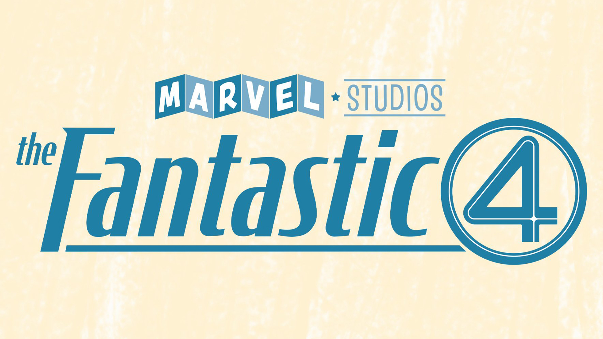
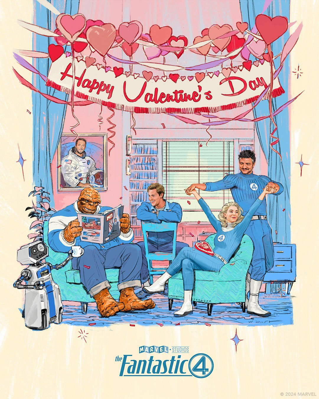
Marvel has debuted the cast of the upcoming Fantastic 4 movie and alongside it is an exclusive look at the movie's new logo. With the promotional poster's stylish 60s-inspired design, fans are highly anticipating a retro revival from the studio, with hopes that the film will be a homage to the comic's original art style.
This year we've seen plenty of stunning film posters but Marvel's latest design has embraced a retro aesthetic that's been somewhat underappreciated in recent poster design trends. With its stylised design, the poster hints at a welcome dose of retro-futurism – an exciting prospect for new and old Marvel fans alike.

The new logo is simple yet quintessentially Fantastic 4, with a pale yellow and bright blue colourway gesturing to the original comic's signature colour scheme. With a nostalgic retro feel that looks straight out of a '60s TV show, the typography compliments the promotional poster perfectly. As various Reddit users have noted, it's impressive how much context fans can extract from such a simple logo design, proving the design's strategic effectiveness.
Article continues belowWhile Wandavision bought fans a taste of retro aesthetics, it's exciting to see Marvel (potentially) venturing into a full-blown 60s-themed film. With such a rich comic history, it feels well overdue that the studio brings these classic designs to life. For more Marvel news, take a look at the new Madame Web posters, or check out the surprisingly stylish new poster for the worst Star Wars movie.

Sign up to Creative Bloq's daily newsletter, which brings you the latest news and inspiration from the worlds of art, design and technology.

Natalie Fear is Creative Bloq's staff writer. With an eye for trending topics and a passion for internet culture, she brings you the latest in art and design news. Natalie also runs Creative Bloq’s 5 Questions series, spotlighting diverse talent across the creative industries. Outside of work, she loves all things literature and music (although she’s partial to a spot of TikTok brain rot).
