Duolingo gets a new logo and feathery custom typeface
Owl mascot Duo inspired the new look.

Sign up to Creative Bloq's daily newsletter, which brings you the latest news and inspiration from the worlds of art, design and technology.
You are now subscribed
Your newsletter sign-up was successful
Want to add more newsletters?
Language learning app Duolingo has amassed a huge user base of 300 million people, thanks in no small part to its playful branding and gamified approach. However its visual elements were starting to lag behind its rapidly expanding reach. Enter Johnson Banks and Fontsmith, who have worked together to create a fun bespoke font for Duolingo called Feather bold.
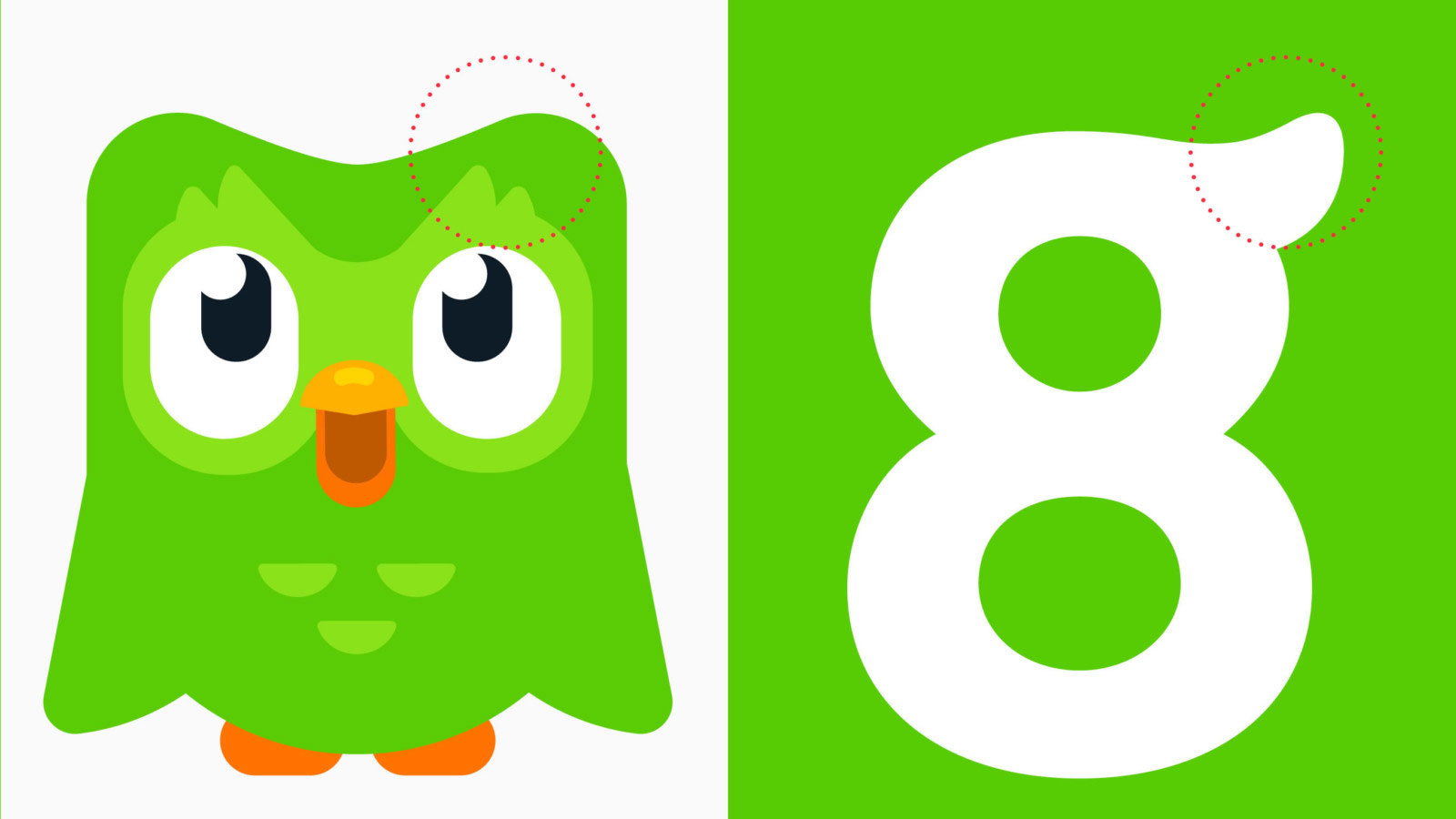
We've already seen how fun fonts can liven up a design, but Feather bold goes one step further as it captures the spirit of the app's owl mascot, Duo. The story behind the typeface was shared on the Johnson Banks site, which reveals how elements of Duo informed the shape of the lettering.

"Visually, their owl mascot (Duo), the core colour, and their illustration style were broadly working," the design consultancy explains. "But they lacked clear guidelines on how to use the brand 'away' from the app environment."
Article continues belowWith the help of independent type foundry Fontsmith, Johnson Banks was able to address this by fine-tuning the logotype and extending the look to the Feather bold typeface as a whole. This includes quirks such as the flick found in the lowercase 'g', and a wing tipped stem junction.
"Instead of using neutral typography alongside the symbol (like every other tech company), we redrew the logotype drawing inspiration from Duo's feathery form to reflect the company's quirky personality," it adds.

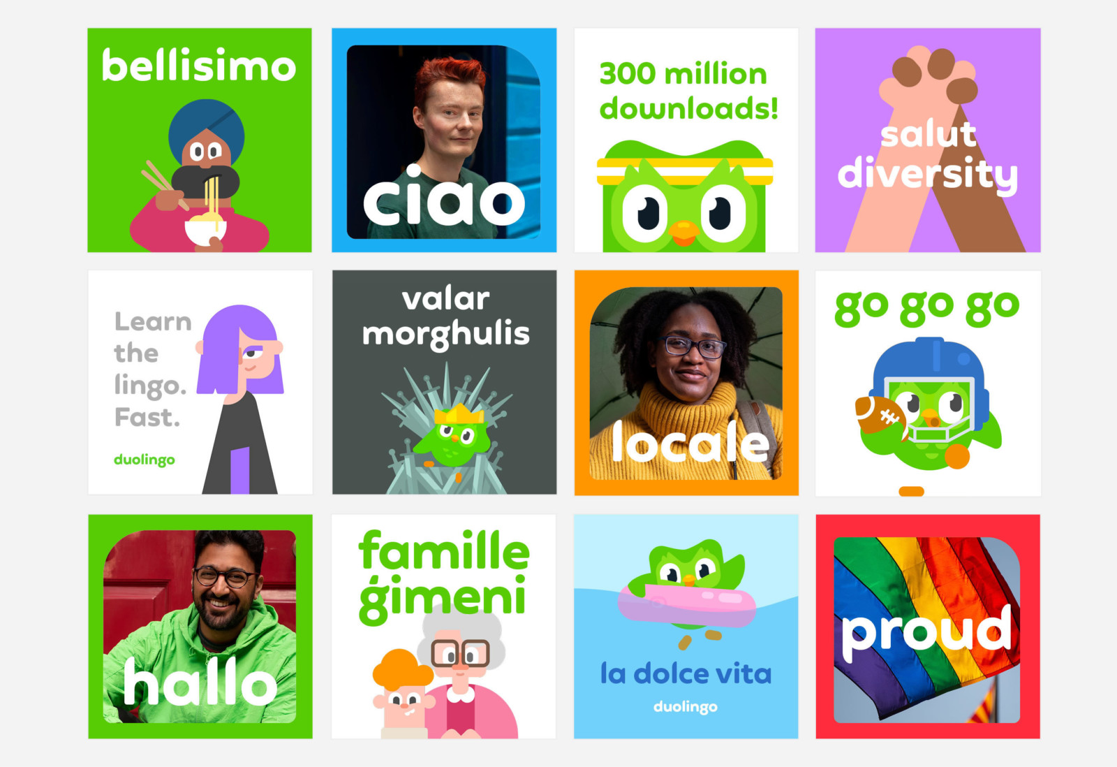
As well as creating Feather bold, Johnson Banks also helped to develop a clearer tone of voice and guidelines for the Duolingo brand. At the heart of this identity was the idea that 'everyone can Duolingo'.
New logo lock-ups, revised colours, and illustration guides accompany the new typographic styling. All of these elements are now being introduced across digital and physical touchpoints, with future merchandise plans already in place.
Sign up to Creative Bloq's daily newsletter, which brings you the latest news and inspiration from the worlds of art, design and technology.

The launch of Feather bold isn't the first Duolingo update to roll out this year. Back in January the app redesigned its green owl mascot in the hope of making the tool more engaging.
And having laid the foundations for this typographic update, we'd say they did a
buen trabajo (that's Spanish for nice job).
Related articles:

Dom Carter is a freelance writer who specialises in art and design. Formerly a staff writer for Creative Bloq, his work has also appeared on Creative Boom and in the pages of ImagineFX, Computer Arts, 3D World, and .net. He has been a D&AD New Blood judge, and has a particular interest in picture books.
