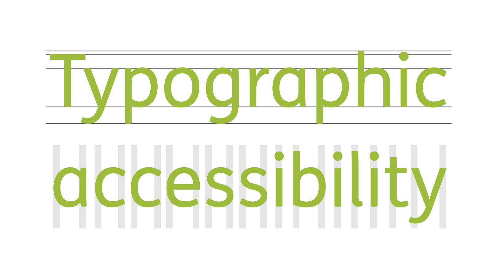
How accessible is your typeface?
This infographic from Fontsmith explains how designers can gauge the accessibility of their typefaces.

When it comes to creating or choosing professional fonts for public use, it's important to keep in mind how accessible they are. Accessible typography gets your message across smoothly, and they are more legible for people with learning difficulties. To help designers gauge how accessible their font is, Fontsmith have produced this infographic.

Using one of their most accessible typefaces, FS Me, which was researched and developed with charity Mencap, Fontsmith's infographic points out the main features to look for when it comes to choosing an inclusive font.
While designing an accessible typeface isn't an exact science, the creative director and founder of Fontsmith, Jason Smith, hopes this infographic will help designers understand where typefaces sit on the scale.
"Inclusive design has always been important but we have seen an increase in enquiries for accessible typefaces from our clients, not just charities and public bodies but also banks, supermarkets and other large organisations," Smith explains. "They recognise the importance of being inclusive to all and are looking for stylish designs which aren’t childish or patronising."
Sign up to Creative Bloq's daily newsletter, which brings you the latest news and inspiration from the worlds of art, design and technology.

Dom Carter is a freelance writer who specialises in art and design. Formerly a staff writer for Creative Bloq, his work has also appeared on Creative Boom and in the pages of ImagineFX, Computer Arts, 3D World, and .net. He has been a D&AD New Blood judge, and has a particular interest in picture books.

