Iceland's football logo reveal is ludicrously exhilarating
Other brands: take note.
Sign up to Creative Bloq's daily newsletter, which brings you the latest news and inspiration from the worlds of art, design and technology.
You are now subscribed
Your newsletter sign-up was successful
Want to add more newsletters?
Iceland has enjoyed huge success in the world of football in recent years, with the men's team becoming the smallest country ever to qualify for the World Cup in 2018, and the women's team being named 18th in the world by FIFA last year. In honour of its "fighting spirit", the team has been given a brand new identity – and it certainly packs a punch.
KSI, Iceland's national football association, worked with Reykjavík-based agency Brandenburg to design the identity, which features a new logo and typeface inspired by ancient folklore (check out our best logos of all time for more inspiration).

The old logo (featuring a football and the Icelandic flag) was shared by KSI, and has now been replaced by a symbol based on the 'four guardians' of Iceland: a bull, a giant, a dragon and an eagle. While it's quite a busy logo, it's certainly impressive that it manages to portray all four guardians in such an abstract yet coherent symbol. KSI introduced Brandenburg's design (and the four guardians) in a cinematic video – and if we're honest, a new logo has never filled us with quite so much adrenaline:
Article continues below"The guardian spirits have been the protectors of Iceland since 1918 and are the perfect symbol for the national team," KSI explains. "They are symbols of solidarity and defend the stronghold, which other teams fear, our home ground. Their fighting spirit, resolve and perseverance are all-encompassing."

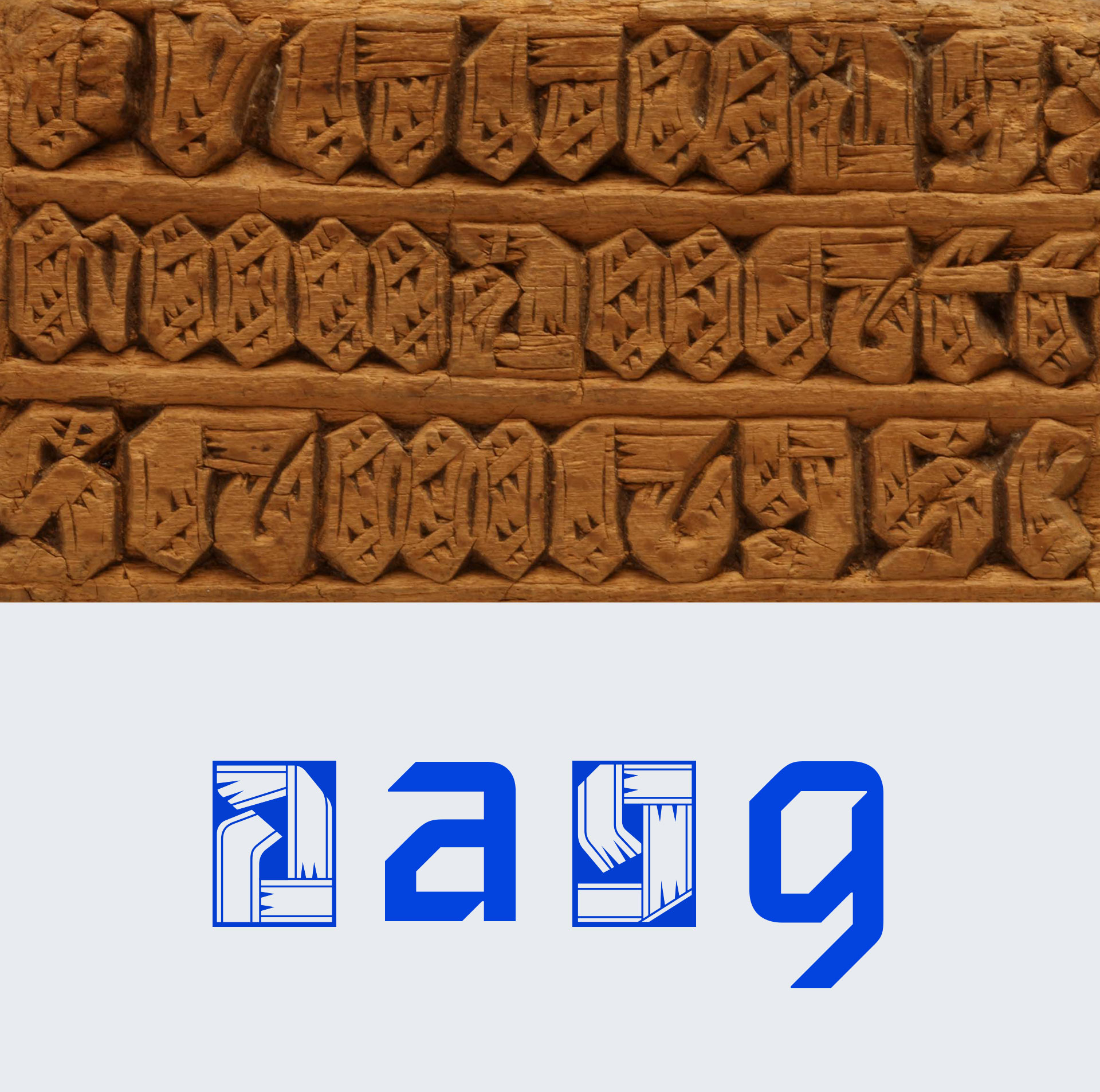
KSI also introduced an all-lowercase typeface (above), which features similar sharp angles to the new logo. Described as “a distinctive blend of old traditions and modern styles,” the unnamed typeface also includes a decorative version, inspired by traditional wood carvings.
Football logos mean a lot to fans, and rebrands aren't always welcome (as American team LA Rams recently found out the hard way). But Brandenburg and KSI's efforts feel like a success to us, resulting in an identity that's both contemporary and steeped in heritage – not to mention fighting spirit. With that spirit in mind, if anyone needs us, we'll be watching that video again.
Read more:
Sign up to Creative Bloq's daily newsletter, which brings you the latest news and inspiration from the worlds of art, design and technology.

Daniel John is Design Editor at Creative Bloq. He reports on the worlds of design, branding and lifestyle tech, and has covered several industry events including Milan Design Week, OFFF Barcelona and Adobe Max in Los Angeles. He has interviewed leaders and designers at brands including Apple, Microsoft and Adobe. Daniel's debut book of short stories and poems was published in 2018, and his comedy newsletter is a Substack Bestseller.
