Peanut butter is one of those foods that people either love or hate, but whichever side you sit on, it's hard not to love these designs for the new peanut butter producer Mothernutter. The brand has got a funky look to match its cheeky name, with 70s-inspired psychedelic visuals.
It's bright, it's bold, and there's even a clever little Easter egg in the negative space of the brand name (see our pick of the best branding books if you're looking for inspiration for your own branding work).

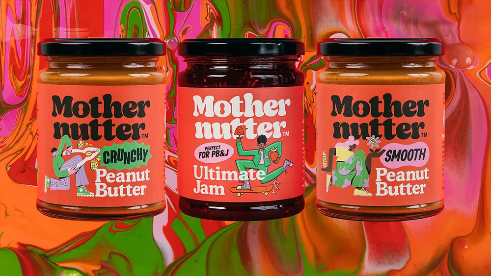
The new branding is the work of Analogue, which was tasked with creating a bold identity that reflects Mothernutter's focus on green values and quality ingredients. With the market for sustainable, natural products already pretty crowded, the agency sought out an original approach with a little retro magic, turning to the "positivity and vibrancy of the fun-loving ’70s" for the brand's colours and typeface.
It's created unique illustrations for each product, including the new UK company's Ultimate Jam (that's jelly, if you're in the US), to give them their own character. The crunchy peanut butter sports a more angular character cracking a peanut, the smooth version has a softer-edged illustration.

The exuberant modern-retro typeface feels approachable and organic, which matches the brand's values, and it also allows for a clever little feature in the negative space, with the centre of the 'o' in the brand's name forming the shape of a peanut. Very nicely done.
Looking for more inspiration? See our pick of some of our favourite packaging designs. As for what to avoid, take a gander at these design fails that were so bad they're good.

