New Sears logo is giving us design déjà vu
We feel like we've seen the new Sears logo somewhere before.

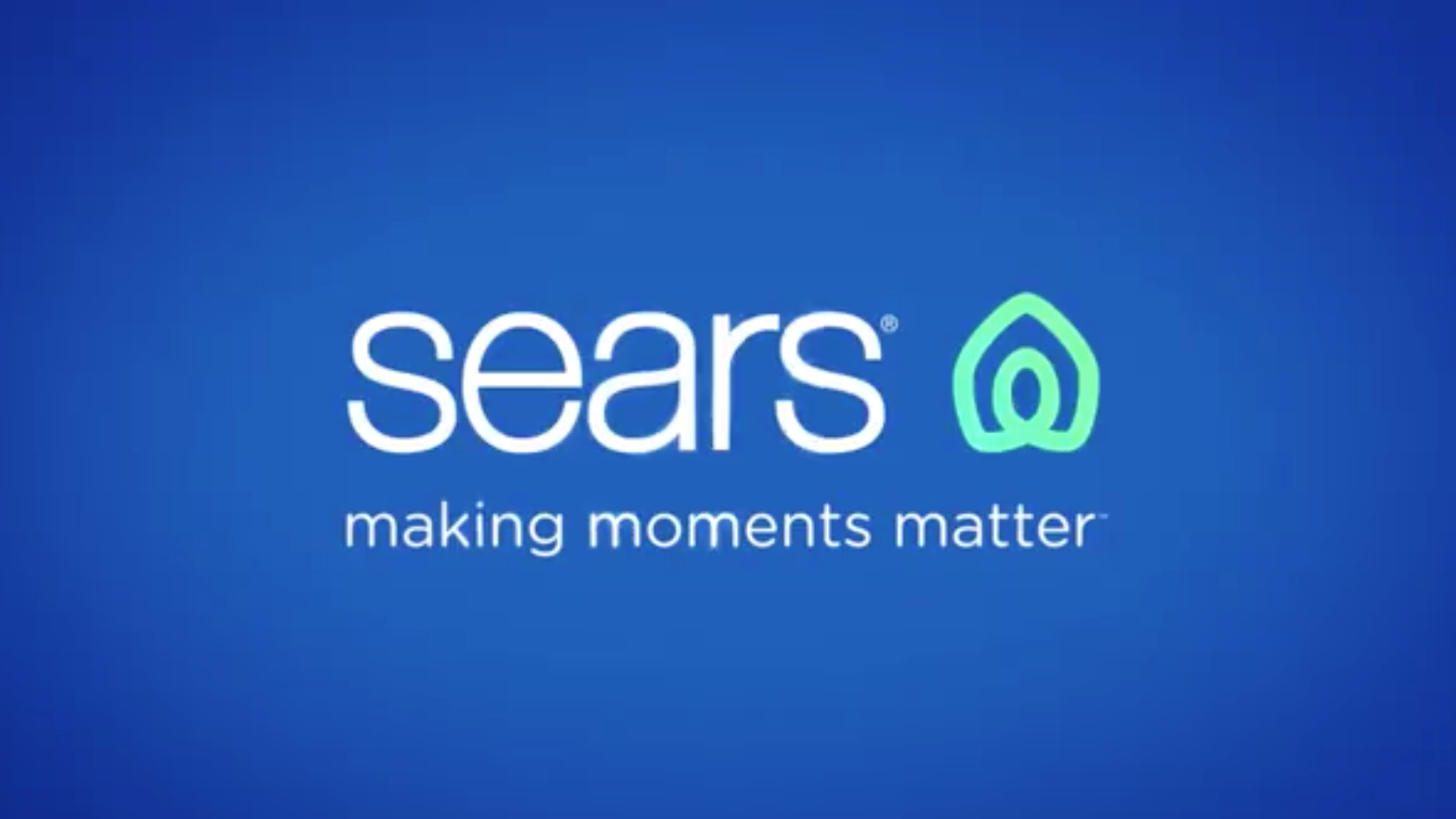
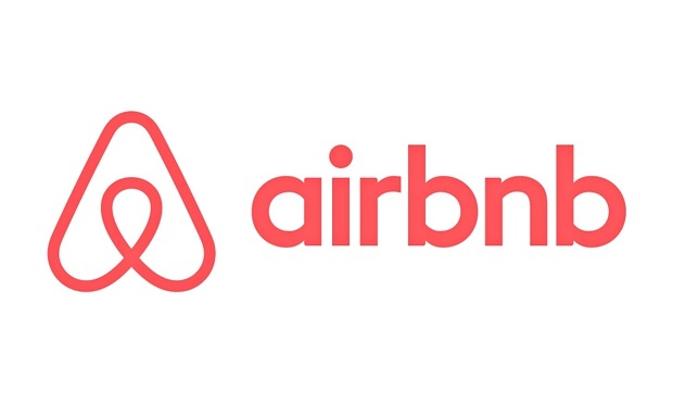
Department store chain Sears has unveiled a new logo that's meant to make customers think of their homes and their hearts. But instead it's reminded people of Airbnb, thanks to a design that bears more than a passing resemblance to the hospitality service's identity.
Launched via social media recently, the Sears rebrand sees a slim, typographic logo accompanied by an icon shaded with a green gradient (above). But it's the shape of the logo which has confused onlookers. With a line forming a loop and vaguely roof-like shape, this design has uncanny similarities with the branding for Airbnb. We're all for learning everything you need to know about logo design, but we wouldn't recommend resembling other icons. It just dilutes your impact.

The announcement video reveals how the theme of homes and hearts ties into the design. In it, we see the green line twist itself into the shape of a house, then a heart, before bringing the two outlines together in the final logo.
Article continues belowmaking moments matter. The big, the little, and all of them in between. We’re here for yours, building a home and life you 💙. Home. Heart. @Sears. #iheartsears pic.twitter.com/P5jlT5cp8kMay 1, 2019
Makes sense in concept, right? Well, it depends who you ask. Users over on the Sears' Facebook page were split over the design. Some, such as Teresa Herman, offered suggestions on how it could be improved, saying it "[s]hould gradually morph it into a true typical house symbol with a typical heart symbol in the center".
Meanwhile others were more direct with their criticism. Cory Dunn brought up the issue of Sears recent financial troubles with his scathing feedback: "[a] new logo is not going to save Sears." Over on Twitter, users were asking the question we're all thinking, why didn't anyone at Sears spot the similarity to Airbnb?
I'll never understand how things like this at major companies happen... How did not one person at Sears say the logo looks like Airbnb? pic.twitter.com/7nhFq4Wy2nMay 9, 2019
Regardless of whether or not you like it, there's no denying that the new logo is very similar to Airbnb's (below). We obviously can't tell if this was accidental or not, however it would be an odd move if it was deliberate.
This is because the Airbnb proved to be divisive amongst the public and critics when it was originally unveiled way back in 2014. We even spoke to its designers at DesignStudio to hear the truth behind the controversial Airbnb rebrand.
Sign up to Creative Bloq's daily newsletter, which brings you the latest news and inspiration from the worlds of art, design and technology.
To clear up some of the confusion and frustration surrounding the logo, Sears responded with a statement on Facebook that explained the thinking behind the design.
"The new icon was created to represent both home and heart, this shape also conveys motion through an infinity loop, reminiscent of one getting their arms around both home and life," it says.
"The rings, like those of a tree trunk, show longevity. With home and heart at the center, the rings radiate and grow to encompass our broad assortment of products and services."
Related articles:

Dom Carter is a freelance writer who specialises in art and design. Formerly a staff writer for Creative Bloq, his work has also appeared on Creative Boom and in the pages of ImagineFX, Computer Arts, 3D World, and .net. He has been a D&AD New Blood judge, and has a particular interest in picture books.
