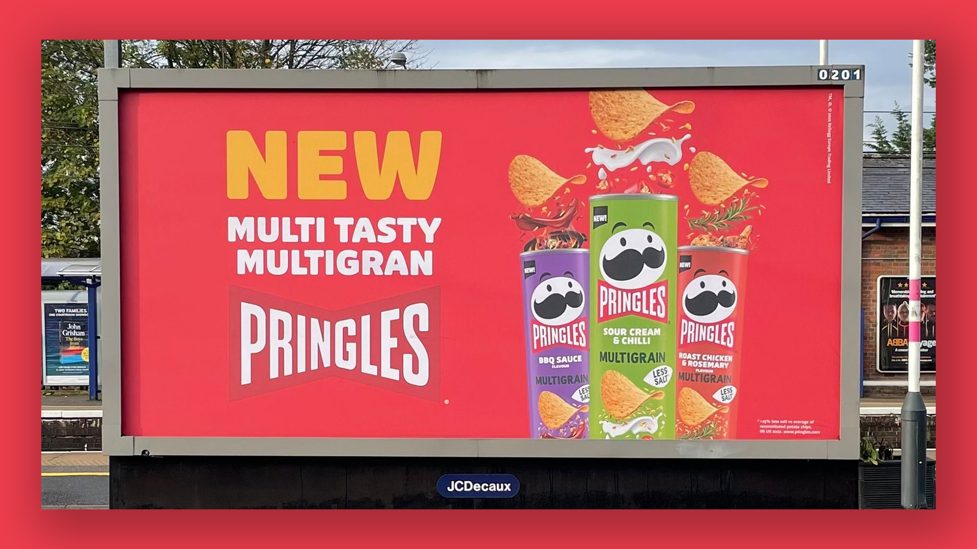
Hilarious Pringles poster typo gets roasted on Twitter
There's no 'I' in team – but there is one in multigrain.
It's every designer's worst nightmare. Your campaign has just gone live, the billboards are up and people across the country are finally setting eyes on your work. And they're all seeing the same thing – a huge, fat typo.
Whoever runs Pringles' UK Twitter account has woken up to quite the day, with the account getting flooded with photos of a billboard advertising the company's new multigran crisps. There might be no 'I' in 'team', but there's definitely one in 'multigrain'. This one won't be making our roundup of the best print ads.

"I'm crying with laughter," one Twitter user comments along with a photo of the offending billboard on the London Underground. "What is a multi gran? Is it many grans? Explain!" Another adds, "I love the old Pringles, but these new ones with extra grans look good."
Article continues belowIf you’re having a bad corporate week, it could be worse. You could be one of the presumably multiple people who signed off on this huge poster campaign for ‘multigran’ @Pringles. pic.twitter.com/42HXo7bg4jOctober 25, 2022
@Pringles_UK Grain or Gran? 🤔If the latter, how many old ladies are needed to make one tube pic.twitter.com/kUH9O3e17UOctober 24, 2022
Pringles has attempted to take the joking with a gran of salt, responding light-heartedly to the many (many) tweets, "Grans are for long hugs and wisdom. Not Pringles. We can guarantee that our new Multigrain Pringles are 100% gran free." And of course, we've been treated to some good old brand banter (brandter), with the company tweeted UK opticians Specsavers to ask for a "block booking" for its marketing team.
From Amazon's unfortunate app icon to that Sonic Nintendo Switch controller, we've seen plenty of design fails in 2022. If you want to see some examples of posters done right, take a look at our roundup of the best billboard ads.
Read more:
- This genius optical illusion print ad deserves a prize
- Burger King's new print ad is outrageously misleading
- Coca-Cola launches print ads you can actually hear
Sign up to Creative Bloq's daily newsletter, which brings you the latest news and inspiration from the worlds of art, design and technology.

Daniel John is Design Editor at Creative Bloq. He reports on the worlds of design, branding and lifestyle tech, and has covered several industry events including Milan Design Week, OFFF Barcelona and Adobe Max in Los Angeles. He has interviewed leaders and designers at brands including Apple, Microsoft and Adobe. Daniel's debut book of short stories and poems was published in 2018, and his comedy newsletter is a Substack Bestseller.
