Riot Games' new logo packs a punch
League of Legends developers make a pretty good fist of it.
If you don't pay that much attention to the world of video games then Riot Games might not mean that much to you. But to anyone with an interest in esports, it's a bit of a gaming titan; it's the company behind League of Legends, one of the biggest esports titles on the planet.
For a company with that much cash floating around it, you'd expect Riot Games to have a pretty impressive logo design. But since 2006 it's had the same logo, originally drawn by its art director, consisting of the word RIOT in a sort of graffiti tag style, with a little fist motif. Because, you know, games.
That's all changed now, though, because Riot has just unveiled its brand new logo, and yes, it still has a fist, but it's a much better effort than the old logo. As Riot notes in a blog post about the new logo, when it came to the original version no-one thought about readability for app use or scaling.
Article continues belowThis new one, designed in-house with input from the company's founders and CEO, aims to capture the spirit of the original while giving it the update it needed.
So the fist (which has been swapped from left to right-handed) has been separated out from the Riot Games wordmark, clearly with the intention of using it as a stand-alone logo on occasion. It's designed to mirror the R of Riot Games, and the wordmark itself, while still having a hand-drawn look to it, is more angular and much easier on the eye than the original.

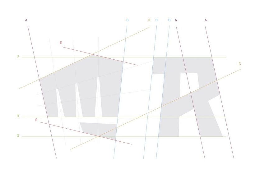
What we really love, though, is the little diagram Riot has done demonstrating how all the angles of the logo work together. It's total design bullshit, but it's adorable design bullshit.
If esports is your thing then you'll doubtless see this new logo appearing all over the place over the coming weeks, and the team at Riot Games hopes you'll grow as fond of it as they have. You can find out more about it here.
Sign up to Creative Bloq's daily newsletter, which brings you the latest news and inspiration from the worlds of art, design and technology.
Related articles:
Jim McCauley is a writer, performer and cat-wrangler who started writing professionally way back in 1995 on PC Format magazine, and has been covering technology-related subjects ever since, whether it's hardware, software or videogames. A chance call in 2005 led to Jim taking charge of Computer Arts' website and developing an interest in the world of graphic design, and eventually led to a move over to the freshly-launched Creative Bloq in 2012. Jim now works as a freelance writer for sites including Creative Bloq, T3 and PetsRadar, specialising in design, technology, wellness and cats, while doing the occasional pantomime and street performance in Bath and designing posters for a local drama group on the side.
