Why minimalist design speaks to more people
Anthony Burrill on why he stripped back his approach to design.
Sign up to Creative Bloq's daily newsletter, which brings you the latest news and inspiration from the worlds of art, design and technology.
You are now subscribed
Your newsletter sign-up was successful
Want to add more newsletters?
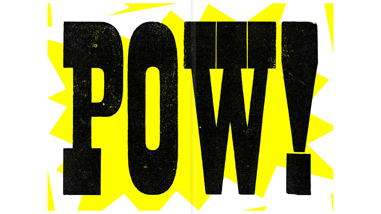
Anthony Burrill is known for producing bold, minimalist designs that combine striking typography, clean colours and pro printing techniques to beautiful effect.
Shunning the term ‘style’ to describe his often stripped-back designs because of the word's link to fleeting fashions, Burrill explains that he has a solid approach to his work that's here to stay.
“It is singular and has developed from a set of values that I try to communicate through everything I do,” the graphic artist, print maker and designer tells us. “I’m a naturally optimistic person, so my work reflects this positive approach.”
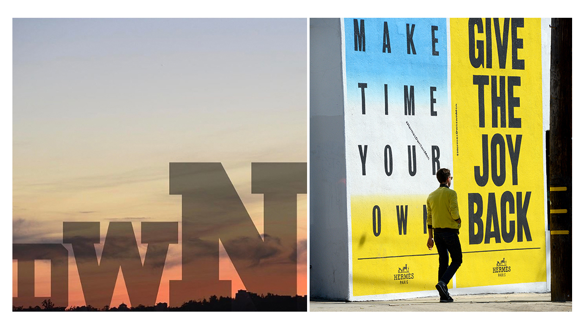
Article continues belowBurrill has worked for huge international clients including Apple, Google, Hermés, The New York Times and London Underground and his work is held in the permanent collections of London’s V&A museum and New York’s Cooper-Hewitt National Design Museum.
Next month, the British designer will speak at Something Good, a new two-day design festival in Bristol, UK, that focuses on the creative process.
He'll also be running a letterpress workshop – and Creative Bloq readers can get 20 per cent off both Friday's ticket and workshop tickets with the code: CreativeBloq20.
How to communicate effectively

For a creative with such a distinctive approach to his work now, Burrill didn’t get off to the surest of starts. “My work at college was unconnected to the real world. I was looking for something, trying to find out what I was trying to say,” he recalls.
Sign up to Creative Bloq's daily newsletter, which brings you the latest news and inspiration from the worlds of art, design and technology.
However, this early difficulty seems to have ignited his love of simplistic design, as he explains. “I found it frustrating that people didn’t connect with my work, so I made attempts to create work that was easier to understand."
"I learnt that by being simple and straightforward with your message you can communicate effectively with a broad range of people.”
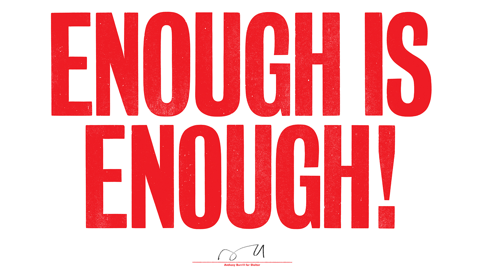
This commitment to simple and straightforward communication runs throughout his work, with short, uncomplicated phrases featured often.
Message like ‘Work hard & be nice to people’; ‘Enough is enough’ (for homeless charity Shelter); ‘Make time your own’ (for Hermes); and even the title of his book – Make it Now! – grab attention with the directness of their phrasing as well as the attractive way they’re presented.
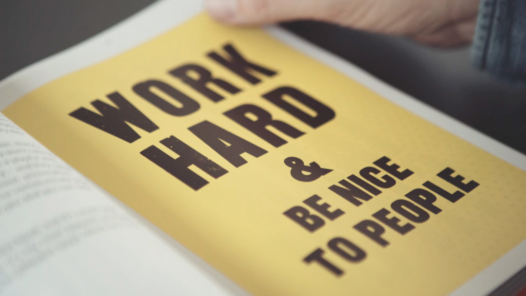
Simplicity continues to feature in Burrill’s approach to colour and texture, too. “I like purity in colour, my palette is simple; bright yellow, red, black and occasionally blue,” he says.
A stripped-back approach
“I like to work with interesting materials that add a tactile feel to the work I produce. I choose materials that have a texture and colour that works well with accents of pure pigment."
“I prefer to print with a maximum of two colours, I think it keeps the message simple when there is the minimum of visual noise, that includes colour.”
Burill says, though, that finding this definite approach led to a period of uncertainty after college. “After graduation I spent a few years working out what I was going to do. I didn’t know how my work would fit in and it didn’t feel like there were the right jobs out there for me,” he says.
“I tried to market myself as an illustrator, but that didn’t work. It was only when I started to make work that focused entirely on words and typography that things began to take off.”
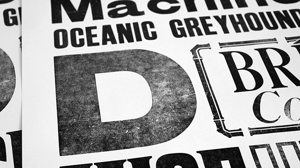
Take off it has. Burrill has created designs for huge clients, co-created interesting typefaces and produced prints and more for his own shop. He now gets to choose the commercial projects he takes on and the clients he wants to work with.
Choosing clients
“I’m in the situation now where the work I make is almost all developed from a personal brief,” he explains, adding that he relishes vague creative briefs. “I prefer to work with a client to develop a project from scratch, rather than being given a prescriptive brief.”
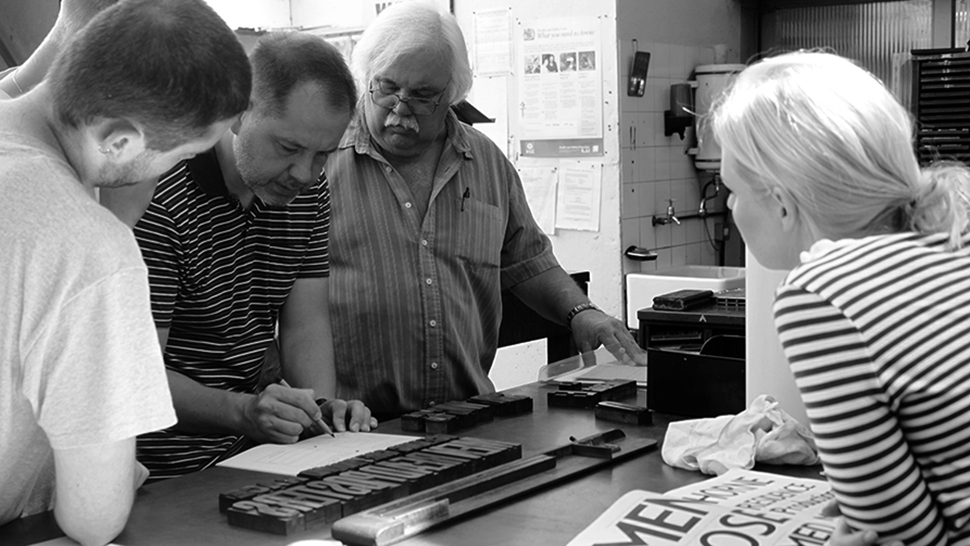
Get 20% off Something Good tickets
Hear more of Burrill’s story, how he developed his visual language and how his personal values inform the way he lives and works at Something Good in Bristol, UK, on 6-7 October. Creative Bloq readers can get 20 per cent off both Friday's ticket and workshop tickets with the code: CreativeBloq20.
Related articles:

Ella is Creative Bloq’s former production editor, and now works as managing editor for CB’s sister site, Woman&Home. In both roles, she helped the team to ensure content is expertly written, authoritative, timely and compelling.
While on Creative Bloq, she wrote a number of news and feature articles, specialising in graphic design and photography, attending design industry events and interviewing leading studios. She has 14 years of of editorial experience, graduating from Kingston University with a First Class Honours degree in Journalism in 2008.
Ella has written and edited magazines and websites including TechRadar.com, Digital Camera magazine, BikeRadar.com, Mollie Makes and more. She worked on professional photography website www.canon-europe.com/pro for six years, having worked her way up from production editor, to deputy editor, to editor. As such, she's a stickler for fact-checking, has too many opinions about grammar and is easily excited by a beautiful photo.
