15 stunning pieces of video game cover artwork
Alex Black lists his selection of the best examples of cover art used on video games.
Sign up to Creative Bloq's daily newsletter, which brings you the latest news and inspiration from the worlds of art, design and technology.
You are now subscribed
Your newsletter sign-up was successful
Want to add more newsletters?
Graphic designers often face the challenge of having to create artwork that fits a certain mood. Designing art for an album cover or for a film is a great example - more often than not, the artwork needs to encompass an overall feeling of the end product. It's also true of video games, and it's something that I've been looking at more closely over the last few months.
Historically, I think it's fair to say, video game box art hasn't had as much attention in terms of design compared to things like film or music, but in the last few years I think that's changed. The artwork that a video game arrives in potentially has the ability to change how that game is perceived, and every so often you come across a design that's just perfect for the game.
I wanted to bring together some examples of my favourite video game cover artwork. These designs beautifully capture the mood and ideas of the game, and in many cases are works of art themselves (Bioshock Infinite's example in particular), which wouldn't look out of place as a print on a wall. If you know of any other examples of video game box art that you'd like to share, I'd love to hear about them in the comments.
Article continues below01. Bioshock Infinite
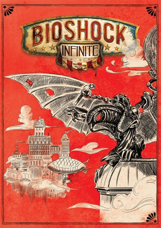
This cover for Irrational Games' masterpiece Bioshock Infinite can be found on the reverse of the regular sleeve. While the original cover drew some flak for being a bit too generic, the sleeve of the reverse was a much bolder and braver design that suits the atmosphere and mood of the game beautifully.
02. Ico
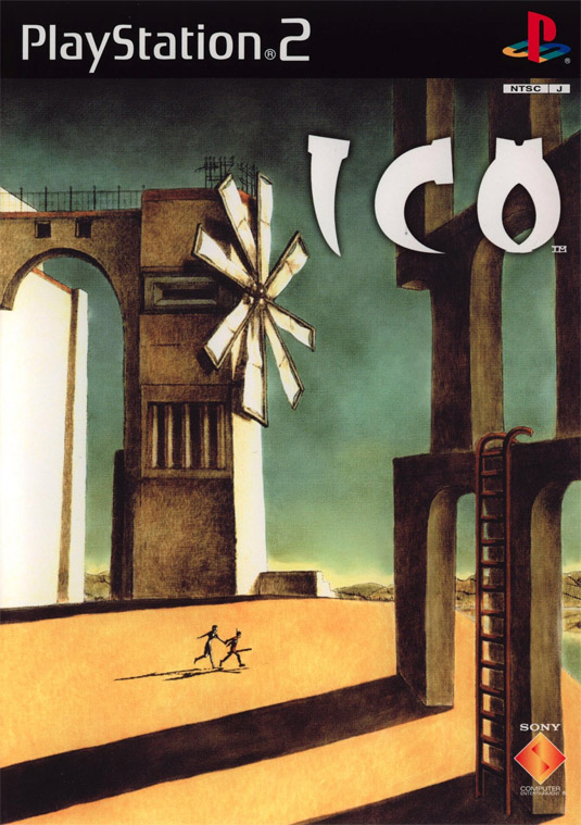
Ico is a puzzle game created by Japanese developers Team Ico. It's a visually stunning game that has a design direction from Fumito Ueda, and aesthetically it's surprising, unexpected and stands out from most puzzle games. The cover does a great job of also being different from the norm, with a piece of artwork that depicts the open space of the game.
03. Sleeping Dogs
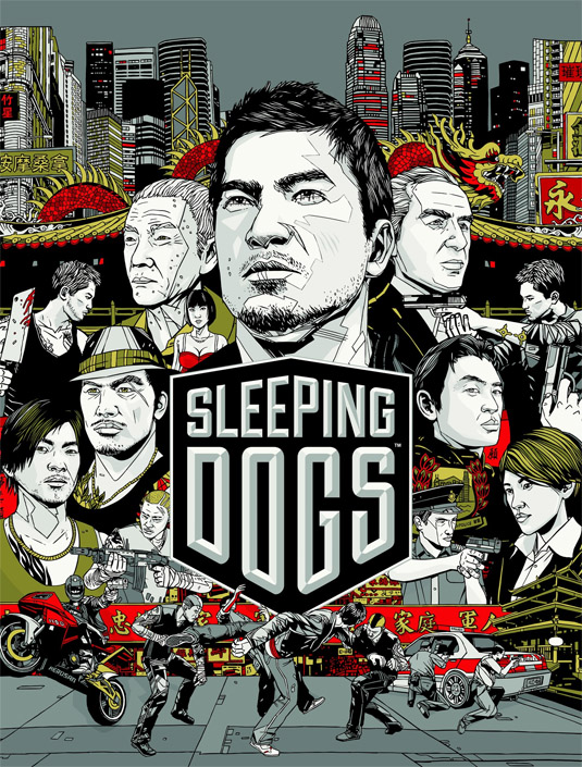
Sleeping Dogs is a Grand Theft Auto-esque open world game set in Hong Kong, and was developed by United Front Games and Square Enix. The cover art makes heavy use of illustration to depict various characters, scenes and settings and is as intricate and complex as the game itself.
04. Borderlands
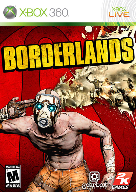
Cult favourite Borderlands is an open world game built by 2K games, and it has an unusual design direction of using a blend of a cartoon style with heavy cell shading to almost provide a strange mix of 2D and 3D graphics. The cover art makes use of the cell shading shown in game, and is both violent and unexpected, much like the game itself.
Sign up to Creative Bloq's daily newsletter, which brings you the latest news and inspiration from the worlds of art, design and technology.
05. Limbo

Indie fan favourite, puzzle game Limbo was a surprising success when it launched in 2010. The visual style of Limbo is instantly recognisable - dark, minimalist and constantly in the shadows, and the cover art depicts the overall mood and style perfectly.
06. Disney's Epic Mickey
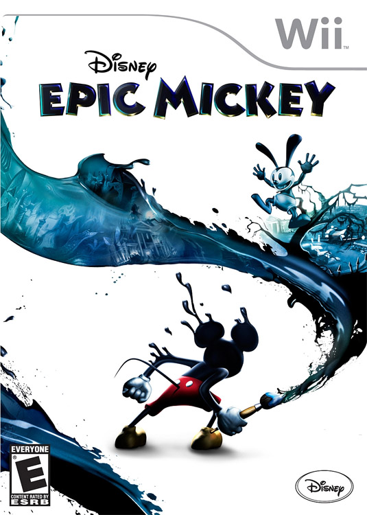
Disney's Epic Mickey is one of the most popular Wii games, released in 2010 and selling more than 2 million copies. The game has a much darker, gloomier tone than the more cheerful previous games, and the cover art was designed to reflect that - with an almost monochromatic design direction.
07. Final Fantasy X
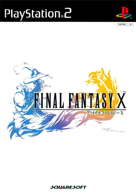
The Final Fantasy series has always had an instantly recognisable, elegant design style, and the cover for Final Fantasy X is no exception. It manages to be both elegant and colourful, intricate and minimalist - and the combination results in a beautifully stylish cover.
08. Resistance 3
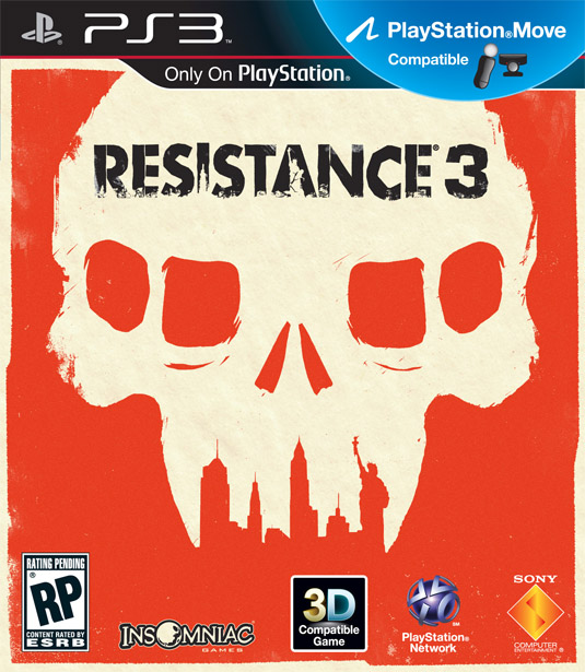
Resistance 3 is a post-apocalyptic first person shooter created by devlopers Insomniac Games. The cover art is wonderfully simple but brilliantly clever, depicting a skull from one of the alien invaders, with humanity's well known monuments depicted within the negative space.
09. Amnesia: The Dark Descent
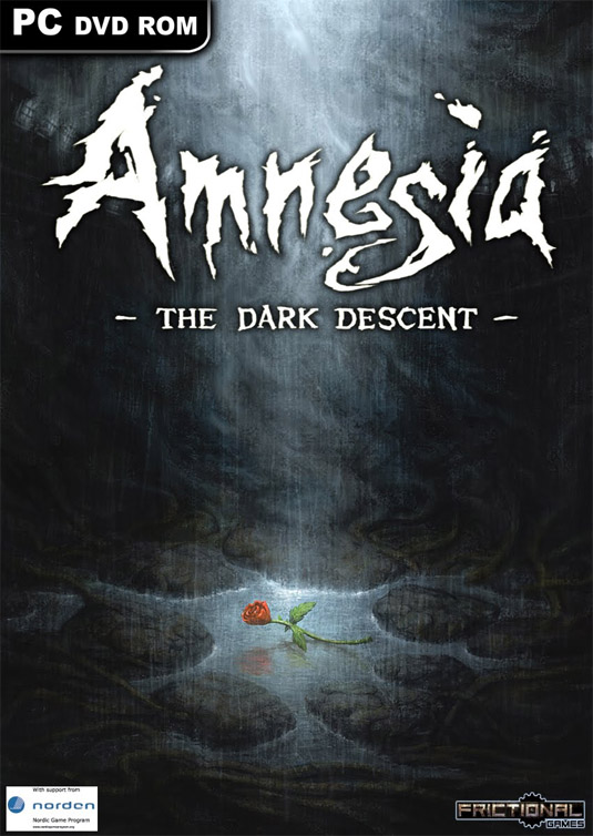
Amnesia: The Dark Descent is a survival horror game created by Frictional Games and released in 2010. The overall tone of the game is remarkably dark, gloomy and the atmosphere is designed to heighten the tension and the cover art captures the feeling perfectly.
10. Metal Gear Solid 4
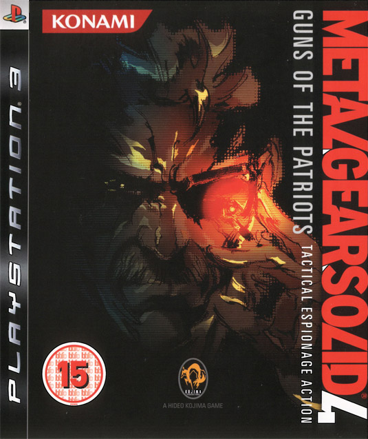
Metal Gear Solid has become a cult favourite over the years ever since the original was released on the PlayStation back in 1998 (and even then, it was based on the Metal Gear series which dates back to 1987). The cover art depicts the protagonist, Snake, and opts for an illustration that shows him slinking into the shadows.
11. Red Dead Redemption
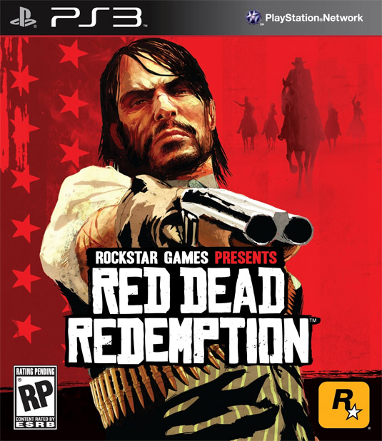
Read Dead Redemption was one of Rockstar Games' biggest successes. It took the core concept of open world exploration straight out of Grand Theft Auto, but swapped the city for the Old West. A lot of work went into the art direction for the game to make sure they had the right look and feel of the time and setting, and the cover art brilliantly depicts the old-world style of violence and cowboys.
12. The Saboteur
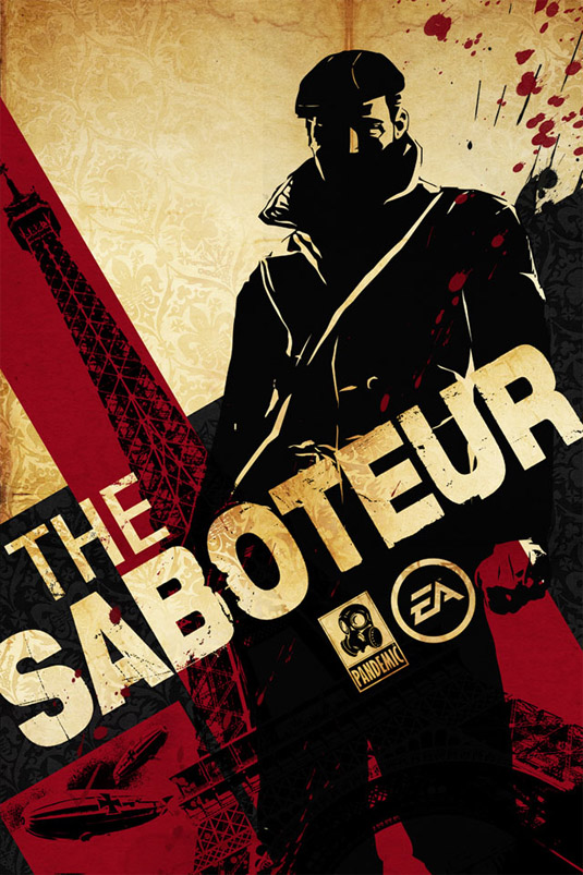
The Saboteur was created by Pandemic Studios, and is an open world action-adventure game set in Paris during World War II. As the protagonist, your goal is to use stealth to blend into the shadows. The game itself makes heavy use of black and white, with only a few other colours used brightly, like the colours of characters eyes, and the red of the Nazi flags. The game's cover reflects this well, with a black and white focused design showing the protagonist blending into the background.
13. Dishonored
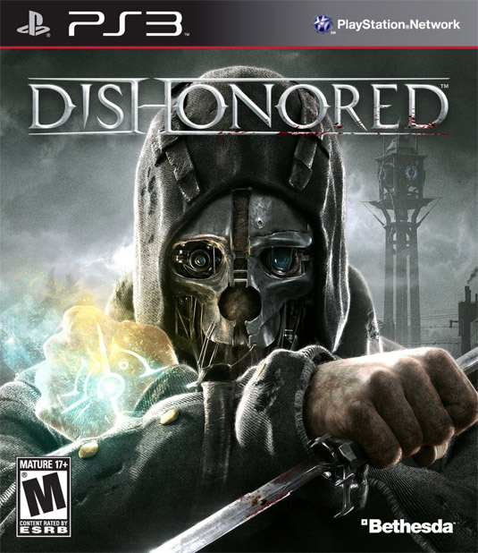
Dishonored is a remarkably popular game, released in 2012 and developed by Arkane Studios. Dishonored is also a stealth based game, and has you playing the role of a master assassin, capable of blending into the shadows and stopping time. The art direction is masterful, and the core visual element behind the whole game is the intricate, creative mask worn by the protagonist - which is shown in all it's form on the cover.
14. Destiny
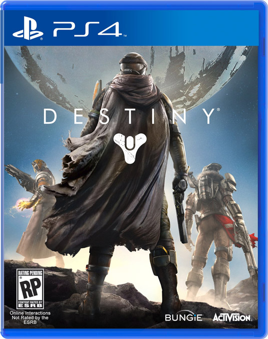
Destiny is an as-yet-unreleased game by Bungie, creators of the Halo series. Designed exclusively for next-gen systems and PC, it's set to be released in 2014 and tells the story of humanity's last city on Earth. The cover art depicts a last stand, with the mysterious sphere known as 'The Traveller' shown in the background.
15. Heavy Rain
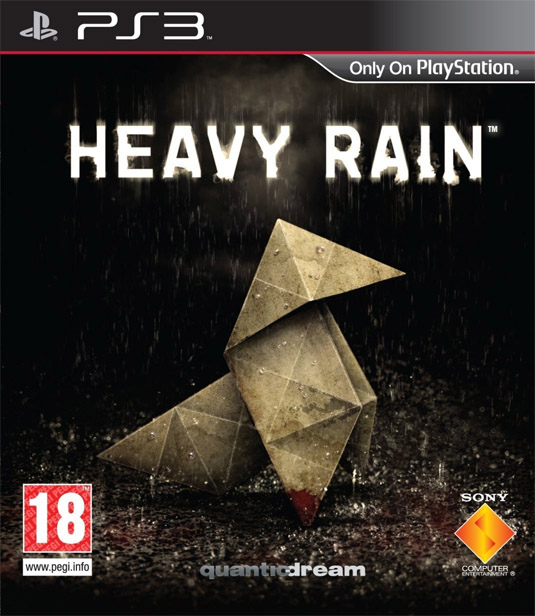
Heavy Rain is a game that blends cinema with games, and which has a very atmospheric, film-noir tone throughout. Created by Quantic Dream and released in 2010, the game earned critical acclaim and won multiple Game of the Year awards. The box art is reminiscent of Blade Runner, with an origami figure slowly being destroyed in the rain - and fits the games unusual, dark and moody visual style.
Words: Alex Black
Alex Black writes for printing experts Print Express. He enjoys studying graphic and web design, and writes for their new blog DESIGN.
- The best collage maker tools - and most are free!
- How to build an app: try these great tutorials
- Free graphic design software available to you right now!
Which of these designs do you like best? Do you know of any others that you think we should include in our list? Share your thoughts in the comments!

The Creative Bloq team is made up of a group of art and design enthusiasts, and has changed and evolved since Creative Bloq began back in 2012. The current website team consists of eight full-time members of staff: Editor Georgia Coggan, Deputy Editor Rosie Hilder, Ecommerce Editor Beren Neale, Senior News Editor Daniel Piper, Editor, Digital Art and 3D Ian Dean, Tech Reviews Editor Erlingur Einarsson, Ecommerce Writer Beth Nicholls and Staff Writer Natalie Fear, as well as a roster of freelancers from around the world. The ImagineFX magazine team also pitch in, ensuring that content from leading digital art publication ImagineFX is represented on Creative Bloq.
