5 killer ways to use background imagery
High broadband speeds mean it's possible to use full-scale background imagery that make your site sing, says Matthew Smith.
Sign up to Creative Bloq's daily newsletter, which brings you the latest news and inspiration from the worlds of art, design and technology.
You are now subscribed
Your newsletter sign-up was successful
Want to add more newsletters?
Using big, bold imagery as a background for content can give a powerful look to a site in need of strong presentation.
For the majority of our short web history, the large file sizes of full-scale imagery have made it a poor choice for websites. Now, with the advent of high-speed broadband, that obstacle is slowly disappearing. While it’s still best practice to keep sites lightweight, large-scale imagery is a viable option when you need an emotional punch.
Often, web patterns are drawn in lines and boxes - and are therefore experienced as manufactured and digital. Imagery can add nuance to a design, giving it an organic or artistic feel. The tone of the pictures can be used to enhance the mood, and changing the imagery per section or page can be a nice way to keep the site fresh.
Article continues belowI recommend using imagery that has an atmospheric or blurred presence, so that it doesn’t distract from or interfere with the internal content. Adding a semi-transparent pixel overlay can give the design a nice blend of the organic and digital. The overlay has the extra bonus of diffusing the pixellation caused by JPEG compression, enabling you to save the images at a smaller dimension.
However, a word of caution. Background imagery should strictly be used as part of the style layer, and not as an essential piece of the content. It should be an adjunct to great copy and strong contextual imagery (within the page), and usually shouldn’t heavily influence the user interface.
Although high broadband speeds are on the rise, they’re by no means ubiquitous. Your audience or clients may need lightweight sites that don’t allow for full-scale imagery. Do your homework first so you don’t frustrate your users.
Here are five examples of some excellent background imagery to add an emotional punch and nuance to a design. Hopefully they can inform and inspire your next project, but be cautious when employing this style...
Sign up to Creative Bloq's daily newsletter, which brings you the latest news and inspiration from the worlds of art, design and technology.
Five examples to check out
01. Sourcebits

A great example of an atmospheric background image that adds wonder to an incredible portfolio can be found at the website of mobile development company Sourcebits.
02. Fox Classics
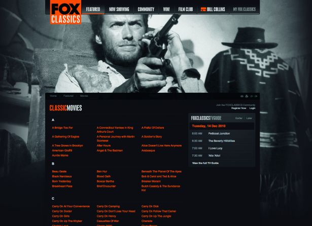
The Fox Classics website has an incredibly flexible design. Background imagery is used to showcase a shot of the actor being featured on the page.
03. Rebecca Barry
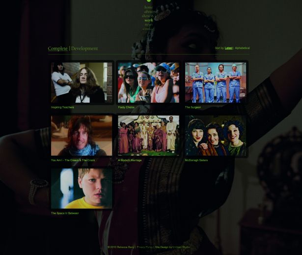
The site of director, writer and producer Rebecca Barry uses a subtle semitransparent pixel overlay. The pattern helps disguise any pixellation from the image compression of these large photos.
04. Chicago L-Shirts
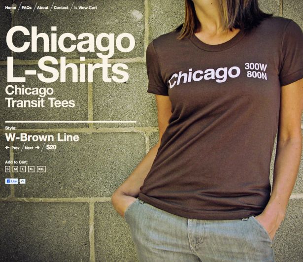
The site of Chicago L-Shirts plants a bold, white Helvetica font on top of the showcased product. This works because of the layout of the photograph, but would fall apart if there wasn’t a large open area for the type.
05. G2
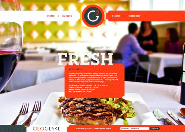
Giving a quick introduction to the ambience and flair of the Texan restaurant G2, this site uses a photographic background to draw you in.
What are you favourite sites using full-scale background imagery? Let us know in the comments. It would be interesting to know which other sites get background imagery right.
Words: Matthew Smith

The Creative Bloq team is made up of a group of art and design enthusiasts, and has changed and evolved since Creative Bloq began back in 2012. The current website team consists of eight full-time members of staff: Editor Georgia Coggan, Deputy Editor Rosie Hilder, Ecommerce Editor Beren Neale, Senior News Editor Daniel Piper, Editor, Digital Art and 3D Ian Dean, Tech Reviews Editor Erlingur Einarsson, Ecommerce Writer Beth Nicholls and Staff Writer Natalie Fear, as well as a roster of freelancers from around the world. The ImagineFX magazine team also pitch in, ensuring that content from leading digital art publication ImagineFX is represented on Creative Bloq.
