Building prototypes in HTML and CSS
Prototyping tools can be restrictive and it's becoming more important that designers know how to code up their concepts, so Leisa Reichelt organised a workshop teaching how to build prototypes in HTML and CSS. Here Anna Debenham summarises what she taught on the Code Fitness day
Sign up to Creative Bloq's daily newsletter, which brings you the latest news and inspiration from the worlds of art, design and technology.
You are now subscribed
Your newsletter sign-up was successful
Want to add more newsletters?
- Knowledge needed: A bit of secondary school maths
- Requires: Text editor (optional), modern browser
- Project time: 1 hour
If you already know how to build a basic web page, you probably won't learn anything here. But if you don't, or your knowledge is from back in the days of table-based layouts, this will give you a good grounding in building prototypes in HTML and CSS.
Why prototype in code?
If you're building a prototype for the web, it makes sense to build it in its natural environment as it provides as real an experience as you can hope to achieve. Understanding how to build your designs can also give you a greater affinity with developers; they'll be more open to your ideas and able to communicate theirs better too.
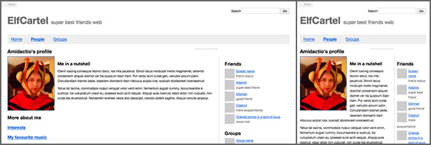
It also has the benefit that you can take full advantage of all the web has to offer. Your prototype can adapt to the width of the browser window but a graphic wireframe can't. This is useful when demonstrating how your site adapts at different screen widths.
What about frameworks?
Frameworks like 960 are really useful for prototyping, but before you dive into one of these, it's useful to understand the fundamentals of how it works first. Once you've got to grips with how it all fits together, you'll be much better prepared.
Assumptions
There are a couple of assumptions I'm going to make about your prototype:
- It's only going to be viewed in modern browsers, including during user testing and if the link is sent to a client.
- Your code isn't going to be made live. I won't be talking about how to build in a way that's optimised or as semantic as live code should be.
Testing in older browsers and code optimisation wouldn't fit in this article, and would be overkill for a quick prototype. However, if you’ll be testing with real users, take speed of page load into account.
Getting started
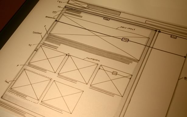
If you've got a design, start by printing it out and labelling it.
Sign up to Creative Bloq's daily newsletter, which brings you the latest news and inspiration from the worlds of art, design and technology.
- Draw boxes round things for the layout. How many columns are there? Draw round these.
- What are the widths of these boxes and columns?
- Note the main text elements like headings, paragraphs, lists, images and links.
- What are the common styles? What are the default text styles, link colours and heading sizes?
Now we're ready to start building. If you have a code editor, create a file called "index.html" and paste the following code in. If you don't, you can follow along straight away in the browser using Remy Sharp's jsbin.com. (No tedious sign-up or download required.)
Structure
This is a web page at its most basic level:
- <!DOCTYPE html>
- <html>
- <head>
- <meta charset="utf-8" />
- <title>Page name</title>
- </head>
- <body>
- <p>Page content</p>
- </body>
- </html>
Anything within our <head> tags is information for the browser and doesn't get displayed on our page. The bit within the <title> tags is the name of the page and gets put in the browser tab. All our page content goes within the <body> tags.
The first thing we're going to do is put our basic structure in place. I normally begin by marking up the content and work my way out from this, but people who are new to HTML often find it easier to begin by thinking about how content is grouped.
To do this, I'm going to add in the main page sections using <div> tags. These tags are used to group bits of content together. Nested within the <div> tag I've added text inside <p> (paragraph) tags.
- <!DOCTYPE html>
- <html>
- <head>
- <meta charset="utf-8" />
- <title>Page name</title>
- </head>
- <body>
- <div class="header">
- <p>Header</p>
- </div>
- <div class="content">
- <p>Content</p>
- </div>
- <div class="ads">
- <p>Ads</p>
- </div>
- <div class="footer">
- <p>Footer</p>
- </div>
- </body>
- </html>
The "class=" bit is a label we use as a hook to help style content. We'll come back to this shortly.
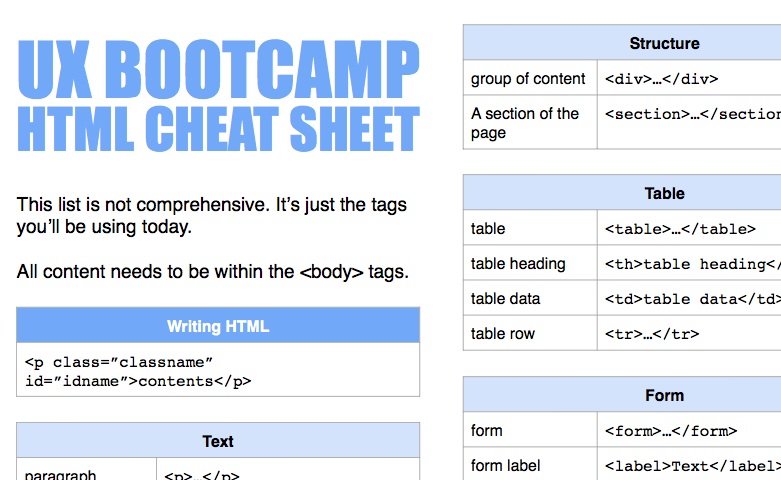
Note the indentation and the way I've lined up the opening and closing tags. Try and keep your code easy to read or you'll get in a muddle. Also, you can't make up your own HTML tags, but there are lots to choose from. Here's an HTML cheat sheet you can print and refer to.
Styling
We're now going to begin styling the content using CSS (Cascading Style Sheets). HTML is about what the content is, and CSS is about how that content looks. I like to start by adding garish background colours onto everything to help me see where things are on the page.
In my examples, I'm adding all my CSS styles before the </head> tag so we can see everything on one page, but if you're building more than one page, it's better to create a separate style sheet and link to this externally.
To do this, create a new file in the same directory as index.html called styles.css, and in your index.html file, add this bit of code before the </head> tag.
- <link href="styles.css" rel="stylesheet" type="text/css" />
All your styles will live in here.
If you're using jsbin, open a <style> tag before your </head> tag, paste the following code inside, and close it with a </style>.
- <code>div {
- background-color: hotpink;
- height: 100px;
- }
- p {
- background-color: orange;
- }</code>
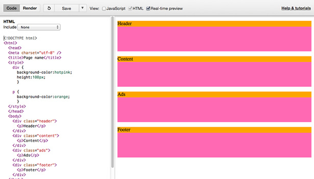
Any bits of content we've wrapped in a <div> tag have been given a bright pink background. I've also added a height to these so you can see more clearly what's happening, but we'll take this off later when there's proper content inside.
What if we want to style each content block differently? Underneath the styles we just added, but before the </style> tag, we're going to add the following:
- .header {
- background-color: green;
- }
- .content {
- background-color: red;
- }
- .ads {
- background-color: blue;
- }
- .footer {
- background-color: yellow;
- }
Note the American spelling of "color".
Remember the class="" bits we added to our HTML tags? We're using these class names as hooks to style. The . before the word "header", "content" and "footer" shows that this is a classname rather than the name of an element. (We didn't add a . before the div and p because they are pure HTML elements rather than classnames.)
Choosing classnames
You can name a class anything, as long as it doesn't start with a symbol or a number, and it needs to all be one word or string. However, it's worth thinking carefully about the names you use. To be effective in an agile environment, our prototype code needs to be:
- Quick to update if we decide to do something like tweak the layout. This is why it's a very good idea to use class names that describe what the content is rather than how it looks. If you were to give it a classname like "left-hand-col" or "red" and later move it to the right or change the colour, it will be very confusing.
- Clear and easy to read, not a mess of tags. Make sure you indent tags nicely so it doesn't get confusing. Tags that haven't been closed and break the page are the usual reason why things aren't working as you expect, and they're difficult to spot unless your markup is well organised.
- Easy to understand if you hand the code to someone else. A good way to document your work is to add comments in your HTML and CSS explaining what things do. (Comments can be added <!-- like this --> in HTML and /* like this */ in CSS.)
Layout
Now we know how to target blocks of content specifically, we'll start laying things out. The design I've done is in pixels, but flexible layouts are cool so we'll convert our pixels into percentages using a bit of secondary school maths.
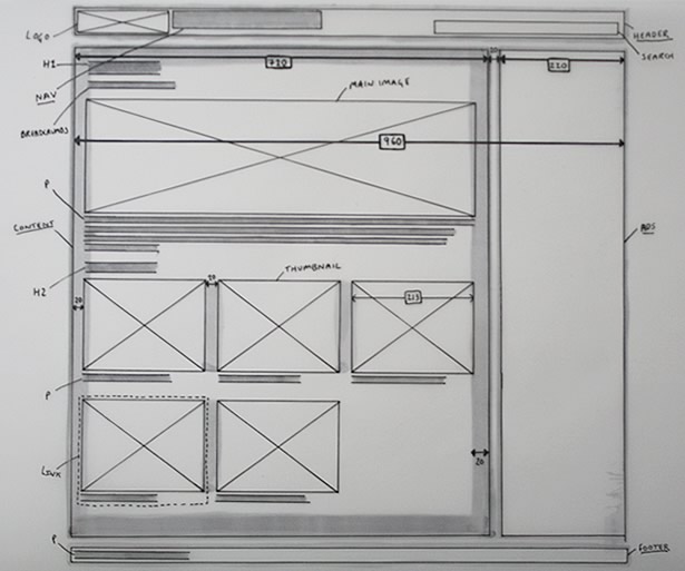
The total width of our design is 960px. We've got two columns, one a width of 720px and the other a width of 220px. (This gives us a 20px gap in-between the columns.) The main column, which we've given the class of "content" sits on the left, the smaller one with the class of "ads" to the right. The header and footer are 960px wide.
- 960px is 100% of the width of all the content. So to find out how much 1px is in percentages, we divide 100 by 960.
- This gives us 0.104166667, which we'll round to 0.104%
- Therefore 720 x 0.104 = 74.88% and 220 x 0.104 = 22.88%
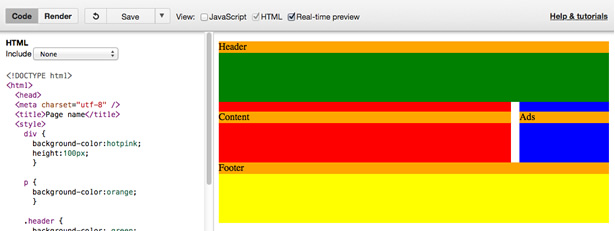
We can position blocks of content in CSS by telling things to "float". When we tell something to "float: left", we're telling it to push to the top-left corner of its containing element, and stop if there's anything in its way. "float: right" tells it to float to the top-right corner. It's a bit like text-align left and right, but for blocks of content. We also need to give the blocks widths or they'll default to the full width of their content and won't sit next to each other. Add the following to the bottom of your styles:
- .content {
- width: 74.88%; /* 720px */
- float: left;
- }
- .ads {
- width: 22.88%; /* 220px */
- float: right;
- }
- .footer {
- clear:both;
- }
I've added a CSS comment next to the widths to help me remember what they originally were in pixels. Comments are very useful for documentation, use them generously.
I've also told the footer to "clear:left", which is like forcing it onto a new line. It was filling the space left when we added the float rules, and rising up next to the ad block where we didn't want it.
You'll have probably noticed, our text sits flush against the edge of the blocks. We should give it a bit of breathing space, so we'll add some padding to the content. This pulls the text that's inside the container away from the edges. In my design I noted this padding as 20px, which is 2.08%. We'll also add some margin to the bottom to push the blocks away from each other so they aren't touching. This can stay as pixels because only the widths are going to be flexible.
- .content {
- width: 74.88%; /* 720px */
- float: left;
- padding: 2.08%;
- }
- .header,
- .content,
- .ads {
- margin-bottom: 20px;
- }
I've grouped the styles for the content, ad and header blocks using a comma, because they both share the same properties. Making changes is a lot quicker when you can group styles.
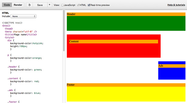
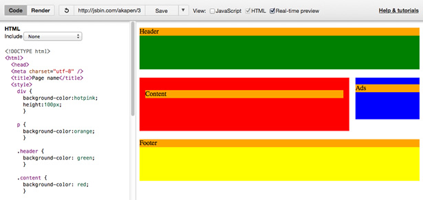
Oops, our blocks don't sit next to each other any more. This is because when we add padding, it adds to the overall width of the block. We'll go back and change the widths to take the padding into account by taking away the extra 2.08% that's been added to the left and right of the content block.
- .content {
- width: 70.72%; /* 680px */
- float: left;
- padding: 2.08%;
- }
Confused about why this happens? Here's some more in-depth reading on padding and margin. I've also set up an interactive demo in jsbin of what we've got so far.
Images
To save us some time, let's use a service called placehold.it to add placeholder images to the page. This generates images at any dimensions we choose. I'll add our first one in the HTML, within the <div class="ad"></div> tags.
- <img src="http://placehold.it/220x400" />
The 220x400 bit refers to the width and height. This automatically loads in a placeholder image into our ad column, but because the image is bigger than the width of the column, it overflows. This is nice and easy to fix in CSS.
- img {
- max-width: 100%;
- }
This forces images to never be bigger than their containing element, and they'll adapt to the width of the page.
Thumbnails
The next step is to add some thumbnails within the main content column between the <div class="content"></div> tags, and get them to line up next to each other. Here's the HTML for one thumbnail, so copy and paste it a few times to add more.
- <a class="thumbnail" href="#">
- <img src="http://placehold.it/213x160" />
- <p>Strawberry Cheesecake</p>
- </a>
The link is wrapped round the image and the paragraph, so the whole area is clickable. (I've just added a # in the href= bit because the link doesn't go anywhere yet, but you can add a URL.)
We now need to make these line up next to each other, three in a row, with a bit of a gap to the right. Here's the CSS:
- .thumbnail {
- float: left;
- width: 31%; /* That's 31% of the containing element */
- margin-right: 3.5%;
- margin-bottom: 13px;
- text-decoration: none;
- }
- .thumbnail:nth-of-type(3n+3) {
- margin-right: 0;
- }
I've given each thumbnail a width of 31% which is roughly a third of 100%, and "float:left" so they line up. I've also given each one a margin-right of 3.5%, but I don't want the third thumbnail on each row to have any margin because there's already a gap from the padding on the content column. This is why I've put "margin-right: 0;" on ".thumbnail:nth-of-type(3n+3)". ":nth-of-type(3n+3)" looks for the third element with a class of "thumbnail" and every third one after that, and removes the margin.
Now we've got some content in place, we can remove "height: 100px;" from the style for "div" elements that we added right at the start.
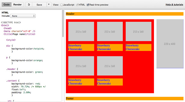
With the basic structure in place, adding the rest of the content and styles is much more straightforward. I've built a version of this prototype in jsbin if you wanted to poke about with it. If you're really proud of what you've built, hit save and share a link to your version in the comments.
There's a lot I couldn't fit in here like the cascade, box model, different ways to position content and adding more pages, but if you're interested in learning more there'll be another UX Bootcamp Prototyping in Code workshop on 27 to 29 October.
Further reading and resources
- Web Standards Curriculum (Very readable set of web development tutorials)
- Hackasaurus Hackbook (HTML snippet library)
- Firebug web inspector (Firefox extension)
- Web Developer toolbar (Firefox extension)
- Yahoo User Interface Library (check out the grids section)
Words: Anna Debenham
Anna is a front-end developer, trying to make the world a better place. She works with Mozilla on a project called Hackasaurus, which helps teach kids how about the open web, launched an online magazine called Scrunchup, for young designers and developers, and is the technician for the Boagworld podcast.

The Creative Bloq team is made up of a group of art and design enthusiasts, and has changed and evolved since Creative Bloq began back in 2012. The current website team consists of eight full-time members of staff: Editor Georgia Coggan, Deputy Editor Rosie Hilder, Ecommerce Editor Beren Neale, Senior News Editor Daniel Piper, Editor, Digital Art and 3D Ian Dean, Tech Reviews Editor Erlingur Einarsson, Ecommerce Writer Beth Nicholls and Staff Writer Natalie Fear, as well as a roster of freelancers from around the world. The ImagineFX magazine team also pitch in, ensuring that content from leading digital art publication ImagineFX is represented on Creative Bloq.
