Hot in web standards: May 2012
In the first of a regular series of reports, Lea Verou summarises the latest need-to-know developments in the fast-moving world of the Working Groups
Sign up to Creative Bloq's daily newsletter, which brings you the latest news and inspiration from the worlds of art, design and technology.
You are now subscribed
Your newsletter sign-up was successful
Want to add more newsletters?
May 2012 brought many exciting developments in web standards, across a number of different Working Groups. Here, in the first of a regular series of reports, I’ll sum up the hottest topics and emerging trends every professional web designer needs to know about. If any of the concepts seem unfamiliar, you can might want to begin by reading the 8 biggest web standards myths, debunked. Otherwise, let’s get started!
Blending modes and filters are coming to CSS
Ever wanted to blur an HTML element? Greyscale its contents? Use Photoshop-style blending modes on it, like "Multiply"? There are two new proposals that do exactly this:
These are not entirely new concepts, they have been possible in SVG for a long time. However, these new specifications bring those effects to HTML content as well. In addition, they are introducing a couple of simple shortcuts, that eliminate the need of linking to an SVG file that contains the effects. For example, to blur an element, you simply do:
Article continues below- filter: blur(10px);
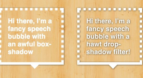
Filters also solve the common problem with CSS box-shadows which don't follow the transparency of the element, but are always rectangular (see image). CSS filters can produce true drop shadows that fully follow the form of the element, accounting for non-solid borders, semi-transparent fills, pseudo-elements etc. You can play with a dabblet comparing the differences here.

Blending modes are equally simple to apply:
- blend-mode: multiply;
There are going to be ways to selectively apply blending modes to parts of the element, such as only the background or shadows, but the syntax for this is still under discussion.
Filters are already supported by Chrome (behind a -webkit- prefix), so you can experiment with them all you want. Blending modes are newer and have no implementations yet. However, once they get a few implementations you can start using them immediately, as they both degrade quite gracefully.
Sign up to Creative Bloq's daily newsletter, which brings you the latest news and inspiration from the worlds of art, design and technology.
Both specs are developed in the FX task force (FX TF), which is a joint effort between the CSS WG and the SVG WG. The FX TF focuses on developing new specifications that apply to both CSS and SVG as well as merging and simplifying existing technologies that could apply to both (such as transforms).
The responsive images saga
"Responsive images" is a term used to describe a number of approaches to conditionally load different image files on an <img>, based on the capabilities of the client (eg screen size, pixel density etc).
Lately, there has been a lot of discussion around standardising responsive images. After a misunderstanding in the WHATWG mailing list, a group of developers formed a W3C Community Group to discuss the issue. After a lot of back and forth, they decided that the best solution would be a <picture> element, containing one or more <source> elements, as well as an optional fallback (eg an <img>). One of the biggest benefits of this approach is consistency, as it's on par with other HTML5 media elements, such as <video> and <audio>. According to most authors, it's also a more elegant and easy to understand syntax.
Unfortunately, it turned out that, despite the aforementioned benefits, their proposed solution was harder to implement as it conflicts with the work performed by the lookahead pre-parser, a technique employed by every rendering engine to download assets faster, before even proper parsing of the content. In addition, it was advocated that media queries are not the best way to select which assets to load. For example, if we have an iPhone 4 Retina display with a high pixel density, but said iPhone is currently on a data roaming internet connection that costs €3/MB, do we load high- or low-res images? Media queries won't help here and as someone who uses data roaming a lot, I don't think such use cases are negligible.
For these reasons, WHATWG settled on a srcset attribute instead. A lot of author outrage followed that news, but at the time of writing, WHATWG is still reluctant to reverse their decision. Furthermore, rumours are circulating that Apple has already implemented srcset in WebKit, pushing WHATWG towards it.

CSS Alignment module
In the past few years, it became clear that CSS layout was lacking. Floats and CSS tables were not built for laying out web applications. To deal with this, the CSS WG authored a number of different layout modules, such as Flexbox and Grid Layout.
These new modules are finally on par with the layout managers traditionally used in native applications. However, fantasai noticed that they each introduced different mental models and syntax for alignment, even though this could be shared across all layout-related CSS modules. To rectify this, she started a new draft that attempts to merge all these different models into one: CSS Box Alignment Module Level 3. It’s still at a very early stage, but it's showing a lot of promise.
Flexbox is on its way to Last Call, a milestone that will also incorporate the new alignment properties.
CSS prefixes, again
A few weeks ago, Opera's leaked decision to actually implement some -webkit- features stirred the CSS prefixes drama again. The issue is multi-faceted and it could even be said that it's one of the worse situations the CSS WG has ever faced. The main problem is that every proposed solution suffers from at least two of the following four problems:
- Does not allow the CSS WG to get enough author feedback on experimental features (eg constraining experimental features only in non-stable browser builds)
- Does not allow the CSS WG to change the features because any change will break too many existing websites (the current situation)
- Does not allow authors to target specific implementations, which is a problem since experimental implementations can (and should) be vastly different (dropping the prefixes falls in this category)
- If authors are allowed to target specific implementations in an opt-in fashion, they don't handle it responsibly, turning the system into a popularity contest (the current situation).
At the moment, it seems almost impossible to find a holy grail solution that will address all of the above. Florian Rivoal from Opera took a shot at it, with a proposal that gained some traction, as it almost eliminates both #3 and #4. Unfortunately, it still suffers from issue #2, so it was rejected.
Web Components and Shadow DOM
One of the hottest in-development W3C drafts is the one about Shadow DOM. Shadow DOM is what browsers have always used to present us with more complex controls that seemingly consist of a single HTML element. For example, a checkbox internally consists of two elements: One for the checkmark and one for the box. There are even more complex controls that internally consist of dozens of elements, such as <audio>. However, this is abstracted away and we only interact with one element that represents the entire component. This is called DOM encapsulation and allows for easy reuse of components, abstracting away the implementation details, just like OOP encapsulation abstracts away the implementation details of classes.
The aim of this new specification is to give the same power to web developers and allow web applications the same kind of architectural elegance that HTML itself always had. As Jake Archibald put it, "it turns [browser-exclusive] magic into [author] toys". Doug Schepers, developer relations at W3C, recently tweeted from a global W3C meeting that "Web Components and Web Intents are crucial emerging tech".
If the Shadow DOM draft specification is too technical for you, there is also an Introduction to Web Components that is geared more towards authors, rather than implementors.
Two new APIs facilitate game development
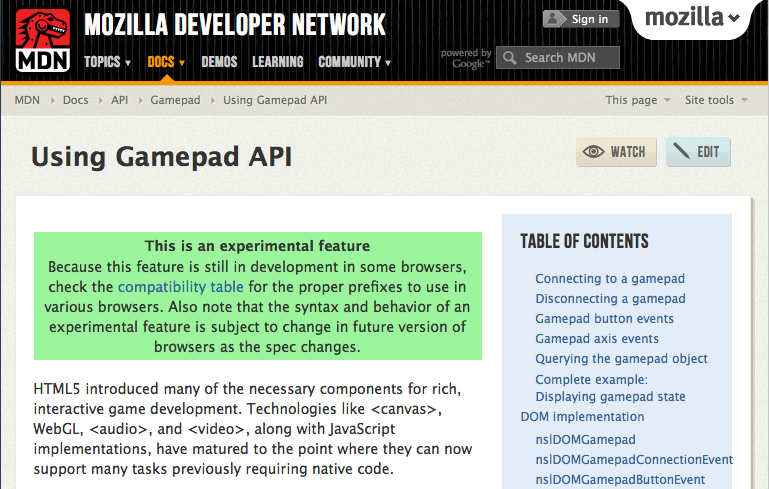
As the web platform is increasingly used for game development, new APIs emerge to help with this use case. Two of the newest ones are the Pointer Lock API and the Gamepad API.
The Pointer Lock API provides more fine-grained control to mouse movements, and introduces methods that address the use case of using the mouse to move an element in a certain way. The Gamepad API, quite predictably, provides the means to use the Gamepad as a first-class input device, rather than having it emulate a mouse, which reduces its potential. Despite being a very new idea, there is already an experimental implementation of the Gamepad API by Mozilla.
Both APIs are developed in the WebApps WG.

Full Screen API
The Full Screen API allows requesting full-screen access from any web application (something that Flash had for a while, but the web platform lacked), as well as detecting it and handling it. The draft has been around for a couple of months now, but now its publication as a First Public Working Draft (FPWD) is imminent so it's in the limelight again.
The Full Screen API is a joint effort between the WebApps and CSS Working Groups. Its earlier drafts are supported by both WebKit and Gecko.
Many thanks to fantasai and David Storey for their ideas and feedback
Words: Lea Verou
Lea works as a developer advocate for the W3C. She has a long-standing passion for open web standards, which she fulfills by researching new ways to use them, blogging, speaking, writing, and coding popular open source projects to help fellow developers.

The Creative Bloq team is made up of a group of art and design enthusiasts, and has changed and evolved since Creative Bloq began back in 2012. The current website team consists of eight full-time members of staff: Editor Georgia Coggan, Deputy Editor Rosie Hilder, Ecommerce Editor Beren Neale, Senior News Editor Daniel Piper, Editor, Digital Art and 3D Ian Dean, Tech Reviews Editor Erlingur Einarsson, Ecommerce Writer Beth Nicholls and Staff Writer Natalie Fear, as well as a roster of freelancers from around the world. The ImagineFX magazine team also pitch in, ensuring that content from leading digital art publication ImagineFX is represented on Creative Bloq.
