Netflix may have unveiled a redesigned logo in April, but for Dublin-based tech startup PR Slides that went nowhere near far enough. In a blog post confidently titled 'What Netflix should look like', art director Philip Joyce outlined a refreshed look for the streaming service - because he loves it so much. This is not as paradoxical as it may seem - there's care and attention-to-detail gone into this concept, designed to improve the experience while retaining the all-important Netflix identity.
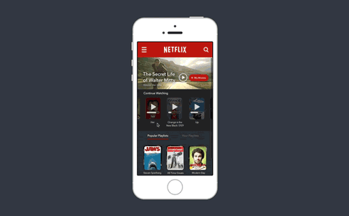
Visual improvements centre around the incorporation of large movie stills as the primary image on each movie or show's page, immersing you in your video selection while a colour-coded sidebar takes on the menu duties. The mobile app has also been made over to incorporate the new aesthetic.
In addition to the UI refresh, several new features have been included in the concept - the most intriguing being Spotify-style playlists. Netflix is famed for its tens-of-thousands of genre collections, so why shouldn't you be able to create your own? Joyce has neatly placed these in playing card-style stacks. More innovation comes in the form of deeper Facebook integration, with an activity feed sidebar.


PR Slides is a free image library for journalists, but their minds are obviously always ticking over if this design is anything to go by. Check out the full concept on their blog, and you can follow Philip Joyce on Twitter.

