Infographics are typically bright, colourful and flat, using 2D vector drawings and concise text bubbles to explain a topic in simple terms. They're easy to read and eminently shareable.
But that doesn’t mean you have to follow the crowd and do exactly the same with every infographic you create.
01. How a car engine works
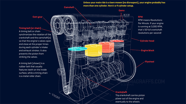
This brilliant infographic explores the inner workings of a car engine in detail, making great use of 3D line drawings, colour and animation to make things clearer. It’s the work of designer Jacob O'Neal, the brains behind Animagraffs.
“Animagraffs are designed to be popular content,” he explains. “When companies buy content, they have less opinion on how it's designed as long as it attracts viewers. So often, clients have a general area of interest (like cars, tech, nature, etc) and we'll propose topics we think might be popular online. Then we handle the rest, from writing to final visual design.”
It’s not easy work, he stresses. “Animagraffs projects are hard work from start to finish, not only due to tech involved, but just researching things properly and getting visuals right. Every step of these projects takes intense effort.”
For this infographic, O'Neal used Blender to create the models and set up the 3D scene, then exported everything using Blend4Web to allow it to be able to display within web browsers.
That last stage can get pretty involved, he notes. “Browsers use WebGL to display 3D content, and it's still pretty new technology. Our projects generally work across devices and platforms, and optimising projects for various scenarios has honestly been very difficult work.
"But it’s all worth it when I can pull out my phone and show people the works of art we make – rotating objects right on the phone.”
02. The flow of international trade

This animated 3D infographic uses figures from the UN’s Comtrade database on the multi-trillion global market for imported goods. Its interactive moving map shows where those goods come from and where they go, with each dot representing $1 billion in value.
Types of trade, such as food, minerals and plastics, are colour-coded so it’s clear what type of goods are going where. And best of all, you can spin the globe and select a country to see the flow of goods in and out of that country.
It was built by Max Galka, who teaches data wrangling/data visualisation at the University of Pennsylvania, using his own dynamic maps software, Blueshift. You can watch him creating it in this video.
03. SWANH

From the serious to the slightly silly... this infographic tells the entire story of the first Star Wars movie and is 123 metres (403.5ft) long. Yes, you read that right: the size of this thing is simply enormous.
Once you’ve had a scroll through it, you won’t be surprised to hear that it took Swiss illustrator Martin Panchaud a year and a half to produce in Illustrator CC, using 157 images across 22 separate files.
“I never thought it would take so long,” he admits now. “To be honest, I think I was only able to do this extensive work because I managed to mislead myself. Initially, I made an estimate at 8m, then at 20 and then at 60, and then I just stopped counting.”
Nor was it a trouble-free process. “I quickly realised that my Illustrator files had too many elements and crashed my poor iMac. So I had to create new files in order to continue working.”
Perhaps surprisingly, Panchaud didn’t create the entire infographic in the same order as the movie. “I began by taking some key scenes of the movie, and imagined what they would be like, with this graphic language,” he explains. “What interests me the most is the narration, how to illustrate actions and dialogues in infographics.
“I then watched the first part of the movie and made a storyboard. Then, I dived into the mechanics of making the movie. The decor, the characters, the costumes... Luckily, this movie is very well documented and it wasn’t too difficult to find what I was looking for. My red thread was the script of 1974 (since there were several versions of the film, I preferred taking the first one).”
He’s regularly asked whether he’ll do another infographic based on The Empire Strikes Back. “The idea is there,” he responds. “But for the moment, I'm working on my graphic novel with the same narrative style. It will be released at the end of 2018 and it will have about 250 pages.”
In the meantime, SWANH will be exhibited in 4K at Onassis Cultural Center in Athens, Greece, as part of the Science Fiction: A Journey into the Unknown exhibition from 9 October to 14 January.
04. Brexit VR infographic

Infographics are now entering the world of virtual reality, and here’s a great example. In the run up to the UK referendum on leaving the EU, Google Labs created this 360-degree data visualisation, which illustrates the top questions being asked in each country on search.
Designed for use with the Google Cardboard VR viewer, it was created in collaboration with Wes Grubbs and the team at Pitch Interactive (who built the original infographic) and coder Michael Chang (who turned it into an immersive VR experience).
You can learn more about how the infographic was created, and what lessons the team learned from it, in this blog post.
05. Income inequality in LA and Chicago

When does an infographic become a work of art? This astonishing creation by Herwig Scherabon somehow manages to tick both boxes. It’s basically a visualisation of income inequality in Los Angeles and Chicago, using the heights of buildings in different areas to represent how poor or wealthy they are.
The biggest challenge was to create a two dimensional base map that would retain the quality and detail of the city’s street grid. “Most of my time went into this phase of the design,” says Scherabon, “And it took a while to learn to control the relationship between two dimensional map and three dimensional outcome.”
The 2D map was colour coded and later translated into height values. Scherabon then used Cinema 4D for generating and rendering the 3D image: “It really enabled me to design the look and feel of the image exactly the way it had to be,” he says.
Another big challenge was to balance the aesthetic appeal of this visualisation with the accuracy of the data. “Ultimately, what these visualisations are about is the more immersive aspect of it and experiencing them as actual large scale prints (150 x 75cm),” he explains.
“Accuracy is important and a top priority for me. However, my focus was definitely on the visual and experiential aspect of the divide.”

