10 great uses of graphic design in Christmas ads
These seasonal print ads all harness the power of great graphic design to make their point effectively.
Sign up to Creative Bloq's daily newsletter, which brings you the latest news and inspiration from the worlds of art, design and technology.
You are now subscribed
Your newsletter sign-up was successful
Want to add more newsletters?
When Christmas ads come round, it’s the blockbuster TV commercials by the likes of John Lewis that get the most column inches. But print ads are far from dead, and there are some great Yuletide-themed print campaigns out there.
These advertisements all showcase the power of graphic design to take a simple idea and execute it in a way that grabs the attention and engages the emotions.
We’re sure there are plenty more great Christmas print ads out there, of course, so feel free to share your favourites in the comments below.
Article continues below01. FoodForward

FoodForward SA (recently rebranded FoodBank SA) has a mandate to collect edible surplus food from manufacturers, wholesalers and retailers, and use it to feed the hungry across South Africa. JWT created this print campaign for the organisation, with evocatively textured lettering and an original but effective colour scheme that really makes the festive scene sing with the joy of the season.
02. Verdant Zeal
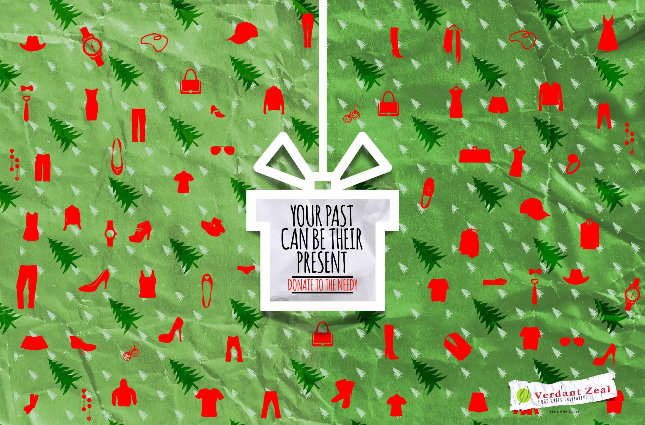
Verdant Zeal is a marketing agency with offices in Nigeria, Ghana and The Gambia. Another charitable campaign, this one emanating from the agency itself, encourages people to donate items to the needy. It takes a simple idea and makes it work brilliantly, through effective use of icons and a grounded, textured feel to the background that makes it look less like something designed on a screen and more like a real, physical experience.
03. Ecovia
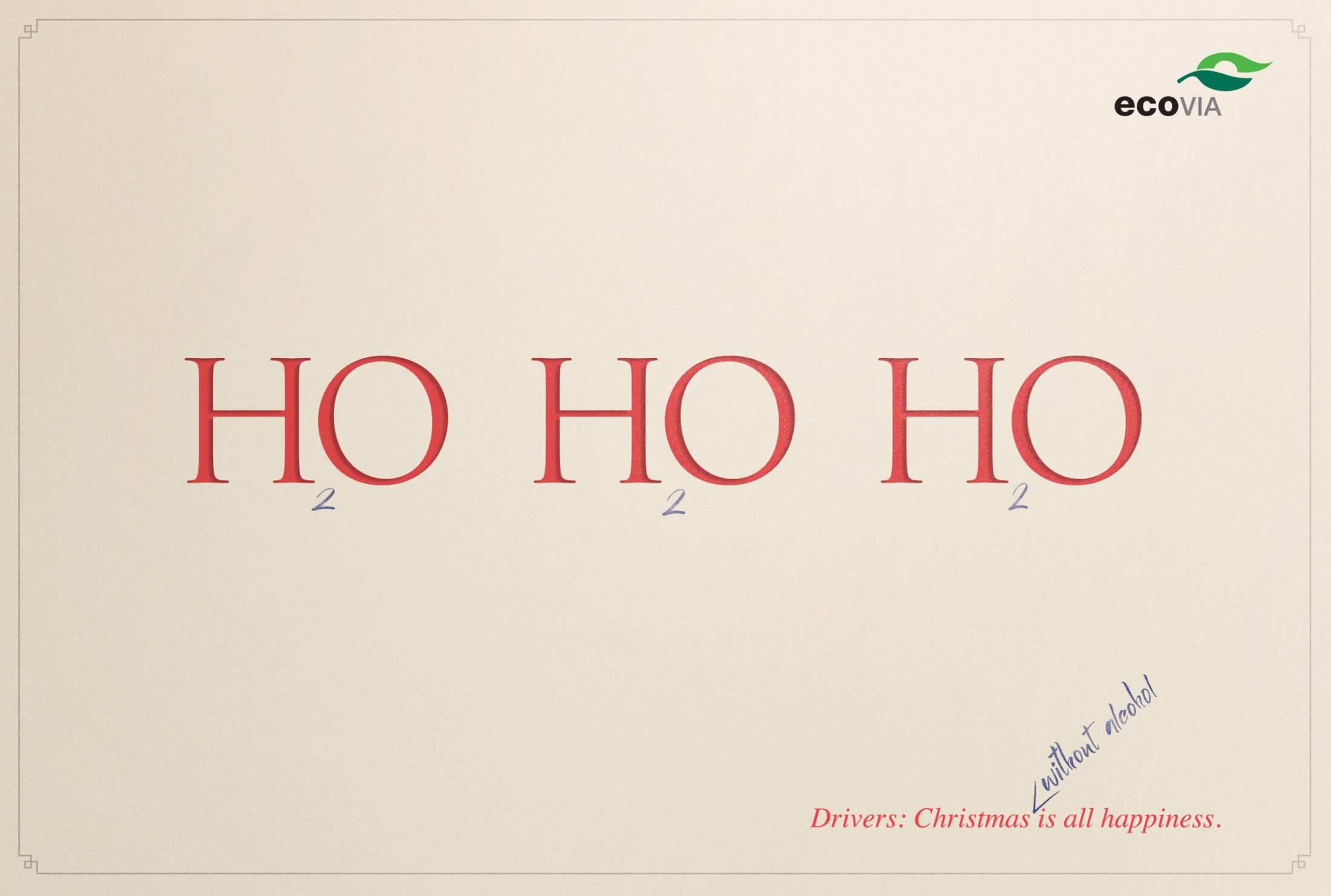
Brazilian advertising agency Terremoto Propaganda designed this public interest poster for Ecovia, which turns the negative idea of "don't drink and drive" into a positive one (drink water instead of beer). This design makes great use of negative space, employs an original, cliche-free colour scheme, and balances a range of different typefaces perfectly. All combine to convey the message with humorous immediacy.
04. Cia Athletica
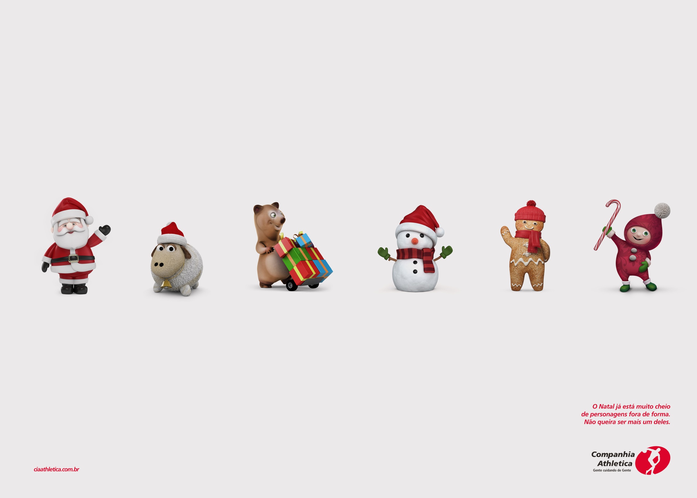
Advertising agency Portal Publicidade designed this print ad campaign for Brazilian gymwear retailer Cia Athletica and stands as a great example of how generous use of white space can double for an expanse of snow. The wry tagline translates as “Christmas has plenty of characters out of shape. Don't be another one.”
Sign up to Creative Bloq's daily newsletter, which brings you the latest news and inspiration from the worlds of art, design and technology.
05. Salvation Army

Helsinki agency Make it Simple created this clever campaign for the Salvation Army, the religious and charity organisation well known for its work with the poor. What’s great about it is the confident and thought-through use of colour to convey the message. There’s no need for frills and fussiness: the red-and-white palette conveys both the ring buoy metaphor and the spirit of Christmas simultaneously.
06. Triumph

There are times when an image looks like a dodgy Photoshop job, and other times when you can’t believe you’re not looking at an original photo. This smile-raising print ad for Triumph motorcycles is firmly in the latter camp. This masterful example of image editing is the work of Strauss Comunicação.
07. Red Cross

Another unlikely combination of the mundane with the seasonal, this print ad for the Ukrainian Red Cross was created by Provid. It’s the attention to photorealistic detail on the blood bag/Christmas stocking that pulls it all together and makes the conceit work so well.
08. Relate
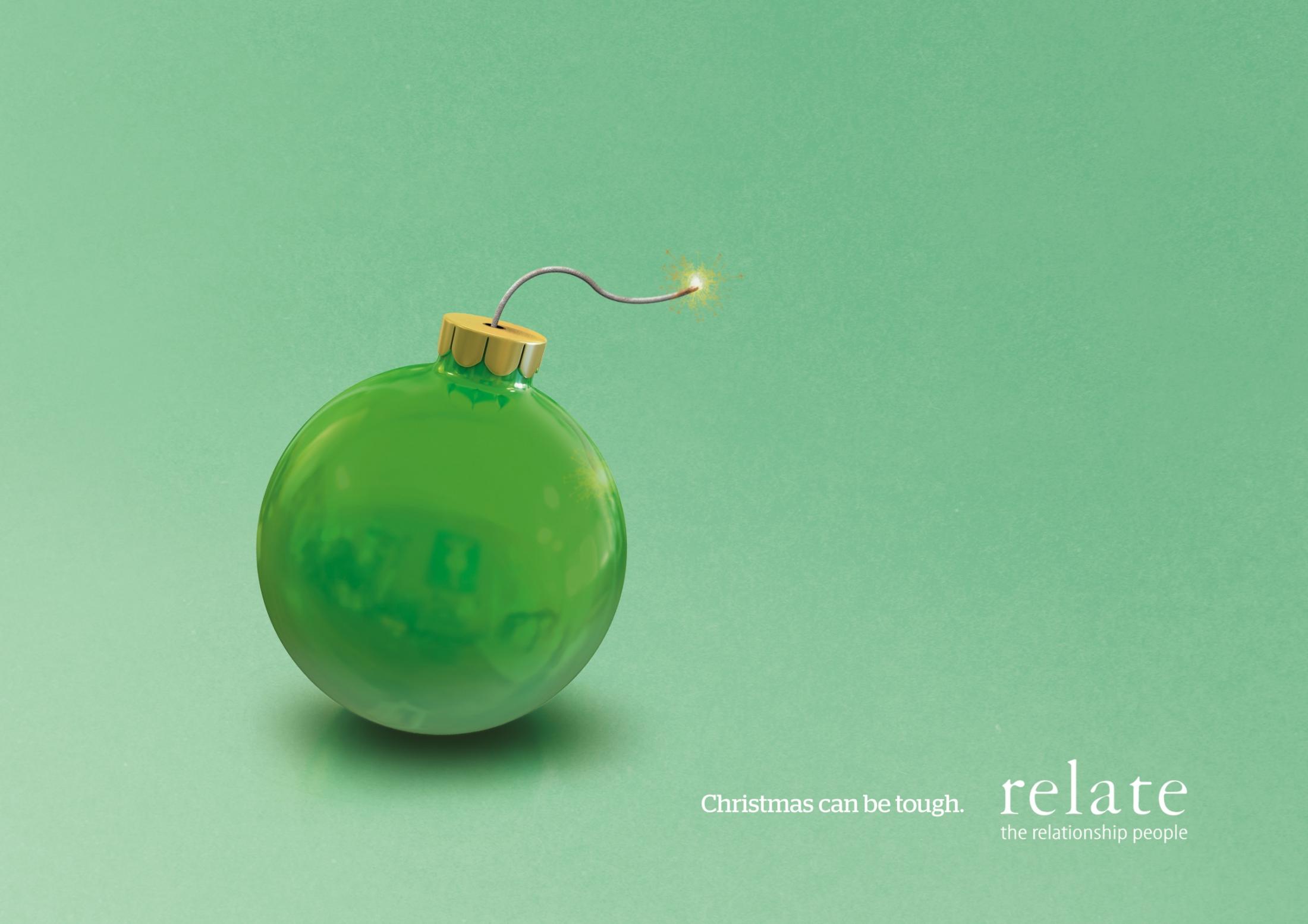
While most Christmas print ads reflect happiness and positivity, relationship guidance experts Relate are more focused on the sadder side of the season. But that’s no reason their print ad can’t raise a smile. The work of advertising agency Big Communications, it’s the original colour palette that really makes this work. Reds and greens would have been a more traditional combination, but this works better, with the calming hue of the background better selling the idea of mediation to resolve a personal crisis.
09. Stihl
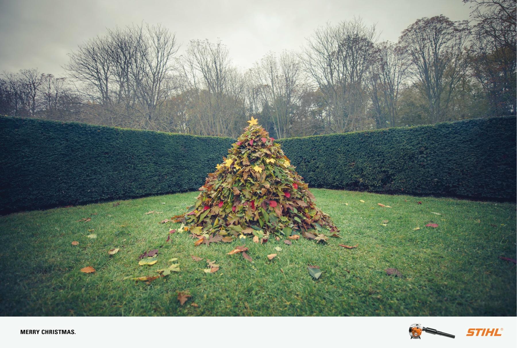
Stihl is a well-known German manufacturer of chainsaws and other power tools, including trimmers and blowers. Focusing your Yuletide print ad on a Christmas tree motif may be the ad industry’s biggest cliche, but this one just works. That’s partly down to the perfect balance in the composition, which has been beautifully realised by Parisian agency Publicis Conseil.
10. Harvey Nichols
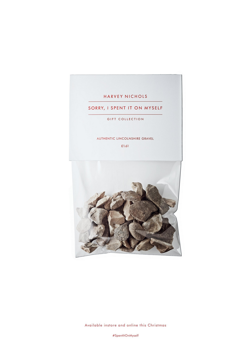
On the one hand, this tongue-in-cheek campaign for the high-end British store Harvey Nichols appears to our darker, greedy side. On the other hand, the luxurious packaging and sophisticated typography of the fake “bad gift” still makes it looks like something you’d want to buy. Great work by Adam & Eve DDB.

Tom May is an award-winning journalist specialising in art, design, photography and technology. His latest book, The 50 Greatest Designers (Arcturus Publishing), was published this June. He's also author of Great TED Talks: Creativity (Pavilion Books). Tom was previously editor of Professional Photography magazine, associate editor at Creative Bloq, and deputy editor at net magazine.
