Critics may have panned the Wachowskis' latest film Jupiter Ascending, yet it's been praised for delivering on visuals what it lacks in substance.
No surprise. While many big budget film scripts read like they're written by a committee of fan boys, time and time again art departments deliver. Jupiter Ascending is no different, and concept artist George Hull's artwork for the film is a case in point.
Creative Bloq spoke to the film's lead conceptual designer (who has worked on the Matrix films, Elysium, The Cloud Atlas, and many more) about creating the "elegant architecture" of spaceships, seeking inspiration in Adolf Hitler's chief architect, and working with the Wachowskis again.

What was your favourite part of the world to depict?
After I read the script I asked the Wachowskis if I could tackle the decorated vehicles and told them I was extremely excited as a designer to work on that challenge.
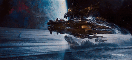
I was asked by the directors to focus on the spaceships, the Zero (Armored Battle Suit), and the ships called the Shadows that attack our heroes on Earth.
I love juxtaposing high tech and low tech, and I could imagine a ship the size of a Star Destroyer, but exquisitely detailed like the gorgeous art deco Carbon & Carbine building in Chicago.

Was working with the Wachowskis this time different to the Matrix films?
Lana and Andy are really kind, humble, generous, and very artistic-minded. They speak creatively in terms and references that I think about as a designer.
Their scripts are already very descriptive from the get go and they have their world within their imagination from the first day I was brought on.

What did you bring to the look of the film's spaceships?
The directors wanted the driving theme for Titus's ship to be elegant, exquisite, rich beyond belief. They gave me reference pictures that spoke to them about gracefulness, and were very particular on the winged solar sail aesthetic.
But putting it all together was a very hard challenge. I started by looking at elegant architecture, Art Deco, even Indian wedding jewellery. But elaborate and over the top embellishments were often busy and not graceful.
Eventually, I remembered no matter how cool an idea is conceptually, the most important attribute is always silhouette and proportions. All the decorative aspects should come later, so I went back and studied elegant animalistic forms. Butterflies, moths, but also Siamese fighting fish, and peacocks.

Drawing a unique shape that had never seen before in the long history of movie space ships was the hardest challenge by far! I absorbed all of the references in my head and just started drawing ideas through my own design personality.
I was also studying decorated weapons from various cultures and I came across an Indian knife and pistol combination that had a very unique shape. I merged this inspiration with a rotated butterfly, I new I was onto something a bit different.
For Balem's ship, Lana referenced Albert Speer, who was a chief architect for Adolf Hitler. So I used more brutalism cues, a bit of gothic and merged with my own industrial shape vocabulary for an imperialistic motif.
Lana and Andy are artistic-minded and we would discuss things like linear forms to contrast the curved language being created for Titus's aesthetic. Shapes, textures and colour palette all were carefully considered with Hugh Bateup supervising as production designer, and Charlie Revai as Supervising art director.

What reference material was most prevalent in your artwork?
The directors and Hugh Bateup collected many wall boards of reference pictures. Everything from Chicago Art deco, elaborate jewellery, to 3D computational architecture.
There was no one dominant reference on purpose, as the goal was to blend it all - historical decorated palaces, unusual hand drawn shapes, fractal textures perhaps - blend it all cohesively with a slight futuristic twist.
It all had to look harmonious at the end which was not my doing past eh spaceships. That was in fact the great work of the production designer who managed myself as well as 18 others artist.
Also the incredible work of Dan Glass and the visual effects artists that should take great credit for bring it all to life with such rich details.

You started work in industrial design, then moved to sci-fi films... do you see similarities to Syd Mead's career?
He was the closest example I could think of when I was thinking about a big change in my career. I got started at ILM as a visual effects art director. After seven years of post production work I learned a lot about visual effects and grew as an artist.
But my deepest passion, at the core of my creative heart, was to dig deep into design on something visually bold. I knew I couldn't get that satisfaction in post production so I left ILM to become and independent, freelance conceptual designer.

It felt like a small step back from a position of leadership, but I knew I couldn't go to my grave without giving it a chance. I'm so thankful I got this opportunity on this huge ambitious film.
The highest prize for a conceptual designer, is to be asked to help invent a bold new visual vocabulary for a world. It is rare a film makes me really push aesthetics, but with the Wachowskis they are always imagining big! I love that feeling while working day to day.
Words: George Hull
George Hull started his career in art as an industrial designer, then moved to ILM straight out of school. He has since worked on Iron Man 2, Elysium, The Cloud Atlas and several of the Wachowski's films.
Like this? Read these!
- 10 digital art events you shouldn't miss in 2015
- Paralysed artist creates incredible work using only his eyes
- Wizards of the Coast artist paints a warrior the Applibot way

