Get started with editorial design
Pro advice for designing editorial layouts.
Sign up to Creative Bloq's daily newsletter, which brings you the latest news and inspiration from the worlds of art, design and technology.
You are now subscribed
Your newsletter sign-up was successful
Want to add more newsletters?
Editorial design can be a daunting task for someone who isn’t used to formatting large amounts of text. The skills you'll need are different to those of other types of graphic design – organisation and planning are key. However, if you're keen to add another skill to your design portfolio, editorial design could be a great place to start.
In this article, I'll share some editorial design tips to make sure your life doesn’t suck while designing editorial layouts in InDesign CC. If you want to take things further, check out our guide to brochure design and our article that teaches you how to design a book cover.
01. Get organised first
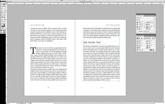
First things first: you need to have all the content organised and finalised before starting to work on the design of your book. Working with content that is still developing will only lead to an inconsistent product and plenty of headaches along the way.
Article continues belowKeep chapters separate and use InDesign’s book feature to link them all together. Never, ever, try to work with one long InDesign document for multiple chapters in a book. It will make your life a living hell.
02. Set up master pages
Set up your Master pages before doing anything else. Your Master pages will include any design elements that will carry through the whole layout, such as folios and automatic page numbering.
Use separate Master pages for different editorial layouts within your document. For example, if you have a sidebar column, set up a master for that type of layout. If you have a layout for the beginning of a chapter, set up a master for that. If you have an Appendix with no formatting, set up a blank master for that... you can see what I’m getting at.
You can use as many Master layouts as you need. This will be a huge time saver in the end.
Sign up to Creative Bloq's daily newsletter, which brings you the latest news and inspiration from the worlds of art, design and technology.
03. Establish a visual hierarchy
Make sure you establish a visual hierarchy, and stick with it. No matter the editorial content, a hierarchy is key. As well as being more aesthetically pleasing, a hierarchy will enable readers to skim the page and find the content they’re looking for. A basic outline for text hierarchy might look something like this: Main headline, subhead 1, subhead 2, pull quotes; body content, captions, folios.
It is very important to make sure the design of each level of the hierarchy is consistent throughout the document, which is where Styles come in. Styles are your best friend; use as many Paragraph and Character Styles as you can. The more efficient you are with these, the easier it is to make sure everything is consistent.
04. Create a balanced layout
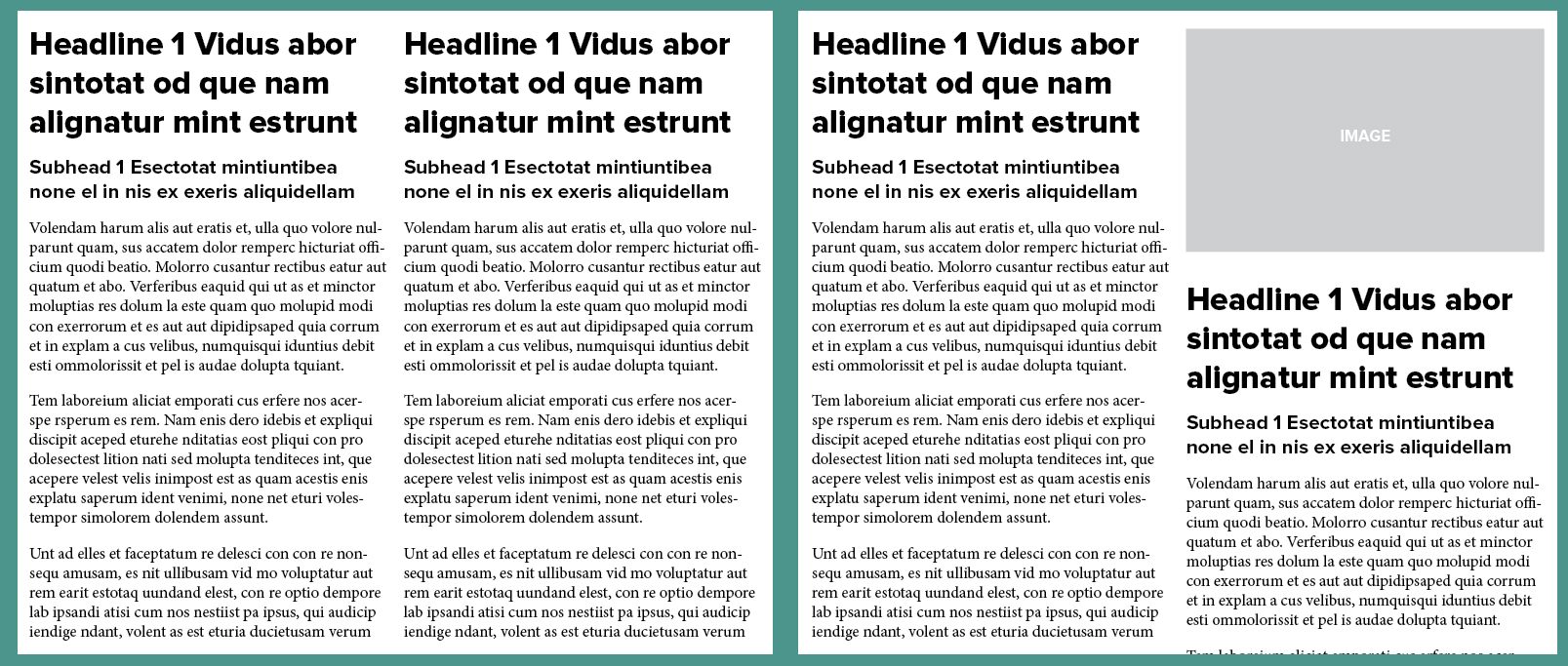
Think about the balance of imagery and text in your layout. It can be a good idea to use images to break bigger chunks of text into digestible blocks to make them easier to read and absorb. Visuals will also make the page more interesting to look at.
Ideally, you want to make sure headlines don’t crash into each other. For example, in a 2-column layout, you would not want to have both columns starting on the same line (above left). Add images to offset the columns (above right), or use the Span Columns function to create a headline that runs across both columns of text.
05. Don't forget about screens
It's not unusual for print articles to be made available to view as PDFs online, so you may need to consider this in your design too. If designing an editorial piece for print, make sure it will be readable when viewed on a screen.
PDFs will often have live hyperlinks, so check these all work. Also consider using links within your table of contents, so readers can quickly jump to the chapter or section they want.
06. Choose fonts carefully
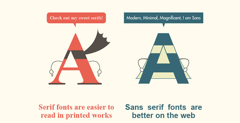
Your decision on which typefaces to use should be based on where most readers will be viewing the editorial. Many people argue that serif fonts are best for large blocks of text in print, while sans-serif fonts work better for large blocks of text on screen.
So if it's going to be viewed by most people as a PDF on a screen, you might want to opt for a sans-serif. If you want to learn more about the reasoning behind this theory, there are great articles here and here. To find a great font from either category, check out our best free fonts for designers post.
Read more:
