80 years of World Cup ticket designs
We look back at the history of FIFA World Cup ticket design from 1930 onwards.
Sign up to Creative Bloq's daily newsletter, which brings you the latest news and inspiration from the worlds of art, design and technology.
You are now subscribed
Your newsletter sign-up was successful
Want to add more newsletters?

Five times a week
CreativeBloq
Sign up to Creative Bloq's daily newsletter, which brings you the latest news and inspiration from the worlds of art, design and technology.

Once a week
By Design
Sign up to Creative Bloq's daily newsletter, which brings you the latest news and inspiration from the worlds of art, design and technology.
Once a week
State of the Art
Sign up to Creative Bloq's daily newsletter, which brings you the latest news and inspiration from the worlds of art, design and technology.

Seasonal (around events)
Brand Impact Awards
Sign up to Creative Bloq's daily newsletter, which brings you the latest news and inspiration from the worlds of art, design and technology.
FIFA World Cup 2014 is underway, and for those lucky spectators who have managed to get a ticket for one or more of the tournament matches, it's a little piece of print design they'll probably cherish for years to come.
But one thing's for sure, that design will be a long way from the ticket designs of the early years of the World Cup. In those first tournaments, tickets were printed with minimal branding and almost no focus on design. But over the years, they have become more elaborate and creative. When Mexico hosted the World Cup in 1970, official logos and branding were created specifically for the tournament and have continued to be produced for every tournament since.
Looking back now, in a similar way to our selection of World Cup posters, some of these tickets are wonderful items whereas others look a little odd. Some contained useful information, whereas some were made to be small pieces of art. Let's start at the beginning...
1930: Uruguay vs Argentina World Cup Final
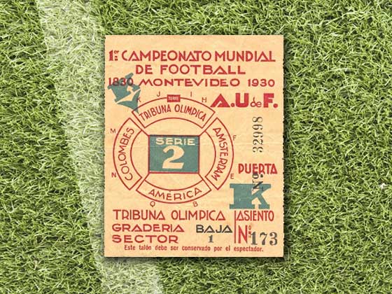
This very first World Cup Final ticket, featuring a slab typeface and two-colour scheme, is pretty standard design-wise. Despite that, it now retails for £1,000 as a collector's item.
1934: Spain vs Brazil first stage
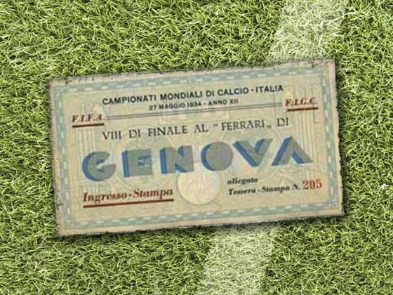
The 1934 ticket provided more typographic variation, with four different styles of font (standard, italic, bold and calligraphy) and the venue location in a 3D font style. Host nation Italy is represented by the Roman artwork in the background and the mosaic tiling around the border, all using a blue and white colour scheme, which is still visible despite the age of the ticket.
1938: France vs Belgium first stage
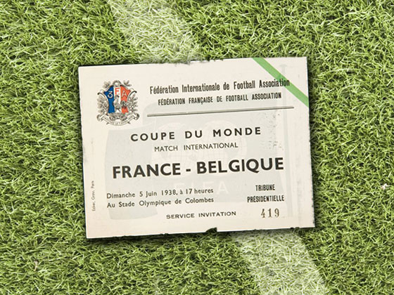
An early sign of the influence of minimalism, this rare ticket has been preserved well as it still shows the original off-white card stock, the combination of font styles used and the unusually placed green stripe in the top right hand corner.
1950: England vs Spain first stage
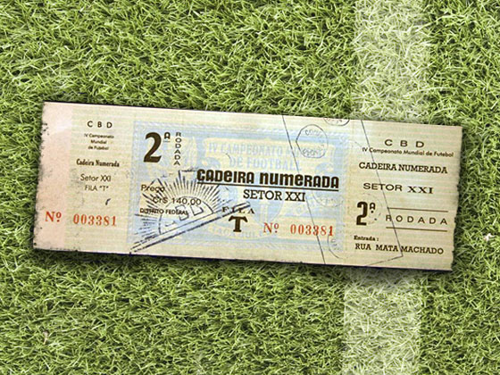
After the World Cup had taken a break for 12 years, this collection of 1950 tickets built upon the style of the 1938 tickets. Using a three-tone colour scheme, this was the first World Cup ticket to contain a stub.
Sign up to Creative Bloq's daily newsletter, which brings you the latest news and inspiration from the worlds of art, design and technology.
1954: West Germany vs Hungary World Cup Final
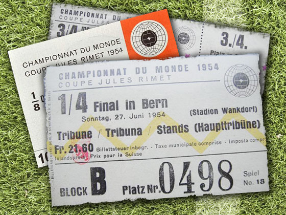
This 1954 Brazil ticket marks a return to a more standard design style, with the stub design gone and just a couple of (fairly random) graphic elements to add interest.
1958: Sweden (various)
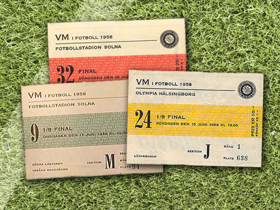
The 1958 World Cup saw a more attractive and thoughtfully designed set of tickets, with nice use of typography and the colourful horizontal stripe balanced nicely with the emblem in the top-right corner.
1962: Brazil vs Czechoslovakia World Cup Final

The 1962 ticket was styled upon a trading card game form factor, with a clean colour scheme rounded off with the white of the card stock. This example is a little faded, but the Pele signature makes up for that.
1966: England vs West Germany World Cup Final
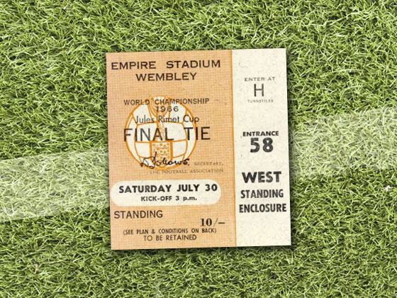
This 1966 ticket expanded on the trading card form factor, with a stub-like design making it clear what entrance to use and where you should stand or sit down.
1970: Brazil vs England quarter-final
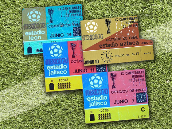
1970 marked the arrival of World Cup branding on the ticket designs. Note the addition of the logo design in the top-left and the time displayed in analogue format on the right-hand side of the date.
1974: Australia vs Chile first stage
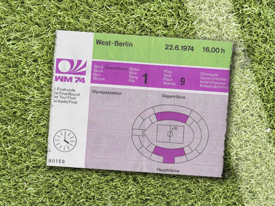
The 1974 ticket also includes the logo, with its colour scheme informing the design. This ticket is particularly user-friendly for the spectator, with an analogue clock indicating the start time, and the seating display, plus corresponding seat numbers, making it easy to find where you need to be.
1978: Netherlands vs Argentina World Cup Final
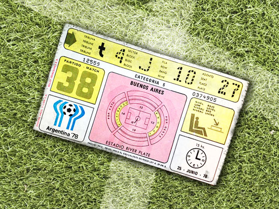
1978 saw a new approach to ticket design, based on a traditional stadium scores and statistics board. There's all the information you need, without the design seeming cluttered. The time is still displayed in analogue, as well as being displayed in 24-hour format above the clock and the date underneath.
1982: West Germany vs France semi-final
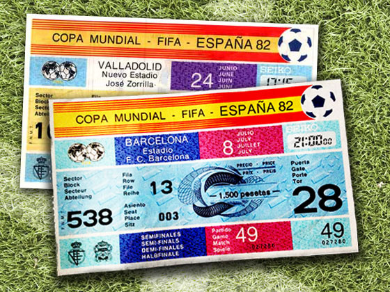
The ticket for the 1982 World Cup, hosted by Spain, is designed around the colours of that nation's flag. Here we see the first use of digital clock, and for the first time the price of the ticket is displayed.
1986: Soviet Union vs Canada group stage
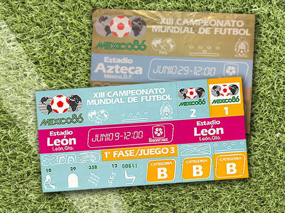
The 1986 ticket uses similar branding to the previous occasion Mexico hosted the World Cup in 1970 but retains the traditional scoreboard layout of the 1978 ticket.
1990: West Germany vs Argentina World Cup Final
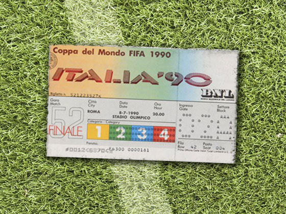
With a slightly washed out colour scheme representing the colours of the Italian national flag, the 1990 ticket design sees the return of 3D text, as first seen in 1934.
1994: Brazil vs Italy World Cup Final
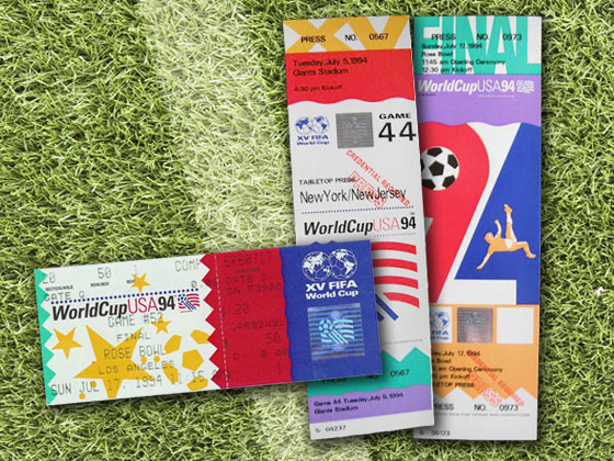
The 1994 ticket uses a huge splash of colours; including the red, white and blue of the national flag. The tickets were sold in two formats, portrait and landscape, both heavily branded with the World Cup USA logo and the FIFA World Cup logo. A series of different font weights, from light to bold, are used - even in the logo itself.
1998: France vs Brazil World Cup Final
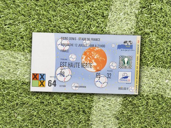
The 1998 ticket combined a light blue and white colour scheme with a striking red globe (the colour has washed out over time). The text was printed using a dot matrix printer, which restricted what could be used: it was the first time since 1970 that a brand hasn’t been applied to the ticket design.
2002: Brazil vs Germany World Cup Final
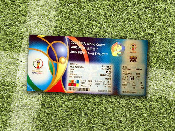
The 2002 ticket is remininscent of heavy branding applied to the 1994 USA ticket. The ticket design incorporates the logo's colour scheme of gold, purple, green, blue and red and reinstates the ticket stub. This cut the hologram in half, showing the ticket is authentic and allowing ground staff to check attendees into the match.
2006: Italy vs France World Cup Final
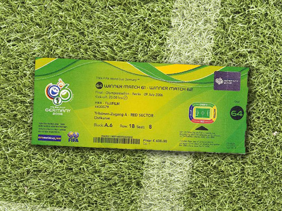
The 2006 ticket design is similar to that 2002's, and features the same custom-made font used in the logo, venue and team names. Each ticket was given a number, which is the only item printed on the stub of the ticket; all other contents are held in the main body.
2010: Spain vs Netherlands World Cup Final
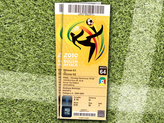
The 2010 ticket design combines design elements from the 2002 and 2006 tickets and borrows ideas from the 1994 USA ticket. Again using custom made typography, this ticket was printed vertically, with the stub being toned down into a barcode format, which corresponds with the barcode at the top of the ticket. The gold-yellow colour scheme fits in nicely with the green, red and purple used in the logo.
Words: Shout Digital
Shout Digital is a full service digital agency, headquartered in Newcastle upon Tyne, working for clients including Elanders UK.

The Creative Bloq team is made up of a group of art and design enthusiasts, and has changed and evolved since Creative Bloq began back in 2012. The current website team consists of eight full-time members of staff: Editor Georgia Coggan, Deputy Editor Rosie Hilder, Ecommerce Editor Beren Neale, Senior News Editor Daniel Piper, Editor, Digital Art and 3D Ian Dean, Tech Reviews Editor Erlingur Einarsson, Ecommerce Writer Beth Nicholls and Staff Writer Natalie Fear, as well as a roster of freelancers from around the world. The ImagineFX magazine team also pitch in, ensuring that content from leading digital art publication ImagineFX is represented on Creative Bloq.
