João Oliveira puts on his fashion 'face
We catch up with João Oliveira to find our more about the designer's stylish new typeface
Sign up to Creative Bloq's daily newsletter, which brings you the latest news and inspiration from the worlds of art, design and technology.
You are now subscribed
Your newsletter sign-up was successful
Want to add more newsletters?
Portuguese art director, graphic designer and illustrator Joo Oliveira counts everyone from Adidas and Nike to Diesel and Hugo Boss as clients. When he let us know he was releasing a brand new typeface, we thought we'd catch up with him to find out more...
Computer Arts (CA): What was the inspiration behind the typeface?
Joo Oliveira (JO): "Typography masters such as Bodoni and Didot and elegant personality of calligraphy typefaces, especially their extravagant and endless swashes."
Article continues below 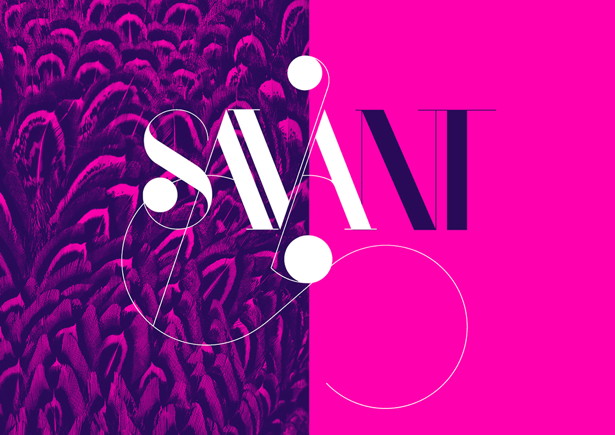
CA: How would you describe the typeface?
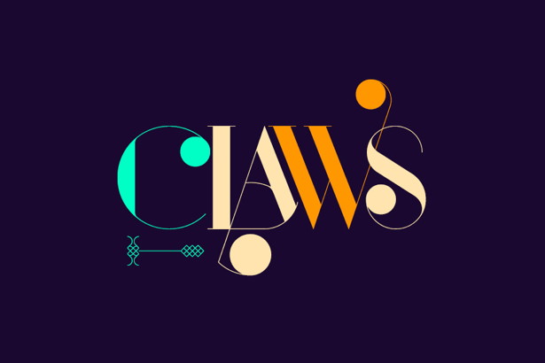
JO: "Port is an experimental Didone display typeface with a modern twist: a mixture of distinct typographic flavours combined in unexpected and surprising ways, melting the straight lines and strong contrasts of Didone typefaces with the elegant lines of calligraphy in a geometric way, and resulting in exuberant characters with geometric swashes that can be combined in countless ways."
CA: What, if any, problems did you encounter creating the typeface?
JO: "Being in development for over a year, I faced several problems: maintaining a visual coherency throughout hundreds of characters was the first problem I encountered. So I had to create and follow rules I could apply throughout the whole development process. Having so many alternate characters was another. Kerning was also difficult."
Sign up to Creative Bloq's daily newsletter, which brings you the latest news and inspiration from the worlds of art, design and technology.
CA: Where and how do expect to see it used?
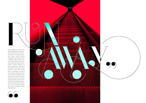
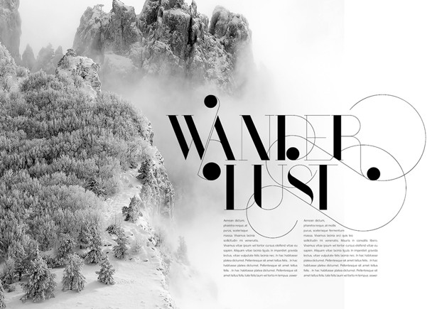
JO: "Being a designer who loves typography and editorial design, my objective with Port was to create a display typeface to be used on editorial projects like magazine spreads. It's probably aimed at fashion magazines – sometimes it can be funky, sometimes it can be glamurous, but I would love to be surprised and see it being used on unexpected ways."
See more of Joo Oliveira's work at onrepeat.net and on his Facebook page.

The Creative Bloq team is made up of a group of art and design enthusiasts, and has changed and evolved since Creative Bloq began back in 2012. The current website team consists of eight full-time members of staff: Editor Georgia Coggan, Deputy Editor Rosie Hilder, Ecommerce Editor Beren Neale, Senior News Editor Daniel Piper, Editor, Digital Art and 3D Ian Dean, Tech Reviews Editor Erlingur Einarsson, Ecommerce Writer Beth Nicholls and Staff Writer Natalie Fear, as well as a roster of freelancers from around the world. The ImagineFX magazine team also pitch in, ensuring that content from leading digital art publication ImagineFX is represented on Creative Bloq.
