This salty streetwear collection is nautical but nice
How nautical flags and maritime imagery inspired Matt W Moore's collection for streetwear brand Glyph Cue.
Sign up to Creative Bloq's daily newsletter, which brings you the latest news and inspiration from the worlds of art, design and technology.
You are now subscribed
Your newsletter sign-up was successful
Want to add more newsletters?
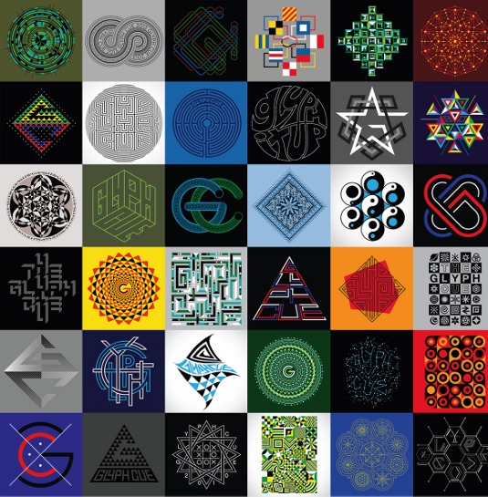
Matt W. Moore took inspiration from nautical and navigational imagery for the Glyph Cue Winter 13/14 collection, creating four new designs to be screen printed onto cotton sweatshirts. This latest collection marks the brand's five year anniversary and has been designed to work in concert with previous annual collections.
We decided to launch the Glyph Cue brand back in 2008, after years of involvement in the street level fashion industry. As a designer, working with many brands on their collections, I always had a strong desire to build my own brand and direct the course of the graphic narrative. My business partner Kris Wilfert and I were in Las Vegas at the Magic tradeshow and we decided to just go for it.
Even with all of the brands out there doing different things with tees, we still noticed a clear opportunity to make a unique contribution. Much of the fashion world is just reacting to current hype. To be memorable, you need to be original and unexpected, with a strong narrative that holds the brand together through the years.
Article continues belowThe name 'Glyph Cue' refers to the idea of taking meaning and direction from symbols and signs, and the brand is all about telling stories through graphic artworks. Our designs are supposed to be deciphered, sometimes quite literally and sometimes in a more abstract way. This newest series of work was inspired by the sea, using nautical and navigational imagery as a starting point.
Matt W. Moore walks through how he and business partner Kris Wilfert create a design:
Ideas and sketches
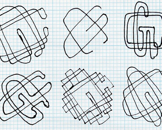
This series takes its cues from the sea - the graphics are inspired by nautical lore and navigational iconography. All my designs begin with a list of ideas, then I do quick sketches on scrap paper. I like to get the best results by creating lots of options and identifying the best ones rather than locking in on one idea.
Creative partners
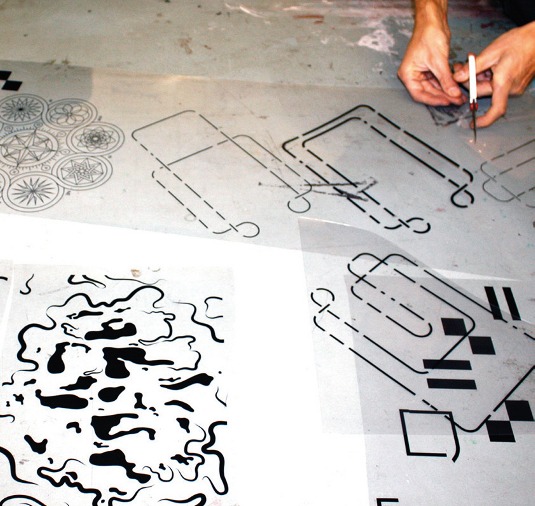
The creative process is similar to working with any brand on a series of graphics for fashion and textiles, but there's a nice freestyle aspect as I'm a partner. We always review and discuss everything on the design side, but my partner Kris trusts my intuition when it comes to which designs we proceed with.
Sign up to Creative Bloq's daily newsletter, which brings you the latest news and inspiration from the worlds of art, design and technology.
Nautical palette
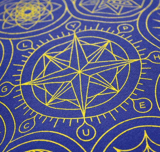
Every collection has a new colour palette. This one takes inspiration from the bold colours of nautical flags: white, red, yellow, blue and black. With intricate designs like 'Navigation', for which I custom-designed nine diff erent compass rose-style graphics, it was important to keep the colours simple and bold.
Coded concepts
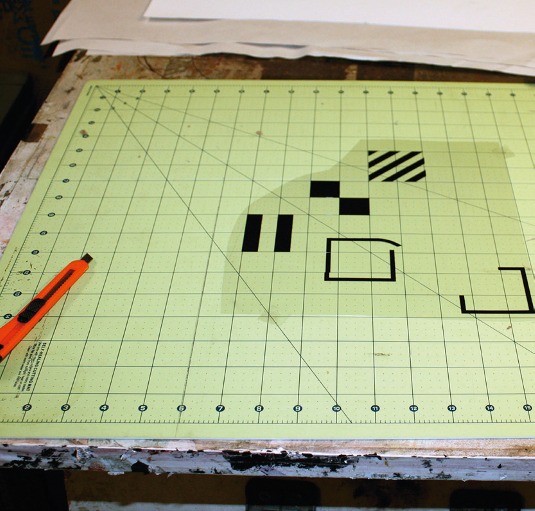
The concept for 'Nautical Flags' had been on my brainstorm list for years. Sailors use 26 flags corresponding to the alphabet, so I arranged the eight flags of our brand name into a diamond shape and added a square knot in the centre. It's a simple code and graphic that stands strong, with or without that knowledge.
Ink on cotton
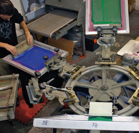
We use the best Plastisol inks and double-hit each layer to ensure longevity and colour richness. We have used other inks, such as the eco ink for our hemp collection, but good old-fashioned Plastisol ink on thick cotton is still our favourite. We've developed a great understanding with our screenprinters, Arm Factory.
Test strokes
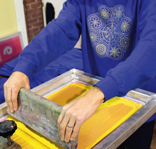
A lot of testing went into getting the hairline yellow stroke on 'Navigation' just right - too thick and the graphic would seem too heavy, too thin and it wouldn't endure in the salty sea air. I'm often standing next to the printer through the sampling phase, but for this collection I was travelling so he figured it out and kept me updated.
Retail stock
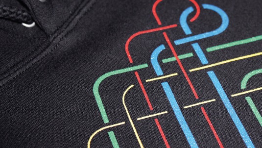
I worked for about two weeks designing this collection, refining the details and making the colour palette cohesive. Then Arm Factory printed our first batch of retail orders and sent through enough to stock our online shop. We're five years and 10 collections deep, so we have a nice rhythm and an established process.
Words: Matt W Moore
Matt W Moore is the founder of design, illustration and fine art studio MWM Graphics. This article originally appeared in Computer Arts issue 225.

The Creative Bloq team is made up of a group of art and design enthusiasts, and has changed and evolved since Creative Bloq began back in 2012. The current website team consists of eight full-time members of staff: Editor Georgia Coggan, Deputy Editor Rosie Hilder, Ecommerce Editor Beren Neale, Senior News Editor Daniel Piper, Editor, Digital Art and 3D Ian Dean, Tech Reviews Editor Erlingur Einarsson, Ecommerce Writer Beth Nicholls and Staff Writer Natalie Fear, as well as a roster of freelancers from around the world. The ImagineFX magazine team also pitch in, ensuring that content from leading digital art publication ImagineFX is represented on Creative Bloq.
