Create responsive grid layouts with Bourbon Neat
Bourbon Neat is an open-source grid framework built on top of Sass. Derek Blank explains how to code responsive layouts faster and smarter.
Over the past two years, CSS preprocessors have proven their worth tenfold. We'll soon reach a point where it's no longer appropriate to debate when to use a preprocessor or framework. Instead, the scope of the application will either demand or eliminate the need for one.
When appropriate, abstraction of frontend assets is mostly a good thing: as processes get faster and more routinised, we'll expect to see project life cycles shorten, developer headaches decrease and project budgets reduce.
- Download the source files for this tutorial
To some, grid frameworks are a burden. Applied with consideration, they should be seen as a foundation. Rather than sighing at the announcement of yet another grid framework, we should interpret each newcomer as part of the next logical step in the trend of abstraction occurring in frontend development. With that, allow me to introduce to you that next step: Bourbon Neat.
Article continues below 
Handcrafted by thoughtbot in Boston, Bourbon and Neat are actually two distinct tools. Bourbon is essentially a distilled mixin library, while Neat is a semantic grid framework dependent on Bourbon. Both are dependencies of Sass (and play very well with Ruby). If you're comfortable with Sass and semantic markup, you'll feel right at home with Bourbon Neat.
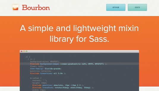
Bourbon
Bourbon provides common mixins and functions to save time. If you just want to take a look at the features that Bourbon offers, you may want to skip to the next section. Otherwise, peruse the following instructions for installation. For Rails 3.1+ apps, set-up couldn't be easier. Include the following in your Gemfile:
gem 'bourbon'Run the following command:
bundle installNext, add .scss file extensions to your .css files and delete the following sprockets directive:
Sign up to Creative Bloq's daily newsletter, which brings you the latest news and inspiration from the worlds of art, design and technology.
*= require_tree .Then add the following to the top of your main style sheet:
@import "bourbon"You're ready to go! Non-Rails projects have it just as easy, though, especially if you're using CodeKit. First install the Bourbon gem:
gem bourbon installThen generate the Bourbon folder:
(bourbon install)Then command Sass to watch your style sheets:
sass --watchFinally, import Bourbon at the beginning of your main style sheets:
@import "bourbon/bourbon" 
First steps

Bourbon simplifies many things. After installation, there's really no configuration needed to get started. If you were to take a peek at Bourbon's source code, you'd discover that it's essentially just SCSS. Supplementing the benefits provided by Sass, Bourbon includes out-of-the-box solutions for increasingly common CSS3 idioms, such as animations, gradients, and image optimisation.
Vendor prefixes become a non-issue. The maintainers of Bourbon are adamant about the project's source conforming to the CSS3 specification, which ensures that your code remains sustainable as technology progresses. Make sure you update the gem regularly, because changes are rapid.
Mix it up
If you're familiar with the Sass mixins syntax, you'll understand Bourbon almost immediately. For instance, simply include the following style declaration to create a linear gradient:
@include linear-gradient(#1e5799, #2989d8);Compiled, this will create a gradient using hex or RGB colours as arguments. Up to 10 colour-stops are supported – and the gradient can even be rotated by degrees. Bourbon makes development for HiDPI devices easier too. Using the hidpi media query mixin, we can create a breakpoint that will specifically target HiDPI devices:
@include hidpi(1.5) {
width: 260px;
}
The raw CSS output of the above declaration highlights the efficiency of CSS preprocessors in general:
@media only screen and (-webkit-min-device-pixel-ratio: 1.5),
only screen and (min--moz-device-pixel-ratio: 1.5),
only screen and (-o-min-device-pixel-ratio: 1.5/1),
only screen and (min-resolution: 144dpi),
only screen and (min-resolution: 1.5dppx) {
  width: 260px;
}
Bourbon also includes a number of useful 'add-ons' to speed up development. Well-designed buttons can easily be created with a few lines of code. Again, hex or RGB values may be passed as arguments:
button {
@include button(#ff0000);
}
You may be happy to learn that Bourbon recognises certain web typefaces, too. We're provided with shorthand for creating font stacks that reference some of the most popular choices. Using the font-family add-on, we can declare:
font-family: $helvetica;You can probably guess the CSS output:
font-family: "Helvetica Neue", Helvetica, Arial, sans-serif;Pretty handy, right? It's not mind-blowing, but it saves time.
Bourbon also includes a very useful image-replacement mixin for hiding text, which is intended to be an alternative to the classic text-indent technique. To use, include the following line in your code and follow it with a backgroundimage declaration:
@include hide-text;We can take a look at Bourbon's source code to see what's going on behind the scenes:
@mixin hide-text {
color: transparent;
font: 0/0 a;
text-shadow: none;
}
Upon examination, it's clear that Bourbon's techniques are simple. Could you write these mixins yourself and include them in your own project? Absolutely. Would you want to? Let the scope of your endeavour decide.

Closing time
In short, Bourbon provides a solid foundation for speeding up development of CSS3 features. It's simple enough to comprehend within a few minutes, yet powerful enough to be used alone on large projects. However, the true power of Bourbon is evident when used in tandem with its grid framework, Neat.
Neat
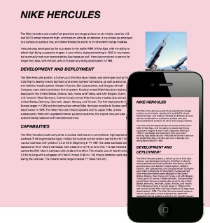
Rather than filling your HTML markup with grid structure classes, Neat enables you to use Sass mixins to define column counts, grid spans and breakpoints within your own Sass. This also allows for dynamically altering column counts at different breakpoints.
Getting started
Installation is much the same as Bourbon. (If you just want to read about Neat's excellent features, feel free to skip to the next section.) After ensuring you have installed Sass and Bourbon, run:
gem install neatThen cd into your scss directory, and run:
neat installAlso include the following line at the top of your main scss style sheet:
@import "neat/neat";You're ready to start using Neat.

The grid
According to Thoughtbot, "the main motivation behind Neat is allowing anyone to build fluid, entirely semantic grid layouts without having to wade through hundreds of lines of documentation." If you can count to 12, you're already halfway to comprehending Neat. Take a look at the markup for a standard twocolumn layout:
<section class="wrapper">
<article class="primary">Neat is an open source semantic grid framework
built on top of Sass and Bourbon…</article>
<aside class="secondary">Discover more at neat.bourbon.io</aside>
</section>
With a few lines of SCSS, we can turn this vanilla markup into a functioning column layout:
.wrapper {
@include outer-container;
.primary { @include span-columns(8); }
.secondary { @include span-columns(4); }
}
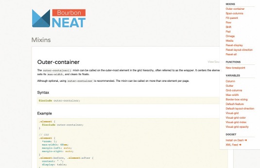
These are simple concepts but, when unravelled, we find there's a lot of powerful stuff going on. The outer-container() mixin is always called on the outermost container element of the grid. outer-container() will centre the element, set its max-width (which can be assigned to a variable via Sass) and clear any floats. Taking a look at the compiled CSS output, we can see that it does so in a very sustainable way:
.element {
  *zoom: 1;
  max-width: 68em;
  margin-left: auto;
  margin-right: auto;
}
.element:before, .element:after {
  content: " ";
  display: table;
}
.element:after {
  clear: both;
}
Likewise, the span-columns mixin provides a lot of service for very little expense. The desired number of columns is passed as an argument. Including the following line on an element's style would set the element's width to fill eight columns of a 12-column grid:
@include span-columns(8);When nesting selectors with Sass, it's necessary to pass the number of columns of the parent element as well:
.example {
  @include span-columns(6);
  .nested-example {
    @include span-columns(2 of 6);
  }
}
Afterwards, you can get fancy with things like rows:
.example {
  @include row();
}
The row() mixin will clear any floats on an element and allows you to pass the display property as an argument. You can also shift columns horizontally:
.example {
  @include shift(-3);
}
This compiles to:
.example {
  margin-left: -25.58941%;
}
Neat also provides the ability to remove the column gutter from any element and designate it as the last element in a row by using the omega mixin:
.element {
  @include omega;
}
The omega mixin will accept any nth-child value as an argument, a useful feature for tasks like creating a two-column grid using the list items of only one ordered list. Neat also allows you to create responsive layouts with a few lines of code: define breakpoints by declaring different device types as variables:
$mobile: new-breakpoint(max-width 480px);
$desktop: new-breakpoint(min-width 850px);
We can then apply different styles to different devices by applying the appropriate media query, like so:
.element {
  @include media($mobile) {
  @include span-columns(4);
}
  @include media($desktop) {
    @include span-columns(12);
  }
}
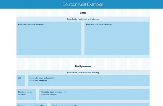
Neat additionally includes a handy visual grid that can be displayed over your project to put things in perspective. The following code would overlay a transparent grid within your markup for debugging:
$visual-grid: true;
$visual-grid-color: red;
$visual-grid-index: front;
$visual-grid-opacity: 0.1;
Just don't forget to turn it off when you're done!

Caveats and conclusion
As the CSS spec evolves, some features will inevitably become deprecated and new ones will be added. This is a great thing for the web's development, but not always practical for developers who need to support legacy browsers.
Fortunately, Bourbon Neat rigidly matches the CSS3 spec, so sustainability isn't as much of an issue. Bourbon supports the latest version of most major browsers, including IE9+. However, IE7+ support is possible when Bourbon is used with Selectivizr for CSS3 selectors and Respond.js for media queries.
As the Apollo program rocketed to the moon on the successes of Mercury and Gemini, earlier toolsets like Compass and Bootstrap have successors in tools like Bourbon and Neat. In short, it's improvement in the bottom line for all.
Words: Derek Blank
This article originally appeared in net magazine issue 245.
Liked this? Read these!
- Web design inspiration: great examples of CSS3
- Our favourite web fonts - and they don't cost a penny
- Discover the top jQuery plugins

The Creative Bloq team is made up of a group of art and design enthusiasts, and has changed and evolved since Creative Bloq began back in 2012. The current website team consists of eight full-time members of staff: Editor Georgia Coggan, Deputy Editor Rosie Hilder, Ecommerce Editor Beren Neale, Senior News Editor Daniel Piper, Editor, Digital Art and 3D Ian Dean, Tech Reviews Editor Erlingur Einarsson, Ecommerce Writer Beth Nicholls and Staff Writer Natalie Fear, as well as a roster of freelancers from around the world. The ImagineFX magazine team also pitch in, ensuring that content from leading digital art publication ImagineFX is represented on Creative Bloq.
