Get to grips with CSS3 multiple background images
What if you could keep your HTML clean and still add a number of separate images to your design? Freelance front-end designer Prisca Schmarsow shows you how you can do this with CSS3 multiple background images
- Knowledge needed: Basic HTML and CSS
- Requires: HTML/CSS editor, modern browser
- Project time: 30 minutes - 1 hour
- Download source files
- View demo
We’ve all been there: you’re on a flow, you’re drawing and sketching your bright idea of a design that is to wow people with its imagery. Then, you come to produce it.
And your enthusiasm gets a blow as you realise that this is not quite as easily done as you thought. Your design is to be accessible and requires several images which should all be flexible and controlled separately.
What are the options? Do you commit crimes against semantics and add presentational markup to your otherwise clean and minimal code? Or do you compromise your original idea, stick to your principles but sacrifice some of the finer details?
Luckily we no longer need to worry in regards to background images. Now, we have CSS3 and the ability to apply multiple background images to any element we like. Creative freedom!
In this tutorial, I’d like to take you through creating a 404 page design using multiple background images.
The final page design
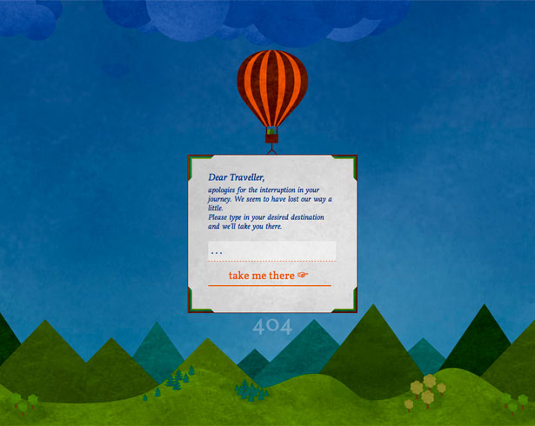
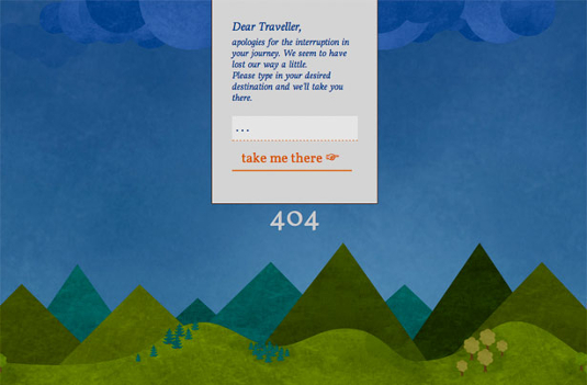
Our final design shows the error message with a search box, presented in a sign suspended from a balloon hovering over a landscape. At the top, there is one large cloud with a few smaller clouds scattered over the sky. We’ll also keep the ‘404’ on the page to indicate the error. Our hidden surprise is to use a subtle parallax effect to shift the position of the mountain peaks, hills, and the clouds when the browser window is resized.
HTML structure
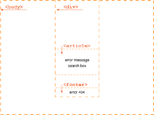
Let’s start by setting up the HTML page, getting our boxes into place. Considering the content first, we can keep to three core boxes:
Daily design news, reviews, how-tos and more, as picked by the editors.
- one wrapper DIV which will contain all page content
- an article for the text and search box
- a footer for the 404 error
- <body>
- <!-- START content wrap -->
- <div id="wrap">
- <!-- START article -->
- <article>
- <h1>Dear Traveller,</h1>
- <p>
- apologies for the interruption in your journey. We seem to have lost our way a little.
- <br />
- Please type in your desired destination and we'll take you there.
- </p>
- <form>
- <input type="text" value=". . ." id="search" onclick="this.value=''" />
- <input type="submit" value="take me there ☞ " id="searchsubmit" onclick="search.value='. . . '" />
- </form>
- </article>
- <!-- END article -->
- <!-- START footer -->
- <footer>
- 404
- </footer>
- <!-- END footer -->
- </div>
- <!-- END content wrap -->
- </body>
With the HTML done we're set.

and ready to get onto the styling.
Content styling
Let’s start by styling the content first and then proceed to adding the images.
All content is placed on the sign suspended from the balloon – we will set the width of the wrapper DIV to be a minimum of 150px, adding a percentage for smaller/larger screens, and centre it within the window. All content has a generous outer spacing to allow for good legibility as well as the addition of our border graphics later on.
- /* content wrap */
- #wrap {
- min-width: 150px;
- width: 28%;
- margin: 0 auto;
- }
- /* main content */
- article {
- border: 1px solid #461200;
- background-color: #d4d4d4;
- }
- article h1 {
- display: block;
- width: 76%;
- margin: 1.8em auto .2em auto;
- font-size: 1.26em;
- font-style: italic;
- }
- article p {
- width: 76%;
- margin: 0 auto 1em auto;
- font-style: italic;
- }
- /* search box */
- article form {
- display: block;
- width: 76%;
- margin: 1em auto 0 auto;
- }
- article input {
- display: block;
- width: 96%;
- margin: 1em auto 0 auto;
- padding: .26em;
- border: none;
- border-bottom: 1px dashed #cc5100;
- background: rgba(255,255,255,.4);
- font-size: 1.36em;
- color: #1d3d89;
- }
- article input:hover, article input:active, article input:focus {
- background: #fff;
- color: #531900;
- }
- article input[type=submit] {
- display: block;
- width: 100%;
- background: none;
- border: none;
- border-bottom: 2px solid #cc5100;
- font-size: 1.46em;
- line-height: 1.2;
- margin: .5em 0 2.36em 0;
- color: #cc5100;
- }
- article input[type=submit]:hover, article input[type=submit]:active, article input[type=submit]:focus {
- cursor: pointer;
- color: #1d3d89;
- font-style: italic;
- border-color: #531900;
- }
- /* footer */
- footer {
- text-align: center;
- font-size: 3em;
- line-height: 1;
- color: #ccc;
- color: rgba(255,255,255,.2);
- }
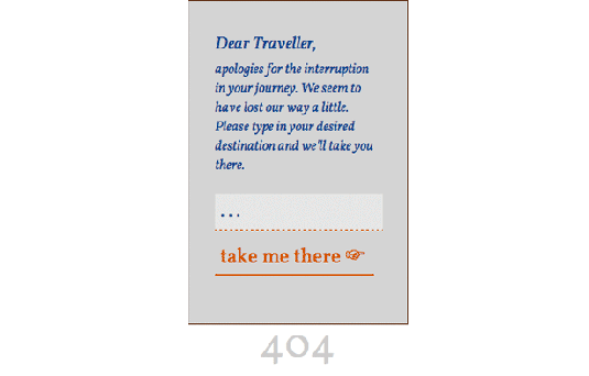
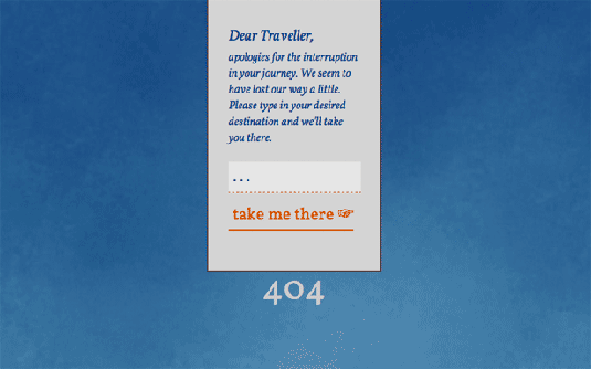
Our page now shows all content neatly grouped and centred within the browser window.
Adding the visuals
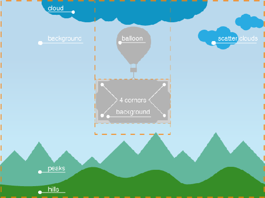
Before we can get stuck into adding our images let’s have another look at the design and figure out how many images we will need.
Image break down:
- background image – sized to fit the window
- cloud – large cloud visual, centred within the window
- scattered clouds – several smaller clouds, flexible positioning
- peaks – repeated horizontally, flexible positioning
- hills – repeated horizontally, flexible positioning
- balloon – centred above the page content
- sign background – tiled
- 4x corner images – positioned into each of the four corners of the sign
Let’s go through implementing each image in turn:
1. background image
The background image shows a soft texture with a subtle gradient, lighter at the horizon and darkening towards the sky. In order to maintain this shading we'll scale the image to fill the window.
As the visual sitting at the very bottom of the image stack we will apply this to the <html> tag. To ensure that the HTML box will fill the window, regardless of actual content height, we will set the width and height to 100% and apply the background image as follows:
- html, body {
- padding: 0px;
- margin: 0px;
- width: 100%;
- height: 100%;
- }
- /* --------------------------------
- separate rules to keep FF happy
- -------------------------------- */
- html {
- background-color: #447d9a;
- background-image: url(imgs/bg.jpg);
- background-repeat: repeat-x;
- background-size: cover;
- background-attachment: fixed;
- }
Note that the rules are written very specifically, avoiding the shorthand approach. This is necessary to avoid problems with Firefox.
If you want to find out more about the CSS background size property go and read this great tutorial by Stephanie Rewis.
2. cloud, peaks and hills
Now we’re getting to the fun part, and the point of this tutorial: the use of multiple background images, applied to one HTML element – but there are a few things to consider first.
Browser compatibility:
Luckily, at the time of writing, the use of multiple background images is supported by the latest versions of all common browsers.
If a browser doesn't support multiple background images, it will ignore the entire property. It's therefore advised to set a default background first, even if only for colour, and then overwrite it with the multiple background images which will be implemented by all compatible browsers.
For more detailed information on browser support, see caniuse.com.
Stacking order of multiple background images:
To apply several images the standard background property is used, listing the images one by one, separated by commas. If you want to specify a background colour it will need to be set last and without the preceding comma.
- background: url(img1.png), url(img2.png), url(img3.png) #fdfdfd;
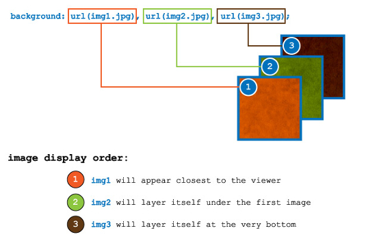
When applying more than a single background image to an HTML element a set stacking order will become apparent. Contrary to what you might expect the order is reversed to the HTML stacking order where the first element listed becomes the bottom most layer.
For the CSS3 multiple images however, the first image you specify will become the top most image, with the second image positioning itself underneath, the third image again below the first and the second and so on.
Controlling positioning and repetition:
Controlling the additional properties of the images – we can either use shorthand, or a second declaration.
Shorthand CSS:
- background: url(img1.png) top left no-repeat,
- url(img2.png) bottom left repeat-x;
Separate declarations:
- background: url(img1.png), url(img2.png);
- background-position: top left, bottom left;
- background-repeat: no-repeat, repeat-x;
In this case, each property will applied following the order specified for the images.
Back to our design:
Taking another look at our design, we'll need to be clear on how the visuals are to be stacked.
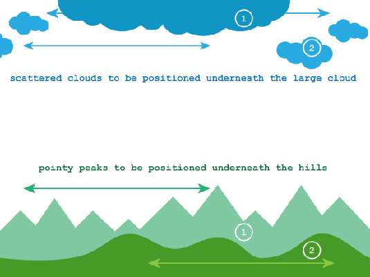
First we'll need to specify one of the visuals as background image for browsers that won't be able to implement the multiple background images.
Overwriting this property we can then proceed to list our images in our preferred stacking order:
- body {
- background: url(imgs/peaks.png) bottom center repeat-x;
- background: url(imgs/cloud.png) top center no-repeat,
- url(imgs/clouds-scatter.png) -46% -330px repeat-x,
- url(imgs/hills.png) bottom center repeat-x,
- url(imgs/peaks.png) bottom right repeat-x;
- }
Both the percentage and the left / right positioning of the images will now show the parallax effect when the window is resized. And best of all, no additional mark up was required!
3. Custom corners
The background for our design is now complete. Time to finalise the content wrapper, adding the balloon and the sign’s custom corners.
Positioning the content itself lower within the page will free space for the balloon visual which is applied to the wrapper DIV and positioned into place.
- /* content wrap */
- #wrap {
- min-width: 150px;
- width: 28%;
- margin: 0 auto;
- padding: 150px 0 0 0;
- background: url(imgs/balloon.png) center 85px no-repeat;
- }
- /* main content */
- article {
- border: 1px solid #461200;
- background-color: #d4d4d4;
- margin: 150px 0 0 0;
- }
Our final step is to add the custom corners to the sign, framing the content text. With a fixed sized element the solution would be simple, one plain image would be enough. But as we’d like our content box to remain flexible and resize to the window width, as well as resize when the text is enlarged, we'll need to apply each corner image separately, allowing the box itself to remain scalable.
Before the support for multiple background images this would have been another headache and dilemma. You might remember doing some nasty things when creating rounded corner boxes? Polluting your code with presentational markup?
No more. For these corner graphics we can now easily add four images, a separate graphic for each corner. Again, we need to choose one image to be applied for older browsers and then add the corner visuals in one by one, setting the background last.
- article {
- border: 1px solid #461200;
- background-color: #d4d4d4;
- margin: 150px 0 0 0;
- background: #d4d4d4 url(imgs/sign-bg.png) center repeat;
- background: url(imgs/sign-border-tl.png) top left no-repeat,
- url(imgs/sign-border-tr.png) top right no-repeat,
- url(imgs/sign-border-bl.png) bottom left no-repeat,
- url(imgs/sign-border-br.png) bottom right no-repeat,
- url(imgs/sign-bg.png) center repeat;
- }
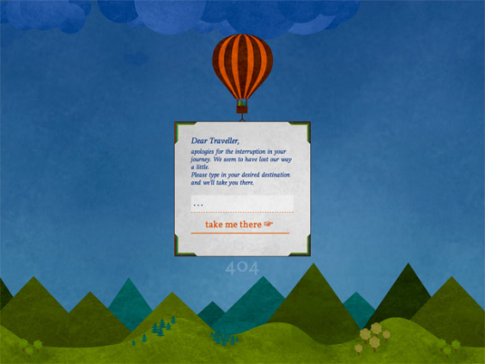
And we’re done – hope you had fun!
Looking back and planning
Before you get carried away now, do bear in mind that the support for multiple background images will only work reliably for the latest versions of the popular modern browsers. You'll still need to consider other browsers and older versions and implement appropriate fallback options. Plan carefully how your design will appear in incompatible browsers.
There are quite a few solutions for this problem out there, such as using jQuery or using pseudo-elements (:before/:after) to add additional elements. But you might not even have to go down that path as this property will be simply ignored by browsers which don't understand it – the solution could be as simple as defining a different background image entirely, one which could include multiple visuals.
Happy designing and coding!

The Creative Bloq team is made up of a group of art and design enthusiasts, and has changed and evolved since Creative Bloq began back in 2012. The current website team consists of eight full-time members of staff: Editor Georgia Coggan, Deputy Editor Rosie Hilder, Ecommerce Editor Beren Neale, Senior News Editor Daniel Piper, Editor, Digital Art and 3D Ian Dean, Tech Reviews Editor Erlingur Einarsson, Ecommerce Writer Beth Nicholls and Staff Writer Natalie Fear, as well as a roster of freelancers from around the world. The ImagineFX magazine team also pitch in, ensuring that content from leading digital art publication ImagineFX is represented on Creative Bloq.
