Get more out of your CSS transitions with jQuery
CSS3 transitions alone don’t always quite cut it. We can use a little help from jQuery to get better control over them and push them just a bit further. Val Head shows us how
CSS animation and transitions have a lot of potential for bringing your design to life. But they often leave you wanting just a little bit more control to get what you really want.
You'll see how easily we can extend the usefulness of these CSS features by adding just a tiny bit of JavaScript. We'll create a more advanced interaction while keeping our code nice and simple. The best of both worlds!
Building our interactive widget
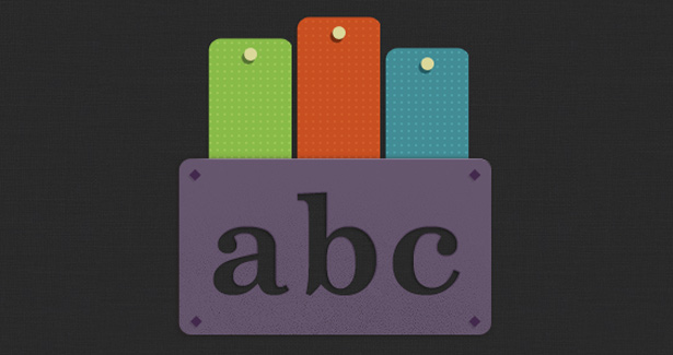
Our example is based on a little interactive widget that I made with the fine folks at Bearded. It’s the digital version of a puzzle that allows you to slide wooden blocks into place to fill letters. When you click on a block it slides down, and if you click it again it slides back up. (It’s obviously meant for a kids’ site of some kind. The “abc” part probably gave that away.)

Our basic structure
Since this is a demo page, we've got exactly what we need and nothing more:
Article continues below<div id="wrap"> <img src="img/abcmask.png" class="mask"> <div id="blocks"> <div class="col col1" ></div> <div class="col col2"></div> <div class="col col3"></div> </div></div>We have two layers of content that we'll be working with. Starting from the back, we first have the three divs that represent the movable wooden blocks of our puzzle. These are contained within their parent div, #blocks, to make positioning easier later. On top, we have an image that will be acting as our mask. It's not a true mask but a .png with some well placed transparency so that we'll be able to see though the letter shapes.
To position the two layers of our animation we position them both absolutely at 0 pixels top and left. Our image gets assigned a z-index to keep it on top, and a slightly lower top position of 118 pixels so it sits at the bottom of our widget.
#blocks { width:300px; height:300px; position:absolute; top:0; left:0; overflow:hidden;}/* our "mask" image positions over top of the animated blocks */.mask { position:absolute; top:118px; left:0; z-index:500;}Let’s get things moving!
Now that we have our elements all nicely in place, let's move on to the fun stuff and set up our transitions.
The effect we're going for in this case is blocks of wood being pushed down into a slot. We don’t need to accurately simulate realistic physics here, but something that suggests a bit of friction is what we're going for. This is the time to play around and get the easing that best fits your particular situation.
For me, the basic easing keywords left a lot to be desired, so I looked to ceaser to help me define some custom cubic-bezier timing functions for my transitions that I was happier with. It’s a handy tool that let’s you test out various timing functions and provides the code for you. The numbers can be a bit scary looking but the near infinite easing possibilities they provide makes up for it.
/* shared styles and animation definitions for all of our animated blocks */.col { width:72px; height:144px; position:absolute; top:10px; -webkit-transition: all 225ms cubic-bezier(0.545, 0.165, 0.835, 0.425); -moz-transition: all 225ms cubic-bezier(0.545, 0.165, 0.835, 0.425); -ms-transition: all 225ms cubic-bezier(0.545, 0.165, 0.835, 0.425); -o-transition: all 225ms cubic-bezier(0.545, 0.165, 0.835, 0.425); transition: all 225ms cubic-bezier(0.545, 0.165, 0.835, 0.425); }We want all three boards to move in the same way so we can define our transition (along with all the associated vendor prefixes) in a single class, col, that we’ve assigned to all our coloured boards. As an added bonus, this helps keep things nicely organised too.
If you're new to CSS transitions it might seem strange to define the transition here. CSS transitions work by being assigned to the element that will be transitioned. The all keyword in our transition means that it will be applied to all eligible properties for that element when they are changed.
With our shared styles in place, we'll move on to assign each coloured board its background image and a slightly staggered start position to make things look more varied and playful.
Additionally, we've created a class called col-anim that defines a top position representing the lowest the point all the coloured boards can possibly reach. This will come in handy a bit later.
/* specific images and top positions for each of our blocks */ .col1 {background: url(img/aslider.png); top:22px; left:26px;} .col2 {background:url(img/bslider.png); top:4px; left: 100px;} .col3 {background:url(img/cslider.png); top:30px; left:174px;} /* the class we'll toggle with jQuery to trigger our transitions */ .col-anim {top:96px;}Now we have some nicely positioned layers to our puzzle and a transition that we like for them, but they're still just kind of sitting there waiting to become, well, interactive. There’s just one last step.
Sign up to Creative Bloq's daily newsletter, which brings you the latest news and inspiration from the worlds of art, design and technology.
Adding the jQuery
To start a transition we change the position of one of our elements. As long as there is a CSS transition applied to that element and the property that’s changing, we’ll see it animate to the new position.
When working purely with CSS, you've probably done this most often by defining a property change on hover. The same basic principal applies here, but we're going to apply the change via jQuery. More specifically, we're going to add and remove a class on the active board’s div dynamically to change its top position when it's clicked.
Diving into jQuery, we first set up a click event with this line:
$("#blocks div").click();We can even be so efficient as to write just one function for all three of the divs. That should get us some extra points. (“#blocks div” means that we’re assigning a click event to all child divs of #block.)
With that in place, the function we define will be executed each time for that div when it’s clicked:
$(this).toggleClass("col-anim");Put them together, and we have a rather efficient looking function. Not bad for five whole lines of code!
$(function() { $("#blocks div").click(function() { $(this).toggleClass("col-anim"); }); });toggleClass comes in very handy here and does exactly what it's name suggests. The class will be added to that div if it isn't currently there, or if it’s already there it will be removed. It’s like an on/off switch.
Adding and removing that class effectively changes the top position of the div each time it's clicked. If you’ve been following along you know that change in the top position triggers our transition. And that chain of events is what drives our interactive animation!
By combining toggleClass and a transition we get an interaction that feels nicely responsive and handles interruption well with a very minimal amount of code. Try clicking the board again before it reaches the bottom to see this in action. You’ll have to be quick, but the board will start moving back to it’s original position even if it hasn’t reached the bottom yet. We’re letting the inherent behaviours of CSS transitions do some of the heavy lifting for us!
But wait, there’s more ...
Clickable puzzles are fun and all but they probably aren't so common in the grand scheme of things. However, the underlying technique of dynamically assigning a class via jQuery to trigger a transition has a lot of potential applications beyond puzzles.
This technique can also be used to trigger CSS keyframe animations. Just define your animation in a specific class and then assign that class via jQuery when you want that animation to play. That exact approach is used in sites likes one hour per second to change the scrolling background animations for each "story" as it goes by. It's especially handy for looping animations.
If you’ve used similar techniques to push your CSS transitions and animations to the max, I’d love to see them!

The Creative Bloq team is made up of a group of art and design enthusiasts, and has changed and evolved since Creative Bloq began back in 2012. The current website team consists of eight full-time members of staff: Editor Georgia Coggan, Deputy Editor Rosie Hilder, Ecommerce Editor Beren Neale, Senior News Editor Daniel Piper, Editor, Digital Art and 3D Ian Dean, Tech Reviews Editor Erlingur Einarsson, Ecommerce Writer Beth Nicholls and Staff Writer Natalie Fear, as well as a roster of freelancers from around the world. The ImagineFX magazine team also pitch in, ensuring that content from leading digital art publication ImagineFX is represented on Creative Bloq.
