Slash build time with proportional RWD
Dan Nisbet says there's a technique that's gaining traction that allows us to slash our design-build overhead. The secret: the humble em.
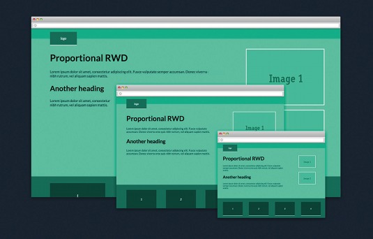
No matter how you work, implementing the principles of responsive web design (RWD) on a large, complex project can be tricky. Like it or not, attaining the hallowed ground of multi-device, cross-platform layouts has a tangible overhead.
The more breakpoints and grid changes your content and framework dictate, the more complicated and time-consuming it becomes to maintain a project. At its worst, an elegant start can descend into a nightmare of specificity and confused overriding declarations. Potentially impacting your site performance with bloated CSS and an increased page load.
Expanding on already well-documented responsive techniques, we'll look to form a predicable pattern of responsive scaling, which can result in cleaner, lighter CSS and increased maintainability.
Article continues belowCombining an em-based layout and typography with flexible widths, we can serve up consistent large screen designs in which all elements both take full advantage of available screen real-estate and resolution. Change the layout once and you can be quietly confident that the change has been reflected throughout all of your breakpoints, and all controlled by a single CSS declaration. Sound good to you? Let's get started.
Dealing with the screen
The crux of any responsive site is in the definition how major and minor breakpoints allow a flexible grid to collapse, or equally, expand. No matter your preferred workflow, producing visuals with a modular style guide or designing in browser, it's the viewport width and its effect on our content that should drive our design decisions.
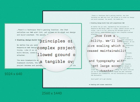
But the viewport width isn't the end of it. We also have to contend with a multitude of physical screen sizes with differing resolutions. Your content can both be magnified and reduced depending on the display. It can have a marked effect on the legibility of your content and effectiveness of your layout. For example, typography set to look comfortable on a large display will be totally inappropriate for a smaller device.
This isn't a new problem. In fact, screen resolution has always been a limiting factor in how we've designed websites. Remember the 960 grid, or designing for 760 before that? RWD's flexible approach to layout has helped us negotiate this limitation. Yet, it can still hold some challenges and, surprisingly, an opportunity.
Sign up to Creative Bloq's daily newsletter, which brings you the latest news and inspiration from the worlds of art, design and technology.
Proportional thinking
In many ways, responsive typography has already gone some way in addressing our concern. It's common to encounter a site where headings and copy reduce in size as the screen real estate tightens.
While triggered by a narrowing viewport, the text can also be seen as applying appropriate scaling for the screen resolution. It becomes acceptable to reduce the font size because the reduction is countered, in part, by a magnification at smaller resolutions. The most common and perhaps most inefficient approach to responsive typography is the simple styling and then restyling of elements at individual breakpoints. Client-side scripts are also often used to dynamically resize headings, maximising their size to fit within the available space, FitText and slabText being some of the more popular open-source projects. But there is another approach, a simple yet powerful technique and one that should capture our interest.
Controlling scale with relative units
No doubt you've used pixels to size your typography and layout and why not? Converting a design into HTML requires a common unit and there's nothing wrong with using pixels. But there is a drawback. Pixels are absolute values, ignoring the context of their environment. (It's often accepted that a single CSS px equates to a physical screen pixel. In a high-definition world, that's not always the case.)
Ems are different. Defined as font-relative lengths, they are directly proportionate to a parent element's font-size. Defining this as a percentage will scale any child attributes defined in ems by that factor. Setting your font-size on the root of your document, you have a global effect on your typographic proportions.
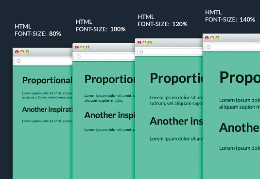
Let's create a basic document with a HTML fontsize of 100%, with headings set in ems. Now, lower the HTML font-size to 80%. Everything defined in ems will scale by 80%. We can better take advantage of this with the introduction of media queries.
For example:
@media screen and (max-width: 55em) {
html { font-size: 80%; }
}
By simulating different viewport widths, you can get a feel for how our typography now scales. This can work both ways, by defining a font-size above 100% we can also enlarge our text.
@media screen and (min-width: 75em) {
html { font-size: 135%; }
}
A simple premise, but a powerful one. By using this method you can effectively control an entire site's typographic sizing with a single CSS declaration, completely avoiding the need to repeatedly target individual elements. If your document's vertical rhythm is composed of relative units, it will also scale beautifully. Find a live example of this on CodePen.
Adding a little more structure
As we've seen, defining our typography with ems can allow us to take full advantage of its relative properties. But ems are not only valid for typographical elements, we can use them to define any CSS measurement and, in doing so, we'll bind them into a relational relationship with the root font-size.
Sounds good. But if you're not careful, ems can cause trouble. When nested they can produce unwanted scaling through inheritance. But ems have a more inheritance-friendly counterpart in the form of rems.
A rem functions in the same manner as an em, with the only difference being that it looks directly to the root font-size for its relational value. This works around our inheritance issue and is perfect for our application.
While rems were broadly supported by leading browsers around the same time as media queries, for pre-CSS support, however, we can use px values as a unit fallback.
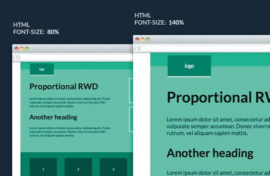
Expanding on our previous example, let's add a little more structure, being sure to define all of our layout and typography in rems with one exception. Because of an issue with Safari, we'll need to define our media queries in standard ems. You can view the expanded example on CodePen.
With that in place, the entire layout now scales, getting smaller as the screen narrows and larger as it widens. But importantly, it stays in proportion with both our typography and its surrounding framework. But, let's be honest, without a flexible grid at its heart, we are some way off a truly responsive layout. We need a plan.
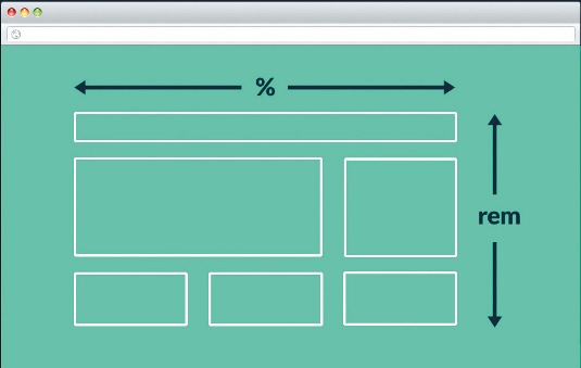
We can still achieve our flexible layout in precisely the same way we would normally approach a responsive build. We just have to show a little discipline in where we introduce percentages into the mix. It's helpful to visualise two separate planes of effect within our document.
Plan of attack
The horizontal: anything that makes up the combined width of the document is defined as a percentage. This includes the likes of: widths, margin, padding, and border-left and right.
The vertical and everything else: specified in rems and bound to the documents root font-size it should be our default unit, including: min- and max-width, top and bottom relative, and absolute positioning.
Let's put that into action:
html { font-size: 100%; }
h1 { font-size: 2.75rem; }
h2 { font-size: 2.125rem; }
.wrapper {
width: 100%;
min-width: 50rem;
margin: 0 auto;
}
.header {
position: relative;
width: 100%;
height: 3rem;
}
.header-logo {
position: absolute;
top: 1rem;
left: 6%;
width: 5rem;
padding: 1.3rem 1.5rem;
}
.article {
overflow: hidden;
}
.article-content {
float: left;
width: 56%;
padding: 2rem 6% 4rem;
}
.article-aside {
float: right;
width: 26%;
padding: 1.5rem 5% 3rem 0;
}
.article-figure {
padding: 0 2%;
}
.article-figure > img {
margin: 1.5rem 0 0;
}
.auxiliary-list
{
margin: 0;
padding: 0 0 0 6%;
}
.auxiliary-list > li
{
display: inline-block;
}
.aux-item
{
width: 19%;
margin: 2rem 5.6% 2rem 0;
padding: 3.1rem 0;
}
.footer {
width: 97%;
padding: 3rem 0 0 3%;
}
@media screen and (max-width: 55em) {
html { font-size:80%;}
}
@media screen and (min-width: 65em) {
html { font-size:115% }
}
@media screen and (min-width: 75em) {
html { font-size:135%; }
}
For the sake of brevity, we're only dealing with layout within our example. You can view the complete styles on CodePen.
This all seems pretty straightforward, but, with percentages controlling two aspects of our layout, it can be a little confusing. So, to be clear, the percentages that make the document's overall width are not directly influenced by our root scaling. By maintaining this separation we can produce a site that is both flexible and one that can be proportionally scaled.
In the wild
While these short examples show the basic premise of what we're looking to achieve, its real life application will often rely on converting a design comp into styled HTML. For that, we'll need a method of expressing pixel measurements in rems.
Luckily for us, this already exists. It's a formula you should already be familiar with. It's the same as one we use to find proportional percentages in a responsive workflow, that is:
target ÷ context = resultBecause rems are font-relative lengths, our context is then tied to the root font-size. Assuming a HTML font-size of 100% equates to 16px, then an example measurement of 58px would be 58 divided by 16 equals 3.625 rem. This is also true of converting px based font-sizes to rem units. It's completely feasible to work out our rem values longhand. But that in of itself creates an overhead, a barrier to working efficiently. Using a CSS preprocessor like Sass can save us a lot of the heavy lifting. With a simple mixin in place, we can define all of our measurements in pixels, making our CSS easier to digest.
$em-root: 16px !default;
@function rem($target, $context: $em-root)
{
  @return ($target / $context) * 1rem;
}
Hidden benefits
Often overlooked, the browser zoom function allows users to control the magnification of a site. It forms an important part of a suite of accessibility tools for people with visual impairments. Untested, it can cause layouts to behave unexpectedly, potentially impacting site navigation. With our scaling patterns in place, we find ourselves replicating this native behaviour and testing against it becomes part and parcel of our workflow.
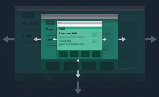
Scaling also helps us to present a more consistent experience over a wider number of screens. This consistency can help to find workflow efficiencies when working with a larger team. Many conversations on how the content should reflow and associated complexities can be reduced. Testing and QA become easier, as expectations are the same throughout the large-screen experience. This can allow us to invest more time in crafting interaction and our experience as a whole.
Taking it too far
Scaling your content has its limitations. Don't use it to the detriment of your small screen experience. Proportional RWD can work beautifully with a mobile first approach. We can look to craft our small screen experience with the introduction of a major breakpoint defining a small and large screen layout each controlled by an independent scaling pattern.
Conclusion
A simple execution, combining flexible widths with proportional scaling, can deliver a number of benefits. It achieves our responsive goals while presenting consistent, predicable layouts to our audience and reduces the need to re-flow our content. By echoing the browser native scaling function, we inherently test our designs against an undervalued accessibility feature.
On larger projects, the scaling of layouts reduces the need for redundant CSS, and allows for a more efficient team workflow, slashing our design and build time.
Words: Dan Nisbet
This article originally appeared in net magazine issue 253.

The Creative Bloq team is made up of a group of art and design enthusiasts, and has changed and evolved since Creative Bloq began back in 2012. The current website team consists of eight full-time members of staff: Editor Georgia Coggan, Deputy Editor Rosie Hilder, Ecommerce Editor Beren Neale, Senior News Editor Daniel Piper, Editor, Digital Art and 3D Ian Dean, Tech Reviews Editor Erlingur Einarsson, Ecommerce Writer Beth Nicholls and Staff Writer Natalie Fear, as well as a roster of freelancers from around the world. The ImagineFX magazine team also pitch in, ensuring that content from leading digital art publication ImagineFX is represented on Creative Bloq.
