
We are delighted to reveal the full list of winners at the Brand Impact Awards 2024, after the Best of Show and Social Impact Awards were presented at our winners' celebration event in London on 7 November.
Following our rigorous new process established in 2023, our global judging panel had three weeks to review and rate the entries independently – and then small specialist panels of 5-6 came together over a two-week period to debate the final results in their allocated categories.
From just over 200 entries, a total of 56 projects from 34 different agencies made it through to the shortlist stage. Several of those received multiple awards apiece: we're proud to announce a total of 7x Gold Awards, 24x Silver Awards and 39x Bronze Awards.
All our winners will receive one of our all striking new BIA Mallet trophies, designed in collaboration with Taxi Studio.
So without further ado, here are this year's winners...
Best of Show
Brand Impact Awards 2024: Best of Show
For the first time since 2015, we are proud to reveal two Best of Show Awards – selected by a panel-wide vote from all our Gold-winning projects.
Why two? Because we feel it’s important to acknowledge, at the highest level of the scheme, that the DNA of a high-impact campaign and a beautiful-yet-robust identity system, built for longevity, are fundamentally different.
And when pitting them directly against each other for a Best of Show accolade, the wow factor and rich in-the-moment storytelling of the former cannot be easily compared to the rigour and craft of the latter.
Samsung Micro Miracles by ManvsMachine


- Best of Show: Campaign
- Gold Award: Technology & Telecoms
- mvsm.com
“Mesmerizing.”
Heitor Piffer – Design Bridge & Partners
Competing against six other projects, our Best of Show (Campaign) earned over a third of the total vote from our global panel for this year’s top accolade.
This ground-breaking campaign celebrates Samsung’s pioneering role in producing semiconductors: the nanoscopic, unsung heroes of technological progress. Micro Miracles features 3D-printed models on a nanoscopic scale, captured using a one-of-a-kind scanning electron microscope (SEM).
Collaborating with agencies BMB and Cheil Worldwide and production partner CYLNDR, ManvsMachine handled direction, design, animation and post-production for the campaign. This included creating a series of dioramas to depict different uses of semiconductors.
"An amazing commitment to both craft and concept.”
Andrea Dell-Anna – Human After All
Every microscopic model celebrates a different incredible technology that wouldn’t be possible without the ‘micro-miracles’ that are semiconductors. This includes ordinary everyday moments such as making a video call or playing a video game, right through to extraordinary life-saving inventions and space exploration.
Sculptures were produced physically in incredible, super-miniature detail. Some of the details are nanoscopic in size: one-60th of the width of a human hair. This incredible feat was made possible thanks to a cutting-edge 2GL 3D printing technique, developed by microfabrication pioneers Nanoscribe, using a process called Two-Photon Polymerisation.
Scientific photographer Stefan Diller then painstakingly recreated the dynamic camera moves from ManvsMachine’s original animatic, frame-by-frame, at a nanoscopic level. The result: a cinematic perspective of the microscopic world that has never been seen before in commercial filmmaking.
RSPCA by Jones Knowles Ritchie


- Best of Show: Identity
- Gold Award: Not-for-Profit
- Read more about this project at jkrglobal.com
"I love this. It feels new, but also even more RSPCA than ever before."
Ren Rigby – Proto
JKR’s bold and bright revamp of the RSPCA won over the Not-for-Profit panel immediately, and with almost a third of our global panel advocating for it, it also takes home our Best of Show (Identity).
Founded in London in 1824, the RSPCA has been tackling animal cruelty for two centuries. But in a world where animals are facing the biggest challenges of our time, they needed as many people as possible to join the cause.
With an ambition to inspire a million acts of kindness for animals, the charity wanted to welcome in its 200th year by building a brand fit for the future. How? By putting the society back into the RSPCA.
“Hugely controversial, especially in the right-leaning press. But it’s exactly that expectation-confounding quality that makes it good. Confident, well-thought-through, clearly a labour of love.”
Matt Baxter – Baxter & Bailey
To achieve this externally, JKR began by investigating the role that society plays inside the organisation. The team immersed themselves in the charity’s day-to-day work, including riding along with inspectors and meeting volunteers.
The solution is built around three main elements. The ownable new ‘octopunct’ shape adapts to fit every aspect of the brand. Characterful illustration brings life to all the animals the RSPCA supports, and the typeface evokes rallying posters from the brand’s storied past.
These core assets work together for a truly distinctive identity, reaffirming the RSPCA’s position as the leading voice in animal welfare.
Social Impact
Brand Impact Awards 2024: Social Impact Award
Our Social Impact Award demonstrates how design can help make a meaningful difference in the world.
Untold by Here Design


- Social Impact Award
- heredesign.com
- Read more about this project at untold.org.uk
The young men involved in the co-design process report increased feelings of ownership, creativity, self-belief, confidence, determination, and hope. Three transferred to open prisons after demonstrating outstanding behaviour, engagement, and commitment to personal development.
Untold's social impact
Untold works with creative institutions to provide vocational training for young men in UK prisons, building the skills required for entry-level roles with industry partners.
But the charity’s identity was failing to demonstrate the potential of creative education in prison. It didn’t inspire or compel, lacking the impact needed to attract funders and the authority to reach policymakers. Crucially, it also didn’t resonate with prisoners, limiting the number accessing programmes and opportunities.
Over 18 weeks, Here Design led workshops at HM Prison Isis covering the fundamentals of design. This equipped the group with the tools they needed to co-create a new identity based on the message they wanted to share. The result: a brand for young men in prison, designed by young men in prison.
The logo uses speech marks to communicate the importance of having a voice. Yellow infuses optimism, and the bold typeface represents pride. Alongside core assets, Here also delivered a website to attract industry partners, influence policymakers and demonstrate the power of creative education.
The work was designed to have an immediate impact on the wellbeing of the young men involved, and on Untold’s reputation and visibility, both externally and within HM Prison Isis. It was also designed to have a long-term impact on prison education, the criminal justice system, and the creative industries by amplifying Untold’s voice.
Gold Award winners
Brand Impact Awards 2024: Gold Awards
In alphabetical order, the following five projects received at least one Gold Award trophy at the Brand Impact Awards 2024.
EE by Zag


- Gold Award: Technology & Telecoms
- Read more about this project at wearezag.com
“Evolution perfected. Flawless execution, impactful design, and a system built for success.”
Heitor Piffer – Design Bridge & Partners
As EE expanded into new territories – such as gaming, TV, home security, electronics and digital identity – it needed a broader, bolder brand expression to match its ambitions, scaling from the UK’s biggest mobile provider to become its biggest technology platform brand.
Zag’s new identity builds on the existing strengths of the EE brand, and supercharges them. 100% new, 100% EE, the result is a refreshed, re-energised, rethought brand for a new era that goes far beyond its roots in mobile.
“Young, fresh, strong and consistent.”
Amr El Badry – Vodafone
Built to stretch, the brand dials up its distinctiveness with enough extra elasticity to cut through in multiple new categories. After paring the brand back to its core component, the smart dot, Zag gave it a new, simpler aesthetic – and defined new behaviours to allow it as much playful, memorable, multi-channel utility as possible.
Packed with purpose and possibility, the all-new identity system spans everything from a new symbol and refreshed colour palette, to reimagined typography and behaviours, to new motion DNA, sound, tone of voice, UI and UX, retail, physical product, scent and mixed reality principles.
Google – Circle to Search by R/GA


- Gold Award: Technology & Telecoms
- rga.com
“A brilliant way to hack partners’ comms in a subtle and elegant way. The smartest 'ingredient brand' solution I’ve seen.”
Heitor Piffer – Design Bridge & Partners
One of Google’s hottest new innovations, Circle to Search is an AI-enabled consumer innovation that enables you to search anything on your phone with a simple gesture alone.
The problem: the feature was designed to blend in, so there was no way for Google to get the credit when promoted in its partners’ global marketing materials.

“It’s hard to drive attribution to a brand through a gesture. We’ve seen it with Apple’s swipe to unlock. In the Android world, this seems intuitive enough to stand the test of time.”
Andrea Dell’Anna – Human After All
R/GA’s challenge was to drive brand attribution across any and all marketing channels not owned by Google so that every time the gesture was featured, it also served as an ad for Google’s innovation.
The solution: branding the interface itself. Leveraging Google’s most recognisable equity, its four colours, R/GA blended engineering and marketing into one branded gesture. So no matter who was leveraging the new feature, Google always gets the attribution through the subtle use of their most iconic colours. All the credit, in every environment.
Pastiglie Leone by Design Bridge & Partners


- Gold Award: FMCG
- Read more about this project at designbridge.com
“Joyful. Brings together so many little heritage stories into a lovely range of products.”
Daniel Kennington – Turner Duckworth
Founded in Turin in 1857 by Luigi Leone, candy brand Pastiglie Leone is part of the fabric of life in Italy, with the iconic pastilles sharing an almost familial bond with Italian consumers of all ages.
However, as the brand extends its reach around the world, a lack of brand awareness, coupled with visual inconsistencies, were hindering its growth. The brand needed to change – without changing a thing.

“I love everything about this. It pays true respect to the brand's Italian heritage, while contemporizing it in a way that feels so right. Every detail is considered and crafted: they’re mini works of art.”
Leigh Chandler – Sister Mary
Capturing the vibrant imagination and inherent charm of Leone, Design Bridge & Partners brought the brand to life through a singular creative idea: Sensory Escapism. An antidote to the stresses, anxieties, and uncertainty in the world; a place where consumers can indulge in moments of pure joy and a sense of escapism, even if only for a fleeting moment.
Traditional Italian sign writing style creates a sense of craft and provenance, with each pack inspired by different styles of street signs in Turin. Filigree detailing found throughout the architectural ironwork of the original factory building provides an extra layer or ornate detailing. And Luxor Gold foiling elevates the visual aesthetic on a par with the confectionary’s historic artisanal production.
National Portrait Gallery by EDIT


- Gold Award: Culture
- Read more about this project at editbrandstudio.co.uk
“A beautifully considered solution that blends heritage and modernity.”
Charlie De Grussa – Wise
2023 was a momentous year for National Portrait Gallery, marking the most significant transformation in its history. EDIT embraced this a once-in-a-generation opportunity to create a new NPG brand for people today and in the future.
Putting people and portraits front and centre, the timeless new identity proudly celebrates ‘a Gallery of people, for people’. Sitting seamlessly alongside NPG’s magnificent Grade I listed building and its historic and contemporary collections, it’s designed to appeal to a diverse range of audiences.

“Elegant, distinctive and contemporary. All the elements work harmoniously.”
Marc Atkinson – Southbank Centre
EDIT’s design process involved looking back to move forwards. The monogram, logotype, typeface and colour palette are all inspired by historic references found within the Gallery’s archives, with particular focus on an original sketch by the Gallery’s first director, Sir George Scharf, in 1893.
These assets sit at the heart of a flexible design framework that puts the vast, magnificent and diverse Collection front and centre, respecting the integrity of the portraits whilst being responsive to an ever-growing number of brand touchpoints for the Gallery – a shop, café, fine dining restaurant, learning centre, family activities, and even a night out.
Yellowbird by Gander


- Gold Award: FMCG
- Read more about this project at takeagander.com
“This just made me smile. Quirky, ownable and fun, taking the brand from something I wouldn’t consider to something that would go straight into my basket.”
Stu Tallis – Taxi Studio
Yellowbird is a hot sauce made with love (and a whole lot of peppers) in Austin, Texas. Founded by Erin and George over a decade ago, it started as a farmer’s market product and soared to new heights. However, the brand hadn’t evolved alongside its success, which is where Gander came in.
In the hot sauce world, there are countless brands, split into small batch and mass-produced categories. Small batch brands cater to hot sauce enthusiasts who seek new, extreme flavours, while big brands offer a classic standby.

“Bags of personality. Bold and eye catching. Playful. Love it!”
Emma Follett – Design Bridge & Partners
Yellowbird stands out with its simple yet unconventional ingredients and approachable heat levels, making it perfect for daily use. It’s the Goldilocks of hot sauces: modern, off-beat, and crafted for everyday enjoyment.
The rebrand aimed to simplify and amplify, creating an iconic, universally loved brand. The redesigned packaging prominently features the bird icon and yellow colour, adding levity and instant shelf appeal. Playful touches like bird eyes following your cursor on the website and quirky photoshoots of cowboys eating breakfast in bed all contribute to the wider mission, which embraces Austin’s unique vibe: ‘Keep Hot Sauce Weird.’
Yellowbird now confidently competes with both big-league and small-batch hot sauces, embodying equal parts mischief and delight, craft and casualness – just like their hot sauce.
Silver Award winners
Brand Impact Awards 2024: Silver Awards
In alphabetical order, the following 24 projects received at least one Silver Award trophy at the Brand Impact Awards 2024.
Act for Early Years by Saboteur


- Silver Award: Typography
- Bronze Award: Not-for-Profit
- Read more about this project at saboteur.studio
“I love the simplicity of this idea, and the authenticity in the typeface. What else would you use to give children a voice other than their own letters?”
Tony de Ste Croix – Heavenly
A child’s early years are the most critical. Yet half the world’s children are being left behind, without quality childcare and pre-school education. Theirworld, a global children’s charity, needed a campaign to raise awareness of this crisis and persuade adults to act for early years.
Saboteur invited kids across Kenya, Ghana, and Scotland to draw wonky letters, doodles, and scribbles that were then digitised into a real, functional and expressive font family. The letters are all random sizes and colours. Some letters are backwards. Kerning or spacing is totally random. So is colour. It looks like children have written all over the page, scribbling out broken promises and pleading for action across every channel –from billboards to emails, and even official UN documents.
“Brilliantly simple and emotionally strong.”
Veronika Burian – Type Together
In a world spilling over with crises and a congested charity sector, Act For Early Years bursts through persuasively with the urgent optimism of a child’s voice. In a category that’s often neat, stylised and systematic, real letters collected from real children have greater power to speak emotively to adult decision-makers around the world.
Bikedot by Studio Sutherl&


- Silver Award: Typography
- Bronze Award: Retail
- studio-sutherland.co.uk
“In an era where AI and digital capture the limelight, it’s refreshing to see typographic craft that brings physicality to the category in such a fresh and pertinent way.”
Stu Tallis – Taxi Studio
Drawing on three decades of experience with many of the world’s leading bike builders, Bikedot is a new company that builds, sells and curates bikes, parts, and clothing from their London showroom and online. Having built strong relationships with many of the top manufacturers, the team only recommends quality parts they have tested themselves.
To express the freedom of cycling combined with precision engineering, Studio Sutherl& created a number of bespoke typographic ‘BIKE’ tracks, reflecting the array of products sold. Tracks are always combined with a graphic dot: a mark of excellence for everything that Bikedot curates.
“Beautifully authentic with a cool edge that’s perfect for the market.”
Tony de Ste Croix – Heavenly
Reflective tracks are used on bespoke bike frames and apparel, and the track motif is also used as a ‘rollergraph’ on all print collateral, including overprinting packaging and catalogues from Bikedot’s various collaborators and suppliers.
Bombardier by Lippincott


- Silver Award: Transport & Travel
- Read more about this project at lippincott.com
“Muted tones, considered photography, elegant pattern work, and upmarket typography combine to give a truly luxurious, high-end impression.”
David Airey – Logo Design Love
For 80 years, Bombardier has shaped how people move around the world. Today, it is at the forefront of innovation in sustainability and emission reduction. The brand needed to reflect this new chapter.
To capture Bombardier’s unique ethos, Lippincott started with its people. A powerful brand idea – At Your Altitude – emerged, evocative of Bombardier’s connection with and empathy for customers, partners and employees, and an unmatched ability to operate at their level.
“Really beautiful.”
Vicki Young – Nalla
A new logo, the Bombardier Mach, features the silhouette of an aircraft breaking the sound barrier, an ode to the ambition of its people. The visual expression extends to the livery with a striking engineered pattern of the Mach symbol, creating a sense of precision and dynamic wind flow motion.
Bonta by Magpie


- Silver Award: Illustration
- Bronze Award: Artisan
- Read more about this project at magpie-studio.com
“The world isn’t short of ice-cream. But Bonta’s playful packaging has bags of character that sets it apart, and puts it on the map.”
Marc Atkinson – Southbank Centre
Born in Bend, Oregon, Bonta crafts small-batch gelato with the best ingredients from the Pacific Northwest, with wholesome goodness in every scoop. Magpie rejuvenated the brand, celebrating the great outdoors and capturing the spirit of ‘low-adrenaline adventure’.
The new visual identity takes strong cues from Bend’s effortless cool and laid-back lifestyle. The imperfect, slightly curved character of National Park ephemera inspired the logo mark, whilst the colour palette mixes earthy tones with pops of bright colour for a modern look. The typography has an energy, even when static, and the monochrome approach gives the logo a minimalist feel.
“Won me over with its charm, fun and deliciousness.”
Matt Baxter – Baxter & Bailey
Magpie collaborated with Aron Leah on the playful, low-adrenaline illustrations. Illustrated characters interact with the ingredients or the crafting process: shards of stracciatella ladder up the mountain side; a bubbling dulce-de-leche rock pool is constantly being stirred; a trekker wades through a peanut-butter fudge river.
Four distinct topographic patterns, with relevant geographic coordinates, represent well-known local landmarks on pack alongside warm, informal copy that reflects the laid-back lifestyle enjoyed by those lucky enough to be in Bend.
Brompton House by UnitedUs


- Silver Award: FMCG
- Read more about this project at unitedus.co.uk
“Not dumbed down or playing a price game: the personality and passion shine through.”
Emma Follett – Design Bridge & Partners
A family-run business based in Madrid, Brompton House has spent 20 years providing low-cost baked goods that are staple snacks in many UK households. But its brand communications were pushed to the back of the shelf.
This rebrand by UnitedUs bakes moments of joy into the brand. Warmly welcoming people to the home of sweet treats, Brompton House now has a clear, consistent and tasty identity capable of communicating personality, increasing brand awareness and capitalising on market share.
“Delicious, beautifully crafted, disruptive and nostalgic.”
Leigh Chandler – Sister Mary
Brompton House’s target market is everyday families, not upper-class estate dwellers – so the antiquated country house illustration from its original logo gave way to a simplified, easily scalable brand mark.
A grin-inducing tone of voice – combined with playful illustration, lifestyle photography, nostalgic references and bold hero type – infuse joy and fun family values in every bite, proving that low-price-point product positioning needn't mean a lower-quality brand.
Crumbl by Turner Duckworth


- Silver Award: Illustration
- Read more about this project at turnerduckworth.com
“Makes me hungry for a cookie. Delightful and delicious.”
Rebecca Sutherland – Illustrator
Having enjoyed rapid growth since it was founded in 2017, US-based cookie brand Crumbl was being held back by a tired brand that had lost touch with its unique story and delicious product.
Turner Duckworth’s refreshed visual identity breathes a new sense of dynamism into the brand. It takes inspiration from Crumbl’s iconic pink box, incorporating its unique shape and colour throughout the system to elevate its iconic status.
“Gorgeous, fresh, and full of personality and flair.”
Leigh Chandler – Sister Mary
Playfulness and indulgence sit proudly at the heart of Crumbl’s personality, and the rebrand – with a distinctive style of character-led illustration by BUCK – infuses those traits throughout to give it a new lease of life.
Google Android by R/GA


- Silver Award: Technology & Telecoms
- Bronze Award: Motion
- Read more about this project at rga.com
“Working within the parameters of a giant corporation like Google isn’t easy. This system is coherent and progressive without over-designing or overthinking.”
Andrea Dell’Anna – Human After All
With over three billion active users, the Android ecosystem is powered by a global community of around 12 million developers. But despite its huge reach, the brand was static, stale, corporate, and losing vital share with Gen Z.
R/GA went back to Android’s founding values of freedom and inclusivity to reassert its future. For a new generation who want even greater autonomy and choice in building their connected world, the agency evolved the brand to be as open and adaptive as they are.
“Modern, cohesive, and playful.”
Amr El Badry – Vodafone
The evolved design system is borderless as it flexes across partners and devices, with a more accessible colour palette. Beloved by developers, the iconic robot is more fun and expressive, reflecting the different contexts and characters of different Android users.
20 years after it first launched, R/GA also took the opportunity to more clearly define Android’s relationship with Google, connecting the brand identities to lift consideration while creating a new suite of tools to help scale the brand through high-profile partnerships – from NASA to Peloton.
January Blues by Magpie


- Silver Award: Copywriting
- Bronze Award: Self-Branding
- magpie-studio.com
“Who wouldn’t want to receive this pack of colourful loveliness? The idea of contacting clients in January rather than the traditional Christmas mailer is lovely, and the idea to subvert January blues is joyful.”
Matt Baxter – Baxter & Bailey
Part of the challenge in self-promotion is identifying the right moment and message. Reinforcing value, and building emotional engagement. Landing a message that builds relationships, without feeling salesy.
Known for holiday hangovers, perpetual rain and broken resolutions, January can feel more like survival than the start of something new. Delivered at a time when the postman brings nothing but bills, this seasonal mailer was intentionally generous.
Designed as keepsakes that could find a spot on a desk or shelf, January Blues is a series of eight fluorescent art prints intended to brighten the darkest month of the year with a message of positivity. An unexpected gift, the collection was presented under the title: ‘Brighter days are coming.’
“Lovely idea. Not many words, but all of them perfectly considered with a lovely light-touch execution. I wish I’d been sent one of these.”
Nick Parker – That Explains Things
Understanding the audience mindset was central to the piece. Recipients had to physically tear through January Blues to reveal their gift inside, creating a memorable moment of theatre that heightened engagement. At a time when the financial climate compounded our collective depression after the excesses of the season, January Blues reminds us that brighter times are just around the corner.
Joyful Outdoors by Alphabetical


- Silver Award: Sport & Leisure
- Read more about this project at alphabetical.studio
“A nice way to emphasise the connection with nature using the die-cut. The nod to a smile and an eye in the 'j' added an extra layer of delight.”
Emma Follett – Design Bridge & Partners
Joyful Outdoors founder Elspeth Fimpel runs group workshops which are always based in nature: from foraging and bushcraft, to navigation and laughter yoga. She needed a unique identity to promote these experiences to a wide audience, and encourage people to reconnect with nature.
Expressing the joy to be found in the outdoors, the logo acts as a window through which anyone can highlight what makes them a smile. Workshop attendees can use die-cut business cards to frame their favourite discovery in nature.
“Clever and consistent. Makes you want to collect it all.”
Nicolas Houssin – Mattel
Everything in the brand is influenced by nature – from a suite of textures to the colour palette. Icons denote the four key workshops on offer, whilst a bright palette reflects the changing seasons and a playful tone of voice encourages people to ditch their desk and get outside.
The resulting system enables Fimple to implement pre-made design templates across physical and digital applications, bringing joy to every brand touchpoint.
The Kraken Rum: The Legendary Survivor Series by NB Studio


- Silver Award: Illustration
- Read more about this project at nbstudio.co.uk
“Beautifully crafted.”
Leigh Chandler – Sister Mary
Each year, Kraken Rum's Legendary Survivor Series will reveal a gripping story of unlikely escape, pulling audiences deeper into the formidable legend of the Kraken – with each tale brought to life by a different illustrator.
The series begins with the tale of a brave lighthouse keeper who narrowly evaded the Beast’s clutches, illustrated by Justin Estcourt. With an intricate, ethereal quality, Estcourt’s unique style illuminates the moment of escape in all its perilous glory.
“Lovely work.”
Rebecca Sutherland – Illustrator
A white gloss finish on the bottle creates an elegant canvas for the sublimation print process, highlighting illustrative details such as the metallic silver foiled shield for fans to discover. A green hue adds a nautical vibe, evoking the storm-swept setting.
Building on the Kraken brand’s well-established reputation for covetable Limited Editions, this latest iteration serves as a disruptive tool to enhance brand awareness, generate PR, and excite fans of the Beast.
LIFFFE/FFFORMS by ManvsMachine
- Silver Award: Motion
- Read more about this project at mvsm.com
“Playful and feels right for the audience. I love how the experimental characters mimic the attendees.”
Eric Ng – DesignStudio
ManvsMachine set out to encapsulate the vibrant energy of OFFF Barcelona 2024, a world-renowned festival celebrating the cutting edge of visual culture and design. OFFF needed a visual language that resonated with its diverse creative community – from designers and developers to thinkers and theorists.
MvsM visualised the highs and lows of creative life, capturing raw emotions such as curiosity, excitement, burnout, fulfilment, and connection through abstract forms.
“Fun to watch, and really captures the tone of the event. A++ work.”
Kenesha Sneed – BUCK
The LIFFFE-FFFORMS became a dynamic visual tapestry woven throughout the festival. They pulsed on digital screens, adorned banners and posters, and even materialised as a hidden 3D-printed sculpture – sparking plenty of social media buzz. This immersive experience transformed the festival grounds into a celebration of the shared emotional landscape of creativity.
By embracing the full spectrum of creative experiences, LIFFFE-FFFORMS mirrors the eclectic spirit of OFFF, fostering a sense of community and connection among the festival’s attendees.
London Transport Museum by Kit Studio


- Silver Award: Retail
- Read more about this project at kit.studio
“Simple, understated, and iconic, but done with sensitivity. It’ll stand the test of time.”
Emma Follett – Design Bridge & Partners
London Transport Museum's ever-changing range of products are pitched at everyone from families to transport enthusiasts, home-makers to international visitors. But the retail experience had become disjointed, lacking the crucial storytelling element to help preserve and share the heritage of London Transport.
From the Tube map to eclectic ‘this way’ signage, illustrative arrows, moquette seat patterns and the iconic roundel logo, Kit Studio had a wealth of original, historic and quintessentially ‘London’ design elements to work with.
“The iconography is immediately identifiable, making the packaging just as collectible as the product.”
Nicolas Houssin – Mattel
Without a single-source supplier, and with products ranging from wooden trains to moquette sofas, the new visual identity needed plenty of flex and longevity. The studio set out to tell the story of London Transport in a way that was relevant to each carefully selected product.
The new identity makes each disparate product part of a unified system that educates, surprises and delights from the Museum, to the shelf, to your home. An illustrated library of graphic tiles work together uniquely on each product, and when paired with the Johnston typeface and iconic London Transport colours, are unmistakably ‘London’.
Ostro by Mucho


- Silver Award: Professional Services
- Read more about this project at wearemucho.com
“Simplifies the complexity of what Ostro is there to solve in a simple and elegant way.”
Vicki Young – Nalla
Ostro is a life science software company helping consumers and healthcare providers navigate a complex healthcare system and find the right treatment.
With multiple product lines and multiple stakeholders, including patients, clinicians, and life science companies, Ostro – originally called RxDefine – needed a brand that could concisely communicate the who, what, and why of the business.
“The Meccano-like shapes, while simple, have almost infinite interpretations.”
David Airey – Logo Design Love
Healthcare is often inundated with complex jargon and unfamiliar acronyms, so the brand architecture needed to be clear and easy to navigate.
Mucho drew inspiration from Meccano, the inventive childhood construction set, to bring concept of connections and links to life in a simple yet memorable way. Built on a modular, Meccano-like lozenge, the new logo builds out into a corresponding graphic language, the many connection points representing the role that Ostro plays at various stages of the healthcare navigation journey.
Philharmonie Luxembourg by NB Studio
- Silver Award: Culture
- Read more about this project at nbstudio.co.uk
“Classical music can easily get stuck in a bygone era, but this feels contemporary and forward-thinking. It comes to life in motion, but feels fresh and active even when static.”
Marc Atkinson – Southbank Centre
Philharmonie Luxembourg is a world-class concert hall that hosts over 400 performances yearly. Most Luxembourgers are familiar with the iconic architecture from the outside, but not the symphony of experiences within. In a challenging landscape for the arts, they needed to reach beyond loyal classical music lovers and attract a younger, culturally curious and digital-minded audience.
A rhythmic identity alive with music, NB Studio’s rebrand breaks free of the elitist connotations of classical music, amplifying the diversity of experiences on offer.
The Philharmonie’s iconic building, an architectural landmark in Luxembourg, inspires the new logo. But it’s much more than a depiction of the static monument: the vertical columns pulsate in response to the music.
“Visually compelling, with a strong, single-minded idea.”
Peggy Afriyie – Senior Copywriter
NB Studio developed a generative animation tool in JS, WebGL and Vue.js that dynamically creates wave patterns in response to sound and rhythm. In turn, the columns inspire a system of lines that dictate how type and images appear throughout the identity system.
Pleasurama by Design Bridge & Partners
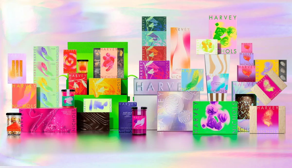


- Silver Award: Luxury
- Bronze Award: Retail
- Read more about this project at designbridge.com
“Takes risks while maintaining a level of luxury. It won’t be to everyone’s taste, but that’s the way with any pioneering product.”
Nicolas Houssin – Mattel
In the 90s, Harvey Nichols was iconic and pioneering. It was the first store in London to provide a platform to Gucci. The place where Max Mara collections were inspired, and vibrant independents like Jacquemus hosted pop-ups. And it introduced the city to sushi on a conveyor belt – a real purveyor of culture.
But time moved on, whilst they stood still. Tasked with reigniting the icon, Design Bridge & Partners introduced Pleasurama: a new vision of redefined luxury, immersing fashion insiders in a heightened and hedonistic world.
“Interestingly weird.”
Jane Duru – R/GA
The concept informed an extensive new luxury food and beverage flagship range for Harvey Nichols. Featuring nearly 300 pieces of packaging, it evolves the brand from black-and-white 90s nostalgia, to an unapologetically maximalist world that embraces the pursuit of unadulterated pleasure.
The idea grew bigger and bigger, inspiring everything from Harvey Nichols’ fashion campaigns, to interior design, to seasonal collections, to the ever-iconic windows. An anything goes, excess-all-areas riot of colour, texture that’s a full-on sensory overload.
Politico: Are You Thinking What We're Thinking? by Studio Sutherl& x Thomas Sharp


- Silver Award: Copywriting
- Bronze Award: Publishing
- studio-sutherland.co.uk
- thepoetryofitall.com
“Bang on-brand as serious thinkers. Creates a sort of cross-party word-salad that’s thought-provoking without being at all preachy or partisan, and feels like there’s a ‘voice’ even though they’ve not said a word themselves. Props for that.”
Nick Parker – That Explains Things
Politico is the global authority on the intersection of politics, policy, and power. It is the most robust news operation and information service in the world, informing the most influential audience in the world with insight, edge, and authority.
Are You Thinking What We’re Thinking? was a campaign to coincide with the recent UK General Election. Studio Sutherl& and collaborator Thomas Sharp researched the history of Election slogans from 1979–2024, combining them into one thought-provoking stream of consciousness.
The text is set in the colours of the main political Parties, overprinted to form a murky brown. Red on the left, blue on the right, yellow in the middle, also forming green and purple. A digital speech was broadcast on Election Day, and printed copies were distributed amongst all new MPs.
“Thoughtful, intriguing, and eye-opening.”
Rae Boocock – Sonder & Tell
Finally, a series of icons with the same offset typographic styling gave Politico a suite of assets to use for covering everything from Question Time to poll results, speeches to breaking news.
Precise by Design Bridge & Partners


- Silver Award: Brand Strategy
- designbridge.com
“A clear, insightful, single-minded idea that accentuates the business’ strengths and supports its commercial focus.”
Tom Moloney – Koto
Once tech-led and innovative, B2B specialist mortgage lender Precise Mortgages was tired, indistinct and struggling to keep up. Business development managers couldn’t articulate its competitive difference, new lenders were stealing loyal brokers, and perceptions of the brand were tied to characters no longer in the business.
Following extensive broker interviews, the issue was clear: brokers didn’t know if their cases would be accepted or not. And a ‘no’ didn’t always mean ‘no’ – a phone call to an underwriter could often push a case through, but it wasn’t guaranteed. This left brokers vulnerable to unknowns, and open to criticism. They needed speed, simplicity, reliability and transparency, alongside clear-cut ‘yes’ and ‘no’ criteria.
“I love how the creative idea ran with the insight.”
Rae Boocock – Sonder & Tell
It began with a new name. ‘Precise Mortgages’ became the punchier and simpler ‘Precise’, with a new brand promise at its heart: ‘Precisely the right lending products at precisely the right time.’
The new Precise offers ‘everything you need, nothing you don’t’. A redesigned brokers’ website includes tools for quick answers and automated submissions. And the creative idea, ‘Boldly Vanilla’, manifests the brand strategy with a visual identity that features a unique cut of the Motorway font, designed to be read at 70mph, and a hero colour – vanilla – that stands proudly in a sea of neon financial services brands. Finally, a pithy, decisive tone of voice adds a sprinkling of humour.
Royal Parks Half by Rose


- Silver Award: Not-for-Profit
- rosedesign.co.uk
“There are a lot of these kinds of races. This is the first time I’ve seen something that stands out in its field – forgive the pun.”
Helen Jones – Shelter
The first and only half marathon through the centre of London, The Royal Parks Half raises funds and creates awareness for The Royal Parks, helping other charities raise funds in a major annual event.
Since its inception in 2008, the annual event has raised over £60m for more than 1,200 UK charities. Rose’s brief was to create a new identity that could build brand recognition and clarify the event’s connection with the parks themselves.
“Lovely work. The OOH posters work particularly well in showing the setting and event with equal weight.”
Luke Taylor – UnitedUs
Using the Royal Parks typeface family, Rose created a strong logotype to take ownership of the ’half’ in half marathon. The Royal Parks marque – a crown made of leaves found in the parks – sits majestically on top.
One the world’s most beautiful half marathons, the route winds through London’s most iconic parks in the Autumn. The seasonal golden colour of the leaves, juxtaposed with the stone colour of the historic London architectural backdrop, informed an evocative colour palette to be used across different media.
Sense by BUCK


- Silver Award: Artisan
- Read more about this project at buck.co
“Super fresh and vibrant. Sets a new standard for a normally quite weakly branded industry.”
Chris Moody – Landor & Fitch
Physical intimacy is astonishingly rare for Gen Z. The data doesn’t lie – they’re having way less sex than the generations before them – but sex positivity and inclusivity are nonetheless often front of mind.
In a world where most sexual wellness and contraceptive products are designed to blend in, Sense wanted a strong, spicy brand that could both stand out in the retail aisle and be at home in the bedroom for their North American product launch.
“Brilliant work. Properly unusual and unexpected in the sector: playful, a bit rude, seductive, odd.”
Matt Baxter – Baxter & Bailey
BUCK developed a bold visual identity, tantalising product packaging, and a sultry brand voice playfully dubbed ‘Body Language’. The design system begs to be played with – abstract shapes that hint at sex toys and bodily curves – and incorporates playful moments of tension and anticipation.
The new packaging shines on the shelf amid the darker tones of its competitors, and boasts some functional enhancements too – from easy-opening condom packages to a clear lube bottle that shows when you’re running low.
Sinfonia Smith Square by Studio Sutherl&


- Silver Award: Copywriting (with Nick Asbury)
- Bronze Award: Culture
- Bronze Award: Typography
- studio-sutherland.co.uk
“Admire their commitment to long-form copy that’s strongly musical. ‘The river glideth at his own sweet will…’ is terrific: confident, evocative, rhythmically interesting, and unashamedly highbrow.”
Nick Parker – That Explains Things
Relaunched in June 2024 after renowned venue St John’s Smith Square merged with the much-loved Southbank Sinfonia, Sinfonia Smith Square is a beacon for the future of classical music. A forward-thinking organisation that enriches lives through the universal power of music, it supports exciting cultural initiatives for the widest possible audience.
Studio Sutherl& identity is based on the ’S’ of Sinfonia forming a Square at its heart, a simple but distinctive graphic device that translates seamlessly across other touchpoints: performances are literally framed within the square.
“Like music to my ears. Pace, craft, emotion – all while communicating the benefit and function.”
Peggy Afriyie – Senior copywriter
The typeface is a redrawn version of Caslon, drawn up in 1722, when St John Smith Square was being built. Large Caslon serifs are combined with Euclid, a modern geometric sans. Tight crops of letters are used for all festivals and programmes – A for Anghiari, B for Bach, C for Chopin, and so on – and bold typographic patterns reflect the black and white tiles found on the floor throughout the venue.
Longer-form writing, crafted in collaboration with Nick Asbury, captures the ethos of the Sinfonia, the spirit of performances, and the central London location across posters and programme notes.
Stern Grove Festival by Mucho


- Silver Award: Entertainment
- Read more about this project at wearemucho.com
“I love how the triangles create the trees in such a simple way. The energy of the other illustration style adds a lot to the VI: it’s expressive, which is what a festival needs.”
Emma Follett – Design Bridge & Partners
Founded in 1938, Stern Grove is the oldest music festival in San Francisco. Located in the heart of the city in a gorgeous eucalyptus grove, Stern Grove Festival offers free concerts featuring world-renowned artists from a wide range of genres, for 10 Sundays throughout the summer.
Mucho refreshed the brand to appeal to younger audiences, and establish the festival as a world-class event. The identity needed be modern, fresh, and flexible enough to work with any genre of music while being truly ownable.
Inspiration came from Stern Grove Festival’s spectacular location: nestled and surrounded by Eucalyptus trees, concert goers line up early in the morning to grab their favourite spots between the trees.
“Super nice.”
Thomas Wilder – Wolff Olins
To evoke this setting while reflecting the festival’s strong community aspect, Mucho created a simple tree icon that rotates to represent a grove, a community, and a vibrating graphic device that can animate and crop to represent sound.
Tanquerary No. TEN by Design Bridge & Partners


- Silver Award: Wine, Beer & Spirits
- designbridge.com
“The original No. TEN was an incredible design, and I didn’t imagine it could be improved upon to this extent. It feels fresh, it has flair, and it’s intricately crafted – perfection! A true re-imagination of an icon.”
Leigh Chandler – Sister Mary
Tanqueray No. TEN is one the world’s most celebrated gins. Yet few are aware of its craft credentials. With sales dropping, the new bottle needed to celebrate this spirit of craftsmanship, elevating No. TEN above the masterbrand – and the competition – to justify its elevated price point.
Artisanship sits at the heart of what No. TEN stands for, so celebrating its history of daring cocktail artistry was key. The new bottle form perfectly captures this pinnacle of craft: an elegant reimagining of art-deco geometry, celebrating the brand’s golden age and artisanal, small-batch origin story.
“Sleek and minimal.”
Charmie Shah – Creative director
Strong and architectural in stature, the bottle is a contemporary tribute to the iconic cocktail shaker, crafted with flair.
The pièce de resistance: a dramatic ooze of the seal, evocative of human flair and finesse – and essential ingredient in the story of this ever-experimental, but always iconic, liquid.
Toledo Museum of Art by Lafayette American


- Silver Award: Culture
- Read more about this project at scorpionrose.studio
“There’s a lot going on, from the multi-dimensionality, to the reference to the building and the T for Toledo, to the city of glass. Yet it holds together so well: strikingly simple yet incredibly flexible.”
Marc Atkinson – Southbank Centre
At over 123 years old, Toledo Museum of Art (TMA) is a beloved cultural institution in Toledo, Ohio, and a global leader in the museum field. It serves as a critical crossroads and cultural town square for a city that has seen radical shifts in the landscape over the past half century. But, like so many others, TMA is emerging from a complex history that was not always equally inclusive or accessible to the city’s whole population.
The museum’s visual identity hadn’t been touched for decades, and Lafayette American was tasked with evolving this powerful institution into a more inviting, lively, future-facing brand.
"Loved this when it first launched, and its appeal hasn’t diminished. The more outré elements are balanced against some ’straight’ grounding elements. Holy Toledo, it’s a cracker.”
Matt Baxter – Baxter & Bailey
It began with the insight that art is never static – it’s always dynamic. Just as a viewer’s perspective on a piece of art shifts as they cross the room, the TMA’s brand should continually drive change in perspective.
Grounded in the campus’ ’T-shaped’ footprint, and set in motion to reflect the continual reframing of art history and its emerging future, the new TMA identity is a dynamic, multifaceted icon built for the digital age.
West Dean by Johnson Banks


- Silver Award: Education
- Read more about this project at johnsonbanks.co.uk
“This one’s a real grower. I love the boldness and tactility of the mark.”
Chris Moody – Landor & Fitch
West Dean was born out of a post-war desire to create a community where artists and craftspeople could be nurtured, and unique craft skills preserved.
It provides a vast range of courses, ranging from clockmaking to creative writing, and the concept of ‘making’ is fundamental to the college's new brand expression.
“The combination of distinctive mark and strong copywriting really elevates this college, and shining a light on its people reinforces its creative standing.”
Marc Atkinson – Southbank Centre
For the new symbol, Johnson Banks drew inspiration from stone mason and ceramic marks to create a ‘W’ monogram, formed from three vertical strokes to reflect West Dean’s three schools.
A key creative asset of the system is the ability to express individuality: a whole array of ‘W’ marks have been drawn, scraped, chiselled and torn, ready to be used throughout the new design system.
Bronze Award winners
Brand Impact Awards 2024: Bronze Awards
In alphabetical order, the following 24 projects received at least one Bronze Award trophy at the Brand Impact Awards 2024.
Aardman Academy by Halo


- Bronze Award: Brand Strategy
- halostudio.love
“Nice bridge between craft, stories, and opportunities that the Academy offers. I like the guiding principles in particular: great sentiment, articulated in an ownable way.”
Rae Boocock – Sonder & Tell
Aardman Academy is one of the places to get trained in stop-motion animation. The problem was, it had grown organically, and lacked clarity on what the brand represented. The Aardman brand is strong, but the Aardman Academy brand needed to emerge from its shadow.
Following an in-depth review of competitors and audience, and interviews with alumni, tutors, and staff, Halo landed on three key things that make the Academy distinctive: its very practical, hands-on courses; the community it fosters; and that its tutors are themselves renowned animators.
Aardman Academy exists to bring people’s stories to life, and this can be believed because it actually delivers world-class, independent, animation education. At the core of the brand is a simple invitation: ‘Craft your story’.
Archer School for Girls by Design Bridge & Partners


- Bronze Award: Copywriting
- Read more about this project at designbridge.com
“Love the bold smartness of the ‘furtHER’ idea. Energetic and smart without feeling overly gimmicky. Feels like it could run and run. Very different from standard private school marketing, in the UK at least!”
Nick Parker – That Explains Things
Though a tiny all-girls school in LA, Archer School for Girls has a bold, insightful point of view on the limits that all girls and women face, and promises limitless education that deliberately offsets them.
57% of US teen girls feel sad or hopeless most of the time. Archer equips its pupils with the fearlessness, compassion, joy, and resilience to pursue their brilliance.
Design Bridge & Partners found a classical-modern sweet spot that evokes Archer’s balance of traditional schooling with emerging research-based methods. Artemis – Greek archer and protector of girls – helms the visual identity, aiming at a star for every girl. And the ‘her’ in Archer becomes a platform for emboldening every girl and woman in the world.
Aruba by How&How


- Bronze Award: Public Sector
- Read more about this project at how.studio
“A really fresh approach for a tourism brand – not the usual stock photos and boring lines. It’s well executed both visually and verbally.”
Jane Duru – R/GA
The Aruba Conservation Foundation is tasked with protecting over 24% of Aruba's natural habitat, terrestrial and marine. How&How was tasked with rallying local support for the island's biodiversity and natural heritage, and the flora and fauna that inhabit its protected sites.
The rebrand positions ACF as Aruba’s Voice of Nature: an organisation speaking up for the interests of local ecosystems and reminding locals of their ties with the land. By framing the brand’s role as a spokesperson for overlooked species and ecosystems, this in turn prompted Aruban communities to remember their oneness with the natural world.
This metaphor laid the groundwork for the visual identity, which showcases humanity’s spiritual connection to nature, using a bright purple taken from a local flower. The rest of the brand palette evokes the National Park's different geographical areas – dunes, marshes, ocean and scrubland – alongside a modular illustration system where plants and animals ‘grow’ to fit the layout.
Aston Martin Vantage by Design Bridge & Partners
- Bronze Award: Automotive
- Bronze Award: Luxury
- Bronze Award: Motion
- Read more about this project at designbridge.com
“A masterclass in appealing to automotive purists. The visuals and cinematography are striking, highlighting the aggressive design and dynamic capabilities in a relatable way.”
Amr El Badry – Vodafone
All modern performance OEMs (original engine manufacturer) are engaged in a facts and stats arms race, which means purist driver thrills take a back seat to vanity stats.
So, real drivers have never before had a car that truly meets their needs; forever short-changed or forced to compromise. That changes with the launch of the Vantage: Aston Martin at its most thrilling and quintessential; perfectly balanced and intentionally engineered for drivers to revel at the limits of their performance.
Entitled ‘Engineered for Real Drivers’, Design Bridge & Partners’ launch campaign puts this visceral enjoyment of the drive front and centre, showing the Vantage literally construct itself around F1TM legend, Fernando Alonso – with every driving action causing a new part of the car to materialise as it screams around some of the world’s most challenging corners.
Betterfly by DesignStudio


- Bronze Award: Financial Services
- Read more about this project at design.studio
“By sensitively echoing the well-known Bitcoin mark, the logo communicates ‘crypto’ quickly – and the gamification aspect is bang-on for the target audience.”
Vicki Young – Nalla
By rewarding people’s positive habits, Betterfly transforms insurance from a product we use when things go wrong, into something that companies can use to protect their workforce. This relationship empowers each person to build a better everyday for themselves – and a better world for everyone.
This triple-win was made possible through many innovations that weren’t always easy to communicate. DesignStudio helped tell that story through a brand that beams with energy, captivates people, and inspires meaningful change.
Through each step of a gamified journey, rewards are visualised as vibrant in-app currencies. Users can track progress and perks, how much they can contribute to causes they care about, and how big of an impact they’ve already had. An avatar, Buddy, offers guidance and encouragement, reacting and empathising with users while inspiring positive actions.
Cannonball! by Taxi Studio


- Bronze Award: Self-Branding
- Bronze Award: Illustration
- Read more about this project at taxistudio.co.uk
“A nicely unexpected approach to the thorny task of the anniversary celebration mailer. Lovely illustrations and lively copy that I’m sure will win this agency new fans and clients.”
Matt Baxter – Baxter & Bailey
To celebrate its 21st birthday, Taxi Studio created Cannonball! – a playful, beautifully produced pop-up book filled with smart papercraft touches and cheeky moments of humour. Brought to life in the style of a children’s book by renowned illustrator Rebecca Sutherland, the book is dedicated to the agency’s clients, friends, and founders’ kids.
Far from your usual, predictable retrospective of work, it’s an embodiment of the Taxi’s positioning: ‘Create unforgettable’. Cannonball! tells a timeless tale of creativity, courage, collaboration (and shameless self-promotion), inspired by the agency’s three core values: Live Fearless, Form Real Relationships, and Play Fair.
Written in a playful, rhyming style by Taxi co-founder and chief creative officer Spencer Buck – and featuring symbolic characters including Elephant, Mouse, and Pelican – Cannonball! is redolent of an Aesop fable, complete with the obligatory moral to the story.
Chococo by Buddy Creative


- Bronze Award: FMCG
- Read more about this project at buddycreative.com
“Lovely thought to champion the ownable square asset, and challenge pre-conceptions that it’s boring to be square. Great to see the power of the square in pretty much everything from logo through to the architecture.”
Stu Tallis – Taxi Studio
An award-winning independent maker of fine chocolate, Chococo has been setting the standards in ethical trade and sustainability since 2002. Inspired by the square chocolate compartments within the original boxes, their once-trailblazing packaging set high standards and disrupted the category.
However, over the years the identity began to lose it cohesiveness. As additional ranges were introduced, it no longer lived up to its potential both on- and off-pack.
Buddy Creative embraced and strengthened the legacy of Chococo’s coloured squares with a logotype that integrates neatly into the core chocolate boxes, but also stands alone as a logo for the brand. The square grid formation underpins the geometric style of all subsequent ranges, becoming a distinct starting point for a design system that brings recognition, cohesion and colour to Chococo’s ever expanding range.
Coffee Foundation by The Mental Health Association Switzerland


- Bronze Award: Not-for-Profit
- Read more about this project at thementalhealthassociation.com
“I love the playfulness they’ve brought to this identity, while challenging stereotypes head-on.”
Luke Taylor – UnitedUs
Coffee Foundation is more than a brand – it’s a movement. It transforms the perception of mental health, leveraging the universal symbol of coffee to foster open conversations and promote awareness.
Talking about mental health is one of Switzerland’s biggest taboos, and Coffee Foundation – the first mental health awareness brand in the country’s history – aims to disarm the powerful human emotions that stop many from declaring their struggles.
The slogan ‘Call Us Crazy’ reshapes the notion of ’craziness’ into a positive force, envisioning a world where mental health receives the same level of care as physical well-being, and striving towards a future free from suicide.
Enterprise Mobility by R/GA


- Bronze Award: Typography
- rga.com
“A well-executed redesign, beautifully expanded into a typeface with variations suitable for any kind of text. An excellent way to tell the brand’s story in an authentic way.”
Bianca Dumitrașcu – Type designer
Over 65 years, Enterprise has expanded far beyond the rental desk. With the addition of brands and services, the direction of the brand at the top got lost. A stale look, coupled with a fragmented brand identity system, didn’t match the vision and forward trajectory of the business itself.
As a leader in mobility in not only volume – the firm manages around 1.7 million vehicles globally – but also innovation, Enterprise needed a brand to set the pace for the road ahead. R/GA rebranded Enterprise Holdings from a legal container to a best-in-class brand: Enterprise Mobility.
This included a new custom typeface: EM Text. Inspired by the sweeping curves of the open road, the typeface builds the idea of progression into every detail, from tails to crossbars. The more expressive EM Display uses a programatic script to automatically introduce alternate characters, keeping display copy fresh and dynamic across key touchpoints.
Florentia Village by DNCO


- Bronze Award: Property & Construction
- Read more about this project at dnco.com
“Stylish, fun, and simple – and it feels relevant to the area.”
Simon Dixon – DixonBaxi
London’s creative spaces are increasingly at risk from redevelopment. General Projects wanted to turn the tide with the expansion of North London’s Florentia Village. Mindful of a general cynicism and lack of trust in developers, DNCO needed to find a solution that celebrated the resident creatives. The answer: focus on the enjoyment of making.
A new tagline – ‘for the love of making’ – reflects the area’s industrial history, while committing to a healthy future of creativity. Energetic and popping with positivity, the new brand features a flexible framework inspired by the punch-out kits commonly found in model making and manufacturing. It can be dialled up as supergraphic murals, and scaled down for more intimate brand experiences, such as the playful website.
In a brand landscape fixated on clean refinement, Florentia Village puts process over perfection, embracing the grainy, lo-fi realness inherent in the reality of crafting things.
Great Ormond Street Hospital Charity by Pentagram, Stuart Gough and JKR


- Bronze Award: Not-for-Profit
- pentagram.com
- stuartstuart.com
- jkrglobal.com
“Feels reinvigorated without losing the charm of the brand that we all know and love. Beautiful language anchors the whole identity, and provides the jumping-off point for graphic creativity.”
Luke Taylor – UnitedUs
Pentagram, Stuart Gough and JKR transformed heritage charity Great Ormond Street (GOSH) into an bold, inclusive, relevant brand with the joy and fragility of childhood at its heart. The strategic proposition – ‘Every life deserves a childhood’ – became an statement of intent: ‘We stop at nothing to help give seriously ill children childhoods that are fuller, funner and longer.’
The new brand expression celebrates children as protagonists in their own story. The logo returns to its origins as a more childlike sketch, celebrating the charm and happy mistakes of childhood drawings, while child’s-eye-view photography portrays spontaneous, joyful and intimate moments of children’s lived experiences.
A more inclusive, flexible palette is paired with a new, more relatable style of illustration, and animation that deepens the emotional resonance of the message. And a fresh TOV reflects the organisation’s hope and determination, tuning into more child-friendly language while being unafraid to share the difficult realities of life at GOSH with sensitivity and honesty.
IWM: Blavatnik Galleries by Alphabetical


- Bronze Award: Culture
- Read more about this project at alphabetical.studio
“A well-considered system that neatly solves the challenges of the brief, moving IWM into a more contemporary expression. The digital execution is particularly strong.”
Charlie De Grussa – Wise
Imperial War Museum London’s new Blavatnik Art, Film and Photography Galleries opened in November 2023. IWM is the first museum in the UK to offer a suite of galleries dedicated to the uniqueness of art created in times of conflict, across three artistic mediums.
As well as giving the galleries an ownable identity, IWM London wanted to challenge perceptions of the museum as ‘old fashioned’. This was also an opportunity to attract wider audiences by developing new digital motion principles for the brand.
Conflict fractures society, yet out of the fragments of war, creativity can be found. Inspired by the bold simplicity of wartime posters, and building on the angular cuts of IWM’s logo, Alphabetical crafted a flexible visual system using shards of text and images to showcase a wide range of artworks from all three disciplines.
Isle of Wight Tomatoes by B&B Studio


- Bronze Award: Artisan
- Read more about this project at bandb-studio.co.uk
“Brings a joy and wit to this identity that was previously lacking. The star device cleverly hangs it all together.”
Marc Atkinson – Southbank Centre
With more sunshine hours than anywhere else in the UK and a uniquely rich soil, the Isle of Wight is the perfect place to grow tomatoes. Rather than relegate this information to a background message, B&B rebranded The Tomato Stall to Isle of Wight Tomatoes to emphasise its provenance.
This new brand identity brings sunshine to the produce category, pushing the branding on from an expected red and green world to a vibrant and unexpected yellow. Used as a core colour across the brand world and on fresh produce labelling, this leads a new flavour-led palette of colours on packaging for the brand’s range of tomato-based condiments and sauces.
A new green star icon, derived from a tomato calyx, draws focus and expresses quality and expertise in a natural and organic way, elevating the company’s produce and products beyond own-label and branded competitors.
Jim Beam Flavours by Turner Duckworth


- Bronze Award: Wine, Beer & Spirits
- Bronze Award: FMCG
- Read more about this project at turnerduckworth.com
“A much-needed evolution! Beautifully crafted, oozing with flavour and informality in what can be a stuffy category.”
Leigh Chandler – Sister Mary
Jim Beam Flavours is a fruit-forward, smooth, crafted range. But the existing black, heavy, photo-real labels didn’t deliver the right light-spiritedness and easy informality. Turner Duckworth’s brief was to put the soul back, emphasising tradition, togetherness, and craftsmanship to make bourbon appeal to all.
In a conscious departure from both black and photography, the rebrand builds on the iconic white colour of the brand’s signature bottling, adding flavour in a distinctly ‘Beam’ way with authentically woodcut illustrations of fruits, informally laid out and inked in rich flavourful colours.
A consistent approach to key visual posters for in-store and out-of-home heroes each bottle – putting flavour front and centre. The resulting design plays to the soul and spirit of Jim Beam, disrupting the retail environment with a lightness, flavour, and ease that makes bourbon appeal to all.
KIN by Kit Studio


- Bronze Award: Entertainment
- Read more about this project at kit.studio
“Bold, creative, iconic.”
Nicolas Houssin – Mattel
KIN is an independent London-based production company born from the creative genius of Bafta-nominated writer, producer and showrunner Michael Hirst. Nurtured by Hirst’s actual kin – in development Scarlett Hirst, and in writing, acting and production Horatio James – KIN united fearless creatives to meet the global appetite for authentic content.
Kit Studio partnered with KIN to develop their brand strategy, build their brand identity and develop their website and communications. The design approach heroes the concept of connections, with a unique K-I ligature in the logo to champion the idea of community and collaboration.
KIN’s approach is anything but cold, so Kit Studio opted for a warm supporting colour palette with a bright highlight blue to complement the monochrome industry norm. Launching amidst their first production, the identity spanned business cards, T-shirts and decks, plus production-branded merch.
Nature Returns by Johnson Banks


- Bronze Award: Public Sector
- johnsonbanks.co.uk
“Like a novel take on a nature story.”
Jane Duru – R/GA
Scientists are looking harder at what nature itself has been doing to stabilise our planet – without our help – for millennia. But we lack the hard data to back up the power of these ‘nature-based solutions’. For example, we know that wetlands and bogs act as carbon sinks – but not how much carbon they are storing. How we manage – or mismanage – our hillsides upstream can hugely impact flooding downstream, but again we lack concrete evidence.
Nature Returns is a new project to capture pilots that have begun across England, digging deeper into the science of how nature can help mitigate climate change and biodiversity loss. Because to be taken seriously, these natural solutions must be inspiring, evidenced, cost-effective and realistic for all concerned.
By deliberately hinting at both natural and fiscal returns, Johnson Banks opened up a unique verbal and visual language – helping the organisation build a mutually beneficial alliance of science, philanthropy and community action. Based on a simple x/y axis, the logo hints at what is to come: a versatile identity system that blends the statistical language of graphs and data with beautiful imagery and smart copy.
Nepal Nature Trust by Saboteur


- Bronze Award: Illustration
- saboteur.studio
“I love this idea. It would be great to see it extended to trees, insects, and smaller mammals too.”
Rebecca Sutherland – Illustrator
The Nepal Nature Trust is a charity committed to preserving the unique environment and wildlife of Nepal. The beautiful microclimate can only be preserved by maintaining a very delicate balance: if the wildlife is to survive, we must protect and preserve the pristine environment.
Saboteur’s new identity celebrates that perfect natural harmony. In a beautifully crafted illustration, the topographical outlines of the mountains move gently to reveal the stripes on a tiger’s back: a quiet, subtle revelation, like catching a glimpse of a tiger in the wild.
Original cartographer sketches of the mountains from 1600 look identical to those of 1900. But recent photographs tell a different story: the silhouettes, unchanged for millennia, are changing dramatically as millions of tonnes of snow and ice melt away. The identity is a silent protest about the devastation of this fragile place, and the threat this casual damage poses to everything that lives here. With sustainability in mind, it can be easily printed, stamped and painted onto existing surfaces using natural, plant-based inks and dyes.
Obama Foundation by Manual


- Bronze Award: Not-for-Profit
- manualcreative.com
“A thoughtful update of a classic. This is a nice, clean, simple system – especially for the political space.”
Ren Rigby – Proto
Established in 2014 by former US President Barack Obama and former First Lady Michelle Obama, The Obama Foundation seeks to inspire, empower, and connect individuals to drive positive global change. Through programs and events worldwide, the Foundation equips emerging leaders with the skills, resources, and networks needed to maximise their potential and amplify their local impact on a global scale.
The Foundation calls on us to ‘Bring Change Home’, encouraging us to use our individual power within our communities to create the change we hope to see. To inspire a new generation of changemakers, the Obama Foundation sought to redefine its brand identity.
Manual created a forward-thinking, digitally native identity that would resonate globally, adding energy and approachability to the Foundation’s existing authority and enhancing its connection to the communities it serves. The new brand is all about forward movement, community ownership, and the ripple effect that one person can have in making meaningful change.
The Pack by Kotex by Pearlfisher


- Bronze Award: Education
- Read more about this project at pearlfisher.com
“This is great. It hits the audience perfectly.”
Chris Moody – Landor & Fitch
The Pack by Kotex is a groundbreaking educational brand and first period kit for South African schools. It demystifies menstruation, providing tween girls (ages 11-15) with the knowledge and confidence needed to embrace their journey to womanhood positively. This aligns perfectly with Kotex’s mission to ensure periods never hinder a woman’s progress.
The brand concept was translated across multiple touchpoints, including a physical first period kit, with a reusable tin; educational materials, including leaflets, posters, and digital presentations; four friendly digital characters, called Kiara, Thembeka, Amy, and Mia; and the potential for AR and VR features on product packaging.
The Pack’s gamified aesthetic sets it apart in the feminine hygiene sector, resonating with its tech-savvy Gen Alpha audience. Unlike traditional, often clinical approaches to menstrual education, it adopts an interactive, digital-first design that blends learning with play. Relatable characters help address the emotional aspects of menstruation alongside the practical, engaging not only the tween girls but also their mothers or guardians – fostering trust in the Kotex brand across generations.
Spectrum.Life by UnitedUs


- Bronze Award: Professional Services
- Read more about this project at unitedus.co.uk
“Vibrant, flexible, and distinctive, with plenty of scope to grow.”
David Airey – Logo Design Love
For innovative Irish healthtech Spectrum.Life, caring isn’t just a value: it’s the very fabric of their team – woven into every action and decision. A mission to ‘change and save as many lives as possible’ had already permeated the organisation, from board level to clinical and tech teams.
But care alone isn’t enough. To make change in the world, a business must partner ambition with commercial acumen. Having already instilled a culture of transformation, Spectrum.Life needed a high-calibre brand to match.
UnitedUs developed a digital-first identity to help communicate the organisation’s presence as a ‘full-spectrum’ whole-of health partner. From a carefully tailored verbal messaging hierarchy, to a flexible design system based on waveform shapes and colour prisms, to lifestyle photography and hero video that recognises diverse experiences of life – the result is a ‘full-spectrum brand’ that does justice to Spectrum.Life’s transformative digital health experiences.
Spirit of Heineken by Design Bridge & Partners


- Bronze Award: Wine, Beer & Spirits
- designbridge.com
“A thoughtful execution to generate buzz around a landmark anniversary. Reusing leftover waste is a nice way to start the conversation about recycling.”
Daniel Kennington – Turner Duckworth
For Heineken’s 150th anniversary, Design Bridge & Partners crafted a luxury gift embodying sustainability and circularity. The Spirit of Heineken is a one-of-a-kind spirit made with leftover alcohol generated during the Heineken 0.0 brewing process. Beyond recycling, it transforms waste into treasure, reflecting Heineken’s commitment to environmental impact.
Crafted with the finest attention to detail, in collaboration with Royal Delft Porcelain, the limited-edition flask embodies elegance and simplicity. Its design, featuring the iconic racetrack shape and embossed star, subtly elevates the world-renowned beer brand. Inside is a refined spirit at 18.73% alcohol, a nod to Heineken’s founding year.
Made only with recyclable materials, the flask is designed to be so iconic, it will be repeatedly reused. It is crafted from porcelain, wooden cork, and recycled cardboard in the outer packaging. Heineken ordered 3550 bottles in the first round of production, and shipped them all over the globe to key stakeholders and influencers.
University of California Investments by Mucho


- Bronze Award: Education
- Read more about this project at wearemucho.com
“It’s rare to see real craft integrated into design these days, more so in the world of finance. So hallelujah to that.”
Marc Atkinson – Southbank Centre
University of California Investments works on the principle that by eliminating what’s not essential, you’re better able to recognise and act on market openings you might otherwise miss. Mucho was tasked with bringing this concept to life for the organisation’s annual report.
Rather than simply using minimalist design, the studio took a different tack: literally stripping away the unnecessary to reveal the necessary. In collaboration with UK artist Steve Bennett, the team used a linocut printmaking technique to sculpt linoleum with a scalpel.
The handcrafted blocks were then photographed for use throughout the report. To complement the illustrations, Mucho chose an ‘inktrap’ style font, featuring apertures that appear to be chiseled – like the linocuts themselves. In a final twist, the envelope that the report is mailed in shows the fillings that were chiseled away.
Uoga Uoga Kids by Andstudio


- Bronze Award: Pharmaceuticals & Toiletries
- byandstudio.com
“A breath of novelty and joy in the FMCG sea of sameness. Fun, simple and functional.”
Heitor Piffer – Design Bridge & Partners
Uoga Uoga Kids is an organic extension of Uoga Uoga cosmetics, designed to help kids like bath time just as much as playtime. Recognising that children often find bath time unpleasant and are keen to resist it, Andstudio looked for ways to transform that experience into a positive one.
Noticing that kids react much better when they can focus on toys rather than the bath process itself sparked an idea. Each bottle becomes a vibrant purple character, waiting to be customised with a set of stickers – so kids can create their own quirky characters. Essentially, the products double as interactive toys, turning the bathroom into a playroom.
Through Uoga Uoga Kids, Andstudio set out to change kids’ relationships with mundane products such as toothpaste, shampoo and cream, while teaching a valuable early lesson in sustainability.
Vocation Brewery by Turner Duckworth


- Bronze Award: Wine, Beer & Spirits
- Bronze Award: FMCG
- Bronze Award: Illustration
- Read more about this project at turnerduckworth.com
“Exciting illustrations that live really nicely on product. If I were hosting a get together, I’d buy this simply because of the ‘eye’-catching packaging.”
Kenesha Sneed – BUCK
The ‘Vocation Eye’ has been part of Vocation Brewery's identity since its inception. Inconsistently used, it fell out of favour – but remained a familiar asset. Turner Duckworth put it at the heart of the new identity, symbolising the brand’s unwavering focus and visionary outlook.
Created in collaboration with illustrator Brian Steely, a new design language gives the brand freedom to grow and express itself in imaginative ways. As seen at the craft beer shelf, any brand can achieve visual stand-out – but Vocation Brewery’s cans needed to match the bold and flavourful experience inside.
Each was given a characterful personality, and a suggestion of occasion – from uplifting alfresco summer vibes to a smooth and soulful session-able tipple to fuel your evening. As competitors play to category conventions by simplifying their offerings, Vocation Brewery is well-equipped to challenge what it is to be a craft beer in the 2020s.
Credits
Brand Impact Awards 2024: Credits
Click to read full production credits for all the winning projects at the Brand Impact Awards 2024, as supplied by the entrants.
If we're missing anything, or you need to make a correction, please get in touch.
Congratulations to all winning agencies
Thank you to everyone who submitted entries, and congratulations again to all our worthy winners – you smashed it.
See you in 2025!

