15 years after the worst rebrand in history, Tropicana is trying again
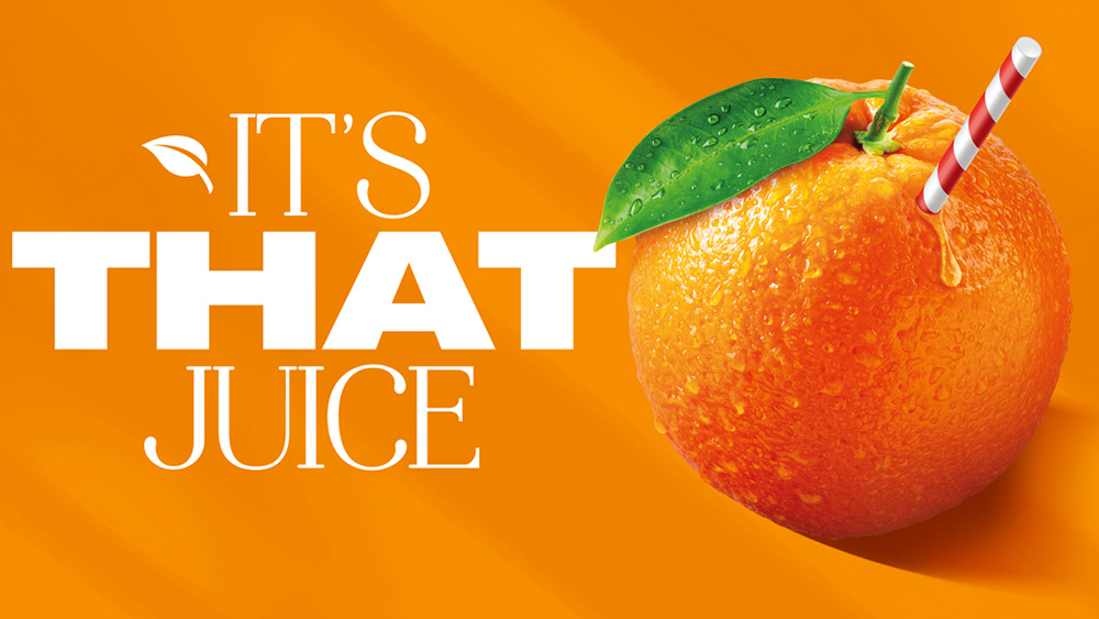
Back in 2009, Tropicana rebranded, and it was an unmitigated disaster. PepsiCo, its owner at the time, ditched the brand's classic packaging with its arched logo and fruit pierced with a straw in favour of an identity that looked like a cheap supermarket own-brand.
The fiasco made it into our list of the most embarrassing marketing blunders... and the classic logos that should never have been changed... and even the 10 most hated logos of all time. So bad was the reaction (and it wasn't all us, I promise), that PepsiCo ditched the rebrand within less than a year. In that lapse, it reportedly lost over $100m amid a 20% drop in sales. You would think that experience might put Tropicana off rebrands forever. But 15 years on, it's trying again. Will it go any better?

The minute I saw 'Tropicana rebrand', I immediately felt a pang of nerves for a brand I have no connection with and don't even consume. The 2009 rebrand was really that bad. Like that exercise, the 2024 refresh includes a new logo and new packaging. And at first glance, it might look like, after all this time, PepsiCo was still set on simplifying the identity. But happily, the result is a lot less bland than the last effort, and a lot cleverer than what it might seem like at first while still respecting the existing identity.
Article continues belowDevised by Sunhouse Creative, the new logo removes for good the iconic leaf over the 'i' in 'Tropicana'. That's a bold move since this has long been an intrinsic part of the brand's visual identity. The leaf is replaced with a new device: an orange circle. Simple to the point of bordering on the generic, perhaps, but that new pop of colour on the 'i' becomes stronger when you make the connection to the lid on the brand's juice cartons.
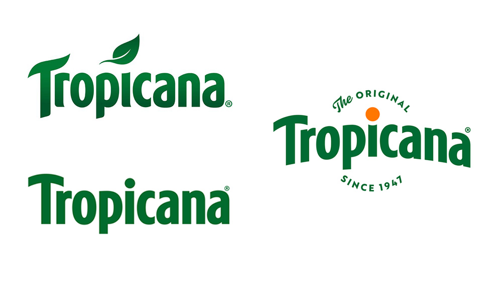
And the lid is where you'll now find that missing leaf, converting part of the packaging into an orange (on the classic orange flavours) and into a brand symbol in its own right. It's a kind of self-referential identity in stages: the new logo takes us to the lid, and the lid takes us to the old logo, but also gives birth to a new brand asset that's perhaps even more recognisable. The move resolves the issue of the two separate logos that were in use until now (one with and one without the leaf) and puts full emphasis on the orange, emphasising the original "straight from source" product story.
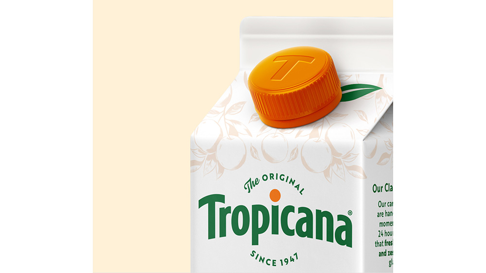
This is backed up in the rest of the packaging redesign, which could be described as the reverse of that fateful 2009 rebrand. The orange and straw not only remain in place, but they're enhanced and made to stand out more, backed up by the addition of more colour and hand-drawn illustration for a more vibrant palette. The tagline 'The Original since 1947' around the logo and founder Anthony T. Rossi’s signature on the packaging seal the ode to the brand's legacy.
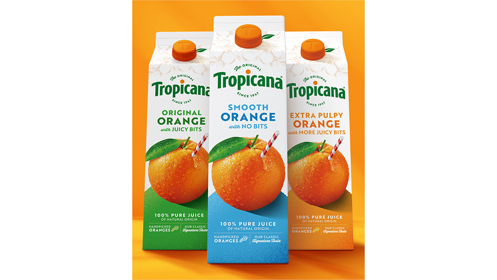
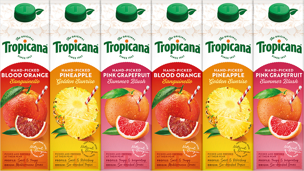
“Our task was to breathe new life into the brand’s assets, showcasing these compelling stories with confidence and credibility to reinforce the message that ‘Not All Juices are Created Equal," says James Giles, executive creative director at Sunhouse.
Sign up to Creative Bloq's daily newsletter, which brings you the latest news and inspiration from the worlds of art, design and technology.
So, happily, it seems Tropicana did indeed learn from that previous rebrand. The new look leans into its legacy while ensuring it doesn't age: adding a colour to make the identity more inviting but still instantly recognisable. I breathe a sigh of relief and congratulate all involved.
For more inspiration, see our pick of the best new logos of the year so far (and the worst logos of 2024).

Joe is a regular freelance journalist and editor at Creative Bloq. He writes news, features and buying guides and keeps track of the best equipment and software for creatives, from video editing programs to monitors and accessories. A veteran news writer and photographer, he now works as a project manager at the London and Buenos Aires-based design, production and branding agency Hermana Creatives. There he manages a team of designers, photographers and video editors who specialise in producing visual content and design assets for the hospitality sector. He also dances Argentine tango.
