The Switch 2 is the hot new gaming release on everyone's lips with rumours flying all around the internet. While Reddit's recent Switch 2 leaks gave us an exciting hint at specs and design, many fans were pretty underwhelmed with the potetial logo, but fear not, I think I've found the perfect replacement.
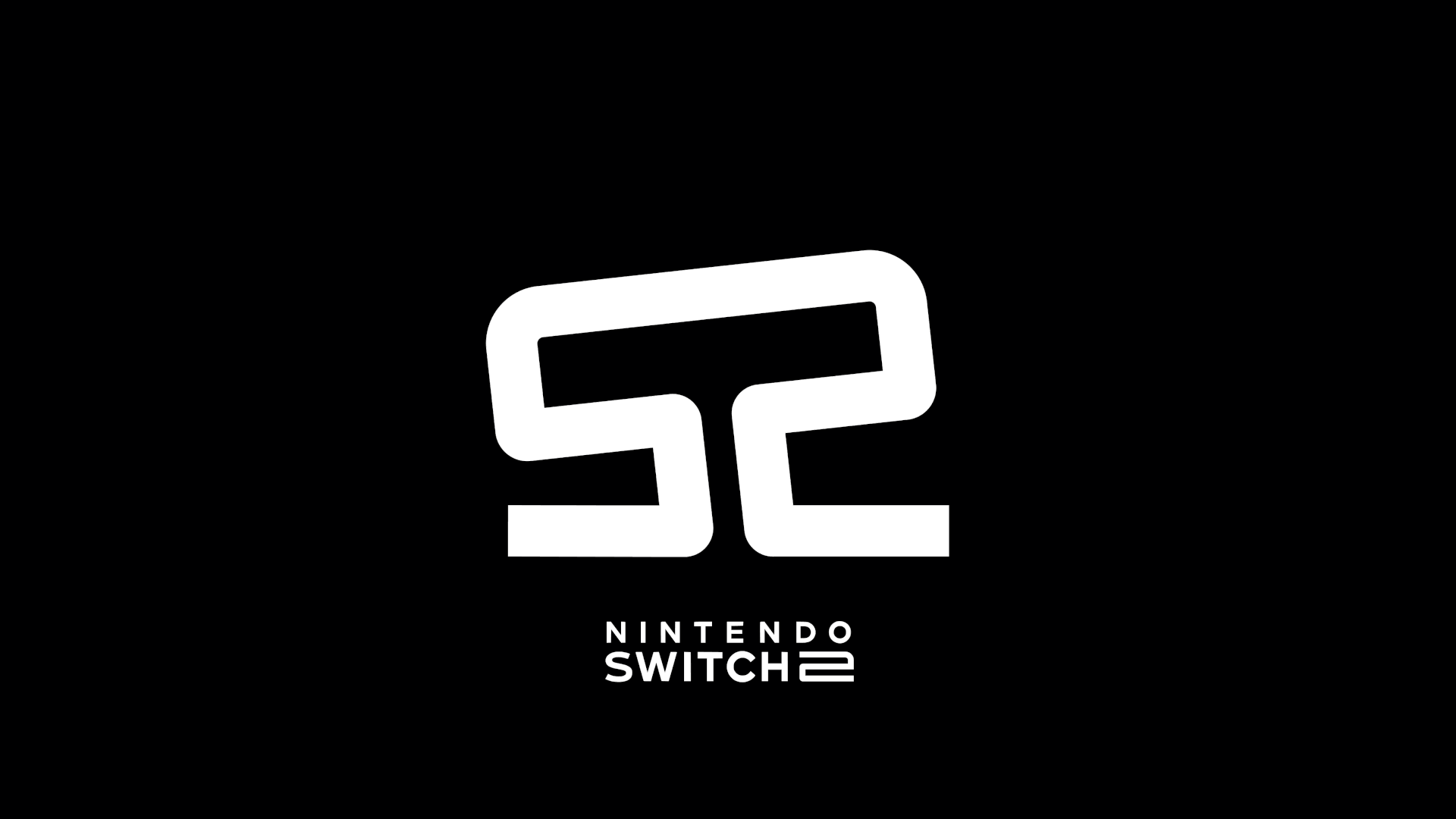
Created by graphic designer Jason Combs, the Switch 2 logo concept is complete design perfection, bringing retro visuals and ingenious design together into one slick emblem. While sadly it's not the official design, Nintendo could (and should) take some serious hints, but for now check out everything we know about the Nintendo Switch 2 to stay updated.
the switch 2 logo is... an analog stick?? 😮 pic.twitter.com/tG5oFWoWLzDecember 12, 2024
Jason's viral Switch 2 logo concept was born from humble beginnings, inspired by a Discord chat with friends about "how Nintendo is notoriously goofy about naming sequels ('Wii U', 'NEW Super Mario Bros.' etc.)." He tells Creative Bloq, "One of my friends said he hoped they just call it Switch 2 and that the logo could be 'S2.' I responded that S2 would be great from a design perspective because you could mirror the characters."
To create the ingenious logo Jason explains, "I whipped up a couple of versions of the mirrored S2 in Figma just using a mono-weight stroke. The ‘analog stick’ idea came when I realized I could link the top bars of the S and 2 together to create a single shape. So I spent a couple more minutes creating a left and right rotated version, threw together a quick 4-frame looping GIF, and that’s it!"
insanely good logodare 2 say, the best console logo everDecember 14, 2024
While Jason claims he "didn’t spend more than 10 minutes on it total," gaming fans on X were instantly enamoured by the design, with one user writing, "This is the most creative and wonderful thing I've seen on this social network." Another commented "This is PEAAAAAAAKKKKKK logo design", while another fan called it "the best console logo ever".
For more gaming news check out the bizarre AI cat game that snuck its way into this year's Game Awards. Can't wait for the Switch 2? Check out our picks of the best game consoles rated by performance, value and more.

